function jdb_page_navigation()
sPageSlug = blog
sPageTitle = easily amused
header:139:aPageArgs:page_title = easily amused
header:140:aPageArgs:section_title =
functions-johndberry:262:aPageArgs:page_title = easily amused
functions-johndberry:298:sPageTitle = easily amused
functions-johndberry:359:sPageTitle = easilyamused

easilyamused |

Typographer’s lunch 5: Letterform Archive in its new home

Published

I’ve just had a chance to peek behind the curtain at the Letterform Archive, to see its new digs in the Dogpatch neighborhood of San Francisco. The move to larger quarters began before the pandemic, but everything moves slowly when you’re in quasi lockdown. The new Archive has much more space than the old location, including a spacious, well-lit double room that will become both a classroom and a reading room, with a folding dividing wall that is actually soundproof and that doubles as a whiteboard.

The first post-Covid exhibition opens in early November, a celebration of the centennial of the Bauhaus. Archive founder Rob Saunders showed us a sample copy of the elaborate catalog of the exhibition, which shows off the strengths of the Archive’s publishing program with its finely controlled stochastic printing, where you can peer closely at tiny reproductions of full two-page spreads and even read the text.

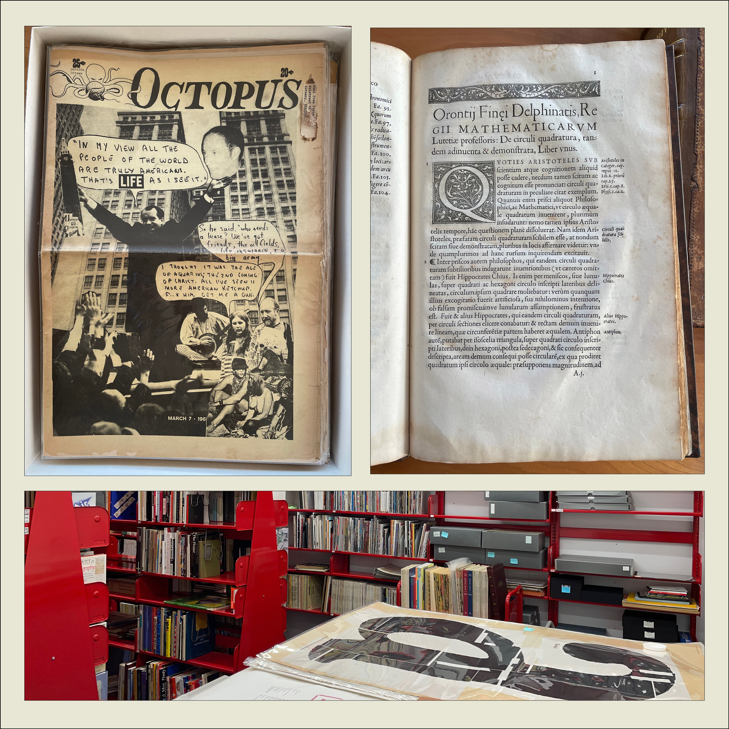
We looked at early printing examples such as Claude Garamond’s first Greek type (16th century) and the first type specimen known to be published by a woman printer (18th century). We also perused issues of the San Francisco Oracle from the late 1960s and an alternative newspaper from Ottawa, Octopus. On the back page of one issue of Octopus was a surprisingly professional-looking ad for “3 Days of Peace & Music” at Woodstock.

The Archive plans to begin regular tours in January (pandemic permitting).

[Originally published on November 1, 2021, in PPN Post and Updates, the newsletter of the Publishing Professionals Network.]

Typographer’s lunch 4: Gerard Unger’s life in letters

Published

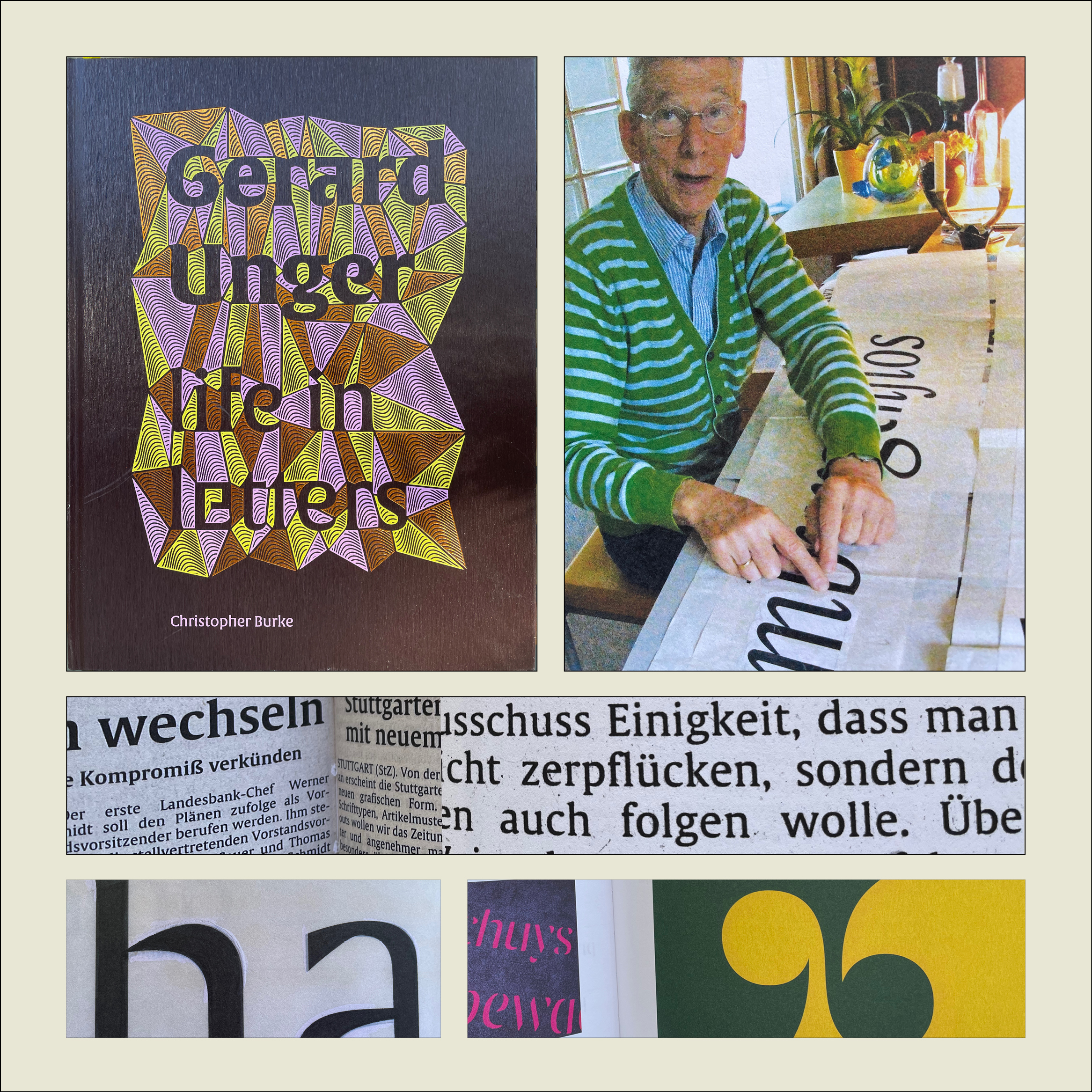
Christopher Burke, Gerard Unger: Life in Letters (Amsterdam: Uitgeverij de Buitenkant, 2021).

Christopher Burke writes clearly and knowledgeably about type and the people who design it. His just-published biography of Dutch type designer Gerard Unger, one of the most prolific and talented type designers of the later 20th century and the early 21st, is quite simply a must-have book. It’s well made, effectively designed, artfully written, and lavishly illustrated.

Gerard Unger: Life in Letters is above all a book about process. In tracing Unger’s life and career, Burke shows Unger repeatedly wrestling with new techniques and new technologies, figuring out how to take advantage of them and finding creative ways to put even their constraints to use. Unger did not begin by cutting metal punches, but he came into the field of typography when it was adapting to phototypesetting, and he then encountered each new iteration of digital typesetting and type design. The book’s ample and detailed illustrations show these processes in abundance.

Unger was a pragmatic designer, always focused on making type that people could actually read. Whether designing signage faces for highways or metros, or text faces for daily newspapers, he studied what made the letters readable and incorporated his insights into each design. The distinctive curve forms of his letters were unique to him, often making it easy to spot an Unger typeface when you saw it. He incorporated history but always created something new; his last major typeface, Alverata, with its sanserif companion Sanserata, is both a usable text face and an exuberant expression of letter forms that first blossomed in Romanesque lettering a thousand years ago.

[Originally published on October 1, 2021, in PPN Post and Updates, the newsletter of the Publishing Professionals Network.]

Typographer’s lunch 3: DJR’s Font of the Month Club

Published

Need a font that’s strange and bonkers but also well made and usable? And a new one every month? Then join the Font of the Month Club.

Type designer David Jonathan Ross, better known as “DJR,” worked for nearly ten years at The Font Bureau, before starting his own independent digital type foundry in 2016. In 2018, he was awarded the Prix Charles Peignot, given by the Association Typographique Internationale (ATypI) to an outstanding type designer under the age of 35. You can find practical, versatile type families like Roslindale, Gimlet, and Forma at Type Network or through DJR’s own website. But what’s fascinating is when he goes wild, taking established typographic norms and forms and turning them inside out, to see what they might be capable of.

That’s what his Font of the Month Club is for. You can subscribe for a nominal fee ($6/month, or $2/month if you have a financial hardship), and every month Ross will send you a different, unpredictable new font. It might be something as pragmatic as Fern Text or as geometrically crazy as Megazoid, as spectacularly reverse-contrast as Tortellini or as unabashedly Victorian as Clavichord.

I have sometimes found ways to put some of these fonts to use the very month they are released. I’ve recently used Roslindale, Dattilo, Job Clarendon, and Rhododendron on book covers, for instance. It’s a delight to be able to send DJR a PDF that shows his typefaces in use (as I try to do whenever I’m using typefaces by a contemporary type designer). And it’s fun to try out freshly baked new fonts, fresh from the digital oven.

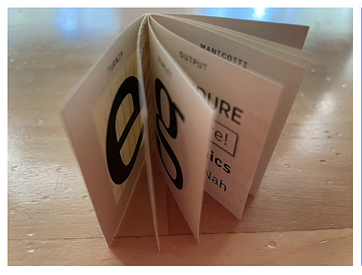
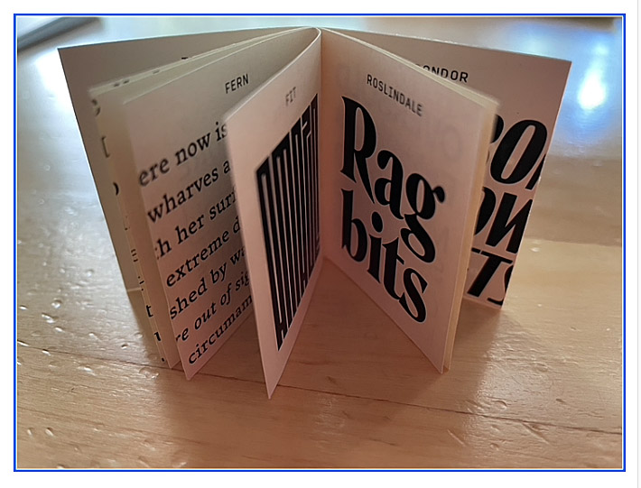
[Images: two snapshots of DJR’s tiny, tiny type specimen booklet.]

[Originally published on September 1, 2021, in PPN Post and Updates, the newsletter of the Publishing Professionals Network.]

Typographer’s lunch 2: Calibri

Published

You may have seen Microsoft’s recent announcement that they were releasing five new font families, one of which will end up replacing Calibri as the default font in Microsoft Office. “Calibri has been the default font for all things Microsoft since 2007,” the announcement read, “when it stepped in to replace Times New Roman across Microsoft Office. It has served us all well, but we believe it’s time to evolve.”

Originally Calibri, designed by Dutch type designer Luc(as) de Groot, wasn’t meant to be the new Office text face; that role would be given to Jelle Bosma’s sturdy serif typeface Cambria, which was designed to be a Times replacement. But Calibri worked so well that their roles got reversed.

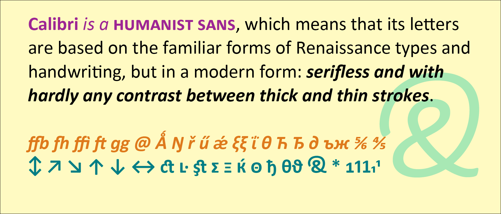
Calibri is a humanist sans, which means that its letters are based on the familiar forms of Renaissance types and handwriting, but in a modern form: serifless and with hardly any contrast between thick and thin strokes. Calibri also features softly rounded ends to its strokes, which gives it a friendly, informal feel even though it’s a classically structured typeface.

De Groot gave Calibri a lot of extra features, including small-caps numerals, direction arrows, an alternate g, a swash ampersand, and an unexpectedly wide range of ligatures. Like all of the ClearType fonts, Calibri was designed simultaneously for Latin, Greek, and Cyrillic.

Both Calibri and Cambria were part of the ClearType Font Collection, a suite of digital typefaces commissioned in 2002 to take advantage of Microsoft’s then-new ClearType technology. Calibri proved versatile and popular, even after the underlying technology was superseded by higher screen resolutions.

Interestingly, all five of the new proposed replacements for Calibri are sans serifs.

[Originally published on August 1, 2021, in PPN Post and Updates, the newsletter of the Publishing Professionals Network.]

Typographer’s lunch

Published

When Dave Peattie, the vice-president of Publishing Professionals Network, asked me if I’d write a short column about type for the PPN email newsletter that he edits, naturally I said yes.

Thanks to an untimely system crash and an update that somehow didn’t get uploaded properly to Mailchimp, the July newsletter went out with an early draft of the text of my column, under a placeholder column title that I hadn’t chosen.

It would be silly to insist that Dave send out a corrected newsletter just for me, so I suggested that a simple solution: I would publish my intended version here, on my blog. And, of course, let you know about PPN.

Publishing Professionals Network (formerly Bookbuilders West) is based in the San Francisco Bay Area but widespread in its membership and influence. Its annual Book Show is a showcase for the best book designs in the West each year. In lieu of in-person meet-ups during the pandemic, PPN has had a monthly informal Zoom meet-up online, which has been a boon to those of us who don’t live in the Bay Area but like to hang out with our colleagues. You might want to join in. (You don’t have to be a PPN member to do so.)

Meanwhile, here’s the column. Some of you may have heard me talk about this subject before.

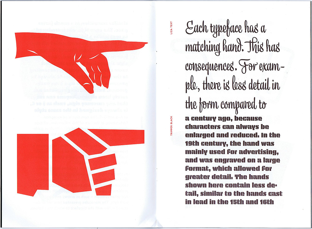
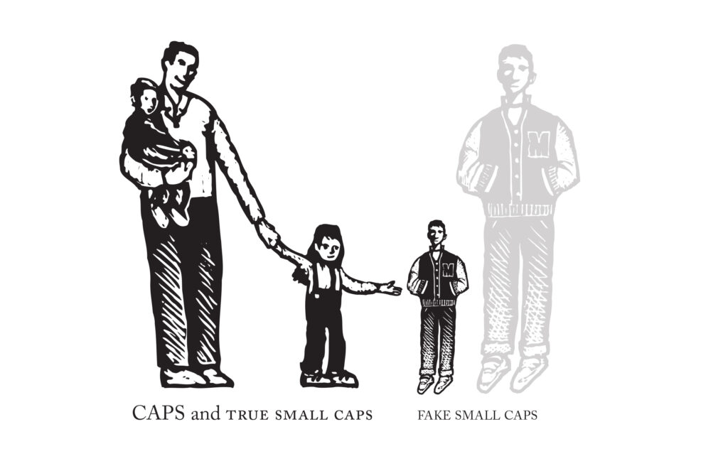
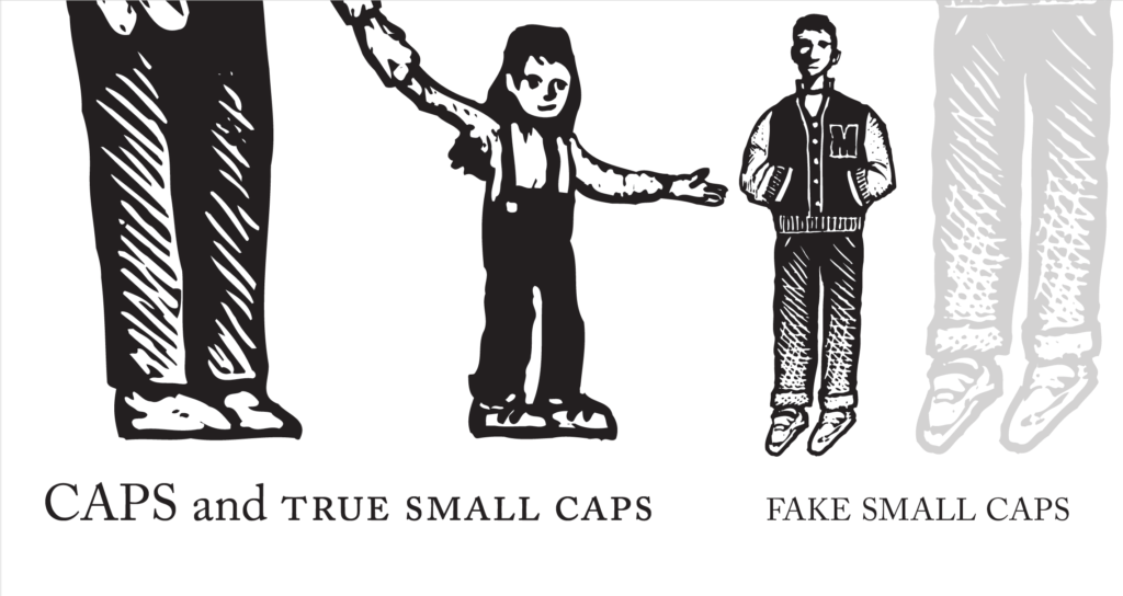
Cartoonish drawings of adults & children, and an adult shrunken down to the height of a child.

Typographer’s lunch | a column by John D. Berry | June 2021

Why use small caps? Small caps can look very elegant. They can help keep a forest of all-caps acronyms from overwhelming a page of text. They are a traditional way of setting off one kind of information, like a byline, from others, like a headline. In reference books, they are often used to highlight cross-references to terms that have their own entry elsewhere in the book.

Small caps are never strictly necessary; there are other ways of distinguishing information typographically. And many fonts, digital or otherwise, don’t include small caps in their character set. So before you specify small caps in a design, make sure they are available in the font you’re going to use. (To cover all the bases, better check for italic small caps, too.)

The software you’re using may try to be helpful by faking small caps if it can’t find them in the font. Fake small caps are nothing but capital letters that have been shrunk down to the x-height or a little higher (the height of the body of a lowercase letter). And that’s exactly what they look like: little miniatures, too light in weight compared to the rest of the letters, and too tightly spaced, so they look both spindly and crowded together. 

Fake small caps are especially distracting when they are set with full-size caps at the beginning of each word. Since the full caps are so much heavier than their shrunken companions, they draw extra attention to themselves, emphasizing the initial letter of each word. Unless you’re spelling out the meaning of an acronym, this is pointless and misleading. Just set the whole word in small caps.Small caps have to be designed, just like any other characters in a font. Like children, small caps have their own size and proportions; they’re not just adults shrunk down to child height. (When you look at Renaissance paintings where the artist has done just that, the children look uncanny and disturbing. So do fake small caps.) And they do need to be spaced out a bit, or they get into fights.

Close-up of lower part of first image, showing the drawn child and a shrunken-down drawn adult at the same height.

A talk on Jack Stauffacher’s legacy

Published

In October I joined Chuck Byrne to give a two-part talk about the life and work of Jack W. Stauffacher for the Society of Printers in Boston. No doubt in a normal time we would have traveled to Boston to address the members in person, but because of the pandemic the event was entirely virtual. This has its disadvantages (my connection was evidently a bit wonky, sometimes making my audio slur for a moment, though I had no way of knowing this until I listened to the recording later), but it has advantages as well: a much larger potential audience, one that was geographically dispersed although constrained by time zone. And of course the talk was recorded, so you can watch it now, well after the fact.

My part focused on Jack’s life, using the biographical essay I had written for Only on Saturday, the upcoming book from the Letterform Archive about Jack’s abstract wood-type prints. I was reading my text, rather than speaking extemporaneously, which seemed appropriate, since the book hadn’t yet been published. For the talk, I put together a selection of images that I hoped would give a visual counterpoint to the narration. Researching Jack Stauffacher’s life was a fascinating project, and finding a way to organize its many aspects and facets was a creative project of its own. But it was all in the service of telling people about Jack.

Chuck is the moving force behind the book, and in his part of the presentation he went through the book, page spread by page spread, explaining why they had chosen particular images and how they had put them together into a remarkable, highly visual volume. The design of the book is Chuck’s; he was quite sure that Jack’s approach to the design would have been different, but they were long-time friends and no doubt would have enjoyed mutually criticizing each other’s choices. It’s a beautifully designed book.

Talkin’ punctuation

Published

A couple of weeks ago, I was asked to do a short talk on the subject of punctuation, to kick off an online British science-fiction convention that was called, for obscure reasons, Punctuation. I was happy to do it, as this gave me a chance to overlap my two long-time communities, typography and science fiction. (There are a few other people with a foot in each puddle.)

The original suggestion, from organizer Alison Scott, was for either a talk or a panel. “Say something about punctuation,” she said. Doing a short talk seemed like the better idea, but the mention of a panel was what prompted me to speak briefly about the very different notions that the two communities have of what a “panel” ought to be.

As intended, my talk was quite short, followed by Alison’s reading questions from the chat stream and my trying to answer them. It was fun to talk about punctuation, along with a few other somewhat related topics, and Alison was an excellent host.

The video is available on YouTube.

New JDB website

Published

After a mere 13 years, this website is getting an overhaul and a brand-new design. Besides being updated to look like something from the modern world, it’s more directly focused on showing the breadth of my work. The primary purpose, of course, is to make it absurdly easy for people who might want to engage my professional services. (That might be you.)

The images on the portfolio pages are meant as examples, not case studies. If you’re interested enough to want to know the details of how a project was done, and with what purpose in mind, we should talk directly.

All the pages of the old site will still be accessible from the “legacy site” link on the main menu. (I say “will be” because at the moment it’s hiding behind a technical glitch.) The design, although not responsive, was at least intended to be comfortably viewable and readable on a phone as well as on a larger screen. (The even less responsively designed “dot-font.com” website is also still there, if you’d care to check it out. It’s got pretty pictures and free text downloads from two of my books of essays.) And of course the standalone website for the Scripta Typographic Institute, which was already responsive, remains unchanged.

Like most design projects, this one has been collaborative. I took on much more of the hands-on coding than I had ever done before, figuring out how to build the responsive grid that I wanted to use for the portfolio pages. But, as always, much of the heavy lifting and correction of misconceptions has been done by Paul Novitski, my long-time webmaster. (Remember that term?) Paul had been encouraging me for years to dive under the hood; at last, this year, I started doing so. It’s been fun as well as useful. I should also call out Dave Miller at Artefact for useful strategic thinking when I was starting this project, and Alexandru Năstase of TypeThursday Bucharest for insightful advice near the end.

Although she could have no hand in this new iteration, I still owe a lot of thanks to the late Julie Gomoll for her advice and guidance on the initial form of this website.

What really got me interested in creating a new website was the possibilities now available for responsive grids. At last, it seemed, web design was beginning to do things that interested me! I found Rachel Andrew’s CSS grid newsletter and tutorials especially helpful. I’ve had lots of fruitful discussions with Jason Pamental about flexible design and typography on the web (although I have not tried using variable fonts in this design). And as someone who originally came to design through production, and who takes a production-based approach to any design project, I was happy to finally get my hands dirty. (“How do you clean all this syntax out of your fingernails, anyway?”)

A history of TypeLab

Published

At the beginning of 2020’s online virtual TypeLab, Petr van Blokland was telling the story of how TypeLab started in the early ’90s.

He described it as “a rogue version of ATypI,” which he and a few collaborators (among them Gerrit Noordzij, David Berlow, Erik van Blokland, and other ATypI designers) put together for the 1993 conference in Antwerp. It grew out of the experience in Budapest a year earlier, when the various international delegates who didn’t speak Hungarian found themselves milling around outside during a lecture on Hungarian type that was being delivered in Hungarian (naturally) without translation (unfortunately). It became apparent, Petr said, that there might be value in providing something else for people to do when they didn’t want to spend all their time in the official program. (In those days, ATypI conferences were fairly small, and they had only a single track of programming.)

After Budapest, Petr suggested to the ATypI Board of Directors that they plan some kind of informal alternative for the Antwerp conference, but the Board wasn’t willing to do that. So Petr and his friends set up their own alternative, which they dubbed TypeLab.

This was a time when digital typography was still thought of as new; it was only three years since Zuzana Licko had épaté la typoisie at Type90 with her HyperCard-based, music-enhanced presentation on fonts for the screen. Very little content about digital type had made its way into ATypI’s main program so far, and what had been included was largely theoretical. TypeLab was meant to be a sort of hands-on side-conference, an experimental laboratory, with a room full of equipment where anybody could try out the new technologies.

They managed to secure sponsorship from Agfa, which made it possible to have the computers, software, and printers all freely available.

“The room of 15 x 15 meters,” says Petr, “was divided into four quarters: a little lecture theatre of 40 chairs, a design studio with Macs and software, a ‘lounge’ where people could sit, talk, and show their sketches and drawings (note that there wasn’t anything like phones or laptops back then), and a printing department (loaded with printers, a typesetter, and copying machines).

“The board of ATypI didn’t go for the idea, so we planned to rent a space on the other side of the street. In the summer of 1993 Agfa, the main sponsor of ATypI that year in Antwerp, got wind of the idea, so Petr got invited to the Antwerp headquarters in late July. The appointment was made with the chairman of the board of Agfa, and also present was the then chairman of ATypI, who still didn’t want TypeLab to happen. But Agfa left ATypI no choice and promised the intended lunch space to TypeLab, also allowing a wish list for equipment.”

Over the course of the conference, they made their own magazine for the delegates, conceived and printed on the fly, using fonts that had been created right there just the day before. “The A3 printed newspapers, ready at breakfast for the attendees, were indeed made with the type that was created the day before. Many traditional/regular ATypI participants thought that to be impossible. Making type was something costing years, not days.”

Petr recalls a student at the Antwerp conference telling him how Adrian Frutiger had wandered into the lab, and the student had shown him how Fontographer worked – a technology that Frutiger was completely unfamiliar with at the time.

That was the first of six TypeLabs, Petr said, the last one being held at the 1996 conference in The Hague. By that time, Petr himself was on the ATypI Board, and from then on, the essence of TypeLab got incorporated into the regular conference program. It was no longer necessary as a guerrilla alternative; it had arrived.

Five years ago, TypeLab got revived as an adjunct to the Typographics conferences that were getting started at Cooper Union in New York. Organizer Cara di Edwardo had suggested that there ought to be some sort of program on the side during the main conference, so Petr re-created TypeLab for the occasion. It has been a Typographics fixture ever since, and this year, because of the coronavirus pandemic, TypeLab became an online-only, virtual event (“a 72-hour marathon,” says Petr), with participants and audience from around the world.

[Image: big blue TypeLab-branded folder for conference materials, from ATypI 1993 in Antwerp.]

Setting type on Skid Row

Published

I have continued my memoir of falling into phototypesetting and working in a small print shop in Seattle in the late 1970s/early 1980s. Franklin Press moved from Capitol Hill to Pioneer Square within a month of my starting there. Being in the heart of the city, and in the heart of Seattle’s pre-grunge alternative culture, I felt intimately connected with the life of the city. And I was learning a craft I had never suspected that I would take up.