When Dave Peattie, the vice-president of Publishing Professionals Network, asked me if I’d write a short column about type for the PPN email newsletter that he edits, naturally I said yes.
Thanks to an untimely system crash and an update that somehow didn’t get uploaded properly to Mailchimp, the July newsletter went out with an early draft of the text of my column, under a placeholder column title that I hadn’t chosen.
It would be silly to insist that Dave send out a corrected newsletter just for me, so I suggested that a simple solution: I would publish my intended version here, on my blog. And, of course, let you know about PPN.
Publishing Professionals Network (formerly Bookbuilders West) is based in the San Francisco Bay Area but widespread in its membership and influence. Its annual Book Show is a showcase for the best book designs in the West each year. In lieu of in-person meet-ups during the pandemic, PPN has had a monthly informal Zoom meet-up online, which has been a boon to those of us who don’t live in the Bay Area but like to hang out with our colleagues. You might want to join in. (You don’t have to be a PPN member to do so.)
Meanwhile, here’s the column. Some of you may have heard me talk about this subject before.

Typographer’s lunch | a column by John D. Berry | June 2021
Why use small caps? Small caps can look very elegant. They can help keep a forest of all-caps acronyms from overwhelming a page of text. They are a traditional way of setting off one kind of information, like a byline, from others, like a headline. In reference books, they are often used to highlight cross-references to terms that have their own entry elsewhere in the book.
Small caps are never strictly necessary; there are other ways of distinguishing information typographically. And many fonts, digital or otherwise, don’t include small caps in their character set. So before you specify small caps in a design, make sure they are available in the font you’re going to use. (To cover all the bases, better check for italic small caps, too.)
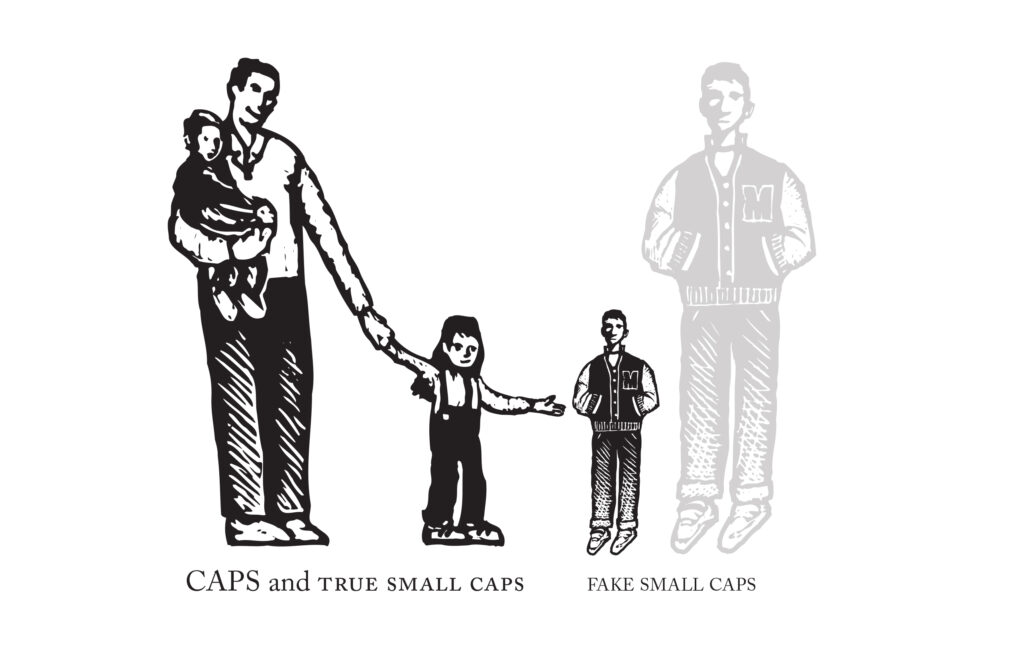
The software you’re using may try to be helpful by faking small caps if it can’t find them in the font. Fake small caps are nothing but capital letters that have been shrunk down to the x-height or a little higher (the height of the body of a lowercase letter). And that’s exactly what they look like: little miniatures, too light in weight compared to the rest of the letters, and too tightly spaced, so they look both spindly and crowded together.
Fake small caps are especially distracting when they are set with full-size caps at the beginning of each word. Since the full caps are so much heavier than their shrunken companions, they draw extra attention to themselves, emphasizing the initial letter of each word. Unless you’re spelling out the meaning of an acronym, this is pointless and misleading. Just set the whole word in small caps.Small caps have to be designed, just like any other characters in a font. Like children, small caps have their own size and proportions; they’re not just adults shrunk down to child height. (When you look at Renaissance paintings where the artist has done just that, the children look uncanny and disturbing. So do fake small caps.) And they do need to be spaced out a bit, or they get into fights.

