header:139:aPageArgs:page_title = easily amused
header:139:aPageArgs:section_title =
functions-johndberry:262:aPageArgs:page_title = easily amused
functions-johndberry:298:sPageTitle = easily amused
functions-johndberry:359:sPageTitle = easilyamused

easilyamused |

Archive for the category ‘typography’

Little, Big

Published

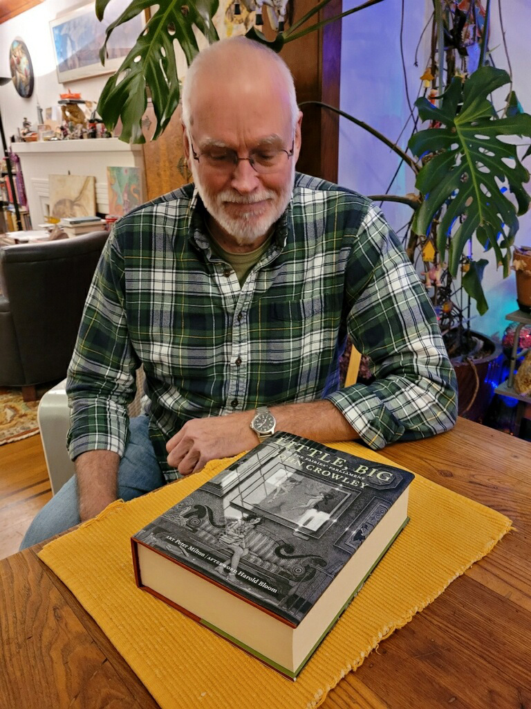
Its origins are lost in the mists of time. Ron Drummond, the one-man publisher of Incunabula, reminds us that he first broached the subject to John Crowley thirty years ago: the subject being a special, celebratory edition of Crowley’s well-loved novel, Little, Big (1981). Incunabula had already published one book by John Crowley and two by Samuel R. Delany, of which I had designed two: Crowley’s Antiquities (1991) and Delany’s Atlantis: Three Tales (1995).

Incunabula, which Ron had named in a combination of respect and chutzpah, was a small press that published worthwhile literary works of science fiction and fantasy (or fantastika as critic John Clute calls it). “Incunabula,” which means “cradles” or “swaddling clothes” in Latin, is used to refer to European printed books published before the year 1501. By that time, sixty years after Gutenberg’s innovations, printing had exploded from a craft into an industry, and many of the standards of book design that we still follow were well established. In calling his new press Incunabula, Ron was drawing on a very long tradition.

I have no recollection of when it was that Ron first asked me about designing this more ambitious volume. I can find files related to the project dating back to 2003, and my earliest design file, LB design 1.indd, is dated May 9, 2005. I’ve been working on this book for at least seventeen years.

I have often referred to it as “Zeno’s book project,” for the way it seemed to keep approaching completion without ever quite arriving. I have also sometimes called it “the Oxford Lectern Little, Big,” in reference to Bruce Rogers’s monumental Oxford Lectern Bible. Our book, however, is not so monumental as to require a lectern.

The tale of how this book came to take its final form, with an intricate interweaving of original etchings and engravings by the artist Peter Milton, would take too long to tell. It has its painful interludes. Ron’s ambitions didn’t always correspond with his practical abilities, or with his never-robust health; this was a much bigger project than any he had undertaken before. But his vision was always clear: choosing and framing details from Peter Milton’s art that would create a conversation with the text of the novel.

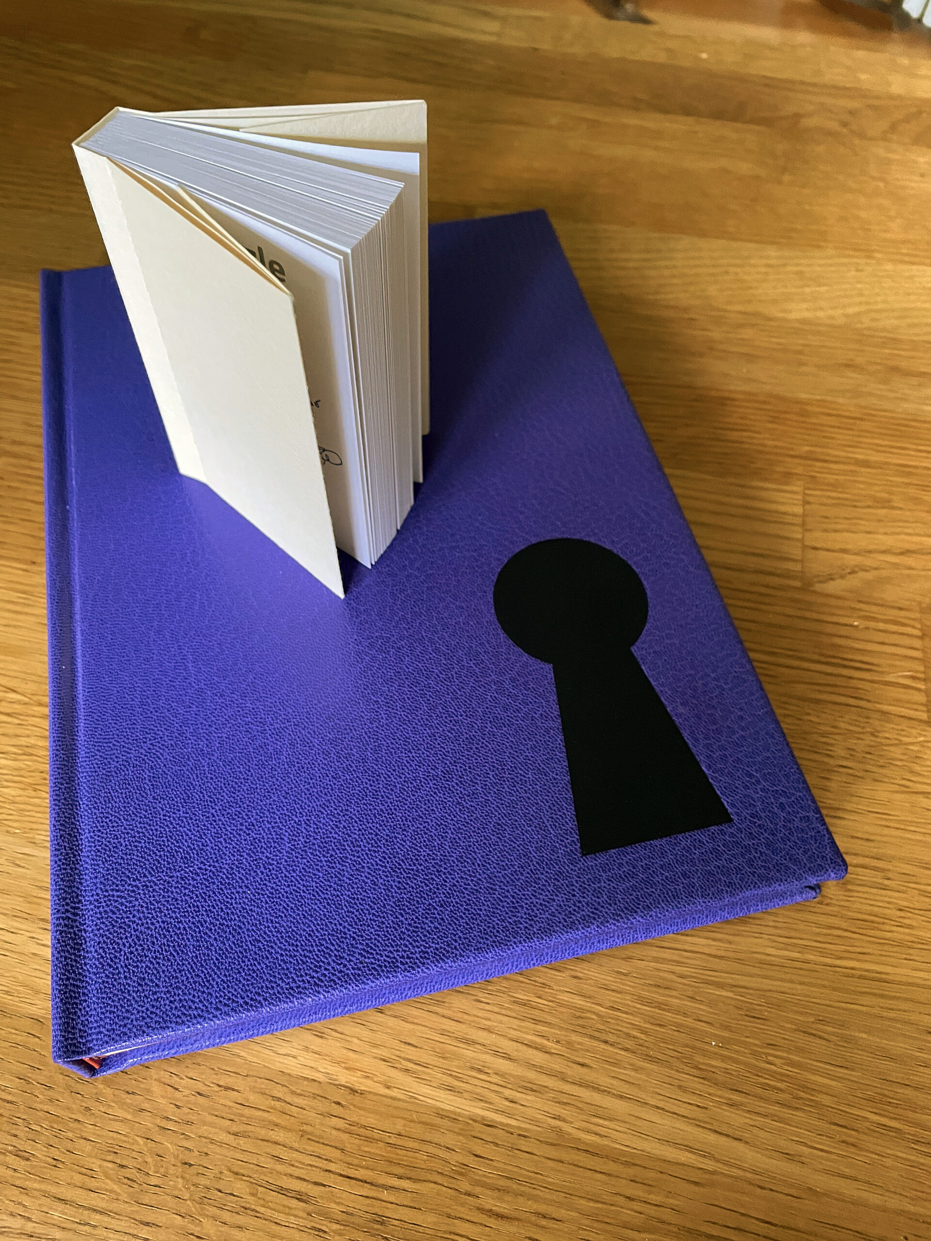
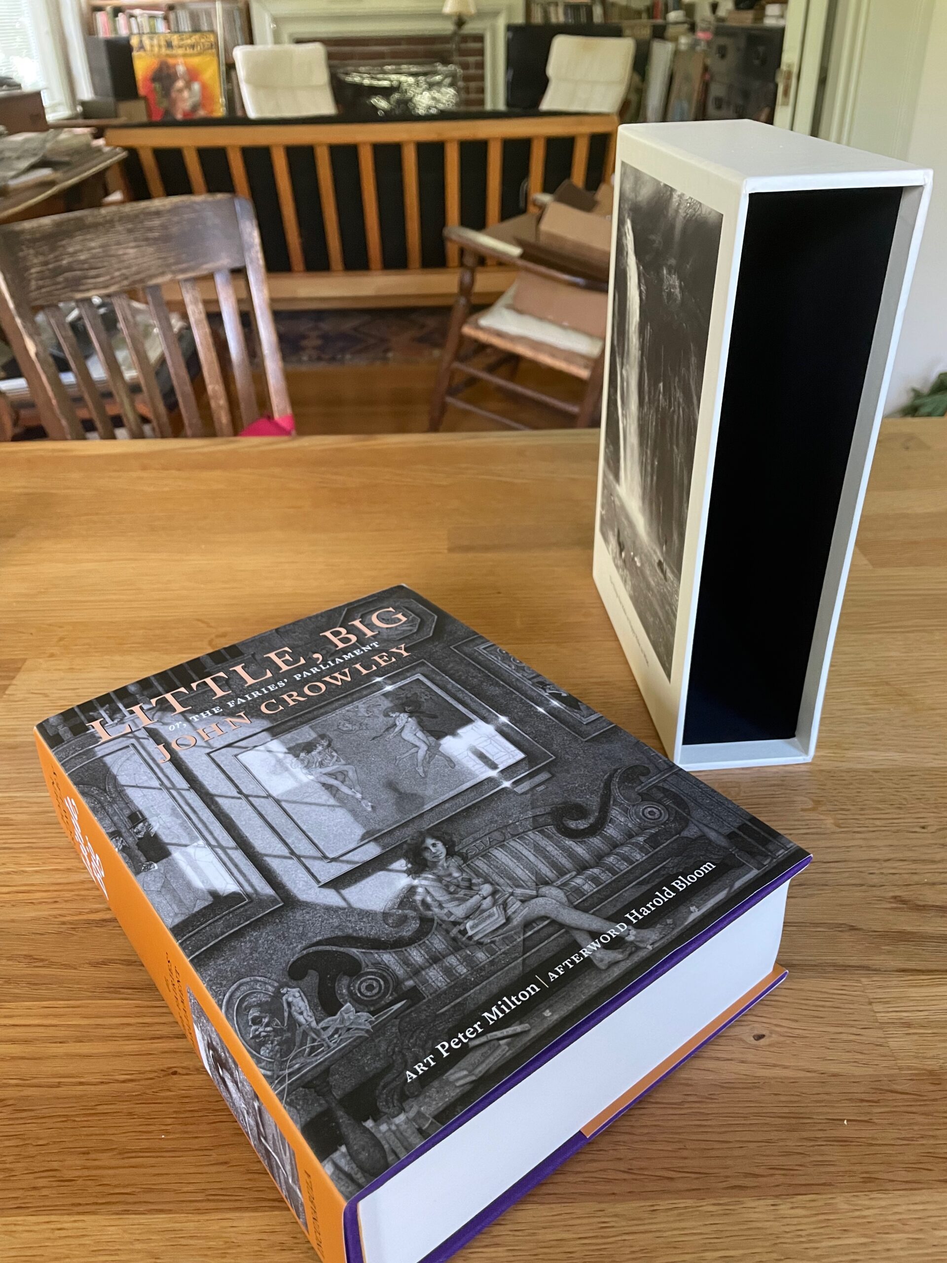
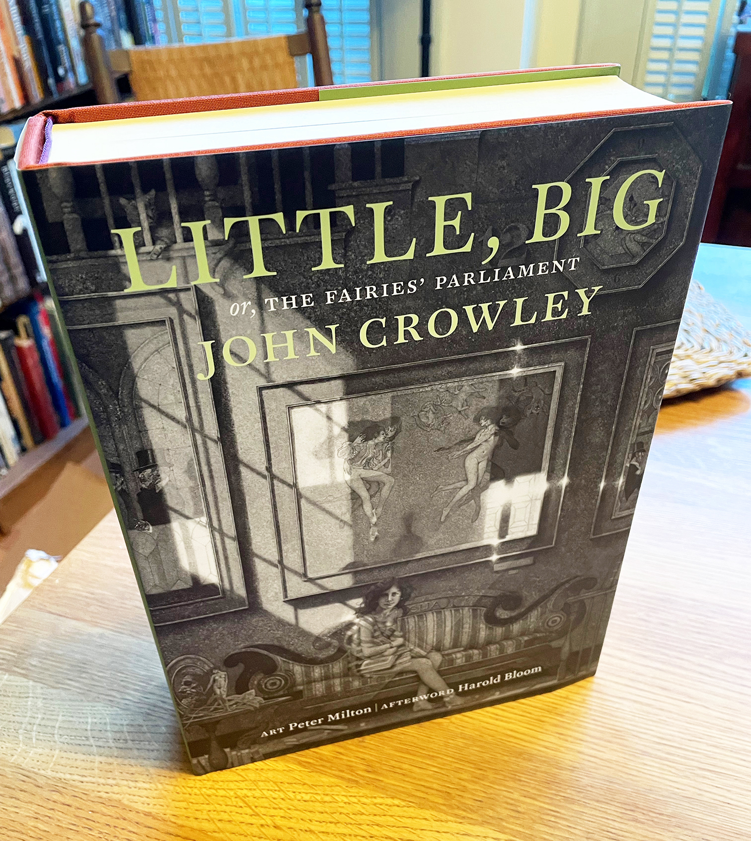
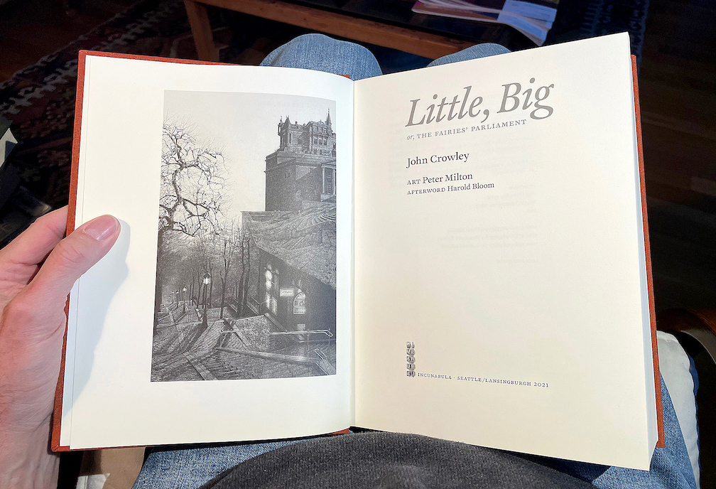
Now, amazingly, Zeno’s arrow has hit its target. A couple of weeks ago, my advance copy of the trade edition arrived in my hands, a few days after Ron’s copy reached him. It’s an 800-page tome, 7½ x 10 inches, sewn in signatures, printed on luxurious Mohawk Superfine paper, rich with art, and all digitally typeset in Akira Kobayashi’s historically inspired typeface FF Clifford. I can say, having hefted the book and laid it in my lap and begun my own rereading of a favorite text, that it’s everything I had hoped for: comfortably readable pages, beautifully printed images, in a sturdy yet flexible binding. The printer, Brilliant Graphics in Exton, Pennsylvania, did a masterful job.

Fulfillment will be handled through Dallas-based literary publisher and distributor Deep Vellum. There are still copies of the trade edition available for purchase. The 25th anniversary edition of Little, Big, which is now the 40th anniversary edition, is finally a reality.

Typographic memories: designing for Copper Canyon

Published

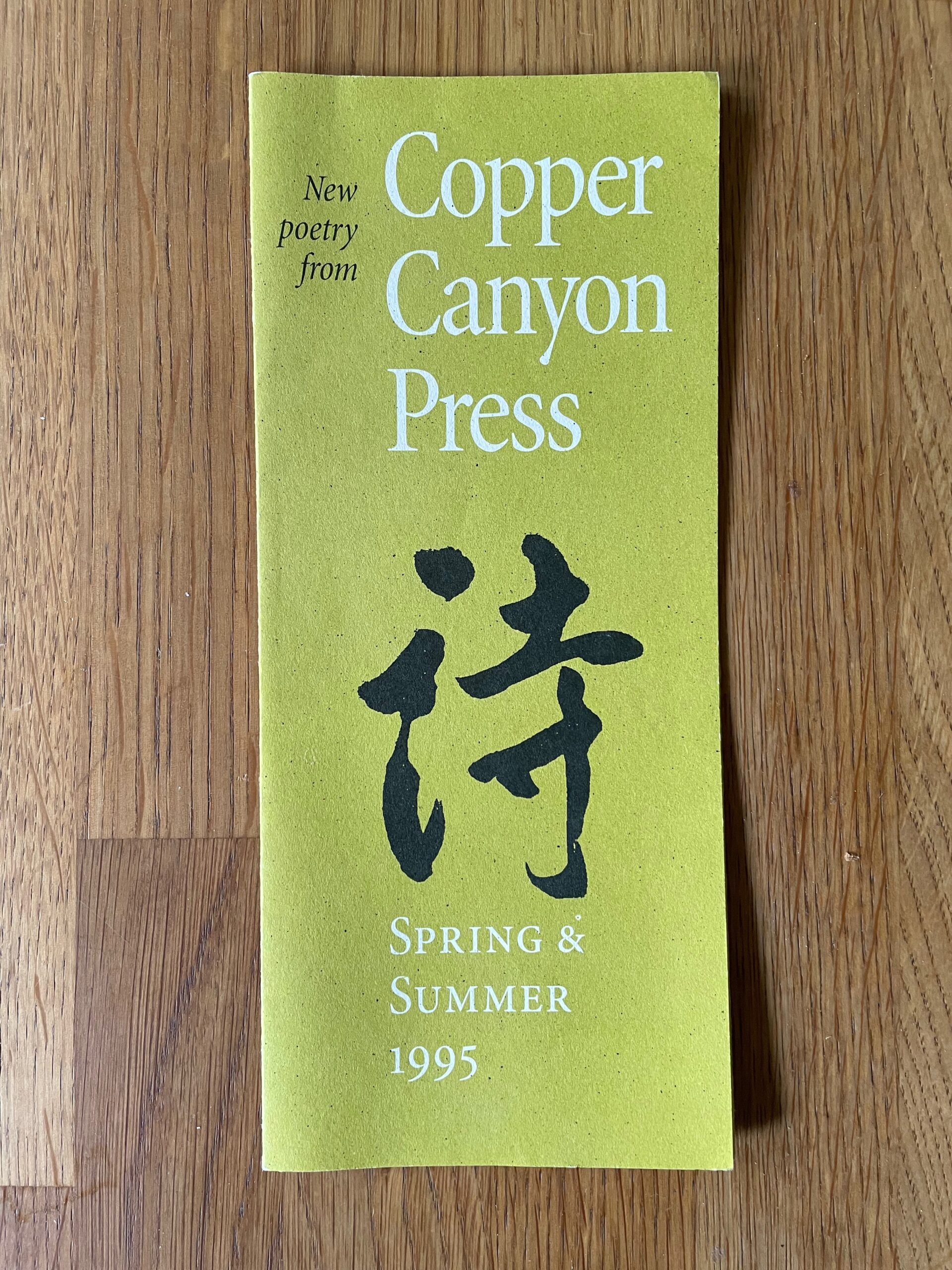
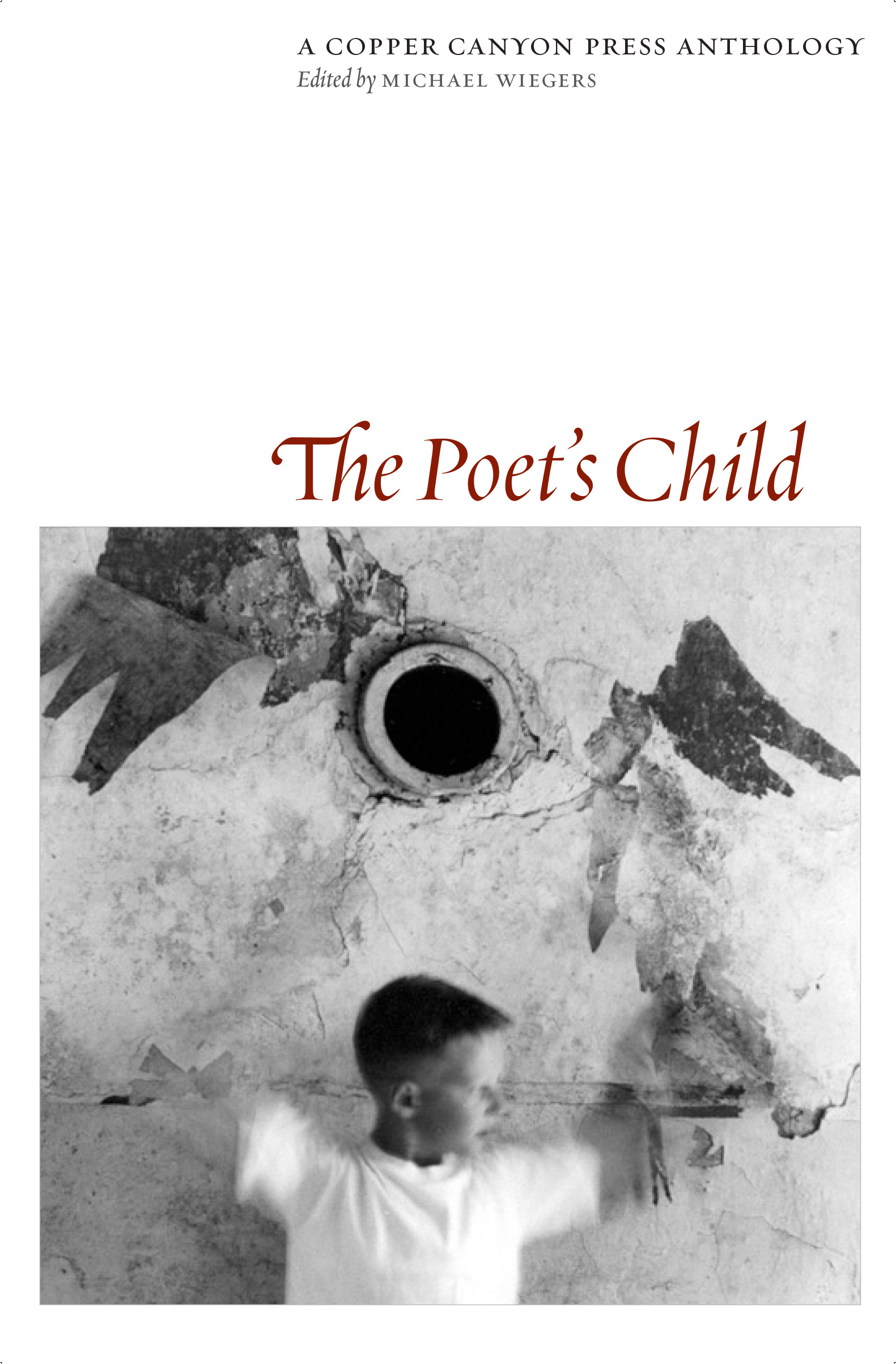
After a bit of a hiatus, I’ve come back to my sporadic typographic memoir, this time to talk about the years in the 1990s when I was the house designer for Copper Canyon Press. In that time, I designed not only the books but all the collateral material as well, trying to keep a consistent feel to everything that came out of the press while maintaining a variety of approaches to individual books.

This chapter is posted on Medium, as are all the previous chapters of the ongoing memoir project.

I still have all the files I created in producing those books, but I was working on a Mac before Apple adopted OS X, which fundamentally changed the file formats of the entire operating system. Unfortunately for future compatibility, all of those old files, none of which had filename extensions, now show up in the modern MacOS as “Unix executable files,” for lack of any other identification. Of course, the file information is still there; add the proper extension and the file type becomes recognizable. Whether it becomes openable, after something like a quarter century, is another question. But there are old Macs and old OSes and old versions of PageMaker. Somewhere.

In a few cases, I did create PDFs of my designs, either book covers or collateral like brochures. But any instances of Minion Multiple Master, the most advanced type technology of the time, which I used a lot, got lost in translation; current Adobe Acrobat technology doesn’t recognize the old MM fonts.

Such a waste of a brilliant technology! Such a short-sighted abandonment of sophisticated design. (Don’t get me started.)

Of course, with today’s variable fonts technology, you can get many of the same effects – and more. I just hope this tech doesn’t get left by the side of the information highway the way multiple-master formats did.

Really, isn’t the point to not lose information as techology advances? Including typographic and graphic-design technology. Our books need to be still readable in 500 years; or five years.

Typographer’s lunch 8: hey, look!

Published

I would like to direct your attention to a typographic element that is often ignored. Allow me to point out what makes it unique.

That element? The manicule. It’s also known as a fist, a hand, and by many other names, but it always takes the same basic form: a small image of a human hand, with the index finger pointing (usually to the right). Manicules date back to at least the Middle Ages, when it was quite common for readers to annotate their books, drawing a little hand in the margin to point out a particularly important or noteworthy passage. (“Manicule” comes from the Latin word for “little hand.”) Today they’re more likely to be part of a font, and to be used typographically, whether very large in a supermarket ad or at small size as an indicator of importance in a system of typographic hierarchy. They are often given a bright color to make them stand out. (Red is the traditional second color.)

Manicules can take the style of the font they’re in, just like ampersands or currency symbols. And now, the Dutch/Finnish type studio Underware, whose typefaces range from one of my favorite book faces, Dolly, to the truly bonkers stencil typeface Plakato, has issued a small booklet they call a “Manicule specimen,” demonstrating their versatility at imagining new forms of manicules for every occasion.

This little limited-edition book has a short text running through it, changing typeface twice per page, facing enlarged manicules in the same typeface, two per page. It’s a tour-de-force in its own highly specific way. And it serves to remind us that we have manicules at our fingertips, in many digital fonts, and that sometimes it’s appropriate to use them.

[Image: page spread from Underware’s Manicule specimen.]

[Originally published on February 8, 2022, in PPN Post and Updates, the newsletter of the Publishing Professionals Network.]

Typographer’s lunch 7: NYC subway map debate

Published

In 1978, in the Great Hall of Cooper Union in New York, a heated debate took place over a proposed redesign of the NYC subway map. In 2021, Gary Hustwit and Standards Manual published the transcript of that debate, accompanied by photos taken that same evening, in a smart-looking little book called The New York Subway Map Debate. It’s a document of design in the very real world.

The debate was a battle of two antagonistic concepts of what a transit map was supposed to do. In 1972, Massimo Vignelli and his studio had designed an elegantly abstract new subway map, doing away almost entirely with geography and presenting a schematic, almost a wiring diagram, of how to get from one point to another within a closed system. In 1978, a new map, championed by railroad enthusiast and cartographer John Tauranac, was proposed as a replacement. The new map would restore a semblance of geography, connect the subway to the city streets above, and show how the complex tangle of New York’s subways really worked. It was, as designer and debate panelist Peter Laundy later described it, “really a tunnel map rather than a route map.”

I started riding the New York subways in 1966, when I was sixteen. Shortly before that, Vignelli and Bob Noorda had designed a new signage system for the subways, assigning color-coded numbers or letters to each route. I found this system easy to follow; what I didn’t find easy to follow was the old signs in all the stations, pointing to the “BMT trains” or the “East Side Local.” The new system had not fully replaced the old, and to a novice these mixed signals were confusing. The Vignelli map had not yet been created, but the then-current subway map did identify all the lines by number or letter. There was no clue on it to the old nomenclature, or to the fact that the NYC subway system had been cobbled together from three separate companies, the IRT, the BMT, and the IND.

That map, and the Vignelli schematic in 1972, was an attempt at imposing order on a fundamentally chaotic and contradictory system. This, it seems to me, is exactly what design is supposed to do.

[Originally published on January 1, 2022, in PPN Post and Updates, the newsletter of the Publishing Professionals Network.]

Typographer’s lunch 6: the coming demise of PostScript fonts

Published

When I recently opened a book file that had been created several years ago, InDesign informed me, “Type 1 fonts will no longer be supported starting 2023. Your document contains 1 Type 1 fonts.” It was easy enough to replace the Type 1 font with an OpenType version of the same typeface, but what does this portend for book publishers with long lead times and large backlists?

I asked Thomas Phinney, the former CEO of FontLab and a former Product Manager for fonts at Adobe, what he thought about this. He told me he had just gotten off an hour-long call with an unnamed university press to discuss exactly this question.

The OpenType font format has been around for more than 20 years, and pretty much every digital font foundry upgraded its library to OpenType long ago. But not every user has upgraded their own type library. Anyone involved in publishing has probably made a big investment in fonts and is not in a hurry to make the same investment all over again.
The fact is that it’s time to bite that particular bullet. Thomas Phinney’s advice is to start thinking about your upgrade path right now: make a plan, budget for it, don’t leave it to the last minute.

If you subscribe to Adobe Fonts, you already have all those fonts in OpenType format. It makes sense, Phinney points out, to inventory the fonts you commonly use that are not in Adobe’s library and plan to upgrade those fonts first.

Incidentally, you don’t have to be actively using a Type 1 font to get that warning message when you open a document; if a Type 1 font is referenced in a paragraph or character style, even if you’re not using that style, it can trigger the warning.

Although there are apps for converting a Type 1 font into an OpenType font (notably FontLab’s TransType), the font’s license may not let you modify the font. Check with the font foundry to see what your options are.

[Originally published on December 1, 2021, in PPN Post and Updates, the newsletter of the Publishing Professionals Network.]

Typographer’s lunch 5: Letterform Archive in its new home

Published

I’ve just had a chance to peek behind the curtain at the Letterform Archive, to see its new digs in the Dogpatch neighborhood of San Francisco. The move to larger quarters began before the pandemic, but everything moves slowly when you’re in quasi lockdown. The new Archive has much more space than the old location, including a spacious, well-lit double room that will become both a classroom and a reading room, with a folding dividing wall that is actually soundproof and that doubles as a whiteboard.

The first post-Covid exhibition opens in early November, a celebration of the centennial of the Bauhaus. Archive founder Rob Saunders showed us a sample copy of the elaborate catalog of the exhibition, which shows off the strengths of the Archive’s publishing program with its finely controlled stochastic printing, where you can peer closely at tiny reproductions of full two-page spreads and even read the text.

We looked at early printing examples such as Claude Garamond’s first Greek type (16th century) and the first type specimen known to be published by a woman printer (18th century). We also perused issues of the San Francisco Oracle from the late 1960s and an alternative newspaper from Ottawa, Octopus. On the back page of one issue of Octopus was a surprisingly professional-looking ad for “3 Days of Peace & Music” at Woodstock.

The Archive plans to begin regular tours in January (pandemic permitting).

[Originally published on November 1, 2021, in PPN Post and Updates, the newsletter of the Publishing Professionals Network.]

Typographer’s lunch 4: Gerard Unger’s life in letters

Published

Christopher Burke, Gerard Unger: Life in Letters (Amsterdam: Uitgeverij de Buitenkant, 2021).

Christopher Burke writes clearly and knowledgeably about type and the people who design it. His just-published biography of Dutch type designer Gerard Unger, one of the most prolific and talented type designers of the later 20th century and the early 21st, is quite simply a must-have book. It’s well made, effectively designed, artfully written, and lavishly illustrated.

Gerard Unger: Life in Letters is above all a book about process. In tracing Unger’s life and career, Burke shows Unger repeatedly wrestling with new techniques and new technologies, figuring out how to take advantage of them and finding creative ways to put even their constraints to use. Unger did not begin by cutting metal punches, but he came into the field of typography when it was adapting to phototypesetting, and he then encountered each new iteration of digital typesetting and type design. The book’s ample and detailed illustrations show these processes in abundance.

Unger was a pragmatic designer, always focused on making type that people could actually read. Whether designing signage faces for highways or metros, or text faces for daily newspapers, he studied what made the letters readable and incorporated his insights into each design. The distinctive curve forms of his letters were unique to him, often making it easy to spot an Unger typeface when you saw it. He incorporated history but always created something new; his last major typeface, Alverata, with its sanserif companion Sanserata, is both a usable text face and an exuberant expression of letter forms that first blossomed in Romanesque lettering a thousand years ago.

[Originally published on October 1, 2021, in PPN Post and Updates, the newsletter of the Publishing Professionals Network.]

Typographer’s lunch 3: DJR’s Font of the Month Club

Published

Need a font that’s strange and bonkers but also well made and usable? And a new one every month? Then join the Font of the Month Club.

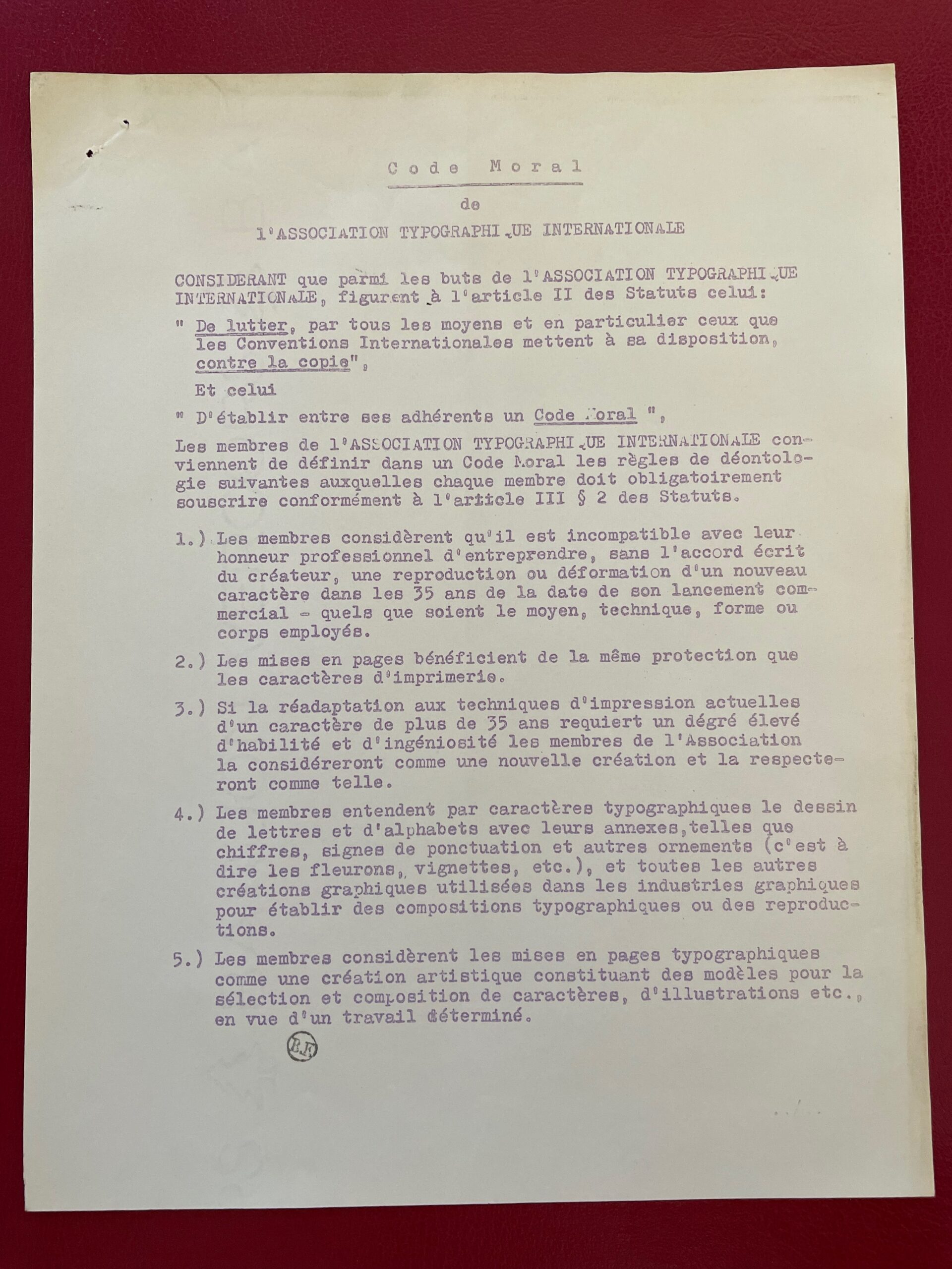
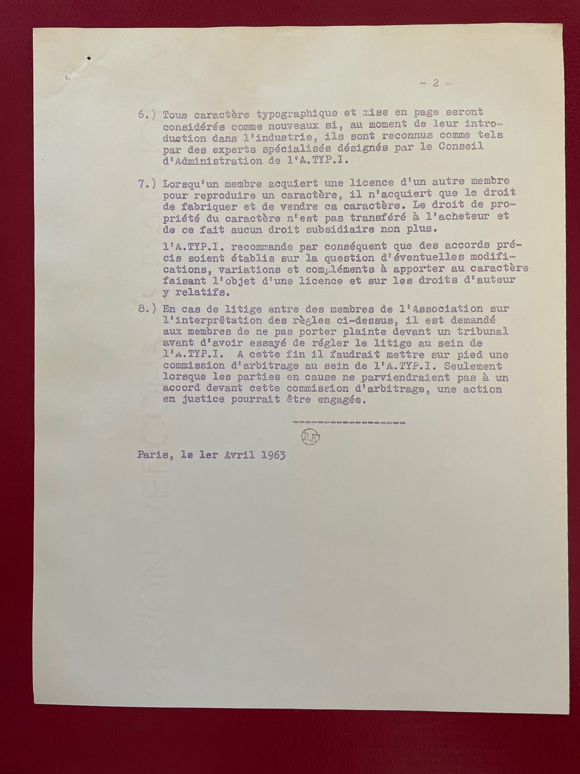
Type designer David Jonathan Ross, better known as “DJR,” worked for nearly ten years at The Font Bureau, before starting his own independent digital type foundry in 2016. In 2018, he was awarded the Prix Charles Peignot, given by the Association Typographique Internationale (ATypI) to an outstanding type designer under the age of 35. You can find practical, versatile type families like Roslindale, Gimlet, and Forma at Type Network or through DJR’s own website. But what’s fascinating is when he goes wild, taking established typographic norms and forms and turning them inside out, to see what they might be capable of.

That’s what his Font of the Month Club is for. You can subscribe for a nominal fee ($6/month, or $2/month if you have a financial hardship), and every month Ross will send you a different, unpredictable new font. It might be something as pragmatic as Fern Text or as geometrically crazy as Megazoid, as spectacularly reverse-contrast as Tortellini or as unabashedly Victorian as Clavichord.

I have sometimes found ways to put some of these fonts to use the very month they are released. I’ve recently used Roslindale, Dattilo, Job Clarendon, and Rhododendron on book covers, for instance. It’s a delight to be able to send DJR a PDF that shows his typefaces in use (as I try to do whenever I’m using typefaces by a contemporary type designer). And it’s fun to try out freshly baked new fonts, fresh from the digital oven.

[Images: two snapshots of DJR’s tiny, tiny type specimen booklet.]

[Originally published on September 1, 2021, in PPN Post and Updates, the newsletter of the Publishing Professionals Network.]

Typographer’s lunch

Published

When Dave Peattie, the vice-president of Publishing Professionals Network, asked me if I’d write a short column about type for the PPN email newsletter that he edits, naturally I said yes.

Thanks to an untimely system crash and an update that somehow didn’t get uploaded properly to Mailchimp, the July newsletter went out with an early draft of the text of my column, under a placeholder column title that I hadn’t chosen.

It would be silly to insist that Dave send out a corrected newsletter just for me, so I suggested that a simple solution: I would publish my intended version here, on my blog. And, of course, let you know about PPN.

Publishing Professionals Network (formerly Bookbuilders West) is based in the San Francisco Bay Area but widespread in its membership and influence. Its annual Book Show is a showcase for the best book designs in the West each year. In lieu of in-person meet-ups during the pandemic, PPN has had a monthly informal Zoom meet-up online, which has been a boon to those of us who don’t live in the Bay Area but like to hang out with our colleagues. You might want to join in. (You don’t have to be a PPN member to do so.)

Meanwhile, here’s the column. Some of you may have heard me talk about this subject before.

Cartoonish drawings of adults & children, and an adult shrunken down to the height of a child.

Typographer’s lunch | a column by John D. Berry | June 2021

Why use small caps? Small caps can look very elegant. They can help keep a forest of all-caps acronyms from overwhelming a page of text. They are a traditional way of setting off one kind of information, like a byline, from others, like a headline. In reference books, they are often used to highlight cross-references to terms that have their own entry elsewhere in the book.

Small caps are never strictly necessary; there are other ways of distinguishing information typographically. And many fonts, digital or otherwise, don’t include small caps in their character set. So before you specify small caps in a design, make sure they are available in the font you’re going to use. (To cover all the bases, better check for italic small caps, too.)

The software you’re using may try to be helpful by faking small caps if it can’t find them in the font. Fake small caps are nothing but capital letters that have been shrunk down to the x-height or a little higher (the height of the body of a lowercase letter). And that’s exactly what they look like: little miniatures, too light in weight compared to the rest of the letters, and too tightly spaced, so they look both spindly and crowded together. 

Fake small caps are especially distracting when they are set with full-size caps at the beginning of each word. Since the full caps are so much heavier than their shrunken companions, they draw extra attention to themselves, emphasizing the initial letter of each word. Unless you’re spelling out the meaning of an acronym, this is pointless and misleading. Just set the whole word in small caps.Small caps have to be designed, just like any other characters in a font. Like children, small caps have their own size and proportions; they’re not just adults shrunk down to child height. (When you look at Renaissance paintings where the artist has done just that, the children look uncanny and disturbing. So do fake small caps.) And they do need to be spaced out a bit, or they get into fights.

Close-up of lower part of first image, showing the drawn child and a shrunken-down drawn adult at the same height.

A talk on Jack Stauffacher’s legacy

Published

In October I joined Chuck Byrne to give a two-part talk about the life and work of Jack W. Stauffacher for the Society of Printers in Boston. No doubt in a normal time we would have traveled to Boston to address the members in person, but because of the pandemic the event was entirely virtual. This has its disadvantages (my connection was evidently a bit wonky, sometimes making my audio slur for a moment, though I had no way of knowing this until I listened to the recording later), but it has advantages as well: a much larger potential audience, one that was geographically dispersed although constrained by time zone. And of course the talk was recorded, so you can watch it now, well after the fact.

My part focused on Jack’s life, using the biographical essay I had written for Only on Saturday, the upcoming book from the Letterform Archive about Jack’s abstract wood-type prints. I was reading my text, rather than speaking extemporaneously, which seemed appropriate, since the book hadn’t yet been published. For the talk, I put together a selection of images that I hoped would give a visual counterpoint to the narration. Researching Jack Stauffacher’s life was a fascinating project, and finding a way to organize its many aspects and facets was a creative project of its own. But it was all in the service of telling people about Jack.

Chuck is the moving force behind the book, and in his part of the presentation he went through the book, page spread by page spread, explaining why they had chosen particular images and how they had put them together into a remarkable, highly visual volume. The design of the book is Chuck’s; he was quite sure that Jack’s approach to the design would have been different, but they were long-time friends and no doubt would have enjoyed mutually criticizing each other’s choices. It’s a beautifully designed book.