header:139:aPageArgs:page_title = easily amused
header:139:aPageArgs:section_title =
functions-johndberry:262:aPageArgs:page_title = easily amused
functions-johndberry:298:sPageTitle = easily amused
functions-johndberry:359:sPageTitle = easilyamused

easilyamused |

Archive for the category ‘publishing’

Evan S. Connell

Published

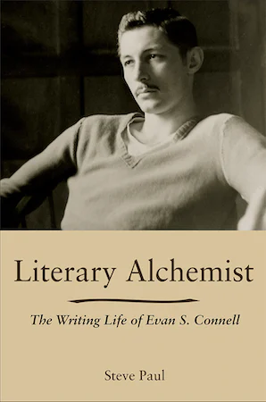
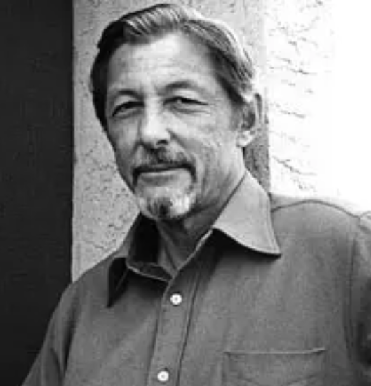
I’ve just finished reading Literary Alchemist: The Writing Life of Evan S. Connell, by Steve Paul (Columbia: Univ. of Missouri Press, 2021). Connell is a peculiar writer, impossible to categorize; he’s been a favorite of mine since I first discovered his writing through North Point Press, my favorite American book publisher of the 1980s. He’s probably best known for his bestseller about Custer, Son of the Morning Star, which examines the Battle of the Little Big Horn from both sides, with its antecedents, its contexts, and its implications. He’s a master of finding the arresting detail, and his prose is wry and precise.

Mid-way through his career, Connell became closely involved with Berkeley-based North Point Press. “Everybody there is intelligent and courteous and they all seem to know what they’re doing – which is not at all true of some people I’ve met in the NY industry.” Jack Shoemaker, North Point’s editor in chief, encouraged Connell and continued to be his editor after North Point shut down and Shoemaker had to create a new publishing company (twice). Steve Paul devotes quite a few pages of the biography to North Point, giving me more background than I knew before now. He describes Shoemaker’s and publisher William Turnbull’s desire to make quality books, though he doesn’t mention David Bullen, North Point’s long-time book designer, who was responsible for how the books looked and felt. (Nor does he mention Jack Stauffacher, who was involved at the press’s inception and set some of the typographic standards that North Point became known for). What Bullen did at North Point was a strong influence on my own ideas about book design.

The other book that Evan S. Connell is best known for is his early novel, Mrs. Bridge, which is highly respected though I haven’t read it. His examination, in detail, of the empty life of an affluent Kansas City matron has simply never appealed to me; I’m much more fascinated by his delvings into history and art. Another of his books that I’ve failed to finish, despite being history-based, is Deus lo volt! (“God wills it!”), which is so effective at conveying the spirit and mindset of the Christians who launched the Crusades that I couldn’t go on; I couldn’t stand being inside their blinkered heads. Maybe one day I’ll come back to it.

But I have read quite a few of Connell’s books, either bought new in North Point editions (which were sometimes reissues) or found and snapped up in used-book stores. Connell’s life is somewhat opaque; he was a private person, notably untalkative. Steve Paul is smart to call his biography a “writing life”; that was clearly the way Connell saw himself. Paul makes it clear, though, that Connell had connections to much livelier characters, especially when he was living in Sausalito and San Francisco. And Paul is good at weaving the strands of Connell’s life together, and at showing how the writing, the publishing, the extensive, usually solitary travel, and the thoughts he expressed were all woven of the same cloth. Or perhaps, given his fascination with pre-Columbian pottery, I should say that they were thrown from the same clay.

Little, Big

Published

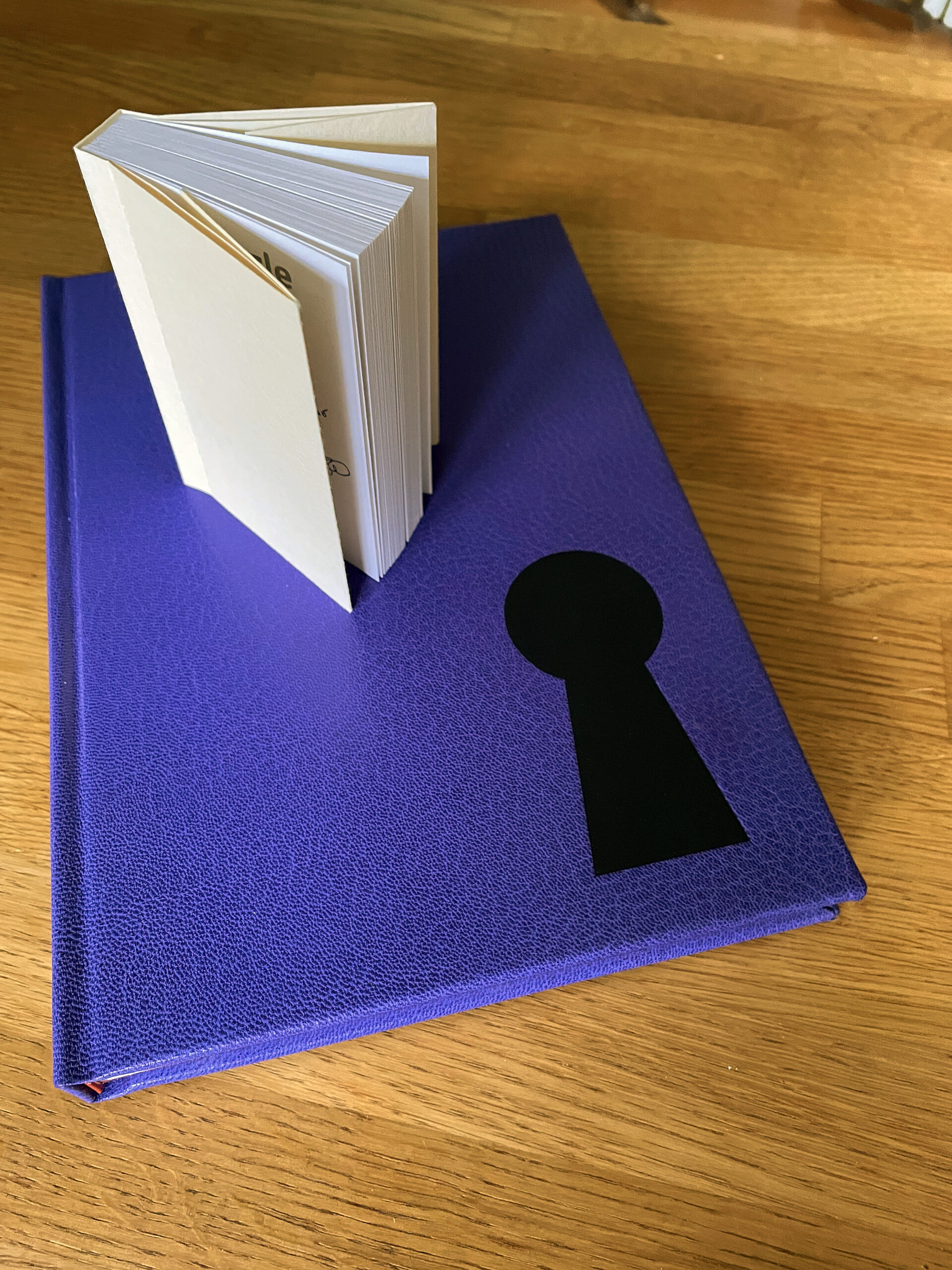
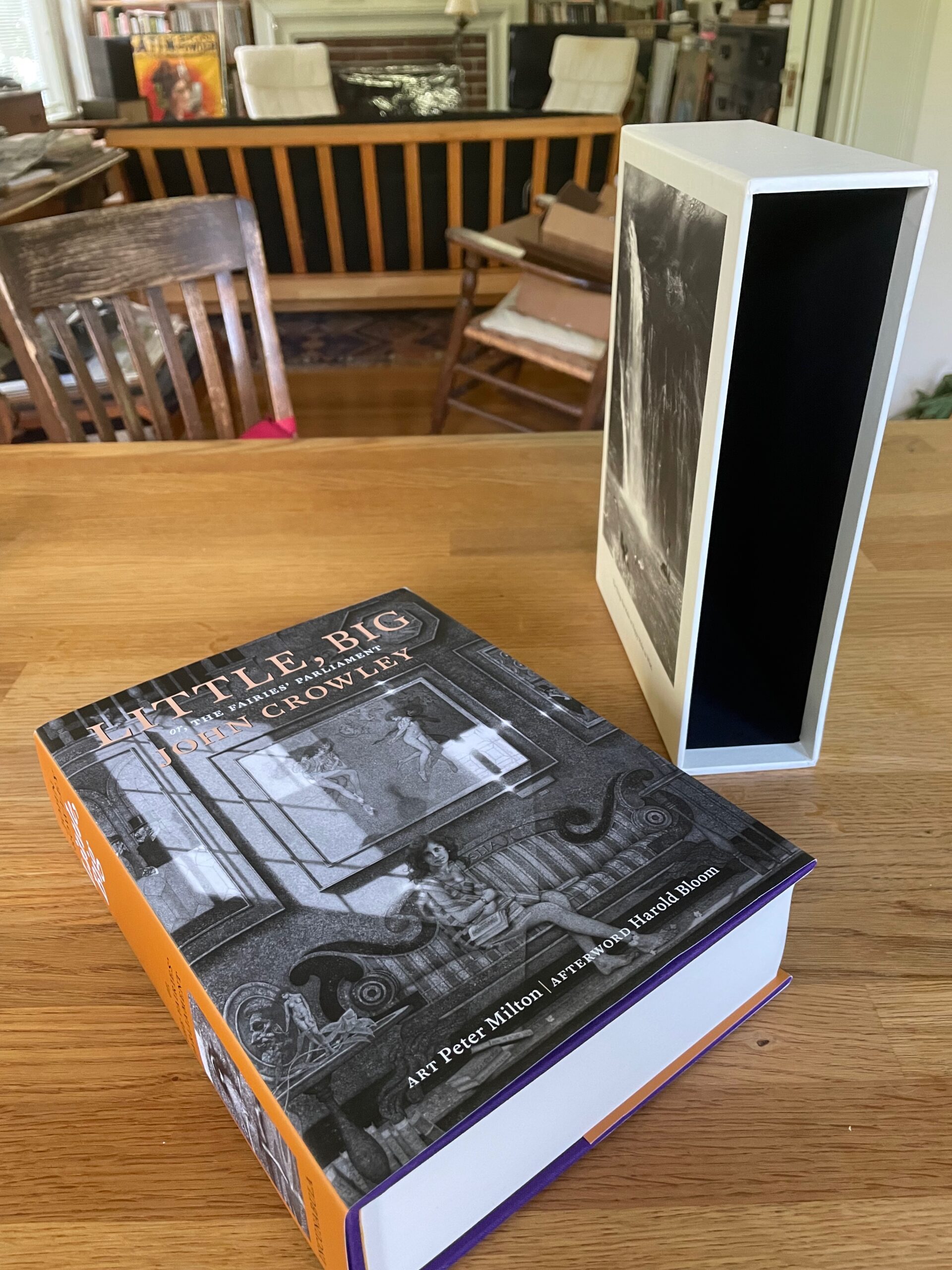
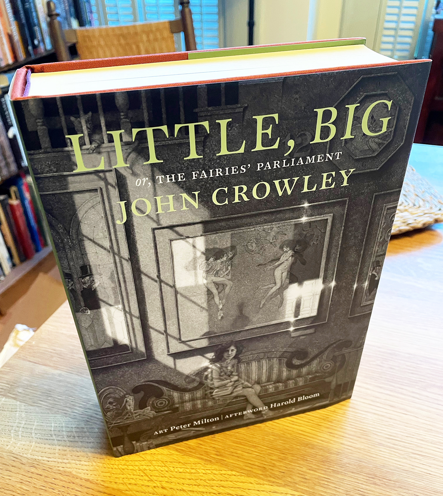
Its origins are lost in the mists of time. Ron Drummond, the one-man publisher of Incunabula, reminds us that he first broached the subject to John Crowley thirty years ago: the subject being a special, celebratory edition of Crowley’s well-loved novel, Little, Big (1981). Incunabula had already published one book by John Crowley and two by Samuel R. Delany, of which I had designed two: Crowley’s Antiquities (1991) and Delany’s Atlantis: Three Tales (1995).

Incunabula, which Ron had named in a combination of respect and chutzpah, was a small press that published worthwhile literary works of science fiction and fantasy (or fantastika as critic John Clute calls it). “Incunabula,” which means “cradles” or “swaddling clothes” in Latin, is used to refer to European printed books published before the year 1501. By that time, sixty years after Gutenberg’s innovations, printing had exploded from a craft into an industry, and many of the standards of book design that we still follow were well established. In calling his new press Incunabula, Ron was drawing on a very long tradition.

I have no recollection of when it was that Ron first asked me about designing this more ambitious volume. I can find files related to the project dating back to 2003, and my earliest design file, LB design 1.indd, is dated May 9, 2005. I’ve been working on this book for at least seventeen years.

I have often referred to it as “Zeno’s book project,” for the way it seemed to keep approaching completion without ever quite arriving. I have also sometimes called it “the Oxford Lectern Little, Big,” in reference to Bruce Rogers’s monumental Oxford Lectern Bible. Our book, however, is not so monumental as to require a lectern.

The tale of how this book came to take its final form, with an intricate interweaving of original etchings and engravings by the artist Peter Milton, would take too long to tell. It has its painful interludes. Ron’s ambitions didn’t always correspond with his practical abilities, or with his never-robust health; this was a much bigger project than any he had undertaken before. But his vision was always clear: choosing and framing details from Peter Milton’s art that would create a conversation with the text of the novel.

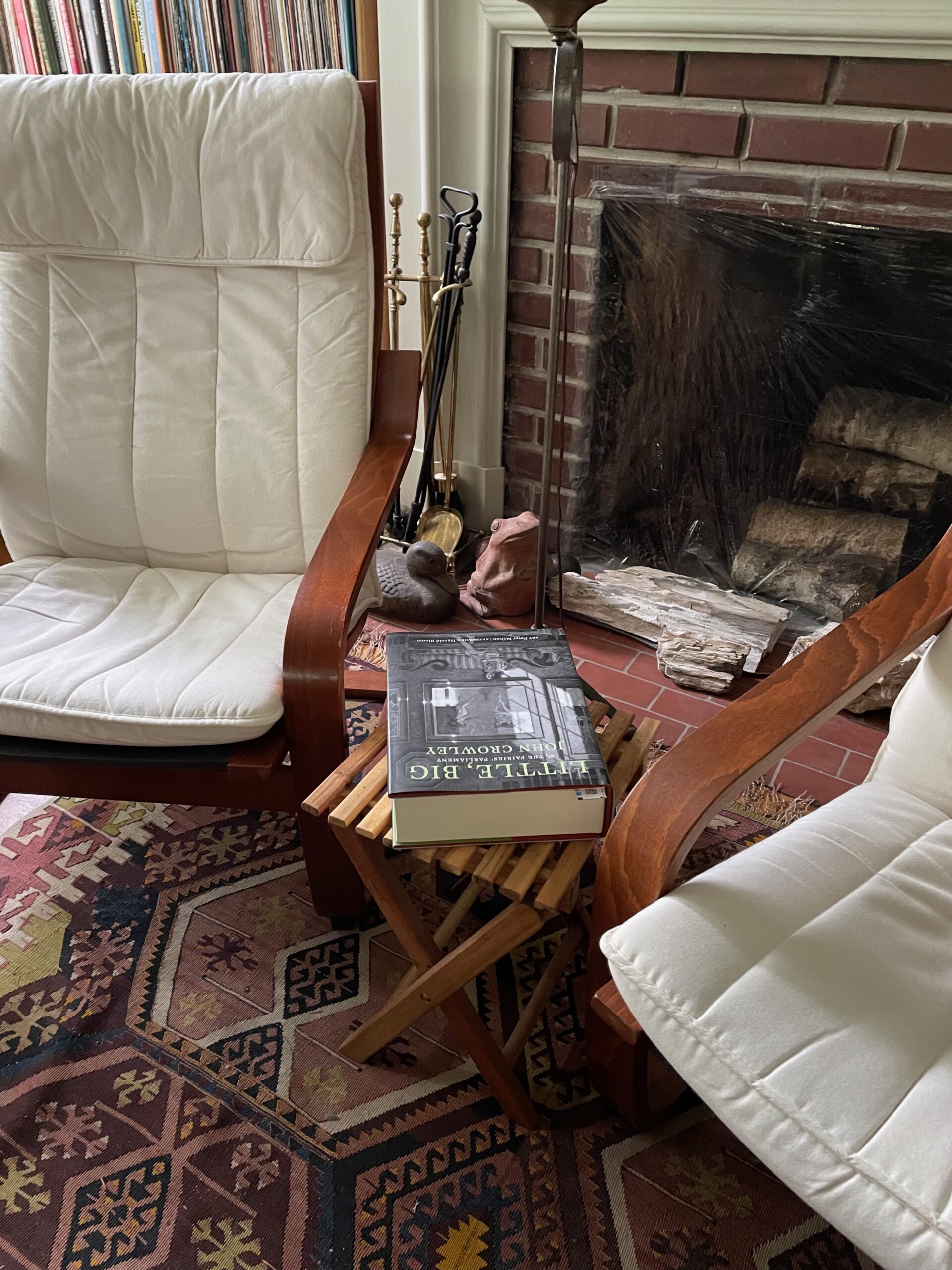
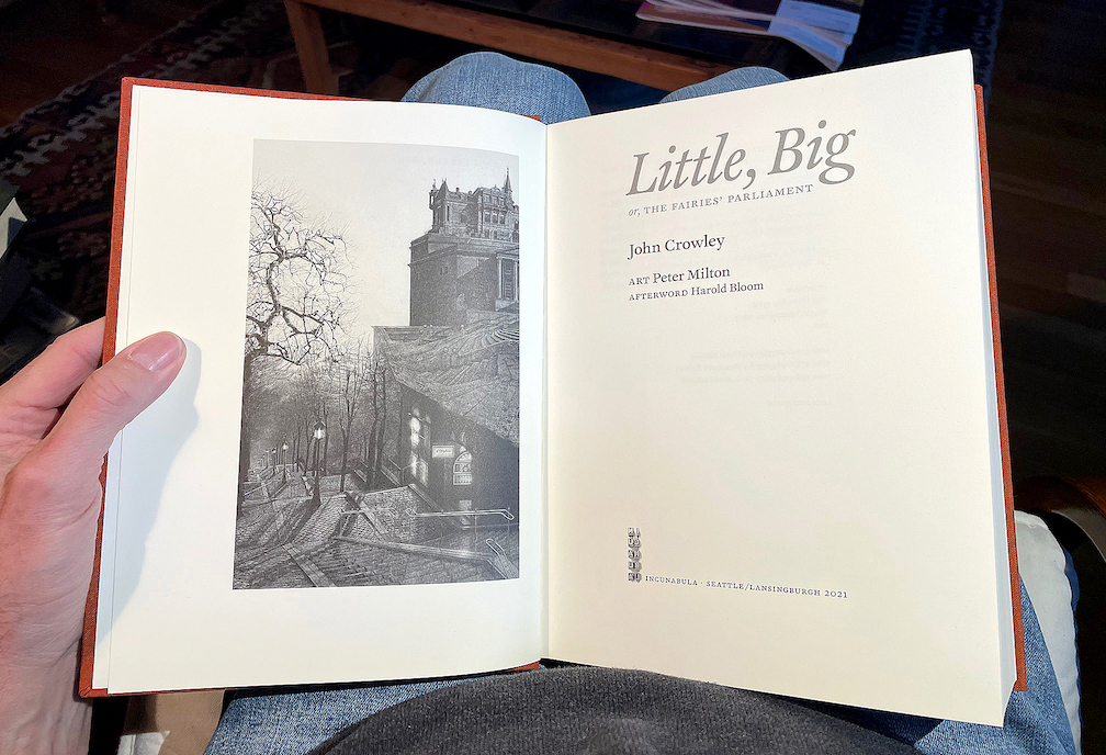
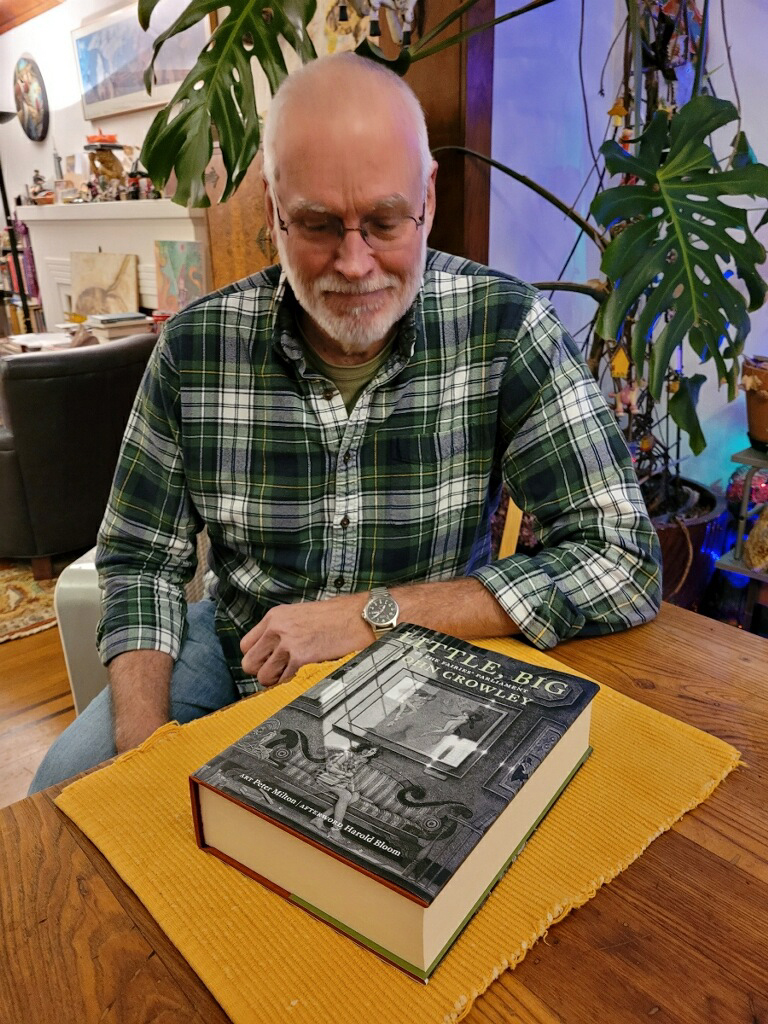
Now, amazingly, Zeno’s arrow has hit its target. A couple of weeks ago, my advance copy of the trade edition arrived in my hands, a few days after Ron’s copy reached him. It’s an 800-page tome, 7½ x 10 inches, sewn in signatures, printed on luxurious Mohawk Superfine paper, rich with art, and all digitally typeset in Akira Kobayashi’s historically inspired typeface FF Clifford. I can say, having hefted the book and laid it in my lap and begun my own rereading of a favorite text, that it’s everything I had hoped for: comfortably readable pages, beautifully printed images, in a sturdy yet flexible binding. The printer, Brilliant Graphics in Exton, Pennsylvania, did a masterful job.

Fulfillment will be handled through Dallas-based literary publisher and distributor Deep Vellum. There are still copies of the trade edition available for purchase. The 25th anniversary edition of Little, Big, which is now the 40th anniversary edition, is finally a reality.

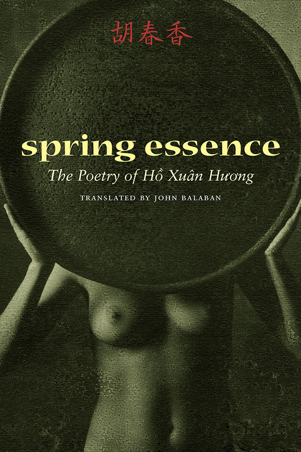
Typographic memories: designing for Copper Canyon

Published

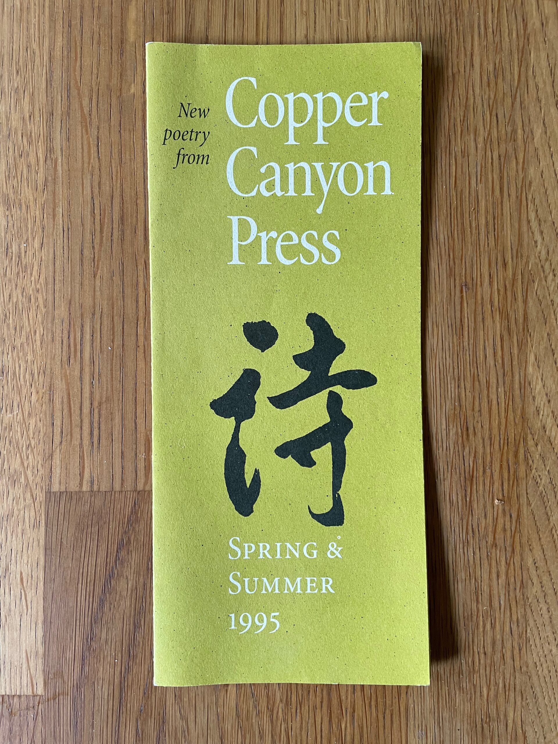
After a bit of a hiatus, I’ve come back to my sporadic typographic memoir, this time to talk about the years in the 1990s when I was the house designer for Copper Canyon Press. In that time, I designed not only the books but all the collateral material as well, trying to keep a consistent feel to everything that came out of the press while maintaining a variety of approaches to individual books.

This chapter is posted on Medium, as are all the previous chapters of the ongoing memoir project.

I still have all the files I created in producing those books, but I was working on a Mac before Apple adopted OS X, which fundamentally changed the file formats of the entire operating system. Unfortunately for future compatibility, all of those old files, none of which had filename extensions, now show up in the modern MacOS as “Unix executable files,” for lack of any other identification. Of course, the file information is still there; add the proper extension and the file type becomes recognizable. Whether it becomes openable, after something like a quarter century, is another question. But there are old Macs and old OSes and old versions of PageMaker. Somewhere.

In a few cases, I did create PDFs of my designs, either book covers or collateral like brochures. But any instances of Minion Multiple Master, the most advanced type technology of the time, which I used a lot, got lost in translation; current Adobe Acrobat technology doesn’t recognize the old MM fonts.

Such a waste of a brilliant technology! Such a short-sighted abandonment of sophisticated design. (Don’t get me started.)

Of course, with today’s variable fonts technology, you can get many of the same effects – and more. I just hope this tech doesn’t get left by the side of the information highway the way multiple-master formats did.

Really, isn’t the point to not lose information as techology advances? Including typographic and graphic-design technology. Our books need to be still readable in 500 years; or five years.

Typographer’s lunch 6: the coming demise of PostScript fonts

Published

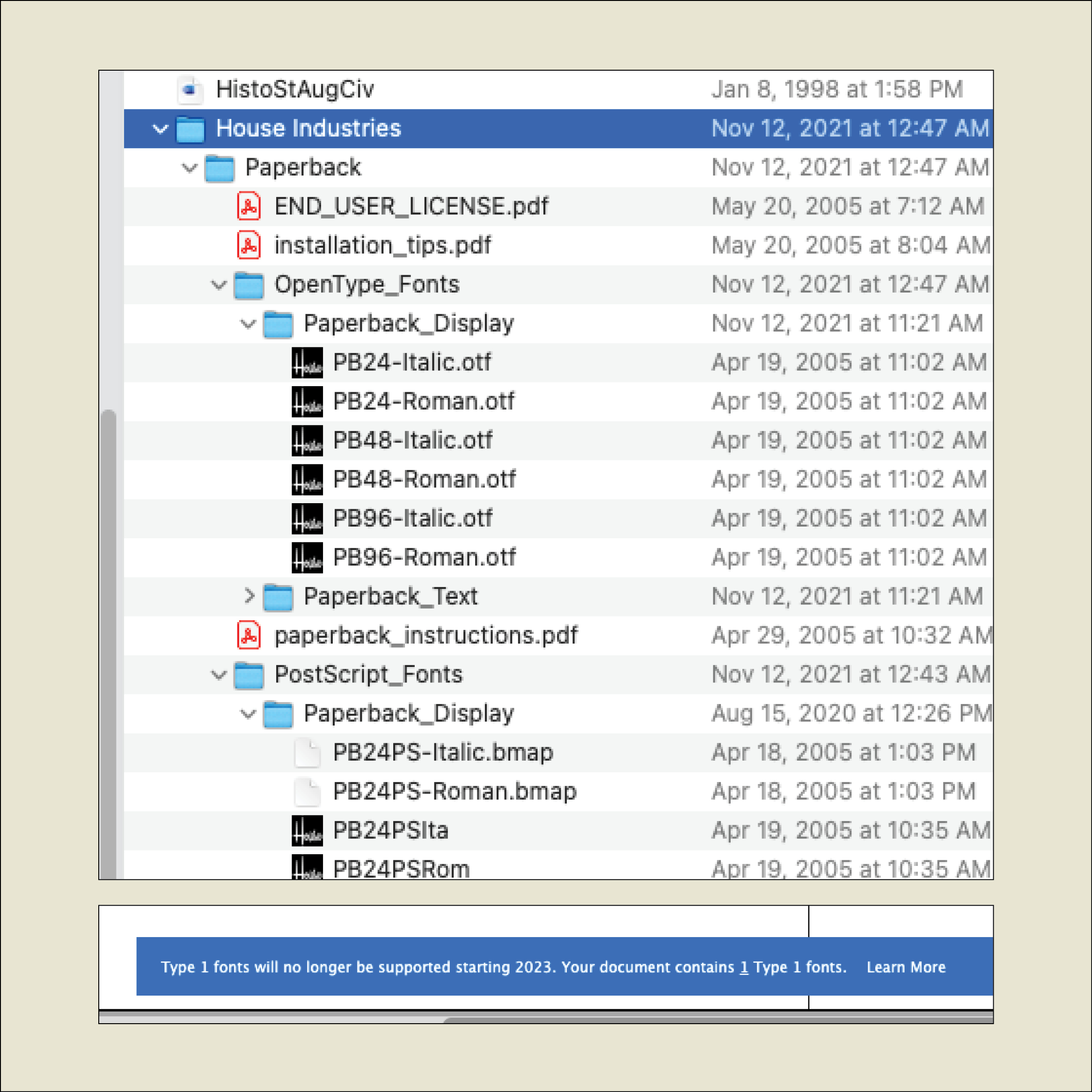
When I recently opened a book file that had been created several years ago, InDesign informed me, “Type 1 fonts will no longer be supported starting 2023. Your document contains 1 Type 1 fonts.” It was easy enough to replace the Type 1 font with an OpenType version of the same typeface, but what does this portend for book publishers with long lead times and large backlists?

I asked Thomas Phinney, the former CEO of FontLab and a former Product Manager for fonts at Adobe, what he thought about this. He told me he had just gotten off an hour-long call with an unnamed university press to discuss exactly this question.

The OpenType font format has been around for more than 20 years, and pretty much every digital font foundry upgraded its library to OpenType long ago. But not every user has upgraded their own type library. Anyone involved in publishing has probably made a big investment in fonts and is not in a hurry to make the same investment all over again.
The fact is that it’s time to bite that particular bullet. Thomas Phinney’s advice is to start thinking about your upgrade path right now: make a plan, budget for it, don’t leave it to the last minute.

If you subscribe to Adobe Fonts, you already have all those fonts in OpenType format. It makes sense, Phinney points out, to inventory the fonts you commonly use that are not in Adobe’s library and plan to upgrade those fonts first.

Incidentally, you don’t have to be actively using a Type 1 font to get that warning message when you open a document; if a Type 1 font is referenced in a paragraph or character style, even if you’re not using that style, it can trigger the warning.

Although there are apps for converting a Type 1 font into an OpenType font (notably FontLab’s TransType), the font’s license may not let you modify the font. Check with the font foundry to see what your options are.

[Originally published on December 1, 2021, in PPN Post and Updates, the newsletter of the Publishing Professionals Network.]

A talk on Jack Stauffacher’s legacy

Published

In October I joined Chuck Byrne to give a two-part talk about the life and work of Jack W. Stauffacher for the Society of Printers in Boston. No doubt in a normal time we would have traveled to Boston to address the members in person, but because of the pandemic the event was entirely virtual. This has its disadvantages (my connection was evidently a bit wonky, sometimes making my audio slur for a moment, though I had no way of knowing this until I listened to the recording later), but it has advantages as well: a much larger potential audience, one that was geographically dispersed although constrained by time zone. And of course the talk was recorded, so you can watch it now, well after the fact.

My part focused on Jack’s life, using the biographical essay I had written for Only on Saturday, the upcoming book from the Letterform Archive about Jack’s abstract wood-type prints. I was reading my text, rather than speaking extemporaneously, which seemed appropriate, since the book hadn’t yet been published. For the talk, I put together a selection of images that I hoped would give a visual counterpoint to the narration. Researching Jack Stauffacher’s life was a fascinating project, and finding a way to organize its many aspects and facets was a creative project of its own. But it was all in the service of telling people about Jack.

Chuck is the moving force behind the book, and in his part of the presentation he went through the book, page spread by page spread, explaining why they had chosen particular images and how they had put them together into a remarkable, highly visual volume. The design of the book is Chuck’s; he was quite sure that Jack’s approach to the design would have been different, but they were long-time friends and no doubt would have enjoyed mutually criticizing each other’s choices. It’s a beautifully designed book.

Designers of books

Published

“Who’s your favorite book designer?” That was the innocent-seeming question that Deborah Iaria, an Italian typographer based in London, asked me yesterday, during one of TypeThursday’s one-to-one “coffee” chats on Zoom. We had just established that we both loved designing books, so that question didn’t come out of the blue. But it’s a question I haven’t been asked very often, unlike the much more common query, “What’s your favorite typeface?” (My reply to that is usually, “It depends on what I’m going to use it for,” followed by naming a few perennial favorites like Verdigris, Dolly, Profile, and Beorcana.)

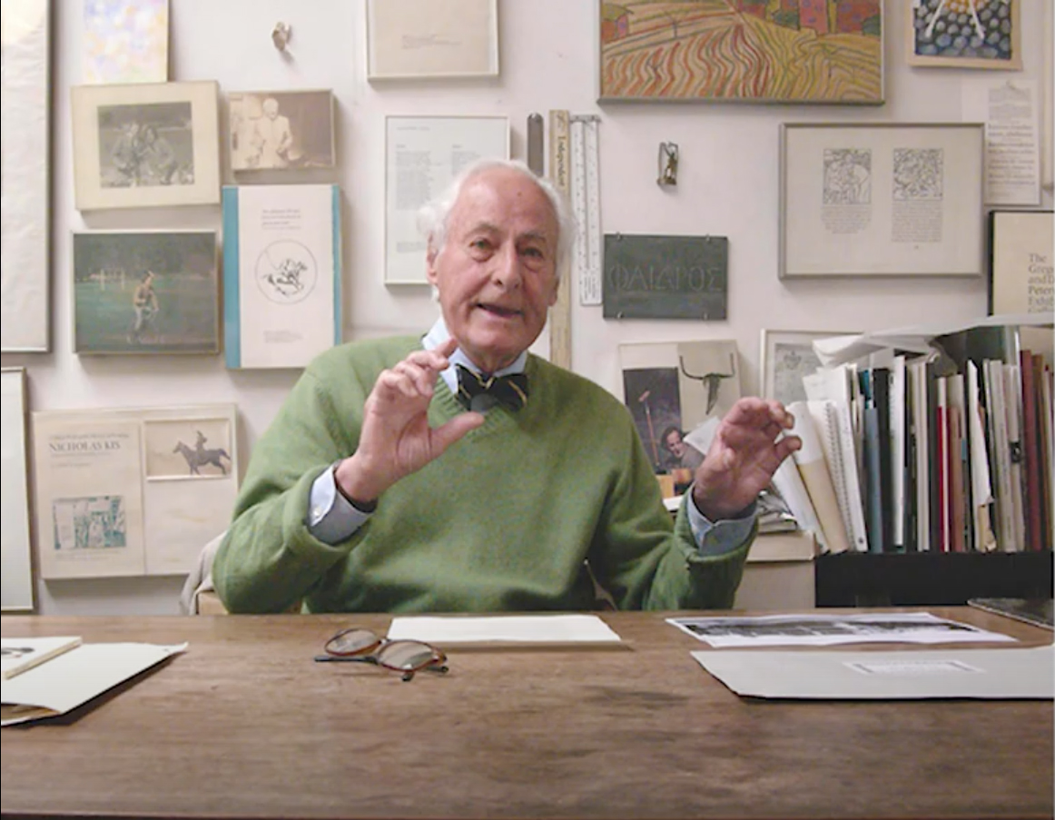
After a long pause while I pondered the question, I decided on an answer: the late San Francisco printer Jack Stauffacher. Not only had I learned a lot from Jack in person, but examples of his aesthetic and his craft, even before I met him, had taught me a lot of what I know about placing text and image on a page. And about the importance of books as carriers of culture.

But since that conversation, I have kept coming back to the question. There are lots of excellent book designers, both historical and contemporary, but which ones have influenced me the most? Which ones are my “favorites”?

From the first half of the 20th century, I would cite Jan Tschichold, W.A. Dwiggins, and Bruce Rogers as primary influences. And Jack Stauffacher’s old friend, whom unfortunately I never met: Adrian Wilson. From my own time, I greatly admire the work of the late Steve Renner, long-time art director at the University of California Press, whose spare, modern style always seemed in direct contradiction to his passion for restoring old hotrod cars.

Two more recent designers whose work I have tried to emulate are David Bullen and Tree Swenson. David Bullen established and maintained the high standards of the Berkeley-based North Point Press in the 1980s (the initial templates owed a lot to Jack Stauffacher), which was a model to me of an independent book publisher of works worth reading. Tree Swenson was the long-time publisher and designer of Copper Canyon Press, the eminent international poetry publisher in Port Townsend, Washington. After Tree left and Sam Hamill asked me to take over as house designer, it was Tree’s established standards of quality that I tried to live up to. (I was very happy when she seemed to think that I had succeeded.)

Others who leap to mind are Valerie Brewster, who later took over much of the book design for Copper Canyon and has produced many, many subtly and elegantly designed books, and Saki Mafundikwa, who was an art director at Random House before returning to Zimbabwe to found the visual/digital design school ZIVA, and who wrote and designed the seminal book Afrikan Alphabets. And John Hubbard, whom I worked with at Marquand Books in the 1990s, and who has continued to design exquisite art books ever since. No doubt I’ll think of more the moment I commit this post to pixels.

I haven’t even considered anyone from before the turn of the 20th century, and I’m not reaching beyond the Western world of printing and publishing. I’ve seen some brilliant book designs from Japan and China, but since I can’t read either language, I can’t really consider them to be influences on my ideas about text typography.

So: who’s your favorite book designer?

Trouble in Tiny Town

Published

We’re all locked away from our favorite bookstores during the current pandemic, so I haven’t seen the trade-paperback edition of Luis Alberto Urrea’s novel The House of Broken Angels in printed form. But I did see a little thumbnail image of the cover in Moira Macdonald’s recent book column in the Seattle Times. That image didn’t quite have the effect it was meant to have: I burst out laughing the moment I saw it.

The symmetrical arrangement of the principal words of the title, and the small size of the ancillary words, turns the title into what appears to be a stack of three words. And the tiny “OF” next to “HOUSE,” at this size, can easily be mistaken for a hyphen.

So you end up with “THE HOUSE-BROKEN ANGELS.” Which would no doubt be a very different book.

The paperback cover looks just fine at full size, as it would if you saw it displayed on a table in a bookstore. And the very different design of the hardcover jacket isn’t so symmetrical, which makes it less prone to this kind of misreading.

I’m not showing this to make fun of the book-cover design. I’m using it to point out how important it is for a cover designer to look at their design in all the contexts it may be seen in, including at Lilliputian size on a newspaper page or on a website on someone’s phone. How can it be misread? If it can be, it will be.

[Images: trade-paperback cover (top) and hardcover jacket (bottom) of Luis Alberto Urrea’s The House of Broken Angels]

Hanging by a serif (again)

Published

The visual concept behind Hanging by a serif came from something I was playing with for our 2012–2013 holiday card. “The stockings were hung by the serifs with care…” read the front of the card; inside, the text continued, “…in hopes that typographers soon would be there.” On the front, a wild cacophony of huge serifs barged in from the outer edges, with little green Christmas-tree ornaments appended to a couple of them. The background was a pale-green image of a potted conifer, drawn in stained-glass-style, taken from an image-based “Design Font” that Phill Grimshaw had designed in the 1990s for ITC. (The inside also featured a pale background image from the same font, this time of a wrapped package.) It was fun, though I wondered what our non-typographer friends and family would make of it when we sent it out.

Later that year, I began experimenting with the concept, juxtaposing short snippets of text from my own writing with big details from various serifs. I found that I had a lot of statements or fragments on the subject of design that seemed to fit into this format. Eventually, these epigrams and serifs took the form of the first edition of the book Hanging by a serif.

That first edition caught the eye of Bertram Schmidt-Friderichs, whose Mainz-based company, Hermann Schmidt Verlag, has published so many excellent books on typography and design. Bertram wanted to do a German edition of my little booklet, which would be a nice calling card for his publishing program and might even sell a lot of copies. (It didn’t.)

Bertram’s approach to publishing is thorough, and he wanted to include notes about which typefaces all the serifs had come from. This sent me back down the rabbit hole into my own production process, since I had been working with truncated images for most of the design of the book, and I hadn’t kept very careful track of what typefaces my serifs had originally been attached to. It took quite a bit of retrospective detective work to find all my sources. (Hint: a couple of the images had been reversed.) In this sense, the German edition is more thorough than mine. It also has a couple of serifs or serif-like glyphs that are different from the ones I used.

But one of the epigrams bothered Bertram: “Most graphic designers never get more than rudimentary training in typography.” While true, this struck him as too negative, and he suggested coming up with a replacement. In the end, we went with a statement in German that translated as, “Typography is never an end in itself, it targets the eye of the beholder.” (Probably pithier in German.)

When it came time to do a new English edition of the book (since I was running out of copies of the original), I decided to make two changes. The serif I had used on the cover of the first edition was taken from Justin Howes’s ITC Founder’s Caslon, a digital reproduction of William Caslon’s original types in which Justin attempted to re-create the exact effect of the metal type printed on hand-made 18th-century paper. The outline, therefore, was rough. This roughness around the edges bothered a number of people, some of whom asked me if perhaps the image had been printed at too low a resolution. It hadn’t; this was precisely the effect that the typeface was designed to have, but blown up to extra-large size like this, it was distracting. So for the new edition I searched out a new serif that would work well on the cover. (The serif I chose is from Matthew Carter’s newly released type family for Morisawa, Role.)

And I did replace the problematic epigram that had bothered Bertram Schmidt-Friderichs, though not with the one we used in the German edition. As I had mentioned once in this blog, a quip of mine had been making the rounds of social media for some time, being quoted repeatedly out of context, and I thought it really belonged in this compendium. So if you turn to page 16 of the new edition, you’ll find this: “Only when the design fails does it draw attention to itself; when it succeeds, it’s invisible.” It really wanted to hang with the other serifs, and now it does.

Gerard Unger, Theory of Type Design

Published

I recently finished reading Gerard Unger’s final book, Theory of Type Design, which I bought at the ATypI conference in Antwerp last September and which Gerard signed at the book-launch event there. It was the last time I saw him, as he died of cancer only a couple of months later.

It took me quite a while to read through Theory, not because it’s at all difficult but because each time I finished a chapter, I wanted to put the book aside and savor what I had just read. It is not, after all, a book with a plot, like a novel; it is, however, a book with a theme and a clear development of that theme.

What Gerard Unger does in this book is nothing less than provide a comprehensive look at every aspect of the design of type, from its origins to the ways we design, read, and design with digital type today on a multitude of screens. Unger always thought about type systematically and observantly, looking for the connections and common elements that bind together such a disparate and unruly history. He was himself a consummate type designer, and a famously thoughtful and helpful teacher. You can hear his voice on every page.

Although his range as a designer was wide, you can often tell a Gerard Unger typeface at a glance; they have a commonality of approach and feel that transcends individual style. One element that I’ve noticed for many years is the way he would pare away what isn’t necessary, including connections within letters: he explored how much you could delete while keeping a typeface happily readable – a useful experiment when you design type for unfavorable conditions of printing or screen viewing. In a note (on page 196), he remarks, “The purest forms I have made as a type design are those of Decoder (1992).” Decoder was a purely experimental typeface (based on the shapes in his typeface Amerigo) issued as an early part of the FUSE project, to see what people would make of the detached yet recognizable parts of Latin letters.

I had hoped to have a chance to interview Gerard for the history of ATypI that I’m working on, since he had been closely involved for many years, but his deteriorating health made that impossible. Despite this, amazingly, he took the trouble after the conference to write me a short note, to let me know that he wouldn’t be able to help after all. That’s the kind of person Gerard Unger was.

Reading Le Guin

Published

A few months back, I got the second two-volume set of Ursula K. Le Guin’s work in the Library of America, “The Hainish Novels and Stories.” (She is one of the very few writers to have their work published in the Library while still living.) Since then, I’ve been rereading these stories, or in a very few cases reading them for the first time. All of Le Guin’s fiction, even the earliest work, stands up to rereading; that’s one of the things I value about it. Her sensibility and her care for language have spoken to me from the moment I first encountered them, when I happened upon Rocannon’s World on the revolving wire paperback rack in a stationery store. (The book was an Ace Double, back-to-back with Avram Davidson’s The Kar-Chee Reign.)

As I read through this collection, I thought about how much the late Susan Wood would have appreciated it. First of all, Susan would have been delighted to see Le Guin’s work in the Library of America. Even more, though, I think she would have appreciated the later stories. Before Susan’s death in 1980, I can remember her lamenting that Le Guin had yet to write “the Hainish novel”: that is, a novel about the Hainish themselves, from their own perspective, not just about the many cultures that their ancestors had spawned. While Le Guin may not have written quite what Susan was anticipating, she did come back, after a gap of several years, to write a series of late stories that delved ever deeper into the culture and psychology of the Hainish and their interaction with the rest of humanity.

Susan and I both met Ursula at the same time, in August 1975, in Melbourne, where both Ursula and Susan were guests of honor at the first World Science Fiction Convention to be held in Australia. Later, Susan edited Le Guin’s first book of essays, The Language of the Night. Susan was a passionate scholar and an enthusiastic teacher. (At the University of British Columbia, and at earlier universities where she had taught, she created courses on science fiction and Canadian literature – both of which were looked on skeptically by the English department and both of which brought in large numbers of enthusiastic students.) Her introduction to Language of the Night was a major essay that she worked long and hard on, situating Le Guin’s writing and presenting it afresh to a thinking audience.

It’s entirely possible that, had Susan lived, she would have been the one to write the introduction to Le Guin’s Hainish novels and stories for the Library of America. I like to think so.

When I first started reading that volume, last winter, and started musing about how much Susan would have enjoyed it, I thought I ought to mention it to Ursula. She would appreciate it, I was sure. But I was slow to act; Ursula had been in poor health, and in January she died. I never managed to share that particular insight.

In June, I had the bittersweet pleasure of attending the celebration of Ursula’s life, in Portland, Oregon. It filled the magnificent Arlene Schnitzer Concert Hall, and after a star-studded program of appreciations, ended with a dragon parading up onto the stage and then out into the street. Her long-time home town certainly knew how to celebrate Ursula K. Le Guin.