header:139:aPageArgs:page_title = easily amused
header:139:aPageArgs:section_title =
functions-johndberry:262:aPageArgs:page_title = easily amused
functions-johndberry:298:sPageTitle = easily amused
functions-johndberry:359:sPageTitle = easilyamused

easilyamused |

Archive for the category ‘design’

Typographic memories: designing for Copper Canyon

Published

After a bit of a hiatus, I’ve come back to my sporadic typographic memoir, this time to talk about the years in the 1990s when I was the house designer for Copper Canyon Press. In that time, I designed not only the books but all the collateral material as well, trying to keep a consistent feel to everything that came out of the press while maintaining a variety of approaches to individual books.

This chapter is posted on Medium, as are all the previous chapters of the ongoing memoir project.

I still have all the files I created in producing those books, but I was working on a Mac before Apple adopted OS X, which fundamentally changed the file formats of the entire operating system. Unfortunately for future compatibility, all of those old files, none of which had filename extensions, now show up in the modern MacOS as “Unix executable files,” for lack of any other identification. Of course, the file information is still there; add the proper extension and the file type becomes recognizable. Whether it becomes openable, after something like a quarter century, is another question. But there are old Macs and old OSes and old versions of PageMaker. Somewhere.

In a few cases, I did create PDFs of my designs, either book covers or collateral like brochures. But any instances of Minion Multiple Master, the most advanced type technology of the time, which I used a lot, got lost in translation; current Adobe Acrobat technology doesn’t recognize the old MM fonts.

Such a waste of a brilliant technology! Such a short-sighted abandonment of sophisticated design. (Don’t get me started.)

Of course, with today’s variable fonts technology, you can get many of the same effects – and more. I just hope this tech doesn’t get left by the side of the information highway the way multiple-master formats did.

Really, isn’t the point to not lose information as techology advances? Including typographic and graphic-design technology. Our books need to be still readable in 500 years; or five years.

Typographer’s lunch 7: NYC subway map debate

Published

In 1978, in the Great Hall of Cooper Union in New York, a heated debate took place over a proposed redesign of the NYC subway map. In 2021, Gary Hustwit and Standards Manual published the transcript of that debate, accompanied by photos taken that same evening, in a smart-looking little book called The New York Subway Map Debate. It’s a document of design in the very real world.

The debate was a battle of two antagonistic concepts of what a transit map was supposed to do. In 1972, Massimo Vignelli and his studio had designed an elegantly abstract new subway map, doing away almost entirely with geography and presenting a schematic, almost a wiring diagram, of how to get from one point to another within a closed system. In 1978, a new map, championed by railroad enthusiast and cartographer John Tauranac, was proposed as a replacement. The new map would restore a semblance of geography, connect the subway to the city streets above, and show how the complex tangle of New York’s subways really worked. It was, as designer and debate panelist Peter Laundy later described it, “really a tunnel map rather than a route map.”

I started riding the New York subways in 1966, when I was sixteen. Shortly before that, Vignelli and Bob Noorda had designed a new signage system for the subways, assigning color-coded numbers or letters to each route. I found this system easy to follow; what I didn’t find easy to follow was the old signs in all the stations, pointing to the “BMT trains” or the “East Side Local.” The new system had not fully replaced the old, and to a novice these mixed signals were confusing. The Vignelli map had not yet been created, but the then-current subway map did identify all the lines by number or letter. There was no clue on it to the old nomenclature, or to the fact that the NYC subway system had been cobbled together from three separate companies, the IRT, the BMT, and the IND.

That map, and the Vignelli schematic in 1972, was an attempt at imposing order on a fundamentally chaotic and contradictory system. This, it seems to me, is exactly what design is supposed to do.

[Originally published on January 1, 2022, in PPN Post and Updates, the newsletter of the Publishing Professionals Network.]

New JDB website

Published

After a mere 13 years, this website is getting an overhaul and a brand-new design. Besides being updated to look like something from the modern world, it’s more directly focused on showing the breadth of my work. The primary purpose, of course, is to make it absurdly easy for people who might want to engage my professional services. (That might be you.)

The images on the portfolio pages are meant as examples, not case studies. If you’re interested enough to want to know the details of how a project was done, and with what purpose in mind, we should talk directly.

All the pages of the old site will still be accessible from the “legacy site” link on the main menu. (I say “will be” because at the moment it’s hiding behind a technical glitch.) The design, although not responsive, was at least intended to be comfortably viewable and readable on a phone as well as on a larger screen. (The even less responsively designed “dot-font.com” website is also still there, if you’d care to check it out. It’s got pretty pictures and free text downloads from two of my books of essays.) And of course the standalone website for the Scripta Typographic Institute, which was already responsive, remains unchanged.

Like most design projects, this one has been collaborative. I took on much more of the hands-on coding than I had ever done before, figuring out how to build the responsive grid that I wanted to use for the portfolio pages. But, as always, much of the heavy lifting and correction of misconceptions has been done by Paul Novitski, my long-time webmaster. (Remember that term?) Paul had been encouraging me for years to dive under the hood; at last, this year, I started doing so. It’s been fun as well as useful. I should also call out Dave Miller at Artefact for useful strategic thinking when I was starting this project, and Alexandru Năstase of TypeThursday Bucharest for insightful advice near the end.

Although she could have no hand in this new iteration, I still owe a lot of thanks to the late Julie Gomoll for her advice and guidance on the initial form of this website.

What really got me interested in creating a new website was the possibilities now available for responsive grids. At last, it seemed, web design was beginning to do things that interested me! I found Rachel Andrew’s CSS grid newsletter and tutorials especially helpful. I’ve had lots of fruitful discussions with Jason Pamental about flexible design and typography on the web (although I have not tried using variable fonts in this design). And as someone who originally came to design through production, and who takes a production-based approach to any design project, I was happy to finally get my hands dirty. (“How do you clean all this syntax out of your fingernails, anyway?”)

Designers of books

Published

“Who’s your favorite book designer?” That was the innocent-seeming question that Deborah Iaria, an Italian typographer based in London, asked me yesterday, during one of TypeThursday’s one-to-one “coffee” chats on Zoom. We had just established that we both loved designing books, so that question didn’t come out of the blue. But it’s a question I haven’t been asked very often, unlike the much more common query, “What’s your favorite typeface?” (My reply to that is usually, “It depends on what I’m going to use it for,” followed by naming a few perennial favorites like Verdigris, Dolly, Profile, and Beorcana.)

After a long pause while I pondered the question, I decided on an answer: the late San Francisco printer Jack Stauffacher. Not only had I learned a lot from Jack in person, but examples of his aesthetic and his craft, even before I met him, had taught me a lot of what I know about placing text and image on a page. And about the importance of books as carriers of culture.

But since that conversation, I have kept coming back to the question. There are lots of excellent book designers, both historical and contemporary, but which ones have influenced me the most? Which ones are my “favorites”?

From the first half of the 20th century, I would cite Jan Tschichold, W.A. Dwiggins, and Bruce Rogers as primary influences. And Jack Stauffacher’s old friend, whom unfortunately I never met: Adrian Wilson. From my own time, I greatly admire the work of the late Steve Renner, long-time art director at the University of California Press, whose spare, modern style always seemed in direct contradiction to his passion for restoring old hotrod cars.

Two more recent designers whose work I have tried to emulate are David Bullen and Tree Swenson. David Bullen established and maintained the high standards of the Berkeley-based North Point Press in the 1980s (the initial templates owed a lot to Jack Stauffacher), which was a model to me of an independent book publisher of works worth reading. Tree Swenson was the long-time publisher and designer of Copper Canyon Press, the eminent international poetry publisher in Port Townsend, Washington. After Tree left and Sam Hamill asked me to take over as house designer, it was Tree’s established standards of quality that I tried to live up to. (I was very happy when she seemed to think that I had succeeded.)

Others who leap to mind are Valerie Brewster, who later took over much of the book design for Copper Canyon and has produced many, many subtly and elegantly designed books, and Saki Mafundikwa, who was an art director at Random House before returning to Zimbabwe to found the visual/digital design school ZIVA, and who wrote and designed the seminal book Afrikan Alphabets. And John Hubbard, whom I worked with at Marquand Books in the 1990s, and who has continued to design exquisite art books ever since. No doubt I’ll think of more the moment I commit this post to pixels.

I haven’t even considered anyone from before the turn of the 20th century, and I’m not reaching beyond the Western world of printing and publishing. I’ve seen some brilliant book designs from Japan and China, but since I can’t read either language, I can’t really consider them to be influences on my ideas about text typography.

So: who’s your favorite book designer?

Visualizing with text

Published

I had fun recently collaborating with Richard Brath, the author of Visualizing with Text, on a cover for this upcoming book from CRC Press. It’s part of the AK Peters Visualization Series, a line of books from Routledge that focuses on different ways of visualizing information, largely scientific or technical. Brath has written a specialized yet informative study of the many ways that text can function as an element of visual design.

Not surprisingly, the book is richly illustrated, so we had lots of possibilities when it came to pulling images that might be used on the cover. But first I tried out a number of dramatic single images of type or letters that did not come from the book. Richard responded with a very dense collage of images from within his own text, which I found fascinating but probably overwrought for a book cover. Especially for the cover of a book that would most likely be seen as a thumbnail in a catalog or online, rather than displayed lavishly on the front table of a bookstore.

The process, as I said, was fun, going back and forth and trying out different combinations to find one that would both be dramatic and reflect the diversity of techniques that his book covers.

I also got the publisher’s permission to replace the ITC American Typewriter that they had been using on the covers of this series with David Jonathan Ross’s recent revival of Dattilo, a typewriter-inspired Italian typeface of the early 1970s that was originally issued by Nebiolo. Like American Typewriter, Dattilo is not actually monospaced at all; it just reminds us of a monospaced typewriter face. But Dattilo has a much richer variety of weights and optical sizes, enabling me to take the same series design and give it a much more dramatic typographic treatment.

Richard Brath has written his own informative blog post about designing the cover of his book. The book will be published this fall.

Designing the Poets’ flexible logo

Published

When Tree Swenson asked me to create a new visual identity for the Academy of American Poets, the brief included creating a new logo. Tree was then Executive Director of the Academy, which was (and is) based in New York City but represents poets and poetry from all over the country. Other parts of the visual identity included the annual report, the website, and promotional material and program books for the Academy’s annual fundraising event in New York, which featured, each year, several very prominent people from the literary and entertainment worlds.

In the logo, Tree told me, the emphasis should be on “Poets”: that was the word she wanted people to remember, not “Academy.” So from the first I thought it should be a two-element logo, with “Academy of American” essentially modifying “Poets.”

As you can imagine, I played with all sorts of typefaces and all sorts of arrangements. At first I aimed for something symmetrical, preferably square or circular, because that’s the least troublesome shape for a logo that has to be used in a wide variety of circumstances. But then I began breaking the boundaries.

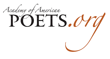
By turning the word “Poets” into the central element, spelled out in all-caps in Matthew Carter’s elegant, sparkling typeface Big Caslon, and placing it within a classical-looking rectangle, I gave the logo a solid, clearly recognizable mark. But what about the rest of the name?

Poets horizontal logos

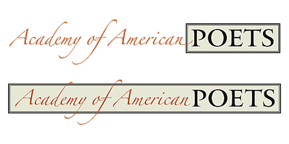
For that, I tried something entirely different, though also in an elegant and somewhat old-fashioned tradition. I set the words “Academy of American” in Zapfino, Hermann Zapf’s swooping calligraphic typeface, a dramatic contrast to the solidity of the Big Caslon caps. And I let the calligraphic strokes overlap the main element.

In fact, I tried out a large number of different placements of the Zapfino words, and what this process made me realize was that there was no one solution; in fact, there should not be a single solution. Instead, it became a modular logo that could change again and again in various uses.

Poets logo variations

Zapfino has an enormous number of swashes and alternate forms of letters, notably for both the lowercase f and the uppercase ‘A’. This meant that varying the logo wasn’t just a matter of moving around a calligraphic element, but of choosing a different arrangement of strokes for each instance.

The version we used most often had restrained A’s but an exuberant f in “of,” which swoops down into the word “POETS” and up outside the top of the box, plus somewhat restrained swashes on the d and y of “Academy.” Other versions substituted a swash version for the first A, breaking the box on the left as well as at the top.

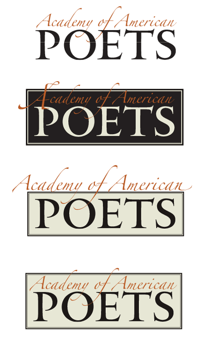
In some instances, we did away with the box altogether. The membership cards boxed “POETS” but left “Academy of American” outside the box, floating above it, with swashes penetrating the space of the box and a swash on the final n flying out to the right. For the mailing label, where a horizontal approach was called for, both elements were in the same line, rather than stacked; though they still had a little overlap.

Poets business & membership cards

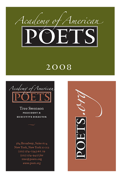
Then there was the website logo: poets.org. In ads in the New York Times and elsewhere, promoting National Poetry Month, we used a “poets.org” logo done in the style of the Academy logo: POETS in Big Caslon, and the “.org” in Zapfino, in a second color, with the tail of the g dramatically sweeping under the word “POETS.” (This proved to be a difficult design for use on the website itself. In the end the website design was done separately.)

Poets combined logo

On the cover of the annual report, the logo’s elements were rearranged along with the other typographic elements, including an enlarged ornament from the Zapfino font (which changed from year to year; the first one was the tip of a calligrapher’s pen). I would use Zapfino ornaments as occasional accents on later pages.

One other situation called out for a special treatment: when the logo would be displayed on the front of the lectern during the annual fundraising events at Lincoln Center. I tried out the slightly bold “Forte” weight of Zapfino, but decided that it wasn’t necessary. Instead, it was a simple stack of four words, in Zapfino and Big Caslon, on a black background, enclosed in a single-line box that some of the (relatively short) swashes burst through. It was meant to be readable at a distance in a large, dimly lit auditorium, yet still to be recognizably the logo of the Academy of American Poets.

This identity, with its ever-changing logo, was used for three years, until changes at the Academy brought on, as they often do, a change in its visual direction. The Academy’s current visual identity is very attractive and effective, though it is entirely different in style and feel.

A tale of three nametags

Published

In the course of less than a month this summer, I attended three major events, each of which had a nametag that attendees were supposed to wear. The first, in Dublin, was this year’s World Science Fiction Convention, which was being held in Ireland for the first time. The second, a week later in Belfast, was the Eurocon, or European Science Fiction Convention, which moves around among European countries and was hosted by the organizers of Titancon, an annual Belfast science fiction convention; holding it in Northern Ireland the week after the worldcon made it easy for people visiting from other countries to attend both conventions on their trip. The third event was ATypI 2019, the annual conference of the Association Typographique Internationale, in Tokyo – ATypI’s second time in Asia, as it happens.

Aside from dueling jetlags (I was only home in Seattle for five days between the two trips), this juxtaposition provided a classic opportunity to compare approaches to designing the nametags or badges for such an event. I’ve written about this before, in an article about nametags published in FontShop’s Font magazine: “The moment when the design of nametags really matters is when you’re stumbling about at an opening reception, trying to spot familiar names without rudely staring at people’s chests.” Although the organizers might consider the first purpose of a nametag or badge to be labeling someone as a paying (or non-paying) official attendee of the event, for the attendees themselves the purpose is to be able to identify individual people by name. And the distance at which you want to be able to read the name is about three meters (ten feet), well before you find yourself face to face with that person whose name you know you ought to recall.

So how well did the badge-designers for these three 2019 events do?

Close-up of three nametags

Well, the Dublin nametag does make the name fairly large, though not large enough to be read at any distance. Fully three-quarters of the area of the nametag is taken up with artwork, which incorporates the name of the convention. Not too bad, but not ideal.

The nametag for Eurocon/TitanCon seems perfunctory. It’s quite small, and the largest visual element is the label “Adult Attending.” The typeface used for the name is a pretty good choice – clear, condensed, bold, and set in upper- and lowercase – but it’s tiny. You can barely read it even if you’re peering at it up close. The same name set ten times larger would have been effective; and there’s plenty of white space to accommodate a much bigger name. The TitanCon nametag is basically not functional.

On the nametag for ATypI, which is the largest of the three, the attendee’s name is both big and bold, clearly set within a large white square. It might have accommodated longer names better with a somewhat condensed typeface (which would also let shorter names be set larger), but overall my only complaint is that the name isn’t set in black; instead, it’s set in a pale second color, which tends to drop back, visually. (The color varied depending on the status of the attendee.) But it was generally readable as you approached someone in the corridor, so it was doing its job.

I don’t understand why this is so difficult. It should be thought of as information design, not just branding. Combine the typeface and color of the TitanCon names and the size and placement of the ATypI names, and you’d have a near-perfect nametag. Yet year after year, organizers of conventions and conferences, even ones devoted to graphic design, reinvent the wheel. And they sometimes get it flat.

Flexible typesetting

Published

As soon as I saw the title of Tim Brown’s new book, Flexible typesetting, I knew it was on a subject that was close to my heart.

I spent more than thirty years perfecting the art and craft of text typography using digital tools, showing that if you knew what you were doing you could create every bit as fine a book page digitally as you could with metal type. (Not to mention exceeding the low standards of phototypesetting.) And I’ve spent more than a decade translating that craft into pages of fixed typography for the screen, trading concerns about ink and paper for the strictures of resolution and screen size.

Now we’re at the next stage. The challenge today, as I’ve pointed out more than once, is not fixed pages at all, but flexible ones. Tim Brown’s new book focuses clearly and tightly on how to meet that challenge.

Instead of talking about pre-set margins and fixed point sizes, Brown speaks of ideas like pressure, tempo, and focus, creating what he calls “a pattern language of typesetting pressures.” His approach to typesetting for the screen deals with variables rather than fixed values, and he gives a finely detailed look at how to set those variables and how to think about them. Much of the book deals with those details, but his main point is to make people aware of the problems and of the tools we currently have (or will have soon) to solve them. It is, first and foremost, an introduction to how to think about flexible typesetting.

One of the tools that Brown presents us with is the modular scale, which is a concept that takes a little while to get used to. It’s a set of numbers that you can use in setting the sizes of both type and other elements of a design. Obviously, if the design is to be flexible, those sizes can only be starting points; but you can use the modular scale to set the rate at which sizes grow or shrink as conditions change. This scale-based system is designed to make the variables all feel naturally related. Brown offers several different modular scales, for different kinds of projects.

This book is full of very specific recommendations and explanations, with links to useful tools created by himself and other web designers; it will be a very pragmatic guide to anyone sitting down to practice flexible typesetting in a hands-on environment. It’s also an eloquent plea for developing better and more finely tuned tools for the future.

Tim Brown’s conclusion: “Typography is ours to shape.”

[Flexible typesetting, by Tim Brown. A Book Apart no. 27. Copyright 2018 by Tim Brown. New York: A Book Apart, 2018.]

Farewell to Jack the printer

Published

“The splendid dawns — how many more of them will the gods toss into your basket of days?”

– Horace, Carminum Liber IV, trans. Michael Taylor

Jack Stauffacher died on Nov. 16, a month shy of his 97th birthday. He was both fiercely opinionated and self-deprecating; when he called you up, he would simply say, “This is Jack, the printer.” But what a printer!

I saw him for the last time just three weeks before he died, when Dennis Letbetter took me and Rob Saunders over to Tiburon for lunch with Jack and his wife Josie at their small house. The conversation ranged all over the place, as it always did, from ideas to reminiscences to literature and craft, but I was there for a purpose: to ask Jack questions about his life and career, for the biographical essay I’ve been asked to write. This essay will appear in a book by Chuck Byrne about Jack’s experimental prints, to be published next year by Letterform Archive. And, of course, I was there because I suspected that it might be my last chance to see Jack.

While I was there, Jack gave me a copy of his last book, a beautifully designed volume of “fragments from a Tuscan diary, 1956–1958,” which he had entitled Oxen. Plough. Bicycle. It is fully in the tradition of Jack Stauffacher’s long book-design and printing career, simple and unadorned yet exquisitely arranged. Its contents consist of photographs that he took while bicycling around the countryside outside Florence when he was living there on a Fulbright scholarship; the photographs are complemented by notes, almost poems – phrases and sentences of reflection on where he was and what he was seeing. It’s a fitting culmination to a publishing career, and I’m glad I got it directly from his own hand.

When Jack turned 90, seven years ago, his friends put together a spectacular celebration at the San Francisco Center for the Book. We won’t be able to celebrate his 97th birthday, except in his absence, but ideas are being floated for a fitting memorial sometime in the new year.

Several obituaries and moving reminiscences have been published already: by Chris Pullman in Design Observer, by Sam Whiting in the San Francisco Chronicle, and by Pino Trogu in Domus. Dennis Letbetter has been putting together a photographic record that he’s taken of Jack over the years (from which the photos at the left are taken).

Acumin & Bickham Script

Published

Now that’s an unusual pair of typefaces to mention together. But both the new Acumin family and the enlarged and updated Bickham Script Pro 3 have been released recently as part of the Adobe Originals program, and I wrote most of the background material on both of them. These were both projects that were a long time in development, so I’m pleased to see my own descriptive work in “print” at last.

Acumin & Bickham Script Pro 3 together

For Acumin, Robert Slimbach’s extensive neo-grotesque type family, I dug into the history of sans-serifs, trying to nail down exactly what makes one a “grotesque” or a “neo-grotesque,” and where the term came from. It was a great pleasure researching images, especially from the 19th century, in the collection of the Letterform Archive in San Francisco. I think we ended up showing more images of old sans-serif type than was strictly required, just because they looked so cool.

Most of my research on the history of the 18th-century English writing style known as “round hand” and George Bickham’s compendium of examples, The Universal Penman, was done at the Seattle Public Library or online, but at the Letterform Archive I also got to see Bickham’s rare earlier book, Penmanship In It’s [sic] Utmost Extent.

The Acumin website is a highly responsive one, coded by Nick Sherman; the Bickham site is more in the mold of Typekit’s usual sites, though it too consists of several parts.

[Images (left, top to bottom): from the Acumin site; Bickham Script Pro 3 illustration; a few 19th-century grotesque typefaces. Above: combining two very different type styles.]