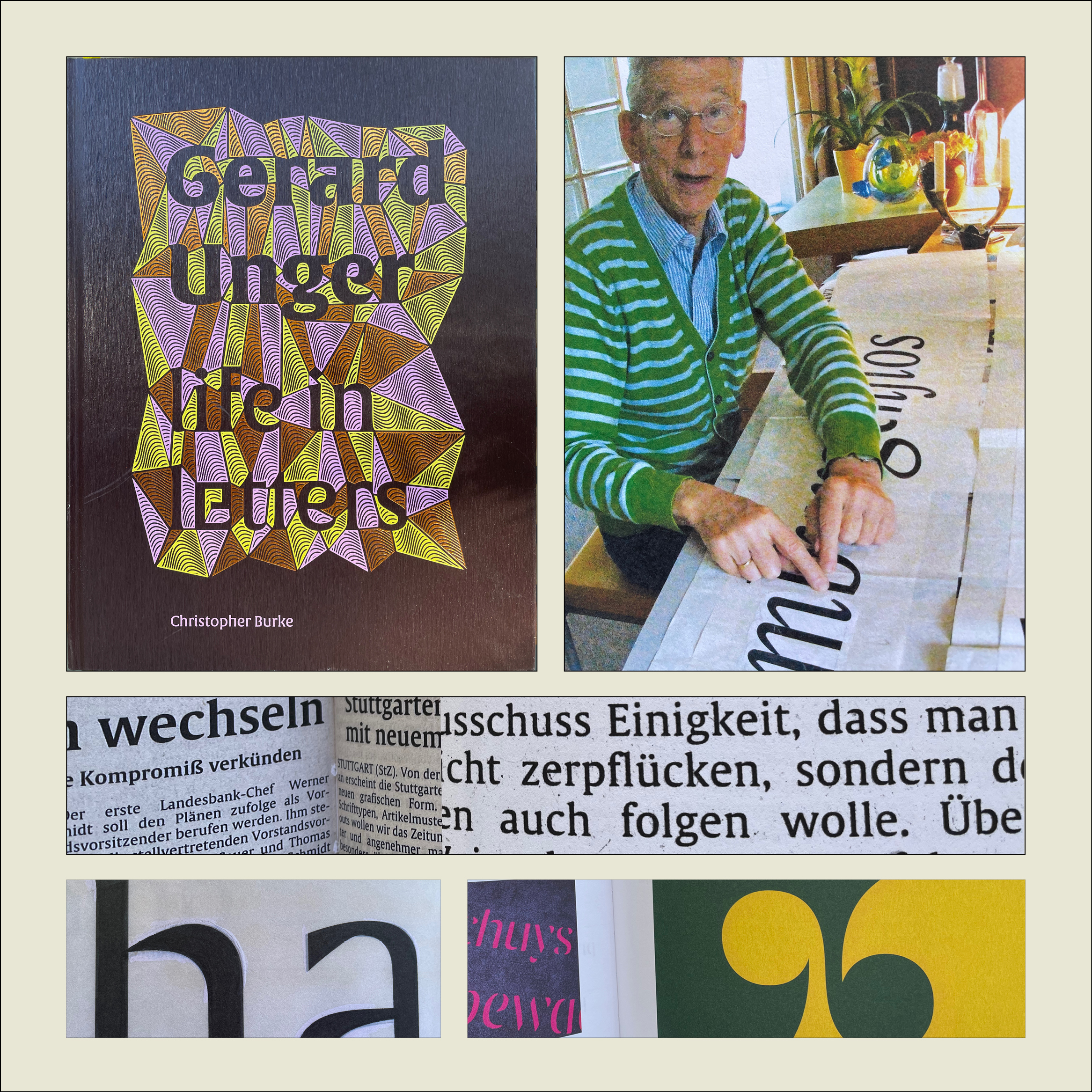
Christopher Burke, Gerard Unger: Life in Letters (Amsterdam: Uitgeverij de Buitenkant, 2021).
Christopher Burke writes clearly and knowledgeably about type and the people who design it. His just-published biography of Dutch type designer Gerard Unger, one of the most prolific and talented type designers of the later 20th century and the early 21st, is quite simply a must-have book. It’s well made, effectively designed, artfully written, and lavishly illustrated.
Gerard Unger: Life in Letters is above all a book about process. In tracing Unger’s life and career, Burke shows Unger repeatedly wrestling with new techniques and new technologies, figuring out how to take advantage of them and finding creative ways to put even their constraints to use. Unger did not begin by cutting metal punches, but he came into the field of typography when it was adapting to phototypesetting, and he then encountered each new iteration of digital typesetting and type design. The book’s ample and detailed illustrations show these processes in abundance.
Unger was a pragmatic designer, always focused on making type that people could actually read. Whether designing signage faces for highways or metros, or text faces for daily newspapers, he studied what made the letters readable and incorporated his insights into each design. The distinctive curve forms of his letters were unique to him, often making it easy to spot an Unger typeface when you saw it. He incorporated history but always created something new; his last major typeface, Alverata, with its sanserif companion Sanserata, is both a usable text face and an exuberant expression of letter forms that first blossomed in Romanesque lettering a thousand years ago.
[Originally published on October 1, 2021, in PPN Post and Updates, the newsletter of the Publishing Professionals Network.]

