You may have seen Microsoft’s recent announcement that they were releasing five new font families, one of which will end up replacing Calibri as the default font in Microsoft Office. “Calibri has been the default font for all things Microsoft since 2007,” the announcement read, “when it stepped in to replace Times New Roman across Microsoft Office. It has served us all well, but we believe it’s time to evolve.”
Originally Calibri, designed by Dutch type designer Luc(as) de Groot, wasn’t meant to be the new Office text face; that role would be given to Jelle Bosma’s sturdy serif typeface Cambria, which was designed to be a Times replacement. But Calibri worked so well that their roles got reversed.
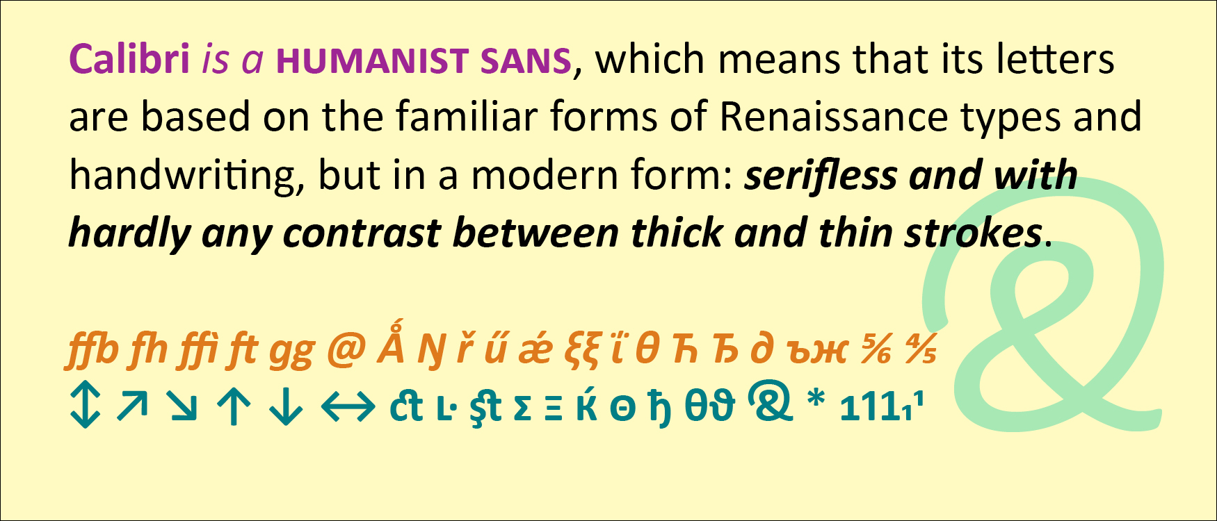
Calibri is a humanist sans, which means that its letters are based on the familiar forms of Renaissance types and handwriting, but in a modern form: serifless and with hardly any contrast between thick and thin strokes. Calibri also features softly rounded ends to its strokes, which gives it a friendly, informal feel even though it’s a classically structured typeface.
De Groot gave Calibri a lot of extra features, including small-caps numerals, direction arrows, an alternate g, a swash ampersand, and an unexpectedly wide range of ligatures. Like all of the ClearType fonts, Calibri was designed simultaneously for Latin, Greek, and Cyrillic.
Both Calibri and Cambria were part of the ClearType Font Collection, a suite of digital typefaces commissioned in 2002 to take advantage of Microsoft’s then-new ClearType technology. Calibri proved versatile and popular, even after the underlying technology was superseded by higher screen resolutions.
Interestingly, all five of the new proposed replacements for Calibri are sans serifs.
[Originally published on August 1, 2021, in PPN Post and Updates, the newsletter of the Publishing Professionals Network.]

