function jdb_page_navigation()
sPageSlug = blog
sPageTitle = easily amused
header:139:aPageArgs:page_title = easily amused
header:140:aPageArgs:section_title =
functions-johndberry:262:aPageArgs:page_title = easily amused
functions-johndberry:298:sPageTitle = easily amused
functions-johndberry:359:sPageTitle = easilyamused

easilyamused |

Archive for September, 2008

Petersburg: the old · the new

Published

I got back last Tuesday from a week in St. Petersburg, Russia, for this year’s ATypI conference. The theme of the conference was “The Old · The New,” and we saw plenty of both – not only in contrast to each other but in many varied forms of both old and new. Our two principal venues, for instance, reflected different current uses for old buildings.

The main program was held in a 19th-century palace, the “pink palace” or Beloselsky-Belozersky Dvorets, which is situated right on the corner of Nevsky Prospekt, the Fifth Avenue of Petersburg, and the Fontanka river, which reminded me of the Seine in Paris. Inside the pink palace, we had two highly decorated function rooms, one an auditorium and the other more of a big seminar room. The old wooden floors creaked when people walked in or out, but otherwise the sound was good. The foyer in between was where we served lunch and had the coffee breaks, and where people could mingle (one of the main functions of an ATypI conference). In the evenings, we adjourned to a very different venue: the Loft Project Etagi (it should be spelled “Etazhi” in English, but the Latinization must be based on French), a five-storey former bread factory that’s been converted into art galleries, boutiques, and culture-related offices. As their description puts it, “The conversion of the space was minimal; as a result, many industrial artifacts have been kept as part of the interior setting: cast-iron floors, tied concrete columns, a boring mill [stet], backing equipment, etc.” This sort of “downtown” arts space contrasted nicely with the faded elegance of the pink palace. We put up the various exhibitions on the second floor of Etagi, and Friday night’s exhibition opening was open to the public; it was jammed. Saturday night we took over the top floor, a modern art gallery with a wine bar, for the main conference party. (This was a more informal replacement for the “gala dinner” that ATypI always used to have.) It was a fine party. Briefly we had to stop everyone from having fun so I could thank all the organizers and sponsors, and so a representative from the government press & arts entity could give a short speech and hand out commemorative plaques. After the party closed, I accompanied a group of typographers to a nearby bar, where we talked and drank until nearly 4 a.m. As I put it on Sunday, “I can no longer blame my exhaustion on jetlag; this time I’ve earned it fair and square.” But I was up for the first talk the next morning, ready to kick things off in my official capacity.

Everyone seemed to agree that the conference went well. There was a certain amount of division between the Russian-speakers and the non-Russian-speakers, as in general one track was in Russian and the other in English, but there was also a fair amount of fluidity and overlap. (We were trying to plan things to encourage as much cross-communication as possible, but some sorting by language is inevitable.) I couldn’t even begin to describe all the things that people spoke on or presented; it was generally a very good program. I ended up being the MC for one track some of the time, so I couldn’t be as flexible as an ordinary attendee in deciding which track to follow. And being president of ATypI, I was always feeling responsible, even when other people were actually carrying out the tasks.

Leaving on Tuesday meant that I had one full day free, after the end of the conference; and Monday turned out to be a gorgeous sunny day, not a cloud in the sky and temperatures around 60°F. I visited the Russian Museum, where I made a beeline for the 20th century art and found two iconic paintings of Anna Akhmatova; I also ran into a couple of people from the conference there. Otherwise I strolled up and down and over the canals, admiring the 19th-century buildings, most in a classic Italian style, and wandered through the Mikhailovsky Gardens and one end of the Summer Garden, past the brooding palace known as the Engineers’ Castle, finally enjoying a cup of coffee outside a Seattle-style coffee company (a local chain called “Coffee House”) on Malaya Sadovaya Street in the sunlight. Earlier, on Wednesday, after checking in with our conference director and making sure there wasn’t anything I needed to deal with, I walked my feet off (the long, wide avenues do go on a long way) and visited the Hermitage, where I finally got to reacquaint myself with the Van Gogh that I had first seen in DC in 1973, in a tour called “Impressionist and Post-Impressionist Paintings from the USSR.” That painting had brought tears to my eyes thirty-five years ago; today it didn’t, but still I spent ten or fifteen minutes just looking at it. I also renewed acquaintance with a number of other paintings that had been in that exhibition (Derain, Cézanne, Matisse) and saw many more that had not gone traveling.

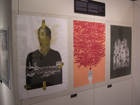
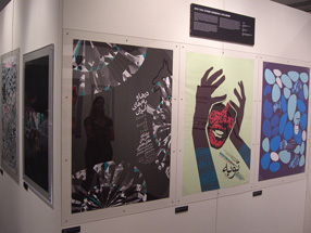
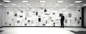
[Photos, top to bottom: transport: the old, the new; the second book printed in Cyrillic (Krakow, 1491); Oleg Genisaretsky delivering the keynote address; School #308; advertising poster at a bus stop on Nevsky Prospekt – another take on the old, the new.]

Posters from Seattle & Tehran

Published

At Seattle’s Bumbershoot music and arts festival over Labor Day weekend, there was a remarkable exhibit: the Seattle–Tehran Poster Show. Curator Daniel R. Smith had gone to Tehran to investigate the graphic-design scene there, meeting as many local designers as he could, and he then put together this exhibition, which gives a parallax view of our two cultures. He paired each Iranian poster with one from Seattle, sometimes based on nothing more than a similar approach to letters or images or subject matter. Both cities have vibrant graphic-design communities, and both have created some wonderful posters.

The treatment of Arabic text is fascinating (that is, the Persian language, Farsi, which is written in the Arabic alphabet). Sometimes the letter forms are entirely deconstructed, given architectural or vegetal structure. When human faces or forms appear, they tend to be stylized, often intertwined with words. The Seattle posters, too, are interesting, but it’s clearly the work from Iran that grabs your attention.

Poster from the Seattle-Tehran poster show at Bumbershoot

Poster from the Seattle-Tehran poster show at Bumbershoot

Bumbershoot only lasts over the holiday weekend, but a slightly different version of the show, called “Seattle–Tehran Poster Show Remix,” is up at the Design Commission in downtown Seattle until October 15. I intend to go down and check it out.

Wooden wall of text

Published

You may have seen photos of it in a design magazine or a book on graphic design in the Sixties: the 35-foot wall of words created by Lou Dorfsman and Herb Lubalin for the cafeteria of CBS television’s new corporate headquarters in 1966. The collage effect, and the lettering styles used, reflected the typographic aesthetic that was being popularized by Lubalin and Tom Carnase, which later bloomed into the establishment of ITC and Upper & lower case. Dorfsman conceived this “Gastrotypographicalassemblage” and art-directed its execution. He considers it his “Magnum Opus, his gift to the world.” It is certainly a monument to a particularly lively period in American graphic design.

But the 9-panel sculpture was removed and dumped in the late 1980s, after tastes had changed. The panels were salvaged by a New York designer, Nick Fasciano, and now the Center for Design Study, in Atlanta, is working to restore the damaged lettering and give the type wall a permanent home.

There’s a lot of restoration needed; time and neglect have taken their toll. Rick Anwyl, the Center’s interim executive director, estimates that it will take around $250,000 to fully restore the sculpture, “to see it as part of a permanent traveling exhibition on American Design, a tool for education and expanded awareness of the value of intelligently applied design.” The Center is a nonprofit foundation, and they’re actively soliciting donations to fund the restoration. Perhaps more importantly, they’re trying to think creatively about ways to approach raising the money. This is, obviously, not a small project.

The CBS cafeteria wall, in situ

Well spaced

Published

Yesterday I was walking past a newly built apartment building on Seattle’s Capitol Hill when I noticed three people huddled around the rectangular frame next to the front door. They were in the process of peeling off a big piece of blank cardboard that had been covering the sign underneath. They were laughing and joking: “We ought to have a camera to record this!” I stopped and watched as they got the cardboard off, revealing the new, three-dimensional lettering that identified the building as the Pearl apartments. “It opens tomorrow,” one of them said, “and the first tenants will be moving in.”

I didn’t have a camera with me, but I went back later and snapped a couple of pictures, because that sign seemed like a good example of clear, simple signage. The lettering on the sign was remarkably well spaced – not so loose that it would fail to hold together within the larger space when you’re standing right in front of it, yet loose enough so it wouldn’t squish together when you view it from an angle, as you would if you were walking along the sidewalk. There are so many poorly conceived and poorly executed bits of public signage on our buildings that it’s a pleasure to see a new one that’s done well.

Sidewalk in front of the Pearl apartments, Seattle

Close-up of the lettering on a Seattle apartment building

©ontent

Published

I’ve been reading Cory Doctorow’s new book of essays, Content: Selected Essays on Technology, Creativity, Copyright, and the Future of the Future, and finding it easy to read. This is not surprising, since I designed and typeset the interior of the book myself, but it’s reassuring when I actually have time to sit down with a copy of the finished, printed book and test that it’s truly readable. It is. (I’m not talking about the prose here; Cory’s writing is compulsively readable, in pretty much any format.) The author seems pretty happy with the design, too.

I’ve done a lot of book interiors for Tachyon Publications, but this was somewhat different from most of them. I wanted a typeface that was serious yet not too literary; it would have seemed silly to typeset Cory’s essays in Bembo, for instance. And it had to be very forgiving: it had to make a lot of different combinations of ALL CAPS and C4PS&NUMB3R5 look good, not like big undigestible chunks clogging up the flow of the prose. Normally I would use old-style figures in a book, and small caps for acronyms and anything set in all-caps. But in these essays, Cory uses a lot of acronyms – DVDs, FBI, RIAA, VHS, and DRM are just a few from a single essay – and there are some combinations of capital letters and numbers or other symbols that come from Leetspeak or keyboard-based typing habits that rely on the simplicity of plain ASCII characters. They’re part of the flow, not an interruption of it. This was not exactly an edition of the Penguin Classics.

The typeface I chose was Chaparral Pro, a sort of humanist slab-serif text face designed by the very talented former Adobe type designer Carol Twombly. Chaparral doesn’t have much variation in the width of the strokes, so it doesn’t look “bright” like Times Roman or Janson; but its letter forms are comfortable, familiar, and easygoing, and it reads well in long text. Chaparral has been a favorite of mine since it first came out, though I don’t often get a chance to use it in a book; it might seem a little strong for, say, a book of fiction. But it hit the right balance here. And its caps and its full-height lining figures don’t overpower the lowercase the way they do in some traditional book faces.

Detail of a page of Content

Although Chaparral does have old-style figures, the only place I used them was in the table of contents. Similarly, the font includes true small caps, but I only used them in the front matter and the running heads. In the body of the text, it was full caps and lining figures all the way through – in the spirit of the prose itself.

In making the physical object – what Cory calls the p-book – comfortable for carrying around and reading on the fly, it helps to keep it small and light, printed on flexible, off-white paper in a binding that opens freely. Worzalla, the printer, did a good job of this. The strikingly simple cover that Ann Monn designed stands out from other books, and it gets curious glances when you’re reading the book in a coffeehouse. The spine will also stand out on a bookshelf, a useful selling point for physical book-product.

The essays themselves? Read ’em.

Title-page spread from Content

Page spread from Content

Backwards rolled the apostrophes

Published

There’s a wonderful photo on SFGate today, in a set of images from the just-completed Republican National Convention. It’s a shot of a couple of stagehands carrying a big sign down to the floor of the auditorium, in preparation for the event. The sign consists of giant Optima letters stuck to a ladder-like frame; the cap-height is about half the height of one of the guys carrying it. Naturally, the phrase spelled out so grandly is “McCAIN ’08” – except that the apostrophe (which is about the length of the guy’s head) is backwards.

There’s something peculiarly wonderful about a typographic error that has its origins in automated typesetting (“smart quotes”) being embodied in such a large, hands-on, physical form and lugged down the stairs to be erected in front of a huge crowd in a convention hall.