function jdb_page_navigation()
sPageSlug = blog
sPageTitle = easily amused
header:139:aPageArgs:page_title = easily amused
header:140:aPageArgs:section_title =
functions-johndberry:262:aPageArgs:page_title = easily amused
functions-johndberry:298:sPageTitle = easily amused
functions-johndberry:359:sPageTitle = easilyamused

easilyamused |

Archive for the category ‘ambient letters’

Watch out for falling rockstars

Published

It’s been a while since I posted a photo of shop-front lettering that’s been removed. I always find such artifacts fascinating. This one is from last September, in Paris, in the 7th arrondissement. “ROCKSTAR,” I think, the sign must originally have read.

Detail of lost shopfront lettering in Paris.

Return to Martha’s Vineyard

Published

In May, I had a chance to revisit my childhood home – on a business trip.

Although I was born and raised in Bronxville, New York, a close-in suburb of New York City, my family spent all of our summers in Edgartown, Mass., on the island of Martha’s Vineyard. My parents had met first there in the 1930s, and they are both buried in the Edgartown cemetery. They would have retired there, if my father hadn’t had a fatal heart attack at the age of 56.

So I always had two homes, like a migratory nomad herding the sheep from winter to summer pastures. Though without the sheep; maybe a cat or two, some years.

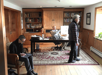
But I never expected to be returning to the island on typographic business. I’ve been working since last year as managing editor for Font Bureau, which has been technically based at its office in Boston but which is run by Sam and David Berlow, who both live on the Vineyard and have done so for many years. So that’s the location of Font Bureau’s annual “offsite,” and this year I was a participant.

Type Network office

Around the two days of meeting and eating and talking type, I also found a little time to reacquaint myself with the island, and to meet up with one of my oldest friends. Sara Piazza and I have known each other since we were little children living two houses apart, best summertime friends from the age of five. (Admittedly we’ve let many years go by between contacts as adults. Facebook has been useful in renewing our connection. As is its wont.) Walking down Main Street to the Edgartown waterfront with Sara, who knows everyone on the street, and stopping to talk to many of them, felt to me like coming home, even though I was a stranger to them. (Well, no, I was a friend of Sara’s, so I wasn’t a stranger. And when I mentioned to Sam Berlow who it was I was going to see, he said, “Oh, Sara! Of course I know Sara.” It’s a small island.)

I had caught a ride from Boston down to Woods Hole with Roger Black and his husband Foster Barnes, and while we were waiting for our ferry we had lunch at a local seafood restaurant (what else?) and walked around the town a bit. I had never explored much more of Woods Hole than the area near the ferry dock, but we discovered a pleasant little New England seaside town with more, and bigger, scientific institutions than I had realized, as well as a peculiar semi-medieval bell tower overlooking the lagoon.

This Font Bureau offsite was retroactively declared the first offsite of Type Network, the new expanded type-distribution business that launched on June 1. I now have expanded responsibility, too, as managing editor for a complex of type foundries. We anticipate that the Type Network website will have a lot of new content in the coming months, so there’s work to be done. Check it out.

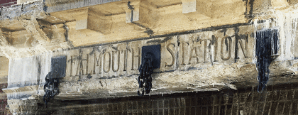
Falmouth Station lettering

[Photos: (top, above) the new Font Bureau/Type Network office in Vineyard Haven (L–R: Cyrus Highsmith, Sam Berlow, Richard Lipton); (immediately above) lettering on the old Falmouth station (now a bus stop on the route from Boston); (left, top to bottom) Edgartown harbor; bell tower in Woods Hole; Roger Black and Foster Barnes in Woods Hole.]

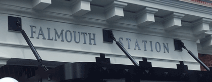
[A year and a quarter later, the Falmouth bus station’s lettering had been spiffed up and updated.]

Falmouth-Station-new-lettering

Eyemag

Published

I just got the latest issue of Dennis Letbetter’s Eyemag, his more or less quarterly series of magazine-size books that showcase different aspects of his long and notable career as a photographer. (I’m not sure I can say “long career” about someone who’s younger than I am, but what the hell. He’s been doing it for a long time. And it’s certainly notable.)

These are printed privately and distributed to a very limited circulation, but after some prodding Dennis did allow as how he would welcome subscriptions. I believe the rate for four issues is $200, but you should check with him. It might be worth your while. Meanwhile, you can view the contents of individual issues on the website.

Dennis’s photography is remarkable. It’s not showy; it’s just good. The one thing that might be considered an affectation is his occasional use of an extremely wide aspect ratio (6x17cm): but he puts it to good use. The current issue, no. 8, uses these long, narrow apertures to document the city of Florence. The first half of the images is vertical, like some of the narrow streets, while the second half is horizontal, as our eyes tend to see a streetscape.

The previous issue documented a full year of daily portraits of his friend and mentor René Fontaine. “Who would submit to portraiture, let alone a serial portrait which requires an involvement of a year?” asks Dennis in his thoughtful essay at the end of the volume. But René did: he sat for 365 portrait photographs, from from the summer of 1980 to the summer of 1981, no matter how he was feeling, what he was doing, or what the rest of the day might hold. And Dennis was there to record it. Occasionally René would don a whimsical hat (the portrait on the left has always been a favorite of mine, even before I knew its context), but mostly he just sat down in his everyday garb and looked patiently at the camera.

What might be the most unusual issue of Eyemag is no. 4, “The Haight Street Project.” During the same period when Dennis was shooting portraits of designers and artists in the San Francisco Bay Area using a big old-fashioned camera with glass plates, he was also inviting his neighbors in the upper Haight into his garage, which he had converted into a studio, to take their portraits on 4×5 color film in a thoroughly informal situation. These photos let the people who live in or pass through the Haight show themselves however they wish.

Each issue of Eyemag ends with an essay by someone notable and appropriate, and one by Dennis himself. In the current issue, the essay, “Eye Level” (in Italian, with an English translation), is by Andrea Ponsi. In the Haight Street Project issue, the guest essay is by Herbert Gold.

The striking “i” logo of Eyemag was designed for Dennis by the late Michael Harvey, a good friend and an amazing artist in the creation of letters. That i is recognizable as a Michael Harvey letter from a mile away.

(Note: Yes, it can be confusing, but Eyemag is entirely different from the excellent Eye magazine.)

[Images (top to bottom): Covers of issues 1, 6, and 8, and portrait of René Fontaine, 21 March 1981. All images copyright by Dennis Letbetter.]

An ironic typeface used for a non-ironic purpose

Published

’Twas the eighteenth of April of Twenty-fourteen…” Yes, it was, actually and literally. That’s when I snapped this picture of the sign at the edge of the Calvary Cemetery, overlooking University Village in Seattle.

Easter sign using the typeface Mason, zoomed in

The typeface, with its postmodern ecclesiastical look, is Jonathan Barnbrook’s Mason, which was originally released by Emigre Fonts in 1992 under the name “Manson.” For reasons that you can imagine, that name caused a lot of unease, and Barnbook soon dropped one n and renamed it “Mason.” By either name, it’s very much in the tradition of ironic type design, taking recognizable features from the past and combining them in unusual ways to achieve a new effect.

The smaller type, identifying the cemetery and its web address, appears to be the appropriately named Requiem. Presumably, irony was not uppermost in the mind of the designer of this welcoming and wholly un-ironic sign.

Massimo Vignelli & organizing information

Published

When Massimo Vignelli died last month, the obituaries and remembrances all mentioned his famous 1972 map of the New York City subway system. The New York Times, of course, spent a good deal of ink and pixels on the subject. In retrospect, everyone keeps talking about how confusing that map was to people at the time, implying that it may have been a brilliant design object but that it was a failure as a navigational tool. That’s not what I remember.

I first learned how to navigate the complex, contradictory New York subways in the late 1960s, when the Vignelli map had not yet appeared but the Vignelli-inspired system of color-coding the lines and identifying them by numbers or letters had been implemented. This was truly a system, and it made sense of a wildly inconsistent tangle of lines; it also made the sometimes chaotic interiors of the subway stations themselves navigable and understandable, at least to an extent. The system was designed not to tame the chaos but to give its users – the subway riders, both straphangers who used the system every day and newcomers or first-timers like me – a tool for navigating, for making our way through the jungle and getting to a destination.

The maps we used before 1972 were already highly stylized; they were really diagrams, not maps, despite the nod to geography in the background shapes of the city’s waterways and landforms. The 1966 subway map, which would have been the first one that I used, was already nothing like a realistic map; the lines in the outer boroughs were compressed and condensed, while Manhattan was shortened and fattened, not reflecting the actual geography at all. But the lines still had names, not numbers or letters (“SEA BEACH, W. END” or “JEROME LEX AV”).

By 1968, the map was clearly a wiring diagram of the city, and it introduced the consistent system of identifying each line by a unique number or letter (6, F, RR). The lines were color-coded as well, just like the signs within the stations. (In the 1966 map, the only color distinction was used to show which lines were part of the old IRT, IND, or BMT systems.) The map was complex, because the city’s subway system was complex, but it formed a very useful and usable chart that enabled you to understand how the system was put together and how to get from one point within it to another efficiently.

The famous 1972 map was just a continuation of this to a slightly more abstract level. Actually, to a slightly more abstract-looking level; the abstraction was already there. Compare the 1968 map to the 1972 one: both are diagrams, it’s just that the ’72 map makes this even more obvious. The biggest innovation was how it showed potential transfer points: instead of inscribing all the line numbers or letters in little boxes, the Vignelli map placed black dots side-by-side where trains from adjacent lines stopped at the same station. It was simple and clear, and if your line passed by but didn’t show a dot, that meant it didn’t stop at that station.

None of these subway maps were intended as a way to understand the city; they were intended as a way to understand the subway system, and to use that to get around the city. They were superb at that, and the more abstract they got, the better they did that job. I know; I used them constantly.

The first “schematic” map of the New York subways was produced in 1959. If you want to see what that was an improvement on, take a look at the 1948 map, which makes a brave attempt to reflect the geography and still show the tangle of lines and where they go. The comparison is educational. I know which one I would want to use as a guide.

Strangely, many of the people who complained about the 1972 Vignelli subway map would be perfectly content to use the equally abstract London tube map, which was introduced decades before New York’s attempts. Nobody in London would claim that the tube map gives you any idea of the layout of the city; but it’ll get you from station to station within the system brilliantly. The 1972 NYC subway map did the same.

Thank you, Massimo, for making it easier for me and a lot of other people to get around.

[Image: a detail from the recent digital version of the Vignelli subway map, even more simplified and rationalized than the original.]

Back on the wall

Published

It’s gratifying to see, from a story on the TDC’s website, that the three-dimensional typographic mural that Lou Dorfsman constructed in 1966 for the cafeteria at CBS headquarters in New York City has finally found a permanent home.

As I wrote six years ago, the “Gastro­typographical­assemblage,” which a subsequent régime at CBS was ready to junk, got saved thanks to the efforts of NYC designer Nicholas Fasciano, and was given a temporary home at the Center for Design Study in Atlanta, while funds were being raised to preserve and restore the crumbling masterpiece.

Now, as you can see from this short video, it has been lovingly restored and installed at the Culinary Institute of America, in Hyde Park, New York. Sounds like a visit to Hyde Park is called for.

Hong Kong images

Published

After an absurdly long delay, I have finally put some of my photos from last October’s ATypI Hong Kong up on Flickr: here. Although I didn’t take a lot of snapshots, there are few images there that ought to be interesting to people who weren’t there – and to some of the people who were. In particular, I got to the very first letterpress workshop at Zi Wut, which contains the type and printing press from a former printshop in Kowloon, now operated by three women as a teaching resource, with the original owner of the printshop offering examples and showing how the processes worked. Zi Wut has a presence on Facebook, and there’s a nice short write-up, with more images, on the Metropolis magazine blog.

Unfortunate signage

Published

The street signs in the town of Alcoa, Tenn., which I found myself driving through a couple of weeks ago, have this unusual choice of typeface. It looks like Impact, though a bit straighter and narrower than even that impactful typeface. You can see what whoever chose this was thinking: keep it narrow but bold, something that will really stand out when seen from a car driving up to an intersection. The unfortunate part is that it’s too bold; it certainly draws your eye, but that doesn’t make it legible. The excessively fat strokes combined with the compressed shapes, and the very tight spacing and tiny counters, make it turn into a blob of black (or, in this case, white) against the background, so that it’s not in fact easy to read at all.

Oh well. Nice try.

Limbic artifice

Published

One of my favorite local shop-front signs (on Capitol Hill in Seattle) – not just for its contrast between the two typefaces used, but for the contrast between the pretty-looking type of the second line and the meaning of the words. It’s carefully composed (not vernacular or naïve at all), but the interplay of what it says and what it looks like is striking. As, no doubt, it was meant to be.

Palimpsest

Published

As part of my ongoing collection of faded, broken, and disinherited lettering, I snapped this sign outside one of the Microsoft buildings that once belonged to a different company; you can see the faint spoor of an older building name in the holes below the current sign. Typographic entropy always interests me.