sPageSlug = blog
sPageTitle = easily amused
header:139:aPageArgs:page_title = easily amused
header:140:aPageArgs:section_title =
functions-johndberry:262:aPageArgs:page_title = easily amused
functions-johndberry:298:sPageTitle = easily amused
functions-johndberry:359:sPageTitle = easilyamused

easilyamused |

Archive for the category ‘ambient letters’

Elegance & credibility, blown

Published

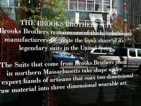
Brooks Brothers has an amazing ability to project established elegance and solid reliability in the realm of men’s formal clothing. A Brooks Brothers suit is iconic. When Brooks Brothers first established a store in downtown Seattle, a few years back, they managed to make it look as though the shop had been established on that corner since the founding of the company in 1818 – despite the fact that there hadn’t even been a town, much less a street intersection, at that spot nearly two hundred years ago. In the spot they moved to later, a couple of blocks away, the building isn’t quite as convincing, but the shop still has that aura of conservative quality.

Except in the execution of its typography. The choice of Bodoni for the type on this window text was clearly meant to emphasize the classic elegance of the brand. But the effect is spoiled by the typewriter apostrophes, which neither Giambattista Bodoni nor any type designer up until the advent of desktop publishing had ever conceived of. (It’s further spoiled by the fact that the second apostrophe doesn’t even belong there: the adjective is its, not it’s.)

Window sign at Brooks Brothers shop in Seattle

Up against the wall

Published

This striking bit of hortatory graffiti was on the wall of an alley near City Lights Books in North Beach, when I was in San Francisco last week. (No, it wasn’t Kenneth Rexroth Alley, surely the best-named street in America.) The drip-effect may have been unintentional – at least at first – but I could imagine this being the basis for an entire lettering style. Whatever caused it, will or happenstance, it was effective.

Swiss-style Latin in Montreal

Published

When I was in the Mile End neighborhood of Montreal a couple of weeks ago, I happened to spot this idiosyncratic logo on a local shop. First I noticed the van, pulling into a parking space outside the shop; then I realized that the shop itself was the business with the logo.

The letters are clearly a heavy, wide variation of Helvetica (or something modeled on it very closely), but someone has given these precise Swiss letters little tails, joining them up into a connected script. Nobody re-drew the letters; that’s obvious from the mismatch between the curl of the “t” and the much narrower joining stroke. (My guess is that the capital-L is really a cap-I with the joining stroke added.) It’s clever, even it’s mechanically rendered. And it’s certainly a strange juxtaposition of cultural tropes, all in a few letters on a shop awning and a delivery truck.

Logo on shop awning

Angles of acuteness

Published

This outdoor telephone box sits next to the entrance to one of the far-flung buildings on the Microsoft corporate campus. It’s a remarkable example of someone thinking about what angle you might be looking at a sign from. Viewed straight on, the lettering looks curiously wide and squat; it takes you a minute to figure out what it says, though it’s ultimately recognizable. The lettering style really comes into its own, however, when viewed from an acute angle – as might be the case if you were approaching the door from the side. The word is most readable when it’s seen from the most extreme angle.

I suppose they could have simply put the word ‘TELEPHONE” on the side of the box, too, and solved the problem that way. But this is an ingenious bit of sideways thinking.

Entropic typography

Published

In the spirit of the expiring year, here’s a bit of decayed lettering on the awning of a car-repair shop in my neighborhood in Seattle. Digital distressing has nothing on the ravages of weather and sunlight. I’m not sure which is more poignant, the choice of typeface (Avant Garde?) or the phrase that it spells out (“Computerized Automotive Repair”).

‘Computerized Automotive Repair’

Signage on the hoof

Published

I love seeing how things actually get made. This set of Flickr photos shows the shop that manufactures the highway signs for Washington State.

As successive photos reveal more of the underlying letters, and the visible part seems to be “ypo,” I find myself fantasizing that it will turn out to be spelling “Typography” – or perhaps the little-known Washington town of Typopolis. It is, however, “Keyport.” Oh well.

[Photo: Distributed by WSDOT under Creative Commons license.]

Toronto: design, tech, celebration

Published

Last weekend Eileen and I were in Toronto for the wedding of Cory Doctorow and Alice Taylor. It was my first time in Toronto since 1973, except for changing planes once or twice in the airport, and Eileen’s first visit ever. The hotel of choice for incoming guests was the Gladstone, once a notorious flophouse at the far edge of Queen Street West, now meticulously restored as a boutique hotel with each room decorated by a different artist. The neighborhood, known as West Queen West, seemed to be the funky artistic center of the city (or at least one of them) – the sort of place we would naturally gravitate to. It was a good setting for this confluence of digitally and geographically dispersed people, ideas, and creative energy.

This was a gala affair, though not exactly…um, traditional. The ceremony itself – admirably brief and amusing – was conducted by a magician, and there was a sort of steampunk Halloween theme to the whole celebration. Jack-o-lanterns were carved on the day before, and the event took place in a haunted house – well, actually in a great Victorian pile known as Casa Loma, the extravagant folly of a wealthy Toronto capitalist who went broke getting his mansion built. Costumes were the order of the day; Cory appeared at the Mad Hatter, and Alice as, well, Alice. The star of the show, of course, was their eight-month-old daughter, Poesy Emmeline Fibonacci Nautilus Taylor Doctorow (“Poe”).

Toronto had its share of type and design; in fact, the Queen West neighborhood is officially designated the “Art + Design District,” something I’ve never seen in any other city. And who could resist a bookstore named “Type”? (The sign “pre-loved” is actually the name of the shop nextdoor.) That’s where I bought Robert Bringhurst’s new book about Canadian book design, The Surface of Meaning.

A bookstore called Type

Toronto subway signage

[Photos: left, Alice Taylor (top), Cory Doctorow holding Poesy (middle), brain pumpkin as table centerpiece (bottom); above, signage on the street (top) and in the subway (bottom).]

Microsoft typography

Published

After more than eight years of working for myself, I’ve just taken a job in the typography group at Microsoft. The focus of the team is on providing fonts for all of Microsoft’s markets around the world, in whatever language or writing system, though I also hope to have some influence on how fonts are used – i.e., typography.

“In any case,” as I said to some friends, “it looks like we’ll be staying in Seattle for the foreseeable future.” Eileen and I had been thinking about moving back to San Francisco, which we also consider home, and I had looked at a couple of possibilities in the Bay Area. “Well, unless President Obama asks me to become Minister of Typography.”

Okay, that may be just a riff, but in reality I think it would be a good thing to have a Secretary of Design, or someone with a similarly high level of government responsibility. (I’m tempted to call this Minister With Portfolio.) As I keep saying: since we live in a designed world, we might as well get good at it.

[Photo: Logos have a life cycle of their own, or at least their physical embodiments do. This broken sign, on the back side of a concrete slab in front of one of the buildings on the corporate campus, appealed to my love of missing, crumbling, or distressed lettering in the environment.]

Wooden wall of text

Published

You may have seen photos of it in a design magazine or a book on graphic design in the Sixties: the 35-foot wall of words created by Lou Dorfsman and Herb Lubalin for the cafeteria of CBS television’s new corporate headquarters in 1966. The collage effect, and the lettering styles used, reflected the typographic aesthetic that was being popularized by Lubalin and Tom Carnase, which later bloomed into the establishment of ITC and Upper & lower case. Dorfsman conceived this “Gastrotypographicalassemblage” and art-directed its execution. He considers it his “Magnum Opus, his gift to the world.” It is certainly a monument to a particularly lively period in American graphic design.

But the 9-panel sculpture was removed and dumped in the late 1980s, after tastes had changed. The panels were salvaged by a New York designer, Nick Fasciano, and now the Center for Design Study, in Atlanta, is working to restore the damaged lettering and give the type wall a permanent home.

There’s a lot of restoration needed; time and neglect have taken their toll. Rick Anwyl, the Center’s interim executive director, estimates that it will take around $250,000 to fully restore the sculpture, “to see it as part of a permanent traveling exhibition on American Design, a tool for education and expanded awareness of the value of intelligently applied design.” The Center is a nonprofit foundation, and they’re actively soliciting donations to fund the restoration. Perhaps more importantly, they’re trying to think creatively about ways to approach raising the money. This is, obviously, not a small project.

The CBS cafeteria wall, in situ

Well spaced

Published

Yesterday I was walking past a newly built apartment building on Seattle’s Capitol Hill when I noticed three people huddled around the rectangular frame next to the front door. They were in the process of peeling off a big piece of blank cardboard that had been covering the sign underneath. They were laughing and joking: “We ought to have a camera to record this!” I stopped and watched as they got the cardboard off, revealing the new, three-dimensional lettering that identified the building as the Pearl apartments. “It opens tomorrow,” one of them said, “and the first tenants will be moving in.”

I didn’t have a camera with me, but I went back later and snapped a couple of pictures, because that sign seemed like a good example of clear, simple signage. The lettering on the sign was remarkably well spaced – not so loose that it would fail to hold together within the larger space when you’re standing right in front of it, yet loose enough so it wouldn’t squish together when you view it from an angle, as you would if you were walking along the sidewalk. There are so many poorly conceived and poorly executed bits of public signage on our buildings that it’s a pleasure to see a new one that’s done well.

Sidewalk in front of the Pearl apartments, Seattle

Close-up of the lettering on a Seattle apartment building