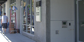
Yesterday I was walking past a newly built apartment building on Seattle’s Capitol Hill when I noticed three people huddled around the rectangular frame next to the front door. They were in the process of peeling off a big piece of blank cardboard that had been covering the sign underneath. They were laughing and joking: “We ought to have a camera to record this!” I stopped and watched as they got the cardboard off, revealing the new, three-dimensional lettering that identified the building as the Pearl apartments. “It opens tomorrow,” one of them said, “and the first tenants will be moving in.”
I didn’t have a camera with me, but I went back later and snapped a couple of pictures, because that sign seemed like a good example of clear, simple signage. The lettering on the sign was remarkably well spaced – not so loose that it would fail to hold together within the larger space when you’re standing right in front of it, yet loose enough so it wouldn’t squish together when you view it from an angle, as you would if you were walking along the sidewalk. There are so many poorly conceived and poorly executed bits of public signage on our buildings that it’s a pleasure to see a new one that’s done well.