function jdb_page_navigation()
sPageSlug = blog
sPageTitle = easily amused
header:139:aPageArgs:page_title = easily amused
header:140:aPageArgs:section_title =
functions-johndberry:262:aPageArgs:page_title = easily amused
functions-johndberry:298:sPageTitle = easily amused
functions-johndberry:359:sPageTitle = easilyamused

easilyamused |

Archive for the category ‘design’

Not so fine

Published

Everybody has forwarded this link to me, though Deb Gibson was the first. I’m familiar with the book, Geoffrey Dowding’s Finer Points in the Spacing and Arrangement of Type (1954, reissued in 1966), though all I have is the Hartley & Marks reprint from 1995 and a xerox of the original that Steve Renick gave me many years ago. I have not actually seen this remarkably poor binding typography face to face, but if it is really the way the title was embossed on the cloth in the original edition, I can only speculate about what Dowding might have said about it at the time. As Loren MacGregor put it to me the other day, “I suspect the book was bound by someone not familiar with the contents.”

The “Fail” folks aren’t the first ones to notice this unfortunate conjunction of title and execution; it was also noted on the Hoefler & Frere-Jones blog back in January, under the title, “Precisely What the Author Had in Mind” – a longer but perhaps clearer description than the noun-cluster “Proof of Concept Fail.”

Dowding’s book is well worth seeking out, though even the Hartley & Marks edition is out of print. I think he carried his argument for tight spacing slightly too far, but he was right in principle; and he gave close thought to the details that make text typography good or mediocre.

Toronto: design, tech, celebration

Published

Last weekend Eileen and I were in Toronto for the wedding of Cory Doctorow and Alice Taylor. It was my first time in Toronto since 1973, except for changing planes once or twice in the airport, and Eileen’s first visit ever. The hotel of choice for incoming guests was the Gladstone, once a notorious flophouse at the far edge of Queen Street West, now meticulously restored as a boutique hotel with each room decorated by a different artist. The neighborhood, known as West Queen West, seemed to be the funky artistic center of the city (or at least one of them) – the sort of place we would naturally gravitate to. It was a good setting for this confluence of digitally and geographically dispersed people, ideas, and creative energy.

This was a gala affair, though not exactly…um, traditional. The ceremony itself – admirably brief and amusing – was conducted by a magician, and there was a sort of steampunk Halloween theme to the whole celebration. Jack-o-lanterns were carved on the day before, and the event took place in a haunted house – well, actually in a great Victorian pile known as Casa Loma, the extravagant folly of a wealthy Toronto capitalist who went broke getting his mansion built. Costumes were the order of the day; Cory appeared at the Mad Hatter, and Alice as, well, Alice. The star of the show, of course, was their eight-month-old daughter, Poesy Emmeline Fibonacci Nautilus Taylor Doctorow (“Poe”).

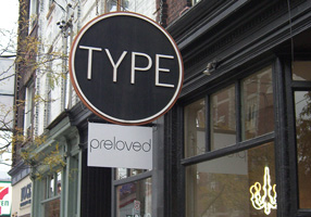
Toronto had its share of type and design; in fact, the Queen West neighborhood is officially designated the “Art + Design District,” something I’ve never seen in any other city. And who could resist a bookstore named “Type”? (The sign “pre-loved” is actually the name of the shop nextdoor.) That’s where I bought Robert Bringhurst’s new book about Canadian book design, The Surface of Meaning.

A bookstore called Type

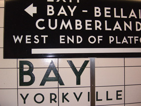
Toronto subway signage

[Photos: left, Alice Taylor (top), Cory Doctorow holding Poesy (middle), brain pumpkin as table centerpiece (bottom); above, signage on the street (top) and in the subway (bottom).]

Microsoft typography

Published

After more than eight years of working for myself, I’ve just taken a job in the typography group at Microsoft. The focus of the team is on providing fonts for all of Microsoft’s markets around the world, in whatever language or writing system, though I also hope to have some influence on how fonts are used – i.e., typography.

“In any case,” as I said to some friends, “it looks like we’ll be staying in Seattle for the foreseeable future.” Eileen and I had been thinking about moving back to San Francisco, which we also consider home, and I had looked at a couple of possibilities in the Bay Area. “Well, unless President Obama asks me to become Minister of Typography.”

Okay, that may be just a riff, but in reality I think it would be a good thing to have a Secretary of Design, or someone with a similarly high level of government responsibility. (I’m tempted to call this Minister With Portfolio.) As I keep saying: since we live in a designed world, we might as well get good at it.

[Photo: Logos have a life cycle of their own, or at least their physical embodiments do. This broken sign, on the back side of a concrete slab in front of one of the buildings on the corporate campus, appealed to my love of missing, crumbling, or distressed lettering in the environment.]

Wooden wall of text

Published

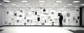
You may have seen photos of it in a design magazine or a book on graphic design in the Sixties: the 35-foot wall of words created by Lou Dorfsman and Herb Lubalin for the cafeteria of CBS television’s new corporate headquarters in 1966. The collage effect, and the lettering styles used, reflected the typographic aesthetic that was being popularized by Lubalin and Tom Carnase, which later bloomed into the establishment of ITC and Upper & lower case. Dorfsman conceived this “Gastrotypographicalassemblage” and art-directed its execution. He considers it his “Magnum Opus, his gift to the world.” It is certainly a monument to a particularly lively period in American graphic design.

But the 9-panel sculpture was removed and dumped in the late 1980s, after tastes had changed. The panels were salvaged by a New York designer, Nick Fasciano, and now the Center for Design Study, in Atlanta, is working to restore the damaged lettering and give the type wall a permanent home.

There’s a lot of restoration needed; time and neglect have taken their toll. Rick Anwyl, the Center’s interim executive director, estimates that it will take around $250,000 to fully restore the sculpture, “to see it as part of a permanent traveling exhibition on American Design, a tool for education and expanded awareness of the value of intelligently applied design.” The Center is a nonprofit foundation, and they’re actively soliciting donations to fund the restoration. Perhaps more importantly, they’re trying to think creatively about ways to approach raising the money. This is, obviously, not a small project.

The CBS cafeteria wall, in situ

Backwards rolled the apostrophes

Published

There’s a wonderful photo on SFGate today, in a set of images from the just-completed Republican National Convention. It’s a shot of a couple of stagehands carrying a big sign down to the floor of the auditorium, in preparation for the event. The sign consists of giant Optima letters stuck to a ladder-like frame; the cap-height is about half the height of one of the guys carrying it. Naturally, the phrase spelled out so grandly is “McCAIN ’08” – except that the apostrophe (which is about the length of the guy’s head) is backwards.

There’s something peculiarly wonderful about a typographic error that has its origins in automated typesetting (“smart quotes”) being embodied in such a large, hands-on, physical form and lugged down the stairs to be erected in front of a huge crowd in a convention hall.

Another road-sign attraction

Published

The photo to your left is of a highway sign on Interstate 90 westbound, a few miles outside of Seattle. It’s a fine example of the comprehensive street-numbering system of King County, and also of the fussiness of too many road and highway signs.

The next exit gives access to three different roads, each of them numbered. The important bit of information is the numbers of the roads themselves; the rest is dross. Why on earth did the sign-makers clutter up this freeway sign with junk like “st” and “th” and the periods in “SE”? It just distracts from the essential information, making it harder to get the message across in those brief moments a driver has while zooming down the highway.

The right way to do this sign would have been:

161 Ave SE
156 Ave SE
150 Ave SE

In fact, given the way streets are designated in King County, you could have dispensed with “Ave” and just said “161 SE” etc. But that might have offended the sensibilities of local drivers, who expect a little more deference to tradition. But the ordinal-number designations, and the utterly useless punctuation, are offenses against function and common sense.

I won’t comment on the oddness of a road system that has all three of these local streets coming off one freeway exit. That’s a problem for highway engineers, not signage designers.

The work of Chris Stern

Published

If you’re in Seattle this Thursday, don’t miss the opening of an exhibit of brilliantly creative letterpress printing by the late Chris Stern, at the Design Commission (121 Prefontaine Place S., near 4th & Yesler). Chris and his wife and partner, Jules Remedios Faye, formed Stern & Faye, Letterpress Printers, and founded their “printing farm” in the Skagit Valley north of Seattle. Each of them was a fine, and unusual, printer and artist before they met, and their work together has been amazing. When Chris died of cancer a year and a half ago, many of us lost a friend and we all lost an original talent.

The exhibit is in several parts: in addition to Chris’s printed work, there will be photos and artifacts from the printing farm, and prints produced by friends, colleagues, and students of Chris and Jules’s, inspired by their work. Much of this will be for sale, to benefit Jules and help pay off Chris’s outstanding medical bills.

The opening runs from 5 to 10 p.m. (this is “First Thursday,” Seattle’s monthly arts walk in Pioneer Square). If you can’t make the opening, the exhibit will be accessible during business hours at the Design Commission for the rest of the month.

Yes, the exhibit includes a copy of the magnificent volume that Chris created from my little story “Roman Seattle.”

Update June 6:

I’ve posted a few photos from last night’s opening.

Six summer evenings of science fiction & fantasy

Published

Jacob McMurray does highly original design work. We just took delivery of this year’s publicity poster for the Clarion West Writers Workshop and its summer reading series (one reading a week by each of the six instructors during the grueling six-week workshop), and it’s gorgeous. You can see a tiny version of it over there, to your left. Jacob has been producing these silkscreened wonders for Clarion West for several years, each one more striking than the last. His day job, which takes up all his time, is as a senior curator at the Experience Music Project/Science Fiction Museum, in Seattle; in his copious spare time, he is co-publisher with Therese Littleton of the quirky small book publisher Payseur & Schmidt, which does little projects with high production values and high-texture materials. Somehow each year he finds time as well to do a poster for Clarion West.

Coalition of the orthogonal

Published

“But a designer is not a major industrialist,” says Bruce Sterling, science fiction writer and self-described “design ideologue,” in an interview about Torino, the northern Italian industrial city that has been designated the first World Design Capital. “A designer is usually somebody who is putting together a coalition of engineers and financiers, marketers, advertising people and consumers, who can think the thing through and make it more user-friendly, cheaper, modish and a little ahead of the game.

“So what the designer is bringing to the table is a new conception of the product, and the coalition he’s able to form by coming in orthogonally and resolving a lot of the issues. If you tear most manufactured objects apart, you’d be able to name the departments who put it together. [Looks at the audio recorder] ‘This is the electric engineering guy, this is the console guy, these are the optics guys, the marketing department insisted on putting this logo here, and the legal department put that warning there…’, et cetera. Whereas the designer can come in, melt these warring things together, get everybody on the same page, and come up with something that looks really great to someone who is not one of the gang.”

Bruce has a great ability to see how things connect; and to see how everything could be shaken up so it connects better.

I was, as far as I know, the first editor to publish Bruce Sterling on design, when I was editor and publisher of U&lc Online. I was creating a web-based companion to U&lc, and to do so I brought in a trio of rotating columnists: Olav Martin Kvern, Eileen Gunn, and Bruce Sterling – one each month, to synch up with the quarterly publishing schedule of the printed magazine. It seems today like an amazingly slow, leisurely schedule for an online publication, but at the time it made sense. You can still find some of Bruce’s columns, “Look at the Underside First,” although the design and formatting has changed, in the archives of the ITC website.

I like the notion of designers putting together coalitions; it matches the complex way in which design really happens. There’s always a big emphasis on design superstars, sort of the auteur theory of design, but in fact design is always collaborative.

Tramwise in Seattle

Published

Last December, Seattle’s new streetcar débuted, connecting downtown with the rapidly developing South Lake Union. This tram, like the development of South Lake Union itself, was the brainchild of Paul Allen, Microsoft co-founder. It was a cold winter day when the service began, but I managed to get there in time to ride the streetcar on the evening of its first day. I may also have seen the new streetcar line’s first drunk – an amiable drunk, to be sure, who was gently ushered off the car at a convenient stop.

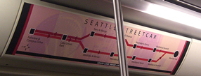
The line is quite simple – there and back again – but I was curious to see how the informational signage would be handled. It seems pretty good at letting you know where you are, and the stops on the street are fairly well marked.

Simple schematic of the line, displayed inside the car

The fare boxes were covered with a decorative paper wrapping, because for the first month everyone got to ride for free. Presumably now the fare boxes are in operation; I’ll have to go back downtown and see.