function jdb_page_navigation()
sPageSlug = blog
sPageTitle = easily amused
header:139:aPageArgs:page_title = easily amused
header:140:aPageArgs:section_title =
functions-johndberry:262:aPageArgs:page_title = easily amused
functions-johndberry:298:sPageTitle = easily amused
functions-johndberry:359:sPageTitle = easilyamused

easilyamused |

Archive for the category ‘architecture’

Eyemag

Published

I just got the latest issue of Dennis Letbetter’s Eyemag, his more or less quarterly series of magazine-size books that showcase different aspects of his long and notable career as a photographer. (I’m not sure I can say “long career” about someone who’s younger than I am, but what the hell. He’s been doing it for a long time. And it’s certainly notable.)

These are printed privately and distributed to a very limited circulation, but after some prodding Dennis did allow as how he would welcome subscriptions. I believe the rate for four issues is $200, but you should check with him. It might be worth your while. Meanwhile, you can view the contents of individual issues on the website.

Dennis’s photography is remarkable. It’s not showy; it’s just good. The one thing that might be considered an affectation is his occasional use of an extremely wide aspect ratio (6x17cm): but he puts it to good use. The current issue, no. 8, uses these long, narrow apertures to document the city of Florence. The first half of the images is vertical, like some of the narrow streets, while the second half is horizontal, as our eyes tend to see a streetscape.

The previous issue documented a full year of daily portraits of his friend and mentor René Fontaine. “Who would submit to portraiture, let alone a serial portrait which requires an involvement of a year?” asks Dennis in his thoughtful essay at the end of the volume. But René did: he sat for 365 portrait photographs, from from the summer of 1980 to the summer of 1981, no matter how he was feeling, what he was doing, or what the rest of the day might hold. And Dennis was there to record it. Occasionally René would don a whimsical hat (the portrait on the left has always been a favorite of mine, even before I knew its context), but mostly he just sat down in his everyday garb and looked patiently at the camera.

What might be the most unusual issue of Eyemag is no. 4, “The Haight Street Project.” During the same period when Dennis was shooting portraits of designers and artists in the San Francisco Bay Area using a big old-fashioned camera with glass plates, he was also inviting his neighbors in the upper Haight into his garage, which he had converted into a studio, to take their portraits on 4×5 color film in a thoroughly informal situation. These photos let the people who live in or pass through the Haight show themselves however they wish.

Each issue of Eyemag ends with an essay by someone notable and appropriate, and one by Dennis himself. In the current issue, the essay, “Eye Level” (in Italian, with an English translation), is by Andrea Ponsi. In the Haight Street Project issue, the guest essay is by Herbert Gold.

The striking “i” logo of Eyemag was designed for Dennis by the late Michael Harvey, a good friend and an amazing artist in the creation of letters. That i is recognizable as a Michael Harvey letter from a mile away.

(Note: Yes, it can be confusing, but Eyemag is entirely different from the excellent Eye magazine.)

[Images (top to bottom): Covers of issues 1, 6, and 8, and portrait of René Fontaine, 21 March 1981. All images copyright by Dennis Letbetter.]

Back on the wall

Published

It’s gratifying to see, from a story on the TDC’s website, that the three-dimensional typographic mural that Lou Dorfsman constructed in 1966 for the cafeteria at CBS headquarters in New York City has finally found a permanent home.

As I wrote six years ago, the “Gastro­typographical­assemblage,” which a subsequent régime at CBS was ready to junk, got saved thanks to the efforts of NYC designer Nicholas Fasciano, and was given a temporary home at the Center for Design Study in Atlanta, while funds were being raised to preserve and restore the crumbling masterpiece.

Now, as you can see from this short video, it has been lovingly restored and installed at the Culinary Institute of America, in Hyde Park, New York. Sounds like a visit to Hyde Park is called for.

ATypI Reykjavík 2011

Published

By all accounts, this year’s ATypI conference was a notable success. People kept coming up to me and telling me how much they were enjoying the event, how impressive the venue was, how well everything was organized, how intelligent the talks were, how much they liked the food. I kept telling them that I couldn’t take any credit for these things, that it was the organizers, both local and from ATypI, who had brought all this together. But it was certainly gratifying to hear.

The venue was spectacular: a brand-new building, Harpa, built right on the edge of the waterfront in the harbor of Reykjavík, which houses the national symphony as well as serving as a state-of-the-art conference center. Harpa’s irregular geometry and fishnet-over-glass windows all around highlighted the location and gave us a light, airy interior to inhabit and meet in. Its various meeting spaces were easy to configure for both talks and meals. And when the weather got bad – Sunday saw a good bit of wind and rain – it was satisfying to sit snug in Harpa and gaze out at the wind-whipped harbor.

There were fewer attendees than usual this year (no doubt a reflection of the dismal economy, and of the fact that while Reykjavík is easily accessible from both North America and Europe, it’s not exactly local to anyone but the Icelanders). But those who came were excited and stimulated, and came away talking about ideas.

How often do you have a head of state opening a typography conference? The President of Iceland, H.E. Ólafur Ragnar Grímsson, not only welcomed ATypI to Iceland but gave a twenty-minute talk about the Icelandic language and its typography – an intelligent, eloquent commentary that set a high standard and neatly prefaced our keynote speaker, Gunnlaugur SE Briem. Briem spoke wittily about type, letters, and language. Together, they kicked off the main conference brilliantly.

The theme of the Icelandic letter “eth” (ð, the voiced “th” sound found in English too) led naturally to a rich track of talks on other special characters, and on a wide range of non-Latin writing systems as well. We heard about the typography of Indic, Korean, Arabic, Mongolian, Chinese, and Khmer scripts, not to mention Danish, Irish, German, and Turkish letters within the Latin alphabet. The number of presentations on Indic typography on Sunday was particularly appreciated; and there was talk of making a proposal in a few years for holding an ATypI conference somewhere in India.

The structure this year seemed to work quite well: two preliminary days of workshops and technical and educational items, in two parallel tracks, followed by the official opening on Thursday night and then a single main track of programming on Friday, Saturday, and most of Sunday. This allowed for specialization in the preliminary days, but a common experience during the main conference – and no running around trying to switch from one track to another, or worrying about coordinating the timing between multiple simultaneous talks. Our program structure is partly determined by the venue, but I think we’ll try to repeat this success in the future.

Saturday night we clambered into city buses for a short ride out of town to a penthouse restaurant with wide views in all directions, where the restaurant’s staff were quickly accommodating when they discovered that we had more people for dinner than we had planned. That was followed by a crowded party back in town at the Icelandic Design Centre, and the usual dispersal to the bars of downtown Reykjavík.

The city is so small that it was easy to keep running into each other; at one point, one of the pleasant local bars was entirely filled with typographers. This also meant that no matter where you were staying, it wasn’t more than a walk away from the conference venue. So not only did Harpa provide excellent spaces for talking and mingling, but the city itself contributed to this lively interpersonal dynamic. Reykjavík is a very cozy capital.

For a flavor of the event, check out write-ups by Roger Black on his blog (“We are all one culture, here on Œŧħ. We’ve just taken different glyphs”) and by Dan Reynolds on ilovetypography (“Font editors & a book steal the show”), and scan the photos from various attendees on Flickr. (I’d be happy to hear of other reports that I’ve missed.) And take a look at the impressionistic, kaleidoscopic videos put together by a group of young Icelandic filmmakers who were roaming the conference, cameras in hand.

[Photos, top to bottom: the exterior of Harpa, with pool in front; the interior of Harpa, looking out; the bar before Saturday’s gala dinner; Thomas Phinney and Dawn Shaikh, at the pub; Mark Barratt and Dave Crossland, suitably out of focus, at another pub; Nick Sherman’s sartorial splendor (what, no hoodie?); and one of the images from the Typographer’s Guide to Iceland.]

Palimpsest

Published

As part of my ongoing collection of faded, broken, and disinherited lettering, I snapped this sign outside one of the Microsoft buildings that once belonged to a different company; you can see the faint spoor of an older building name in the holes below the current sign. Typographic entropy always interests me.

Imperial identity system unearthed

Published

(Lyons, France; 1 April 2010) – Researchers from the Institut internationale de l’identité romaine reported on Thursday that they had discovered fragments of what might be the first graphic-design manual in history. According to Jean-Claude Garamond-Jannon, head of the research team that excavated the find, it appears to be part of a manual for the presentation of the visual identity of the Roman Empire, dating from the early 2nd century A.D., during the reign of the emperor Trajan.

Although the unit system used is unclear, it appears that the Roman design administration had a thoroughly worked-out system for the measurement of inscriptional letters, which allowed them to cut inscriptions in matching lettering styles and in consistent sizes throughout the extremely widespread area under Roman rule.

“It was part of a visual identity that shouted ‘Rome!’,” said the Institut’s vice-director, Robespierre Danton, waving his arms enthusiastically at the partially excavated site. “They projected their power and their brand through a coordinated system of graphics that was instantly recognizable anywhere in the Mediterranean world.” The manual’s threadbare pages, according to Danton, specify exactly how the visual system should be implemented, with hints (barely legible) of extreme penalties for misuse of the empire’s intellectual property.

Although the fragments are in a poor state of preservation, one intriguing supplementary find has excited the interest of Dr. Giambattista Farben, a color researcher with the Institut. “This broken tablet, made of baked and polished tufa,” he says, “was found in close proximity to the manual itself. The tablet shows traces of a pattern of varying colors in lead-based paint, and scratches that may be notations to identify the different colors.” Dr. Farben was cautious, but he said that one theory of the colored tablet was that it constituted a color chart for painters who would turn the Romans’ marble walls into a panoply of colors. “It could be the earliest Pantone matching system,” admitted Dr. Farben.

Scholars from the University of Northern California dispute the primacy of the Roman identity system. Professor Chien Su-ma of UNC says that he has spent more than twenty years cataloging a collection of inscribed tortoise shells found under a pile of Han-dynasty tax receipts at Dunhuang, on the edge of the Taklamakan Desert, in China’s Gansu province. “The Han Dynasty had a clearly defined visual identity,” claims Prof. Chien, “and I believe these fragments, which were preserved at a major entrepot and outpost of empire, are a key to the system in its earliest form. They certainly predate this Western find by at least a century.”

[Photo: Detail of the lettering at the base of Trajan’s column, in Rome.]

Dublin & Birmingham, Nov. 2009

Published

Last month I went to Dublin, and to Birmingham and London in the UK – so soon after returning from Typ09 in Mexico that it felt as though I was just visiting this interesting city called “Seattle” for a brief time. The main purpose of the trip was to check out venues and talk to organizers for next year’s ATypI conference in Dublin, but the timing was occasioned by my being invited to speak at the one-day Typographic Horizons conference in Birmingham (and incidentally to stay an extra day and address the Chitterlings typographers’ dinner). We flew into and out of London, so we had a chance to see a small sampling of our friends in London, too.

Typographic Horizons was a small but enthusiastic conference, bringing together some of the energy of Birmingham’s design community. Caroline Archer and Alexandre Parré, and the hosts at the Birmingham Institute of Art and Design, have ambitions to make Birmingham a design center. London, of course, is the metropolis, but second-city Birmingham actually finds it easier to attract people from around the country, including London, according to Caroline. And besides, it’s got three-foot-high stone statues of John Baskerville’s punches.

Dublin Castle is a remarkable venue, well set up for conferences of all kinds; and Dublin is a delightful city. We certainly enjoyed the Guinness (“the wine of the country,” as James Joyce called it) and the comfortable pubs that served it. Clare Bell and Mary Ann Bolger, the principal organizers of next year’s conference, were well organized and cheerful hosts; so were their colleagues at the Dublin Institute of Technology, which will be hosting the conference. We saw only a small bit of the city, but enough to be sure that it will be a good site for ATypI; Irish culture is so intimately tied up with literature that naturally the theme of the conference is going to be “The Word.” On the last day, before Mary Ann headed off to the picket lines for a one-day public-service strike, we managed to see the National Print Museum, which is full of presses, type, and printing artifacts of all kinds, as well as printed matter, including one of the few remaining copies of the 1916 proclamation of the Irish Republic.

I’ve posted a few photos from the trip on Flickr. This is just a taste; I took lots of shots of the interior spaces of Dublin Castle, but most of them will only be of interest to the organizers. You’ll see them all – the spaces, that is – when you show up next September for the conference.

Mexico City, again

Published

Last week I was in Mexico City for several days of intense but productive meetings with the local organizers of Typ09, this year’s ATypI conference, which will be held there in October. It was almost exactly a year since Eileen and I first visited Mexico City, for preliminary meetings and to look at potential venues. This time we were nailing down the venues for the main conference program (at MIDE, the Museo Interactivo de Economía, a modern high-tech museum in a fully restored 18th-century monastery in the historic center of the city) and for the two days of hands-on workshops, TypeTech presentations, and master classes (at Anáhuac University, in the hills west of the city, which has extensive meeting and working space and a very well-maintained infrastructure).

We visited MIDE and figured out how to make best use of its spaces, and we also visited the nearby Palacio de Bellas Artes, where we should be able to hold the gala dinner, thanks to the support of the Mexican government’s minister of culture, Sergio Vela, whom we met at his office. We also visited the university’s beautiful hilltop campus and imagined creative ways to use its many classrooms, theaters, and display spaces. Since Mexico City’s traffic is legendarily awful (and Anáhuac is not, unfortunately, near any Metro line), the only way to hold events in two widely separated places will be to concentrate on one (the Centro Histórico) for three days, and the other (Anáhuac) for the rest. Hotels will be in the heart of the city, with bus transportation to the university on the workshop days. We are also planning some optional side-trips after the conference; the dates (October 26–30) were chosen not only to avoid the end of the rainy season but to segue neatly into visiting Oaxaca for the Day of the Dead celebrations (and also to see typographic and printing treasures there).

Typ09 will be the first ATypI conference held in Latin America; enthusiasm is running very high, not only in Mexico but in Argentina, Brazil, and other Latin American countries with typographic communities. Even in a time of economic collapse, the organizers expect a larger attendance than we have had at any ATypI conference in many years.

[Images, top to bottom: Roger Black, Barbara Jarzyna, Ricardo Salas, and Mónica Puigferrat in front of the Palacio de Bellas Artes; the Palacio de Bellas Artes; an arcade around the central courtyard at MIDE; detail of a shop sign in the Centro Histórico.]

Wooden wall of text

Published

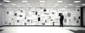
You may have seen photos of it in a design magazine or a book on graphic design in the Sixties: the 35-foot wall of words created by Lou Dorfsman and Herb Lubalin for the cafeteria of CBS television’s new corporate headquarters in 1966. The collage effect, and the lettering styles used, reflected the typographic aesthetic that was being popularized by Lubalin and Tom Carnase, which later bloomed into the establishment of ITC and Upper & lower case. Dorfsman conceived this “Gastrotypographicalassemblage” and art-directed its execution. He considers it his “Magnum Opus, his gift to the world.” It is certainly a monument to a particularly lively period in American graphic design.

But the 9-panel sculpture was removed and dumped in the late 1980s, after tastes had changed. The panels were salvaged by a New York designer, Nick Fasciano, and now the Center for Design Study, in Atlanta, is working to restore the damaged lettering and give the type wall a permanent home.

There’s a lot of restoration needed; time and neglect have taken their toll. Rick Anwyl, the Center’s interim executive director, estimates that it will take around $250,000 to fully restore the sculpture, “to see it as part of a permanent traveling exhibition on American Design, a tool for education and expanded awareness of the value of intelligently applied design.” The Center is a nonprofit foundation, and they’re actively soliciting donations to fund the restoration. Perhaps more importantly, they’re trying to think creatively about ways to approach raising the money. This is, obviously, not a small project.

The CBS cafeteria wall, in situ

Well spaced

Published

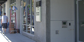
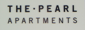
Yesterday I was walking past a newly built apartment building on Seattle’s Capitol Hill when I noticed three people huddled around the rectangular frame next to the front door. They were in the process of peeling off a big piece of blank cardboard that had been covering the sign underneath. They were laughing and joking: “We ought to have a camera to record this!” I stopped and watched as they got the cardboard off, revealing the new, three-dimensional lettering that identified the building as the Pearl apartments. “It opens tomorrow,” one of them said, “and the first tenants will be moving in.”

I didn’t have a camera with me, but I went back later and snapped a couple of pictures, because that sign seemed like a good example of clear, simple signage. The lettering on the sign was remarkably well spaced – not so loose that it would fail to hold together within the larger space when you’re standing right in front of it, yet loose enough so it wouldn’t squish together when you view it from an angle, as you would if you were walking along the sidewalk. There are so many poorly conceived and poorly executed bits of public signage on our buildings that it’s a pleasure to see a new one that’s done well.

Sidewalk in front of the Pearl apartments, Seattle

Close-up of the lettering on a Seattle apartment building

Legible in Poland

Published

My recent article for Eye magazine, “Legible in public space” (first image at left), has been translated into Polish and will be published in the next issue of the Polish magazine 2+3D (second image at left), a design quarterly published in Kraków and devoted to “grafika plus produkt.”

2+3D looks like an interesting magazine, and I’m pleased to be in it. Wish I could read Polish.