sPageSlug = blog
sPageTitle = easily amused
header:139:aPageArgs:page_title = easily amused
header:140:aPageArgs:section_title =
functions-johndberry:262:aPageArgs:page_title = easily amused
functions-johndberry:298:sPageTitle = easily amused
functions-johndberry:359:sPageTitle = easilyamused

easilyamused |

Archive for the category ‘architecture’

Cow down

Published

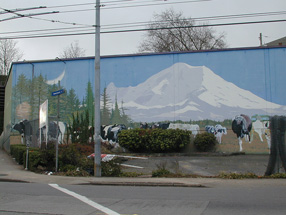
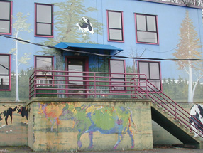
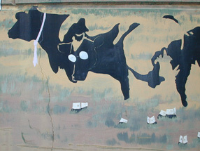
There was no typography involved, but there were a lot of different styles and schools of art. The mural was painted twenty years ago on the side of an utterly nondescript light-industrial building on East Madison Street in Seattle, the home of a locally owned icecream company called Fratelli’s. Its subject was cows, not unusual for an icecream manufacturer. But the cows that covered the side of the Fratelli’s building came in a collage of visual styles, each one reflecting the characteristics of a particular school of painting. There was the Cubist cow, the Impressionist cow, the Jackson Pollock cow. Looming behind them all was the outline of Mt. Rainier, the 14,000-foot volcano that dominates the horizon of Puget Sound. The forms interlocked and interacted in ironic and playful ways, all in the context of what, on the surface, appeared to be a pastoral scene. To walk or drive past this mural was to be reminded of how whimsically and creatively art can spring up.

Detail of cow mural

Fratelli’s went out of business years ago, and for quite some time the building has been awaiting demolition, to make way for some kind of redevelopment on the site. I’ve watched ivy grow over parts of the mural, and more recently large spray-painted graffiti tags appear on top of the lower cows. This past week, finally, the wreckers came, and the building was reduced to rubble.

Several years ago, when the building had already been abandoned for a while, I borrowed Eileen’s digital camera and took a bunch of pictures of the mural – close-ups of each cow, and each odd architectural feature (like the way the artist incorporated the protruding base of the concrete stairway into the mural), as well as some shots from across the street to capture the whole thing together.

Detail of cow mural

Detail of cow mural

Separated at concept?

Published

I just wrote an article for Eye, the excellent graphic-design magazine out of London, about type and lettering on public buildings. It’ll be in the spring issue, Eye 67. The starting point for this piece was Rem Koolhaas’s new Seattle Public Library, and the original ways in which really big type was being used for some of the internal signage. The article expanded far beyond there, of course. (It’s embarrassing to remember how long ago I first spoke with John Walters, Eye’s editor, about doing such a piece. It’s one of those subjects that just keeps expanding; I wouldn’t be surprised if it ended up as a book.)

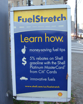
There’s a lot of smaller-scale signage in the library, too – the sort of ordinary informational stuff that everyone has to deal with. I took a bunch of photos of the SPL signage, in the course of my research. Only one of them ended up in the magazine, but I was intrigued by some of the side-roads and byways that didn’t get covered in a more general article. One unexpected juxtaposition is illustrated here: an informational sign from the library (left), which was free-standing at the top of the “books spiral,” SPL’s unique form of library stacks; and another free-standing sign (below), using the same typefaces and remarkably similar color and shapes, which I noticed next to the fuel pumps in my local gas station on Capitol Hill.

Futura sign at Seattle gas station

Coincidence? Well, yes, probably. But it’s a surprising bit of design echo, in two entirely different contexts that are only about a mile apart. Fill ’er up! Would you like a book with that?

Letras mexicanas

Published

We just got back last weekend from Mexico City, where I went to meet people and research potential venues for next year’s ATypI conference. (This year’s, as noted below, will be in St. Petersburg.) Although Roger Black, who has been the key figure in making this happen and was going to meet us there, had to cancel at the last minute because of a sudden dental emergency, we met with Ricardo Salas – director of the design school at Anáhuac University, very well-known graphic designer, and the driving force behind local organizing for the event. Ricardo organized a whirlwind tour of museums and theaters in the Centro Histórico, all of which seemed promising. He knew the principals of all the venues; indeed, he seemed to know virtually everyone in the city.

It was my first visit to Mexico City. Since I absentmindedly forgot to carry my digital camera with me on the day we trooped all around the Centro, I can’t display snapshots of any of the places we visited, such as the amazing Museo de Arte Popular (folk-art museum) or San Ildefonso with its early murals by Orozco, Rivera, and other famous Mexican muralistas. I could show you photos of a bunch of friends eating, drinking, talking, and laughing in the sun, but that would be cruel to those languishing in wintry northern climes.

Type design and typography are alive and very well in Mexico, although everyone there kept telling us that this was mostly a development of the last ten or twenty years. Yet Mexico has a very long printing history; the earliest printing press in the New World was, and is, in Mexico City. And of course design, graphic and otherwise, has been an essential element of Mexican artistic life.

Rooms at the top

Published

When I saw the photos of the door and room signage in the New York Times building, in John Hockenberry’s article in the current Metropolis, I wondered how easy it would be to find your way around in the newspaper’s new digs.

Signs on rooms and doors, designed by Pentagram, use images from the newspaper’s photo archives as backgrounds – a nice touch of context and tradition. Labels are superimposed over the black-and-white photos, in reversed-out industrial-grotesque lettering. Each room number contains several levels of information, encoded in an alphanumeric string: 20S2-234, for example, means room 234 in quadrant 2 of the south section of the 20th floor.

But if you’re actually walking around the 20th floor, trying to locate a particular office and wondering exactly where you are, does this undifferentiated string do the job? I haven’t been in the new Times building, so I don’t know the answer first-hand, but I’ve wandered the corridors of enough confusing office buildings to know the problem. Room numbers like this all tend to run together, at least at first glance – and first glance is exactly what you use to orient yourself in unfamiliar surroundings.

It seems that a simple bit of added contrast would help sort out the parts of the complicated number. Why not use weight or color to make the “S” or “N” stand out, which would also clearly separate the numbers of the floor from the number of the quadrant? Wouldn’t that make these numbers more functional?

As it stands, they seem excessively uniform and minimal, as though the photo were the most important part, not the information conveyed by the sign. They’re like a stereo remote where all the buttons look the same. Which one is fast forward? What floor am I on?

21st-century art on the Sea of Japan

Published

In August we visited Kanazawa, an old city on the Sea of Japan, where there’s a ruined castle, one of the three most celebrated gardens in Japan, and the brand-new, opened-in-February 21st Century Museum of Contemporary Art.

What got my attention was the museum. It’s circular in plan, with four entrances; there’s no “front,” and the museum’s spaces comprise a cavalcade of rooms, corridors, and open courtyards, all of them of different sizes, shapes, and even heights. It’s the most amazing interpenetration of outside and inside, public space and private space, that I’ve ever seen. The art was pretty good, too, but it was the museum itself that I’m glad I saw.

One of the permanent installations is the James Turrell Room, a huge square room like a Roman pluvium: open to the sky in the middle, with stone walls and bench seats and a stone floor with subtle, nearly invisible drainage for the runoff when it rains. And it did rain. When I first went into the Turrell Room, it was a humid, pre-storm day; the clouds ran overhead on the wind, with patches of blue sky appearing and disappearing behind them, and the air in the room was intensely humid. (So was the world outside.) A little while later, when I dragged Eileen and Ellen Datlow back to see the Turrell Room, it had rained; the floor was wet, and a light after-storm sprinkle still fell through the wide square opening in the roof. In typical James Turrell style, extremely subtle banks of lights glowed behind the backs of the side-benches, tinting the walls a slowly-changing range of pastels, which added to the luminous effect. It was a peculiar form of site-specific magic.

One of the two current exhibits was created for the Kanazawa museum, although the artist was from the UK: Grayson Perry’s “My Civilization” presents a kaleidoscopic overview of Perry’s transgressive work, in a form created expressly for this venue. The show opened in Kanazawa, and only later would it head off to London. While Perry’s drawing and ceramic skills impressed me, and he struck me as a wonderfully disruptive kind of artist, it remained the museum itself that pleased me more than any of the art within it.

The interior spaces vary in height and shape and purpose; they’re intertwined with corridors and courtyards that are open to the air – and sometimes to the public, who otherwise have to pay an admission fee for the main exhibits. That interpenetration is at the heart of the Kanazawa museum: literally as well as intellectually.

The museum even uses a schematic of its circular layout as its logo. At the museum shop, I picked up a nicely patterned orange-and-white neck cloth (one of those necessities of Japan’s hot, humid summers) with the logo worked into its design; it served me well, both practically and as an image of the museum, until I left it on the Gatwick Express, three weeks later and a world away.

Although Kanazawa has a long history, establishing a cutting edge art museum there is probably a bit like creating, say, a Spokane Museum of Contemporary Art, and endowing it with a huge budget and a global mission. (Not that I wouldn’t be happy to see such a thing.) It appeals to my anti-metropolitan bias, though my equally strong metropolitan bias just shakes its head. I applaud what looks to me like a heroic effort, and I’m glad to have had the chance to walk through this museum only months after its opening, before some of my Japanese acquaintances have even had a chance to visit it