function jdb_page_navigation()
sPageSlug = blog
sPageTitle = easily amused
header:139:aPageArgs:page_title = easily amused
header:140:aPageArgs:section_title =
functions-johndberry:262:aPageArgs:page_title = easily amused
functions-johndberry:298:sPageTitle = easily amused
functions-johndberry:359:sPageTitle = easilyamused

easilyamused |

Archive for the category ‘letters’

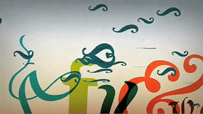
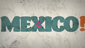
Mexico! the heart of the letter, animated

Published

Last year, Gabriel Martínez Meave and his colleagues Isaías Loaiza Ramírez and Alfredo Lezama Osorio created a dramatic short video about Mexico and typography, which was first seen at ATypI 2008 in St. Petersburg when Roger Black and Ricardo Salas presented the 2009 ATypI conference, Typ09, for Mexico City. This animated video is now up on YouTube, where you can see it for yourself. (Warning: contains music.)

Typ09, the 2009 ATypI conference | Mexico City | October 26–30, 2009

Mexico Typ09 video

Mexico Typ09 video

Mexico Typ09 video

Alphabets in motion

Published

Last week I stopped by the opening of an exhibit at Seattle Central Community College, showcasing the work of students from SCCC’s graphic-design course taught by Jennifer Kennard, “X Type: Experimental Typography.” There was some noteworthy work, and I suggested to Jennifer that there ought to be a website showing it. One of the more unusual works was a video by Sean Fischer, featuring dancers enacting, horizontally against a white-sheeted background, the letters of the alphabet. To see the video, check out this link, then scroll down until you find “Dancers Expirimental Type” (yes, with that spelling). It’s refreshing, amusing, and the dancers were obviously having a lot of fun. (Note: there’s music with the video.)

If you’re in Seattle, it’s worth visiting the atrium gallery at SCCC and checking out the show.

[At left: the letter C.]

Signage on the hoof

Published

I love seeing how things actually get made. This set of Flickr photos shows the shop that manufactures the highway signs for Washington State.

As successive photos reveal more of the underlying letters, and the visible part seems to be “ypo,” I find myself fantasizing that it will turn out to be spelling “Typography” – or perhaps the little-known Washington town of Typopolis. It is, however, “Keyport.” Oh well.

[Photo: Distributed by WSDOT under Creative Commons license.]

Guerrilla pixels

Published

In a daring daylight raid, elements of the Microsoft Typography team carried out an action targeted to advancing the cause of macro-typography and raising the visibility of fonts in the most literal way, says our anonymous informant.

Since the Microsoft Typography team, along with the rest of Windows International, was moving to a new building on the Microsoft corporate campus over the weekend of December 12, it seemed only appropriate to make a visible statement about the importance and ubiquity of type in the visual environment. Through the use of six-inch-square pixels cut out of sticky-backed black vinyl (a technique used previously for an installation at the Design Commission during TypeCon Seattle), these large-scale representations of bitmap characters from the Verdana and Georgia type families appeared without warning on the walls of the new building. This was reportedly achieved without a single X-acto-based industrial accident.

Verdana and Georgia were originally commissioned by Microsoft for onscreen reading of text. The way they were designed was the opposite of the usual process of designing type for the screen. Instead of creating outlines and then hinting the outlines (giving them rules to follow when turning into bitmaps at small sizes), type designer Matthew Carter started by designing the bitmaps – the end result that he wanted to see at each size – and then worked with hinting wizard Tom Rickner to create outlines and hinting that would achieve those shapes. The letters of the wordlet “typo” on the wall of Building 9 are taken from the bitmaps of 10pt Verdana and Georgia (in a mix of styles) at 96dpi. (Can you identify which letters are from which font, and in which style?)

The first versions of Verdana and Georgia were released in 1996; they now represent an early stage in the development of digital type at Microsoft. What will it look like when the MST commandos attempt to represent grayscale hinting and ClearType subpixel rendering at wall-size scale?

“No independent or detached existence”

Published

I had nothing new to bring with me to Seattle’s typographers’ pub last Tuesday, so I brought something old: my copy of Hermann Zapf’s little book, About Alphabets: Some marginal notes on type design by Hermann Zapf. I’ve always liked the ambiguity of that subtitle-cum-author’s-name: yes, the book is by Hermann Zapf, but it’s also true that the type designs discussed in it are all by Zapf as well. So it works either way.

It seemed appropriate to bring this particular book, since November 8 was Zapf’s 90th birthday. I’m not sure what kind of celebration was held in Darmstadt, but I know it was an anniversary that was appreciated in many corners of the world.

In Paul Standard’s preface to the 1960 book (my MIT Press paperback is the 1970 edition), he writes: “If the foregoing lines say much of books, it is because type designs have no independent or detached existence. Types are produced with great effort at great cost, produced for use in printed matter required for learning or study or for industrial or commercial needs. And HZ’s supreme concern, whether in writing or in printing, is never the single letter but the fusion of such letters into a working text.” Although digital type can be produced without the great cost inherent in the older industrial technology, a good text face – which is what Standard is talking about – still takes enormous effort and skill. And their purpose is still, as it always is, their weaving together into meaningful text.

Cyrillic goodies

Published

A little-noticed item was tucked into the goody bags handed out to members of the ATypI conference in St. Petersburg: a CD-ROM with a bright red label sporting the logo of the conference, plus titles, in Russian and English, saying: Первенцы гражданскйо печати / The first-borns of secular printing. The English subtitle explains it: Moscow editions 1708–1711. This little CD contains full scans of thirty-two books printed in Moscow in the very first years after Peter the Great’s drastic reform of the Russian alphabet.

“As they say in the supermarkets, an ‘unadvertised special’,” explained Maxim Zhukov on the ATypI members’ list. “A little gem hidden deep in the bag, just sitting there, waiting to be discovered.

“The idea of throwing into the ATypI’o8 goodie bag the CD-ROM prepared by Irina Fomenko and her friends of the Russian State Library (earlier known as Lenin Library) came very late in the game, two weeks before the conference opened. It turned out that (a) the ‘autorun’ thing only worked on IBM-compatibles, and (b) the introduction was in Russian. That was not surprising, given the usual target audience (domestic) of the RSL and its Rare Book Dept., and the OS most of the people in the world use (Windows). Translating, reformatting and reprogramming the CD-ROM would have taken forever, so we decided to offer the CD-ROM to the attendees of the SPb conference as is.”

The content is in Russian, but the images are wonderful no matter what language you read. And even if you’re viewing on a Mac and can’t take advantage of the “autorun” feature, it’s easy enough to just click on the links to the various PDFs, or open the PDFs directly, and browse through them. Among other things, this CD includes the complete printed specimen of the new Civil Type; we’re used to seeing an image of the first page, with Peter’s hand-scrawled corrections, but how many of us have seen the rest of the booklet? It’s here.

“Of course,” says Maxim, “the image resolution is not press quality. And yet, we never had it this good. For decades, all there was were the tenth-generation reproductions, heavily retouched, most of them coming from Abram Shitsgal books. And now… thirty-two Petrine books and other printed pieces scanned cover-to-cover! Isn’t that something.”

It is.

[Photos: top, interior spread from the first type specimen of the new Civil Type; below, a page from a 1710 book on geography, in the new type.]

Posters from Seattle & Tehran

Published

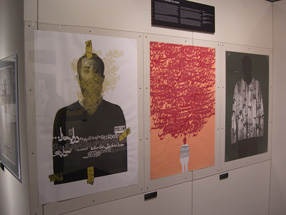
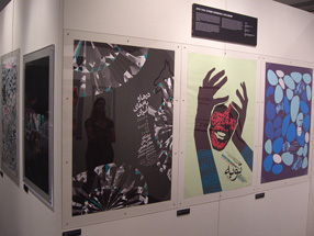
At Seattle’s Bumbershoot music and arts festival over Labor Day weekend, there was a remarkable exhibit: the Seattle–Tehran Poster Show. Curator Daniel R. Smith had gone to Tehran to investigate the graphic-design scene there, meeting as many local designers as he could, and he then put together this exhibition, which gives a parallax view of our two cultures. He paired each Iranian poster with one from Seattle, sometimes based on nothing more than a similar approach to letters or images or subject matter. Both cities have vibrant graphic-design communities, and both have created some wonderful posters.

The treatment of Arabic text is fascinating (that is, the Persian language, Farsi, which is written in the Arabic alphabet). Sometimes the letter forms are entirely deconstructed, given architectural or vegetal structure. When human faces or forms appear, they tend to be stylized, often intertwined with words. The Seattle posters, too, are interesting, but it’s clearly the work from Iran that grabs your attention.

Poster from the Seattle-Tehran poster show at Bumbershoot

Poster from the Seattle-Tehran poster show at Bumbershoot

Bumbershoot only lasts over the holiday weekend, but a slightly different version of the show, called “Seattle–Tehran Poster Show Remix,” is up at the Design Commission in downtown Seattle until October 15. I intend to go down and check it out.

Wooden wall of text

Published

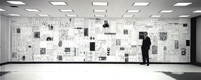
You may have seen photos of it in a design magazine or a book on graphic design in the Sixties: the 35-foot wall of words created by Lou Dorfsman and Herb Lubalin for the cafeteria of CBS television’s new corporate headquarters in 1966. The collage effect, and the lettering styles used, reflected the typographic aesthetic that was being popularized by Lubalin and Tom Carnase, which later bloomed into the establishment of ITC and Upper & lower case. Dorfsman conceived this “Gastrotypographicalassemblage” and art-directed its execution. He considers it his “Magnum Opus, his gift to the world.” It is certainly a monument to a particularly lively period in American graphic design.

But the 9-panel sculpture was removed and dumped in the late 1980s, after tastes had changed. The panels were salvaged by a New York designer, Nick Fasciano, and now the Center for Design Study, in Atlanta, is working to restore the damaged lettering and give the type wall a permanent home.

There’s a lot of restoration needed; time and neglect have taken their toll. Rick Anwyl, the Center’s interim executive director, estimates that it will take around $250,000 to fully restore the sculpture, “to see it as part of a permanent traveling exhibition on American Design, a tool for education and expanded awareness of the value of intelligently applied design.” The Center is a nonprofit foundation, and they’re actively soliciting donations to fund the restoration. Perhaps more importantly, they’re trying to think creatively about ways to approach raising the money. This is, obviously, not a small project.

The CBS cafeteria wall, in situ

Stern, the type

Published

When I first opened the package from P22 with their press release and the specimen booklet for the typeface Stern, I didn’t make the obvious connection. I grasped quickly that it was a new design by Jim Rimmer, notable British Columbia punchcutter and type designer; and I understood that he was doing something unique by issuing the face both as a digital font and in foundry type for hand-setting. (There have been typefaces issued in multiple formats before, such as Sabon, and digital typefaces have been printed by letterpress, but I don’t think anyone has spanned the technologies quite this widely before.)

The obvious connection was the name: Rimmer had named his typeface in honor of artist/printer Chris Stern, whose work spanned the same broad swath of typesetting technologies, and who visited Rimmer and learned from him. It’s a fitting tribute, one that Chris would have appreciated.

He might even have put it to use in a book. The typeface Stern is unusual – “an upright italic type designed for hand-set poetry and diverse digital use,” as Rimmer describes it. The angle of the slant is very slight, as befits an upright italic, but the italic forms of e, f, m, and n give it a calligraphic feel.The wide, two-storey a creates a tension with the italic forms and makes it look more like a text face; there is, however, an alternate, single-storey a for occasions when you want a more consistently italic look. The caps are upright, and come in four different heights: tall, mid-height, small Aldine, and small caps. It looks like mid-height is the default, or at least that’s what was used in the elegant little specimen booklet designed by Rich Kegler.

In metal, Stern is a 16pt font, a size suitable for spacious settings of poetry or short prose passages. It’s a light and delicate-looking typeface, in both metal and digital form; digitally, of course, that lightness can be scaled up for use at display sizes. But it’s designed for use at large text sizes, and in the right circumstances, with careful treatment, it could shine. At first it looks peculiar, but it certainly grows on you.

Incidentally, the exhibit of Chris Stern’s printed work at Design Commission in Seattle has stayed up through July, and many of the broadsides and prints by printer friends of Chris’s are still available for sale; all proceeds go to paying off the huge medical bills that don’t go away even when you die.

In the spirit of technology-spanning, you can play with bits of the Stern letter forms at a site called Typeisart, which uses interactive Flash to let you create your own collage out of elements of the typeface. Watch out – it’s addictive.

Zap!

Published

When I googled the name “Zapfest,” to find something I had written about the 2001 San Francisco celebration of calligraphic type, I was startled to find a link to something called “Zapfest 2008.” It turned out to be a one-day music festival in Oxford; it also turned out to be, for reasons unexplained, canceled. (Well, these things happen.) I don’t imagine the reasons had anything to do with possible confusion with a typographic festival that took place seven years ago, but it’s an odd juxtaposition. Clearly, for the organizers of the Oxford music event, the name breaks down into “Zap” plus “fest”; the combination “Zapf” would have been a coincidental one. But for those of us who know and admire the work of Hermann & Gudrun Zapf, it’s hard to imagine not immediately thinking of them and their work upon seeing such a name.

Incidentally, the book that came out of the original Zapfest exhibition is still available.