function jdb_page_navigation()
sPageSlug = blog
sPageTitle = easily amused
header:139:aPageArgs:page_title = easily amused
header:140:aPageArgs:section_title =
functions-johndberry:262:aPageArgs:page_title = easily amused
functions-johndberry:298:sPageTitle = easily amused
functions-johndberry:359:sPageTitle = easilyamused

easilyamused |

Archive for the category ‘fonts’

Typographic memories: designing for Copper Canyon

Published

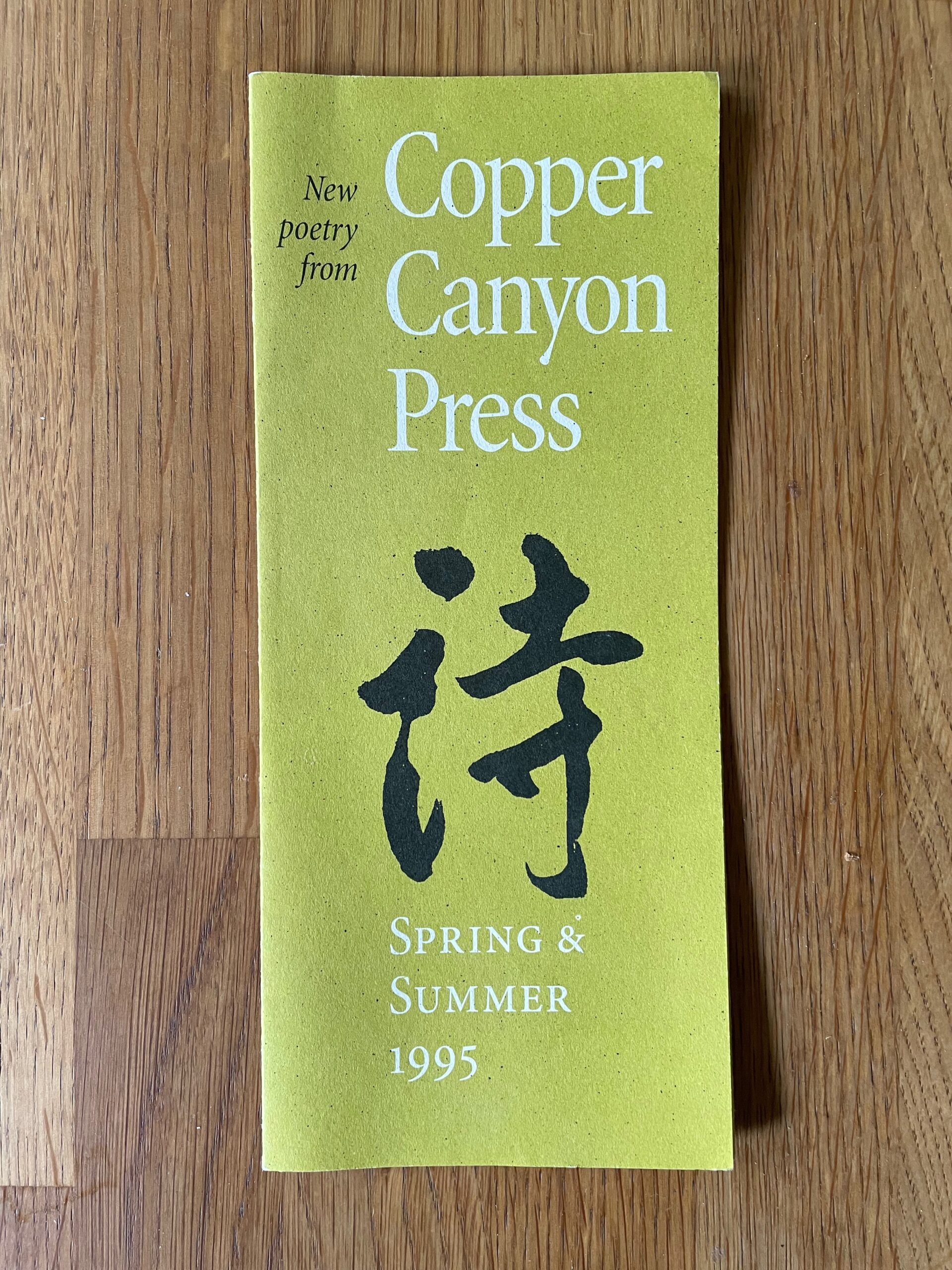
After a bit of a hiatus, I’ve come back to my sporadic typographic memoir, this time to talk about the years in the 1990s when I was the house designer for Copper Canyon Press. In that time, I designed not only the books but all the collateral material as well, trying to keep a consistent feel to everything that came out of the press while maintaining a variety of approaches to individual books.

This chapter is posted on Medium, as are all the previous chapters of the ongoing memoir project.

I still have all the files I created in producing those books, but I was working on a Mac before Apple adopted OS X, which fundamentally changed the file formats of the entire operating system. Unfortunately for future compatibility, all of those old files, none of which had filename extensions, now show up in the modern MacOS as “Unix executable files,” for lack of any other identification. Of course, the file information is still there; add the proper extension and the file type becomes recognizable. Whether it becomes openable, after something like a quarter century, is another question. But there are old Macs and old OSes and old versions of PageMaker. Somewhere.

In a few cases, I did create PDFs of my designs, either book covers or collateral like brochures. But any instances of Minion Multiple Master, the most advanced type technology of the time, which I used a lot, got lost in translation; current Adobe Acrobat technology doesn’t recognize the old MM fonts.

Such a waste of a brilliant technology! Such a short-sighted abandonment of sophisticated design. (Don’t get me started.)

Of course, with today’s variable fonts technology, you can get many of the same effects – and more. I just hope this tech doesn’t get left by the side of the information highway the way multiple-master formats did.

Really, isn’t the point to not lose information as techology advances? Including typographic and graphic-design technology. Our books need to be still readable in 500 years; or five years.

Typographer’s lunch 8: hey, look!

Published

I would like to direct your attention to a typographic element that is often ignored. Allow me to point out what makes it unique.

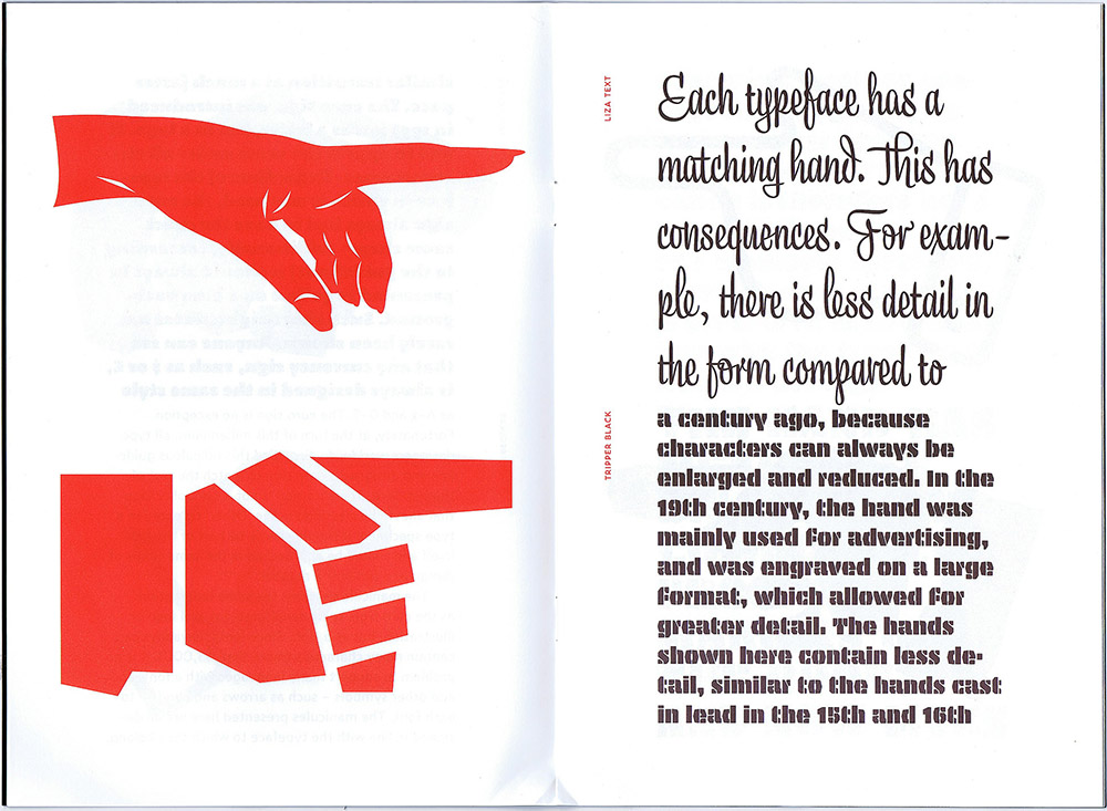
That element? The manicule. It’s also known as a fist, a hand, and by many other names, but it always takes the same basic form: a small image of a human hand, with the index finger pointing (usually to the right). Manicules date back to at least the Middle Ages, when it was quite common for readers to annotate their books, drawing a little hand in the margin to point out a particularly important or noteworthy passage. (“Manicule” comes from the Latin word for “little hand.”) Today they’re more likely to be part of a font, and to be used typographically, whether very large in a supermarket ad or at small size as an indicator of importance in a system of typographic hierarchy. They are often given a bright color to make them stand out. (Red is the traditional second color.)

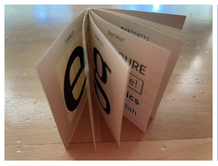
Manicules can take the style of the font they’re in, just like ampersands or currency symbols. And now, the Dutch/Finnish type studio Underware, whose typefaces range from one of my favorite book faces, Dolly, to the truly bonkers stencil typeface Plakato, has issued a small booklet they call a “Manicule specimen,” demonstrating their versatility at imagining new forms of manicules for every occasion.

This little limited-edition book has a short text running through it, changing typeface twice per page, facing enlarged manicules in the same typeface, two per page. It’s a tour-de-force in its own highly specific way. And it serves to remind us that we have manicules at our fingertips, in many digital fonts, and that sometimes it’s appropriate to use them.

[Image: page spread from Underware’s Manicule specimen.]

[Originally published on February 8, 2022, in PPN Post and Updates, the newsletter of the Publishing Professionals Network.]

Typographer’s lunch 6: the coming demise of PostScript fonts

Published

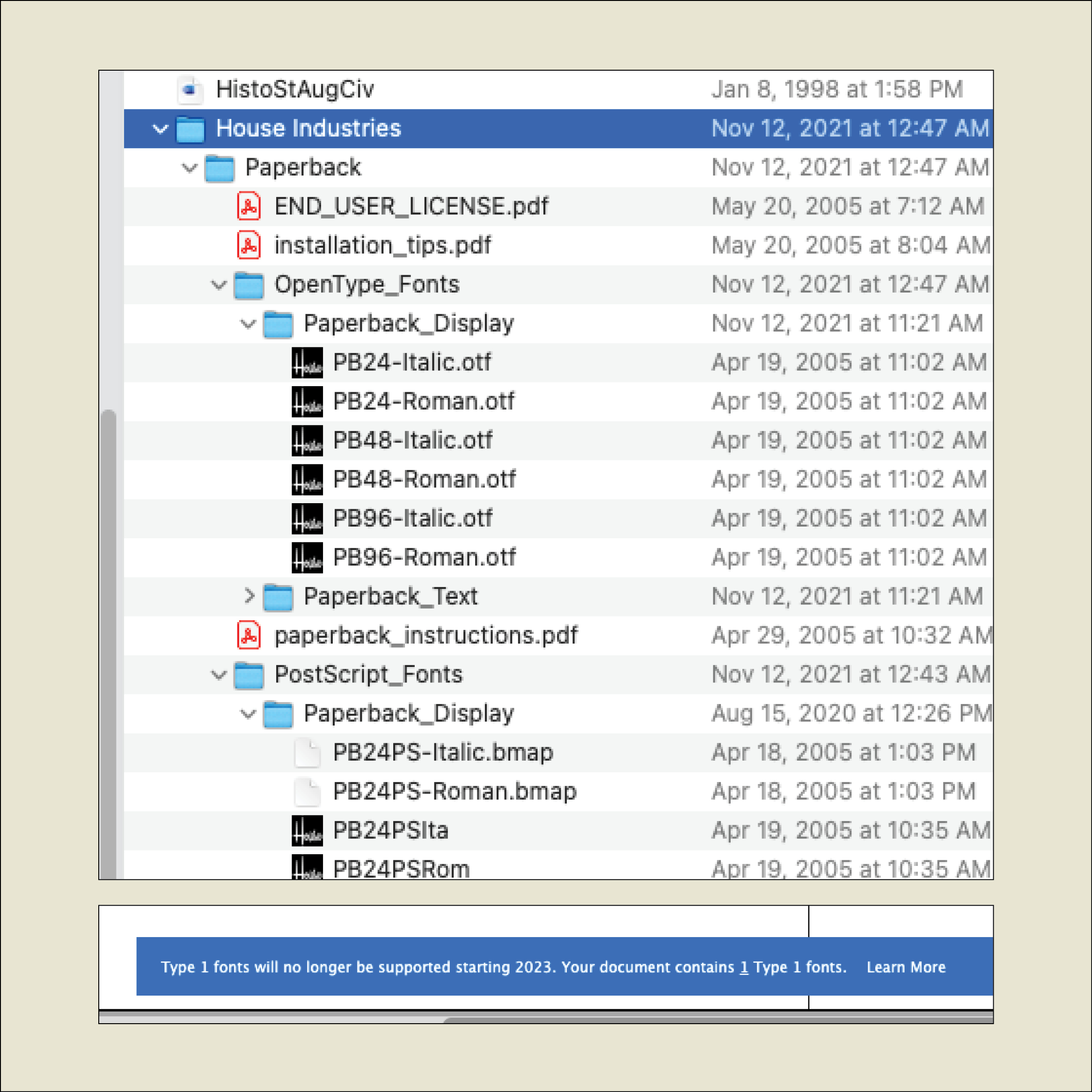
When I recently opened a book file that had been created several years ago, InDesign informed me, “Type 1 fonts will no longer be supported starting 2023. Your document contains 1 Type 1 fonts.” It was easy enough to replace the Type 1 font with an OpenType version of the same typeface, but what does this portend for book publishers with long lead times and large backlists?

I asked Thomas Phinney, the former CEO of FontLab and a former Product Manager for fonts at Adobe, what he thought about this. He told me he had just gotten off an hour-long call with an unnamed university press to discuss exactly this question.

The OpenType font format has been around for more than 20 years, and pretty much every digital font foundry upgraded its library to OpenType long ago. But not every user has upgraded their own type library. Anyone involved in publishing has probably made a big investment in fonts and is not in a hurry to make the same investment all over again.
The fact is that it’s time to bite that particular bullet. Thomas Phinney’s advice is to start thinking about your upgrade path right now: make a plan, budget for it, don’t leave it to the last minute.

If you subscribe to Adobe Fonts, you already have all those fonts in OpenType format. It makes sense, Phinney points out, to inventory the fonts you commonly use that are not in Adobe’s library and plan to upgrade those fonts first.

Incidentally, you don’t have to be actively using a Type 1 font to get that warning message when you open a document; if a Type 1 font is referenced in a paragraph or character style, even if you’re not using that style, it can trigger the warning.

Although there are apps for converting a Type 1 font into an OpenType font (notably FontLab’s TransType), the font’s license may not let you modify the font. Check with the font foundry to see what your options are.

[Originally published on December 1, 2021, in PPN Post and Updates, the newsletter of the Publishing Professionals Network.]

Typographer’s lunch 3: DJR’s Font of the Month Club

Published

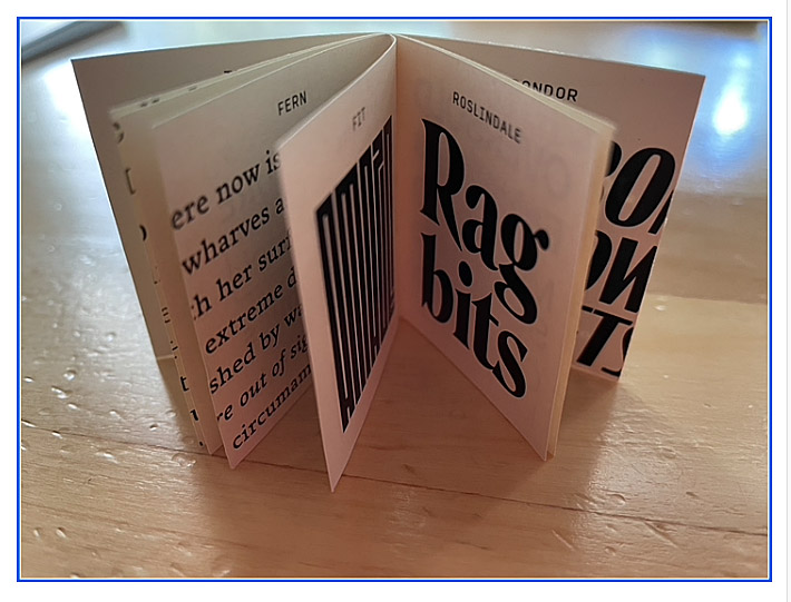
Need a font that’s strange and bonkers but also well made and usable? And a new one every month? Then join the Font of the Month Club.

Type designer David Jonathan Ross, better known as “DJR,” worked for nearly ten years at The Font Bureau, before starting his own independent digital type foundry in 2016. In 2018, he was awarded the Prix Charles Peignot, given by the Association Typographique Internationale (ATypI) to an outstanding type designer under the age of 35. You can find practical, versatile type families like Roslindale, Gimlet, and Forma at Type Network or through DJR’s own website. But what’s fascinating is when he goes wild, taking established typographic norms and forms and turning them inside out, to see what they might be capable of.

That’s what his Font of the Month Club is for. You can subscribe for a nominal fee ($6/month, or $2/month if you have a financial hardship), and every month Ross will send you a different, unpredictable new font. It might be something as pragmatic as Fern Text or as geometrically crazy as Megazoid, as spectacularly reverse-contrast as Tortellini or as unabashedly Victorian as Clavichord.

I have sometimes found ways to put some of these fonts to use the very month they are released. I’ve recently used Roslindale, Dattilo, Job Clarendon, and Rhododendron on book covers, for instance. It’s a delight to be able to send DJR a PDF that shows his typefaces in use (as I try to do whenever I’m using typefaces by a contemporary type designer). And it’s fun to try out freshly baked new fonts, fresh from the digital oven.

[Images: two snapshots of DJR’s tiny, tiny type specimen booklet.]

[Originally published on September 1, 2021, in PPN Post and Updates, the newsletter of the Publishing Professionals Network.]

Typographer’s lunch 2: Calibri

Published

You may have seen Microsoft’s recent announcement that they were releasing five new font families, one of which will end up replacing Calibri as the default font in Microsoft Office. “Calibri has been the default font for all things Microsoft since 2007,” the announcement read, “when it stepped in to replace Times New Roman across Microsoft Office. It has served us all well, but we believe it’s time to evolve.”

Originally Calibri, designed by Dutch type designer Luc(as) de Groot, wasn’t meant to be the new Office text face; that role would be given to Jelle Bosma’s sturdy serif typeface Cambria, which was designed to be a Times replacement. But Calibri worked so well that their roles got reversed.

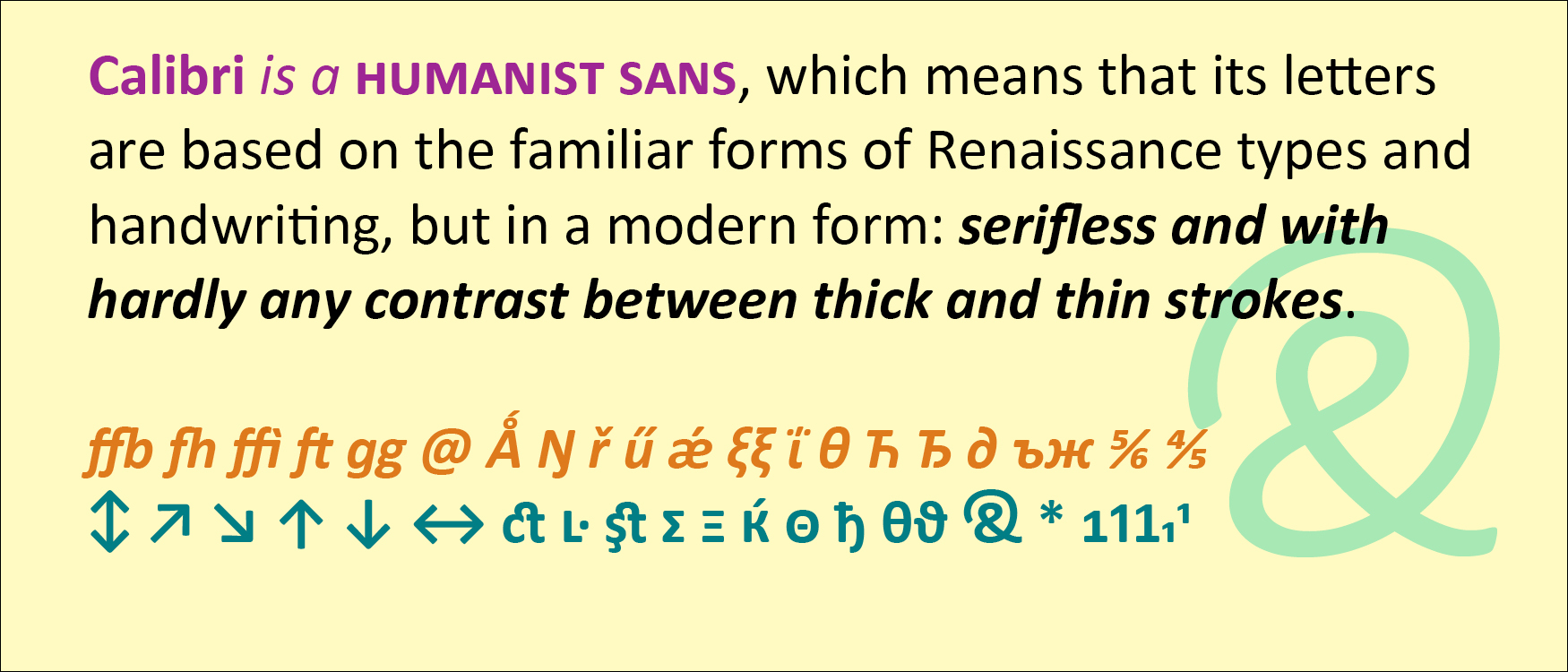
Calibri is a humanist sans, which means that its letters are based on the familiar forms of Renaissance types and handwriting, but in a modern form: serifless and with hardly any contrast between thick and thin strokes. Calibri also features softly rounded ends to its strokes, which gives it a friendly, informal feel even though it’s a classically structured typeface.

De Groot gave Calibri a lot of extra features, including small-caps numerals, direction arrows, an alternate g, a swash ampersand, and an unexpectedly wide range of ligatures. Like all of the ClearType fonts, Calibri was designed simultaneously for Latin, Greek, and Cyrillic.

Both Calibri and Cambria were part of the ClearType Font Collection, a suite of digital typefaces commissioned in 2002 to take advantage of Microsoft’s then-new ClearType technology. Calibri proved versatile and popular, even after the underlying technology was superseded by higher screen resolutions.

Interestingly, all five of the new proposed replacements for Calibri are sans serifs.

[Originally published on August 1, 2021, in PPN Post and Updates, the newsletter of the Publishing Professionals Network.]

Garamondiale

Published

There always seems to be another Garamond. Eight years ago I wrote about this proliferation, not for the first time, inspired by an article that James Felici had just written for Creativepro (“Will the Real Garamond Please Stand Up?”); in that blog post I reprinted a thumbnail version of the “Garamond family tree” that I had first put together twenty years earlier for an article for Aldus magazine about typeface revivals.
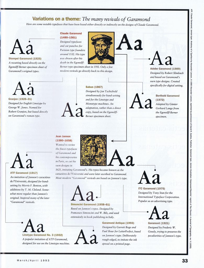
Garamond family tree

By 2012 there were many more Garamond versions than my attempt at a family tree had dealt with, notably Robert Slimbach’s masterful Garamond Premier Pro. And of course there are still more versions today, including a libre version available from Google Fonts, called EB Garamond, that is based on the 1592 Egenolff-Berner type specimen, and Mark van Bronkhorst’s faithful recent revival of the popular ATF Garamond. (Full disclosure: I wrote the promotional copy for digital ATF Garamond.)

I’m not quite prepared yet to attempt an update of that Garamond family tree, but it might be a project worth pursuing. The tree would certainly have many more branches now than it did almost thirty years ago. But the primary distinction remains: between type designs based on Claude Garamond’s original 16th-century punches, and those based on Jean Jannon’s more baroque 17th-century imitation, which for a long time were attributed to Garamond.

Another distinction appears in the various italics. Although Claude Garamond did cut italic types, many of the Garamond revivals eschew his design in favor of an italic based on his contemporary Robert Granjon’s italic types, which type critics often find more finished or more elegant. The italics cut by Jean Jannon have yet another style, even more baroque than his romans.

(“Baroque” may be the wrong word, given some of the very different types from the 17th century that have been described as baroque by type historians, but it seems to me to capture the slightly more ornate style of Jeannon’s types compared to Garamond’s.)

The most commonly used version today is undoubtedly Monotype Garamond, which is the “Garamond” font family installed with every Windows system, and which therefore is what most people think of when they see the name “Garamond.” Monotype Garamond is based on Jean Jannon’s 1615 types, and in its more interesting alternative (not the version shipped with Windows) its italic features ascending letters with varying angles, instead of the regularized slope more common in type revivals.

For practical use right now in digital typesetting, the most useful Garamonds are probably Garamond Premier Pro and ATF Garamond – one based on the original Garamond types, the other on the later Jannon iteration. Both include extensive OpenType features, and both come in multiple optical sizes, for optimal use at different sizes in text or display. Both families also include a Medium weight, slightly heavier than the Regular, for an alternative, more robust effect in running text.

In Wikipedia, I currently find myself referenced three times in the footnotes of the “Garamond” article – though not, interestingly enough, for my 2012 blog post or the Garamond family tree in Aldus magazine.

John D. Berry, ed. (2002). Language Culture Type: International Type Design in the Age of Unicode. ATypI. pp. 80–3. ISBN 978-1-932026-01-6. [The reference is to Gerry Leonidas’s article about the history of Greek type design, including the Greek types cut by Claude Garamond.]

Berry, John D. (10 March 2003). “The Next Sabon”. Creative Pro. Retrieved 9 October 2015.

Berry, John. “The Human Side of Sans Serif”. CreativePro. Retrieved 29 June 2016.

Type designers have never been able to resist playing with the letterforms of Garamond and Jannon. There are two sanserif versions that I know of, ITC Claude Sans (originally published by Letraset, designed by Alan Meeks) and František Štorm’s Jannon Sans (which is a more extensive six-weight family, to complement Štorm’s even more extensive Jannon type family). Yet another branch for the ever-growing family tree.

Hanging by a serif (again)

Published

The visual concept behind Hanging by a serif came from something I was playing with for our 2012–2013 holiday card. “The stockings were hung by the serifs with care…” read the front of the card; inside, the text continued, “…in hopes that typographers soon would be there.” On the front, a wild cacophony of huge serifs barged in from the outer edges, with little green Christmas-tree ornaments appended to a couple of them. The background was a pale-green image of a potted conifer, drawn in stained-glass-style, taken from an image-based “Design Font” that Phill Grimshaw had designed in the 1990s for ITC. (The inside also featured a pale background image from the same font, this time of a wrapped package.) It was fun, though I wondered what our non-typographer friends and family would make of it when we sent it out.

Later that year, I began experimenting with the concept, juxtaposing short snippets of text from my own writing with big details from various serifs. I found that I had a lot of statements or fragments on the subject of design that seemed to fit into this format. Eventually, these epigrams and serifs took the form of the first edition of the book Hanging by a serif.

That first edition caught the eye of Bertram Schmidt-Friderichs, whose Mainz-based company, Hermann Schmidt Verlag, has published so many excellent books on typography and design. Bertram wanted to do a German edition of my little booklet, which would be a nice calling card for his publishing program and might even sell a lot of copies. (It didn’t.)

Bertram’s approach to publishing is thorough, and he wanted to include notes about which typefaces all the serifs had come from. This sent me back down the rabbit hole into my own production process, since I had been working with truncated images for most of the design of the book, and I hadn’t kept very careful track of what typefaces my serifs had originally been attached to. It took quite a bit of retrospective detective work to find all my sources. (Hint: a couple of the images had been reversed.) In this sense, the German edition is more thorough than mine. It also has a couple of serifs or serif-like glyphs that are different from the ones I used.

But one of the epigrams bothered Bertram: “Most graphic designers never get more than rudimentary training in typography.” While true, this struck him as too negative, and he suggested coming up with a replacement. In the end, we went with a statement in German that translated as, “Typography is never an end in itself, it targets the eye of the beholder.” (Probably pithier in German.)

When it came time to do a new English edition of the book (since I was running out of copies of the original), I decided to make two changes. The serif I had used on the cover of the first edition was taken from Justin Howes’s ITC Founder’s Caslon, a digital reproduction of William Caslon’s original types in which Justin attempted to re-create the exact effect of the metal type printed on hand-made 18th-century paper. The outline, therefore, was rough. This roughness around the edges bothered a number of people, some of whom asked me if perhaps the image had been printed at too low a resolution. It hadn’t; this was precisely the effect that the typeface was designed to have, but blown up to extra-large size like this, it was distracting. So for the new edition I searched out a new serif that would work well on the cover. (The serif I chose is from Matthew Carter’s newly released type family for Morisawa, Role.)

And I did replace the problematic epigram that had bothered Bertram Schmidt-Friderichs, though not with the one we used in the German edition. As I had mentioned once in this blog, a quip of mine had been making the rounds of social media for some time, being quoted repeatedly out of context, and I thought it really belonged in this compendium. So if you turn to page 16 of the new edition, you’ll find this: “Only when the design fails does it draw attention to itself; when it succeeds, it’s invisible.” It really wanted to hang with the other serifs, and now it does.

Gerard Unger, Theory of Type Design

Published

I recently finished reading Gerard Unger’s final book, Theory of Type Design, which I bought at the ATypI conference in Antwerp last September and which Gerard signed at the book-launch event there. It was the last time I saw him, as he died of cancer only a couple of months later.

It took me quite a while to read through Theory, not because it’s at all difficult but because each time I finished a chapter, I wanted to put the book aside and savor what I had just read. It is not, after all, a book with a plot, like a novel; it is, however, a book with a theme and a clear development of that theme.

What Gerard Unger does in this book is nothing less than provide a comprehensive look at every aspect of the design of type, from its origins to the ways we design, read, and design with digital type today on a multitude of screens. Unger always thought about type systematically and observantly, looking for the connections and common elements that bind together such a disparate and unruly history. He was himself a consummate type designer, and a famously thoughtful and helpful teacher. You can hear his voice on every page.

Although his range as a designer was wide, you can often tell a Gerard Unger typeface at a glance; they have a commonality of approach and feel that transcends individual style. One element that I’ve noticed for many years is the way he would pare away what isn’t necessary, including connections within letters: he explored how much you could delete while keeping a typeface happily readable – a useful experiment when you design type for unfavorable conditions of printing or screen viewing. In a note (on page 196), he remarks, “The purest forms I have made as a type design are those of Decoder (1992).” Decoder was a purely experimental typeface (based on the shapes in his typeface Amerigo) issued as an early part of the FUSE project, to see what people would make of the detached yet recognizable parts of Latin letters.

I had hoped to have a chance to interview Gerard for the history of ATypI that I’m working on, since he had been closely involved for many years, but his deteriorating health made that impossible. Despite this, amazingly, he took the trouble after the conference to write me a short note, to let me know that he wouldn’t be able to help after all. That’s the kind of person Gerard Unger was.

Typography of the future: variable fonts

Published

I’ve just finally watched the Special OpenType session, ATypI 2016 Warsaw of the “Special OpenType Session” from the ATypI 2016 Warsaw in Warsaw in September. (Because of scheduling and flight conflicts, I didn’t arrive in Warsaw until the evening of that day, so I missed the live event. Not surprisingly, it was the talk of the town among attendees at the conference.) The discussion in the video is highly technical, but the upshot of this development is exciting.

Variable fonts” seems to be the name that everyone’s adopting for this new extension of the OpenType font format. What it means is that an entire range of variations to a basic type design can be contained in a single font: all the various styles from Extra Light to Extra Bold, for instance, and from Compressed to Extended. Instead of a super-family of separate font files, you can have one font that, conceivably, contains them all.

The presentation had representatives from Adobe, Microsoft, Apple, and Google, reflecting the fact that this is truly a cooperative effort. All four major companies (and several smaller ones) have committed to supporting and implementing this new standard. That’s a very important fact: usually, adventurous people come up with an ambitious new spec for wonderful typographic features, but the problems arrive when the developers of operating systems and applications don’t fully commit to supporting them. This time, from the very first, the companies that develop those apps and OSes are committed.

What that means is that, if it’s implemented properly, the new format will make it possible for font developers to create fonts that adapt to changing circumstances. For instance, in a responsive web layout, you might change the width of the text font as the width of the window gets narrower or wider. You could also change the weight subtly when the screen colors are reversed. These small, almost unnoticeable, but very important variations could make reading onscreen much more comfortable and natural.

This is a watershed. What it reminds me of is two different nodal points in the development of digital type: multiple master fonts, and web fonts. The introduction of variable fonts at this year’s ATypI conference has the same “Aha!” and “At last!” feeling that the introduction of the WOFF font format standard for web fonts had at Typ09, the 2009 ATypI conference in Mexico City. Both events mark the coming-together of a lot of effort and intelligent work to make a standard that can move the typographic world forward.

The history of multiple master fonts is sadder, and it points up the pitfalls of creating a good idea without getting buy-in from all the people who have to support it. The multiple-master font format was a breakthrough in digital type; with its flexible axes of variable designs, it made possible a nearly infinite variation along any of those design axes: a weight axis, a width axis, or (most promising of all) an optical-size axis, where the subtleties of the design would change slightly to be appropriate to different sizes of type.

But the multiple master technology, developed by Adobe, never made it into everyday use. The various Adobe application teams didn’t adopt it in any consistent or enthusiastic way, and it wasn’t adopted by other companies either. Instead of being incorporated into the default settings of users’ applications, giving them the best version of a font for each particular use, multiple master was relegated to the realm of “high-end typographers,” the experts who would know how to put it to use in airy, refined typographic projects. That’s not the way it should have worked; it should have been made part of the default behavior of fonts in every application. (Of course, users should have had controls available if they wanted to change the defaults or even turn it off; but the defaults should have been set to give users the very best, most appropriate typographic effects, since most users never make any changes to the defaults at all. It’s important to make the defaults as good as possible.)

Now it sounds like the new variable-fonts technology is going to be incorporated into the operating systems and the commonly used applications. If this really happens, it will improve typography at the everyday, ordinary, pragmatic level. And what that means is the improvement of communication.

I’m looking forward to seeing how this works in practice. And to putting it to use myself, and helping in any I can to improve and implement these new standards.

[Images: (left, top) Peter Constable speaking at the Special OpenType Session at ATypI Warsaw, September 2016; (left) schematic of the design variations of Adobe’s Kepler, designed by Robert Slimbach.]

Acumin & Bickham Script

Published

Now that’s an unusual pair of typefaces to mention together. But both the new Acumin family and the enlarged and updated Bickham Script Pro 3 have been released recently as part of the Adobe Originals program, and I wrote most of the background material on both of them. These were both projects that were a long time in development, so I’m pleased to see my own descriptive work in “print” at last.

Acumin & Bickham Script Pro 3 together

For Acumin, Robert Slimbach’s extensive neo-grotesque type family, I dug into the history of sans-serifs, trying to nail down exactly what makes one a “grotesque” or a “neo-grotesque,” and where the term came from. It was a great pleasure researching images, especially from the 19th century, in the collection of the Letterform Archive in San Francisco. I think we ended up showing more images of old sans-serif type than was strictly required, just because they looked so cool.

Most of my research on the history of the 18th-century English writing style known as “round hand” and George Bickham’s compendium of examples, The Universal Penman, was done at the Seattle Public Library or online, but at the Letterform Archive I also got to see Bickham’s rare earlier book, Penmanship In It’s [sic] Utmost Extent.

The Acumin website is a highly responsive one, coded by Nick Sherman; the Bickham site is more in the mold of Typekit’s usual sites, though it too consists of several parts.

[Images (left, top to bottom): from the Acumin site; Bickham Script Pro 3 illustration; a few 19th-century grotesque typefaces. Above: combining two very different type styles.]