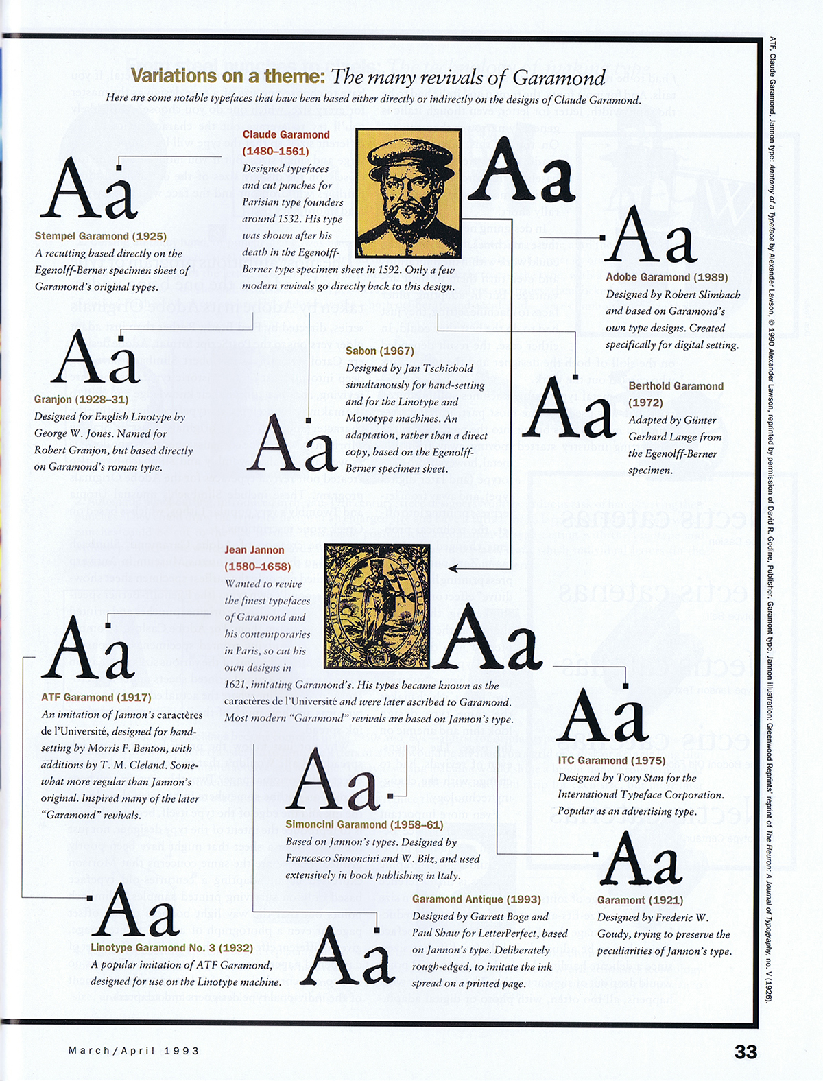
There always seems to be another Garamond. Eight years ago I wrote about this proliferation, not for the first time, inspired by an article that James Felici had just written for Creativepro (“Will the Real Garamond Please Stand Up?”); in that blog post I reprinted a thumbnail version of the “Garamond family tree” that I had first put together twenty years earlier for an article for Aldus magazine about typeface revivals.
By 2012 there were many more Garamond versions than my attempt at a family tree had dealt with, notably Robert Slimbach’s masterful Garamond Premier Pro. And of course there are still more versions today, including a libre version available from Google Fonts, called EB Garamond, that is based on the 1592 Egenolff-Berner type specimen, and Mark van Bronkhorst’s faithful recent revival of the popular ATF Garamond. (Full disclosure: I wrote the promotional copy for digital ATF Garamond.)
I’m not quite prepared yet to attempt an update of that Garamond family tree, but it might be a project worth pursuing. The tree would certainly have many more branches now than it did almost thirty years ago. But the primary distinction remains: between type designs based on Claude Garamond’s original 16th-century punches, and those based on Jean Jannon’s more baroque 17th-century imitation, which for a long time were attributed to Garamond.
Another distinction appears in the various italics. Although Claude Garamond did cut italic types, many of the Garamond revivals eschew his design in favor of an italic based on his contemporary Robert Granjon’s italic types, which type critics often find more finished or more elegant. The italics cut by Jean Jannon have yet another style, even more baroque than his romans.
(“Baroque” may be the wrong word, given some of the very different types from the 17th century that have been described as baroque by type historians, but it seems to me to capture the slightly more ornate style of Jeannon’s types compared to Garamond’s.)
The most commonly used version today is undoubtedly Monotype Garamond, which is the “Garamond” font family installed with every Windows system, and which therefore is what most people think of when they see the name “Garamond.” Monotype Garamond is based on Jean Jannon’s 1615 types, and in its more interesting alternative (not the version shipped with Windows) its italic features ascending letters with varying angles, instead of the regularized slope more common in type revivals.
For practical use right now in digital typesetting, the most useful Garamonds are probably Garamond Premier Pro and ATF Garamond – one based on the original Garamond types, the other on the later Jannon iteration. Both include extensive OpenType features, and both come in multiple optical sizes, for optimal use at different sizes in text or display. Both families also include a Medium weight, slightly heavier than the Regular, for an alternative, more robust effect in running text.
In Wikipedia, I currently find myself referenced three times in the footnotes of the “Garamond” article – though not, interestingly enough, for my 2012 blog post or the Garamond family tree in Aldus magazine.
John D. Berry, ed. (2002). Language Culture Type: International Type Design in the Age of Unicode. ATypI. pp. 80–3. ISBN 978-1-932026-01-6. [The reference is to Gerry Leonidas’s article about the history of Greek type design, including the Greek types cut by Claude Garamond.]
Berry, John D. (10 March 2003). “The Next Sabon”. Creative Pro. Retrieved 9 October 2015.
Berry, John. “The Human Side of Sans Serif”. CreativePro. Retrieved 29 June 2016.
Type designers have never been able to resist playing with the letterforms of Garamond and Jannon. There are two sanserif versions that I know of, ITC Claude Sans (originally published by Letraset, designed by Alan Meeks) and František Štorm’s Jannon Sans (which is a more extensive six-weight family, to complement Štorm’s even more extensive Jannon type family). Yet another branch for the ever-growing family tree.