function jdb_page_navigation()
sPageSlug = blog
sPageTitle = easily amused
header:139:aPageArgs:page_title = easily amused
header:140:aPageArgs:section_title =
functions-johndberry:262:aPageArgs:page_title = easily amused
functions-johndberry:298:sPageTitle = easily amused
functions-johndberry:359:sPageTitle = easilyamused

easilyamused |

Archive for the category ‘culture’

Typ09 happened

Published

I was too busy during Typ09, the 2009 ATypI conference in Mexico City, to write anything for this blog (or for much of anything else), but it wasn’t for lack of potential content. The conference was very well attended and full of ideas; everyone I’ve talked to seemed to think that the program was particularly stimulating, and the cultural and intellectual milieu was rich and intense.

Many thanks to the organizers of the conference – especially to Ricardo Salas, the mastermind of the whole event; to the indispensible Mónica Puigferrat and Paulina Rocha; to Marina Garone and Leonardo Vásquez, of the program and exhibitions committees, respectively; to Roger Black, who got the ball rolling; and to Barbara Jarzyna, ATypI’s conference organizer and executive director.

Although I didn’t have time to write anything, I did take a lot of photos. I posted an early batch to Flickr before the conference began, and later added quite a few more. Most of them even have captions! Here they are.

[Photos: Typ09 banner and posters at Anáhuac University (left); Mark Barratt & Simon Daniels at a sidewalk bar in the Centro Histórico (below, top, L–R); one of the multiple screens in the main program at MIDE (below, bottom).]

Mark Barratt & Simon Daniels

Main program at MIDE

Four score and three cheers

Published

Time to mark one of those arbitrary points on the calendar that mean so much to us. October 21 is the 80th birthday of one of the finest American writers, Ursula K. Le Guin. Her novels have embodied a thoughtfulness, a humanity, and a pragmatic sensibility that have resonated with me since I read the earliest ones when I was just a teenager. Her essays, beginning with The Language of the Night, edited by Susan Wood, joined the most intelligent conversations in print, the ongoing weaving of ideas and their telling that humans have been engaged in since they first had time to speculate.

She’s got a great laugh, too. Happy birthday, Ursula!

[Photo: Ursula Le Guin, by Eileen Gunn]

Typ09: very early registration

Published

Registration is now open for Typ09, the 2009 ATypI conference in Mexico City (26–30 October 2009). To register, go to the ATypI Store. The sooner you do this, the cheaper it will be: there’s a very early rate, an early rate, and a regular rate, depending on how close to the conference dates you register. The very early rate is good until Sept. 11.

The conference takes place during the last week of October, which is after the end of the rainy season in central Mexico, so the weather should (with any luck) be sunny and pleasant, while the recent rains will have washed some of Mexico City’s famous pollution out of the air. The timing also makes it extraordinarily easy to stay a few extra days and experience the the uniquely Mexican celebration of the Day of the Dead.

Typ09 has benefited from the enthusiastic support and involvement of the Mexican type community, and of typographers from throughout Latin America. Three full days of main-conference program, in a historic building at the heart of the city, will be followed by two days of TypeTech and hands-on workshops at the hilltop campus of Anáhuac University, near the city’s western edge. Both the lovely modern campus and Mexico City’s amazing Centro Histórico are inviting settings for a unique event.

¡Hasta la vista, en Mexico!

Mexico! the heart of the letter, animated

Published

Last year, Gabriel Martínez Meave and his colleagues Isaías Loaiza Ramírez and Alfredo Lezama Osorio created a dramatic short video about Mexico and typography, which was first seen at ATypI 2008 in St. Petersburg when Roger Black and Ricardo Salas presented the 2009 ATypI conference, Typ09, for Mexico City. This animated video is now up on YouTube, where you can see it for yourself. (Warning: contains music.)

Typ09, the 2009 ATypI conference | Mexico City | October 26–30, 2009

Mexico Typ09 video

Mexico Typ09 video

Mexico Typ09 video

Mexico City, again

Published

Last week I was in Mexico City for several days of intense but productive meetings with the local organizers of Typ09, this year’s ATypI conference, which will be held there in October. It was almost exactly a year since Eileen and I first visited Mexico City, for preliminary meetings and to look at potential venues. This time we were nailing down the venues for the main conference program (at MIDE, the Museo Interactivo de Economía, a modern high-tech museum in a fully restored 18th-century monastery in the historic center of the city) and for the two days of hands-on workshops, TypeTech presentations, and master classes (at Anáhuac University, in the hills west of the city, which has extensive meeting and working space and a very well-maintained infrastructure).

We visited MIDE and figured out how to make best use of its spaces, and we also visited the nearby Palacio de Bellas Artes, where we should be able to hold the gala dinner, thanks to the support of the Mexican government’s minister of culture, Sergio Vela, whom we met at his office. We also visited the university’s beautiful hilltop campus and imagined creative ways to use its many classrooms, theaters, and display spaces. Since Mexico City’s traffic is legendarily awful (and Anáhuac is not, unfortunately, near any Metro line), the only way to hold events in two widely separated places will be to concentrate on one (the Centro Histórico) for three days, and the other (Anáhuac) for the rest. Hotels will be in the heart of the city, with bus transportation to the university on the workshop days. We are also planning some optional side-trips after the conference; the dates (October 26–30) were chosen not only to avoid the end of the rainy season but to segue neatly into visiting Oaxaca for the Day of the Dead celebrations (and also to see typographic and printing treasures there).

Typ09 will be the first ATypI conference held in Latin America; enthusiasm is running very high, not only in Mexico but in Argentina, Brazil, and other Latin American countries with typographic communities. Even in a time of economic collapse, the organizers expect a larger attendance than we have had at any ATypI conference in many years.

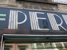
[Images, top to bottom: Roger Black, Barbara Jarzyna, Ricardo Salas, and Mónica Puigferrat in front of the Palacio de Bellas Artes; the Palacio de Bellas Artes; an arcade around the central courtyard at MIDE; detail of a shop sign in the Centro Histórico.]

Scrambled Eggs & Whiskey

Published

One of my favorite American poets, Hayden Carruth, died in September at the age of 87. I had the honor and the pleasure of designing two of his books, for Copper Canyon Press, as well as designing a new cover for a reissue of his Collected Shorter Poems. One of the new books I designed had the wonderfully evocative title quoted above (“It’s what we used to have for breakfast,” he said).

Recently, I finally got around to subscribing to the long-running magazine Poetry, and the first thing I read when my first issue arrived was not a poem but W.S. di Piero’s account of spending time with Hayden Carruth. Di Piero’s final anecdote, about Hayden going walkabout before a TV interview, particularly pleased me. I can’t claim to have known Hayden more than slightly, but I do recall an evening in New York City a few years ago when Michael Wiegers and I picked up Hayden at his hotel and took him downtown to the New School, where he was supposed to do a reading. He claimed it was going to be his last city reading (“I hate this place,” Mike remembers him saying), and perhaps it was; I haven’t checked.

The taxi we caught to take us downtown was driven by a classic New York cabbie, the kind of long-time driver who regaled us with tales of his encounters with savvy traffic cops over the years. (“But officer, there was no sign there telling me I couldn’t turn left.” “Sure, buddy, but you’ve been driving a long time; you know perfectly well that there used to be a sign there. I’m giving you a ticket.”) This character and his stories delighted Hayden.

At the New School, there was a noisy social gathering upstairs before the event, and after a while I noticed Hayden ducking out the fire door to the stairs. I figured I’d better follow him; I knew Mike had told me that he worried that Hayden would bolt. I found Hayden on the sidewalk out front, sitting on the curb and smoking a cigarette. I don’t smoke, but I joined him on the sidewalk, and we talked companionably for a while. When he was done with his cigarette, we just got up and took the elevator back up to the event, where Hayden gave his reading to great applause.

Posters from Seattle & Tehran

Published

At Seattle’s Bumbershoot music and arts festival over Labor Day weekend, there was a remarkable exhibit: the Seattle–Tehran Poster Show. Curator Daniel R. Smith had gone to Tehran to investigate the graphic-design scene there, meeting as many local designers as he could, and he then put together this exhibition, which gives a parallax view of our two cultures. He paired each Iranian poster with one from Seattle, sometimes based on nothing more than a similar approach to letters or images or subject matter. Both cities have vibrant graphic-design communities, and both have created some wonderful posters.

The treatment of Arabic text is fascinating (that is, the Persian language, Farsi, which is written in the Arabic alphabet). Sometimes the letter forms are entirely deconstructed, given architectural or vegetal structure. When human faces or forms appear, they tend to be stylized, often intertwined with words. The Seattle posters, too, are interesting, but it’s clearly the work from Iran that grabs your attention.

Poster from the Seattle-Tehran poster show at Bumbershoot

Poster from the Seattle-Tehran poster show at Bumbershoot

Bumbershoot only lasts over the holiday weekend, but a slightly different version of the show, called “Seattle–Tehran Poster Show Remix,” is up at the Design Commission in downtown Seattle until October 15. I intend to go down and check it out.

Wooden wall of text

Published

You may have seen photos of it in a design magazine or a book on graphic design in the Sixties: the 35-foot wall of words created by Lou Dorfsman and Herb Lubalin for the cafeteria of CBS television’s new corporate headquarters in 1966. The collage effect, and the lettering styles used, reflected the typographic aesthetic that was being popularized by Lubalin and Tom Carnase, which later bloomed into the establishment of ITC and Upper & lower case. Dorfsman conceived this “Gastrotypographicalassemblage” and art-directed its execution. He considers it his “Magnum Opus, his gift to the world.” It is certainly a monument to a particularly lively period in American graphic design.

But the 9-panel sculpture was removed and dumped in the late 1980s, after tastes had changed. The panels were salvaged by a New York designer, Nick Fasciano, and now the Center for Design Study, in Atlanta, is working to restore the damaged lettering and give the type wall a permanent home.

There’s a lot of restoration needed; time and neglect have taken their toll. Rick Anwyl, the Center’s interim executive director, estimates that it will take around $250,000 to fully restore the sculpture, “to see it as part of a permanent traveling exhibition on American Design, a tool for education and expanded awareness of the value of intelligently applied design.” The Center is a nonprofit foundation, and they’re actively soliciting donations to fund the restoration. Perhaps more importantly, they’re trying to think creatively about ways to approach raising the money. This is, obviously, not a small project.

The CBS cafeteria wall, in situ

Steampunk, steampunk everywhere

Published

What was once a recondite literary movement in the science-fiction field has blossomed into a popular-culture phenomenon, and as far as I can see it’s done so overnight. When the New York Times starts writing about “steampunk,” you know it’s attracting wider attention, and has probably already passed its peak. Written steampunk took a cyberpunk sensibility and injected it into a substrate of Victorian technology and sartorial style; it married our fascination with the brass-gears science epitomized by the Time Traveler’s machine in the 1960 movie The Time Machine with a noir-ish outsider take on 19th-century society. The extension of this into popular culture has been fun, though often silly. Some of the “steampunk” clothing appearing now just looks like retreads from The Wild, Wild West; and the application of clockwork skins to digital electronics is basically a matter of decoration.

This seems to have gotten up the nose of someone at Design Observer (that design website that I always intend to keep up with, but never do). Randy Nakamura wrote a screed about the humbug of steampunk; I noticed it when Bruce Sterling, who has some implication in the development of steampunk, quoted from it (“Design Observer Hates Steampunk”) and exclaimed, “Man, this is priceless. The backlash has begun!”

But my favorite bit, which makes this worth writing about, is a momentary fantasy that Bruce spun between quotes and comments: “Maybe Randy Nakamura would like ‘steampunk’ better if it was called ‘Eamespunk’ and involved making computers out of bent plywood.”

Cow down

Published

There was no typography involved, but there were a lot of different styles and schools of art. The mural was painted twenty years ago on the side of an utterly nondescript light-industrial building on East Madison Street in Seattle, the home of a locally owned icecream company called Fratelli’s. Its subject was cows, not unusual for an icecream manufacturer. But the cows that covered the side of the Fratelli’s building came in a collage of visual styles, each one reflecting the characteristics of a particular school of painting. There was the Cubist cow, the Impressionist cow, the Jackson Pollock cow. Looming behind them all was the outline of Mt. Rainier, the 14,000-foot volcano that dominates the horizon of Puget Sound. The forms interlocked and interacted in ironic and playful ways, all in the context of what, on the surface, appeared to be a pastoral scene. To walk or drive past this mural was to be reminded of how whimsically and creatively art can spring up.

Detail of cow mural

Fratelli’s went out of business years ago, and for quite some time the building has been awaiting demolition, to make way for some kind of redevelopment on the site. I’ve watched ivy grow over parts of the mural, and more recently large spray-painted graffiti tags appear on top of the lower cows. This past week, finally, the wreckers came, and the building was reduced to rubble.

Several years ago, when the building had already been abandoned for a while, I borrowed Eileen’s digital camera and took a bunch of pictures of the mural – close-ups of each cow, and each odd architectural feature (like the way the artist incorporated the protruding base of the concrete stairway into the mural), as well as some shots from across the street to capture the whole thing together.

Detail of cow mural

Detail of cow mural