function jdb_page_navigation()
sPageSlug = blog
sPageTitle = easily amused
header:139:aPageArgs:page_title = easily amused
header:140:aPageArgs:section_title =
functions-johndberry:262:aPageArgs:page_title = easily amused
functions-johndberry:298:sPageTitle = easily amused
functions-johndberry:359:sPageTitle = easilyamused

easilyamused |

Archive for the category ‘culture’

Ernest Callenbach

Published

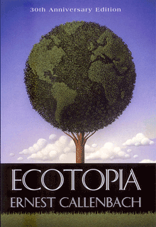
Ernest Callenbach died the other day, at the ripe old age of 83. (Doesn’t actually seem that ripe when I’ve got friends in their 90s, but it’s at least a respectable total.) Callenbach was the author of the seminal 1975 book Ecotopia, which certainly had an effect on my thinking and my experience of the ’70s.

Ecotopia wasn’t very good as a novel; I remember thinking at the time that it felt like an account by a college freshman of his discovery of a life wider and more exciting than the one he’d grown up in. (It reminded me of “encounter groups” that I experienced when I was a college freshman myself in the late ’60s.) But it carries you along, keeping you interested enough in the characters to enjoy the story, while mostly presenting the society of Ecotopia that he had envisioned and invented. That vision of a radically environmentally sustainable society was what got people excited in the later 1970s.

Not long after I moved to Seattle, I signed up for a class at the Experimental College, a sort of officially unofficial adjunct to the University of Washington, on the concepts of Ecotopia. In that class I met a lot of people who were involved in trying to create a sustainable counterculture and asking themselves serious questions about how to really live in a place in modern North America. It tied in with ideas that I’d been reading and thinking about through writers such as Wendell Berry and Gary Snyder, and with currents of thought that were rife in the Pacific Northwest at that time. The concept of “Ecotopia” was very satisfying: it was a country comprising Washington, Oregon, and Northern California that had supposedly seceded from the United States and set up an ecologically based society with very little communication with the rest of the US. The precept of the novel is that an American reporter is finally able to penetrate Ecotopia and make a journey of discovery there. The story is told as entries in his diary.

Ecotopia is a utopian novel; so is Ursula K. Le Guin’s The Dispossessed, which came out shortly before Ecotopia. Although they are miles apart in literary quality, I remember intending to write a comparative review of the two books, because they took different, perhaps complementary, approaches to creating a fictional utopia. Le Guin’s Annares was a world of scarcity; Ecotopia, by contrast, was a world of abundance (the rich economy and ecology of northern California and the Pacific Northwest). Comparing the utopias, if not the novels, would have been enlightening.

After taking that Experimental College class in Ecotopia, I was so moved by the energy and the excitement among such a bunch of creative people that I and two other students from the class decided to continue it by teaching it ourselves the next quarter; and when we had done that, a couple of our own students did the same, taking the class and its community to a third quarter. (I don’t think it went farther than that.) There was a ferment at that time in environmental and “alternative” lifestyles and ideas on the West Coast, and the connections made through that class fueled a lot of creative activity in Seattle and environs for several years to come. We certainly didn’t create any utopias, but the study formed some of our perspectives and assumptions about the land we lived in and how we intended to go forward in our lives. Much of it later fell by the wayside, but some of it has persisted.

I only met Ernest Callenbach once, when he came through Seattle and visited our class to see what he had wrought. He seemed an unassuming man, who had simply had some good ideas at the right time and succeeded in expressing them in a way that people responded to. Before he wrote Ecotopia, he was better known as a film critic and the editor of Film Quarterly magazine. I remember his telling us that what had led him to writing Ecotopia was living in Berkeley and simply asking himself questions about where the waste went to. When he followed its route (intellectually, I assume, not literally), he realized that he was discovering a whole way of looking at the world.

You might think that Ernest Callenbach and Ecotopia don’t have much to do with design, which is the ostensible subject of this blog. But in the larger sense that we live in a designed world and ought to get better at it, this is very much at the heart of design.

TypeCon surges ahead

Published

TypeCon 2011 – the first one run by SOTA on an all-volunteer basis – seemed to be a successful conference, and it was held in a fascinating city: New Orleans. The single-track program was well designed to engender conversation; in fact, individual presentations seemed to be speaking back and forth to each other, even when they had not be planned with that in mind. A lot of that conversation was about web fonts, design for the screen, and new forms of publishing. That’s what I spoke about myself, in a rambling talk full of questions and explorations (“all questions; no answers!”) about the problems and possibilities of designing books for a digital age. You won’t be surprised to hear that I embraced flexible design and adaptive layout as the best way to design any extended text for a variety of screens.

Everyone enjoyed New Orleans – the food, the music, the culture – though some attendees weren’t prepared for the binary contrast between the hot, steamy outdoors and the brutal air-conditioning in the hotel and in the bars and restaurants. The hotel was in the heart of the French Quarter, however, right on Bourbon Street; a fun place to be, but definitely also a tourist bubble. Bourbon Street seemed the least changed of any part of the city that I saw, since my one previous visit back in 1988 (also for a conference, also in the summer). I’m sure this is not only because the Quarter is on high ground and Katrina’s flood waters mostly didn’t reach that far.

I couldn’t, of course, make it to everything on the program; and as I didn’t arrive until Thursday afternoon, I wasn’t there for the pre-conference Education Forum or workshops. Presentations that stood out for me were Bill Berkson’s provocative “Great Readability Scandal”; Amelia Hugill-Fontenel’s well-crafted and artfully delivered “Artifacts All Around,” about some of the typographic curiosities in the Cary Collection at RIT; Otmar Hoefer’s affectionate tour of the collection of the Klingspor-Museum in Offenbach; Veronika Burian and José Scaglione on their joint type-making venture; and the “three guys in hats” (Scott Boms, Brian Warren, and Luke Dorny) on how designers use web fonts. Particularly notable was the presentation by three guys from the Cherokee Nation, about designing type for the Cherokee syllabary; this was a real-world application of type design that really matters. (“Every font that’s made makes your culture stronger.”) I also liked the tail end of Nick Sherman’s talk, filling in at the last minute for the absent David Berlow, though I missed much of Nick’s talk because I was too busy preparing for my own, which was up next. It was also fun hearing Matthew Carter, John Downer, and Akira Kobayashi do an onstage type crit of each other’s well-known typeface designs.

The heart of the event is always just meeting and talking with people, often at the evening social gatherings. Sometimes they were just a late-night party overlooking Bourbon Street, or an expedition to go “type busking” in Jackson Square in the hot summer night. TypeCon traditionally concludes with a special Sunday-evening event, after the close of the official programming; usually it’s something type-related, such as the visits to printing museums in Boston and Los Angeles, but this time it was pure tourist indulgence: a ride on the riverboat Natchez up and down the river, with music and drinks and commentary as we viewed the city and its environs from the middle of the Mississippi. The ship was by no means ours alone; we were just one among many groups aboard. But despite the cliché’d nature of the voyage, it proved to be a relaxing and enjoyable way to end a conference, and also to get a better sense of just where we were.

I got an even better idea on Tuesday, before catching an evening flight back to Seattle, when my friend Nevenah Smith, an artist who has lived in New Orleans for more than ten years, gave me a whirlwind tour of the city’s neighborhoods. It was great to get away from the Quarter and see something more down home. Even seeing parts of the devastated Lower Ninth Ward or the flooded-out sections near Lake Pontchartrain was a welcome reality check – and encouraging, when Nevenah pointed out to me the new houses being built there by volunteers for returning locals, and the people hanging out on their front porches the way they always used to. New Orleans has been devastated, especially the poorer neighborhoods, and its people treated shabbily. There’s no reason to expect that it won’t happen again; but there’s a resilience among those who’ve stayed or come back. I had prepared for this visit by watching Spike Lee’s powerful documentary When the Levees Broke and by reading Ned Sublette’s excellent book The World That Made New Orleans; I was trying to finish Ned’s more recent Year Before the Flood before I left for TypeCon, but I’m still reading it now at home. All of these gave me a little bit of insight into the context of the city I was visiting. (Even after the fact, I would recommend them to anyone who was in New Orleans for TypeCon.)

No venue was announced for next year’s TypeCon. Perhaps you’d like to put it on.

[Photos, top to bottom: what really goes on at a type conference (hint, hint); Ed Benguiat can’t escape his own typefaces; TypeCon attendees on the Natchez riverboat.]

Back to the Futura

Published

A couple of weeks ago, we drove down to Portland to see a play that promised to mix science fiction and typography. How could I resist a that combination? (“Are you sure you didn’t write this play?” asked a skeptical friend of mine when I told him about it.)

The play is Futura, written by Jordan Harrison, and directed in this performance by Kip Fagan at the Portland Center Stage. (I say “this performance” because the play was having a sort of parallax début: it opened simultaneously in Portland and Los Angeles, after being workshopped in 2009 at the JAW Playwrights’ Festival in Portland.)

The opening act is a lecture on typography – and a good one. In the best science-fiction tradition, you realize, as the lecture goes on, that there’s more to the context that you thought. When the lecturer whips out a genuine piece of paper, it is clearly meant to be a shock to her students. This is a world where physical books have been superseded, and banned, replaced by an agreed-upon digital library that keeps changing, and has no grounding in solid fact. The lecturer drops acerbic references to her late husband, who seems to have been murdered, apparently by the forces of imposed order.

The first act ends [spoiler here!] when the lecturer is suddenly kidnapped, blindfolded and hustled offstage.

The trouble with Futura is that it breaks down after that. The four actors seem good; it’s the writing that lets them down. The arguments between two of the main characters in the second act are true to life, the kind of half-thought-through emotional arguments that people really make. But the play itself doesn’t rise above them, or go any deeper. The logic falls apart at the slightest touch. The metaphor, reminiscent of Fahrenheit 451 and 1984, doesn’t really offer any more insight than a sort of worried extrapolation of Google’s attempt to digitize the world’s books.

The stage sets were wonderful. (I wonder what they were like in the LA performance.) I’m not at all sorry that I went to see this play; I’m just disappointed that it wasn’t better than it was. There’s a lot to be said about books, printing, digital literature, and society; but this play didn’t go beyond its own characters’ blinkered arguments.

Still: “Futura”? How could any typographer resist?

When disaster strikes

Published

As I have followed the news about the earthquake and tsunami disaster in northeastern Japan, naturally my thoughts have turned to the many people we met in both the typographic and science-fiction communities when Eileen and I visited Japan in 2007. Our closest Japanese friends, we found out quickly, were all right, as was everyone in their circle of friends. I certainly hope that all of the wonderful, generous people that I met in the Tokyo Type Directors Club, in the Japan Typography Association, at Idea magazine, and from other parts of the Japanese typographic community are safe and sound; and that all of their families and friends are, as well.

[Photo by Taro Yamamoto, 2007.]

Jack the printer at 90

Published

Sunday, December 19, was Jack Stauffacher’s ninetieth birthday, and more than 150 of his friends came to celebrate it at the San Francisco Center for the Book. It was a gathering that illuminated both the breadth of Jack’s knowledge and his influence, through the wide variety of talented, creative people who showed up for the occasion in the midst of a ferociously stormy winter weekend. (“It always rains on my birthday,” Jack told me the day before. “It’s December – what can I expect? The clouds to open, trumpets to sound, and the sun to shine?”)

In talking about Jack, I can’t do better than quote Chuck Byrne, who wrote twelve years ago: “Jack Stauffacher describes himself as a printer. It is a somewhat deceptive term for us today. His use of the term connects him to a five-hundred-year tradition of the entrepreneur-publisher-designer-typographer-printer. Like the best who made up that custom, he possesses a love of type and printing and the ability to convey meaningful words and thought.” (“Jack Stauffacher, Printer,” 1998; cribbed in this case from the AIGA’s webpage from when they awarded Jack the AIGA medal.)

Chuck was one of the organizers of this birthday event, which brought together people from all parts of the Bay Area’s book, printing, arts, and design communities (and a few of us from farther away). It would be impossible to tell you all the people who were there, even if my memory for names hadn’t turned into a sieve. It was certainly a celebration – not just of Jack Stauffacher but of the interlocking creative communities that he has influenced, and continues to influence.

As Andrew Hoyem, of Arion Press, said a couple of days afterward, “I ran into people there that I hadn’t seen in years!”

It was a printer’s occasion. In the course of the party, Jack approved the inking on a hand-set letterpress keepsake that he had designed for the occasion, and many people ran off copies. There were a number of other keepsakes distributed, too (I brought one that I had commissioned from Jack leNoir and Maura Shapley at Day Moon Press in Seattle), but the most spectacular was the single big foldout artifact created by Pat Reagh, featuring Jack’s favorite typeface, Kis.

Several of Jack’s friends, and his two daughters, spoke briefly, and Chuck Byrne unveiled the hand-carved alphabet in slate that Chris Stinehour had made for Jack.

When Jack himself took the microphone, he spoke of the ongoing conversation, of how he delights in asking deep questions of everyone he meets, finding out about new things and gaining new understanding. And he urged us to carry this conversation forward – then he put down the mike to let us get on with it.

After all, this was just a birthday party, a punctuation point in a long discourse that’s not done. At 90, Jack may have slowed down a bit – all right, he no longer plays bicycle polo – but he’s still a vigorous voice for excellence, intellectual curiosity, and attention to our cultural history. And he’s intensely interested in what we have to say.

[Photos: (top) keepsake that Day Moon Press created for me for the occasion, designed by Jack leNoir and printed by Maura Shapley; (2nd from top) Jack Stauffacher holding the stone plaque hand-carved by Chris Stinehour; (3rd from top) Jack and Patrick Reagh, holding up Pat’s Kis keepsake; (4th from top) the milling throng; (bottom) milling around a couple of the hand presses at the San Francisco Center for the Book.]

Update: Chuck Byrne has posted three pages of photos taken by him and Dennis Letbetter at the event. For your convenience and amusement – no captions!

When s changed

Published

The best use I’ve seen yet of Google Labs’ nifty new Books Ngram viewer is from Frank Chimero: “Rest in peace, medial s.” By doing a little intelligent searching on several words that would have used the long-s in earlier books but had lost that form in more recent times, he pinpointed when it changed: right around the year 1800.

Which is just about what I would have guessed, based on a thoroughly unscientific analysis of what I recall from books and publications I’ve seen from various periods. It also corresponds reasonably closely to the much more detailed summary given by James Mosley in his article “Long s,” which records not only changes in usage around the turn of the 19th century but also changes in the availability of the long-s in new type fonts.

[Image: long & short italic s, and a long-s/t ligature, from Adobe Jenson Light]

Imperial identity system unearthed

Published

(Lyons, France; 1 April 2010) – Researchers from the Institut internationale de l’identité romaine reported on Thursday that they had discovered fragments of what might be the first graphic-design manual in history. According to Jean-Claude Garamond-Jannon, head of the research team that excavated the find, it appears to be part of a manual for the presentation of the visual identity of the Roman Empire, dating from the early 2nd century A.D., during the reign of the emperor Trajan.

Although the unit system used is unclear, it appears that the Roman design administration had a thoroughly worked-out system for the measurement of inscriptional letters, which allowed them to cut inscriptions in matching lettering styles and in consistent sizes throughout the extremely widespread area under Roman rule.

“It was part of a visual identity that shouted ‘Rome!’,” said the Institut’s vice-director, Robespierre Danton, waving his arms enthusiastically at the partially excavated site. “They projected their power and their brand through a coordinated system of graphics that was instantly recognizable anywhere in the Mediterranean world.” The manual’s threadbare pages, according to Danton, specify exactly how the visual system should be implemented, with hints (barely legible) of extreme penalties for misuse of the empire’s intellectual property.

Although the fragments are in a poor state of preservation, one intriguing supplementary find has excited the interest of Dr. Giambattista Farben, a color researcher with the Institut. “This broken tablet, made of baked and polished tufa,” he says, “was found in close proximity to the manual itself. The tablet shows traces of a pattern of varying colors in lead-based paint, and scratches that may be notations to identify the different colors.” Dr. Farben was cautious, but he said that one theory of the colored tablet was that it constituted a color chart for painters who would turn the Romans’ marble walls into a panoply of colors. “It could be the earliest Pantone matching system,” admitted Dr. Farben.

Scholars from the University of Northern California dispute the primacy of the Roman identity system. Professor Chien Su-ma of UNC says that he has spent more than twenty years cataloging a collection of inscribed tortoise shells found under a pile of Han-dynasty tax receipts at Dunhuang, on the edge of the Taklamakan Desert, in China’s Gansu province. “The Han Dynasty had a clearly defined visual identity,” claims Prof. Chien, “and I believe these fragments, which were preserved at a major entrepot and outpost of empire, are a key to the system in its earliest form. They certainly predate this Western find by at least a century.”

[Photo: Detail of the lettering at the base of Trajan’s column, in Rome.]

Books alive!

Published

Truly remarkable piece of book-related animation from the New Zealand Book Council, “where books come to life.” The text takes on a life of its own through the literal medium of the book pages.

Thanks to Bruce Sterling for this. Following a link from his blog, I found this thoughtful description by an earlier poster, Arwen O’Reilly Griffith, on the site Craft: transforming traditional crafts: “This really is an extraordinary stop-motion animation from the New Zealand Book Council. It usually makes me sad to see books cut up, even for artistic purposes, but this is so masterfully done (and for such a good purpose!) that I can’t mind too much. Yay for books! (Via All About Papercutting.)” Well put.

Looks like the book in question was set ragged-right in Adobe Caslon, as far as I can tell. With title & author’s name in Gill Sans.

The irony of using voiceover and animation to embody such a silent, solitary experience as reading a book isn’t lost on me. But it’s a representation of the kind of visualization you go through in your own mind every time you read an engaging story. It’s just continuation of communication by other means.

It wasn’t good association, but it was free

Published

This morning I was trying to think of the name of the musicologist who compiled the famous 1952 Anthology of American Folk Music. “Harry Something-or-other,” I muttered to myself. The name I wanted was Harry Smith, but what my sieve-like brain came up with instead was Harry Carter. I immediately found myself imagining an alternate history in which noted typographic historian Harry Carter had gone out and conducted field recordings of ephemeral fonts. He would have hunted down an agèd and forgotten Garamond in the back country of northern France, a frail but feisty Bodoni in a village in the Apennines. Carter’s compilation would be credited with sparking the later type revival that swept the coffeehouses and small printshops of post-Eisenhauer America.

All right, my flight of fantasy probably owed more to another musicologist, Alan Lomax, and his father John, who actually did conduct field recordings to an extent that Harry Smith never did. But the imagination isn’t held back by petty fact.

Dublin & Birmingham, Nov. 2009

Published

Last month I went to Dublin, and to Birmingham and London in the UK – so soon after returning from Typ09 in Mexico that it felt as though I was just visiting this interesting city called “Seattle” for a brief time. The main purpose of the trip was to check out venues and talk to organizers for next year’s ATypI conference in Dublin, but the timing was occasioned by my being invited to speak at the one-day Typographic Horizons conference in Birmingham (and incidentally to stay an extra day and address the Chitterlings typographers’ dinner). We flew into and out of London, so we had a chance to see a small sampling of our friends in London, too.

Typographic Horizons was a small but enthusiastic conference, bringing together some of the energy of Birmingham’s design community. Caroline Archer and Alexandre Parré, and the hosts at the Birmingham Institute of Art and Design, have ambitions to make Birmingham a design center. London, of course, is the metropolis, but second-city Birmingham actually finds it easier to attract people from around the country, including London, according to Caroline. And besides, it’s got three-foot-high stone statues of John Baskerville’s punches.

Dublin Castle is a remarkable venue, well set up for conferences of all kinds; and Dublin is a delightful city. We certainly enjoyed the Guinness (“the wine of the country,” as James Joyce called it) and the comfortable pubs that served it. Clare Bell and Mary Ann Bolger, the principal organizers of next year’s conference, were well organized and cheerful hosts; so were their colleagues at the Dublin Institute of Technology, which will be hosting the conference. We saw only a small bit of the city, but enough to be sure that it will be a good site for ATypI; Irish culture is so intimately tied up with literature that naturally the theme of the conference is going to be “The Word.” On the last day, before Mary Ann headed off to the picket lines for a one-day public-service strike, we managed to see the National Print Museum, which is full of presses, type, and printing artifacts of all kinds, as well as printed matter, including one of the few remaining copies of the 1916 proclamation of the Irish Republic.

I’ve posted a few photos from the trip on Flickr. This is just a taste; I took lots of shots of the interior spaces of Dublin Castle, but most of them will only be of interest to the organizers. You’ll see them all – the spaces, that is – when you show up next September for the conference.