Jacob McMurray does highly original design work. We just took delivery of this year’s publicity poster for the Clarion West Writers Workshop and its summer reading series (one reading a week by each of the six instructors during the grueling six-week workshop), and it’s gorgeous. You can see a tiny version of it over there, to your left. Jacob has been producing these silkscreened wonders for Clarion West for several years, each one more striking than the last. His day job, which takes up all his time, is as a senior curator at the Experience Music Project/Science Fiction Museum, in Seattle; in his copious spare time, he is co-publisher with Therese Littleton of the quirky small book publisher Payseur & Schmidt, which does little projects with high production values and high-texture materials. Somehow each year he finds time as well to do a poster for Clarion West.
![]()
easilyamused |
Adventures in POD
Published
I’ve just recently gotten printed copies of two books that I designed, for different publishers, both printed by print-on-demand or extremely short-run printers. And I’ve been surprised and pleased by the results.
The main problem with POD printing has been in the paper and the binding – the manufacturing, essentially, rather than the printing. Too many POD books are printed on overly bright white paper, often with the grain running the wrong way (the grain should be parallel to the spine; otherwise, the pages tend to curl from top to bottom), and bound much too tightly for easy opening and reading. The binding is still not perfect (despite being what’s misleadingly called “perfect bound” – a poor excuse for properly sewn signatures), but it’s more flexible than it used to be; and once you know how the bound book will open, you can design your pages with sufficient space in the gutter so none of the text gets lost in the glue.
These two books both have personal connections for me: the first, The WisCon chronicles: volume 2 (Aqueduct Press), is co-edited by L. Timmel Duchamp and by my partner Eileen Gunn; the second, Pushing leaves towards the sun, is a first novel self-published by my nephew Mark L. Berry, who in his “real” life is a pilot for American Airlines. I designed and typeset both books, naturally. The WisCon Chronicles was printed by Applied Digital Printing, in Bellingham, Washington, who have done quite a few short-run books for the publisher, Aqueduct Press; I made specific requests about paper stock and how flexible the books would be, and they managed to make it happen. Pushing leaves was printed by BookMobile, which was recommended by Michael Wiegers at Copper Canyon Press (when Copper Canyon has to reprint a book with a short run, they often use BookMobile); not surprisingly, the result is quite readable. Both books were printed on off-white paper, so that the pages won’t glare brightly in your face while you’re reading. While neither book lies flat when it’s opened, as a book should, they’re no worse in this than most commercially printed books these days. What this means is that both books can be comfortably read – and that POD or short-run printing is no longer the spavined, jury-rigged approximation of real printing that it once was.
“You need to read this!”
Published
People are always asking me what I’ve been reading, whether it’s a conversational ice-breaker like “Read any good books lately?” or a real inquiry about recent intellectual activity. When someone asked me this recently, I found that I had a good, tripartite answer.
In the past year, I’ve read three remarkable nonfiction books: The stories of English, by David Crystal; The world that made New Orleans, by Ned Sublette; and 1491, by Charles C. Mann. Each of these books enlarged my understanding of my own world, and did so in a highly readable, engaged, intelligent manner.
The stories of English traces the history of our language, but does so while exploding the idea that there is only one English language, with all its variants being secondary. Nationalism began imposing a central language on people all over Europe in the 16th century (in France there was an explicit policy of translating what had once been written in Latin into French, and using the language as a tool of state expansion). In the 17th and 18th centuries, the idea of a “standard” language caught hold, with strenuous efforts made to regularize and regulate the national language, and to make one version of the language (usually what was spoken in the capital, or at court) the template for everyone else. Although the English proved too anarchic to set up a national Academy, the way the French had done, there were plenty of pundits in the 18th century trying desperately to do so. And they did succeed in imposing the notion of “correct” language – and by implication to make all other versions “incorrect.” The chapters of Crystal’s book about the English language before and after the Norman conquest are the most fascinating, though everything in the book puts our language into a very welcome and original perspective.
The world that made New Orleans: from Spanish silver to Congo Square does for American history what David Crystal’s book does for the English language: lifts it out of cant and doctrine and exposes its multifarious roots. Ned Sublette has written before about the complexities of New World culture, in Cuba and the its music, where he made it very clear that historically, the ports of Havana and New Orleans have been intertwined since they were founded. What he does here, superbly, is make us feel, not just know, how the cultures of Africa and of Latin America have been integral to the culture of North America all along – not just adjuncts or footnotes or incidental flavorings, but part and parcel of our culture. The world that Ned Sublette portrays is infinitely rich, and it’s ours.
1491: new revelations of the Americas before Columbus is probably the best-known of these three books; it’s had a high profile. I was a bit skeptical of it at first, expecting a woo-woo mishmash; but it’s nothing of the sort. It’s a well documented, carefully described investigation of some of the new scientific information that has emerged in just the last few years about the peoples of the New World before (and immediately after) the arrival of the Europeans. It upsets received notions and refuses a simplified catch-phrase portrayal of either the native cultures or the European cultures that colonized them. Some of what he writes about I already knew – such as the widespread use of fire as a way of modifying the growth of trees and other plants on the pre-Columbian eastern seaboard, which I learned about in reading the cultural geographer Carl Sauer – but much of it was new to me; much of it is simply new, coming from extremely recent research. My skepticism was assuaged when a friend of mine who is a specialist in pre-Columbian art spoke highly of this book and its accuracy. 1491 is not one of those “everything you know is wrong” crowd-pleasers; it’s an enrichment of our understanding, a book that leaves us with more than we thought we had.
Missing letters | 2
Published
This one is a more traditional sort of missing lettering: a faded sign on a wall in Brighton, which I took a photo of while I was there in September for the ATypI conference. Palimpsests within palimpsests.
David Berlow, type designer
Published
A few months ago, the Font Bureau published a small book about the type designs of David Berlow. The typefaces shown in this specimen-style booklet are only a subset of the larger Font Bureau type library, but it’s remarkable to realize just how many of those typefaces are Berlow’s work. Seeing them all in one place like this is eye-opening.
David Berlow has always been a consummate type designer, crafting new faces and new versions of old faces for any number of specific, practical uses. He may have done a few designs just for the hell of it, but it’s obvious that the great majority of these typefaces were created for a purpose, often for a particular client. (Many of them first appeared as proprietary designs for publications, later released to the general font-buying public.)
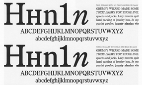
When Berlow and Roger Black founded the Font Bureau in 1989, it was aimed squarely at the realm of editorial design. In the nearly twenty years since then, anyone reading a random sample of U.S. publications has probably spent a good deal of their time reading typefaces designed by David Berlow. He has designed subtly varied series for newspaper production, exuberantly expansive families for headline and display use, and carefully honed text faces that – if they’re deployed well – never call attention to themselves in a page of text.
He has worked with a wide variety of collaborators, and navigated the shoals of changing technologies. Anyone who has heard David speak at a design conference knows that he’s funny, quirky, and opinionated. He’s also prolific: according to this booklet, the Font Bureau has developed “more than 300 new and revised type designs” in the past nineteen years, and a large percentage of them have been partly or wholly David Berlow’s work.
[Images | Above left: detail from the title page of the Berlow type-specimen book. Top: detail from a type-specimen page for Bureau Grot, the expanded family originally called Bureau Grotesque. Bottom: two of the five “grades” of the newspaper text face Bureau Roman.]
Missing letters | 1
Published
I’m a collector of images of vanished signs – not just the decades-old faded lettering on old brick buildings that’s so common around central cities, but the ephemeral remains of more recent signage. Sometimes it’s nothing more than the holes in the wall where molded letters were once attached. This is a form of instant obsolescence; it must appeal to my sense of passing time.
This shot is of a soon-to-be-torn-down building on Broadway in Seattle.
Eye makes a break for it
Published
John L. Walters, editor of Eye magazine in London, writes that Eye is about to go solo – leaving Haymarket, the media group that bought the magazine three years ago, and striking out on its own. Walters, along with Simon Esterson (Eye’s art director), and Hannah Tyson (business director at Esterson Associates), has set up an independent company, Eye Magazine Ltd, to publish the magazine, beginning with the new Spring issue (which, coincidentally, has an article of mine in it).
This sounds like good news for Eye. Any publishing venture is risky, but Eye is an established design magazine with a deservedly strong reputation and a loyal readership. Simon Esterson’s design has made it a pleasure to read (even with the perfect-binding that never allows the pages to lie flat – something that is inexplicably popular in magazines these days). The articles and reviews are thoughtful. I’ve been subscribing, with only one break, since the second issue. (It would have been the first issue, but I got my subscription in too late.) Design magazines tend to be seen as cuckoos in the nest of any large publishing group; they don’t fit in, and the owners never know quite what to do with them or how to promote them. I’m looking forward to seeing what Eye does now that it’s free to soar.
News! Papers! Live!
Published
Thursday’s column by Jon Carroll in the San Francisco Chronicle (which I read online at the excellent SFGate.com, since these days I’m usually not local and can’t pick up the Chron on the street) was all about newspapers. About how newspapers, which everyone says are dying, aren’t dying at all – although, he suggests, they might be signing up for a mutual suicide pact. As Jon Carroll points out, newspapers do make money – in fact, as Roger Black has pointed out, they make profit margins that would cause some other large businesses to break out in great big smiley faces all day long. (Check out the profit margin in supermarkets sometime.) It’s just that someone upstairs thinks they’re not making money – or not enough money.
As an editor/designer who has put together a book about the design of newspapers, not about their business, I’m no expert on the profit-and-loss sheets of our nation’s daily papers (not to mention those of other nations around the globe). But it’s perfectly obvious that newspapers are still a profitable business, overall; and also that they are a fundamental part of our information system – in other words, in how we think. The good ones are worth their weight in, well, paper (not such a cheap commodity these days), and even the mediocre ones offer an astonishing value for a pittance every day. Plus, they’re good for wrapping fish.
Newspapers: still not dead. Changing, yes; that’s usually a sign of what we call life.
Separated at concept?
Published
I just wrote an article for Eye, the excellent graphic-design magazine out of London, about type and lettering on public buildings. It’ll be in the spring issue, Eye 67. The starting point for this piece was Rem Koolhaas’s new Seattle Public Library, and the original ways in which really big type was being used for some of the internal signage. The article expanded far beyond there, of course. (It’s embarrassing to remember how long ago I first spoke with John Walters, Eye’s editor, about doing such a piece. It’s one of those subjects that just keeps expanding; I wouldn’t be surprised if it ended up as a book.)
There’s a lot of smaller-scale signage in the library, too – the sort of ordinary informational stuff that everyone has to deal with. I took a bunch of photos of the SPL signage, in the course of my research. Only one of them ended up in the magazine, but I was intrigued by some of the side-roads and byways that didn’t get covered in a more general article. One unexpected juxtaposition is illustrated here: an informational sign from the library (left), which was free-standing at the top of the “books spiral,” SPL’s unique form of library stacks; and another free-standing sign (below), using the same typefaces and remarkably similar color and shapes, which I noticed next to the fuel pumps in my local gas station on Capitol Hill.

Coincidence? Well, yes, probably. But it’s a surprising bit of design echo, in two entirely different contexts that are only about a mile apart. Fill ’er up! Would you like a book with that?
Big in L.A.
Published
The first I knew that I’d been quoted in a front-page article on the Image section of last Sunday’s Los Angeles Times was when I responded to a phone message on Monday morning from a potential client in LA. They’d read the article and decided I was their man. I knew that Times journalist Adam Tschorn had interviewed me by phone, while I was on the road at a conference in Florida, about the fonts used by Barack Obama and the other presidential candidates; I hadn’t realized, though, that the article had been published.
Now I find, thanks to a heads-up from Amy Redmond, that this article has been republished (in shortened form) by The Age in Melbourne. I guess this makes me Big in Australia, too. Wonder whether any of my Melbourne friends noticed.
Thanks, Adam. Nice article.