function jdb_page_navigation()
sPageSlug = blog
sPageTitle = easily amused
header:139:aPageArgs:page_title = easily amused
header:140:aPageArgs:section_title =
functions-johndberry:262:aPageArgs:page_title = easily amused
functions-johndberry:298:sPageTitle = easily amused
functions-johndberry:359:sPageTitle = easilyamused

easilyamused |

Ikea Verdanarama

Published

It’s amazing when fonts turn up in the news. As everyone in the type business has undoubtedly heard by now, Ikea decided to switch from one typeface to another for its catalogs and ads, and all hell broke loose on Twitter. You wouldn’t think that a typographic design change would generate that much heat, but lots of people (not all of them typographers or graphic designers) have expressed outrage – outrage! – at Ikea’s dropping its longstanding catalog typeface, a custom version of Futura, and replacing it with, of all things, Verdana. Shock! Horror! A web font!

Verdana was designed in the 1990s for Microsoft, developed specifically as a typeface for reading onscreen. The designer, Matthew Carter, has long experience of virtually every kind of typeface technology, and he brought that to bear on designing Verdana. Since text on a computer screen appears, of necessity, at pretty coarse resolution, the outlines of the letters have to be adapted somehow when rendering them at small sizes; there simply aren’t enough pixels available to reproduce the outline shapes perfectly. That’s where the art and craft of designing screen fonts comes in: making the most of those extreme limitations. In what was at the time a revolutionary turnabout, Carter first designed bitmapped letters for each of the target sizes, positioning pixels to get the most legible shapes he could; then he drew the outlines for the higher-resolution letters, based on the shapes of the lo-res bitmaps. Tom Rickner, a wizard of digital font technology, then created the “hints” that would tell the font software exactly how to distort the outlines at a particular size, when drawing a character on the screen, in order to achieve the ideal bitmap at that size.

One of the things that make Verdana legible onscreen, compared with a lot of other typefaces, is the generous space around the characters. There’s always a tendency among web designers to try to cram in as much material as possible in the space available, but that works against clarity and legibility. Without enough space between the letters, they all tend to run together. We’ve all seen this, much too frequently, on our computer screens. The clear, open shapes of Verdana’s letters can vary quite a bit from size to size at small text sizes onscreen, but one thing they have in common is that they’ve been given enough space to breathe.

Although Verdana was meant primarily for onscreen reading, it works surprisingly well on paper as well. It’s a simple, clean, unpretentious sans serif typeface, easy to read. I’ve used it for years as the typeface for manuscripts and drafts of anything I’m writing, because it’s easy to read both onscreen and on paper and it gets out of the way. I realized seven or eight years ago that Verdana had passed into general use, when I saw it on a billboard in San Francisco. (The same characteristics that make it legible onscreen may make it easy to read at a distance as you’re driving by.) I’ve never tried using Verdana in print, but I can imagine situations where I might want to.

It’s funny to see the choice of Verdana lambasted because it was designed for a different purpose. As Erik Spiekermann has pointed out, many of our most versatile typefaces were originally designed for one specific purpose, answering a particular set of constraints (Times New Roman, for instance, which was designed for the presses that printed The Times in 1931). Even Bell Centennial and Bell Gothic, both of which were designed for the listings in American telephone books, have been used successfully at huge display sizes by editorial designers with an eye for the unusual. Perhaps Verdana has unexpected uses as well.

I have no strong opinion about Ikea’s redesign. Certainly Verdana’s numerals are very clear and readable – even stylish, in a chunky, sturdy sort of way – and the numerals are what end up at the largest size on the pages of an Ikea catalog. And I alway felt that the Ikea version of Futura was a little too tightly spaced, though that’s not the fault of the typeface but of how it’s used.

One of the reasons Ikea chose Verdana is that it works across quite a lot of languages and scripts. The basic fonts include Greek and Cyrillic alongside the extended Latin alphabet; and Microsoft’s Japanese typeface Meiryo is based on Verdana, with the romaji (Latin letters) being essentially slightly revised and sharpened versions of Verdana’s designs. (As near as I can tell, from Ikea’s Japanese web pages, the Japanese catalog does use Meiryo, although with a different typeface for some text.)

Verdana may be about to become more versatile for both web and print use, since Ascender Corporation just announced that they are working with Matthew Carter and the Font Bureau to extend both the Verdana and the Georgia families with new weights and widths.

Whatever the merits of the case, what strikes me most forcefully in all of this is that a debate about which font to use could even be noticed, much less become a cause célèbre in the public consciousness. What typographic times we live in!

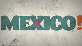
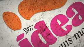
[Images: two details from Ikea’s U.S. website (top and middle); sample of some of the forthcoming new members of the Verdana and Georgia families.]

Typ09: very early registration

Published

Registration is now open for Typ09, the 2009 ATypI conference in Mexico City (26–30 October 2009). To register, go to the ATypI Store. The sooner you do this, the cheaper it will be: there’s a very early rate, an early rate, and a regular rate, depending on how close to the conference dates you register. The very early rate is good until Sept. 11.

The conference takes place during the last week of October, which is after the end of the rainy season in central Mexico, so the weather should (with any luck) be sunny and pleasant, while the recent rains will have washed some of Mexico City’s famous pollution out of the air. The timing also makes it extraordinarily easy to stay a few extra days and experience the the uniquely Mexican celebration of the Day of the Dead.

Typ09 has benefited from the enthusiastic support and involvement of the Mexican type community, and of typographers from throughout Latin America. Three full days of main-conference program, in a historic building at the heart of the city, will be followed by two days of TypeTech and hands-on workshops at the hilltop campus of Anáhuac University, near the city’s western edge. Both the lovely modern campus and Mexico City’s amazing Centro Histórico are inviting settings for a unique event.

¡Hasta la vista, en Mexico!

Swiss-style Latin in Montreal

Published

When I was in the Mile End neighborhood of Montreal a couple of weeks ago, I happened to spot this idiosyncratic logo on a local shop. First I noticed the van, pulling into a parking space outside the shop; then I realized that the shop itself was the business with the logo.

The letters are clearly a heavy, wide variation of Helvetica (or something modeled on it very closely), but someone has given these precise Swiss letters little tails, joining them up into a connected script. Nobody re-drew the letters; that’s obvious from the mismatch between the curl of the “t” and the much narrower joining stroke. (My guess is that the capital-L is really a cap-I with the joining stroke added.) It’s clever, even it’s mechanically rendered. And it’s certainly a strange juxtaposition of cultural tropes, all in a few letters on a shop awning and a delivery truck.

Logo on shop awning

Type designs from Mexico

Published

As called out recently on FontFeed, Mexican designer Isaías Loaiza Ramírez has posted on Flickr a bunch of images of Mexican typefaces in action, from the presentation first shown at TypeCon 2007 in Seattle. These images serve as an excellent fore-taste of the typographic exuberance that will be on display in Mexico City at the 2009 ATypI conference, Typ09.

Mexico! the heart of the letter, animated

Published

Last year, Gabriel Martínez Meave and his colleagues Isaías Loaiza Ramírez and Alfredo Lezama Osorio created a dramatic short video about Mexico and typography, which was first seen at ATypI 2008 in St. Petersburg when Roger Black and Ricardo Salas presented the 2009 ATypI conference, Typ09, for Mexico City. This animated video is now up on YouTube, where you can see it for yourself. (Warning: contains music.)

Typ09, the 2009 ATypI conference | Mexico City | October 26–30, 2009

Mexico Typ09 video

Mexico Typ09 video

Mexico Typ09 video

TypeCon2009

Published

Since Thursday, I’ve been at TypeCon Rhythm in Atlanta. It’s a far cry from that first TypeCon, in a motel near an office park in Westborough, Massachusetts. Although this year’s TypeCon is noticeably smaller than in recent years (everyone’s feeling the economic pinch), it’s been lively. And the weather hasn’t been as brutal as you might expect in Georgia in July.

The program has been varied and mostly engaging. Gerard Unger was here to receive the 2009 SOTA Typography Award – richly deserved, and greeted with a standing ovation. As always, he has been friendly and approachable. I missed the Type Crit, when he, Matthew Carter, Akira Kobayashi, and John Downer offered their critiques and commentary on typeface designs that were submitted to them, but it’s always a high point, even for those who aren’t type designers. Bruno Maag did a heartfelt rant on the importance of non-Latin type design (and the wide-open markets for new non-Latin typefaces). Shelley Gruendler told the story of Type Camp, the hands-on learning experience that she started in frustration at the teaching of type in Vancouver and that she is now taking around the world. Rick Anwyl gave a somewhat scattershot but moving account of the origins and the saving of the CBS typographic wall, the “gastrotypographicalassemblage” created by Lou Dorfsman and Herb Lubalin, which once graced the wall of the employee cafeteria at CBS headquarters in New York and is now being slowly restored at Atlanta’s Center for Design Study. Zeena Feldman spoke provocatively about the idea of how visual design contributes to the sense of a globalized “non-place” wherever you go. Heather Shaw gave an intriguing account of how she had taught web typography by having students figure out how to reproduce classic layouts of the New Typography using HTML and CSS, thus connecting contemporary technology with the revolutionary typography of eighty years ago.

It goes on tomorrow, kicking off with a two-hour panel on the hot topic of web fonts – how you can give web designers a way to use real typefaces without either turning them into graphic images or giving away digital fonts to everyone who views a web page.

TypeCon is one of the two major typographic events of the year (the other being ATypI). Both of them share at least one characteristic: no matter how stimulating the program may be, the heart of it all is the social and personal interactions, among old friends, current colleagues, and new acquaintances – who may in turn become old friends in future years. And sometimes you go off on a tangent: on Friday night, I ended up accompanying Paul Shaw and Frank Wildenberg to an Atlanta Braves baseball game (my first live baseball game in thirty years). It was a way to get a little sense of Atlanta beyond the vicinity of the conference hotel. (And, as it turned out, to see some fireworks.)

Next year’s TypeCon will be in Los Angeles. It’ll be worth being there.

[Photos: Hatch Show Print posters after Jim Sherradan’s keynote talk; opening slide at the presentation of the SOTA Typography Award to Gerard Unger; and two sculptures by June Corley made out of physical letters, from a gallery exhibit at the Grand Hyatt. More photographs here.]

Angles of acuteness

Published

This outdoor telephone box sits next to the entrance to one of the far-flung buildings on the Microsoft corporate campus. It’s a remarkable example of someone thinking about what angle you might be looking at a sign from. Viewed straight on, the lettering looks curiously wide and squat; it takes you a minute to figure out what it says, though it’s ultimately recognizable. The lettering style really comes into its own, however, when viewed from an acute angle – as might be the case if you were approaching the door from the side. The word is most readable when it’s seen from the most extreme angle.

I suppose they could have simply put the word ‘TELEPHONE” on the side of the box, too, and solved the problem that way. But this is an ingenious bit of sideways thinking.

Drive-by typography

Published

Last week we were in Madison and other bits of Wisconsin, and on the way home I noticed this bit of inadequate signage at the Dane County Airport in Madison. (This is, I should note, generally a very well designed small city airport.) We were flying on Northwest, but the signage problem would be the same for any airline. It’s all about, as I keep saying, space.

When you’re driving up to the Departures gates at an airport, what is the primary thing you’re looking for? The name of the airline. In an airport the size of Madison’s, there’s no question of multiple terminals; it’s just a matter of deciding where to pull up at the sidewalk and let your passengers off. The one and only thing that the signage needs to do at that point is identify each airline, distinguishing it clearly from all the others.

This sign for Northwest Airlines fails at its task. (The signs for the other airlines fared similarly poorly; this just happened to be the airline we were flying on.) The light, thin letters are squashed together so tightly that you cannot distinguish one from the next at any distance – and distance is exactly what counts in signage like this. The tight spacing might be readable if you were looking at this on a printed page held in your hands; at a distance of thirty or forty yards, as you drive up to the terminal looking for the right airline, it just merges into a single barely intelligible shape. (I almost wrote “unintelligible,” but since the name is set in caps and lowercase, rather than all in caps, at least it does have an irregular shape that you might potentially recognize.)

The two photos at the left are close-ups, one closer than the other; the one below is a more realistic example of what you might see as you arrive at Departures. (Except that I’ve sharpened the photographs in Photoshop, so they might be a little easier to make out.)

Sure, other airlines have longer names, which would fill up more of the area of the sign. But that’s not the point. The spacing is much too tight for a functional sign. The curbside signage at the Dane County Airport may look elegant, but it doesn’t do its job.

I only wish it were alone in this failure. Unfortunately, it has lots of company.

Distant shot of airline signage at Madison airport

Not-so-fine print

Published

Today’s New York Times has an article about the new credit-card legislation that just passed the U.S. Senate (and, later in the day, the House), which would limit the exorbitant interest rates and extra fees and sudden changes of terms that have become standard practice among credit-card companies in recent years. One of the details that I noticed deep in the article has typographic relevance:

“The bill also bans expiration dates on gift cards and certificates any sooner than five years after the card’s original issue date. And the retailer or card issuer will have to print the terms of any expiration date in capital letters in at least 10-point type. Call it the fine print rule.”

Capital letters? I can see the intended effect, but the real effect will be to make the important text less readable than it would otherwise be. ALL-CAPS are inherently less readable and less inviting than upper- & lowercase – especially if they haven’t been tracked looser than normal, to give a little extra space between letters.

Legal contracts such as “Terms of Use” agreements often use all-caps to emphasize the most important parts. But if there’s a long passage in caps, it’s even more likely to be skipped by anyone reading it than the regular text might be. (Perhaps this is the point, in some legal agreements.) Far better would be to set the important bits in normal case but make it bold for emphasis. (Maybe not in Times New Roman, whose bold is really a headline typeface rather than a bolder version of the text face.)

Requiring “capital letters in at least 10-point type” does have one advantage: it’s easy to define. Although typefaces vary wildly in their apparent size, it’s usually the lowercase x-height that varies the most (compare Times and Helvetica at the same point size); the capital letters are likely to be of similar height even when the design is different. But this just highlights the folly of trying to define legible type simply by its point size.

Incriminating evidence: Type90

Published

The first type conference I ever attended was Type90, the 1990 ATypI conference in Oxford, England. It was also the first ATypI event that was truly a conference, widely publicized, rather than a “congress” of insiders. Type90 was the brainchild of Roger Black, who even then was a well-known editorial designer and had just co-founded the Font Bureau. This year’s ATypI conference, the first one in Mexico City, is also Roger’s brainchild, which is one of the reason’s he pushed to have it called “Typ09,” as a sort of allusion to or inversion of Type90.

At Type90, I was a newcomer; I knew only a couple of people there, though I knew a few others by reputation. Several of us relative newcomers ended up hanging out together during the weekend; a number of friendships began there.

Not too long ago Thom Feild unearthed a photo from Type90, showing a bunch of us in a pub on the final day of the conference. Recognize anyone?

[Photo (counterclockwise from lower left): Phil Baines (London), Tom Bee (Edinburgh), Susan Skarsgard (Ann Arbor), me (Seattle), Iskra Johnson (Seattle), Thom Feild (Seattle), random local at the table behind us (Oxford, presumably), and April from Apple (Cupertino; sorry, neither Thom nor I can remember her last name). Photo copyright by Thom Feild. Slightly larger version here.]