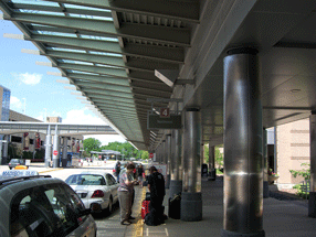
Last week we were in Madison and other bits of Wisconsin, and on the way home I noticed this bit of inadequate signage at the Dane County Airport in Madison. (This is, I should note, generally a very well designed small city airport.) We were flying on Northwest, but the signage problem would be the same for any airline. It’s all about, as I keep saying, space.
When you’re driving up to the Departures gates at an airport, what is the primary thing you’re looking for? The name of the airline. In an airport the size of Madison’s, there’s no question of multiple terminals; it’s just a matter of deciding where to pull up at the sidewalk and let your passengers off. The one and only thing that the signage needs to do at that point is identify each airline, distinguishing it clearly from all the others.
This sign for Northwest Airlines fails at its task. (The signs for the other airlines fared similarly poorly; this just happened to be the airline we were flying on.) The light, thin letters are squashed together so tightly that you cannot distinguish one from the next at any distance – and distance is exactly what counts in signage like this. The tight spacing might be readable if you were looking at this on a printed page held in your hands; at a distance of thirty or forty yards, as you drive up to the terminal looking for the right airline, it just merges into a single barely intelligible shape. (I almost wrote “unintelligible,” but since the name is set in caps and lowercase, rather than all in caps, at least it does have an irregular shape that you might potentially recognize.)
The two photos at the left are close-ups, one closer than the other; the one below is a more realistic example of what you might see as you arrive at Departures. (Except that I’ve sharpened the photographs in Photoshop, so they might be a little easier to make out.)
Sure, other airlines have longer names, which would fill up more of the area of the sign. But that’s not the point. The spacing is much too tight for a functional sign. The curbside signage at the Dane County Airport may look elegant, but it doesn’t do its job.
I only wish it were alone in this failure. Unfortunately, it has lots of company.

