Font Aid IV is a project to raise money to help the recovery efforts in Haiti after this month’s devastating earthquake. SOTA (Society of Typographic Aficionados), which is a US-based nonprofit, is acting as organizer. The way it works is much like the three previous Font Aid efforts: type designers contribute one character each to a special font, which is then sold to benefit the needy cause. This time, the special font will consist entirely of ampersands; ostensibly this is because of the theme “Coming Together,” though I’m sure it can’t hurt that ampersands are fun to draw and easy to find a use for. All proceeds from sales of the font will go to Doctors Without Borders.
![]()
easilyamused |
Archive for the category ‘society’
Font Aid for Haiti
Published
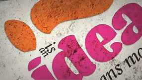
Ikea Verdanarama
Published
It’s amazing when fonts turn up in the news. As everyone in the type business has undoubtedly heard by now, Ikea decided to switch from one typeface to another for its catalogs and ads, and all hell broke loose on Twitter. You wouldn’t think that a typographic design change would generate that much heat, but lots of people (not all of them typographers or graphic designers) have expressed outrage – outrage! – at Ikea’s dropping its longstanding catalog typeface, a custom version of Futura, and replacing it with, of all things, Verdana. Shock! Horror! A web font!
Verdana was designed in the 1990s for Microsoft, developed specifically as a typeface for reading onscreen. The designer, Matthew Carter, has long experience of virtually every kind of typeface technology, and he brought that to bear on designing Verdana. Since text on a computer screen appears, of necessity, at pretty coarse resolution, the outlines of the letters have to be adapted somehow when rendering them at small sizes; there simply aren’t enough pixels available to reproduce the outline shapes perfectly. That’s where the art and craft of designing screen fonts comes in: making the most of those extreme limitations. In what was at the time a revolutionary turnabout, Carter first designed bitmapped letters for each of the target sizes, positioning pixels to get the most legible shapes he could; then he drew the outlines for the higher-resolution letters, based on the shapes of the lo-res bitmaps. Tom Rickner, a wizard of digital font technology, then created the “hints” that would tell the font software exactly how to distort the outlines at a particular size, when drawing a character on the screen, in order to achieve the ideal bitmap at that size.
One of the things that make Verdana legible onscreen, compared with a lot of other typefaces, is the generous space around the characters. There’s always a tendency among web designers to try to cram in as much material as possible in the space available, but that works against clarity and legibility. Without enough space between the letters, they all tend to run together. We’ve all seen this, much too frequently, on our computer screens. The clear, open shapes of Verdana’s letters can vary quite a bit from size to size at small text sizes onscreen, but one thing they have in common is that they’ve been given enough space to breathe.
Although Verdana was meant primarily for onscreen reading, it works surprisingly well on paper as well. It’s a simple, clean, unpretentious sans serif typeface, easy to read. I’ve used it for years as the typeface for manuscripts and drafts of anything I’m writing, because it’s easy to read both onscreen and on paper and it gets out of the way. I realized seven or eight years ago that Verdana had passed into general use, when I saw it on a billboard in San Francisco. (The same characteristics that make it legible onscreen may make it easy to read at a distance as you’re driving by.) I’ve never tried using Verdana in print, but I can imagine situations where I might want to.
It’s funny to see the choice of Verdana lambasted because it was designed for a different purpose. As Erik Spiekermann has pointed out, many of our most versatile typefaces were originally designed for one specific purpose, answering a particular set of constraints (Times New Roman, for instance, which was designed for the presses that printed The Times in 1931). Even Bell Centennial and Bell Gothic, both of which were designed for the listings in American telephone books, have been used successfully at huge display sizes by editorial designers with an eye for the unusual. Perhaps Verdana has unexpected uses as well.
I have no strong opinion about Ikea’s redesign. Certainly Verdana’s numerals are very clear and readable – even stylish, in a chunky, sturdy sort of way – and the numerals are what end up at the largest size on the pages of an Ikea catalog. And I alway felt that the Ikea version of Futura was a little too tightly spaced, though that’s not the fault of the typeface but of how it’s used.
One of the reasons Ikea chose Verdana is that it works across quite a lot of languages and scripts. The basic fonts include Greek and Cyrillic alongside the extended Latin alphabet; and Microsoft’s Japanese typeface Meiryo is based on Verdana, with the romaji (Latin letters) being essentially slightly revised and sharpened versions of Verdana’s designs. (As near as I can tell, from Ikea’s Japanese web pages, the Japanese catalog does use Meiryo, although with a different typeface for some text.)
Verdana may be about to become more versatile for both web and print use, since Ascender Corporation just announced that they are working with Matthew Carter and the Font Bureau to extend both the Verdana and the Georgia families with new weights and widths.
Whatever the merits of the case, what strikes me most forcefully in all of this is that a debate about which font to use could even be noticed, much less become a cause célèbre in the public consciousness. What typographic times we live in!
[Images: two details from Ikea’s U.S. website (top and middle); sample of some of the forthcoming new members of the Verdana and Georgia families.]
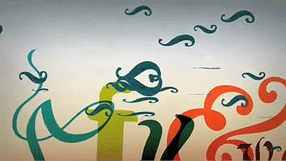
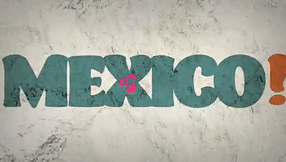
Last year, Gabriel Martínez Meave and his colleagues Isaías Loaiza Ramírez and Alfredo Lezama Osorio created a dramatic short video about Mexico and typography, which was first seen at ATypI 2008 in St. Petersburg when Roger Black and Ricardo Salas presented the 2009 ATypI conference, Typ09, for Mexico City. This animated video is now up on YouTube, where you can see it for yourself. (Warning: contains music.)
Typ09, the 2009 ATypI conference | Mexico City | October 26–30, 2009
Not-so-fine print
Published
Today’s New York Times has an article about the new credit-card legislation that just passed the U.S. Senate (and, later in the day, the House), which would limit the exorbitant interest rates and extra fees and sudden changes of terms that have become standard practice among credit-card companies in recent years. One of the details that I noticed deep in the article has typographic relevance:
“The bill also bans expiration dates on gift cards and certificates any sooner than five years after the card’s original issue date. And the retailer or card issuer will have to print the terms of any expiration date in capital letters in at least 10-point type. Call it the fine print rule.”
Capital letters? I can see the intended effect, but the real effect will be to make the important text less readable than it would otherwise be. ALL-CAPS are inherently less readable and less inviting than upper- & lowercase – especially if they haven’t been tracked looser than normal, to give a little extra space between letters.
Legal contracts such as “Terms of Use” agreements often use all-caps to emphasize the most important parts. But if there’s a long passage in caps, it’s even more likely to be skipped by anyone reading it than the regular text might be. (Perhaps this is the point, in some legal agreements.) Far better would be to set the important bits in normal case but make it bold for emphasis. (Maybe not in Times New Roman, whose bold is really a headline typeface rather than a bolder version of the text face.)
Requiring “capital letters in at least 10-point type” does have one advantage: it’s easy to define. Although typefaces vary wildly in their apparent size, it’s usually the lowercase x-height that varies the most (compare Times and Helvetica at the same point size); the capital letters are likely to be of similar height even when the design is different. But this just highlights the folly of trying to define legible type simply by its point size.
Minister without fontfolio
Published
Well, someone must be reading this stuff. The other day, John D. Boardley, who runs the website I Love Typography, posted this Photoshop mash-up (it’s rather far down the page in his “week in type” for November 11). He was presumably inspired by my off-the-cuff remark a couple of weeks ago about the need for a Minister of Typography. Thanks to Jennifer Kennard, who pointed this out to me; it cracked me up when I saw it. And you certainly won’t find me complaining; I think I’m in good company.
Boardley made a connection between this notion and an idea expressed by Robin Kinross in Unjustified texts: “Could typography be a topic of regular and intelligent discussion in newspapers? […] If music, architecture, cookery and gardening have critics and columnists, then why not typography?” Kinross was taking off from an idea of Erik Spiekermann‘s (“The typographer Erik Spiekermann set off this hare in his book Rhyme & reason, in which he complained that one could never read discussion of typography there”), and it’s a point I’ve made myself when arguing for more public design and typography criticism. Although Boardley says the Kinross quotation is “not completely related – this is just how my mind works,” the connection seems logical enough to me.
Type votes ’08
Published
When I opened up the recently arrived Washington State Voters’ Pamphlet (a hefty 136 pages, including the complete texts of various state and county initiatives), I was surprised to discover that there’s a typographer running for President of the United States. Or at least a labor leader with typographical connections. Gloria La Riva, the presidential candidate of the Party for Socialism and Liberation, lists her current occupation as “President, Typographical Sector, Media Workers Union, Local 39521, CWA (Communication Workers of America).” (Her running mate, Eugene Puryear, lists himself as a student and community organizer.) While I’m not about to vote for the La Riva/Puryear ticket, I am tickled to know that the long history of labor organizing in the typesetting and printing business has a place on the ballot this year.
Posters from Seattle & Tehran
Published
At Seattle’s Bumbershoot music and arts festival over Labor Day weekend, there was a remarkable exhibit: the Seattle–Tehran Poster Show. Curator Daniel R. Smith had gone to Tehran to investigate the graphic-design scene there, meeting as many local designers as he could, and he then put together this exhibition, which gives a parallax view of our two cultures. He paired each Iranian poster with one from Seattle, sometimes based on nothing more than a similar approach to letters or images or subject matter. Both cities have vibrant graphic-design communities, and both have created some wonderful posters.
The treatment of Arabic text is fascinating (that is, the Persian language, Farsi, which is written in the Arabic alphabet). Sometimes the letter forms are entirely deconstructed, given architectural or vegetal structure. When human faces or forms appear, they tend to be stylized, often intertwined with words. The Seattle posters, too, are interesting, but it’s clearly the work from Iran that grabs your attention.
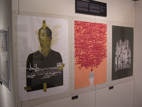
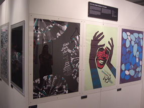
Bumbershoot only lasts over the holiday weekend, but a slightly different version of the show, called “Seattle–Tehran Poster Show Remix,” is up at the Design Commission in downtown Seattle until October 15. I intend to go down and check it out.
Steampunk, steampunk everywhere
Published
What was once a recondite literary movement in the science-fiction field has blossomed into a popular-culture phenomenon, and as far as I can see it’s done so overnight. When the New York Times starts writing about “steampunk,” you know it’s attracting wider attention, and has probably already passed its peak. Written steampunk took a cyberpunk sensibility and injected it into a substrate of Victorian technology and sartorial style; it married our fascination with the brass-gears science epitomized by the Time Traveler’s machine in the 1960 movie The Time Machine with a noir-ish outsider take on 19th-century society. The extension of this into popular culture has been fun, though often silly. Some of the “steampunk” clothing appearing now just looks like retreads from The Wild, Wild West; and the application of clockwork skins to digital electronics is basically a matter of decoration.
This seems to have gotten up the nose of someone at Design Observer (that design website that I always intend to keep up with, but never do). Randy Nakamura wrote a screed about the humbug of steampunk; I noticed it when Bruce Sterling, who has some implication in the development of steampunk, quoted from it (“Design Observer Hates Steampunk”) and exclaimed, “Man, this is priceless. The backlash has begun!”
But my favorite bit, which makes this worth writing about, is a momentary fantasy that Bruce spun between quotes and comments: “Maybe Randy Nakamura would like ‘steampunk’ better if it was called ‘Eamespunk’ and involved making computers out of bent plywood.”
News! Papers! Live!
Published
Thursday’s column by Jon Carroll in the San Francisco Chronicle (which I read online at the excellent SFGate.com, since these days I’m usually not local and can’t pick up the Chron on the street) was all about newspapers. About how newspapers, which everyone says are dying, aren’t dying at all – although, he suggests, they might be signing up for a mutual suicide pact. As Jon Carroll points out, newspapers do make money – in fact, as Roger Black has pointed out, they make profit margins that would cause some other large businesses to break out in great big smiley faces all day long. (Check out the profit margin in supermarkets sometime.) It’s just that someone upstairs thinks they’re not making money – or not enough money.
As an editor/designer who has put together a book about the design of newspapers, not about their business, I’m no expert on the profit-and-loss sheets of our nation’s daily papers (not to mention those of other nations around the globe). But it’s perfectly obvious that newspapers are still a profitable business, overall; and also that they are a fundamental part of our information system – in other words, in how we think. The good ones are worth their weight in, well, paper (not such a cheap commodity these days), and even the mediocre ones offer an astonishing value for a pittance every day. Plus, they’re good for wrapping fish.
Newspapers: still not dead. Changing, yes; that’s usually a sign of what we call life.