function jdb_page_navigation()
sPageSlug = blog
sPageTitle = easily amused
header:139:aPageArgs:page_title = easily amused
header:140:aPageArgs:section_title =
functions-johndberry:262:aPageArgs:page_title = easily amused
functions-johndberry:298:sPageTitle = easily amused
functions-johndberry:359:sPageTitle = easilyamused

easilyamused |

Archive for the category ‘publishing’

The typography of e-books

Published

It’s gratifying to see, at last, some attention given to the shortcomings of the various e-readers. It took the hoopla around the introduction of the iPad to get us to this critical state. Perhaps the most telling thing about the iPad as a reading device is where it doesn’t improve on its predecessors.

None of the existing e-reading devices – or at least none that I’ve seen – have good book typography. They look superficially impressive – “a decent simulacrum of printed pages,” as Ken Auletta said of the Kindle in his recent New Yorker article – but when you look closely at the actual words on the page, you find that they’re rather crudely typeset. I’m not talking about the fonts or how they’re rendered onscreen; I’m talking about spacing, which is what typography is all about. Most notably, none of the most popular e-readers employ any kind of decent hyphenation-and-justification system (H&J, in digital typesetting terms). And yet all of them default to fully justified text.
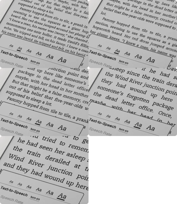
Kindle text sizes

As anyone who has done production typesetting or has designed a book meant for reading knows well, the factors that make a block of text easy or hard to read all occur at a scale smaller than the page. The most obvious is the length of the line, but line length is engaged in a complicated dance with the space between lines, the space between words, and the spaces between letters. The choice of typeface is almost irrelevant; any legible typeface can be made readable with enough care given to the spacing. (Well, almost any legible typeface.) Finding the right combination of all these factors for a particular typeface, and for a particular author’s words, is what text typography is all about.

All of these space relationships will be thrown to the winds if you typeset a page with justified text but no hyphenation. There’s a reason why the words “hyphenation” and “justification” are used together.

In producing a printed book, you can massage all these variables until you get pages that look consistent and that are effortlessly readable. You can do the same for a book that’s going to be read on a screen, but only if the end result is in a static format, such as a PDF document – essentially, a printed page by other means.

But one of the great advantages of e-readers is that you can change the type size at will. (In some, you can also change the typeface, within a narrowly circumscribed range of choices.) Lovely! But then what happens to all those careful choices about line length and word spaces and so on? They have to be made again, on the fly, automatically, by the software. And if the software isn’t smart enough to know how and when to divide words, then the spacing is going to look like hell.

Which is pretty much the way it does look, except when we get lucky, on all of the popular e-reading platforms. Great big holes appear in some lines, or a cascade of holes opens up on adjacent lines, which typographers call a “river.” It’s not just ugly; it slows down reading.

This is bad enough on a normal rectangular page, but it gets even worse when some visual element – an illustration, for instance – intrudes into the text block and the text has to wrap around it. Bad examples abound.

Some people like justified pages on an e-book page because they’re used to it in printed books. Fine. But they’re also used to better typesetting in printed books (even sloppily done ones) than we’re getting so far in e-books. The simplest solution is to give the reader a choice: justified or unjustified. And make the default unjustified. A ragged right-hand edge is easier to read than a ragged middle that’s full of holes.

The ideal solution, of course, is to have a good H&J system built into the e-book reader. But creating a really good hyphenation and justification program isn’t a trivial undertaking. Not only does the software have to know where it can break a word, and have some parameters for knowing when to break it, but the program should also modify these choices depending on the lines above and below the current line. This is what Adobe InDesign’s “multi-line composer” does. No automated system is perfect, but InDesign’s default text composition is pretty good. Certainly something like that would be a vast step upwards from what we see in e-books today.

Since we’ll all be stuck reading digital books at least some of the time, I’d like to see the standards of book composition improve, and improve fast. It might start with reviewers not blithely passing over the poor typesetting and getting wowed by the hardware or the pretty pictures. There has to be a demand for good composition in e-books. Attention to quality on that level doesn’t often get rave reviews; most people never consciously notice it. But they definitely notice it on an unconscious level, and it affects their willingness to read a book or abandon it. This is true in printed books; it’s just as true in e-books.

Who will bring out the first really good e-book reader?

[Photos: iBooks page spreads from iPad in landscape mode (left); animated GIF of Kindle page as the font size changes (above).

Detail in typography

Published

When I read through the new edition of Jost Hochuli’s Detail in typography, I found myself wondering, “Have I really learned anything about type in the last twenty years?” Most of the points I find myself making to people over and over again can be found in these pages, organized and explained more clearly than by any other writer I know. A large part of what Hochuli says can be summed up (inadequately) in the aphorism I keep repeating: typography is all about space.

Detail in typography was originally published in 1987 by Compugraphic, as one of a triad of little booklets by Jost Hochuli; the other two were the complementary volume The design of books and a jeu d’esprit called Jost Hochuli’s Alphabugs, in which the author/designer played with expressive display typography and the meaning of words. The books were (all three of them, I think) published in several languages; the English-language edition was translated by Ruari McLean. (One of my two copies of Detail in typography is inscribed to me by Ruari McLean, dated February 1989. I never met McLean, unfortunately, though we were in contact about his then-unpublished translation of Jan Tschichold’s Neue Typographie.)

The book was revised and updated in German in 2005, and this new English edition, published by Hyphen Press in London, is expanded and newly translated by Charles Whitehouse. Although the book is slightly longer than its first edition (64 pages instead of 48), its format is even smaller: 125 x 210 mm, to match the Hyphen Press format for small books. It fits handily in most pockets. Like its original edition, this one is two-color, paperbound with full-width flaps, on uncoated off-white paper stock, and it opens easily in the hand. Jost Hochuli is a master of book design, and Robin Kinross, proprietor of Hyphen Press, is a stickler for production quality.

Hochuli’s focus in this little book is the details of text typography, or “microtypography.” (The design of pages and whole publications is the realm of “macrotypography”; he has expanded on that subject in Designing books: practice and theory.) The fundamental elements that he writes about are the letter, the word, the line, linespacing, and the column, with a bit at the end that he calls “the qualities of type.” He leads off with a short discussion of the process of reading; this was where I first encountered the word saccade, a technical term for rapid eye movement, specifically the way our eyes move as we read a line of text. (They don’t move smoothly along the line, but jump from clump to clump of letters – not necessarily by word, but by visual cluster. They jump backwards, too, quite frequently; just how frequently is one of those things we quantify while trying to come up with a scientific measurement of readability.)

I won’t make Hochuli’s points for him here, nor will I expropriate them as my own. (I quote them often enough.) I’ll just repeat one paragraph from his introduction, because he clearly lays out the scope of what he’s writing about:

While macrotypography – the typographic layout – is concerned with the format of the printed matter, with the size and position of the columns of type and the illustrations, with the organization of the hierarchy of headings, subheadings and captions, detail typography is concerned with the individual components – letters, letterspacing, words, wordspacing, lines and linespacing, columns of text. These are the components that graphic or typographic designers like to neglect, as they fall outside the area that is normally regarded as ‘creative’.

This is one of those books that belongs on everyone’s bookshelf – everyone who deals in any way with turning text into readable pages, whether the words are their own or someone else’s.

The Guardian on Little, Big

Published

Both publisher Ron Drummond and I were pleasantly surprised to discover a story in Wednesday’s Guardian all about the upcoming 25th anniversary edition of John Crowley’s Little, Big. It’s another excellent goad to finishing up the preparatory work (which often seems endless) and getting the book ready for the printer. Several people asked me about the state of the project at the recent Potlatch, a small literary science-fiction convention that Eileen and I were at last weekend in Sunnyvale, California. As I assured them (truthfully), we’re in the endgame now. Of course, since this project is being executed by an exaltation of perfectionists, even the endgame isn’t simple or easy.

The Guardian story, by David Barnett, is appreciative and informative, even if he never mentions that this edition will include a sumptuous selection of artwork by Peter Milton that complements Crowley’s text (without in any way being illustration). It’s the integration of art and text that has taken so long, but it’s one aspect that will make this edition unique.

Cyrillic goodies

Published

A little-noticed item was tucked into the goody bags handed out to members of the ATypI conference in St. Petersburg: a CD-ROM with a bright red label sporting the logo of the conference, plus titles, in Russian and English, saying: Первенцы гражданскйо печати / The first-borns of secular printing. The English subtitle explains it: Moscow editions 1708–1711. This little CD contains full scans of thirty-two books printed in Moscow in the very first years after Peter the Great’s drastic reform of the Russian alphabet.

“As they say in the supermarkets, an ‘unadvertised special’,” explained Maxim Zhukov on the ATypI members’ list. “A little gem hidden deep in the bag, just sitting there, waiting to be discovered.

“The idea of throwing into the ATypI’o8 goodie bag the CD-ROM prepared by Irina Fomenko and her friends of the Russian State Library (earlier known as Lenin Library) came very late in the game, two weeks before the conference opened. It turned out that (a) the ‘autorun’ thing only worked on IBM-compatibles, and (b) the introduction was in Russian. That was not surprising, given the usual target audience (domestic) of the RSL and its Rare Book Dept., and the OS most of the people in the world use (Windows). Translating, reformatting and reprogramming the CD-ROM would have taken forever, so we decided to offer the CD-ROM to the attendees of the SPb conference as is.”

The content is in Russian, but the images are wonderful no matter what language you read. And even if you’re viewing on a Mac and can’t take advantage of the “autorun” feature, it’s easy enough to just click on the links to the various PDFs, or open the PDFs directly, and browse through them. Among other things, this CD includes the complete printed specimen of the new Civil Type; we’re used to seeing an image of the first page, with Peter’s hand-scrawled corrections, but how many of us have seen the rest of the booklet? It’s here.

“Of course,” says Maxim, “the image resolution is not press quality. And yet, we never had it this good. For decades, all there was were the tenth-generation reproductions, heavily retouched, most of them coming from Abram Shitsgal books. And now… thirty-two Petrine books and other printed pieces scanned cover-to-cover! Isn’t that something.”

It is.

[Photos: top, interior spread from the first type specimen of the new Civil Type; below, a page from a 1710 book on geography, in the new type.]

©ontent

Published

I’ve been reading Cory Doctorow’s new book of essays, Content: Selected Essays on Technology, Creativity, Copyright, and the Future of the Future, and finding it easy to read. This is not surprising, since I designed and typeset the interior of the book myself, but it’s reassuring when I actually have time to sit down with a copy of the finished, printed book and test that it’s truly readable. It is. (I’m not talking about the prose here; Cory’s writing is compulsively readable, in pretty much any format.) The author seems pretty happy with the design, too.

I’ve done a lot of book interiors for Tachyon Publications, but this was somewhat different from most of them. I wanted a typeface that was serious yet not too literary; it would have seemed silly to typeset Cory’s essays in Bembo, for instance. And it had to be very forgiving: it had to make a lot of different combinations of ALL CAPS and C4PS&NUMB3R5 look good, not like big undigestible chunks clogging up the flow of the prose. Normally I would use old-style figures in a book, and small caps for acronyms and anything set in all-caps. But in these essays, Cory uses a lot of acronyms – DVDs, FBI, RIAA, VHS, and DRM are just a few from a single essay – and there are some combinations of capital letters and numbers or other symbols that come from Leetspeak or keyboard-based typing habits that rely on the simplicity of plain ASCII characters. They’re part of the flow, not an interruption of it. This was not exactly an edition of the Penguin Classics.

The typeface I chose was Chaparral Pro, a sort of humanist slab-serif text face designed by the very talented former Adobe type designer Carol Twombly. Chaparral doesn’t have much variation in the width of the strokes, so it doesn’t look “bright” like Times Roman or Janson; but its letter forms are comfortable, familiar, and easygoing, and it reads well in long text. Chaparral has been a favorite of mine since it first came out, though I don’t often get a chance to use it in a book; it might seem a little strong for, say, a book of fiction. But it hit the right balance here. And its caps and its full-height lining figures don’t overpower the lowercase the way they do in some traditional book faces.

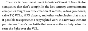
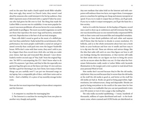
Detail of a page of Content

Although Chaparral does have old-style figures, the only place I used them was in the table of contents. Similarly, the font includes true small caps, but I only used them in the front matter and the running heads. In the body of the text, it was full caps and lining figures all the way through – in the spirit of the prose itself.

In making the physical object – what Cory calls the p-book – comfortable for carrying around and reading on the fly, it helps to keep it small and light, printed on flexible, off-white paper in a binding that opens freely. Worzalla, the printer, did a good job of this. The strikingly simple cover that Ann Monn designed stands out from other books, and it gets curious glances when you’re reading the book in a coffeehouse. The spine will also stand out on a bookshelf, a useful selling point for physical book-product.

The essays themselves? Read ’em.

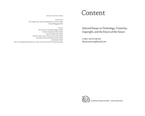
Title-page spread from Content

Page spread from Content

Steve Renick: book designer

Published

I’ve been intending to write an article about Steve Renick and his work ever since his sudden death in 2002. Even before that, I had the idea in the back of my head. And clearly, such an article needs to be written, since when I google him in various ways, in search of the best link for his name above, in the first sentence, everything I come up with is partial and oblique. But this is not that article; it’s just a few notes towards one.

There isn’t a current exhibit of Steve Renick’s work that I can point you to, unless you drop by the offices of the University of California Press, where he was Art Director for twenty years. In their library/meeting room, last time I was there, they had a lot of Steve’s work on display; even without that intention, any display of books from UC Press in the past two decades would show a lot of Steve Renick’s work, either as designer or as art director. He was a consummate book designer, with an understated style in a sort of classical Modernist tradition. He was a typographer in the best sense; I remember that he had a Monotype type-specimen poster, from the days of hot-metal typesetting, under the glass top of his drawing table. We would talk about typefaces and books and the details of typography; I believe it was he who gave me a photocopy of the long-out-of-print book by Geoffrey Dowding, Finer Points in the spacing & arrangement of type.

I would try to visit Steve at the Press whenever I was in the Bay Area. He was always friendly, helpful, informal, and curious about whatever was new. I remember arriving one day when he had just gotten his hands on a Mac and an early version of QuarkXPress; he was noodling around, trying things out, finding out how the software worked, thinking about how he could incorporate these new capabilities into the way he designed books. At that point I had never used XPress, but I had been designing and typesetting books digitally for several years; we compared notes on digital type and how it was set.

Many of the most high-profile books to come out of UC Press were Steve’s work, either designed by him or produced under his art direction: Henry Thoreau: a life of the mind, with Barry Moser illustrations; Geisha, by Liza Dalby; Poles apart: parallel visions of the Arctic and Antarctic, by Galen Rowell; the Allen Mandelbaum translation of Dante’s Inferno. He designed the remarkable English-language facsimile edition of Jan Tschichold’s Die Neue Typographie, the first time this classic of Modernist typography had appeared in English. That book, in fact, I had some responsibility for: I had been corresponding with Ruari McLean, Tschichold’s biographer and sometime translator, about getting his unpublished translation of Die Neue Typographie into print, when I found out that UC Press, all unknowing, was contemplating commissioning a translation, not realizing that a translation already existed in manuscript. I got hold of Steve, who put me in touch with the editor of the project; then I got the editor and McLean together and then left them to work out the best way to approach the book.

In contrast to his elegant, spare book designs, Steve’s hobby was fixing up old hotrod cars. (No doubt the engine details were as finely crafted as his typography.) I recall the first time he drove me to lunch in his current rod, and how flabbergasted I was at the apparent aesthetic contradiction of these two wildly different styles.

Steve was famously generous with his time and advice; everyone who has worked with him, been on a book-show jury with him, or just spent time with him remembers this. He was also resolutely unpretentious; in a group photo from a book-industry event, he would be the one over on the end with the rumpled jacket and oblique tie. He had an eagle eye for typography and a fine hand for design; his influence is easy to spot in the work of innumerable younger designers. Most of all, for book buyers and readers, he quite simply produced a wealth of books that we can read easily and that we can feel happy to have on our shelves.

Adventures in POD

Published

I’ve just recently gotten printed copies of two books that I designed, for different publishers, both printed by print-on-demand or extremely short-run printers. And I’ve been surprised and pleased by the results.

The main problem with POD printing has been in the paper and the binding – the manufacturing, essentially, rather than the printing. Too many POD books are printed on overly bright white paper, often with the grain running the wrong way (the grain should be parallel to the spine; otherwise, the pages tend to curl from top to bottom), and bound much too tightly for easy opening and reading. The binding is still not perfect (despite being what’s misleadingly called “perfect bound” – a poor excuse for properly sewn signatures), but it’s more flexible than it used to be; and once you know how the bound book will open, you can design your pages with sufficient space in the gutter so none of the text gets lost in the glue.

These two books both have personal connections for me: the first, The WisCon chronicles: volume 2 (Aqueduct Press), is co-edited by L. Timmel Duchamp and by my partner Eileen Gunn; the second, Pushing leaves towards the sun, is a first novel self-published by my nephew Mark L. Berry, who in his “real” life is a pilot for American Airlines. I designed and typeset both books, naturally. The WisCon Chronicles was printed by Applied Digital Printing, in Bellingham, Washington, who have done quite a few short-run books for the publisher, Aqueduct Press; I made specific requests about paper stock and how flexible the books would be, and they managed to make it happen. Pushing leaves was printed by BookMobile, which was recommended by Michael Wiegers at Copper Canyon Press (when Copper Canyon has to reprint a book with a short run, they often use BookMobile); not surprisingly, the result is quite readable. Both books were printed on off-white paper, so that the pages won’t glare brightly in your face while you’re reading. While neither book lies flat when it’s opened, as a book should, they’re no worse in this than most commercially printed books these days. What this means is that both books can be comfortably read – and that POD or short-run printing is no longer the spavined, jury-rigged approximation of real printing that it once was.

David Berlow, type designer

Published

A few months ago, the Font Bureau published a small book about the type designs of David Berlow. The typefaces shown in this specimen-style booklet are only a subset of the larger Font Bureau type library, but it’s remarkable to realize just how many of those typefaces are Berlow’s work. Seeing them all in one place like this is eye-opening.

Bureau Grot

David Berlow has always been a consummate type designer, crafting new faces and new versions of old faces for any number of specific, practical uses. He may have done a few designs just for the hell of it, but it’s obvious that the great majority of these typefaces were created for a purpose, often for a particular client. (Many of them first appeared as proprietary designs for publications, later released to the general font-buying public.)

Bureau Roman

When Berlow and Roger Black founded the Font Bureau in 1989, it was aimed squarely at the realm of editorial design. In the nearly twenty years since then, anyone reading a random sample of U.S. publications has probably spent a good deal of their time reading typefaces designed by David Berlow. He has designed subtly varied series for newspaper production, exuberantly expansive families for headline and display use, and carefully honed text faces that – if they’re deployed well – never call attention to themselves in a page of text.

He has worked with a wide variety of collaborators, and navigated the shoals of changing technologies. Anyone who has heard David speak at a design conference knows that he’s funny, quirky, and opinionated. He’s also prolific: according to this booklet, the Font Bureau has developed “more than 300 new and revised type designs” in the past nineteen years, and a large percentage of them have been partly or wholly David Berlow’s work.

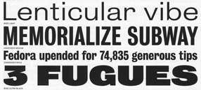
[Images | Above left: detail from the title page of the Berlow type-specimen book. Top: detail from a type-specimen page for Bureau Grot, the expanded family originally called Bureau Grotesque. Bottom: two of the five “grades” of the newspaper text face Bureau Roman.]

Eye makes a break for it

Published

John L. Walters, editor of Eye magazine in London, writes that Eye is about to go solo – leaving Haymarket, the media group that bought the magazine three years ago, and striking out on its own. Walters, along with Simon Esterson (Eye’s art director), and Hannah Tyson (business director at Esterson Associates), has set up an independent company, Eye Magazine Ltd, to publish the magazine, beginning with the new Spring issue (which, coincidentally, has an article of mine in it).

This sounds like good news for Eye. Any publishing venture is risky, but Eye is an established design magazine with a deservedly strong reputation and a loyal readership. Simon Esterson’s design has made it a pleasure to read (even with the perfect-binding that never allows the pages to lie flat – something that is inexplicably popular in magazines these days). The articles and reviews are thoughtful. I’ve been subscribing, with only one break, since the second issue. (It would have been the first issue, but I got my subscription in too late.) Design magazines tend to be seen as cuckoos in the nest of any large publishing group; they don’t fit in, and the owners never know quite what to do with them or how to promote them. I’m looking forward to seeing what Eye does now that it’s free to soar.

News! Papers! Live!

Published

Thursday’s column by Jon Carroll in the San Francisco Chronicle (which I read online at the excellent SFGate.com, since these days I’m usually not local and can’t pick up the Chron on the street) was all about newspapers. About how newspapers, which everyone says are dying, aren’t dying at all – although, he suggests, they might be signing up for a mutual suicide pact. As Jon Carroll points out, newspapers do make money – in fact, as Roger Black has pointed out, they make profit margins that would cause some other large businesses to break out in great big smiley faces all day long. (Check out the profit margin in supermarkets sometime.) It’s just that someone upstairs thinks they’re not making money – or not enough money.

As an editor/designer who has put together a book about the design of newspapers, not about their business, I’m no expert on the profit-and-loss sheets of our nation’s daily papers (not to mention those of other nations around the globe). But it’s perfectly obvious that newspapers are still a profitable business, overall; and also that they are a fundamental part of our information system – in other words, in how we think. The good ones are worth their weight in, well, paper (not such a cheap commodity these days), and even the mediocre ones offer an astonishing value for a pittance every day. Plus, they’re good for wrapping fish.

Newspapers: still not dead. Changing, yes; that’s usually a sign of what we call life.