function jdb_page_navigation()
sPageSlug = blog
sPageTitle = easily amused
header:139:aPageArgs:page_title = easily amused
header:140:aPageArgs:section_title =
functions-johndberry:262:aPageArgs:page_title = easily amused
functions-johndberry:298:sPageTitle = easily amused
functions-johndberry:359:sPageTitle = easilyamused

easilyamused |

Archive for the category ‘printing’

The completion of Little, Big

Published

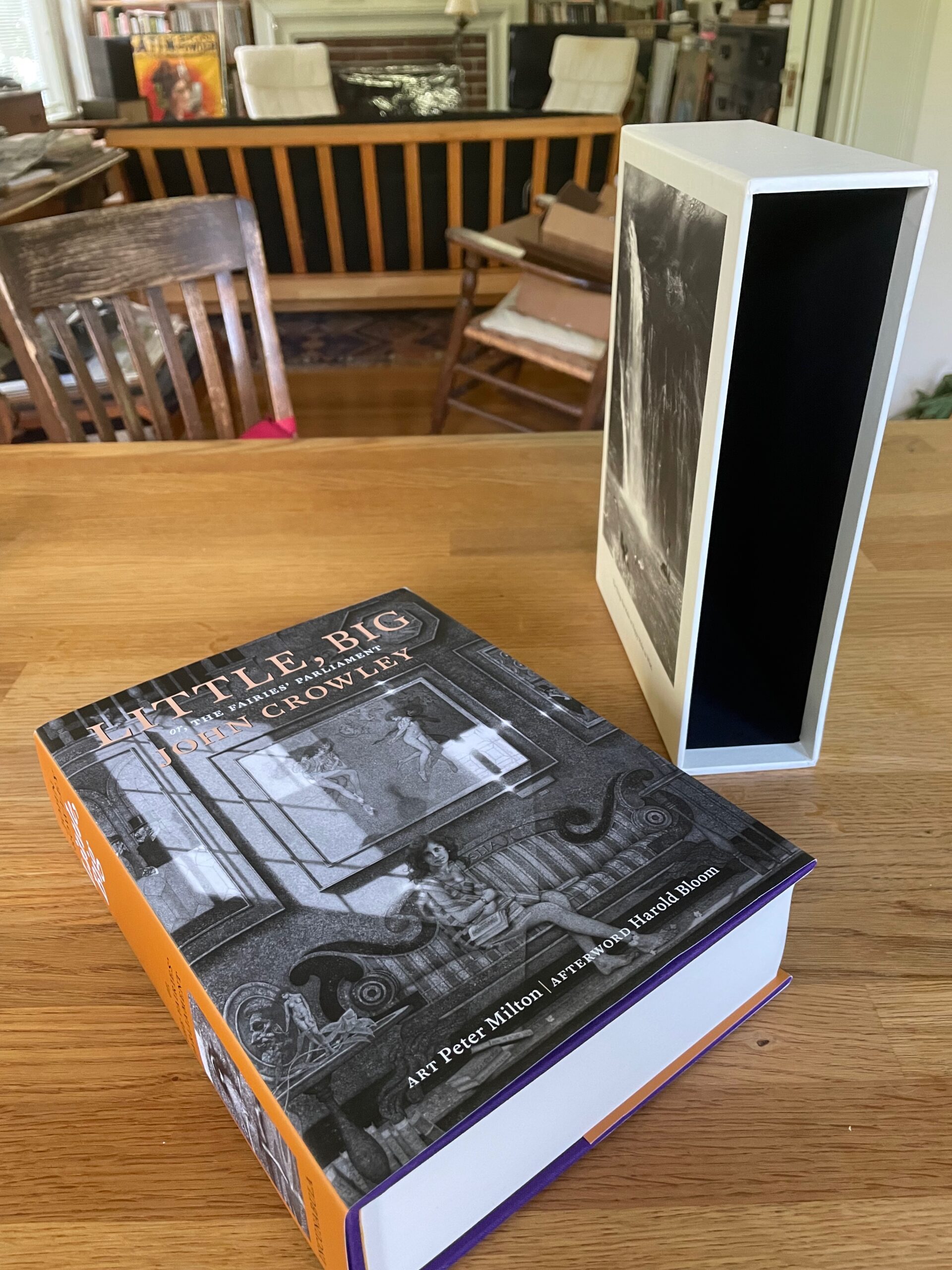
At long last, after more than 17 years of ups, downs, and circuitous side trips, the 40th anniversary edition of John Crowley’s Little, Big was published in late 2022, and the limited Numbered and Lettered editions are finally being distributed. The extra delay on the limited editions involved two different shipments of slipcases being lost en route from China, as well as a painstaking on-site check to ensure that each of the individually signed and inscribed four-page signatures got into the right individual copy. Plus, of course, the apparently inevitable twists and turns of fortune that have accompanied this project from the beginning. (Ben Kamm attributes this to the troublesome whims of the fay. I just say it must be Coyote.)

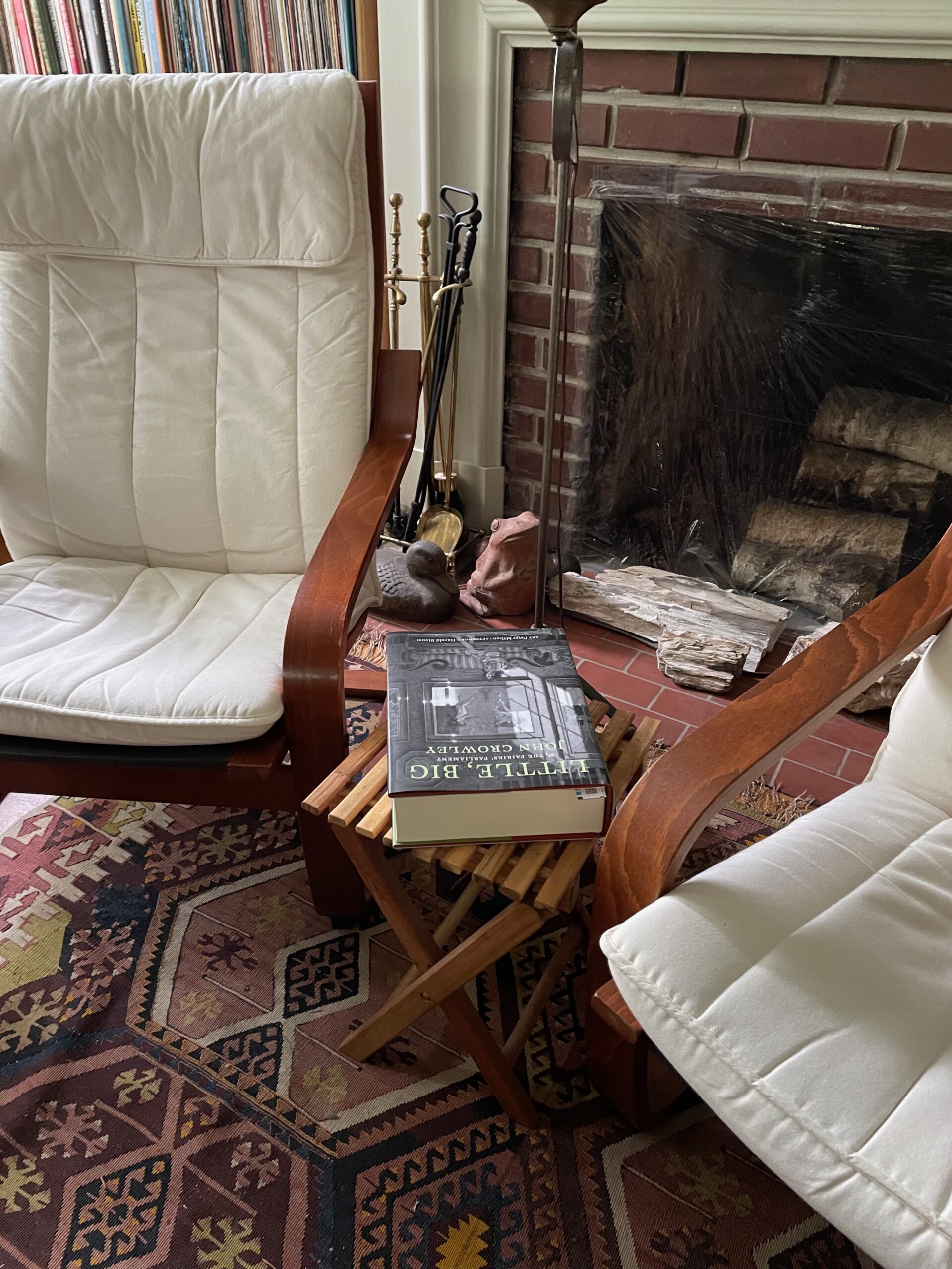
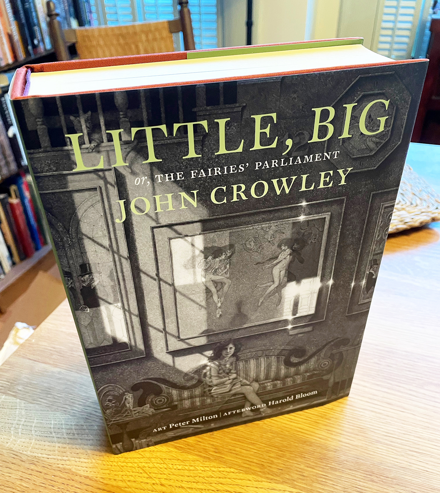
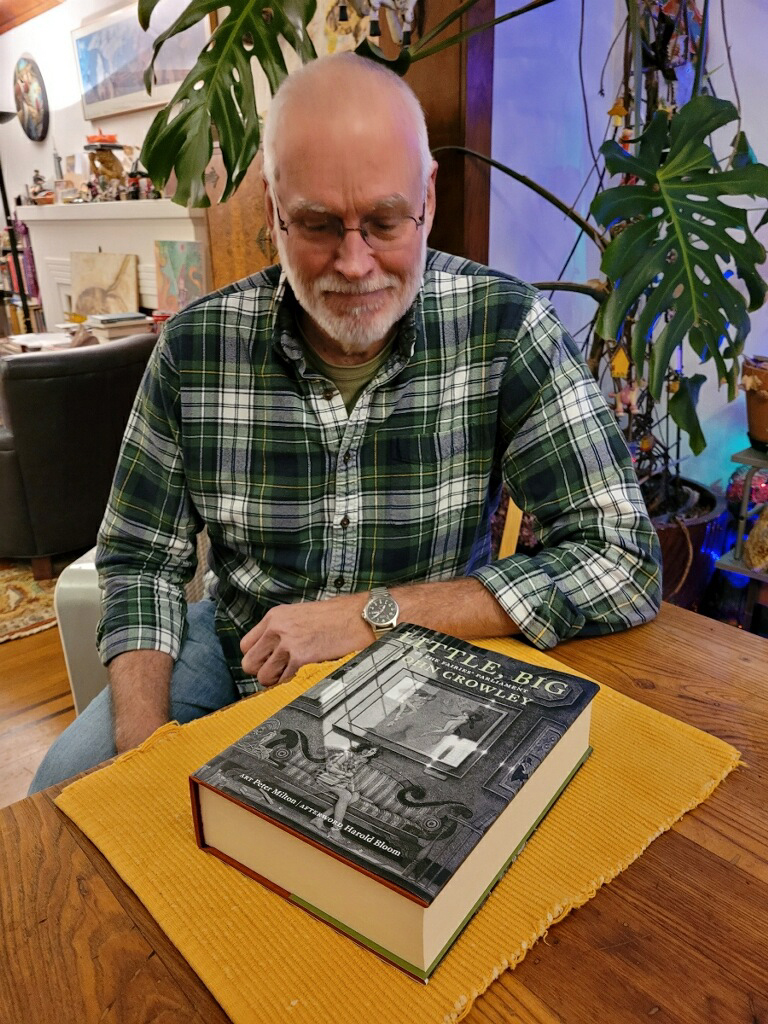
The Trade edition won an award at the Publishing Professionals Network (PPN) Book Show last year. (As manager of the judging team, I was involved in the judging process, but I recused myself from any consideration of my own book. As did judges whose books had been submitted.) The Trade edition itself is a luxurious book: 800 pages including etchings and prints by Peter Milton, exquisitely printed in a 7.5×10-inch format on Mohawk Superfine by Brilliant Graphics in Exton, Pennsylvania. The Numbered and Lettered editions (which sold out years ago) include a new short story by John Crowley, as well as the slipcases with more Peter Milton art. In the Lettered copies, Crowley wrote out a short passage from the novel in his elegant chancery italic handwriting.

The vision behind this project was Ron Drummond’s, publisher of Incunabula and instigator of ambitious undertakings. Ron and I collaborated over many years on the details of the book’s design; the overall page grid and the details of typesetting were mine, with Ron deciding on image trims and specifying the placement of Peter Milton’s art. Ron also commissioned three different essays about the book, to be published on the generous flaps of the dustjackets, one for each of the three editions. (On the Trade edition, which you can still purchase, the essay is by Neil Gaiman.)

It’s been a very long process. As I’ve written before, there were times when I took to referring to this as “Zeno’s book project,” because like Zeno’s arrow it seemed that it would never reach its target. Amazingly, it has. And it seems to be a bulls-eye.

[Images: The three editions of the Little, Big 40th anniversary edition: Numbered (top), Lettered (middle), and Trade (bottom).]

Little, Big

Published

Its origins are lost in the mists of time. Ron Drummond, the one-man publisher of Incunabula, reminds us that he first broached the subject to John Crowley thirty years ago: the subject being a special, celebratory edition of Crowley’s well-loved novel, Little, Big (1981). Incunabula had already published one book by John Crowley and two by Samuel R. Delany, of which I had designed two: Crowley’s Antiquities (1991) and Delany’s Atlantis: Three Tales (1995).

Incunabula, which Ron had named in a combination of respect and chutzpah, was a small press that published worthwhile literary works of science fiction and fantasy (or fantastika as critic John Clute calls it). “Incunabula,” which means “cradles” or “swaddling clothes” in Latin, is used to refer to European printed books published before the year 1501. By that time, sixty years after Gutenberg’s innovations, printing had exploded from a craft into an industry, and many of the standards of book design that we still follow were well established. In calling his new press Incunabula, Ron was drawing on a very long tradition.

I have no recollection of when it was that Ron first asked me about designing this more ambitious volume. I can find files related to the project dating back to 2003, and my earliest design file, LB design 1.indd, is dated May 9, 2005. I’ve been working on this book for at least seventeen years.

I have often referred to it as “Zeno’s book project,” for the way it seemed to keep approaching completion without ever quite arriving. I have also sometimes called it “the Oxford Lectern Little, Big,” in reference to Bruce Rogers’s monumental Oxford Lectern Bible. Our book, however, is not so monumental as to require a lectern.

The tale of how this book came to take its final form, with an intricate interweaving of original etchings and engravings by the artist Peter Milton, would take too long to tell. It has its painful interludes. Ron’s ambitions didn’t always correspond with his practical abilities, or with his never-robust health; this was a much bigger project than any he had undertaken before. But his vision was always clear: choosing and framing details from Peter Milton’s art that would create a conversation with the text of the novel.

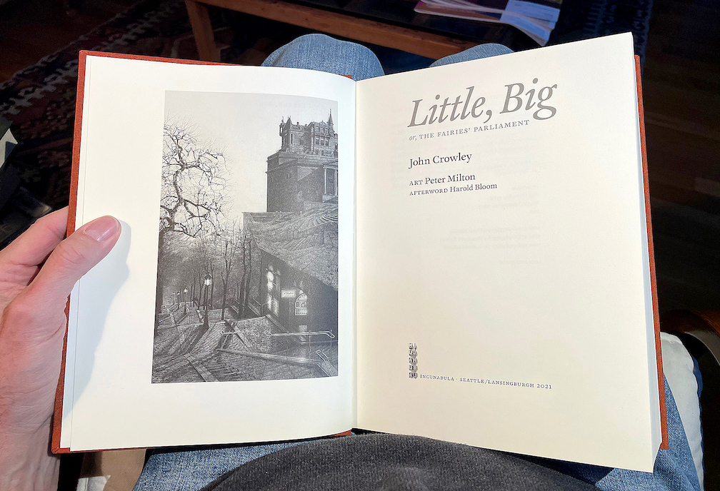
Now, amazingly, Zeno’s arrow has hit its target. A couple of weeks ago, my advance copy of the trade edition arrived in my hands, a few days after Ron’s copy reached him. It’s an 800-page tome, 7½ x 10 inches, sewn in signatures, printed on luxurious Mohawk Superfine paper, rich with art, and all digitally typeset in Akira Kobayashi’s historically inspired typeface FF Clifford. I can say, having hefted the book and laid it in my lap and begun my own rereading of a favorite text, that it’s everything I had hoped for: comfortably readable pages, beautifully printed images, in a sturdy yet flexible binding. The printer, Brilliant Graphics in Exton, Pennsylvania, did a masterful job.

Fulfillment will be handled through Dallas-based literary publisher and distributor Deep Vellum. There are still copies of the trade edition available for purchase. The 25th anniversary edition of Little, Big, which is now the 40th anniversary edition, is finally a reality.

Typographer’s lunch 5: Letterform Archive in its new home

Published

I’ve just had a chance to peek behind the curtain at the Letterform Archive, to see its new digs in the Dogpatch neighborhood of San Francisco. The move to larger quarters began before the pandemic, but everything moves slowly when you’re in quasi lockdown. The new Archive has much more space than the old location, including a spacious, well-lit double room that will become both a classroom and a reading room, with a folding dividing wall that is actually soundproof and that doubles as a whiteboard.

The first post-Covid exhibition opens in early November, a celebration of the centennial of the Bauhaus. Archive founder Rob Saunders showed us a sample copy of the elaborate catalog of the exhibition, which shows off the strengths of the Archive’s publishing program with its finely controlled stochastic printing, where you can peer closely at tiny reproductions of full two-page spreads and even read the text.

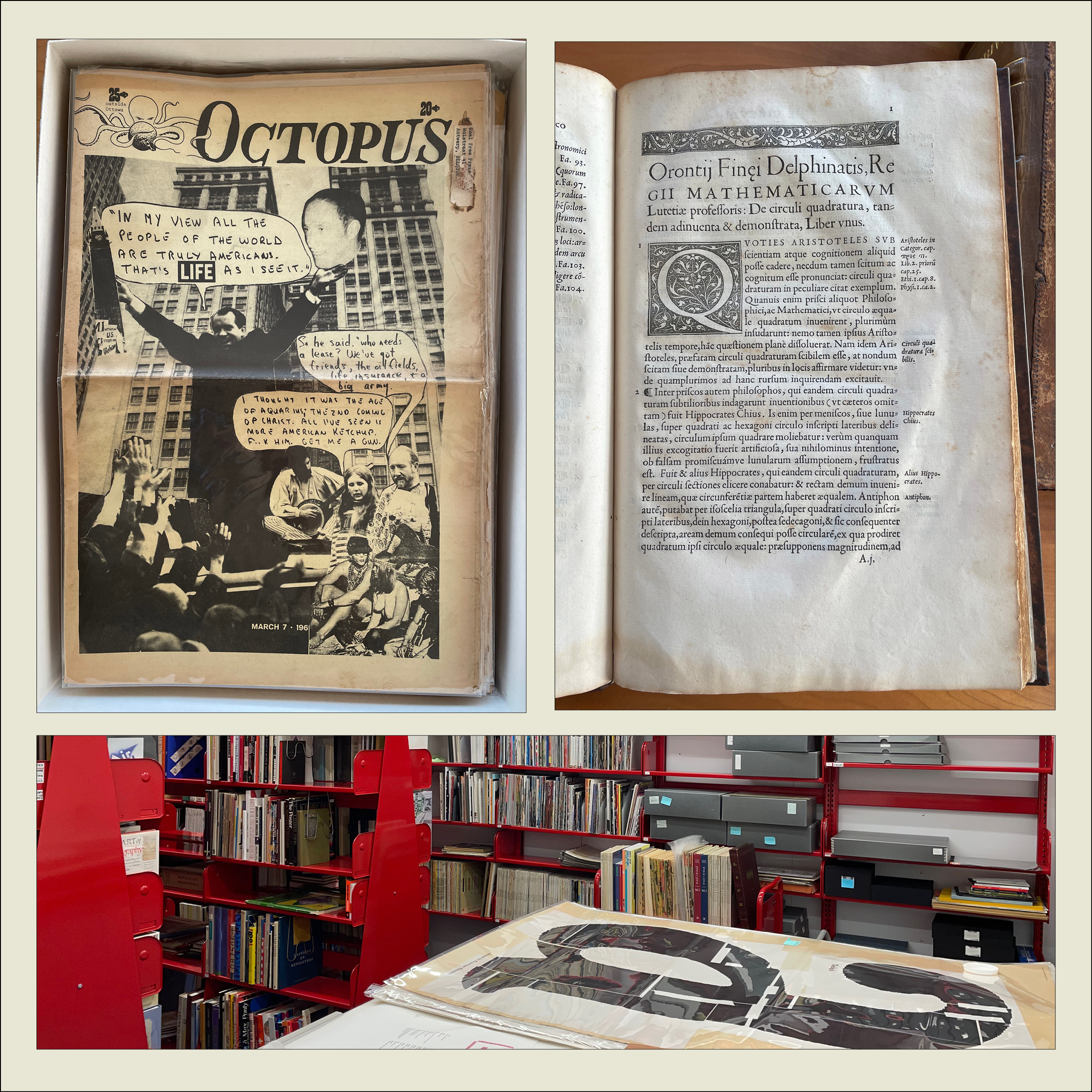
We looked at early printing examples such as Claude Garamond’s first Greek type (16th century) and the first type specimen known to be published by a woman printer (18th century). We also perused issues of the San Francisco Oracle from the late 1960s and an alternative newspaper from Ottawa, Octopus. On the back page of one issue of Octopus was a surprisingly professional-looking ad for “3 Days of Peace & Music” at Woodstock.

The Archive plans to begin regular tours in January (pandemic permitting).

[Originally published on November 1, 2021, in PPN Post and Updates, the newsletter of the Publishing Professionals Network.]

Farewell to Jack the printer

Published

“The splendid dawns — how many more of them will the gods toss into your basket of days?”

– Horace, Carminum Liber IV, trans. Michael Taylor

Jack Stauffacher died on Nov. 16, a month shy of his 97th birthday. He was both fiercely opinionated and self-deprecating; when he called you up, he would simply say, “This is Jack, the printer.” But what a printer!

I saw him for the last time just three weeks before he died, when Dennis Letbetter took me and Rob Saunders over to Tiburon for lunch with Jack and his wife Josie at their small house. The conversation ranged all over the place, as it always did, from ideas to reminiscences to literature and craft, but I was there for a purpose: to ask Jack questions about his life and career, for the biographical essay I’ve been asked to write. This essay will appear in a book by Chuck Byrne about Jack’s experimental prints, to be published next year by Letterform Archive. And, of course, I was there because I suspected that it might be my last chance to see Jack.

While I was there, Jack gave me a copy of his last book, a beautifully designed volume of “fragments from a Tuscan diary, 1956–1958,” which he had entitled Oxen. Plough. Bicycle. It is fully in the tradition of Jack Stauffacher’s long book-design and printing career, simple and unadorned yet exquisitely arranged. Its contents consist of photographs that he took while bicycling around the countryside outside Florence when he was living there on a Fulbright scholarship; the photographs are complemented by notes, almost poems – phrases and sentences of reflection on where he was and what he was seeing. It’s a fitting culmination to a publishing career, and I’m glad I got it directly from his own hand.

When Jack turned 90, seven years ago, his friends put together a spectacular celebration at the San Francisco Center for the Book. We won’t be able to celebrate his 97th birthday, except in his absence, but ideas are being floated for a fitting memorial sometime in the new year.

Several obituaries and moving reminiscences have been published already: by Chris Pullman in Design Observer, by Sam Whiting in the San Francisco Chronicle, and by Pino Trogu in Domus. Dennis Letbetter has been putting together a photographic record that he’s taken of Jack over the years (from which the photos at the left are taken).

The Letterform Archive

Published

I recently had my first chance to visit the remarkable Letterform Archive in San Francisco. This is the fruit of thirty-five years of collecting by Rob Saunders, all of it related to type and lettering and printing – especially type specimens and printer’s samples, along with books, manuscripts, and all kinds of printed and hand-made ephemera. In 2013, Rob turned his private obsession into an institution and established the Letterform Archive as a formal entity. More recently, as he announced last month at TypeCon, he acquired the enormous collection of the late Dutch bibliophile Jan Tholenaar, consisting of thousands of type specimens from the last 400 years.

The purpose of the Letterform Archive is to make original research materials available to people for hands-on study: so you can not just look at them but pick them up and hold them in your hands. There are larger collections than his, as Rob freely admits; but too many of them are closed to the public and not easily accessible. With the Letterform Archive, Rob hopes to provide a resource to students, researchers, type historians, graphic designers, and anyone interested in the history of letters. It’s easy to arrange a visit; the space is bright and welcoming, and so are the people.

The other initiative that Rob announced at TypeCon is a new program in conjunction with Cooper Union: Type@Cooper West. This will be a West Coast equivalent of Type@Cooper, the post-graduate program in type design that Cooper Union has been offering for several years at its campus in New York City.

Rob has a few other ambitious plans in mind, too. I’m delighted to see such an energetic undertaking. And I can say from personal experience that it’s a pleasure to sit in the Archive and peruse type in all its many forms.

TypeCon Port L’ampersand

Published

For last month’s TypeCon in Portland, Oregon (“TypeCon Portl&” as it was dubbed), Jules Faye and I prepared a talk about the work of her late partner Chris Stern, who was an innovative letterpress printer with a particular fondness for sans-serif type. Although he came to typography through learning to set phototype at a local job shop, and later headed up the type department at the fledgling Microsoft Press, Chris taught himself letterpress printing and became an expert in hand-set and hot-metal typesetting. At his death, Chris had been working on a manifesto about the use of sans-serif type in metal, with lots of images both informative and playful and lots of samples of carefully set Monotype and foundry sans-serif type. He never completed this work, but Jules unearthed enough notes and proofs and trial settings that we could weave a narrative around them that we thought would inspire some of the printers and typographers in the audience.

We got to show some of Chris’s meticulously layered typographic compositions, as well as fanciful characters – printed faces and bodies made up entirely of metal type. We also showed some of his serious book work (concentrating on the ones where he used sans-serif), as well as some sample spreads for his unfinished manifesto: juxtaposing sober blocks of sample text with whimsical but pointed illustrations. I even scanned and zoomed in on several pages of Chris’s notes and edits to his own proposed text – but a little of that goes a long way when you’re seeing it projected on a big screen. One passage from his own text that we quoted and showed in a sample setting was his description of the type for the manifesto itself: “Sans Transgression/ This book was going to be 100% sans serif. It seemed only fitting, after all. But along the byways of design, Commercial Script jumped into my path and I couldn’t resist. I feel confident that this will be my only sans transgression. My partner, however, says not to worry because there aren’t any serifs, just swirls.”

Among my favorite images are the multi-color prints of U-Man, an anthropomorphic character whose body is a bold, condensed capital U (sans-serif, of course!) and whose other body parts sometimes changed from one incarnation to the next.

In presenting this material, Jules felt that we were opening up Chris’s unfinished manifesto and giving it a continuing life, whatever form that may take. Nothing is ever finished.

Warning! Adults Only! Product contains letterforms at their most exposed! Viewer Discretion Is Advised. Adults Only: Warning!

On Sunday afternoon, I caught a city bus up to the north end of town for an open house at the C.C. Stern Foundry, which is now the home of much of the printing and type-casting equipment that once filled up the barn at the “printing farm” of Stern & Faye. Many TypeCon attendees made the trek, so there was a lively group of printers, typographers, and interested amateurs. And whoever designed the nametags for the volunteer staff of C.C. Stern put to shame the design of the TypeCon nametags, which (typically) gave pride of place to the logo and kept the name too small to read from across a room.

This was a good TypeCon, full of good conversations and with a number of excellent talks and presentations. Of course Portland is a great city to visit – it’s hipster central, a land of coffee, beer, wine, and food trucks, with a very convenient transit system. The weather even gave us a taste of Northwest drizzle, though it also gave us some un-Northwestern warm humidity. I think pretty much everyone had a good time.

The visual identity for this TypeCon rendered the host city as “Portl&” in a very retro-’80s graphic style. I kept referring to it as “Port L’ampersand” – the little settlement on the Willamette River that grew up to be a real city written with real letters.

Next up on the typographic calendar: ATypI in Amsterdam, October 9–13. See you there?

Ivan Fedorov’s books and types

Published

When Eileen and I went over to the University of Washington the other day, to take a look at the magnificent century-old Yoshino cherry trees in bloom around the quad, we walked past the Magus used-book store on our way to the campus; our eyes were caught by the display of enticing books in the front windows. In fact, the display seemed so well calculated to appeal directly to us that I began fantasizing that the windows were really smart displays that targeted whoever happened to pass by on the sidewalk; a different person or group of people would perceive an entirely different display, tailored to their tastes and buying habits.

“Hey,” said Eileen when I told her this, “you mean they’ve got real physical books in buildings now? Books that you can pick up and hold in your hand?” She shook her head. “Who’d have guessed!” No, no, I assured her, it was just a virtual display; behind the windows we’d find no actual books. Just a digital buying experience.

But we stopped in on our way back from the cherry trees, and what I found on a back shelf was not virtual at all. It was a beautifully bound large-format book called Artistic Heritage of Ivan Fedorov, by Yakim Zapasko. At least, that’s the title in English; the book was published in Lvov in 1974, and its proper title is displayed bilingually in Ukrainian and Russian. The book is a catalog of the work of the 16th-century printer Ivan Fedorov (“and the masters that worked in association with him,” as an English summary carefully adds), who worked first in Muscovy and then in the Polish-Lithuanian Commonwealth (Moscow, Lvov, and Ostrog) and who is one of the fathers of eastern Slavic printing. The main text of the book is in both Ukrainian and Russian, but for those of us who are not fluent in either language the most rewarding part (besides the typography, design, printing, and binding of this book itself) is the illustrations: books printed by Ivan Fedorov, types he cast (both Cyrillic and Greek), initial letters and decorative ornaments, and the wonderfully complex “ligature lines” of intertwined capital letters. Just for lagniappe, the book’s title page and section pages feature magnificently energetic calligraphy in two colors and five languages. (Summaries and labels are provided in English, French, and German as well as Russian and Ukrainian.)

Ligature line, from 'Artistic Heritage of Ivan Fedorov'

This copy is rubber-stamped by the Department of Slavic Languages and Literature of the University of Washington. What led the department to de-acquisition it, I have no idea; but it has found a good home now. Out of curiosity, once I got home I looked online; there were a number of copies available, at varying prices of course. One of the listings, through ABEbooks, had a note saying, “This copy is no longer available.” The listing was from Magus Books, so in fact “this copy” was the one I had in my hands. (Quick work, Magus!)

I love the early Cyrillic types, so much more vibrant to my eye than the westernized Civil Type introduced by Peter the Great. And I wondered, as I gazed over the pages, whether I had in fact seen some of these very books when I was in the rare-book libraries of Moscow or St. Petersburg.

It was a good day for both cherry blossoms and books.

[Images: top, cover of Artistic Heritage of Ivan Fedorov; middle, title page; bottom, a 16th-century book page; inline above, a red-printed ligature line.]

Hong Kong images

Published

After an absurdly long delay, I have finally put some of my photos from last October’s ATypI Hong Kong up on Flickr: here. Although I didn’t take a lot of snapshots, there are few images there that ought to be interesting to people who weren’t there – and to some of the people who were. In particular, I got to the very first letterpress workshop at Zi Wut, which contains the type and printing press from a former printshop in Kowloon, now operated by three women as a teaching resource, with the original owner of the printshop offering examples and showing how the processes worked. Zi Wut has a presence on Facebook, and there’s a nice short write-up, with more images, on the Metropolis magazine blog.

Jack Stauffacher: Master of Types

Published

If you’re in San Francisco on June 15, I suggest that you drop by Swissnex, 730 Montgomery, between 6:30 and 9:30 p.m. to hear Jack Stauffacher in conversation with his friends. I’ve written plenty of times about Jack, who simply calls himself a printer but in fact carries on the cultural traditions of centuries of printing and learning through his practice of the printer’s trade (and, not incidentally, his practice of talking and thinking and encouraging others to do the same in his company). If I weren’t going to be in Yerevan for Granshan 2012 next week, I’d be sorely tempted to bop down to the Bay Area for the event.

This evening marks the close of “Types We Can Make,” an exhibition at Swissnex of “new typographic works from Switzerland.”

Swissnex is conveniently located just up the street from William Stout Architectural Books, which is a dangerous place to enter if you’re a bibliophile, especially if your vulnerability is in the line of architecture, typography, or graphic design. You’ve been warned.

New: Check out this very nicely done short video of Jack talking about his creative working methods and interacting with people at last week’s event.

[Photo: Jack Stauffacher at the AIGA National Design Conference in Vancouver, B.C., October 2003.]

Substrate

Published

I’ve been musing about that wonderful word substrate, and contemplating its many permutations. The word has uses in biochemistry and philosophy, but the meaning that intrigues me is literal. By its etymology, a substrate is an “under-layer,” or what lies behind or underneath something. When it comes to letters, the substrate is the surface you write or print on.

The substrate gives typography its third dimension. Even when the surface is perfectly flat, it’s the surface of something. In printing, the substrate is the paper (and the occasional non-paper surfaces that people choose to print on). The substrate for digital type is the screen that it appears on, whether that screen is held in your hand or propped on your desk. (Or, indeed, mounted on the wall in your living room or a theater.)

Printing, in all its many forms, deposits ink on the paper. Type on screen is projected out of the substrate on the surface (and from there into our eyes). In e-ink and other kinds of smart paper, the letters are actually displayed inside the substrate. The substrate is the physical ground of “figure & ground.”

Essentially, type is about the nature of the substrate and how the type is rendered on that surface. In traditional printing, this is a matter of inking and presswork. On a screen (like this), this depends on resolution, and all the many tricks for making it appear finer than it really is.

Printing or display depends on the relationship between substrate and rendering. Everything else – the real heart of typography – is arranging.

[Photo: “Rock 6,” copyright Dennis Letbetter.]