function jdb_page_navigation()
sPageSlug = blog
sPageTitle = easily amused
header:139:aPageArgs:page_title = easily amused
header:140:aPageArgs:section_title =
functions-johndberry:262:aPageArgs:page_title = easily amused
functions-johndberry:298:sPageTitle = easily amused
functions-johndberry:359:sPageTitle = easilyamused

easilyamused |

Archive for the category ‘education’

Typographer’s lunch 5: Letterform Archive in its new home

Published

I’ve just had a chance to peek behind the curtain at the Letterform Archive, to see its new digs in the Dogpatch neighborhood of San Francisco. The move to larger quarters began before the pandemic, but everything moves slowly when you’re in quasi lockdown. The new Archive has much more space than the old location, including a spacious, well-lit double room that will become both a classroom and a reading room, with a folding dividing wall that is actually soundproof and that doubles as a whiteboard.

The first post-Covid exhibition opens in early November, a celebration of the centennial of the Bauhaus. Archive founder Rob Saunders showed us a sample copy of the elaborate catalog of the exhibition, which shows off the strengths of the Archive’s publishing program with its finely controlled stochastic printing, where you can peer closely at tiny reproductions of full two-page spreads and even read the text.

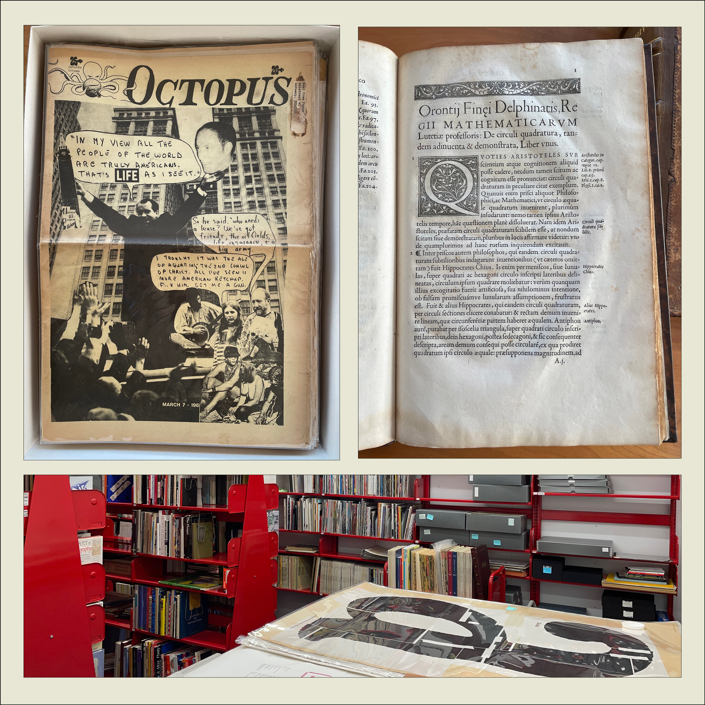
We looked at early printing examples such as Claude Garamond’s first Greek type (16th century) and the first type specimen known to be published by a woman printer (18th century). We also perused issues of the San Francisco Oracle from the late 1960s and an alternative newspaper from Ottawa, Octopus. On the back page of one issue of Octopus was a surprisingly professional-looking ad for “3 Days of Peace & Music” at Woodstock.

The Archive plans to begin regular tours in January (pandemic permitting).

[Originally published on November 1, 2021, in PPN Post and Updates, the newsletter of the Publishing Professionals Network.]

Gerard Unger, Theory of Type Design

Published

I recently finished reading Gerard Unger’s final book, Theory of Type Design, which I bought at the ATypI conference in Antwerp last September and which Gerard signed at the book-launch event there. It was the last time I saw him, as he died of cancer only a couple of months later.

It took me quite a while to read through Theory, not because it’s at all difficult but because each time I finished a chapter, I wanted to put the book aside and savor what I had just read. It is not, after all, a book with a plot, like a novel; it is, however, a book with a theme and a clear development of that theme.

What Gerard Unger does in this book is nothing less than provide a comprehensive look at every aspect of the design of type, from its origins to the ways we design, read, and design with digital type today on a multitude of screens. Unger always thought about type systematically and observantly, looking for the connections and common elements that bind together such a disparate and unruly history. He was himself a consummate type designer, and a famously thoughtful and helpful teacher. You can hear his voice on every page.

Although his range as a designer was wide, you can often tell a Gerard Unger typeface at a glance; they have a commonality of approach and feel that transcends individual style. One element that I’ve noticed for many years is the way he would pare away what isn’t necessary, including connections within letters: he explored how much you could delete while keeping a typeface happily readable – a useful experiment when you design type for unfavorable conditions of printing or screen viewing. In a note (on page 196), he remarks, “The purest forms I have made as a type design are those of Decoder (1992).” Decoder was a purely experimental typeface (based on the shapes in his typeface Amerigo) issued as an early part of the FUSE project, to see what people would make of the detached yet recognizable parts of Latin letters.

I had hoped to have a chance to interview Gerard for the history of ATypI that I’m working on, since he had been closely involved for many years, but his deteriorating health made that impossible. Despite this, amazingly, he took the trouble after the conference to write me a short note, to let me know that he wouldn’t be able to help after all. That’s the kind of person Gerard Unger was.

Facing the world, typographically

Published

On Dec. 1 & 2, Stanford University hosted “Face/Interface,” a small conference on “Type Design and Human-Computer Interaction Beyond the Western World.” The conference was held in conjunction with an exhibition at Stanford’s Green Library: “Facing the World: Type Design in Global Perspective.” The exhibition, organized by Becky Fischbach, runs until March 24. (Go see it!)

The organizer of Face/Interface was Thomas S. Mullaney, an associate professor of Chinese history at Stanford who has spoken at ATypI and who wrote the canonical book on the history of the Chinese typewriter. Tom is an indefatigable organizer and a generous host, with a clear idea of what is required to make an event like this a success (and a ruthless way with a stopwatch, if speakers run over).

The roster of scheduled speakers was impressive. I knew this would be a notable event, but, as everyone seemed to agree, it turned out to be even better than we had been expecting. There was not a single talk that I was willing to miss, even first thing in the morning, and the interplay among them, dealing with varying languages and technologies and cultures, wove a rich tapestry of ideas. Which is exactly what a scholarly conference ought to do.

Not surprisingly, there were a number of references to an earlier typographic event at Stanford: the famous 1983 ATypI Working Seminar, “The Computer and the Hand in Type Design,” which was recently written about in an article by Ferdinand Ulrich in Eye magazine. That 1983 seminar had been organized by Chuck Bigelow, who at the time was an associate professor of typography at Stanford (the only person ever to hold such a position there – so far). And Bigelow was one of the closing speakers this year, thus tying together these events 33 years apart. (Donald Knuth, also a key figure of the 1983 seminar, dropped by on Friday for a while, though he had no official involvement in this year’s event.) I wouldn’t be surprised if Face/Interface didn’t figure as prominently in future typographic memory as the 1983 gathering has over the last three decades. It felt like a pivotal moment.

Highlights for me included Thomas Huot-Marchand on the contemporary successor to the Imprimerie nationale; Bruce Rosenblum’s highly personal account of “Early Attempts to Photocompose Non-Latin Scripts”; Liron Lavi Turkenich‘s visual tour through trilingual signage in Israel; Lara Captan’s tour-de-force performance, “Facing the Vacuum: Creating Bridges between Arabic Script and Type“; Gerry Leonidas on Adobe’s treatment of Greek typefaces; and the other two closing talks (mine was sandwiched between them), by Chuck Bigelow and John Hudson. Other notable memories include Tom Milo projecting his ground-breaking live-text Qur’an technology on a wall-sized screen in the Stanford maps collection, upstairs from the exhibition reception, and a lively conversation with Chuck Bigelow over breakfast on the last day.

For those speakers who didn’t have to rush off on Sunday, there was an informal brunch and tour of the Letterform Archive in San Francisco, where Rob Saunders showed off his collection and ended up selling off some of his duplicates to eager collectors such as myself.

[Images, top to bottom:] Chuck Bigelow, John Hudson, & John D. Berry after the closing presentations (photo by Chen-Lieh Huang); Chuck Bigelow at the podium; Sumner Stone, asking a question from the audience; John D. Berry at the podium (photo by Eileen Gunn); Becky Fischbach & Fiona Ross outside the hotel in Palo Alto; Rob Saunders’s hands showing off the original Depero bolted book at the Letterform Archive.]

A tale of two cons

Published

I just got back from almost a week in Montréal, where I was attending this year’s ATypI conference; just a couple of weeks before that, I had been in Boston at TypeCon. There was, as you might expect, a lot of overlap among the attendees at both conferences, though the close proximity, both geographical and temporal, meant that many people had to choose between them. (I chose both.)

In both cities I was staying with friends, rather than at the official hotel. In Boston, that meant hopping the Red Line in from Cambridge each day. (Since my journey took me right by the Charlie Card store at Downtown Crossing, I stopped in and got myself a senior pass. It took only a few minutes, and now I’m an official Old Person in the eyes of Boston’s transit system.) In Montréal, it was a straight shot on the no. 80 bus down Avenue du Parc from the Mile End neighborhood, where I was staying, to the UQAM campus on Sherbrooke. One day, since the weather was lovely, I borrowed my friend Will’s bike helmet and his key to the public-bike system and bicycled down to the conference.

From the conversations at both events, it has become clear to me that the next big thing is flexible publishing: publishing on any and all platforms, without dividing them up or treating them differently (print vs. screen, tablet vs. phone, website vs. ebook). Variable fonts, which were last year’s bombshell announcement, are on track to becoming a key ingredient in the mix. Evolving layout capabilities in web design are another. The great challenge, as these tools finally begin to be available at a practical level, is achieving excellence across all those platforms.

One of the key events at ATypI wasn’t on the program: it was a lunch discussion organized by Gloria Kondrup of HMCT about “type education.” There must have been thirty or forty people there, not all involved directly in educational institutions. What grew out of that was a clear sense that it wasn’t students who needed to rethink their approach to design, but teachers and practitioners. The old categories, and the assumptions about those categories, are standing in the way. But how do you rethink your approach to doing design and teaching design, and still maintain the highest standards? A conundrum well worth pondering.

Highlights of ATypI this year included the three keynote speeches, by Paula Scher, Rod McDonald, and Roger Black; Stephen Coles’s visual feast of pre-digital type specimens from the Letterform Archive; Peter Constable’s report on the current state of variable fonts; Paul Shaw’s history of the Electra typeface by W.A. Dwiggins; Sergio Trujillo’s funny, articulate presentation of designing a typeface for an endangered language from Assam in northeastern India; Sahar Afshar on new and old approaches to designing Arabic typefaces; a four-person panel discussion that interrogated job titles and what we mean by them; and Veronika Burian and José Scaglione on the need for giving credit where credit is due in the complex teamwork of designing typefaces and producing fonts. And of course the interstitial schmoozing and networking that are at the heart of any conference.

[Above: a quick panorama of the exhibits room during one of the coffee breaks at ATypI 2017 Montréal.]

As always, there were talks I would have liked to see but had to miss. Happily, the AV team not only videotaped the entire program, but they got much of it up online and freely available while the conference was still going on.

Aside from any formal events, I enjoyed conversations, some long, some short, with Lucie Lacava, Katy Mawhood, Gerry Leonidas, Paul Luna, Jason Pamental, Mary Catherine Pflug, Matt Soar, Laurence Penney, Rod McDonald, Liu Zhao, Natalie Dumont, Roger Black, Sahar Afshar, Tom Foley, and Will Hill – and no doubt with others who have slipped my mind at the moment. This is the essence of a good conference.

This year marked a personal watershed, as I finally left the ATypI board of directors after 17 years. I was first elected in Leipzig in 2000, when Mark Batty suggested that I ought to run. I certainly didn’t expect to remain a board member for such a long stretch of time – possibly the longest continuous run, though I’m not sure about that – including two three-year terms as ATypI president. I’m very pleased with the directions that ATypI has taken in that time, and of course I’m not going away. But I’m looking forward to attending next year’s conference in Antwerp as a civilian (and not having to take time out for board meetings).

José Scaglione stepped down this year as president, after leading ATypI through a smooth transition from our ancient, outdated bylaws and into a newly outward-facing approach. The new president, Gerry Leonidas, has plenty of experience on the board and a lot of new ideas, which strikes me as a fine combination. And I’m glad that José is helping to establish a tradition by continuing as a board member after his term as president. That’s a useful kind of continuity in any organization.

In August at TypeCon, I spent a fruitful lunch talking with Jason Pamental, whose zeal for online typography matches my own and whose knowledge of web design outstrips mine by a mile, about how to encourage higher standards in flexible publishing and what can be demonstrated right now. We continued this conversation in Montréal, along with others like Gerry Leonidas and Paul Luna. This is the sort of thing I’m talking about above, the direction that typography seems to be going right now.

(Why “A tale of two cons”? Two conferences, of course. But why “con”? Jean François Porchez once asked, “Why do they call it by a rude word in French?” The answer is simple (and ignorant of the French meaning of con). TypeCon was founded in 1998 by Bob Colby, who had also been one of the founders of the literary science-fiction convention Readercon. And in the SF community, “con” is shorthand for “convention,” the annual or occasional gatherings that have been going on, in the United States and elsewhere, since the late 1930s. I’m sure it seemed quite natural to Bob Colby to name his new creation in the same tradition, as “TypeCon.” The shortened term works equally well for a convention or a conference.)

[Photos, top to bottom: outgoing president José Scaglione kicks things off; Rod McDonald’s keynote talk, “Type Night in Canada”; Kevin Larson pointing, not really saying, “This is your brain on type!”; 8 Queen, the highly typographic venue for the workshops & the final-night closing party; at the Morisawa party; at the final-night party; at the after-party, very late Saturday night.]

The Letterform Archive

Published

I recently had my first chance to visit the remarkable Letterform Archive in San Francisco. This is the fruit of thirty-five years of collecting by Rob Saunders, all of it related to type and lettering and printing – especially type specimens and printer’s samples, along with books, manuscripts, and all kinds of printed and hand-made ephemera. In 2013, Rob turned his private obsession into an institution and established the Letterform Archive as a formal entity. More recently, as he announced last month at TypeCon, he acquired the enormous collection of the late Dutch bibliophile Jan Tholenaar, consisting of thousands of type specimens from the last 400 years.

The purpose of the Letterform Archive is to make original research materials available to people for hands-on study: so you can not just look at them but pick them up and hold them in your hands. There are larger collections than his, as Rob freely admits; but too many of them are closed to the public and not easily accessible. With the Letterform Archive, Rob hopes to provide a resource to students, researchers, type historians, graphic designers, and anyone interested in the history of letters. It’s easy to arrange a visit; the space is bright and welcoming, and so are the people.

The other initiative that Rob announced at TypeCon is a new program in conjunction with Cooper Union: Type@Cooper West. This will be a West Coast equivalent of Type@Cooper, the post-graduate program in type design that Cooper Union has been offering for several years at its campus in New York City.

Rob has a few other ambitious plans in mind, too. I’m delighted to see such an energetic undertaking. And I can say from personal experience that it’s a pleasure to sit in the Archive and peruse type in all its many forms.

Traveling & listening & talking: Typo Day

Published

“I can’t believe this is your first time,” said the young Indian woman with whom I was sharing the auto-rickshaw.

“It is, though,” I replied, calmly clutching a handhold as the three-wheeled vehicle careered through the traffic of northern Mumbai.

I hadn’t even encountered yet the full roar of the city, but Indian traffic was proving to be everything I had expected it to be. Chaotic, crowded, incredibly varied, and resoundingly effective at getting everyone around, despite the lack of any perceivable patterns. Drivers seemed to navigate by echo-location, honking fairly constantly to let other drivers know that they were approaching; and they might approach from pretty much any direction, or any side. Lanes, although clearly marked, were completely ignored, and each participant in the mêlée of Mumbai road traffic claimed possession of every inch of available space, whether occupied or not. Private cars predominated, but alongside them you’d find gaily decorated trucks, flitting motorbikes, daredevil pedestrians, and of course swarms of putt-putting auto-rickshaws, all punctuated with occasional feral dogs and meandering cattle.

I was in Mumbai for only a few days, invited as a keynote speaker at Typography Day 2015, an annual event that moves around among various Indian universities. This year it was being held at its original home, IIT Bombay, or the Indian Institute of Technology Bombay. The large, leafy campus lies on the northern fringe of Mumbai, abutting the shore of Powai Lake and at the southern tip of the vast hilly Sanjay Gandhi National Park. The university has about 8,000 students in a variety of faculties, clustered throughout the campus; many of the central buildings are aligned along a covered open-air walkway known as the Infinite Corridor. Although the campus feels considerably less crowded than the heart of Mumbai, and it suffers much less from the ever-present air pollution, proximity to the national park requires signs like one I saw near the lake warning that a panther had been spotted in the vicinity. “Well,” as one local put it to me, “we’re encroaching on their territory, so why wouldn’t they came into ours?”

Typo Day was put on by the Industrial Design Center, the design school at IIT, and the talks were presented in the IDC’s large, modern auditorium. Outside the auditorium was a large common area where people could mingle during the breaks for the aptly named “tea and networking,” and just outside the building, a display of typographic posters was hung in the open air and a sculptural assemblage of 3D Indian letters climbed one of the twisting trees.

The displays, like the subjects of talks and workshops, were not only multilingual but multi-script. India is a land of many languages and many writing systems; Hindi is simply the largest, and the dominant one in northern India, but the only common language that educated Indians have throughout the country is English. Although most of the various Indian writing systems are somehow related to Devanagari, the complex script developed for ancient Sanskrit and used today for Hindi and several other North Indian languages, the relationship is tenuous enough that only scholars can really spot the similarities. As one Hindi-speaking designer from Mumbai put it, “If I go to Bangalore, I can only admire the writing there as shapes; I cannot read it.” Several of the talks at Typo Day dealt with the fine points of Devanagari type designs and manuscript traditions; others dealt with different writing systems, including one talk by a woman from Sri Lanka, Sumanthri Samarawickrama, about the lack of vocabulary to describe the letterforms of written Sinhala.

But it wasn’t just fine points and details. There was exuberant creativity on display, and the other keynote speaker, Itu Chaudhuri, gave an inspiring and well-illustrated talk about how a love of letters “will enrich your life.” He then proceeded to demonstrate how it had enriched his.

I was treated extremely well by the organizers of Typo Day, Prof. Ravi Poobaiah and his wife, Dr. Ajanta Sen. Not only did they fly me to Mumbai, have students meet me at the airport when my flight arrived in the middle of a hot March night, and put me up in the comfortable Guest House at IIT, but on the day after the end of the conference they arranged a car and driver for me to explore Mumbai (and its traffic), and the next night they had me staying at the Royal Bombay Yacht Club, which is every bit as luxurious as it sounds. We had met there for dinner the night before, but, as Ravi explained, there wasn’t a room available that night, so they drove me back to IIT, with Ajanta giving me a running commentary on the history of the heart of the city and which buildings she had grown up in.

At the conference, I found myself being naturally adopted into the circle of gray-haired elders of Indian design, though I also met quite a few younger designers and students. Although I often missed the jokes, sometimes from lack of context, sometimes from not catching the accents, I enjoyed the company of these men and women with their shared history of typography and graphic design in India. (Accents varied. There was one brilliant, impassioned speaker that I had a very hard time understanding; when I mentioned this to someone else, he said, “Oh, yes, he has a strong Marathi accent. He sounds the same when he speaks Hindi.” What he was saying was so forceful that I regretted missing some of it through my own incomprehension.) I felt as though I had only scratched the surface of the typographic culture of the country.

I barely scratched the surface of Mumbai, too. I spent one afternoon walking around the streets near the Gateway of India, the monumental stone arch that once welcomed incoming ships of the British Empire during the Raj. (The Yacht Club was right across the street from the public park in front of the Gateway.) Although I clearly stood out as a foreigner, the only hassles I had on the streets were the expected attempts to sell me something; most of the time, people just ignored me and went about their way, as they ignored most of the teeming crowds around them. I visited a couple of museums, of which the oddest and thus most fascinating was the Mumbai City Museum, with its collections of objects and artifacts and models and dioramas depicting the city’s history. In one room was a current exhibit about the cultural and economic connections through history of the two sides of the Arabian Sea.

I also dropped in to the vast Chhatrapati Shivaji Maharaj Vastu Sangrahalaya, formerly known as the Prince of Wales Museum, to see the relatively small permanent exhibit on “Pre and Proto History,” the pre-Hindu Indus Valley civilization of Harappa and Mohenjo-daro. Most of the objects, however, were reproductions; the originals were in Delhi.

Impressions of Mumbai:

Very, very hot. No surprise there! I adopted a slow amble as I walked through the streets, in accord with the way most people seemed to be moving, just sort of easing through the humidity with a minimum of effort and disturbance.

Huge contrasts of affluence and poverty. Also no surprise, frankly; I knew I would encounter this, and I was neither shocked nor numbed by the inescapable poverty. I saw some of the upper levels of Indian society, but the top and the bottom mingle on the same streets. I did not try venturing into any slums, such as Dharavi, where Slumdog Millionaire was filmed; nor did I go to see colorful fisherfolk on the quay at Sassoon Dock. For that matter, I did not go see a Bollywood movie while I was in the town that makes them. I just looked and listened wherever I was, and experienced the city that I was presented with, in all its ordinary glory.

Traffic. But you already know about that. It was wild and wooly, yet I never saw an accident of any kind.

Urban texture. It seemed as though everything I saw in Mumbai was either crumbling away or in the midst of being built. When I mentioned this to Ajanta Sen, she said yes, that’s exactly the way it is. Many big cities give this impression, but Mumbai had it in spades.

Military bands. This wasn’t something I expected, but while I was staying at the Royal Bombay Yacht Club, the park across the street was closed off, with a police cordon all around the Gateway of India. It turned out that there was a huge celebration going on there during those couple of days: a big stage in front of the arch, with performances by military bands and orchestras from around the country. The music was loud; and it was eclectic, a blend of Bollywood show tunes and folk performances and military band music, accompanied by light shows. I never did quite figure out what the point was. One effect that it had was purely personal: I had hoped to catch the boat to Elephanta Island on my next-to-last day in Mumbai, to see the Hindu temple and its famous carvings, but because the quay was temporarily blocked off, the boats weren’t running.

One of the typographers I saw at the conference was Aurobind Patel, a type designer and design consultant whom I had met before, a friend of Roger Black’s. He made my last day in India memorable by inviting me to his weekend house, in a fishing village north of Mumbai, to spend a relaxing day out of the city; his driver would then drive me to the airport for my flight to Amsterdam, which didn’t leave until 2:45 a.m. So I got to see a little bit of what lies outside the city, and how the city is encroaching on the countryside year by year; and I got to walk on the beach by the shore and watch the sunset over the Arabian Sea. Aurobind’s house, which was newly built to replace a crumbling older house inherited by his wife, was in the process of being repainted and having the pool’s foundation reinforced. During the painting, the wall-size sliding-glass doors on the seaward side were covered by huge segments of Bollywood movie posters, their painted sides turned in; this gave the interiors a bizarre and dramatic look. But while I was there, that very afternoon, the workmen finished the painting of the exterior, and as I was taking a much-needed nap they removed the posters from the windows. So when I awoke I could look out through the glass directly to the sea. That was quite some transformation.

I have now seen a very tiny piece of India, and met a wonderful and eclectic range of Indian designers and typographers. Perhaps this will be just the first of many visits to the subcontinent.

TypeCon2014 | Washington DC

Published

This year’s TypeCon, which went by the name “Capitolized” but really seemed to revel in being “Redacted,” was very enjoyable. It was a great reunion of colleagues and old friends, and a fine way to make new friends and meet new colleagues, as this sort of event always is. The hotel, the Hyatt Regency Washington (a few blocks from Union Station and the Capitol), had a nice open bar area in its lobby, with several surprisingly good beers on tap, and proved to be the sort of meeting place that you hope for when you’re organizing something like this.

There were some very good talks (and the occasional dud, of course), including some that I really wanted to hear but that started too early in the morning for me. As I was staying with local friends across town, a few stops away on the Red Line, it was often hard to tear myself away from breakfast and conversation – especially if I’d been up late the night before, doing much the same thing (except for the breakfast part). Theoretically, all the talks were videotaped (except for a couple where the speakers asked not to be recorded), so perhaps eventually we’ll have a chance to catch up on the ones that we missed, for one reason or another.

It was gratifying to see so many talks about non-Latin typefaces; TypeCon is showing an admirable international flavor, despite being the North American type conference. Emblematic of this was the choice of Bulgarian type designer Krista Radoeva as the recipient of this year’s SOTA Catalyst Award.

Even better – and carrying the non-Latin theme further – was the presentation of the SOTA Typography Award to Fiona Ross, who must have done more than any other single person to further excellence in non-Latin type design: most notably in Indian types, but in Arabic, Thai, and other non-Latin scripts as well. The enthusiasm with which everyone greeted the announcement that Fiona was this year’s awardee was palpable. It was a very well-deserved award.

Personal favorites among the talks that I did get to hear included Mark Simonson’s nostalgic paean to the pleasures of phototype, X-acto knives, waxers, and rub-down type; Liron Lavi Turkenich on a failed experiment in updating Hebrew type; Carl Crossgrove’s trawl through the much-neglected range of sans-serif types with contrast and modulated strokes; Thierry Blancpain showing us that, yes, there’s been some Swiss graphic design since the days of Max Bill and Müller-Brockmann; Nick Shinn on the visual marketing of recorded music, 1888–1967; and the very clever way that Victor Gaultney demonstrated to English-speaking readers what it’s like for readers whose scripts are barely and inadequately supported in common electronic communications media.

I can’t help pointing out that this year’s TypeCon featured one of the most unreadable nametag designs I have ever seen. The “redacted” bit was cute, but extending it to the nametags made them utterly nonfunctional. There’s a reason they’re call “name” tags.

Washington, DC, in the summertime is not an ideal climate experience, though we did get one soft, warm evening when it was a pleasure to sit outside at the bar across from the hotel and enjoy the evening breeze. The weather was not as fiercely hot as it could have been, but the humidity was up to its usual standard. I lived in the DC area for a couple of years in the early ’70s, first in northern Virginia and then for a year in the District, near Dupont Circle. (As the Metro train stopped at the Dupont Circle station on my daily commute, I found myself thinking, “When I lived above here, they were just building this station.”) I remember one summer without air-conditioning where I got through it only by pretending that I was underwater the whole time; I simply never expected to be dry, and I was never disappointed. Unfortunately, I can neither think nor work in that kind of climate.

I’ll be seeing some of the same people, as well as many who were missed in DC, next month at the ATypI conference in Barcelona. Must be the typographic season.

Blackout-alarm sign on the door in an old DC apartment

[Photos: a TypeCon2014 nametag (top); TypeCon attendees suddenly deciding to wear their nametags as headbands (middle); expressive typography in Washington (bottom); and the sign on the door in my friends’ apartment building (above).]

Type to be read

Published

While I was relaxing in one of the comfy chairs in Typekit’s temporary Pop-Up Library, at TYPO SF in San Francisco last spring, I spotted a small booklet that I had never seen, displayed on the shelf. It was one of the series of booklets produced in the 1960s by the Canadian typographer Carl Dair for West Virginia Pulp and Paper (Westvaco), “A Typographic Quest,” each one of which covered a particular aspect of typography. These little booklets are among the best guides to the basics of typography that you can find; Carl was a master of explaining by showing, and his book Design With Type is justifiably renowned for its clarity and usefulness, despite being by now hopelessly outdated in terms of typesetting technology. (The principles don’t change, only the means.)

The book I spotted was A Typographic Quest Number Three, subtitled type to be read; it was the only one of the series that I had never been able to find in my bookstore spelunking. As it talks about exactly what fascinates me in typography – making a page or paragraph of text easy to read – I had kept looking for a copy, but the last time I had checked, the only copy available was fabulously expensive. I resisted the illicit urge to slip Typekit’s copy into my pocket and spirit it off, but I did come away from the conference with a renewed impetus to seek out a copy of my own.

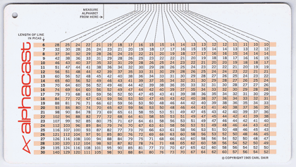
Which, of course, turned out to be available from several sources, and not at ruinous prices; my earlier searches must have been conducted at infelicitous times. At any rate, I now have my own copy of the excellent Number Three in Carl Dair’s series, complete with its own plastic-coated insert, the “Alphacast,” which is a handy tool for “casting off,” or “estimating how much space a typewritten manuscript will occupy when set in any given size and style of type.” Tools like this are pretty much unneeded these days, when we set type digitally and can simply apply the relevant type size and style to the text and see exactly how much space it takes up, but in the days of handset type or hot machine-set metal, there was no easy way to do this.

The Alphacast

In the sort of detail typical of Dair’s work, his Alphacast even deals with the variance created by texts that are full of narrow letters (illicit still) versus those full of wide ones (mammal); the typewritten copy would treat all letters the same, since typewriters typically use fixed-width alphabets, but typeset copy is almost always set in a font with variable widths.

Now the set of A Typographic Quest on my bookshelf will be complete.

In Amsterdam

Published

The ATypI conference in Amsterdam last week was my last one as President of ATypI.

After six years as president, I was stepping down, and at Sunday’s annual general meeting the membership elected José Scaglione as the new president of ATypI. I will remain on the Board, and I expect to be actively involved with ATypI for years to come, but I’m looking forward to attending next year’s conference in Barcelona as a civilian.

I’m pleased with what we’ve done with ATypI in the past six years (and it was by no means just my doing; it was a collective effort). I’m especially pleased with how we have visibly expanded the organization’s reach beyond its heartland in western Europe, staging conferences in St. Petersburg, Mexico City, Reykjavík, and Hong Kong, and taking the design of non-Latin typefaces from a marginal sideshow to a central part of the programming at each ATypI conference, no matter where it’s held. ATypI may have begun fifty-odd years ago as an industrial trade group, but today its most important function is educational. At a time when type, type design, and typography are in the hands of everyone with a computer, there’s more need than ever for an explanation of the history, the standards, and the future possibilities of type.

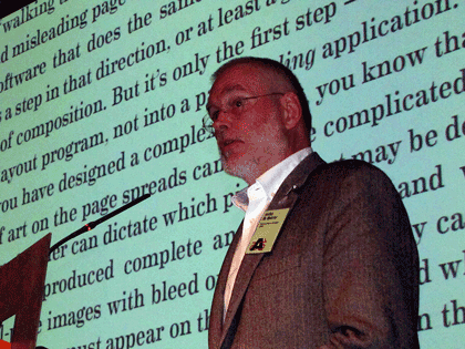
Which leads directly into my own talk on Sunday morning, just before the lunch break on the conference’s final day. I spoke about design for the onscreen page (something that anyone who has followed this blog knows that I’ve written and spoken about many times over the past two years), and I launched a new initiative: the Scripta Typographic Institute, a think tank and advocate for excellence in digital typography and the development of new tools for text typography on screens of every kind. At this point, it’s all about intentions; but by making it public at ATypI I meant to turn it into a real organization, with participation by many more than just myself. If it works the way I hope, Scripta will become a nexus for the development of new ideas and new ways of thinking about reading, and thus about designing for reading, onscreen.

John D. Berry talk: The onscreen page

Between my duties as ATypI president and my preparations for the launch of Scripta, I had very little time to enjoy being in Amsterdam. But I had an unexpected companion: thanks to the machinations of Barbara Jarzyna, ATypI’s executive director, and Thomas Phinney, our treasurer, with the connivance of the rest of the board of directors, my partner Eileen Gunn found her way paid to Amsterdam to join me; and we did manage to have a day or so of plain exploration before the conference itself drew us in.

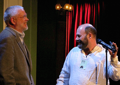
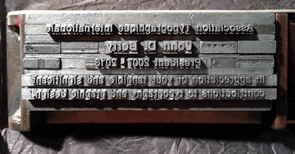
And on Saturday night, at the gala dinner, after the main event – the presentation of the Dr. Peter Karow Award to Donald Knuth – Tom Phinney grabbed me and said, “No, wait, you’re not done yet.” He then gave a short, moving speech to thank me (and embarrass me), handing me a most wonderful keepsake: a metal composing stick full of hand-set type, locked in place, with an inscription (if that’s the right word) that I had to read backwards and upside-down.* I can assure you that it beat the hell out of a gold watch (or any kind of certificate that could have been printed from the locked-up type). I felt honored.

John D. Berry & Thomas Phinney share a laugh

Commemorative stick full of type

That was only a minor part of this year’s ATypI conference, which featured two keynote addresses (by Alice Rawsthorn and Petr van Blokland), each of which presented different perspectives on the nature of design; three awards presentations (the TDC medal to Gerrit Noordzij, the Karow award to Donald Knuth, and, as the closing event of the conference, the Prix Charles Peignot to Alexandra Korolkova); and innumerable excellent talks and presentations by a wide variety of typographers, type designers, educators, and generally inspired people. We had the largest attendance since Mexico City in 2009, and as far as I can tell everyone regarded it as a successful and enjoyable conference.

There was a certain fittingness to ending my term as president in Amsterdam. The last time I had been in the city was in 1990, right after my very first type conference, Type90 in Oxford. At that time I was a rank neophyte, at least in the type world; today I’m at risk of becoming one of the old guard. (That still seems a little weird.) What has changed more than anything else in that time is that type is now in everyone’s hands; the need for understanding it is much greater, and much more widespread, than it has ever been before. Which, of course, offers us a truly wonderful opportunity.

[Images: photos by the ubiquitous Henrique Nardi of me opening the conference (top left), talking about the onscreen page (above), and with Thomas Phinney (also above); my own snapshots of Donald Knuth with Barbara Jarzyna (above left), of Alice Rawsthorn giving her keynote talk (above left, bottom), and of the composing stick full of type that was given to me (above).]

[*Oh, all right. The inscription reads: “Association Typographique Internationale | John D. Berry | President 2007–2013 | In appreciation of your tangible and significant | contributions to typography and graphic design.”]

Hanging by a serif

Published

Recently I published a little booklet called Hanging by a serif: a few words about designing with words. This is the culmination of a project I’ve been working on, off and on, for more than a year: pulling a selection of statements about typography and design from my own writing and presenting them, one to a page, along with a simple decorative element. The hook – quite literally, in some cases – is that those visual elements are all enlarged details of serifs, taken from a wide variety of typefaces. (You’d be surprised how much alike the serifs look on a lot of otherwise distinctive typefaces, when you blow them up in size and cut off the rest of the letter.) I had fun with this, as you might imagine. The hardest part was forcing myself to edit or rewrite my own words, to make them more appropriate to this format and purpose. It was also difficult choosing the quotes, and picking the serifs, but that was the kind of task that you can only revel in: a richness of choice.

One early recipient of a digital version, Scott-Martin Kosofsky, unexpectedly suggested that I “may have invented a new genre, design maxims, making you a kind of typographic Rochefoucauld.” I certainly doubt that my little booklet will go through as many editions and revisions as La Rochefoucauld’s Maximes, but I’ll be happy if it finds a use in the hands of its readers.

For an early draft, which I wanted to take with me on a visit to San Francisco to show to Jack Stauffacher and others at one of his weekly Friday lunches, I had trouble getting the booklet to print properly as page spreads, so I just printed the pages individually and bundled them into a wrap-around folded cover, just to suggest how it might all work as a booklet. What that inadvertant format showed me, however, was that these pages could also work singly, as individual cards. The actual content of those pages has undergone a good bit of revision since that San Francisco trip, but this is the reason why I’m offering Hanging by a serif both as a saddle-stitched booklet and as a set of cards.

When I showed a version of the cards to Juliet Shen at one of our local typographers’ pub gatherings, her immediate thought was, “I could give each of my students one of these and have them do a project based on it.” I hadn’t thought of that; perhaps they have a future use as a teaching tool. (You be the judge.)

This is the “first iteration” of Hanging by a serif; I’m sure it will evolve and appear draped in other clothes. Right now, you can buy the booklet or the cards from the newly created Shop page on this website, and they will undoubtedly be available through other sellers eventually. I sold a few at TypeCon in the SOTA store, and I expect I’ll have at least a few with me at next month’s ATypI conference in Amsterdam. Or you can use PayPal to buy a copy right here, and have me send it to you directly. (If you’re interested in a larger quantity, just send me e-mail at john <at> johndberry <dot> com and let me know.)