function jdb_page_navigation()
sPageSlug = blog
sPageTitle = easily amused
header:139:aPageArgs:page_title = easily amused
header:140:aPageArgs:section_title =
functions-johndberry:262:aPageArgs:page_title = easily amused
functions-johndberry:298:sPageTitle = easily amused
functions-johndberry:359:sPageTitle = easilyamused

easilyamused |

Archive for the category ‘culture’

Cow down

Published

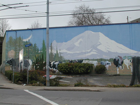
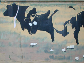
There was no typography involved, but there were a lot of different styles and schools of art. The mural was painted twenty years ago on the side of an utterly nondescript light-industrial building on East Madison Street in Seattle, the home of a locally owned icecream company called Fratelli’s. Its subject was cows, not unusual for an icecream manufacturer. But the cows that covered the side of the Fratelli’s building came in a collage of visual styles, each one reflecting the characteristics of a particular school of painting. There was the Cubist cow, the Impressionist cow, the Jackson Pollock cow. Looming behind them all was the outline of Mt. Rainier, the 14,000-foot volcano that dominates the horizon of Puget Sound. The forms interlocked and interacted in ironic and playful ways, all in the context of what, on the surface, appeared to be a pastoral scene. To walk or drive past this mural was to be reminded of how whimsically and creatively art can spring up.

Detail of cow mural

Fratelli’s went out of business years ago, and for quite some time the building has been awaiting demolition, to make way for some kind of redevelopment on the site. I’ve watched ivy grow over parts of the mural, and more recently large spray-painted graffiti tags appear on top of the lower cows. This past week, finally, the wreckers came, and the building was reduced to rubble.

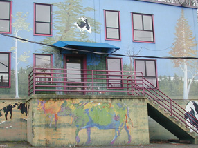
Several years ago, when the building had already been abandoned for a while, I borrowed Eileen’s digital camera and took a bunch of pictures of the mural – close-ups of each cow, and each odd architectural feature (like the way the artist incorporated the protruding base of the concrete stairway into the mural), as well as some shots from across the street to capture the whole thing together.

Detail of cow mural

Detail of cow mural

Zap!

Published

When I googled the name “Zapfest,” to find something I had written about the 2001 San Francisco celebration of calligraphic type, I was startled to find a link to something called “Zapfest 2008.” It turned out to be a one-day music festival in Oxford; it also turned out to be, for reasons unexplained, canceled. (Well, these things happen.) I don’t imagine the reasons had anything to do with possible confusion with a typographic festival that took place seven years ago, but it’s an odd juxtaposition. Clearly, for the organizers of the Oxford music event, the name breaks down into “Zap” plus “fest”; the combination “Zapf” would have been a coincidental one. But for those of us who know and admire the work of Hermann & Gudrun Zapf, it’s hard to imagine not immediately thinking of them and their work upon seeing such a name.

Incidentally, the book that came out of the original Zapfest exhibition is still available.

The work of Chris Stern

Published

If you’re in Seattle this Thursday, don’t miss the opening of an exhibit of brilliantly creative letterpress printing by the late Chris Stern, at the Design Commission (121 Prefontaine Place S., near 4th & Yesler). Chris and his wife and partner, Jules Remedios Faye, formed Stern & Faye, Letterpress Printers, and founded their “printing farm” in the Skagit Valley north of Seattle. Each of them was a fine, and unusual, printer and artist before they met, and their work together has been amazing. When Chris died of cancer a year and a half ago, many of us lost a friend and we all lost an original talent.

The exhibit is in several parts: in addition to Chris’s printed work, there will be photos and artifacts from the printing farm, and prints produced by friends, colleagues, and students of Chris and Jules’s, inspired by their work. Much of this will be for sale, to benefit Jules and help pay off Chris’s outstanding medical bills.

The opening runs from 5 to 10 p.m. (this is “First Thursday,” Seattle’s monthly arts walk in Pioneer Square). If you can’t make the opening, the exhibit will be accessible during business hours at the Design Commission for the rest of the month.

Yes, the exhibit includes a copy of the magnificent volume that Chris created from my little story “Roman Seattle.”

Update June 6:

I’ve posted a few photos from last night’s opening.

“You need to read this!”

Published

People are always asking me what I’ve been reading, whether it’s a conversational ice-breaker like “Read any good books lately?” or a real inquiry about recent intellectual activity. When someone asked me this recently, I found that I had a good, tripartite answer.

In the past year, I’ve read three remarkable nonfiction books: The stories of English, by David Crystal; The world that made New Orleans, by Ned Sublette; and 1491, by Charles C. Mann. Each of these books enlarged my understanding of my own world, and did so in a highly readable, engaged, intelligent manner.

The stories of English traces the history of our language, but does so while exploding the idea that there is only one English language, with all its variants being secondary. Nationalism began imposing a central language on people all over Europe in the 16th century (in France there was an explicit policy of translating what had once been written in Latin into French, and using the language as a tool of state expansion). In the 17th and 18th centuries, the idea of a “standard” language caught hold, with strenuous efforts made to regularize and regulate the national language, and to make one version of the language (usually what was spoken in the capital, or at court) the template for everyone else. Although the English proved too anarchic to set up a national Academy, the way the French had done, there were plenty of pundits in the 18th century trying desperately to do so. And they did succeed in imposing the notion of “correct” language – and by implication to make all other versions “incorrect.” The chapters of Crystal’s book about the English language before and after the Norman conquest are the most fascinating, though everything in the book puts our language into a very welcome and original perspective.

The world that made New Orleans: from Spanish silver to Congo Square does for American history what David Crystal’s book does for the English language: lifts it out of cant and doctrine and exposes its multifarious roots. Ned Sublette has written before about the complexities of New World culture, in Cuba and the its music, where he made it very clear that historically, the ports of Havana and New Orleans have been intertwined since they were founded. What he does here, superbly, is make us feel, not just know, how the cultures of Africa and of Latin America have been integral to the culture of North America all along – not just adjuncts or footnotes or incidental flavorings, but part and parcel of our culture. The world that Ned Sublette portrays is infinitely rich, and it’s ours.

1491: new revelations of the Americas before Columbus is probably the best-known of these three books; it’s had a high profile. I was a bit skeptical of it at first, expecting a woo-woo mishmash; but it’s nothing of the sort. It’s a well documented, carefully described investigation of some of the new scientific information that has emerged in just the last few years about the peoples of the New World before (and immediately after) the arrival of the Europeans. It upsets received notions and refuses a simplified catch-phrase portrayal of either the native cultures or the European cultures that colonized them. Some of what he writes about I already knew – such as the widespread use of fire as a way of modifying the growth of trees and other plants on the pre-Columbian eastern seaboard, which I learned about in reading the cultural geographer Carl Sauer – but much of it was new to me; much of it is simply new, coming from extremely recent research. My skepticism was assuaged when a friend of mine who is a specialist in pre-Columbian art spoke highly of this book and its accuracy. 1491 is not one of those “everything you know is wrong” crowd-pleasers; it’s an enrichment of our understanding, a book that leaves us with more than we thought we had.

Big in L.A.

Published

The first I knew that I’d been quoted in a front-page article on the Image section of last Sunday’s Los Angeles Times was when I responded to a phone message on Monday morning from a potential client in LA. They’d read the article and decided I was their man. I knew that Times journalist Adam Tschorn had interviewed me by phone, while I was on the road at a conference in Florida, about the fonts used by Barack Obama and the other presidential candidates; I hadn’t realized, though, that the article had been published.

Now I find, thanks to a heads-up from Amy Redmond, that this article has been republished (in shortened form) by The Age in Melbourne. I guess this makes me Big in Australia, too. Wonder whether any of my Melbourne friends noticed.

Thanks, Adam. Nice article.

The other letters: women printers in Mexico

Published

In Mexico City a couple of weeks ago, when we had lunch with members of the local type community in the café of the Palacio de Bellas Artes, I met Marina Garone, an Argentinian typographer who lives and works in Mexico. She told us about the exhibition and lecture series she had just organized, “Las otras letras: mujeres impresoras en el mundo del libro antiguo,” about the traditions and history of women printers, and how they embodied the “professional, intellectual and economic life of women.” The opening, which Eileen and I would dearly have loved to be able to attend, was to take place on March 8, in Puebla.

The lecture program is taking place this week, at the Lafragua Library and the Palafoxiana Library, which are co-hosting the events.

“With this exhibition we want to present an aspect of the history of books and printing which is practically unknown in the Iberoamerican world: prints in which the professional, intellectual and economic life of women is reflected. In this exhibition, a total of 63 works printed by Spanish, Mexican, Flemish, and French women, undertaken between the sixteenth and the nineteenth centuries, will be presented.”

At lunch, Marina gave Eileen an impressive book, Casa de la primera imprenta de América: X aniversario, published by the Universidad Autónoma Metropolitana in 2004, celebrating the earliest printshop in the Americas, which includes her essay “Herederas de la letra: mujeres y tipografía en la Nueva España” (heirs – heiresses, literally – of the letter: women and typography in New Spain). This is clearly a fertile area for investigation.

When I asked Marina whether the exhibition would travel, she named a number of cities around Mexico and also in Spain where it was scheduled to be shown; and I hope it will come to the United States sometime as well. I think it should. Certainly I know many women printers in this country – and those who appreciate them – who would be glad to see it.

The future is here

Published

We’ve all been reading for quite a while about the future of advertising, where ads would be targeted directly at each individual consumer, based on information collected about our buying habits, our viewing habits, our listening habits, maybe even our philosophical habits. But I hadn’t realized that it was already happening.

Yesterday I dropped by a local website that I check periodically, Crosscut, a Seattle-based news and comment site with some smart thinking and good writing. As I browsed down the home page, I came across an ad from Amazon – and stopped cold. The four books being advertised were all design and printing books. All of them. How likely is that? Would the average reader have a yen for books about graphic design? No, but I would; in fact, my recent browsing habits on Amazon would probably show a lot of books about typography and related subjects. Was this ad tailored specifically to me?

Personally tailored Amazon ad

The answer is yes. If you click on the ad’s link to “Privacy Information,” you find that, indeed, Amazon is using their records of what you’ve looked at on their site, and choosing which books to push in their ad based on that. Which means that each Amazon ad on Crosscut (or any other website that hosts such an ad) varies its content depending on who’s looking at it, or more precisely whose computer you’re using to look at it. The future is here.

If you refresh the web page, the Amazon ad changes its contents – but they’re still based on your own recent patterns at Amazon’s own site. The contents even seem to vary by web browser; I was using Safari when I discovered this, but logging on to Crosscut from Firefox brought up an Amazon ad with no obvious relationship to me. (Something to do with how my preferences are set in the two browsers? Probably.)

I’m never surprised by invasions of info-privacy; I’ve read enough science fiction to have been expecting this for a long time. But the potential for embarrassment, at the very least, is large. You log on from somebody else’s computer, and when you get to the Amazon ad, you see a suspicious number of books about…typography! “You, uh, look at a lot of, uh, ‘type,’ don’t you?” you ask your friend. His guilty secret is out, for all the world to see.

Update March 10:

Today’s New York Times has an article on this very subject – how web ads are being targeted directly to individuals – but it conspicuously fails to mention Amazon. A surprising omission.

Roman Seattle

Published

Today in his blog on Wired.com, Bruce Sterling wrote a post called “Historical Musings About the Future Ruins of Seattle,” with a link to a “future tour” of the ruins of Seattle’s ancient 520 bridge (“Come Visit the Historic Ruins of Highway 520”).

This made me think of a short piece I wrote in the late 1980s, when the local culture of the Capitol Hill neighborhood in Seattle included ingenious artistic flyers posted on telephone poles – all sorts of art and text, quickly xeroxed and stapled to the wooden poles, soon to be soaked and weathered away, or torn away by irate citizens, or simply covered over by the next layer of new flyers. Many were ads for bands and clubs, part of Seattle’s well-known poster culture. But what I did was create tiny stories, each one complete in itself, and post them on the phone poles in the neighborhood.

One of them was called…

Roman Seattle

from The Mossy Stones Speak: A Handbook of Roman Seattle

It’s easy to see, as you walk around the top of Capitol Hill, the remnants of the ancient Roman city. The capital-less columns on the side of the hill are only the most obvious reminder; now they overlook the freeway, but once from that spot you could have looked west toward the colony’s busy port. The Gallo-Roman tower at the northern crest of the hill, now used for the storage of drinking water, may in fact pre-date Roman settlement, although it shows no sign of Phoenician influence. (Excavations in the vicinity of Volunteer Park have not uncovered any evidence that the tower was connected with the aqueduct system, which implies that its use as a water tower is of much more recent origin.)

Very little else remains of the Roman city, yet its stones and paving have been used again as the building blocks of modern Seattle. It is easy to see fragments of concrete pavement in the walls shoring up the city’s terraced yards today. These chunks of paving have often been brought from more than one site and jumbled together, making it virtually impossible to reconstruct the original location, despite the wealth of material. There are very few inscriptions dating from this period, even fewer than one might expect from random jumbling; it is possible that the local people ransacking the ruins for building materials deliberately discarded fragments with inscriptions on them, or turned the incised sides toward the earth for aesthetic or superstitious reasons.

The plunder of ancient Seattle still goes on, to the despair of archaeologists specializing in this area. The city continues to feed off its own rich and lengthy past, and if it diminishes the record in the process, it does assure a continuity in the successive waves of history that have crested here.

(© 1991)

In 1991, Chris Stern turned my little story into a gorgeously printed letterpress book, hand-bound in boards with accordion-fold pages, hand set and illustrated with his own woodcuts, which were printed in five different shades of gray. I have letter “A” of twenty-six copies. The image at the left is a detail from the principal illustration.

Letras mexicanas

Published

We just got back last weekend from Mexico City, where I went to meet people and research potential venues for next year’s ATypI conference. (This year’s, as noted below, will be in St. Petersburg.) Although Roger Black, who has been the key figure in making this happen and was going to meet us there, had to cancel at the last minute because of a sudden dental emergency, we met with Ricardo Salas – director of the design school at Anáhuac University, very well-known graphic designer, and the driving force behind local organizing for the event. Ricardo organized a whirlwind tour of museums and theaters in the Centro Histórico, all of which seemed promising. He knew the principals of all the venues; indeed, he seemed to know virtually everyone in the city.

It was my first visit to Mexico City. Since I absentmindedly forgot to carry my digital camera with me on the day we trooped all around the Centro, I can’t display snapshots of any of the places we visited, such as the amazing Museo de Arte Popular (folk-art museum) or San Ildefonso with its early murals by Orozco, Rivera, and other famous Mexican muralistas. I could show you photos of a bunch of friends eating, drinking, talking, and laughing in the sun, but that would be cruel to those languishing in wintry northern climes.

Type design and typography are alive and very well in Mexico, although everyone there kept telling us that this was mostly a development of the last ten or twenty years. Yet Mexico has a very long printing history; the earliest printing press in the New World was, and is, in Mexico City. And of course design, graphic and otherwise, has been an essential element of Mexican artistic life.

Fonts in flicks

Published

Windsor Condensed – one of the hardest display typefaces to use well. We tried to use it on the cover of what turned out to be the final issue of the Pacific Northwest Review of Books, back in 1978, but it defied our attempts at spacing it right. Apparently Woody Allen has been using it since about the same time for his some of his movie titles, as documented on Boing Boing earlier today.

Actually, it’s the Elsner+Flake digitization of Windsor Elongated, an even more straitened and squashed version of Windsor, that Woody Allen uses. It’s got a decidedly retro feel, which of course is the point; Woody Allen is nothing if not nostalgic, or at least nostalgia-referential. Apparently it was the ubiquitous and talented Ed Benguiat who recommended this typeface to Woody at a diner in New Jersey, back in the mid-1970s. Windsor also has a lot of spirit of Benguiat’s own swash-inspired style of lettering, which was in full flush in the ’70s and is still recognizable and alive today. (So, indeed, is Ed Benguiat, who is one of the most entertaining type designers around.)

[Left: Windsor Bold in a detail from the cover of the Pacific Northwest Review of Books, vol. 1, no. 4, July/August, 1978.]