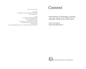
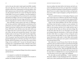
I’ve been reading Cory Doctorow’s new book of essays, Content: Selected Essays on Technology, Creativity, Copyright, and the Future of the Future, and finding it easy to read. This is not surprising, since I designed and typeset the interior of the book myself, but it’s reassuring when I actually have time to sit down with a copy of the finished, printed book and test that it’s truly readable. It is. (I’m not talking about the prose here; Cory’s writing is compulsively readable, in pretty much any format.) The author seems pretty happy with the design, too.
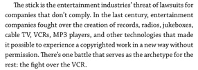
I’ve done a lot of book interiors for Tachyon Publications, but this was somewhat different from most of them. I wanted a typeface that was serious yet not too literary; it would have seemed silly to typeset Cory’s essays in Bembo, for instance. And it had to be very forgiving: it had to make a lot of different combinations of ALL CAPS and C4PS&NUMB3R5 look good, not like big undigestible chunks clogging up the flow of the prose. Normally I would use old-style figures in a book, and small caps for acronyms and anything set in all-caps. But in these essays, Cory uses a lot of acronyms – DVDs, FBI, RIAA, VHS, and DRM are just a few from a single essay – and there are some combinations of capital letters and numbers or other symbols that come from Leetspeak or keyboard-based typing habits that rely on the simplicity of plain ASCII characters. They’re part of the flow, not an interruption of it. This was not exactly an edition of the Penguin Classics.
The typeface I chose was Chaparral Pro, a sort of humanist slab-serif text face designed by the very talented former Adobe type designer Carol Twombly. Chaparral doesn’t have much variation in the width of the strokes, so it doesn’t look “bright” like Times Roman or Janson; but its letter forms are comfortable, familiar, and easygoing, and it reads well in long text. Chaparral has been a favorite of mine since it first came out, though I don’t often get a chance to use it in a book; it might seem a little strong for, say, a book of fiction. But it hit the right balance here. And its caps and its full-height lining figures don’t overpower the lowercase the way they do in some traditional book faces.

Although Chaparral does have old-style figures, the only place I used them was in the table of contents. Similarly, the font includes true small caps, but I only used them in the front matter and the running heads. In the body of the text, it was full caps and lining figures all the way through – in the spirit of the prose itself.
In making the physical object – what Cory calls the p-book – comfortable for carrying around and reading on the fly, it helps to keep it small and light, printed on flexible, off-white paper in a binding that opens freely. Worzalla, the printer, did a good job of this. The strikingly simple cover that Ann Monn designed stands out from other books, and it gets curious glances when you’re reading the book in a coffeehouse. The spine will also stand out on a bookshelf, a useful selling point for physical book-product.
The essays themselves? Read ’em.


Categorized as book design, books, fonts, publishing, typography |

