At TypeCon last week in Boston, I picked up a copy of the newly published book Web Typography by Richard Rutter. While I have certainly not had time yet to read the whole thing, I’ve been perusing it haphazardly and joyfully. I’m impressed. It’s living up to the recommendations I was hearing in Boston.
It’s fitting that the largest section of this book is the one called “Typographic Detail.” Rutter has obviously absorbed a wealth of typographic knowledge; the resources he cites in his bibliography include not just Bringhurst’s Elements and Cyrus Highsmith’s Paragraphs but Dowding’s Finer Points in the Spacing & Arrangement of Type, Tschichold’s Asymmetric Typography, and Jost Hochuli’s Detail in Typography. (It also includes, to my appreciative amusement, Erik Spiekermann’s 1987 Rhyme & Reason: a Typographic Novel.
Rutter is adept at explaining and demonstrating the fine points of typographic composition, and doing so in the context of responsive design for the web. His writing is fluid, direct, and informal; even when he’s making a technical point, it’s never less than clear.
Writing about choosing robust typefaces for text onscreen: “Although modern screens have a pixel density capable of rendering intricate glyphs, the nature of emitted rather than reflected light eats into those forms. Robust forms stand up to this bullying, leaving high resolutions to render any subtleties, thereby rewarding you and your reader in tempering the ruggedness of the type.”
I don’t always agree with Rutter’s aesthetic opinions, but they are always well thought out and defensible. He recommends tightening up the letter-spacing of Univers (“Tightening Univers by 1% gives a more contemporary feel”), while I think it crams the letters together and loses the woven texture that was at the heart of Adrian Frutiger’s type designs; but it’s arguable, and in shorter lines than his visual example, it might work. Disagreements like this, however, are rare as I’m reading through the book; on the whole, and in detail, I would trust Richard Rutter’s taste and typographic choices.
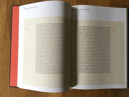
This well-made, well-printed 330-page book is also well designed and well thought out. The body text, set in Thomas Gabriel’s Premiéra (which I hadn’t encountered before), is inviting and comfortably readable, although I think it would have been even more so with the line length a pica shorter. The organizational hierarchy is easy to follow, the illustrations are clear and to the point, and the book is full of useful cross-references.
There’s a good bit of back matter, but for a reference book, there’s one thing obviously missing: an index. Rutter provides a “CSS Index,” which is logical given the subject matter, but that’s only helpful if you already know the name of the CSS term you’re looking for. A regular index of subjects or even of terms would be helpful in a printed book (“Where was it that you were talking about letter-spacing Univers?”). But there is one very useful thing tucked into the back pages: a list of “Guidelines,” in sequence by chapter, with page numbers. “This book is written as a series of guidelines,” says Rutter, and this list serves as an excellent guide to the book’s essential information. It really belongs up front, as a sort of expanded table of contents.
My only production quibble is that the physical book is heavier than it needs to be. A somewhat lighter stock would have made it lighter in the hand, feeling less like a tome.
One little surprise that I discovered was a short section at the end, “Communicating your design.” If you’re not doing all the coding yourself, you’ll have to communicate accurately all the details of your typographic design to the person who is going to implement it in HTML, CSS, JavaScript, and perhaps more arcane languages and tools. Which brings us back around, full circle, to where I came in: as a phototypesetter in a small Seattle printshop in the early 1980s, offering workshops to our clients on how to spec their type properly so they would get back the typeset results they were hoping for.
You could quite easily use Rutter’s book as an introductory guide to typography, not just to typography on the web. It is aimed squarely at the most flexible and problematic area of publishing today, but its advice is grounded in principles drawn from five centuries of typography in print, and it’s applicable to any form of visual communication that uses words.
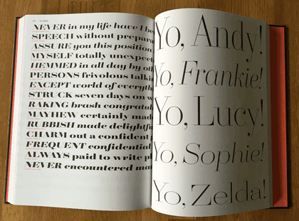
[Images: cover and a couple of page spreads from Web Typography.]