function jdb_page_navigation()
sPageSlug = blog
sPageTitle = easily amused
header:139:aPageArgs:page_title = easily amused
header:140:aPageArgs:section_title =
functions-johndberry:262:aPageArgs:page_title = easily amused
functions-johndberry:298:sPageTitle = easily amused
functions-johndberry:359:sPageTitle = easilyamused

easilyamused |

Archive for the category ‘publishing’

When s changed

Published

The best use I’ve seen yet of Google Labs’ nifty new Books Ngram viewer is from Frank Chimero: “Rest in peace, medial s.” By doing a little intelligent searching on several words that would have used the long-s in earlier books but had lost that form in more recent times, he pinpointed when it changed: right around the year 1800.

Which is just about what I would have guessed, based on a thoroughly unscientific analysis of what I recall from books and publications I’ve seen from various periods. It also corresponds reasonably closely to the much more detailed summary given by James Mosley in his article “Long s,” which records not only changes in usage around the turn of the 19th century but also changes in the availability of the long-s in new type fonts.

[Image: long & short italic s, and a long-s/t ligature, from Adobe Jenson Light]

With a little help from his friends

Published

Cory Doctorow’s self-published book With a Little Help has just been released. It seems a little redundant to announce something done by Cory, who has one of the most ubiquitous and entertaining public personas on the web, but I had a hand in this particular project. As I wrote last May, I designed the interior of the book and did the typographic production for the printed version, although the covers are entirely out of my hands. (There are several versions of the covers.) He’s been writing about the project for Publishers Weekly, so it’s not exactly a low-profile endeavor. Nonetheless, it’s an experiment – to see how a book published entirely outside the normal publishing channels compares in sales and success to one done the normal way. Let’s see how it does.

Oh, by the way, Cory writes good stories.

[Image: one of the four alternate covers to the paperback edition, this one by Frank Wu.]

Web type at last!

Published

This has turned out to be the year of web fonts. I don’t just mean typefaces designed for use on the web; that’s been going on for at least a decade and a half, most notably with the spread of Verdana and Georgia throughout the online world. I mean that at last we’re getting a workable system for using a variety of typefaces on web pages – and being reasonably certain that everyone viewing those pages will see the same typefaces, not some substitute based on what happens to be available on their computer.

A year ago, this seemed impossible. There was a whole track of programming at the ATypI conference in Mexico City about web fonts, and lots of interest in the topic, but there seemed to be no common ground for agreement about the right way to move forward.

WOFF

In the past year, however, the key players came together to form a Web Fonts Working Group under the auspices of the W3C (World Wide Web Consortium), and after months of hard work and persuasion, they agreed on a new format for web fonts. It’s called WOFF (Web Open Font Format), and it’s well on its way to becoming a generally accepted standard. According to Erik van Blokland, one of the creators of the format, WOFF will be “the only (!) specification that W3C will recommend for use on the web.”

All of the newest versions of major browsers, either out now or out soon, support WOFF, including the recently-released beta version of Internet Explorer 9. (Mozilla Firefox was the first to implement WOFF support; Mozilla was one of the developers of the format.) Browsers may implement other formats as well, but WOFF is likely to be the only format that’s guaranteed to work across all “modern” browsers.

Properly speaking, WOFF isn’t a new font format; it’s a software wrapper around an existing TrueType or OpenType font. The WOFF wrapper includes “metadata” – information about the font – that font vendors can use to tell you who designed the typeface, who licensed it to you, and what the terms are for that license. This is just information; there’s no enforcement involved, no DRM, nothing to prevent someone who’s willing to go to a little trouble from unpacking the font inside the wrapper. The purpose of the metadata is to make it obvious to anyone who downloads the font that it’s a web font, intended for use while viewing a web page, not a “desktop” font that you can use in any file or application you want. This whole approach is promulgated on the assumption that most people, if it’s clear and easy for them to do the right thing, will, in fact…do the right thing.

Web-font services

The newest versions of all the major web browsers support WOFF, which makes it a universal format going forward. Looking backward, of course, is another story. What about older browsers that don’t have WOFF support built in? Lots of websites will be viewed in older versions of all of the major browsers. That’s where web-font services come in.

At the same time that vendors and manufacturers are coming out with sets of fonts intended for the web, an increasing number of web-font services have sprung up, each offering its own system for supplying those web fonts to designers and end users.

There are two parts to a web-font service: 1) making the fonts available to web designers so they can specify them in the designs of their web pages; and 2) enabling those fonts to be downloaded to users’ systems when they view those web pages.

The web-font service takes care of delivering the right fonts in the right formats to each version of each browser; the website host or designer makes an arrangement with the service, usually for a fairly nominal fee, and then uses the fonts available for that service in designing their web pages.

The list of web-font services is growing almost daily; so is the list of font foundries who are offering their fonts in web versions. There are many different ideas about the best way to do this, both technically and from a business standpoint. A web designer just has to pick one and give it a try. They’re all available right now.

There is variation in quality, of course. Typekit, for instance, which is perhaps the best known, offers fonts from a lot of different foundries; some of them are better engineered for onscreen use than others. Webtype.com, launched by Font Bureau, offers not only a web-font service but several families of carefully designed new fonts, with their roots in metal but their forms dictated by what works onscreen. Adobe recently launched their web-font library, a wide selection of font families from their larger font library, and already Adobe has upgraded and improved the rendering of some of those fonts. On the web, it’s very easy to update things, to iterate; there’s no final form. Now that the floodgates have opened, you can expect things to keep changing fast, and the quality to keep getting better at a rapid rate.

For users, the WOFF revolution is a very good argument for upgrading your browser, since only the newer versions of each browser will support this format. (You may get good results from some of the backward-compatible formats offered by some web-font services, but you will get better results – the type will be more readable – with an up-to-date browser.) If you’re a web designer, it’s time to start looking into WOFF.

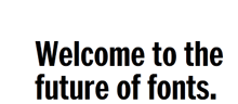
[Image: an apt slogan taken from the homepage of webtype.com]

Pontificating

Published

I was interviewed last week, along with Simon Daniels, by “unsolicited pundit” Glenn Fleishman, who writes regularly for the “Babbage” blog on The Economist‘s website. The subject was type on the web – a huge subject that I’ve been trying to write my own blog post about without success. I guess it’s easier to have someone else asking the questions (and writing up the answers) than to put it all together yourself. I think Glenn plans to write more about the subject; this one article doesn’t come close to exhausting it, but it’s a good start.

“Systems for pages”

Published

Roger Black has been thinking about template-based editorial design for quite a while; when I was talking to him in Mexico City last year, he said he’d been focusing more and more on this kind of systematic design. Last week he, along with Eduardo Danilo, Sam Berlow, Robb Rice, and David Berlow, launched a new venture called “Ready-Media” that would market exactly that. “We’re making systems for pages, not pages themselves,” Roger said in their press release.

Over on spd.org, the website of the Society of Publication Designers, the shit hit the fan. Bob Newman’s brief article “Just Add Water” (Grids, July 20) generated a long slew of heated comments, many of them objecting to the very idea of design templates and worrying that Roger Black was (once again?) going to destroy the profession of publication design. A few people pointed out that templates have been with us for decades, and that the most likely effect may be to raise the base level of quality on low-end publications, rather than replacing “real” designers on big-ticket designs. (The real question there will be whether Ready-Media’s services are priced for low-end or high-end clients.)

Quite apart from the business of offering canned design for sale, templates are essential for what I call “automating quality.” This means not just crafting a beautiful page, but creating a flexible system that you can use to pour varying kinds of content into and create a reliably good result. When I was a compositor at Microsoft Press back in the 1980s, we worked on just this sort of problem with the books we were designing and producing. (I even found myself writing hexadecimal translation tables and complex logical “formats” in order to massage the text we imported into the CCI composition system.) On a text-paragraph level, this is also what Adobe implemented a decade later with InDesign’s multi-line composer. (In the interim, I had been writing a series of white papers for Aldus Corporation, delving into the details of the composition engines underlying, respectively, PageMaker and QuarkXPress, both of which were trying to create workable typographic defaults.)

Ideally, in a truly flexible layout system, you have the same kind of hierarchy of rules for laying out the elements on the page that you have for deciding where to hyphenate a word at the end of a line of text. It’s the same kind of “if, then” decision-making, but at different levels. I’ve seen web designers apply this kind of thinking (too rarely!) to the ever-shifting sizes and orientations of web pages, trying to make sure that the layout adapts to give the best possible result in any circumstances. (Not surprisingly, Ready-Media promises to add templates for web design shortly.) And at a simple level, even in a word-processing program, the use of paragraph- and character-level styles is a tool for intelligent automation.

Nobody can automate quality completely. At the end, you always need to apply a trained eye and make corrections and adjustments. But a good, well-thought-out decision-making system will get you to a much higher plane right from the start.

Download my book!

Published

Do it now! Act without thinking! Do it now!

Inspired by the success of Cory Doctorow in giving away the texts of his books in every conceivable electronic form, and yet ending up selling more copies of the printed books than his publishers would otherwise expect, I have put together a digital version of Dot-font: talking about design, which you can download for free.

This PDF is designed for easy onscreen reading – or for printing out two-up on your laser printer and reading in a comfy armchair. I am also including the full text in a Microsoft Word file (.doc) and in a “plain text” file (.txt), for those who prefer either of those formats.

This electronic version is published under a Creative Commons license; you’re free to share the files, though not to claim them as your own or make money off them. (For the details of the license, look here or see the copyright page of the digital book.) I haven’t included the right to create “derivative works” based on this book – but hey, if you’ve got an idea for a stirring adventure series set in the “dot-font” universe, or if you have an uncontrollable urge to make “dot-font” action figures, let me know.

Unlike Cory’s novels and essay collections, the print version of Dot-font: talking about design is illustrated. The electronic version is not. I can’t give away other people’s images, but I can freely distribute the full text.

So go ahead, download the book. Pass it on. Let me know what you think. And let Mark Batty, my excellent publisher, know too. Let a hundred dot-fonts bloom!

Download dot-font

Don’t wrap it, I’ll read it here

Published

The demo of a new online interface for Sports Illustrated, based on HTML5, does a good job of showing off fancy magazine layout in a screen-friendly format. But it falls down when you look closely – when you tear your eyes away from the action photos and try to read the text.

Like all those current e-books, this e-magazine falls down in simple text typography. The text of the articles is justified, yet there’s no hyphenation. When your text composition engine doesn’t even hyphenate the word “grandmother” at the end of a loose line, it’s just not doing its job.

The page designers at Sports Illustrated make it even harder by shoving intrusive pull-quotes into the main text block and wrapping the text around them. This is a bad enough at any time (it says, in effect, “we don’t care about the words, just the shape”), but it’s inexcusable when you can’t even hyphenate those extra-short lines next to the pull-quotes. Text wrap and justification rarely work together. (Anybody heard of a multi-column grid?)

Oh yes, and the pull-quotes use straight apostrophes. With a non-typewriter typeface.

In a tweet today, after seeing the demo, Roger Black called it “The best digital magazine . . . yet!” Which may be true – but if so, there’s still a long way to go.

[Images at left from the YouTube video about the HTML5 new prototype.]

With a little text

Published

Cory Doctorow was in town Friday, as part of his whirlwind tour for his new book For the Win, and Linda Stone hosted a small late-afternoon gathering for him on her back deck. (Linda’s house has a glorious view of Lake Washington, and Friday turned out to be a warm, sunny day. We even spotted a bald eagle cruising overhead. “The emperor will die,” muttered Matt Ruff, gnomically.)

Cory had with him four printed copies of his next new book, the quixotic project With a Little Help, each with a different cover. This is a collection of short stories, which Cory is publishing himself in a variety of formats, some of them given away – largely to find out what happens when you do this without a regular publisher. I had designed and typeset the interior of the book, creating pages that I hoped would work both printed and bound as a perfect-bound paperback by Lulu and read as a PDF onscreen, but until Friday I hadn’t seen it printed out, except as drafts from my laser printer. Now I have an advance copy, with a cover by Frank Wu, and I’m pretty pleased with the way it all came out. The binding is flexible, and the paper is an off-white with no glare. (Cory was going to get some galleys printed at a quick-print shop in London, but found that it was cheaper just to order copies for himself from Lulu and have them delivered to him en route. A truly dispersed publishing method!) The pages seem readable, which is the whole point.

I’m not sure when the official launch is, but no doubt it’ll be soon. Meanwhile, if you’re in San Francisco this Wednesday, Cory will be doing a benefit reading at the 111 Minna Gallery, as a fundraiser for EFF (Electronic Frontier Foundation).

The typography of e-books

Published

It’s gratifying to see, at last, some attention given to the shortcomings of the various e-readers. It took the hoopla around the introduction of the iPad to get us to this critical state. Perhaps the most telling thing about the iPad as a reading device is where it doesn’t improve on its predecessors.

None of the existing e-reading devices – or at least none that I’ve seen – have good book typography. They look superficially impressive – “a decent simulacrum of printed pages,” as Ken Auletta said of the Kindle in his recent New Yorker article – but when you look closely at the actual words on the page, you find that they’re rather crudely typeset. I’m not talking about the fonts or how they’re rendered onscreen; I’m talking about spacing, which is what typography is all about. Most notably, none of the most popular e-readers employ any kind of decent hyphenation-and-justification system (H&J, in digital typesetting terms). And yet all of them default to fully justified text.

Kindle text sizes

As anyone who has done production typesetting or has designed a book meant for reading knows well, the factors that make a block of text easy or hard to read all occur at a scale smaller than the page. The most obvious is the length of the line, but line length is engaged in a complicated dance with the space between lines, the space between words, and the spaces between letters. The choice of typeface is almost irrelevant; any legible typeface can be made readable with enough care given to the spacing. (Well, almost any legible typeface.) Finding the right combination of all these factors for a particular typeface, and for a particular author’s words, is what text typography is all about.

All of these space relationships will be thrown to the winds if you typeset a page with justified text but no hyphenation. There’s a reason why the words “hyphenation” and “justification” are used together.

In producing a printed book, you can massage all these variables until you get pages that look consistent and that are effortlessly readable. You can do the same for a book that’s going to be read on a screen, but only if the end result is in a static format, such as a PDF document – essentially, a printed page by other means.

But one of the great advantages of e-readers is that you can change the type size at will. (In some, you can also change the typeface, within a narrowly circumscribed range of choices.) Lovely! But then what happens to all those careful choices about line length and word spaces and so on? They have to be made again, on the fly, automatically, by the software. And if the software isn’t smart enough to know how and when to divide words, then the spacing is going to look like hell.

Which is pretty much the way it does look, except when we get lucky, on all of the popular e-reading platforms. Great big holes appear in some lines, or a cascade of holes opens up on adjacent lines, which typographers call a “river.” It’s not just ugly; it slows down reading.

This is bad enough on a normal rectangular page, but it gets even worse when some visual element – an illustration, for instance – intrudes into the text block and the text has to wrap around it. Bad examples abound.

Some people like justified pages on an e-book page because they’re used to it in printed books. Fine. But they’re also used to better typesetting in printed books (even sloppily done ones) than we’re getting so far in e-books. The simplest solution is to give the reader a choice: justified or unjustified. And make the default unjustified. A ragged right-hand edge is easier to read than a ragged middle that’s full of holes.

The ideal solution, of course, is to have a good H&J system built into the e-book reader. But creating a really good hyphenation and justification program isn’t a trivial undertaking. Not only does the software have to know where it can break a word, and have some parameters for knowing when to break it, but the program should also modify these choices depending on the lines above and below the current line. This is what Adobe InDesign’s “multi-line composer” does. No automated system is perfect, but InDesign’s default text composition is pretty good. Certainly something like that would be a vast step upwards from what we see in e-books today.

Since we’ll all be stuck reading digital books at least some of the time, I’d like to see the standards of book composition improve, and improve fast. It might start with reviewers not blithely passing over the poor typesetting and getting wowed by the hardware or the pretty pictures. There has to be a demand for good composition in e-books. Attention to quality on that level doesn’t often get rave reviews; most people never consciously notice it. But they definitely notice it on an unconscious level, and it affects their willingness to read a book or abandon it. This is true in printed books; it’s just as true in e-books.

Who will bring out the first really good e-book reader?

[Photos: iBooks page spreads from iPad in landscape mode (left); animated GIF of Kindle page as the font size changes (above).

Detail in typography

Published

When I read through the new edition of Jost Hochuli’s Detail in typography, I found myself wondering, “Have I really learned anything about type in the last twenty years?” Most of the points I find myself making to people over and over again can be found in these pages, organized and explained more clearly than by any other writer I know. A large part of what Hochuli says can be summed up (inadequately) in the aphorism I keep repeating: typography is all about space.

Detail in typography was originally published in 1987 by Compugraphic, as one of a triad of little booklets by Jost Hochuli; the other two were the complementary volume The design of books and a jeu d’esprit called Jost Hochuli’s Alphabugs, in which the author/designer played with expressive display typography and the meaning of words. The books were (all three of them, I think) published in several languages; the English-language edition was translated by Ruari McLean. (One of my two copies of Detail in typography is inscribed to me by Ruari McLean, dated February 1989. I never met McLean, unfortunately, though we were in contact about his then-unpublished translation of Jan Tschichold’s Neue Typographie.)

The book was revised and updated in German in 2005, and this new English edition, published by Hyphen Press in London, is expanded and newly translated by Charles Whitehouse. Although the book is slightly longer than its first edition (64 pages instead of 48), its format is even smaller: 125 x 210 mm, to match the Hyphen Press format for small books. It fits handily in most pockets. Like its original edition, this one is two-color, paperbound with full-width flaps, on uncoated off-white paper stock, and it opens easily in the hand. Jost Hochuli is a master of book design, and Robin Kinross, proprietor of Hyphen Press, is a stickler for production quality.

Hochuli’s focus in this little book is the details of text typography, or “microtypography.” (The design of pages and whole publications is the realm of “macrotypography”; he has expanded on that subject in Designing books: practice and theory.) The fundamental elements that he writes about are the letter, the word, the line, linespacing, and the column, with a bit at the end that he calls “the qualities of type.” He leads off with a short discussion of the process of reading; this was where I first encountered the word saccade, a technical term for rapid eye movement, specifically the way our eyes move as we read a line of text. (They don’t move smoothly along the line, but jump from clump to clump of letters – not necessarily by word, but by visual cluster. They jump backwards, too, quite frequently; just how frequently is one of those things we quantify while trying to come up with a scientific measurement of readability.)

I won’t make Hochuli’s points for him here, nor will I expropriate them as my own. (I quote them often enough.) I’ll just repeat one paragraph from his introduction, because he clearly lays out the scope of what he’s writing about:

While macrotypography – the typographic layout – is concerned with the format of the printed matter, with the size and position of the columns of type and the illustrations, with the organization of the hierarchy of headings, subheadings and captions, detail typography is concerned with the individual components – letters, letterspacing, words, wordspacing, lines and linespacing, columns of text. These are the components that graphic or typographic designers like to neglect, as they fall outside the area that is normally regarded as ‘creative’.

This is one of those books that belongs on everyone’s bookshelf – everyone who deals in any way with turning text into readable pages, whether the words are their own or someone else’s.