function jdb_page_navigation()
sPageSlug = blog
sPageTitle = easily amused
header:139:aPageArgs:page_title = easily amused
header:140:aPageArgs:section_title =
functions-johndberry:262:aPageArgs:page_title = easily amused
functions-johndberry:298:sPageTitle = easily amused
functions-johndberry:359:sPageTitle = easilyamused

easilyamused |

Archive for the category ‘publishing’

Copper Canyon e-book potlatch

Published

On Wednesday I was in Port Townsend for an “E-book Potlatch” at Copper Canyon Press. The press is housed in one of the old wooden buildings at Fort Worden, a former military base turned into a state park and cultural & arts center; Copper Canyon has been there since the 1970s, publishing some of the best in modern and international poetry. Right now they’re figuring out how to bring their backlist (and their front list) into e-book format alongside their printed books – and how to do it right. Consortium, the independent-books distributor, and the “e-book aggregator” Constellation (both part of the Perseus Books Group) sent three people to this planning meeting; according to Consortium’s Michael Cashin, Copper Canyon is on the cutting edge of creating readable e-books for poetry.

For five years in the ’90s, I was the designer for Copper Canyon’s books and collateral, and I’ve done a few projects since then, but my only current connection is as a friend and supporter of the press. Still, e-book typography is what I’ve been thinking about for the past year, so it made sense to participate in the meeting. I was impressed by the level of thinking and planning that was already going on. Both Copper Canyon and Consortium are committed to finding good ways to get books into practical e-book form right now, for immediate sale, and at the same time to developing formats that will be true to the unique demands of poetry and the future demands of technology. It’s not an easy task, but it’s well worth doing. This is an essential part of our culture.

The all-day summit was productive but exhausting. At the end of the day, Copper Canyon hosted a cook-out on the beach at Discovery Bay, where executive editor Michael Wiegers cooked up clams and prawns and salmon, and a few bottles of wine were drunk. It was one of this summer’s rare warm, sunny days, and some of the madder members of the crew ran out into the cold, cold water for a refreshing dip. That’s how the future of publishing happens.

[Photo: Michael Wiegers (left) and me on the beach at Discovery Bay. Photo by Valerie Brewster.]

What is needed

Published

Books are digital. This is not, strictly speaking, true; but it’s about to be, with a few honorable exceptions. Already today, pretty much all commercial books are produced digitally, although the end product is a physical one: ink printed on paper, then bound and marketed and sold. Already, the selling may be done as often online as in a bookstore. Already, the same books are being issued more and more in electronic form – even if, as yet, the e-books are mostly very shoddy in conception and execution.

But that will change. In order for it to change in a worthwhile way, we have to spell out just what form these books ought to take.

So what’s needed? How do we make good e-books? What should a good tool for designing and creating e-books look like and do? What should the result – the e-book itself – be capable of? And what should the experience of reading an e-book be like?

Last question first. If it’s immersive reading – a story or narrative of some kind – then you, as the reader, should be able to lose yourself in the book without thinking about what it looks like or how it’s presented. This has always been true for printed books, and it’s equally true for e-books.

But e-books present a challenge that printed books do not: the page isn’t fixed and final. At the very least, the reader will be able to make the font bigger or smaller at will, which forces text to reflow and the relative size of the screen “page” to change. That’s the minimum, and it’s a fair bet already today. But the reader many read the same book on several different devices: a phone, a laptop, a tablet, a specialized e-reader, or even the screen of a desktop computer.

For a real system of flexible layout in e-books and e-periodicals that might be viewed on any number of different screens at different times, what’s needed is a rules-based system of adaptive layout. I like to think of this as “page H&J”: the same kind of rules-based decision-making on how to arrange the elements on a page as normal H&J uses to determine line endings.

The requirements for this are easy to describe – maybe not so easy to implement. We need both design & production tools and the reading software & hardware that the result will be displayed on.

A constraints-based system of adaptive layout

The interesting problems always come when you have two requirements that can’t both be met at the same time. (For example: this picture is supposed to stay next to that column of text, but the screen is so small that there isn’t room for both. What to do?) That’s when you need a well-thought-out hierarchy of rules to tell the system which requirement takes precedence. It can get quite complicated. And the rules might be quite different for, say, a novel, a textbook on statistics, or an illustrated travel guide.

OpenType layout support. This means support for the OpenType features that are built into fonts. There are quite a few possible features, and you might not think of them as “layout”; they affect the layout, of course, in small ways (what John Hudson has called “character-level layout”), but they’re basically typographic. Common OpenType layout features include different styles of numerals (lining or oldstyle, tabular or proportional), kerning, tracking, ligatures, small-caps, contextual alternates, and the infinitely malleable “stylistic sets.” In complex scripts like Arabic, Thai, or Devanagari, there are OpenType features that are essential to composing the characters correctly. None of these features are things that a reader has to think about, or ought to, but the book designer should be able to program them into the book so that they’re used automatically.

Grid-based layout. It seems very obvious that the layout grid, which was developed as a tool for designing printed books, is the logical way to think about a computer screen. But it hasn’t been used as much as you’d imagine. Now that we’re designing for screens of varying sizes and shapes, using a grid as the basis of positioning elements on the screen makes it possible to position them appropriately on different screens. The grid units need to be small enough and flexible enough to use with small text type, where slight adjustments of position make a world of difference in readability.

Media query. This is the name used for the question that a program sends to the device: What kind of device are you? What is the resolution of your screen? How big is that screen? What kind of rendering system does it use for text? With that information, the program can decide how to lay out the page for that screen. (Of course, the device has to give back an accurate answer.)

Keep & break controls. These are rules for determining what elements have to stay together and what elements can be broken apart, as the page is laid out. This means being able to insist that, say, a subhead must stay with the following paragraph on the page (keep); if there isn’t room, then they’ll both get moved to the next page. It also means that you could specify that it’s OK to break that paragraph at the bottom of the page (break), as long as at least two lines stay with the subhead.

Element query. I’ve made up this term, but it’s equivalent to media query on a page level. The various elements that interact on a page – paragraphs, columns, images, headings, notes, captions, whatever – need a way of knowing what other elements are on the page, and what constraints govern them.

H&J. That stands for “hyphenation and justification,” which is what a typesetting program does to determine where to put the break at the end of a line, and whether and how to hyphenate any incomplete words. Without hyphenation, you can’t have justified margins (well, you can, but the text will be hard to read, because it will be full of gaping holes between words – or, even more distracting, extra spaces between letters). Even unjustified text needs hyphenation some of the time, though it’s more forgiving. When a reader increases the size of the font, it effectively makes the lines shorter; if the text is justified, those gaps will get bigger and more frequent. But there are rules for deciding where and how to break the line, and a proper H&J system (such as the one built into InDesign) is quite sophisticated. That’s exactly what we need built into e-book readers.

In digital typesetting systems, the rules of H&J determine which words should be included on a line, which words should be run down to the next line, and whether it’s OK to break a word at the end of the line – and if so, where. A system like InDesign’s paragraph composer can do this in the context of the whole paragraph, not just that one line. A human typesetter makes these decisions while composing the page, but when the font or size might be changed at any moment by the reader, these decisions need to be built into the software. In “page H&J,” where the size and orientation of the page itself might change, the whole process of page layout needs to be intelligent and flexible.

Up until now, in the digital work flow, the software’s composition engine has been used in the creation of the published document; the human reader is reading a static page. But now, with flexible layout and multiple reading devices, the composition engine needs to be built into the reading device, because that’s where the final page composition is going to take place.

It’s easy to create a document with static pages that are designed specifically for a particular output device – a Kindle 3, for instance, with its 6-inch e-ink screen, or a 10-inch iPad. I’ve done it myself in InDesign and turned the result into a targeted PDF. But if that’s your model, and you want to target more than one device, you’ll have to produce a new set of static pages for each different screen size and each different device. Wouldn’t it be better to have a flexible system for intelligently and elegantly adapting to the size, resolution, and rendering methods of any device at all?

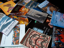
[Photo: a 17th-century Mexican handbook, about the size of a hand-held device, from the collection of the Biblioteca Palafoxiana, displayed during Typ09 in Mexico City. With ink show-through from the back of the page, which will probably not be a feature of e-books.]

Showing backbone

Published

The Print Regional Design Annual hove into sight the other day, joining the stack of recent graphic-design and typography magazines: Metropolis, Eye, Typo, and the new one, Codex. The Print annual was a particularly fat example, but then you’d expect it to be. What distinguishes all of these disparate magazines, however, besides interesting content, is their binding: every one of them has a flat spine.

What’s the point of this? To look at a set of issues on the shelf, after the fact? If a magazine contains enough pages, of course, you have no choice; it must be perfect-bound (the pages trimmed and glued into a spine), since saddle-stitching (folding the sheets and stapling in the middle) is only practical for a relatively thin publication. But it seems as though most magazines these days (not just graphic-design magazines) are bound so they have a flat spine, no matter how thin the issue itself may be. I even got an unsolicited men’s-clothing catalog last week, all of 68 pages, that was bound into a spine, for no apparent reason.

The problem with perfect-binding a magazine is that it won’t lie flat. Nor can you fold it open to read one page at a time, for convenience in a crowded space (or simply to keep the pages less floppy). The spine creates a gutter, which neither editorial designers nor designers of ads for those pages ever seem to take into consideration; on the inner edge, both images and text curve into the gutter and get lost. It’s possible to design with that in mind, but how often have you seen it done?

Print is a perfect example of the real advantage of a glued spine to the publisher of a graphic-design magazine: it makes it very easy to bind in inserts from paper companies who want to show off their wares to potential customers. This isn’t new; the very first issue of Print, in June 1940, included paper samples to accompany an article on the design of wallpaper, and subsequent issues had bound-in samples from printers and paper manufacturers. Today, Print and other popular design magazines like How are thick with this kind of insert. These stiff or thick or off-size pages may serve a function, as illustration or advertising, but they make it impossible for a reader to flip through the pages – one of the most common ways of reading or browsing any printed publication.

The roadblocks along the path through a magazine rarely come at logical stopping or starting points in the magazine’s content. Very few magazines these days maintain an “editorial well” that’s separate from the advertising, and converging trends in editorial and commercial design make it hard to tell the content from the ads. That’s hardly a new trend, but it’s reinforced by the random-seeming intrusions of stiff-papered inserts.

The current popularity of spines on magazines seems part of a dismissive approach that looks at the magazine (or a book, for that matter) as a physical object to be sold, without giving any thought to how that object will be used. There are exceptions – Eye, for instance, uses multiple paper stocks in each issue, but they have similar weight and flexibility; and the page design almost always takes the gutter into account, so despite being perfect-bound, Eye is pretty comfortable to open and read. So is Typo, although its binding is stiffer than Eye’s. But Typo is usually thin enough that it could dispense with the spine entirely, which would make it easier to hold and read.

Some magazines have content that demands immersive reading; others are almost entirely meant for casual browsing. Neither of these functions is well served by pages that are tightly bound into a hard spine.

[Images: two spreads from the Print Regional Design Annual 2011.]

Talking about fonts

Published

Now download my other Dot-font book

Four years ago, Mark Batty published a pair of books by me, Dot-font: talking about design and Dot-font: talking about fonts, which were intended to be the first of a series of small, handy books on typography and design. Last year, I made the first one (on design) available as a free download. Now, I’m posting the second book (on fonts) as well, also as a free download.

Please download the text of both books and enjoy them.

You can download the complete text of Dot-font: talking about fonts as a PDF, designed and formatted for onscreen reading; as a Word document; or as a text file. The illustrations that appear in the printed book are not part of these downloads; I don’t have rights to reproduce and distribute all of the images in digital form, so for the full visual effect you’ll have to buy a copy of the physical book (which of course I encourage you to do). Some of those images appeared online at Creativepro when the original columns were published, but there are quite a few original images that were created for the book: for example, the series of photos that Dave Farey made from scratch, to illustrate the process of cutting a letter by hand out of Rubylith in order to create a Letraset font in the 1960s.

This book, like the last, is published under a Creative Commons license. Please do not distribute it without that license information.

The Creativepro columns that seemed worth collecting into a book broke down naturally into three categories: design in general, typefaces or fonts, and typography or how type is used. So I’ve still got the material for a third book, Dot-font: talking about typography. Is there a demand? You tell me.

Download dot-font

Designing digital books

Published

At TypeCon in New Orleans last month, I spoke about “New problems in book design” – basically the question of how to apply good typography to the design of books that are meant to be read on a screen. Here’s a little of what I said:

“What does it mean to design a book, at a time when books take multiple forms?

“I have no answers; this is all about questions. As Nick [Sherman] said, we’re in a period that people will look back on and see as a seminal time. It is; we’re inventing this as we go along. And the reason I find it interesting is that I read books, and I’ve been designing books for twenty-five years. I’ve spent most of that time — starting out demonstrating that you could use digital typesetting and design tools to do typography every bit as good as what could be done in old metal systems. And now it’s about time to translate that onto the screen.

“One of the reasons it’s interesting now is that I think the tools are beginning to be there for us. And publishers are desperate for it.

[…]

“Basically, what we need is control over all the typographic aspects – but give up the idea of control to make a static page. We want that level of control – I want that level of control – over a dynamic page. So I can say, if somebody decides to change the type size: okay, the line length should stay the same. The number of columns would change – not just making the font larger and making the leading change, which is what happens today in a website when you do that (depending on whether the browser allows you to do that or just blows the whole page up). All those factors need to be controlled together. What we need is dynamic design, we need flexible design, we need intelligent design – intelligently flexible, intelligently dynamic – in order to create good design. And the reason for that, the purpose of that, is the readers: for us, the readers. You can’t design books well if you don’t read them, and that’s true for the screen as well as for paper.

“Every publisher I’ve talked to, every editor, even most of the writers I’ve talked to, is desperate for some kind of solution here. I know writers with backlists that they have the rights to but they don’t know what to do with; they just want to say, ‘Can I put it on a Kindle somehow?’ So the marketing and the sales of books are going to change too – dramatically. But I think that what we need to do is think globally about that, think about how to design, and sell, and market books, both in printed form – for those where that’s appropriate – and in digital form. And as much as possible, for practical reasons, design it so that you actually…so the book can grow out of one file, one set of files. It’s hard! But that’s what we need. Because otherwise, again, you’re back to doing several different versions of everything.

“So in the spirit of it all being questions, I’m concluding inconclusively, and I will throw it open to questions.”

Some of the best stuff, as you can imagine, came out in the questions.

Roger Black: “John, are you saying that we need to set, basically, an extension of HTML rules for typographical things like the relationship between line breaks and leading?”

Me: “Absolutely. How you go about it is a good question, and it’s something that I’m working on right now; but it’s important to have the capability, just as it’s important to have, in browsers and the systems that support them, support for OpenType features.

“But it’s the layout and spacing controls that are the most important part. It’s hard – but not impossible. CSS3 and HTML5 are beginning to add these capabilities. Obviously, in terms of browser constraints, not everybody is going to support that, but… It may be that you use HTML-based systems to still make applications; essentially the book could be an app, if you need control that you can’t have otherwise. I suspect that we’ll do it in both formats. It’s an open question.”

[Thanks for Jill Bell for sending me a copy of the video she shot from her phone, so I could find out what we actually said. The photos above are snapshots grabbed from that video.]

TypeCon surges ahead

Published

TypeCon 2011 – the first one run by SOTA on an all-volunteer basis – seemed to be a successful conference, and it was held in a fascinating city: New Orleans. The single-track program was well designed to engender conversation; in fact, individual presentations seemed to be speaking back and forth to each other, even when they had not be planned with that in mind. A lot of that conversation was about web fonts, design for the screen, and new forms of publishing. That’s what I spoke about myself, in a rambling talk full of questions and explorations (“all questions; no answers!”) about the problems and possibilities of designing books for a digital age. You won’t be surprised to hear that I embraced flexible design and adaptive layout as the best way to design any extended text for a variety of screens.

Everyone enjoyed New Orleans – the food, the music, the culture – though some attendees weren’t prepared for the binary contrast between the hot, steamy outdoors and the brutal air-conditioning in the hotel and in the bars and restaurants. The hotel was in the heart of the French Quarter, however, right on Bourbon Street; a fun place to be, but definitely also a tourist bubble. Bourbon Street seemed the least changed of any part of the city that I saw, since my one previous visit back in 1988 (also for a conference, also in the summer). I’m sure this is not only because the Quarter is on high ground and Katrina’s flood waters mostly didn’t reach that far.

I couldn’t, of course, make it to everything on the program; and as I didn’t arrive until Thursday afternoon, I wasn’t there for the pre-conference Education Forum or workshops. Presentations that stood out for me were Bill Berkson’s provocative “Great Readability Scandal”; Amelia Hugill-Fontenel’s well-crafted and artfully delivered “Artifacts All Around,” about some of the typographic curiosities in the Cary Collection at RIT; Otmar Hoefer’s affectionate tour of the collection of the Klingspor-Museum in Offenbach; Veronika Burian and José Scaglione on their joint type-making venture; and the “three guys in hats” (Scott Boms, Brian Warren, and Luke Dorny) on how designers use web fonts. Particularly notable was the presentation by three guys from the Cherokee Nation, about designing type for the Cherokee syllabary; this was a real-world application of type design that really matters. (“Every font that’s made makes your culture stronger.”) I also liked the tail end of Nick Sherman’s talk, filling in at the last minute for the absent David Berlow, though I missed much of Nick’s talk because I was too busy preparing for my own, which was up next. It was also fun hearing Matthew Carter, John Downer, and Akira Kobayashi do an onstage type crit of each other’s well-known typeface designs.

The heart of the event is always just meeting and talking with people, often at the evening social gatherings. Sometimes they were just a late-night party overlooking Bourbon Street, or an expedition to go “type busking” in Jackson Square in the hot summer night. TypeCon traditionally concludes with a special Sunday-evening event, after the close of the official programming; usually it’s something type-related, such as the visits to printing museums in Boston and Los Angeles, but this time it was pure tourist indulgence: a ride on the riverboat Natchez up and down the river, with music and drinks and commentary as we viewed the city and its environs from the middle of the Mississippi. The ship was by no means ours alone; we were just one among many groups aboard. But despite the cliché’d nature of the voyage, it proved to be a relaxing and enjoyable way to end a conference, and also to get a better sense of just where we were.

I got an even better idea on Tuesday, before catching an evening flight back to Seattle, when my friend Nevenah Smith, an artist who has lived in New Orleans for more than ten years, gave me a whirlwind tour of the city’s neighborhoods. It was great to get away from the Quarter and see something more down home. Even seeing parts of the devastated Lower Ninth Ward or the flooded-out sections near Lake Pontchartrain was a welcome reality check – and encouraging, when Nevenah pointed out to me the new houses being built there by volunteers for returning locals, and the people hanging out on their front porches the way they always used to. New Orleans has been devastated, especially the poorer neighborhoods, and its people treated shabbily. There’s no reason to expect that it won’t happen again; but there’s a resilience among those who’ve stayed or come back. I had prepared for this visit by watching Spike Lee’s powerful documentary When the Levees Broke and by reading Ned Sublette’s excellent book The World That Made New Orleans; I was trying to finish Ned’s more recent Year Before the Flood before I left for TypeCon, but I’m still reading it now at home. All of these gave me a little bit of insight into the context of the city I was visiting. (Even after the fact, I would recommend them to anyone who was in New Orleans for TypeCon.)

No venue was announced for next year’s TypeCon. Perhaps you’d like to put it on.

[Photos, top to bottom: what really goes on at a type conference (hint, hint); Ed Benguiat can’t escape his own typefaces; TypeCon attendees on the Natchez riverboat.]

Flexible, adaptive, responsive

Published

For the past couple of days I’ve been devouring Ethan Marcotte’s new book, Responsive Web Design. It’s the fourth in the series of “brief books for people who make websites” published by A Book Apart (an outgrowth of A List Apart). Each one focuses on a specific subject, and is written in a direct, conversational manner with a hands-on approach for web designers.

“Responsive web design” is Marcotte’s term for what I first heard referred to as “adaptive layout” by Microsoft’s Geraldine Wade (now Banes) when she was working on the original New York Times Reader. I usually just call it “flexible layout.” (As the Times Reader app suggests, it’s not only applicable to web pages.) The essential idea is visual design that adapts itself intelligently to the size, orientation, and resolution of the digital “page” it’s displayed on. This can be done well or badly, of course, but first you’ve got to understand the importance of doing it at all.

Marcotte is cogent and persuasive about that. And he shows you exactly how to do it, step by step, even though this is not strictly speaking a “how to” book. More important, he shows you why to do it. His last chapter suggests a reversal of the notion of “graceful degradation” in onscreen design: instead of making a complex design for a big monitor and the latest, most capable software, and then figuring out how it should deal with smaller sizes or less capable systems, he suggests starting by designing a simple, uncomplicated basic design that will work on the tiniest mobile device (“mobile first”), then adding features as (and if) they seem useful in a more expansive environment. Both approaches are adaptable and responsive, but this one seems cleaner and more elegant.

Now the area that interests me most is text typography, which Marcotte doesn’t go into in any great detail. But this just means that there’s more to be learned and invented in this area.

I’m a fan of small, handy, precisely targeted books, and the Book Apart series is just that. These books are consistently designed (by Jason Santa Maria), readable, and easily portable (despite somewhat heavy coated paper). There are a few bits of sloppiness; the proofreader could have caught the glitches in the hyphenation algorithm that produced “wides-creen” and “in-teract” as word breaks, and a copyeditor might have questioned the author’s frequent use of “to better [do this]” or “to better [do that],” but these are quibbles. Responsive Web Design and its predecessors in this series are useful, well-done tools in their own right.

Regional powers

Published

I’ve been looking with interest at “CSS Regions,” Adobe’s entry into the arena of flexible page design on the web. This is clearly the sanguinary bleeding edge of onscreen design today – designing intelligent layouts that will behave differently (but coherently) under different circumstances, most notably on screens or in windows of different sizes and shapes.

Adobe Labs has released an experimental WebKit-based web browser, as a platform for showing off what CSS Regions can do. The demonstrations are mostly about shapes: they include multiple columns, arbitrarily shaped text blocks, text that flows from one text block to any other text block on the page, and a couple of other, more specific tricks. In the demos, text wraps neatly around images or around other text, in a highly flexible manner.

It’s good to see these problems being tackled. But there’s something missing. As an earlier Wedmonkey article about this technology put it, “when it comes to the flow of text around images, pull quotes and other block level elements, well, web typography falls apart.” CSS Regions is clearly aimed at enabling design with these “block level elements.” But that’s only macro-level typography; what about the typography of the text that’s doing all that wrapping? We need the same level of control over text typography on the web that we’ve got today on the printed page. And not just in an inflexible page created in InDesign and turned into a static PDF.

More tools, please.

Madame Wahler’s Lucky Serif Dream Book

Published

There are always plenty of reasons to be a member of the Type Directors Club, the New York–based organization that fights a never-ending battle for truth, justice, and really great typography. But a particularly wonderful reason arrived in the mail just the other day: a little 16-page booklet called Madame Wahler’s Lucky Serif Dream Book.

This invaluable guide, written and designed by Gail Anderson and illustrated by Bonnie Clas, could set you on the road to a better life. “This book will make you a winner!” exclaims the back cover, and who could doubt it? As the introduction explains, “The Type Directors Club is the first international organization to make public a genuine and authentic guide to the connection between typography and dreams.”

The contents include a list of dream types (“To dream of ligatures denotes popularity with the opposite sex”), a typographic horoscope (“As the most sensitive sign of the zodiac, Pisces is easily devastated by poorly drawn characters”), and small ads for everything imaginable (“Miracle Open Type Necklace,” “Go Away Comic Sans Cologne,” and “PROFESSOR INA’S Tattoo Type Removal Cream”).

Remember: “Madame Wahler’s Lucky Serif Dream Book will prove itself valuable as a reference because it uses small words and lists the meanings of many popular lettering dreams.”

UW Press celebrated

Published

The first Thursday of every month features an “art walk” in downtown Seattle, when galleries throw open their doors and stay open through the evening. On the first Thursday of this month, I dropped by the newly opened storefront space of Marquand Books, on Second Avenue near the Seattle Art Museum, to see an exhibition of notable books from the 90-year history of the University of Washington Press. UW Press has been taking prizes for book design for decades, especially under its long-time art director Audrey Meyer, who retired several years ago. The range of books on display at Marquand reminded me of both the longevity and the quality of UW Press’s publishing program – and of course many of the books themselves were old friends. The way the books were displayed emphasized their covers, but you could pick them up and thumb through them to appreciate the interior design as well. (I looked to see whether the one book I’ve designed for UW Press was included – Answering Chief Seattle by Albert Furtwangler (1997) – but it didn’t make the cut.)

University presses are suffering, like all publishing ventures, from the disastrous economy and the competition of newer publishing technologies, and I’m sure UW Press is no exception. It’s well worth being reminded that a serious and creative approach to publishing, teamed with a sensitivity to book production and design, can produce volumes that we want to keep on our shelves for many years to come.

[Photo: from Marquand Books’ invitation to their “Tribute to University of Washington Press.”]