function jdb_page_navigation()
sPageSlug = blog
sPageTitle = easily amused
header:139:aPageArgs:page_title = easily amused
header:140:aPageArgs:section_title =
functions-johndberry:262:aPageArgs:page_title = easily amused
functions-johndberry:298:sPageTitle = easily amused
functions-johndberry:359:sPageTitle = easilyamused

easilyamused |

Archive for the category ‘information design’

The future is here

Published

We’ve all been reading for quite a while about the future of advertising, where ads would be targeted directly at each individual consumer, based on information collected about our buying habits, our viewing habits, our listening habits, maybe even our philosophical habits. But I hadn’t realized that it was already happening.

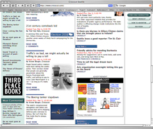
Yesterday I dropped by a local website that I check periodically, Crosscut, a Seattle-based news and comment site with some smart thinking and good writing. As I browsed down the home page, I came across an ad from Amazon – and stopped cold. The four books being advertised were all design and printing books. All of them. How likely is that? Would the average reader have a yen for books about graphic design? No, but I would; in fact, my recent browsing habits on Amazon would probably show a lot of books about typography and related subjects. Was this ad tailored specifically to me?

Personally tailored Amazon ad

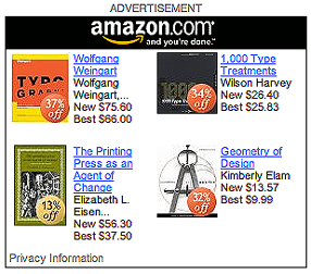
The answer is yes. If you click on the ad’s link to “Privacy Information,” you find that, indeed, Amazon is using their records of what you’ve looked at on their site, and choosing which books to push in their ad based on that. Which means that each Amazon ad on Crosscut (or any other website that hosts such an ad) varies its content depending on who’s looking at it, or more precisely whose computer you’re using to look at it. The future is here.

If you refresh the web page, the Amazon ad changes its contents – but they’re still based on your own recent patterns at Amazon’s own site. The contents even seem to vary by web browser; I was using Safari when I discovered this, but logging on to Crosscut from Firefox brought up an Amazon ad with no obvious relationship to me. (Something to do with how my preferences are set in the two browsers? Probably.)

I’m never surprised by invasions of info-privacy; I’ve read enough science fiction to have been expecting this for a long time. But the potential for embarrassment, at the very least, is large. You log on from somebody else’s computer, and when you get to the Amazon ad, you see a suspicious number of books about…typography! “You, uh, look at a lot of, uh, ‘type,’ don’t you?” you ask your friend. His guilty secret is out, for all the world to see.

Update March 10:

Today’s New York Times has an article on this very subject – how web ads are being targeted directly to individuals – but it conspicuously fails to mention Amazon. A surprising omission.

Signs of change

Published

Seattle’s street signs have recently been undergoing a change. While they’re still the same recognizable freeway-green rectangles, outlined in white and with white letters reversed out of the green, the new signs have noticeably larger type. The old signs (top, left) were always easily legible – upper and lowercase letters, except in secondary information such as “AVE,” and always spaced loosely enough to be readable at an angle from a moving car – though a lot of the old signs are now too faded to do their job. (I had to search a bit to find an example of old signs that were still in good condition.) Even the numerals were legible, an important consideration in a city with lots of numbered streets.

The new street signs (bottom, left) aren’t obviously different, except that the letters are larger. They take up more of the space inside the green rectangle, which creates a less pleasing shape but make them readable from a greater distance away. They look a bit bloated when you see them from the sidewalk, as you walk along a city street; but from a moving car, they’re large and clear. Clearly that was the priority in their design.

Some of the small details are fussier in the new signs. It might seem better to have “Ave” in upper and lowercase letters, like the street name, since it’s more legible than the old all-caps setting; but this is purely secondary information, so it’s actually a distraction. Similarly, the gratuitous addition of superscripts such as “th” on “10th Ave E” just clutters things up. The simpler the form, the better, as long as the essential information is there.

In case you’re wondering, the arrows in the bottom photo are there simply because I took that picture at a peculiar intersection where streets come together at an angle.

Maximum unreadability

Published

This is a nearly perfect example of how not to space type, if you want the words to be read. It was a poster-size ad on the side of a bus stop near the 16th Street BART station in San Francisco; I snapped this photo several years ago, but I still haven’t run across a better bad example.

It’s a good thing the names are familiar; otherwise you might be wondering who “Oeune Don,” “Dxe Choks,” and “Mary J Buge” were. Perhaps if you were standing around for a long time waiting for a bus, and you had nothing better to do than puzzle out what this says, it would be effective. But the real point of advertising on bus shelters isn’t to reach the captive audience of bus-riders; it’s to catch the attention of the people driving by – for whom this collection of letters would look like a rickety bunch of yellow sticks.

If typography is all about negative space, this is negative typography.