function jdb_page_navigation()
sPageSlug = blog
sPageTitle = easily amused
header:139:aPageArgs:page_title = easily amused
header:140:aPageArgs:section_title =
functions-johndberry:262:aPageArgs:page_title = easily amused
functions-johndberry:298:sPageTitle = easily amused
functions-johndberry:359:sPageTitle = easilyamused

easilyamused |

Archive for the category ‘advertising’

An ironic typeface used for a non-ironic purpose

Published

’Twas the eighteenth of April of Twenty-fourteen…” Yes, it was, actually and literally. That’s when I snapped this picture of the sign at the edge of the Calvary Cemetery, overlooking University Village in Seattle.

Easter sign using the typeface Mason, zoomed in

The typeface, with its postmodern ecclesiastical look, is Jonathan Barnbrook’s Mason, which was originally released by Emigre Fonts in 1992 under the name “Manson.” For reasons that you can imagine, that name caused a lot of unease, and Barnbook soon dropped one n and renamed it “Mason.” By either name, it’s very much in the tradition of ironic type design, taking recognizable features from the past and combining them in unusual ways to achieve a new effect.

The smaller type, identifying the cemetery and its web address, appears to be the appropriately named Requiem. Presumably, irony was not uppermost in the mind of the designer of this welcoming and wholly un-ironic sign.

’tis or ’tain’t

Published

’Tis the season for backwards apostrophes. The web, and the pages of magazines, are full of variations on the phrase ’tis the season, half of which have the apostrophe backwards (like the example at left) – presumably because someone just typed an apostrophe on the keyboard and their software helpfully turned it into a single open quotation mark. But that ain’t an apostrophe. The apostrophe, like the comma, only faces one way. Pay attention, please, and get it right!

Web-page headline with backwards apostrophe

(Not sure how to get the right glyph? Copy and paste it from someplace else. If your software is giving you an open single quote, just type an apostrophe at the end of the word, where it’ll face the right way; then delete that and paste it at the front.)

[Images: from the holiday-season home page of lee.com – hardly the only high-profile retailer to make this mistake.]

Type different

Published

Thomas Phinney wrote a thoughtful blog post last week about “The Impact of Steve Jobs on Typography”: about how the Mac pioneered proportional fonts on the screen, and how the combination of Aldus PageMaker and the LaserWriter created desktop publishing; and about a host of later improvements and developments: “Being able to see what fonts look like on screen. Showing proportional fonts on screen. Scaling the same font outlines for screen as for print. Putting a ‘font’ menu in applications, and having all applications share a pool of fonts installed at the system level (instead of associated with some specific printer).” Jobs was famously attentive to details; more to the point, he was famously attentive to the details of design. His flare and care for industrial design made Apple’s products desirable – and usable.

Which is why I’ve always been disappointed that Apple doesn’t bring that same level of perfectionism to its use of type. The graphic design, both in Apple’s marketing and in its products themselves, is always careful and clean; but the choices of fonts have been erratic, and they’re not always used consistently. Just looking at a current page of the Apple website, about Mac products, I see both their corporate font, Myriad, and the current Mac user-interface font, Lucida Grande. Both are well-designed humanist sans-serif typefaces, and either one works well; they actually play together better than you would think, but it’s still subtly jarring to see two competing sans serifs on the same page. But that’s not all.

Ever since the introduction of the iPhone, Apple has been moving toward using versions of Helvetica on screen. I’ve written before about the problem with reading numbers in Helvetica. The same repetition of shapes that makes Helvetica look consistent and “modern” (or at least retro-modern) creates ambiguity and makes it all too easy to mistake one number or letter for another. As Thomas Phinney said in a comment on his own post, “I love iOS, but I am still horrified that it uses Helvetica as a UI font.”

A typographer is not a type designer

Published

Earlier this summer, I got e-mail from Abebooks.com, promoting a bunch of books about type and typography that they had for sale. It was a nice set of books. (Happily, I already owned most of them.) But in the text of the e-mail, the writer seemed to be misinformed about just what a typographer was:

“The book world revolves around typefaces. You might not even notice them but they are right under your nose. Typographers like Claude Garamond, John Baskerville, Eric Gill, Giambattista Bodoni, Adrian Frutiger and Hermann Zapf define the style of the words we read.”

And if you click through to Abebooks’ page about type books, you find that the very first two sentences contradict each other: “Typography is the art of arranging type and that includes the selection of typefaces, the point size and the leading. A typographer is someone who designs typefaces.”

This confusion has been creeping into print over the last couple of years: people who are newly come to writing about fonts start calling type designers “typographers.”

That’s like calling someone who makes violins a “violinist.” Typography is the art and craft of using type; it’s not the art and craft of designing type. That’s done by type designers. The classic type designers named by Abebooks may also have been typographers – Bodoni and Baskerville were renowned for their book design and printing as well as for the types they designed for those books – but what this e-mail is talking about is type design. Please don’t mix them up.

PLINC is in the House

Published

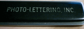
It was impossible resist: when I got the package from House Industries with the catalog for their new Photo-Lettering collection, I had to use my old Photo-Lettering, Inc. letter-opener to slit the envelope. It seemed the right thing to do.

The catalog showcases lots and lots of newly digitized Photo-Lettering fonts from the heyday of over-the-top advertising typography in New York. Like all of House Industries’ productions, it’s a keepsake in itself. The cover stock for the catalog was milled exclusively for House by the only other business that could match their flair and sensibility, French Paper.

Most of the lettering styles sold by Photo-Lettering, then and now, are playful and exuberant; they were headline styles, sold to type shops that would price headlines for their clients by the letter or the word. Today you can buy headlines the same way, but in digital form, from photolettering.com.

The letter-opener? It was on my desk when I started at ITC as editor of U&lc, just down the block from where Photo-Lettering’s shop used to be; and it’s on my desk today.

Handle of the PLINC letter-opener

Madame Wahler’s Lucky Serif Dream Book

Published

There are always plenty of reasons to be a member of the Type Directors Club, the New York–based organization that fights a never-ending battle for truth, justice, and really great typography. But a particularly wonderful reason arrived in the mail just the other day: a little 16-page booklet called Madame Wahler’s Lucky Serif Dream Book.

This invaluable guide, written and designed by Gail Anderson and illustrated by Bonnie Clas, could set you on the road to a better life. “This book will make you a winner!” exclaims the back cover, and who could doubt it? As the introduction explains, “The Type Directors Club is the first international organization to make public a genuine and authentic guide to the connection between typography and dreams.”

The contents include a list of dream types (“To dream of ligatures denotes popularity with the opposite sex”), a typographic horoscope (“As the most sensitive sign of the zodiac, Pisces is easily devastated by poorly drawn characters”), and small ads for everything imaginable (“Miracle Open Type Necklace,” “Go Away Comic Sans Cologne,” and “PROFESSOR INA’S Tattoo Type Removal Cream”).

Remember: “Madame Wahler’s Lucky Serif Dream Book will prove itself valuable as a reference because it uses small words and lists the meanings of many popular lettering dreams.”

Re-fi type hell

Published

Sometimes you just have to show a really bad example. The one you see on the left is an online ad that appeared recently on a popular web page. It’s not high-end advertising design. The open-book metaphor seems to fight with the interactive drop-down lists, and in a misguided attempt to suggest the printed page, the designer has let the program freely alter the spaces within words and lines, without the aid of anything so mundane as a hyphen. The result is magnificently bad.

In those 19 lines of text, there are almost none that are typeset competently. Words are squashed together, other words are stretched out, all with no apparent logic except to force them into those terribly narrow justified columns. It’s hard to imagine this ad enticing anyone to read the text, even if they were hooked by the promise of the headline. What an open book has to do with refinancing a mortgage is anyone’s guess, but this miniature version is about as far from the even texture of a well-typeset page as you can possibly get.

Imperial identity system unearthed

Published

(Lyons, France; 1 April 2010) – Researchers from the Institut internationale de l’identité romaine reported on Thursday that they had discovered fragments of what might be the first graphic-design manual in history. According to Jean-Claude Garamond-Jannon, head of the research team that excavated the find, it appears to be part of a manual for the presentation of the visual identity of the Roman Empire, dating from the early 2nd century A.D., during the reign of the emperor Trajan.

Although the unit system used is unclear, it appears that the Roman design administration had a thoroughly worked-out system for the measurement of inscriptional letters, which allowed them to cut inscriptions in matching lettering styles and in consistent sizes throughout the extremely widespread area under Roman rule.

“It was part of a visual identity that shouted ‘Rome!’,” said the Institut’s vice-director, Robespierre Danton, waving his arms enthusiastically at the partially excavated site. “They projected their power and their brand through a coordinated system of graphics that was instantly recognizable anywhere in the Mediterranean world.” The manual’s threadbare pages, according to Danton, specify exactly how the visual system should be implemented, with hints (barely legible) of extreme penalties for misuse of the empire’s intellectual property.

Although the fragments are in a poor state of preservation, one intriguing supplementary find has excited the interest of Dr. Giambattista Farben, a color researcher with the Institut. “This broken tablet, made of baked and polished tufa,” he says, “was found in close proximity to the manual itself. The tablet shows traces of a pattern of varying colors in lead-based paint, and scratches that may be notations to identify the different colors.” Dr. Farben was cautious, but he said that one theory of the colored tablet was that it constituted a color chart for painters who would turn the Romans’ marble walls into a panoply of colors. “It could be the earliest Pantone matching system,” admitted Dr. Farben.

Scholars from the University of Northern California dispute the primacy of the Roman identity system. Professor Chien Su-ma of UNC says that he has spent more than twenty years cataloging a collection of inscribed tortoise shells found under a pile of Han-dynasty tax receipts at Dunhuang, on the edge of the Taklamakan Desert, in China’s Gansu province. “The Han Dynasty had a clearly defined visual identity,” claims Prof. Chien, “and I believe these fragments, which were preserved at a major entrepot and outpost of empire, are a key to the system in its earliest form. They certainly predate this Western find by at least a century.”

[Photo: Detail of the lettering at the base of Trajan’s column, in Rome.]

The great apostrophe turnaround

Published

The eagle-eyed proofreaders and fact-checkers at The New Yorker clearly didn’t have a go at this pre-Christmas advertisement that came in my e-mail. If I were Eustace Tilley in this image, I’d be peering skeptically not at the butterfly but at the conspicuously backward apostrophe. ’Tis sad, is ’t not?

Elegance & credibility, blown

Published

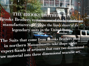
Brooks Brothers has an amazing ability to project established elegance and solid reliability in the realm of men’s formal clothing. A Brooks Brothers suit is iconic. When Brooks Brothers first established a store in downtown Seattle, a few years back, they managed to make it look as though the shop had been established on that corner since the founding of the company in 1818 – despite the fact that there hadn’t even been a town, much less a street intersection, at that spot nearly two hundred years ago. In the spot they moved to later, a couple of blocks away, the building isn’t quite as convincing, but the shop still has that aura of conservative quality.

Except in the execution of its typography. The choice of Bodoni for the type on this window text was clearly meant to emphasize the classic elegance of the brand. But the effect is spoiled by the typewriter apostrophes, which neither Giambattista Bodoni nor any type designer up until the advent of desktop publishing had ever conceived of. (It’s further spoiled by the fact that the second apostrophe doesn’t even belong there: the adjective is its, not it’s.)

Window sign at Brooks Brothers shop in Seattle