function jdb_page_navigation()
sPageSlug = blog
sPageTitle = easily amused
header:139:aPageArgs:page_title = easily amused
header:140:aPageArgs:section_title =
functions-johndberry:262:aPageArgs:page_title = easily amused
functions-johndberry:298:sPageTitle = easily amused
functions-johndberry:359:sPageTitle = easilyamused

easilyamused |

The future is here

Published

We’ve all been reading for quite a while about the future of advertising, where ads would be targeted directly at each individual consumer, based on information collected about our buying habits, our viewing habits, our listening habits, maybe even our philosophical habits. But I hadn’t realized that it was already happening.

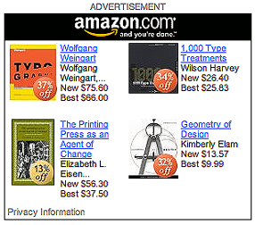
Yesterday I dropped by a local website that I check periodically, Crosscut, a Seattle-based news and comment site with some smart thinking and good writing. As I browsed down the home page, I came across an ad from Amazon – and stopped cold. The four books being advertised were all design and printing books. All of them. How likely is that? Would the average reader have a yen for books about graphic design? No, but I would; in fact, my recent browsing habits on Amazon would probably show a lot of books about typography and related subjects. Was this ad tailored specifically to me?

Personally tailored Amazon ad

The answer is yes. If you click on the ad’s link to “Privacy Information,” you find that, indeed, Amazon is using their records of what you’ve looked at on their site, and choosing which books to push in their ad based on that. Which means that each Amazon ad on Crosscut (or any other website that hosts such an ad) varies its content depending on who’s looking at it, or more precisely whose computer you’re using to look at it. The future is here.

If you refresh the web page, the Amazon ad changes its contents – but they’re still based on your own recent patterns at Amazon’s own site. The contents even seem to vary by web browser; I was using Safari when I discovered this, but logging on to Crosscut from Firefox brought up an Amazon ad with no obvious relationship to me. (Something to do with how my preferences are set in the two browsers? Probably.)

I’m never surprised by invasions of info-privacy; I’ve read enough science fiction to have been expecting this for a long time. But the potential for embarrassment, at the very least, is large. You log on from somebody else’s computer, and when you get to the Amazon ad, you see a suspicious number of books about…typography! “You, uh, look at a lot of, uh, ‘type,’ don’t you?” you ask your friend. His guilty secret is out, for all the world to see.

Update March 10:

Today’s New York Times has an article on this very subject – how web ads are being targeted directly to individuals – but it conspicuously fails to mention Amazon. A surprising omission.

Roman Seattle

Published

Today in his blog on Wired.com, Bruce Sterling wrote a post called “Historical Musings About the Future Ruins of Seattle,” with a link to a “future tour” of the ruins of Seattle’s ancient 520 bridge (“Come Visit the Historic Ruins of Highway 520”).

This made me think of a short piece I wrote in the late 1980s, when the local culture of the Capitol Hill neighborhood in Seattle included ingenious artistic flyers posted on telephone poles – all sorts of art and text, quickly xeroxed and stapled to the wooden poles, soon to be soaked and weathered away, or torn away by irate citizens, or simply covered over by the next layer of new flyers. Many were ads for bands and clubs, part of Seattle’s well-known poster culture. But what I did was create tiny stories, each one complete in itself, and post them on the phone poles in the neighborhood.

One of them was called…

Roman Seattle

from The Mossy Stones Speak: A Handbook of Roman Seattle

It’s easy to see, as you walk around the top of Capitol Hill, the remnants of the ancient Roman city. The capital-less columns on the side of the hill are only the most obvious reminder; now they overlook the freeway, but once from that spot you could have looked west toward the colony’s busy port. The Gallo-Roman tower at the northern crest of the hill, now used for the storage of drinking water, may in fact pre-date Roman settlement, although it shows no sign of Phoenician influence. (Excavations in the vicinity of Volunteer Park have not uncovered any evidence that the tower was connected with the aqueduct system, which implies that its use as a water tower is of much more recent origin.)

Very little else remains of the Roman city, yet its stones and paving have been used again as the building blocks of modern Seattle. It is easy to see fragments of concrete pavement in the walls shoring up the city’s terraced yards today. These chunks of paving have often been brought from more than one site and jumbled together, making it virtually impossible to reconstruct the original location, despite the wealth of material. There are very few inscriptions dating from this period, even fewer than one might expect from random jumbling; it is possible that the local people ransacking the ruins for building materials deliberately discarded fragments with inscriptions on them, or turned the incised sides toward the earth for aesthetic or superstitious reasons.

The plunder of ancient Seattle still goes on, to the despair of archaeologists specializing in this area. The city continues to feed off its own rich and lengthy past, and if it diminishes the record in the process, it does assure a continuity in the successive waves of history that have crested here.

(© 1991)

In 1991, Chris Stern turned my little story into a gorgeously printed letterpress book, hand-bound in boards with accordion-fold pages, hand set and illustrated with his own woodcuts, which were printed in five different shades of gray. I have letter “A” of twenty-six copies. The image at the left is a detail from the principal illustration.

Tramwise in Seattle

Published

Last December, Seattle’s new streetcar débuted, connecting downtown with the rapidly developing South Lake Union. This tram, like the development of South Lake Union itself, was the brainchild of Paul Allen, Microsoft co-founder. It was a cold winter day when the service began, but I managed to get there in time to ride the streetcar on the evening of its first day. I may also have seen the new streetcar line’s first drunk – an amiable drunk, to be sure, who was gently ushered off the car at a convenient stop.

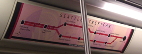
The line is quite simple – there and back again – but I was curious to see how the informational signage would be handled. It seems pretty good at letting you know where you are, and the stops on the street are fairly well marked.

Simple schematic of the line, displayed inside the car

The fare boxes were covered with a decorative paper wrapping, because for the first month everyone got to ride for free. Presumably now the fare boxes are in operation; I’ll have to go back downtown and see.

Letras mexicanas

Published

We just got back last weekend from Mexico City, where I went to meet people and research potential venues for next year’s ATypI conference. (This year’s, as noted below, will be in St. Petersburg.) Although Roger Black, who has been the key figure in making this happen and was going to meet us there, had to cancel at the last minute because of a sudden dental emergency, we met with Ricardo Salas – director of the design school at Anáhuac University, very well-known graphic designer, and the driving force behind local organizing for the event. Ricardo organized a whirlwind tour of museums and theaters in the Centro Histórico, all of which seemed promising. He knew the principals of all the venues; indeed, he seemed to know virtually everyone in the city.

It was my first visit to Mexico City. Since I absentmindedly forgot to carry my digital camera with me on the day we trooped all around the Centro, I can’t display snapshots of any of the places we visited, such as the amazing Museo de Arte Popular (folk-art museum) or San Ildefonso with its early murals by Orozco, Rivera, and other famous Mexican muralistas. I could show you photos of a bunch of friends eating, drinking, talking, and laughing in the sun, but that would be cruel to those languishing in wintry northern climes.

Type design and typography are alive and very well in Mexico, although everyone there kept telling us that this was mostly a development of the last ten or twenty years. Yet Mexico has a very long printing history; the earliest printing press in the New World was, and is, in Mexico City. And of course design, graphic and otherwise, has been an essential element of Mexican artistic life.

The Old · The New

Published

We’ve finalized the dates for this year’s ATypI conference: September 17–21, in St. Petersburg, Russia. The conference theme, appropriately enough, is The Old · The New – appropriate because this is the new, ever-evolving Russia but it is also the 300th anniversary of the start of Peter the Great’s historic reform of Russian typography, when the progressive, authoritarian czar established (by fiat) a whole new style of typography for the Russian language. So there was a dramatic break between the old and the new three hundred years ago, here in Peter’s city; and today there are the ongoing effects of the political break begun nearly twenty years ago, plus the breakneck speed of technological change. It’s like wearing a pair of glasses where one eye sees the old, the other the new; but you’re constantly seeing through both at once.

Democratic caucus, Washington State

Published

This has nothing to do with design or typography (except in the larger sense that we design the society we live in), but it’s topical and seems worth recording.

The Washington State Democratic caucuses were mobbed. Four years ago, before the last presidential election, they’d set a record, with about 100,000 in attendance; this year it was double that. I remember the crowding last time, when a whole bunch of local precincts met in the same large hall at a school (I think it was) somewhere across town; this year there were fewer precincts, and we met in the gymnasium of an elementary school just a few blocks away, but it was every bit as jam-packed. And chaotic. You had to push your way through the crowd just to sign in, and once you’d done that, it wasn’t clear what else there was to do, except wait.

It was hot. It was loud, though no one voice could be heard clearly through it all. There were different groups around the hand-lettered signs for each precinct — a few folding metal chairs, all occupied, and a continuous crowd of people standing or trying to thread their way through, in one direction or another. The whole thing seemed ill-planned, and unable to cope with the numbers. (Funny, that’s exactly the way it felt four years ago. Don’t they learn?)

It was unpleasant enough that when Eileen found someone who told her that, if we’d signed in with our preference and we weren’t planning on changing it, we could simply go, that’s what we did. I was glad I hadn’t done what I was thinking of at first, and signed in either as uncommitted or as a John Edwards supporter, just to make a point about how Edwards had been right on the issues; then I would have had to stick around for the discussion (if anything could be heard in that madhouse) in order to change my vote to Obama.

There didn’t seem to be any rancor; a lot of people, like me, liked both candidates, despite the news media’s efforts to manufacture a scenario of opposing camps of true believers. (I suppose there must a few, somewhere. I haven’t met any, though.) It seemed a hopeful crowd.

From local news reports, I gather than our caucus was typical; they were all over-crowded, even the Republican ones. (Though in our neighborhood, I’d be surprised if the Republicans could have filled a living room. But you never know.) I never even found out the results for our own precinct (it didn’t happen to be one of the ones picked by the news media to mention, and I hadn’t stuck around to find out first-hand), but it seems that across the state, Obama has won hands-down. In fact, in most areas, he’s won 2-to-1. (Actually, I just checked the Washington Democrats’ website; it doesn’t break the results down to the precinct level, but in our legislative district, it’s more like Obama 3-to-1.)

So that’s the caucus process. Simpler than it was four years ago, when there were more choices and I had to stay around and negotiate with people who supported other candidates, and ultimately change my own vote. This time, with only two candidates left in the race, it was just a matter of making a choice. Either one would be a good president, but Obama’s more promising.

Meanwhile, just to keep things interesting, Mike Huckabee won the Kansas caucuses, so he can continue to be a thorn in John McCain’s side. “Confusion to your enemies!”

Gonna be an interesting year.

Fonts in flicks

Published

Windsor Condensed – one of the hardest display typefaces to use well. We tried to use it on the cover of what turned out to be the final issue of the Pacific Northwest Review of Books, back in 1978, but it defied our attempts at spacing it right. Apparently Woody Allen has been using it since about the same time for his some of his movie titles, as documented on Boing Boing earlier today.

Actually, it’s the Elsner+Flake digitization of Windsor Elongated, an even more straitened and squashed version of Windsor, that Woody Allen uses. It’s got a decidedly retro feel, which of course is the point; Woody Allen is nothing if not nostalgic, or at least nostalgia-referential. Apparently it was the ubiquitous and talented Ed Benguiat who recommended this typeface to Woody at a diner in New Jersey, back in the mid-1970s. Windsor also has a lot of spirit of Benguiat’s own swash-inspired style of lettering, which was in full flush in the ’70s and is still recognizable and alive today. (So, indeed, is Ed Benguiat, who is one of the most entertaining type designers around.)

[Left: Windsor Bold in a detail from the cover of the Pacific Northwest Review of Books, vol. 1, no. 4, July/August, 1978.]

Stop the presses!

Published

In the issue of The New Yorker that arrived in today’s mail, there’s an essay on Benjamin Franklin by Harvard history professor Jill Lepore, titled: “The creed: what Poor Richard cost Benjamin Franklin.” It’s a fascinating article, if only because Franklin himself is endlessly fascinating; Lepore can’t begin to encompass his breadth in this short piece, but that’s part of her point. She strews aphorisms from Poor Richard’s Almanac through the article, as a commentary and as a way to attempt to integrate the image that Franklin gained through the Almanac and the infinitely more cosmopolitan man that Franklin was himself. One point she doesn’t make, but that was obvious to me as I read, is that Franklin echoed the ancient Greeks, in the dysjunction between their mottoes and aphorisms and advice to themselves, and the flagrantly disreputable and unreliable way in which they actually behaved.

But there’s a wrong note at the beginning of Lepore’s essay. She starts right out by describing how Franklin left Philadelphia in April of 1757 to get to New York, intending to take ship there for London. “But one delay piled upon another, like so much ragged paper jamming a printing press, and he found himself stuck for more than two months.” Frustrating for a man so intent on getting things done.

But wait – paper jamming a printing press? What kind of press would that be? It’s quite clear that Lepore’s simile is based on a modern, mechanized printing press, where paper is fed automatically into the machine; if a sheet jams, the paper behind it can pile up until the press is shut off. But the printing press in Benjamin Franklin’s time wasn’t mechanized at all; it was a hand-operated press. Each sheet was laid down individually by hand. In fact, the “Franklin press” that has inspired so many printshop names over two hundred years (including the shop in Seattle where I first learned to be a typesetter, albeit in a far different technology from the one Franklin learned) was incapable of producing what Lepore is imagining. The very first image in her essay is an anachronism.

Vigilante typography

Published

A friend send me a link to the Design Police, where you can download cut-out labels that can be stuck onto offending examples of bad typography and design. The very first of the stickers, all of which are stark white on red, says, “Kern this!” with a pointing arrow. Among the noteworthy stickers are: “Hierarchy required”; “Track this!”; “Display font unreadable as body copy”; “Please reduce line length immediately”; “Do not use faux italic”; and the ever-popular “Comic Sans is illegal.” (Sorry, Vinnie.) I particularly like “Caution: rivers,” which really does sound like a warning sign.

A couple of them have more to do with content than with graphic design, though they’re good advice: “Get your tone of voice right” and “Hire a copywriter.” And the huge, stark “WIDOW” could easily be applied too freely; there are worse things than widows on a page. My personal favorite, though, must be: “Microsoft Word™ is not a design tool.”

Well, all right, anything can be a design tool, in the right hands. But still.

Signs of change

Published

Seattle’s street signs have recently been undergoing a change. While they’re still the same recognizable freeway-green rectangles, outlined in white and with white letters reversed out of the green, the new signs have noticeably larger type. The old signs (top, left) were always easily legible – upper and lowercase letters, except in secondary information such as “AVE,” and always spaced loosely enough to be readable at an angle from a moving car – though a lot of the old signs are now too faded to do their job. (I had to search a bit to find an example of old signs that were still in good condition.) Even the numerals were legible, an important consideration in a city with lots of numbered streets.

The new street signs (bottom, left) aren’t obviously different, except that the letters are larger. They take up more of the space inside the green rectangle, which creates a less pleasing shape but make them readable from a greater distance away. They look a bit bloated when you see them from the sidewalk, as you walk along a city street; but from a moving car, they’re large and clear. Clearly that was the priority in their design.

Some of the small details are fussier in the new signs. It might seem better to have “Ave” in upper and lowercase letters, like the street name, since it’s more legible than the old all-caps setting; but this is purely secondary information, so it’s actually a distraction. Similarly, the gratuitous addition of superscripts such as “th” on “10th Ave E” just clutters things up. The simpler the form, the better, as long as the essential information is there.

In case you’re wondering, the arrows in the bottom photo are there simply because I took that picture at a peculiar intersection where streets come together at an angle.