function jdb_page_navigation()
sPageSlug = blog
sPageTitle = easily amused
header:139:aPageArgs:page_title = easily amused
header:140:aPageArgs:section_title =
functions-johndberry:262:aPageArgs:page_title = easily amused
functions-johndberry:298:sPageTitle = easily amused
functions-johndberry:359:sPageTitle = easilyamused

easilyamused |

Archive for December, 2021

Typographer’s lunch 6: the coming demise of PostScript fonts

Published

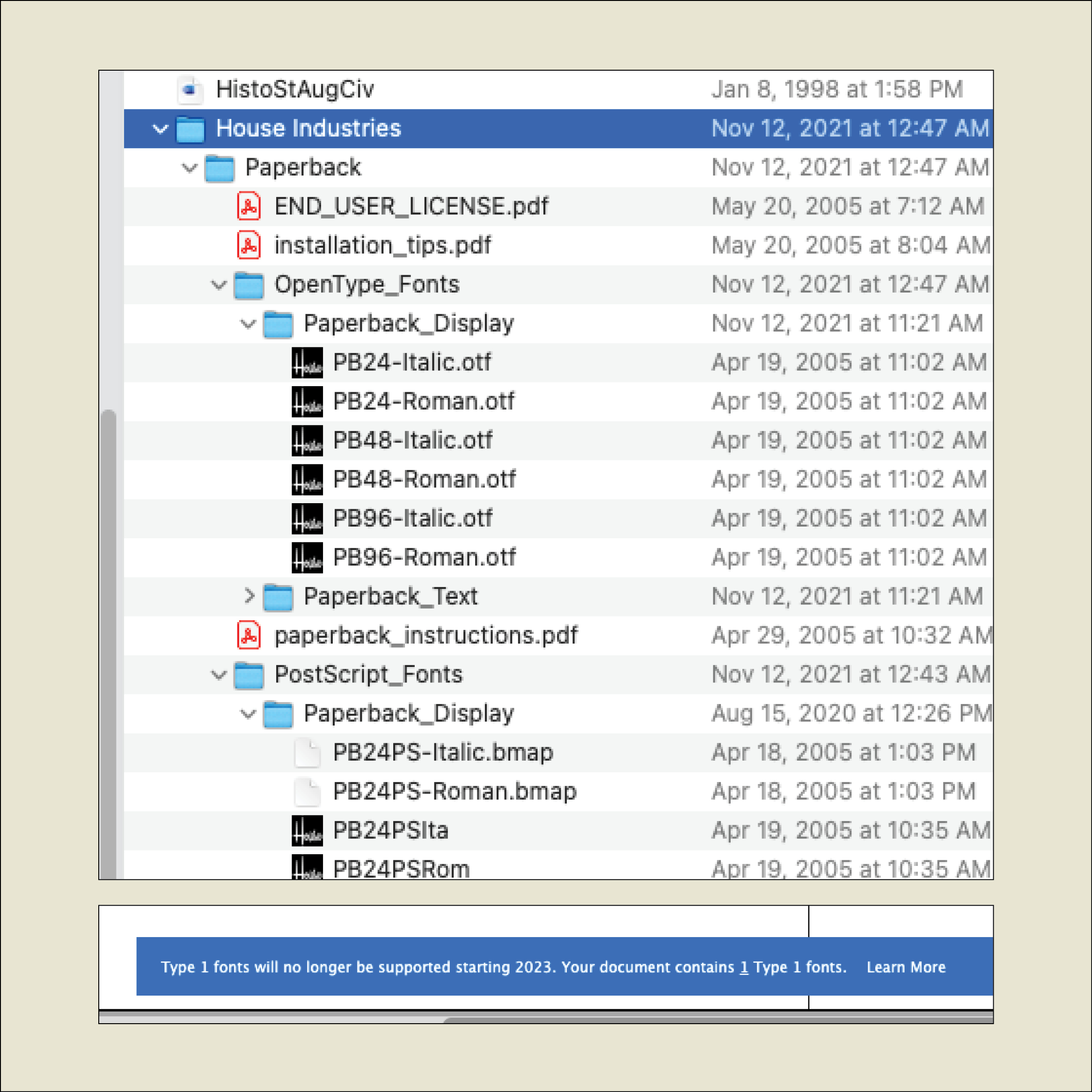
When I recently opened a book file that had been created several years ago, InDesign informed me, “Type 1 fonts will no longer be supported starting 2023. Your document contains 1 Type 1 fonts.” It was easy enough to replace the Type 1 font with an OpenType version of the same typeface, but what does this portend for book publishers with long lead times and large backlists?

I asked Thomas Phinney, the former CEO of FontLab and a former Product Manager for fonts at Adobe, what he thought about this. He told me he had just gotten off an hour-long call with an unnamed university press to discuss exactly this question.

The OpenType font format has been around for more than 20 years, and pretty much every digital font foundry upgraded its library to OpenType long ago. But not every user has upgraded their own type library. Anyone involved in publishing has probably made a big investment in fonts and is not in a hurry to make the same investment all over again.
The fact is that it’s time to bite that particular bullet. Thomas Phinney’s advice is to start thinking about your upgrade path right now: make a plan, budget for it, don’t leave it to the last minute.

If you subscribe to Adobe Fonts, you already have all those fonts in OpenType format. It makes sense, Phinney points out, to inventory the fonts you commonly use that are not in Adobe’s library and plan to upgrade those fonts first.

Incidentally, you don’t have to be actively using a Type 1 font to get that warning message when you open a document; if a Type 1 font is referenced in a paragraph or character style, even if you’re not using that style, it can trigger the warning.

Although there are apps for converting a Type 1 font into an OpenType font (notably FontLab’s TransType), the font’s license may not let you modify the font. Check with the font foundry to see what your options are.

[Originally published on December 1, 2021, in PPN Post and Updates, the newsletter of the Publishing Professionals Network.]

Typographer’s lunch 5: Letterform Archive in its new home

Published

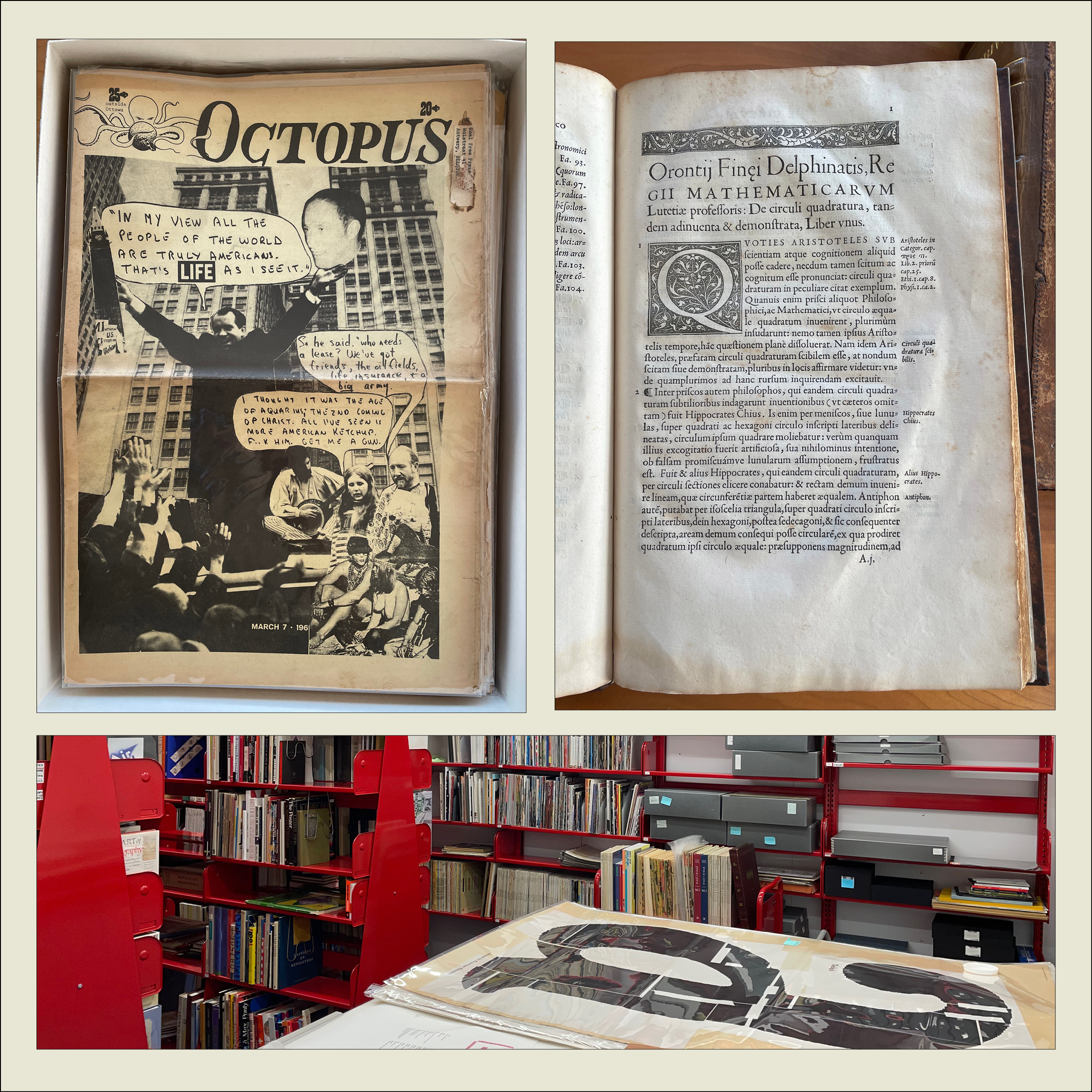
I’ve just had a chance to peek behind the curtain at the Letterform Archive, to see its new digs in the Dogpatch neighborhood of San Francisco. The move to larger quarters began before the pandemic, but everything moves slowly when you’re in quasi lockdown. The new Archive has much more space than the old location, including a spacious, well-lit double room that will become both a classroom and a reading room, with a folding dividing wall that is actually soundproof and that doubles as a whiteboard.

The first post-Covid exhibition opens in early November, a celebration of the centennial of the Bauhaus. Archive founder Rob Saunders showed us a sample copy of the elaborate catalog of the exhibition, which shows off the strengths of the Archive’s publishing program with its finely controlled stochastic printing, where you can peer closely at tiny reproductions of full two-page spreads and even read the text.

We looked at early printing examples such as Claude Garamond’s first Greek type (16th century) and the first type specimen known to be published by a woman printer (18th century). We also perused issues of the San Francisco Oracle from the late 1960s and an alternative newspaper from Ottawa, Octopus. On the back page of one issue of Octopus was a surprisingly professional-looking ad for “3 Days of Peace & Music” at Woodstock.

The Archive plans to begin regular tours in January (pandemic permitting).

[Originally published on November 1, 2021, in PPN Post and Updates, the newsletter of the Publishing Professionals Network.]
Typographer’s lunch 4: Gerard Unger’s life in letters

Published

Christopher Burke, Gerard Unger: Life in Letters (Amsterdam: Uitgeverij de Buitenkant, 2021).

Christopher Burke writes clearly and knowledgeably about type and the people who design it. His just-published biography of Dutch type designer Gerard Unger, one of the most prolific and talented type designers of the later 20th century and the early 21st, is quite simply a must-have book. It’s well made, effectively designed, artfully written, and lavishly illustrated.

Gerard Unger: Life in Letters is above all a book about process. In tracing Unger’s life and career, Burke shows Unger repeatedly wrestling with new techniques and new technologies, figuring out how to take advantage of them and finding creative ways to put even their constraints to use. Unger did not begin by cutting metal punches, but he came into the field of typography when it was adapting to phototypesetting, and he then encountered each new iteration of digital typesetting and type design. The book’s ample and detailed illustrations show these processes in abundance.

Unger was a pragmatic designer, always focused on making type that people could actually read. Whether designing signage faces for highways or metros, or text faces for daily newspapers, he studied what made the letters readable and incorporated his insights into each design. The distinctive curve forms of his letters were unique to him, often making it easy to spot an Unger typeface when you saw it. He incorporated history but always created something new; his last major typeface, Alverata, with its sanserif companion Sanserata, is both a usable text face and an exuberant expression of letter forms that first blossomed in Romanesque lettering a thousand years ago.

[Originally published on October 1, 2021, in PPN Post and Updates, the newsletter of the Publishing Professionals Network.]

Typographer’s lunch 3: DJR’s Font of the Month Club

Published

Need a font that’s strange and bonkers but also well made and usable? And a new one every month? Then join the Font of the Month Club.

Type designer David Jonathan Ross, better known as “DJR,” worked for nearly ten years at The Font Bureau, before starting his own independent digital type foundry in 2016. In 2018, he was awarded the Prix Charles Peignot, given by the Association Typographique Internationale (ATypI) to an outstanding type designer under the age of 35. You can find practical, versatile type families like Roslindale, Gimlet, and Forma at Type Network or through DJR’s own website. But what’s fascinating is when he goes wild, taking established typographic norms and forms and turning them inside out, to see what they might be capable of.

That’s what his Font of the Month Club is for. You can subscribe for a nominal fee ($6/month, or $2/month if you have a financial hardship), and every month Ross will send you a different, unpredictable new font. It might be something as pragmatic as Fern Text or as geometrically crazy as Megazoid, as spectacularly reverse-contrast as Tortellini or as unabashedly Victorian as Clavichord.

I have sometimes found ways to put some of these fonts to use the very month they are released. I’ve recently used Roslindale, Dattilo, Job Clarendon, and Rhododendron on book covers, for instance. It’s a delight to be able to send DJR a PDF that shows his typefaces in use (as I try to do whenever I’m using typefaces by a contemporary type designer). And it’s fun to try out freshly baked new fonts, fresh from the digital oven.

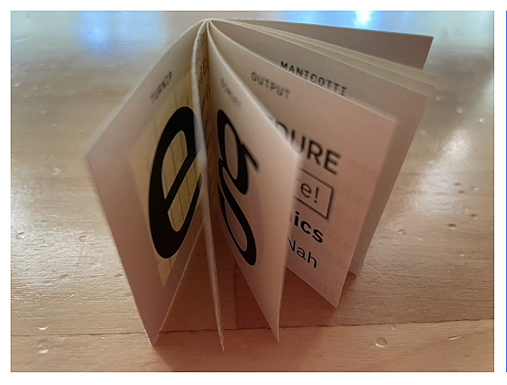
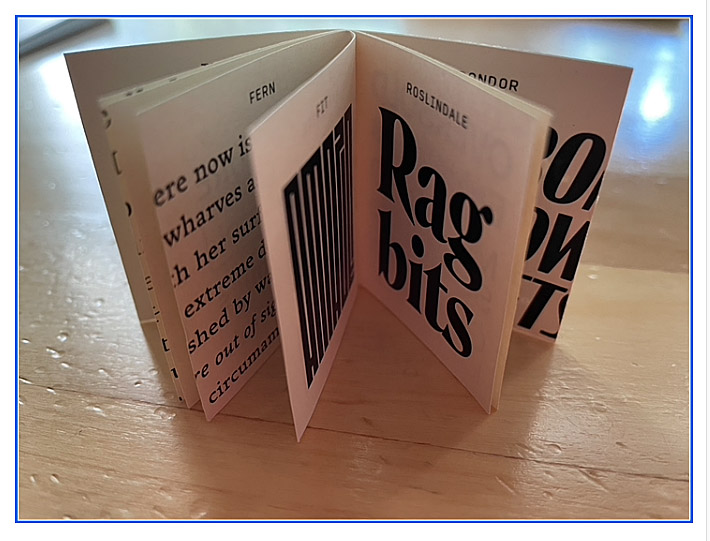
[Images: two snapshots of DJR’s tiny, tiny type specimen booklet.]

[Originally published on September 1, 2021, in PPN Post and Updates, the newsletter of the Publishing Professionals Network.]

Typographer’s lunch 2: Calibri

Published

You may have seen Microsoft’s recent announcement that they were releasing five new font families, one of which will end up replacing Calibri as the default font in Microsoft Office. “Calibri has been the default font for all things Microsoft since 2007,” the announcement read, “when it stepped in to replace Times New Roman across Microsoft Office. It has served us all well, but we believe it’s time to evolve.”

Originally Calibri, designed by Dutch type designer Luc(as) de Groot, wasn’t meant to be the new Office text face; that role would be given to Jelle Bosma’s sturdy serif typeface Cambria, which was designed to be a Times replacement. But Calibri worked so well that their roles got reversed.

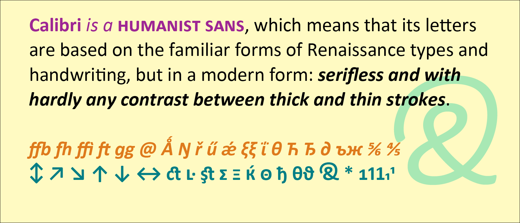
Calibri is a humanist sans, which means that its letters are based on the familiar forms of Renaissance types and handwriting, but in a modern form: serifless and with hardly any contrast between thick and thin strokes. Calibri also features softly rounded ends to its strokes, which gives it a friendly, informal feel even though it’s a classically structured typeface.

De Groot gave Calibri a lot of extra features, including small-caps numerals, direction arrows, an alternate g, a swash ampersand, and an unexpectedly wide range of ligatures. Like all of the ClearType fonts, Calibri was designed simultaneously for Latin, Greek, and Cyrillic.

Both Calibri and Cambria were part of the ClearType Font Collection, a suite of digital typefaces commissioned in 2002 to take advantage of Microsoft’s then-new ClearType technology. Calibri proved versatile and popular, even after the underlying technology was superseded by higher screen resolutions.

Interestingly, all five of the new proposed replacements for Calibri are sans serifs.

[Originally published on August 1, 2021, in PPN Post and Updates, the newsletter of the Publishing Professionals Network.]