function jdb_page_navigation()
sPageSlug = blog
sPageTitle = easily amused
header:139:aPageArgs:page_title = easily amused
header:140:aPageArgs:section_title =
functions-johndberry:262:aPageArgs:page_title = easily amused
functions-johndberry:298:sPageTitle = easily amused
functions-johndberry:359:sPageTitle = easilyamused

easilyamused |

Archive for 2014

Translated serifs

Published

My little book Hanging by a serif caught the eye of Bertram Schmidt-Friderichs, co-owner of Hermann Schmidt Verlag in Mainz, Germany, a fine small publishing company that specializes in books about typography and design. As a result, my book has been translated, revised, and slightly expanded, and is about to be published in Germany. The German title is Thesen zur Typografie (the someone whimsical “Hanging by a serif” proved resistant to translation), and its release coincides with the annual Frankfurt Book Fair, which opens today.

I haven’t held a copy in my hands yet, but I know it has a sewn binding and two-color printing – more ambitious than my original self-published edition. And a few different serifs. Perhaps it will see a more ambitious American edition, too.

Thesen will join other new books in the Hermann Schmidt line at their display at the Book Fair this week.

Display of new Hermann Schmidt Verlag books

Sprinting into the future

Published

My e-book essay “What is needed” has just been republished on the website of “Sprint Beyond the Book,” a project of Arizona State University’s remarkable Center for Science and the Imagination.

In May, Eileen and I met up with nine other invited guests to participate in CSI’s third “Sprint” event, a workshop/conference focusing on “The Future of Reading.” CSI’s first Sprint, with a theme of “The Future of Publishing,” had taken place last fall at the Frankfurt Book Fair, where the participants worked in the midst of the hurly-burly of the world’s biggest book festival; the second (“Knowledge Systems”) took place in January on CSI’s home turf at ASU. This third one was held at Stanford University, in conjunction with Stanford’s Center for the Study of the Novel.

The mix of people and ideas was invigorating, and the fruits of that brainstorming are intended to be published. (One description of what the Sprint was all about was “creating and publishing a book in three days.” But what kind of a book, exactly?) The other participants at the Stanford event were Jim Giles, Dan Gillmor, Wendy Ju, Lee Konstantinou, Andrew Losowsky, Kiyash Monsef, Pat Murphy, David Rotherberg, and Jan Sassano. The whole project was organized by its instigator and ringleader, Ed Finn, and his talented and indefatigable staff members Joey Eschrich and Nina Miller. I’ve been working with Nina, when we each have time, on the format for eventually publishing the results of the Sprint.

In the meantime, in somewhat kaleidoscopic form, parts of our conversations and digressions, and the texts that we created in the course of the three days, are available now on the “Sprint Beyond the Book” website.

“What is needed,” which I wrote more than two years ago as a post on this blog, is essentially a high-level technical spec for the missing tools that we need in order to do good e-book design. Most of these tools are still missing, two years later, despite the rapidly changing nature of digital publishing. Some of the ideas have made their way into various proposals for future standards, but not much has been reliably implemented yet. I’m still looking forward to the day when everything I was asking for will be so common as to be taken for granted. Then we can make some really good e-books; and our readers will be able to enjoy them.

TypeCon2014 | Washington DC

Published

This year’s TypeCon, which went by the name “Capitolized” but really seemed to revel in being “Redacted,” was very enjoyable. It was a great reunion of colleagues and old friends, and a fine way to make new friends and meet new colleagues, as this sort of event always is. The hotel, the Hyatt Regency Washington (a few blocks from Union Station and the Capitol), had a nice open bar area in its lobby, with several surprisingly good beers on tap, and proved to be the sort of meeting place that you hope for when you’re organizing something like this.

There were some very good talks (and the occasional dud, of course), including some that I really wanted to hear but that started too early in the morning for me. As I was staying with local friends across town, a few stops away on the Red Line, it was often hard to tear myself away from breakfast and conversation – especially if I’d been up late the night before, doing much the same thing (except for the breakfast part). Theoretically, all the talks were videotaped (except for a couple where the speakers asked not to be recorded), so perhaps eventually we’ll have a chance to catch up on the ones that we missed, for one reason or another.

It was gratifying to see so many talks about non-Latin typefaces; TypeCon is showing an admirable international flavor, despite being the North American type conference. Emblematic of this was the choice of Bulgarian type designer Krista Radoeva as the recipient of this year’s SOTA Catalyst Award.

Even better – and carrying the non-Latin theme further – was the presentation of the SOTA Typography Award to Fiona Ross, who must have done more than any other single person to further excellence in non-Latin type design: most notably in Indian types, but in Arabic, Thai, and other non-Latin scripts as well. The enthusiasm with which everyone greeted the announcement that Fiona was this year’s awardee was palpable. It was a very well-deserved award.

Personal favorites among the talks that I did get to hear included Mark Simonson’s nostalgic paean to the pleasures of phototype, X-acto knives, waxers, and rub-down type; Liron Lavi Turkenich on a failed experiment in updating Hebrew type; Carl Crossgrove’s trawl through the much-neglected range of sans-serif types with contrast and modulated strokes; Thierry Blancpain showing us that, yes, there’s been some Swiss graphic design since the days of Max Bill and Müller-Brockmann; Nick Shinn on the visual marketing of recorded music, 1888–1967; and the very clever way that Victor Gaultney demonstrated to English-speaking readers what it’s like for readers whose scripts are barely and inadequately supported in common electronic communications media.

I can’t help pointing out that this year’s TypeCon featured one of the most unreadable nametag designs I have ever seen. The “redacted” bit was cute, but extending it to the nametags made them utterly nonfunctional. There’s a reason they’re call “name” tags.

Washington, DC, in the summertime is not an ideal climate experience, though we did get one soft, warm evening when it was a pleasure to sit outside at the bar across from the hotel and enjoy the evening breeze. The weather was not as fiercely hot as it could have been, but the humidity was up to its usual standard. I lived in the DC area for a couple of years in the early ’70s, first in northern Virginia and then for a year in the District, near Dupont Circle. (As the Metro train stopped at the Dupont Circle station on my daily commute, I found myself thinking, “When I lived above here, they were just building this station.”) I remember one summer without air-conditioning where I got through it only by pretending that I was underwater the whole time; I simply never expected to be dry, and I was never disappointed. Unfortunately, I can neither think nor work in that kind of climate.

I’ll be seeing some of the same people, as well as many who were missed in DC, next month at the ATypI conference in Barcelona. Must be the typographic season.

Blackout-alarm sign on the door in an old DC apartment

[Photos: a TypeCon2014 nametag (top); TypeCon attendees suddenly deciding to wear their nametags as headbands (middle); expressive typography in Washington (bottom); and the sign on the door in my friends’ apartment building (above).]

Type to be read

Published

While I was relaxing in one of the comfy chairs in Typekit’s temporary Pop-Up Library, at TYPO SF in San Francisco last spring, I spotted a small booklet that I had never seen, displayed on the shelf. It was one of the series of booklets produced in the 1960s by the Canadian typographer Carl Dair for West Virginia Pulp and Paper (Westvaco), “A Typographic Quest,” each one of which covered a particular aspect of typography. These little booklets are among the best guides to the basics of typography that you can find; Carl was a master of explaining by showing, and his book Design With Type is justifiably renowned for its clarity and usefulness, despite being by now hopelessly outdated in terms of typesetting technology. (The principles don’t change, only the means.)

The book I spotted was A Typographic Quest Number Three, subtitled type to be read; it was the only one of the series that I had never been able to find in my bookstore spelunking. As it talks about exactly what fascinates me in typography – making a page or paragraph of text easy to read – I had kept looking for a copy, but the last time I had checked, the only copy available was fabulously expensive. I resisted the illicit urge to slip Typekit’s copy into my pocket and spirit it off, but I did come away from the conference with a renewed impetus to seek out a copy of my own.

Which, of course, turned out to be available from several sources, and not at ruinous prices; my earlier searches must have been conducted at infelicitous times. At any rate, I now have my own copy of the excellent Number Three in Carl Dair’s series, complete with its own plastic-coated insert, the “Alphacast,” which is a handy tool for “casting off,” or “estimating how much space a typewritten manuscript will occupy when set in any given size and style of type.” Tools like this are pretty much unneeded these days, when we set type digitally and can simply apply the relevant type size and style to the text and see exactly how much space it takes up, but in the days of handset type or hot machine-set metal, there was no easy way to do this.

The Alphacast

In the sort of detail typical of Dair’s work, his Alphacast even deals with the variance created by texts that are full of narrow letters (illicit still) versus those full of wide ones (mammal); the typewritten copy would treat all letters the same, since typewriters typically use fixed-width alphabets, but typeset copy is almost always set in a font with variable widths.

Now the set of A Typographic Quest on my bookshelf will be complete.

An ironic typeface used for a non-ironic purpose

Published

’Twas the eighteenth of April of Twenty-fourteen…” Yes, it was, actually and literally. That’s when I snapped this picture of the sign at the edge of the Calvary Cemetery, overlooking University Village in Seattle.

Easter sign using the typeface Mason, zoomed in

The typeface, with its postmodern ecclesiastical look, is Jonathan Barnbrook’s Mason, which was originally released by Emigre Fonts in 1992 under the name “Manson.” For reasons that you can imagine, that name caused a lot of unease, and Barnbook soon dropped one n and renamed it “Mason.” By either name, it’s very much in the tradition of ironic type design, taking recognizable features from the past and combining them in unusual ways to achieve a new effect.

The smaller type, identifying the cemetery and its web address, appears to be the appropriately named Requiem. Presumably, irony was not uppermost in the mind of the designer of this welcoming and wholly un-ironic sign.

Massimo Vignelli & organizing information

Published

When Massimo Vignelli died last month, the obituaries and remembrances all mentioned his famous 1972 map of the New York City subway system. The New York Times, of course, spent a good deal of ink and pixels on the subject. In retrospect, everyone keeps talking about how confusing that map was to people at the time, implying that it may have been a brilliant design object but that it was a failure as a navigational tool. That’s not what I remember.

I first learned how to navigate the complex, contradictory New York subways in the late 1960s, when the Vignelli map had not yet appeared but the Vignelli-inspired system of color-coding the lines and identifying them by numbers or letters had been implemented. This was truly a system, and it made sense of a wildly inconsistent tangle of lines; it also made the sometimes chaotic interiors of the subway stations themselves navigable and understandable, at least to an extent. The system was designed not to tame the chaos but to give its users – the subway riders, both straphangers who used the system every day and newcomers or first-timers like me – a tool for navigating, for making our way through the jungle and getting to a destination.

The maps we used before 1972 were already highly stylized; they were really diagrams, not maps, despite the nod to geography in the background shapes of the city’s waterways and landforms. The 1966 subway map, which would have been the first one that I used, was already nothing like a realistic map; the lines in the outer boroughs were compressed and condensed, while Manhattan was shortened and fattened, not reflecting the actual geography at all. But the lines still had names, not numbers or letters (“SEA BEACH, W. END” or “JEROME LEX AV”).

By 1968, the map was clearly a wiring diagram of the city, and it introduced the consistent system of identifying each line by a unique number or letter (6, F, RR). The lines were color-coded as well, just like the signs within the stations. (In the 1966 map, the only color distinction was used to show which lines were part of the old IRT, IND, or BMT systems.) The map was complex, because the city’s subway system was complex, but it formed a very useful and usable chart that enabled you to understand how the system was put together and how to get from one point within it to another efficiently.

The famous 1972 map was just a continuation of this to a slightly more abstract level. Actually, to a slightly more abstract-looking level; the abstraction was already there. Compare the 1968 map to the 1972 one: both are diagrams, it’s just that the ’72 map makes this even more obvious. The biggest innovation was how it showed potential transfer points: instead of inscribing all the line numbers or letters in little boxes, the Vignelli map placed black dots side-by-side where trains from adjacent lines stopped at the same station. It was simple and clear, and if your line passed by but didn’t show a dot, that meant it didn’t stop at that station.

None of these subway maps were intended as a way to understand the city; they were intended as a way to understand the subway system, and to use that to get around the city. They were superb at that, and the more abstract they got, the better they did that job. I know; I used them constantly.

The first “schematic” map of the New York subways was produced in 1959. If you want to see what that was an improvement on, take a look at the 1948 map, which makes a brave attempt to reflect the geography and still show the tangle of lines and where they go. The comparison is educational. I know which one I would want to use as a guide.

Strangely, many of the people who complained about the 1972 Vignelli subway map would be perfectly content to use the equally abstract London tube map, which was introduced decades before New York’s attempts. Nobody in London would claim that the tube map gives you any idea of the layout of the city; but it’ll get you from station to station within the system brilliantly. The 1972 NYC subway map did the same.

Thank you, Massimo, for making it easier for me and a lot of other people to get around.

[Image: a detail from the recent digital version of the Vignelli subway map, even more simplified and rationalized than the original.]

Big on the web

Published

This week a pithy statement of mine has been making the rounds on Twitter: Only when the design fails does it draw attention to itself; when it succeeds, it’s invisible. I first noticed this quoted by Graphis, but when I googled it, to remind myself where and when I had said it, I was amazed to see how many times it’s been quoted and requoted over the past seven years. It even appears as one of “50 Inspirational Quotes on the Art & Science of Design.”

When I wrote this, in a 2007 column for Creativepro.com, I was talking about something very specific: designing the table of contents for a book. But obviously this sentence has struck a chord for many people, and it’s certainly applicable to many aspects of design.

If I ever do a second edition of Hanging by a serif, my small book of aphoristic statements about typography and design, I’ll have to include this one too. I wonder what serif I’ll decide to hang it from?

Covering books

Published

Edward Rothstein’s review in last Friday’s New York Times of the current exhibit at the Morgan Library focuses attention on the book jackets that make up an obvious part of the exhibit. The show, “Gatsby to Garp,” is about 20th century American literature, and one of Rothstein’s points is that the book jacket embodied – and sold – that literature in book form. “Jackets were the way books announced their significance in the modern bookstore — an institution that had this single century of hearty life.” It was, as he says, “the jackets’ golden age.”

Another of Rothstein’s points is that any public exhibit like this cannot convey the content of the books; by its nature, a display is about the form. You might show several copies of the same book, open to different pages, but that’s only a series of glimpses at the interior, where the words live. Reading is a continuous experience; viewing a staged exhibit is a series of observations. “This is usually one of the difficulties in literary exhibitions: it is impossible to offer the actual substance of the books, so the curator must make something of their presence, use them to illuminate one another, show why they are gathered in one place.” The Morgan’s curators seem to have dealt with this inherent contradiction in imaginative ways, but it’s still a conundrum.

Book jackets are the most obvious representation of a book, yet they aren’t really part of the book itself. The older term “dust jacket” is telling: the first purpose of a book jacket was simply to protect the book’s actual cover, which might be a highly decorated binding. In the development of commercial bookselling, it didn’t take long for publishers to realize that they could use these functional paper wrappers as advertising for the book inside.

That’s the primary function of a book jacket. It’s meant to attract the attention of the potential reader. But since most books for several decades have been paperback rather than hardcover, the distinction between the jacket and the cover has been obscured. Instead of an advertising wrapper that you could strip off once you’d bought the book, the paperback cover remains an integral part of the book when it’s on your shelves. The packaging, in effect, stays with the product.

Today, the book cover – or book jacket – has to function in a new way: as a small image on a digital screen. It’s still meant to attract the eye, but it has to do this at thumbnail size; and the hoped-for action by the potential buyer isn’t to pick up a book off a table but to tap or click the image on the screen.

How, I wonder, will a future collector like Carter Burden, whose collection forms the basis of the Morgan Library exhibition, commemorate the complex interplay of reading, writing, marketing, and bookselling that makes up publishing in the 21st century?

Back on the wall

Published

It’s gratifying to see, from a story on the TDC’s website, that the three-dimensional typographic mural that Lou Dorfsman constructed in 1966 for the cafeteria at CBS headquarters in New York City has finally found a permanent home.

As I wrote six years ago, the “Gastro­typographical­assemblage,” which a subsequent régime at CBS was ready to junk, got saved thanks to the efforts of NYC designer Nicholas Fasciano, and was given a temporary home at the Center for Design Study in Atlanta, while funds were being raised to preserve and restore the crumbling masterpiece.

Now, as you can see from this short video, it has been lovingly restored and installed at the Culinary Institute of America, in Hyde Park, New York. Sounds like a visit to Hyde Park is called for.

A measured response

Published

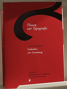
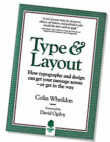
In on online discussion recently about book design, someone with long experience in print design made the claim that it was a proven fact that unjustified text was harder to read than justified. This was presented as an indisputable conclusion. That got me curious, so I made an effort to get hold of a copy of the source he cited: Colin Wheildon’s Type & Layout: Communicating – Or Just Making Pretty Shapes?. Obviously I would be in sympathy with a book with such a subtitle, but I was skeptical about the claim to hard data.

Wheildon first published this in Australia as a slim booklet in 1984; the version I found was the American edition, revised and expanded, published in 1995 by Strathmoor Press in Berkeley, with a cumbersome new subtitle: How typography and design can get your message across – or get in the way. (There’s a yet newer edition, from the Worsley Press in 2005, which I haven’t seen; happily, it goes back to Wheildon’s original subtitle.)

The heart of the book is the controlled experiments that Wheildon carried out, with as much care as possible and all the expert advice he could get, to test different typographic treatments, and try to find out, scientifically and measurably, which worked better and which didn’t. He came to this question from magazine publishing, with experience in both advertising and editorial design, so his examples are all from the pages, either real or made up for the experiment, of magazines.

Since Wheildon spells out in an appendix exactly how he conducted his research, it’s possible to judge the results. As far as I can tell, his methods for measuring comprehension after reading an article make sense, as far as they go; comprehension of facts may not be the only thing that’s important in reading, but at least it’s measurable.

Basically, he tested comprehension of articles that the participants had read, using a randomized series of questions that would tell him whether they had read all the way through the article or just read the first part and skimmed or skipped the rest. He also mixed this with anecdotal responses to particular features of his sample layouts, which he probably found irresistible but which renders many of his results dangerously subjective.

The real problem, though, is that in too many of his experiments, he didn’t measure comparable alternatives. It doesn’t really tell you much about the difference between serif and sans-serif text typefaces if the serif face you’re testing is Corona, a workhorse newspaper face, and the sans-serif is Helvetica, which was never intended for long text – and you’ve set both examples at exactly the same point size and leading. Testing a sans-serif typeface that was designed for text, and adjusting the size and spacing parameters to make them appropriate and comparable, rather than literally the same, would have been a much better comparison. Similarly, in a section about optimal text sizes, he made no allowance for varying x-heights and the difference in apparent size of different typefaces; he just compared 10pt to 10pt, no matter what the font. Even his test of ragged-right versus justified text tells us nothing about the details of how the text was typeset; it was just the same layout with either justified or unjustified setting.

I showed my borrowed copy of Type & Layout to Kevin Larson at a recent type pub in Seattle. Kevin is Microsoft’s researcher into typographic readability and legibility, so this is right up his alley. Naturally he refused to pass judgment based on just browsing through the book, but he did ask some pertinent questions about the specific test conditions and methods, which I found useful in thinking about Wheildon’s results.

What I found missing in Wheildon’s examples and his tests was the fine points of text typography that I’ve been dealing with for the past thirty-five years. In comparing serif and sans-serif settings of the same text, he used typefaces that, while indeed serif and sans, do not otherwise have much in common. Not surprisingly, the test subjects had a harder time reading a column of 8/9 Helvetica than they did a column of 8/9 Corona.

That’s the most obvious failure, but there are all too many places in Wheildon’s examples where he’s testing gross differences rather than well-adjusted settings in each format. He wrote this in the 1980s, so it’s no surprise that it doesn’t reflect the current state of typesetting technology, but it doesn’t even reflect the state of the technology in the 1980s: I was amazed that in his discussion of letter-spacing he confused kerning with tracking, and he seemed to think that letter-spacing in digital type could only be adjusted using one to four rather large units. (Perhaps he was thinking of the four pre-set tracking values in Aldus PageMaker?) Even at that time, typesetting systems were spacing in tiny fractions of an em.

Nothing in his trials had any way of measuring how much of a reader’s response was inherent and how much was just a matter of what they were already used to. (“We read best what we read most,” as Zuzana Licko famously quipped.)

What I came away with, after reading this book, was disappointment. I appreciated what Wheildon was trying to do; I just wish he had done it better. Some of his data is useful; some of it, unfortunately, is useless, or even misleading.

The focus of Wheildon’s attention was on magazines and advertising, rather than books, though most of what he says about reading text would have some relevance for books too. This 1995 edition of Type & Layout is not itself a very good example of book typography; the publisher and editor, Mal Warwick, makes it clear in a note that he is no typographer, and this is borne out on every page. Too often, Warwick’s re-creations of Wheildon’s examples use a different typeface, usually the light digital version of Goudy Old Style that he’s using as the text face of the book. That makes the examples impossible to judge. (Most of the examples that are reproduced directly from other sources are shown much too small to read, so we have to take the author’s conclusions on faith.) The general text typesetting is perfunctory, not carefully considered and adjusted. It’s a shame that the book itself doesn’t set a better example.

This edition is decked out with a foreword by David Ogilvy, an afterword by Tony Antin, and an introduction by Warwick, all of whom make much more grandiose claims than Wheildon himself does. Where Wheildon offers his conclusions modestly (though not without strong opinions), his promoters put them forward as proof positive of everything they hold dear. I don’t blame Wheildon for that, but it undercuts his book’s effectiveness. And it certainly doesn’t help that the publisher added two chapters of his own, which just show bad examples and make snarky comments about them; those two chapters can safely be ignored.

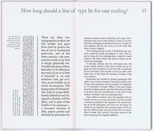
It’s the subtleties of composition, not just the broad strokes of layout or the size or choice of typeface, that make a page of text easy and inviting to read. Anyone who works professionally with book pages and text composition spends all their time on these fine points; and they don’t do it by rote or rules, but by intuition, experience, and paying attention to the text.

The allure of hard numbers – what software companies love to call “metrics” – is that you can quote them to clients or managers as a justification for your design decisions. But when the metrics rule the design, the tail is wagging the dog.

Rules of thumb can be very handy, but all they are is useful patterns; if you treat them like imperatives from on high – or from a few limited tests that others have inflated into ironclad laws – they’ll trip you up every time.

It would be interesting to see the real subtleties of readability tested, but it’s very hard to do, and it would take a lot of time and effort to come up with anything meaningful.