The eagle-eyed proofreaders and fact-checkers at The New Yorker clearly didn’t have a go at this pre-Christmas advertisement that came in my e-mail. If I were Eustace Tilley in this image, I’d be peering skeptically not at the butterfly but at the conspicuously backward apostrophe. ’Tis sad, is ’t not?
![]()
easilyamused |
Archive for the category ‘typography’
The great apostrophe turnaround
Published
Typ09 happened
Published
I was too busy during Typ09, the 2009 ATypI conference in Mexico City, to write anything for this blog (or for much of anything else), but it wasn’t for lack of potential content. The conference was very well attended and full of ideas; everyone I’ve talked to seemed to think that the program was particularly stimulating, and the cultural and intellectual milieu was rich and intense.
Many thanks to the organizers of the conference – especially to Ricardo Salas, the mastermind of the whole event; to the indispensible Mónica Puigferrat and Paulina Rocha; to Marina Garone and Leonardo Vásquez, of the program and exhibitions committees, respectively; to Roger Black, who got the ball rolling; and to Barbara Jarzyna, ATypI’s conference organizer and executive director.
Although I didn’t have time to write anything, I did take a lot of photos. I posted an early batch to Flickr before the conference began, and later added quite a few more. Most of them even have captions! Here they are.
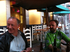
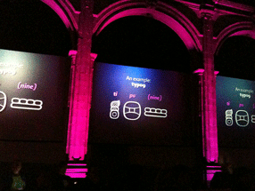
[Photos: Typ09 banner and posters at Anáhuac University (left); Mark Barratt & Simon Daniels at a sidewalk bar in the Centro Histórico (below, top, L–R); one of the multiple screens in the main program at MIDE (below, bottom).]
Elegance & credibility, blown
Published
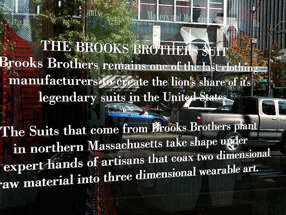
Brooks Brothers has an amazing ability to project established elegance and solid reliability in the realm of men’s formal clothing. A Brooks Brothers suit is iconic. When Brooks Brothers first established a store in downtown Seattle, a few years back, they managed to make it look as though the shop had been established on that corner since the founding of the company in 1818 – despite the fact that there hadn’t even been a town, much less a street intersection, at that spot nearly two hundred years ago. In the spot they moved to later, a couple of blocks away, the building isn’t quite as convincing, but the shop still has that aura of conservative quality.
Except in the execution of its typography. The choice of Bodoni for the type on this window text was clearly meant to emphasize the classic elegance of the brand. But the effect is spoiled by the typewriter apostrophes, which neither Giambattista Bodoni nor any type designer up until the advent of desktop publishing had ever conceived of. (It’s further spoiled by the fact that the second apostrophe doesn’t even belong there: the adjective is its, not it’s.)
The sounds & images of ATypI
Published
A link has just gone up on the ATypI website to a set of videos from the program of the 2007 ATypI conference in Brighton – a selection (not complete) of the talks and presentations that made that conference worth attending. (When I first started listening to one of the recordings, I found myself thinking, “Hey, that sounds like me…!” Of course, as I realized after a few moments, it was me: I did the introduction to the speaker, and that was included in the recording.) It’s a nice, timely reminder of how eclectic and informative an ATypI conference can be. It also gives me a chance (at long last) to catch one or two of the talks that I missed because I was hosting another track at the same time. That won’t be a problem this year, since the main program at Typ09 will be presented in a single continuous track. (“All singing! All dancing!” The Busby Berkeley musical numbers starring John Downer, Erik Spiekermann, and David Berlow will astound and delight!)
Time’s a-wastin’! Register now!
Typ09: very early registration
Published
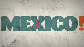
Registration is now open for Typ09, the 2009 ATypI conference in Mexico City (26–30 October 2009). To register, go to the ATypI Store. The sooner you do this, the cheaper it will be: there’s a very early rate, an early rate, and a regular rate, depending on how close to the conference dates you register. The very early rate is good until Sept. 11.
The conference takes place during the last week of October, which is after the end of the rainy season in central Mexico, so the weather should (with any luck) be sunny and pleasant, while the recent rains will have washed some of Mexico City’s famous pollution out of the air. The timing also makes it extraordinarily easy to stay a few extra days and experience the the uniquely Mexican celebration of the Day of the Dead.
Typ09 has benefited from the enthusiastic support and involvement of the Mexican type community, and of typographers from throughout Latin America. Three full days of main-conference program, in a historic building at the heart of the city, will be followed by two days of TypeTech and hands-on workshops at the hilltop campus of Anáhuac University, near the city’s western edge. Both the lovely modern campus and Mexico City’s amazing Centro Histórico are inviting settings for a unique event.
¡Hasta la vista, en Mexico!
Last year, Gabriel Martínez Meave and his colleagues Isaías Loaiza Ramírez and Alfredo Lezama Osorio created a dramatic short video about Mexico and typography, which was first seen at ATypI 2008 in St. Petersburg when Roger Black and Ricardo Salas presented the 2009 ATypI conference, Typ09, for Mexico City. This animated video is now up on YouTube, where you can see it for yourself. (Warning: contains music.)
Typ09, the 2009 ATypI conference | Mexico City | October 26–30, 2009

Not-so-fine print
Published
Today’s New York Times has an article about the new credit-card legislation that just passed the U.S. Senate (and, later in the day, the House), which would limit the exorbitant interest rates and extra fees and sudden changes of terms that have become standard practice among credit-card companies in recent years. One of the details that I noticed deep in the article has typographic relevance:
“The bill also bans expiration dates on gift cards and certificates any sooner than five years after the card’s original issue date. And the retailer or card issuer will have to print the terms of any expiration date in capital letters in at least 10-point type. Call it the fine print rule.”
Capital letters? I can see the intended effect, but the real effect will be to make the important text less readable than it would otherwise be. ALL-CAPS are inherently less readable and less inviting than upper- & lowercase – especially if they haven’t been tracked looser than normal, to give a little extra space between letters.
Legal contracts such as “Terms of Use” agreements often use all-caps to emphasize the most important parts. But if there’s a long passage in caps, it’s even more likely to be skipped by anyone reading it than the regular text might be. (Perhaps this is the point, in some legal agreements.) Far better would be to set the important bits in normal case but make it bold for emphasis. (Maybe not in Times New Roman, whose bold is really a headline typeface rather than a bolder version of the text face.)
Requiring “capital letters in at least 10-point type” does have one advantage: it’s easy to define. Although typefaces vary wildly in their apparent size, it’s usually the lowercase x-height that varies the most (compare Times and Helvetica at the same point size); the capital letters are likely to be of similar height even when the design is different. But this just highlights the folly of trying to define legible type simply by its point size.
Incriminating evidence: Type90
Published
The first type conference I ever attended was Type90, the 1990 ATypI conference in Oxford, England. It was also the first ATypI event that was truly a conference, widely publicized, rather than a “congress” of insiders. Type90 was the brainchild of Roger Black, who even then was a well-known editorial designer and had just co-founded the Font Bureau. This year’s ATypI conference, the first one in Mexico City, is also Roger’s brainchild, which is one of the reason’s he pushed to have it called “Typ09,” as a sort of allusion to or inversion of Type90.
At Type90, I was a newcomer; I knew only a couple of people there, though I knew a few others by reputation. Several of us relative newcomers ended up hanging out together during the weekend; a number of friendships began there.
Not too long ago Thom Feild unearthed a photo from Type90, showing a bunch of us in a pub on the final day of the conference. Recognize anyone?
[Photo (counterclockwise from lower left): Phil Baines (London), Tom Bee (Edinburgh), Susan Skarsgard (Ann Arbor), me (Seattle), Iskra Johnson (Seattle), Thom Feild (Seattle), random local at the table behind us (Oxford, presumably), and April from Apple (Cupertino; sorry, neither Thom nor I can remember her last name). Photo copyright by Thom Feild. Slightly larger version here.]
Alphabets in motion
Published
Last week I stopped by the opening of an exhibit at Seattle Central Community College, showcasing the work of students from SCCC’s graphic-design course taught by Jennifer Kennard, “X Type: Experimental Typography.” There was some noteworthy work, and I suggested to Jennifer that there ought to be a website showing it. One of the more unusual works was a video by Sean Fischer, featuring dancers enacting, horizontally against a white-sheeted background, the letters of the alphabet. To see the video, check out this link, then scroll down until you find “Dancers Expirimental Type” (yes, with that spelling). It’s refreshing, amusing, and the dancers were obviously having a lot of fun. (Note: there’s music with the video.)
If you’re in Seattle, it’s worth visiting the atrium gallery at SCCC and checking out the show.
[At left: the letter C.]
Detail in typography
Published
When I read through the new edition of Jost Hochuli’s Detail in typography, I found myself wondering, “Have I really learned anything about type in the last twenty years?” Most of the points I find myself making to people over and over again can be found in these pages, organized and explained more clearly than by any other writer I know. A large part of what Hochuli says can be summed up (inadequately) in the aphorism I keep repeating: typography is all about space.
Detail in typography was originally published in 1987 by Compugraphic, as one of a triad of little booklets by Jost Hochuli; the other two were the complementary volume The design of books and a jeu d’esprit called Jost Hochuli’s Alphabugs, in which the author/designer played with expressive display typography and the meaning of words. The books were (all three of them, I think) published in several languages; the English-language edition was translated by Ruari McLean. (One of my two copies of Detail in typography is inscribed to me by Ruari McLean, dated February 1989. I never met McLean, unfortunately, though we were in contact about his then-unpublished translation of Jan Tschichold’s Neue Typographie.)
The book was revised and updated in German in 2005, and this new English edition, published by Hyphen Press in London, is expanded and newly translated by Charles Whitehouse. Although the book is slightly longer than its first edition (64 pages instead of 48), its format is even smaller: 125 x 210 mm, to match the Hyphen Press format for small books. It fits handily in most pockets. Like its original edition, this one is two-color, paperbound with full-width flaps, on uncoated off-white paper stock, and it opens easily in the hand. Jost Hochuli is a master of book design, and Robin Kinross, proprietor of Hyphen Press, is a stickler for production quality.
Hochuli’s focus in this little book is the details of text typography, or “microtypography.” (The design of pages and whole publications is the realm of “macrotypography”; he has expanded on that subject in Designing books: practice and theory.) The fundamental elements that he writes about are the letter, the word, the line, linespacing, and the column, with a bit at the end that he calls “the qualities of type.” He leads off with a short discussion of the process of reading; this was where I first encountered the word saccade, a technical term for rapid eye movement, specifically the way our eyes move as we read a line of text. (They don’t move smoothly along the line, but jump from clump to clump of letters – not necessarily by word, but by visual cluster. They jump backwards, too, quite frequently; just how frequently is one of those things we quantify while trying to come up with a scientific measurement of readability.)
I won’t make Hochuli’s points for him here, nor will I expropriate them as my own. (I quote them often enough.) I’ll just repeat one paragraph from his introduction, because he clearly lays out the scope of what he’s writing about:
While macrotypography – the typographic layout – is concerned with the format of the printed matter, with the size and position of the columns of type and the illustrations, with the organization of the hierarchy of headings, subheadings and captions, detail typography is concerned with the individual components – letters, letterspacing, words, wordspacing, lines and linespacing, columns of text. These are the components that graphic or typographic designers like to neglect, as they fall outside the area that is normally regarded as ‘creative’.
This is one of those books that belongs on everyone’s bookshelf – everyone who deals in any way with turning text into readable pages, whether the words are their own or someone else’s.