function jdb_page_navigation()
sPageSlug = blog
sPageTitle = easily amused
header:139:aPageArgs:page_title = easily amused
header:140:aPageArgs:section_title =
functions-johndberry:262:aPageArgs:page_title = easily amused
functions-johndberry:298:sPageTitle = easily amused
functions-johndberry:359:sPageTitle = easilyamused

easilyamused |

Archive for the category ‘typography’

t for 2

Published

You don’t get wonderful bound specimen books from type foundries very often these days. Digital foundries tend to produce digital specimens, for all the obvious reasons. But a few days ago The Terminal Design Type Catalog arrived in my (physical) mailbox, and I was delighted.

James Montalbano, the Chief Cook and Bottle-Washer of Terminal Design, has been designing extensive, carefully coordinated type families for twenty-five years. “Ever since my days as a magazine art director,” he writes in his brief Preface, “I have both loved and been disappointed by type. I loved mixing, arranging and discovering different type designs, but was always disappointed by the lack of weights and widths of most designs.” That disappointment will not await anyone browsing this catalog.

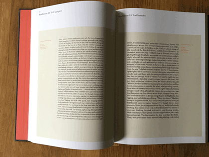
This a well-made, well-bound hardcover book, designed by Charles Nix. The embossed red t that takes up the whole cover is striking and dramatic. Each type family is given several pages, with a display of the full character set and large one-line showings. For text faces, there are also pairs of sample text pages with the type shown at different sizes and sometimes different weights.

Terminal Design catalog text spread

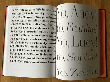
The display faces don’t require extensive text settings, but they’re shown off in dramatic form. My favorite page in the whole book must be the final page for the 20-weight typeface Yo.

Terminal Design catalog display spread

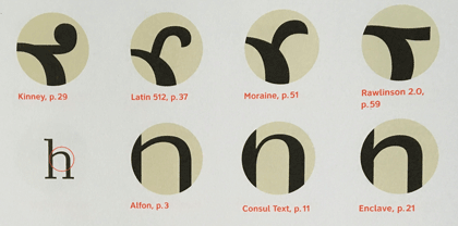
The back matter shows sample pairings of display and text faces, comparison of x-heights, the variations in OpenType stylistic sets, and, most notable of all, a visual index of “earmarks,” the distinguishing features of glyphs from different typefaces.

Terminal Design catalog earmarks

James Montalbano’s typefaces are always thoroughly considered, cleanly designed, and well produced. His squarish text face Choice Sans, with multiple widths, gives a lovely, modern texture to both text and display. The sharply serifed Consul takes high-contrast Didot style and freshens it, with six weights and four optical sizes, in both roman and italic. Even the wonderfully weird Fervent, with its pitchfork e and its double-wide w, looks assured and solid on the page.

There are two things that bother me in this catalog. One is the lack of any descriptions of the various typefaces: each one has a careful list of all its features, but there’s no hint of its history and nature, or of how its designer thinks about it.

The other thing is a choice: in the text samples, facing pages of the same typeface at different sizes have the same amount of added leading (3 points). The effect of that is to give the text blocks of smaller type looser line spacing than the text blocks of larger type. That makes it harder to compare them usefully.

Opening up OpenType

Published

Besides their other useful aspects, OpenType fonts may include a variety of alternate glyphs for the same character: anything from capital and lowercase forms to small caps, superscripts, subscripts, or swash versions. In non-Latin fonts, they may include other related variants, such as the several forms that each character takes in Arabic, and alternate forms preferred in different languages. In some large calligraphic fonts, there may be quite a lot of alternate forms available – but in the past it’s been hard to find them and put them to use.

The most recent update to Adobe’s InDesign CC (2015.2, released Nov. 30) finally addresses this problem. You could always go spelunking in the Glyphs palette to find alternates, but now you have a more direct method: simply select a single character in a text string, and any OpenType alternate forms appear in a small pop-up right on your layout page. Choose one, and it replaces the selected character.

This is the first fruit of a popular groundswell that got started at the ATypI conference in Barcelona last year: type users needed better ways of using OpenType layout features, and petitioned Adobe to improve their products. This new feature in InDesign is a good start.

It has a few glitches, though. Sometimes the relationships among the displayed alternates is not obvious. In Adobe Caslon Pro, for instance, many of the ordinary letters show among their alternates one of the Caslon ornaments. That’s a little odd.

One practical limitation of the current version of this feature is the size of the glyphs in the pop-up. The example shown on Adobe’s tutorial page (left, above) uses a large, bold, flashy typeface (Lust Script) with obvious swash features; it’s not hard to make out the alternates on the screen. But if you try the same thing with a typeface like Bickham Script Pro, which has a very small x-height, it’s virtually impossible to tell one alternate from another.

InDesign pop-up showing OpenType alternates for Bickham Script Pro

The InDesign team added another useful capability while they were figuring out how to access alternate glyphs. Since an OpenType font may include real fractions, you can now select a string of numerals, with a slash in the middle, and turn it into a fraction, using a pop-up much like the one for glyph alternates. How well the fraction is constructed will depend on the font, but if the function is in the font, you can now get at it easily.

Way to go, Adobe! Don’t stop now.

P.S. Yves Peters has done a more in-depth exploration of these features, pointing out some useful things that I had missed. Check it out.

The Letterform Archive

Published

I recently had my first chance to visit the remarkable Letterform Archive in San Francisco. This is the fruit of thirty-five years of collecting by Rob Saunders, all of it related to type and lettering and printing – especially type specimens and printer’s samples, along with books, manuscripts, and all kinds of printed and hand-made ephemera. In 2013, Rob turned his private obsession into an institution and established the Letterform Archive as a formal entity. More recently, as he announced last month at TypeCon, he acquired the enormous collection of the late Dutch bibliophile Jan Tholenaar, consisting of thousands of type specimens from the last 400 years.

The purpose of the Letterform Archive is to make original research materials available to people for hands-on study: so you can not just look at them but pick them up and hold them in your hands. There are larger collections than his, as Rob freely admits; but too many of them are closed to the public and not easily accessible. With the Letterform Archive, Rob hopes to provide a resource to students, researchers, type historians, graphic designers, and anyone interested in the history of letters. It’s easy to arrange a visit; the space is bright and welcoming, and so are the people.

The other initiative that Rob announced at TypeCon is a new program in conjunction with Cooper Union: Type@Cooper West. This will be a West Coast equivalent of Type@Cooper, the post-graduate program in type design that Cooper Union has been offering for several years at its campus in New York City.

Rob has a few other ambitious plans in mind, too. I’m delighted to see such an energetic undertaking. And I can say from personal experience that it’s a pleasure to sit in the Archive and peruse type in all its many forms.

The ATF Collection

Published

Just in time for this year’s TypeCon, the new digital ATF Collection arrived on the typographic scene. This is a remarkably broad range of typefaces and type families based on the metal typefaces issued by the American Type Founders Company from the late 19th century to the middle of the 20th. (These were not “hot metal”; that refers to type that was cast on a machine, such as a Linotype or a Monotype caster. ATF was a consolidation of the many American type foundries that manufactured type for hand-setting, in foundry metal. The metal was “hot” when it was first cast, but not when it was being set.) ATF was responsible for many of the best-known American typefaces of the 20th century, both original designs and revivals of classic European types. This release features a wide variety of sans-serif display faces, plus a classic text & display family and a funky brush-written display face.

I had the pleasure of writing most of the descriptions of the typefaces in the collection, as well as the background on ATF. (Stephen Coles wrote the copy for the peculiar ATF Wedding Gothic and a very amusing riff on the quirky yet familiar ATF Brush.) The new typefaces reference ATF’s original designs, but extend them into larger and more fully usable families. Many of the faces in the ATF Collection are sans display faces that we’ve been seeing, in one form or another, for most of our typographic lives.

The mind behind the ATF Collection is Mark van Bronkhorst, director of TypoBrand and founder of the respected digital type foundry MVB Fonts. (I’ve been using his MVB Verdigris as my go-to book text face for many years.) Mark is unusual among type designers for being both a talented and respectful designer of type and a very thoughtful and creative user of type, a typographer. I had ample experience of this when I was editing U&lc and Mark was the designer of the magazine.

Since the début of the ATF Collection a few weeks ago, a number of people have asked me about the back story, especially how Mark got the rights to the ATF name. The answer turns out to be remarkably simple,

“The ATF and American Type Founders trademarks were abandoned many years ago,” Mark told me. The old trademarks had expired by 1996; no one had renewed them, and in any case, “ATF had never been registered for use with digital fonts.” Mark discovered further that “it also appears that ‘American Type Founders’ has never been registered, and, except for our use, no other company appears to be registered as doing business under that name.” So, legally, the name was available for use.

“We started using the ATF and American Type Founders names and filed trademark applications for them in commerce seven years ago,” says Mark, “by releasing an ATF Franklin Gothic as a single digital font on fonthaus.com. (Technically, we had actually started using the ‘ATF’ trademark much earlier.) The USPTO after a diligent examination accepted and issued trademark registrations to TypoBrand for use of the trademarks with our digital ATF fonts. Our registrations have been live for seven years now.”

That’s the story behind the question of who now owns the ATF name (at least the short version). The point is that Mark and TypoBrand were very careful not to step on any toes, legally or ethically, in bringing these type designs back onto the market.

“Stated briefly,” says Mark, “I felt it was high time that the designs formerly associated with ATF see new life in digital form and that such an effort be branded accordingly as a collection, paying tribute to their legacy.” That is exactly what he is doing with the new ATF Collection. “It is my intent to honor the body of work that deserves a place in the digital community.” Mark adds that this is an ongoing effort, and that he’d love to see participation from other interested type designers.

It’s been fun working on this project, and seeing the typefaces take their present form. Reviving and expanding hundred-year-old metal typefaces involves a lot of careful work – not just adapting to a new medium and new technology but extending character sets far beyond what anyone was expecting back in the hand-setting days. I’m looking forward to seeing how people put these newly available fonts to use.

FontCasting

Published

During last year’s TypeCon in Washington DC, FontShop’s David Sudweeks videotaped interviews with a number of type designers, and with at least one non-type-designer: me. He asked questions about how I’d gotten started in the field of typography (“sideways”) and about book design, which gave me an opportunity to set out my ideas about the typography of onscreen reading, and the nascent Scripta Typographic Institute. (That’s a subject that I’ll be taking up again at ATypI 2015 in São Paulo next month.)

Now that interview has been published. The parts about book design & e-book design start at 1:25, after some introductory material.

All of the FontCast interviews are short, focused, and well edited.

Traveling & listening & talking: Typo Day

Published

“I can’t believe this is your first time,” said the young Indian woman with whom I was sharing the auto-rickshaw.

“It is, though,” I replied, calmly clutching a handhold as the three-wheeled vehicle careered through the traffic of northern Mumbai.

I hadn’t even encountered yet the full roar of the city, but Indian traffic was proving to be everything I had expected it to be. Chaotic, crowded, incredibly varied, and resoundingly effective at getting everyone around, despite the lack of any perceivable patterns. Drivers seemed to navigate by echo-location, honking fairly constantly to let other drivers know that they were approaching; and they might approach from pretty much any direction, or any side. Lanes, although clearly marked, were completely ignored, and each participant in the mêlée of Mumbai road traffic claimed possession of every inch of available space, whether occupied or not. Private cars predominated, but alongside them you’d find gaily decorated trucks, flitting motorbikes, daredevil pedestrians, and of course swarms of putt-putting auto-rickshaws, all punctuated with occasional feral dogs and meandering cattle.

I was in Mumbai for only a few days, invited as a keynote speaker at Typography Day 2015, an annual event that moves around among various Indian universities. This year it was being held at its original home, IIT Bombay, or the Indian Institute of Technology Bombay. The large, leafy campus lies on the northern fringe of Mumbai, abutting the shore of Powai Lake and at the southern tip of the vast hilly Sanjay Gandhi National Park. The university has about 8,000 students in a variety of faculties, clustered throughout the campus; many of the central buildings are aligned along a covered open-air walkway known as the Infinite Corridor. Although the campus feels considerably less crowded than the heart of Mumbai, and it suffers much less from the ever-present air pollution, proximity to the national park requires signs like one I saw near the lake warning that a panther had been spotted in the vicinity. “Well,” as one local put it to me, “we’re encroaching on their territory, so why wouldn’t they came into ours?”

Typo Day was put on by the Industrial Design Center, the design school at IIT, and the talks were presented in the IDC’s large, modern auditorium. Outside the auditorium was a large common area where people could mingle during the breaks for the aptly named “tea and networking,” and just outside the building, a display of typographic posters was hung in the open air and a sculptural assemblage of 3D Indian letters climbed one of the twisting trees.

The displays, like the subjects of talks and workshops, were not only multilingual but multi-script. India is a land of many languages and many writing systems; Hindi is simply the largest, and the dominant one in northern India, but the only common language that educated Indians have throughout the country is English. Although most of the various Indian writing systems are somehow related to Devanagari, the complex script developed for ancient Sanskrit and used today for Hindi and several other North Indian languages, the relationship is tenuous enough that only scholars can really spot the similarities. As one Hindi-speaking designer from Mumbai put it, “If I go to Bangalore, I can only admire the writing there as shapes; I cannot read it.” Several of the talks at Typo Day dealt with the fine points of Devanagari type designs and manuscript traditions; others dealt with different writing systems, including one talk by a woman from Sri Lanka, Sumanthri Samarawickrama, about the lack of vocabulary to describe the letterforms of written Sinhala.

But it wasn’t just fine points and details. There was exuberant creativity on display, and the other keynote speaker, Itu Chaudhuri, gave an inspiring and well-illustrated talk about how a love of letters “will enrich your life.” He then proceeded to demonstrate how it had enriched his.

I was treated extremely well by the organizers of Typo Day, Prof. Ravi Poobaiah and his wife, Dr. Ajanta Sen. Not only did they fly me to Mumbai, have students meet me at the airport when my flight arrived in the middle of a hot March night, and put me up in the comfortable Guest House at IIT, but on the day after the end of the conference they arranged a car and driver for me to explore Mumbai (and its traffic), and the next night they had me staying at the Royal Bombay Yacht Club, which is every bit as luxurious as it sounds. We had met there for dinner the night before, but, as Ravi explained, there wasn’t a room available that night, so they drove me back to IIT, with Ajanta giving me a running commentary on the history of the heart of the city and which buildings she had grown up in.

At the conference, I found myself being naturally adopted into the circle of gray-haired elders of Indian design, though I also met quite a few younger designers and students. Although I often missed the jokes, sometimes from lack of context, sometimes from not catching the accents, I enjoyed the company of these men and women with their shared history of typography and graphic design in India. (Accents varied. There was one brilliant, impassioned speaker that I had a very hard time understanding; when I mentioned this to someone else, he said, “Oh, yes, he has a strong Marathi accent. He sounds the same when he speaks Hindi.” What he was saying was so forceful that I regretted missing some of it through my own incomprehension.) I felt as though I had only scratched the surface of the typographic culture of the country.

I barely scratched the surface of Mumbai, too. I spent one afternoon walking around the streets near the Gateway of India, the monumental stone arch that once welcomed incoming ships of the British Empire during the Raj. (The Yacht Club was right across the street from the public park in front of the Gateway.) Although I clearly stood out as a foreigner, the only hassles I had on the streets were the expected attempts to sell me something; most of the time, people just ignored me and went about their way, as they ignored most of the teeming crowds around them. I visited a couple of museums, of which the oddest and thus most fascinating was the Mumbai City Museum, with its collections of objects and artifacts and models and dioramas depicting the city’s history. In one room was a current exhibit about the cultural and economic connections through history of the two sides of the Arabian Sea.

I also dropped in to the vast Chhatrapati Shivaji Maharaj Vastu Sangrahalaya, formerly known as the Prince of Wales Museum, to see the relatively small permanent exhibit on “Pre and Proto History,” the pre-Hindu Indus Valley civilization of Harappa and Mohenjo-daro. Most of the objects, however, were reproductions; the originals were in Delhi.

Impressions of Mumbai:

Very, very hot. No surprise there! I adopted a slow amble as I walked through the streets, in accord with the way most people seemed to be moving, just sort of easing through the humidity with a minimum of effort and disturbance.

Huge contrasts of affluence and poverty. Also no surprise, frankly; I knew I would encounter this, and I was neither shocked nor numbed by the inescapable poverty. I saw some of the upper levels of Indian society, but the top and the bottom mingle on the same streets. I did not try venturing into any slums, such as Dharavi, where Slumdog Millionaire was filmed; nor did I go to see colorful fisherfolk on the quay at Sassoon Dock. For that matter, I did not go see a Bollywood movie while I was in the town that makes them. I just looked and listened wherever I was, and experienced the city that I was presented with, in all its ordinary glory.

Traffic. But you already know about that. It was wild and wooly, yet I never saw an accident of any kind.

Urban texture. It seemed as though everything I saw in Mumbai was either crumbling away or in the midst of being built. When I mentioned this to Ajanta Sen, she said yes, that’s exactly the way it is. Many big cities give this impression, but Mumbai had it in spades.

Military bands. This wasn’t something I expected, but while I was staying at the Royal Bombay Yacht Club, the park across the street was closed off, with a police cordon all around the Gateway of India. It turned out that there was a huge celebration going on there during those couple of days: a big stage in front of the arch, with performances by military bands and orchestras from around the country. The music was loud; and it was eclectic, a blend of Bollywood show tunes and folk performances and military band music, accompanied by light shows. I never did quite figure out what the point was. One effect that it had was purely personal: I had hoped to catch the boat to Elephanta Island on my next-to-last day in Mumbai, to see the Hindu temple and its famous carvings, but because the quay was temporarily blocked off, the boats weren’t running.

One of the typographers I saw at the conference was Aurobind Patel, a type designer and design consultant whom I had met before, a friend of Roger Black’s. He made my last day in India memorable by inviting me to his weekend house, in a fishing village north of Mumbai, to spend a relaxing day out of the city; his driver would then drive me to the airport for my flight to Amsterdam, which didn’t leave until 2:45 a.m. So I got to see a little bit of what lies outside the city, and how the city is encroaching on the countryside year by year; and I got to walk on the beach by the shore and watch the sunset over the Arabian Sea. Aurobind’s house, which was newly built to replace a crumbling older house inherited by his wife, was in the process of being repainted and having the pool’s foundation reinforced. During the painting, the wall-size sliding-glass doors on the seaward side were covered by huge segments of Bollywood movie posters, their painted sides turned in; this gave the interiors a bizarre and dramatic look. But while I was there, that very afternoon, the workmen finished the painting of the exterior, and as I was taking a much-needed nap they removed the posters from the windows. So when I awoke I could look out through the glass directly to the sea. That was quite some transformation.

I have now seen a very tiny piece of India, and met a wonderful and eclectic range of Indian designers and typographers. Perhaps this will be just the first of many visits to the subcontinent.

Traveling & talking & listening: QVED

Published

At the end of February, I was in Munich for QVED, an annual conference about the design of magazines, which was held as part of Munich Creative Business Week. (The odd acronym “QVED” stands for “quo vadis editorial design,” or, if you like, Whither editorial design?) A focus of this year’s conference was “city magazines,” and one of the surprising realizations for me was that in Europe, city magazines are often published by city governments; in the United States, when we think of a “city magazine” it’s invariably published independently by a private company (though sometimes a publishing chain may produce magazines for several cities). In Seattle, for instance, there are two competing monthly city magazines, Seattle magazine and Seattle Metropolitan. The granddaddy of American city magazines might be New York magazine, which originated in the 1960s as an outgrowth of one of the major local newspapers.

Mike Koedinger’s presentation about the magazine of the city of Luxembourg, which his company produces, laid out the landscape for European city magazines, and other presenters in this part of the program followed up with their own cities’ particular challenges and opportunities.

The two opening talks (which were not the ones originally scheduled for those spots, thanks to some last-minute absences) set a high level: Jaap Biemans, who produces the website coverjunkie.com, which covers nothing but the design of magazine covers, showed and talked knowledgeably about a wide variety of cover designs, including his own for the weekly magazine of the Volkskrant newspaper in Amsterdam. Steve Watson presented his labor of love, Stack magazines, a unique subscription service where you get a different independent magazine every month. Both Jaap and Steve were enthusiastic and articulate, as well as having some wonderful images to show.

I missed the first part of Herlinde Koelbl’s talk on “The Targets Project,” and I failed to pick up a headset to get the simultaneous translation, but even with my limited German I found her presentation one of the most powerful things at the conference. The audience clearly agreed.

Organizer Boris Kochan had asked me to give a talk on U&lc, of which I was the last editor. Steven Heller and Roger Black, both of whom had long connections with U&lc, spoke in the same session, and we finished up with a roundtable discussion about U&lc and the history of typography in the phototype era that could easily have gone on another hour or two.

QVED was held in the Alte Kongresshalle (Old Conference Center), which is “old” only in the sense that it’s a postwar Modernist building – not old like the tiny streets in the heart of the city, or even like its 18th-century palaces and public buildings. The space worked well for both the theater-style presentations and the social mingling that is an essential part of any conference.

[Photos, top to bottom: John D. Berry (left) and Roger Black (right) in the cover image from an online magazine about QVED 2015; the opening of the QVED 2015 conference; street signs in Munich; Boris Kochan (left) and Steven Heller (right); Jaap Biemans as first speaker, with one of his favorite covers.]

Belated tales

Published

In late February and early March, I spoke at two very different design conferences: one in Munich, the other in Mumbai. The program, the audience, even the climate was very different, yet the enthusiasm, the intelligence, and the engagement of speakers and listeners was common to both events.

For no good reason whatsoever, it’s taken me this long to get around to writing about them. I’ll give each its own separate post.

I had to be back in Seattle during the week after the first conference, so I couldn’t simply stay in Europe and then head on to India. I got quite familiar with the Delta flights between Seattle and Schiphol Airport in Amsterdam.

Translated serifs

Published

My little book Hanging by a serif caught the eye of Bertram Schmidt-Friderichs, co-owner of Hermann Schmidt Verlag in Mainz, Germany, a fine small publishing company that specializes in books about typography and design. As a result, my book has been translated, revised, and slightly expanded, and is about to be published in Germany. The German title is Thesen zur Typografie (the someone whimsical “Hanging by a serif” proved resistant to translation), and its release coincides with the annual Frankfurt Book Fair, which opens today.

I haven’t held a copy in my hands yet, but I know it has a sewn binding and two-color printing – more ambitious than my original self-published edition. And a few different serifs. Perhaps it will see a more ambitious American edition, too.

Thesen will join other new books in the Hermann Schmidt line at their display at the Book Fair this week.

Display of new Hermann Schmidt Verlag books

TypeCon2014 | Washington DC

Published

This year’s TypeCon, which went by the name “Capitolized” but really seemed to revel in being “Redacted,” was very enjoyable. It was a great reunion of colleagues and old friends, and a fine way to make new friends and meet new colleagues, as this sort of event always is. The hotel, the Hyatt Regency Washington (a few blocks from Union Station and the Capitol), had a nice open bar area in its lobby, with several surprisingly good beers on tap, and proved to be the sort of meeting place that you hope for when you’re organizing something like this.

There were some very good talks (and the occasional dud, of course), including some that I really wanted to hear but that started too early in the morning for me. As I was staying with local friends across town, a few stops away on the Red Line, it was often hard to tear myself away from breakfast and conversation – especially if I’d been up late the night before, doing much the same thing (except for the breakfast part). Theoretically, all the talks were videotaped (except for a couple where the speakers asked not to be recorded), so perhaps eventually we’ll have a chance to catch up on the ones that we missed, for one reason or another.

It was gratifying to see so many talks about non-Latin typefaces; TypeCon is showing an admirable international flavor, despite being the North American type conference. Emblematic of this was the choice of Bulgarian type designer Krista Radoeva as the recipient of this year’s SOTA Catalyst Award.

Even better – and carrying the non-Latin theme further – was the presentation of the SOTA Typography Award to Fiona Ross, who must have done more than any other single person to further excellence in non-Latin type design: most notably in Indian types, but in Arabic, Thai, and other non-Latin scripts as well. The enthusiasm with which everyone greeted the announcement that Fiona was this year’s awardee was palpable. It was a very well-deserved award.

Personal favorites among the talks that I did get to hear included Mark Simonson’s nostalgic paean to the pleasures of phototype, X-acto knives, waxers, and rub-down type; Liron Lavi Turkenich on a failed experiment in updating Hebrew type; Carl Crossgrove’s trawl through the much-neglected range of sans-serif types with contrast and modulated strokes; Thierry Blancpain showing us that, yes, there’s been some Swiss graphic design since the days of Max Bill and Müller-Brockmann; Nick Shinn on the visual marketing of recorded music, 1888–1967; and the very clever way that Victor Gaultney demonstrated to English-speaking readers what it’s like for readers whose scripts are barely and inadequately supported in common electronic communications media.

I can’t help pointing out that this year’s TypeCon featured one of the most unreadable nametag designs I have ever seen. The “redacted” bit was cute, but extending it to the nametags made them utterly nonfunctional. There’s a reason they’re call “name” tags.

Washington, DC, in the summertime is not an ideal climate experience, though we did get one soft, warm evening when it was a pleasure to sit outside at the bar across from the hotel and enjoy the evening breeze. The weather was not as fiercely hot as it could have been, but the humidity was up to its usual standard. I lived in the DC area for a couple of years in the early ’70s, first in northern Virginia and then for a year in the District, near Dupont Circle. (As the Metro train stopped at the Dupont Circle station on my daily commute, I found myself thinking, “When I lived above here, they were just building this station.”) I remember one summer without air-conditioning where I got through it only by pretending that I was underwater the whole time; I simply never expected to be dry, and I was never disappointed. Unfortunately, I can neither think nor work in that kind of climate.

I’ll be seeing some of the same people, as well as many who were missed in DC, next month at the ATypI conference in Barcelona. Must be the typographic season.

Blackout-alarm sign on the door in an old DC apartment

[Photos: a TypeCon2014 nametag (top); TypeCon attendees suddenly deciding to wear their nametags as headbands (middle); expressive typography in Washington (bottom); and the sign on the door in my friends’ apartment building (above).]