function jdb_page_navigation()
sPageSlug = blog
sPageTitle = easily amused
header:139:aPageArgs:page_title = easily amused
header:140:aPageArgs:section_title =
functions-johndberry:262:aPageArgs:page_title = easily amused
functions-johndberry:298:sPageTitle = easily amused
functions-johndberry:359:sPageTitle = easilyamused

easilyamused |

Archive for the category ‘people’

The completion of Little, Big

Published

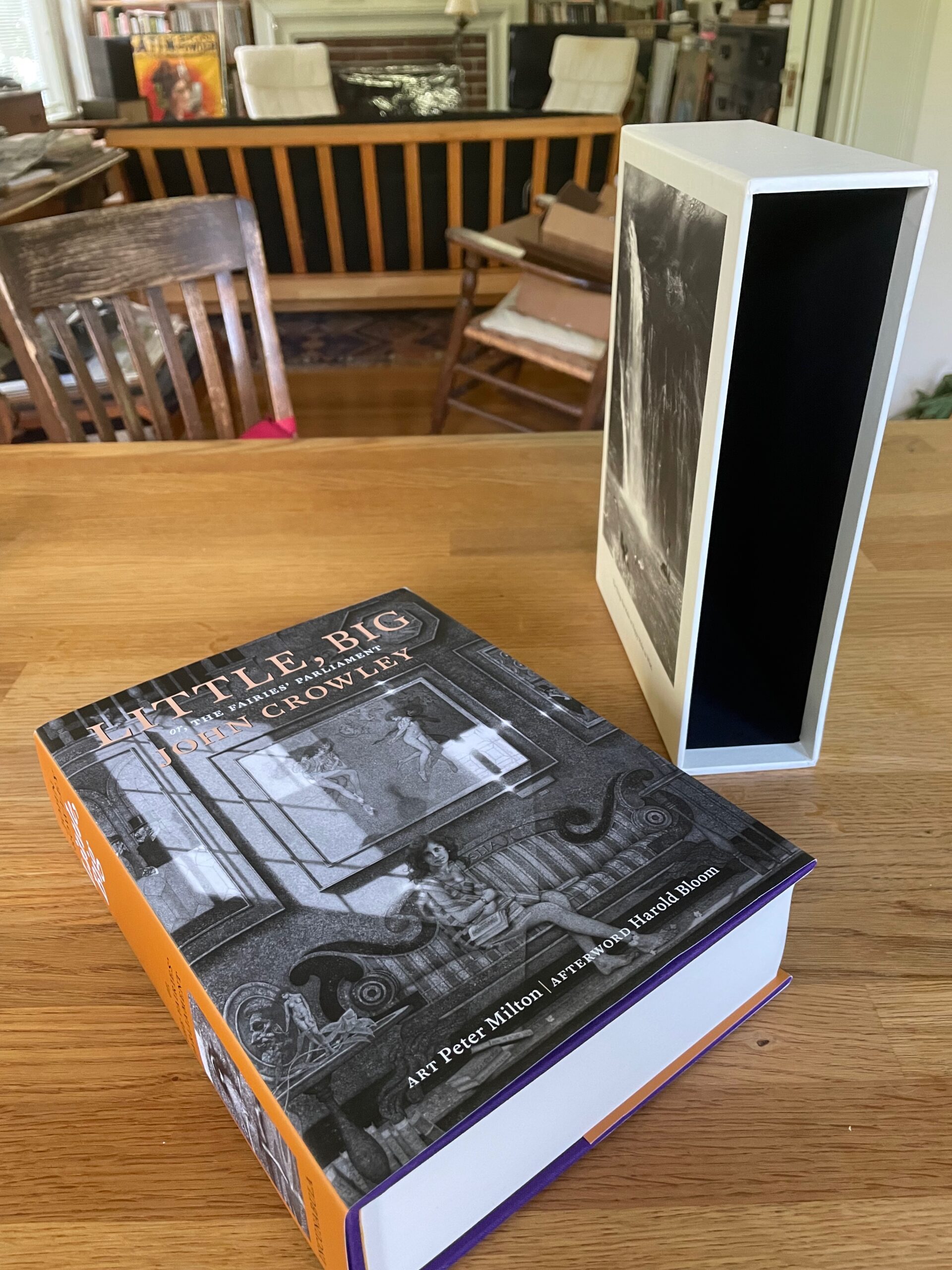
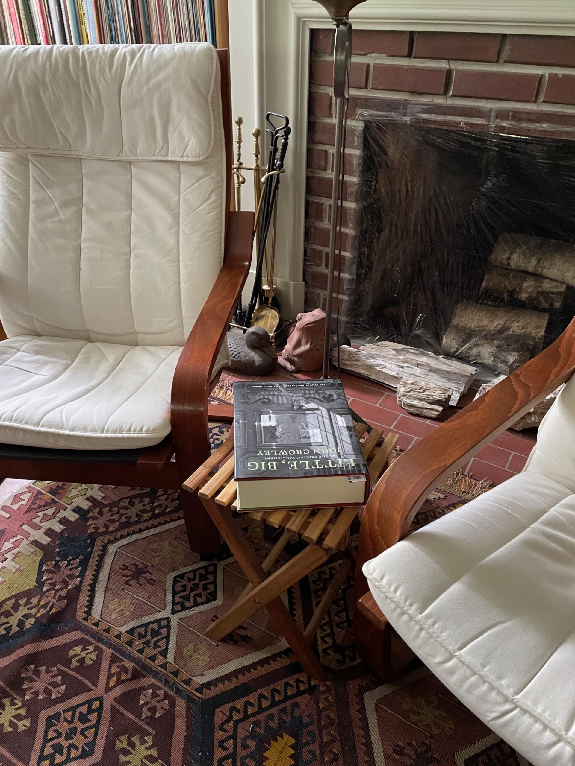
At long last, after more than 17 years of ups, downs, and circuitous side trips, the 40th anniversary edition of John Crowley’s Little, Big was published in late 2022, and the limited Numbered and Lettered editions are finally being distributed. The extra delay on the limited editions involved two different shipments of slipcases being lost en route from China, as well as a painstaking on-site check to ensure that each of the individually signed and inscribed four-page signatures got into the right individual copy. Plus, of course, the apparently inevitable twists and turns of fortune that have accompanied this project from the beginning. (Ben Kamm attributes this to the troublesome whims of the fay. I just say it must be Coyote.)

The Trade edition won an award at the Publishing Professionals Network (PPN) Book Show last year. (As manager of the judging team, I was involved in the judging process, but I recused myself from any consideration of my own book. As did judges whose books had been submitted.) The Trade edition itself is a luxurious book: 800 pages including etchings and prints by Peter Milton, exquisitely printed in a 7.5×10-inch format on Mohawk Superfine by Brilliant Graphics in Exton, Pennsylvania. The Numbered and Lettered editions (which sold out years ago) include a new short story by John Crowley, as well as the slipcases with more Peter Milton art. In the Lettered copies, Crowley wrote out a short passage from the novel in his elegant chancery italic handwriting.

The vision behind this project was Ron Drummond’s, publisher of Incunabula and instigator of ambitious undertakings. Ron and I collaborated over many years on the details of the book’s design; the overall page grid and the details of typesetting were mine, with Ron deciding on image trims and specifying the placement of Peter Milton’s art. Ron also commissioned three different essays about the book, to be published on the generous flaps of the dustjackets, one for each of the three editions. (On the Trade edition, which you can still purchase, the essay is by Neil Gaiman.)

It’s been a very long process. As I’ve written before, there were times when I took to referring to this as “Zeno’s book project,” because like Zeno’s arrow it seemed that it would never reach its target. Amazingly, it has. And it seems to be a bulls-eye.

[Images: The three editions of the Little, Big 40th anniversary edition: Numbered (top), Lettered (middle), and Trade (bottom).]

Evan S. Connell

Published

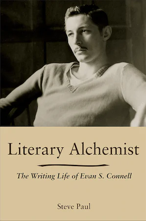
I’ve just finished reading Literary Alchemist: The Writing Life of Evan S. Connell, by Steve Paul (Columbia: Univ. of Missouri Press, 2021). Connell is a peculiar writer, impossible to categorize; he’s been a favorite of mine since I first discovered his writing through North Point Press, my favorite American book publisher of the 1980s. He’s probably best known for his bestseller about Custer, Son of the Morning Star, which examines the Battle of the Little Big Horn from both sides, with its antecedents, its contexts, and its implications. He’s a master of finding the arresting detail, and his prose is wry and precise.

Mid-way through his career, Connell became closely involved with Berkeley-based North Point Press. “Everybody there is intelligent and courteous and they all seem to know what they’re doing – which is not at all true of some people I’ve met in the NY industry.” Jack Shoemaker, North Point’s editor in chief, encouraged Connell and continued to be his editor after North Point shut down and Shoemaker had to create a new publishing company (twice). Steve Paul devotes quite a few pages of the biography to North Point, giving me more background than I knew before now. He describes Shoemaker’s and publisher William Turnbull’s desire to make quality books, though he doesn’t mention David Bullen, North Point’s long-time book designer, who was responsible for how the books looked and felt. (Nor does he mention Jack Stauffacher, who was involved at the press’s inception and set some of the typographic standards that North Point became known for). What Bullen did at North Point was a strong influence on my own ideas about book design.

The other book that Evan S. Connell is best known for is his early novel, Mrs. Bridge, which is highly respected though I haven’t read it. His examination, in detail, of the empty life of an affluent Kansas City matron has simply never appealed to me; I’m much more fascinated by his delvings into history and art. Another of his books that I’ve failed to finish, despite being history-based, is Deus lo volt! (“God wills it!”), which is so effective at conveying the spirit and mindset of the Christians who launched the Crusades that I couldn’t go on; I couldn’t stand being inside their blinkered heads. Maybe one day I’ll come back to it.

But I have read quite a few of Connell’s books, either bought new in North Point editions (which were sometimes reissues) or found and snapped up in used-book stores. Connell’s life is somewhat opaque; he was a private person, notably untalkative. Steve Paul is smart to call his biography a “writing life”; that was clearly the way Connell saw himself. Paul makes it clear, though, that Connell had connections to much livelier characters, especially when he was living in Sausalito and San Francisco. And Paul is good at weaving the strands of Connell’s life together, and at showing how the writing, the publishing, the extensive, usually solitary travel, and the thoughts he expressed were all woven of the same cloth. Or perhaps, given his fascination with pre-Columbian pottery, I should say that they were thrown from the same clay.

Typographer’s lunch 4: Gerard Unger’s life in letters

Published

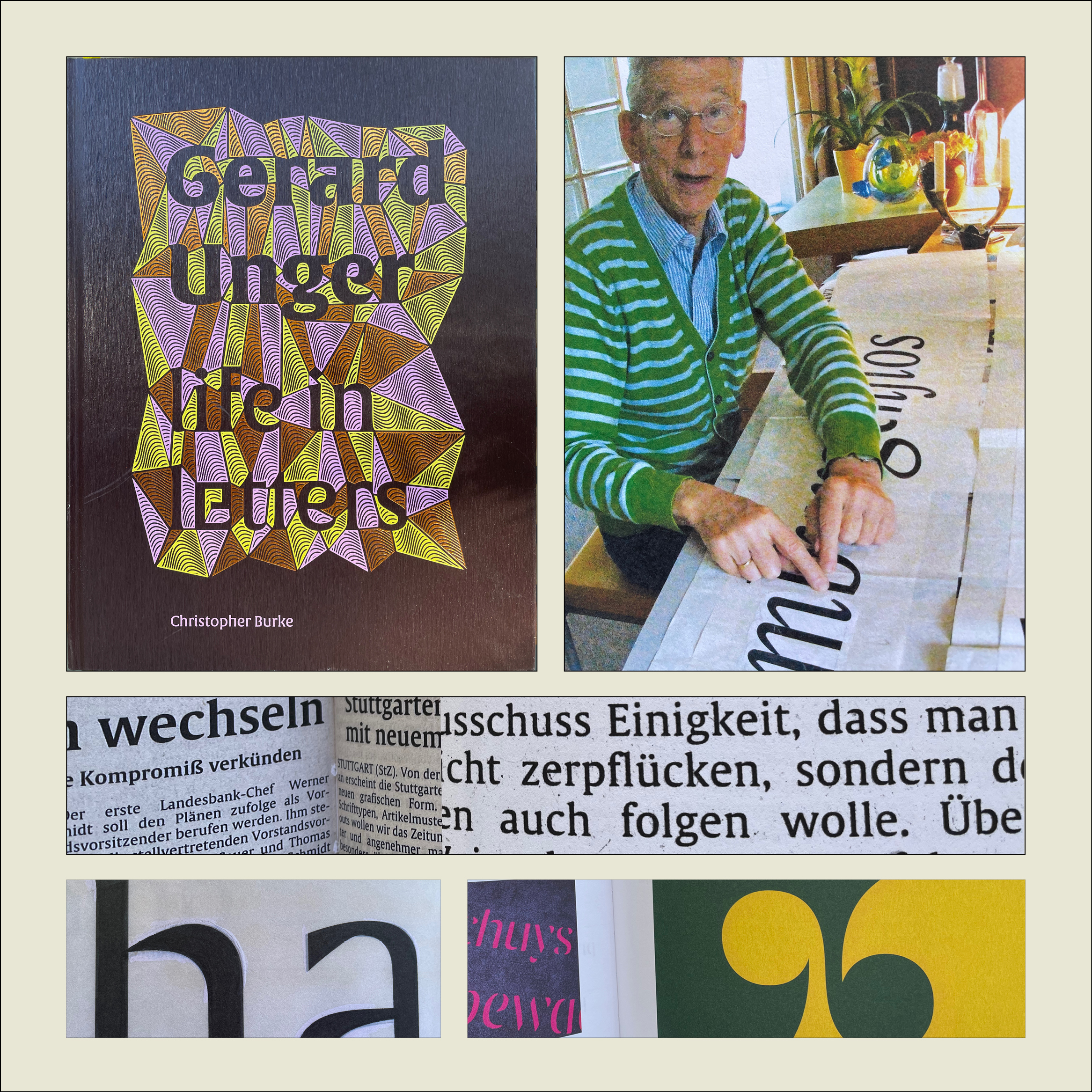
Christopher Burke, Gerard Unger: Life in Letters (Amsterdam: Uitgeverij de Buitenkant, 2021).

Christopher Burke writes clearly and knowledgeably about type and the people who design it. His just-published biography of Dutch type designer Gerard Unger, one of the most prolific and talented type designers of the later 20th century and the early 21st, is quite simply a must-have book. It’s well made, effectively designed, artfully written, and lavishly illustrated.

Gerard Unger: Life in Letters is above all a book about process. In tracing Unger’s life and career, Burke shows Unger repeatedly wrestling with new techniques and new technologies, figuring out how to take advantage of them and finding creative ways to put even their constraints to use. Unger did not begin by cutting metal punches, but he came into the field of typography when it was adapting to phototypesetting, and he then encountered each new iteration of digital typesetting and type design. The book’s ample and detailed illustrations show these processes in abundance.

Unger was a pragmatic designer, always focused on making type that people could actually read. Whether designing signage faces for highways or metros, or text faces for daily newspapers, he studied what made the letters readable and incorporated his insights into each design. The distinctive curve forms of his letters were unique to him, often making it easy to spot an Unger typeface when you saw it. He incorporated history but always created something new; his last major typeface, Alverata, with its sanserif companion Sanserata, is both a usable text face and an exuberant expression of letter forms that first blossomed in Romanesque lettering a thousand years ago.

[Originally published on October 1, 2021, in PPN Post and Updates, the newsletter of the Publishing Professionals Network.]

Typographer’s lunch 3: DJR’s Font of the Month Club

Published

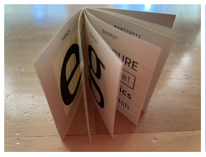
Need a font that’s strange and bonkers but also well made and usable? And a new one every month? Then join the Font of the Month Club.

Type designer David Jonathan Ross, better known as “DJR,” worked for nearly ten years at The Font Bureau, before starting his own independent digital type foundry in 2016. In 2018, he was awarded the Prix Charles Peignot, given by the Association Typographique Internationale (ATypI) to an outstanding type designer under the age of 35. You can find practical, versatile type families like Roslindale, Gimlet, and Forma at Type Network or through DJR’s own website. But what’s fascinating is when he goes wild, taking established typographic norms and forms and turning them inside out, to see what they might be capable of.

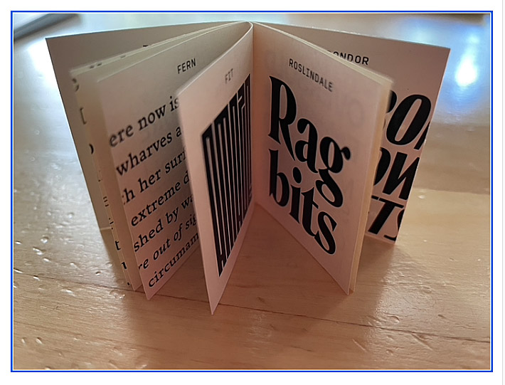
That’s what his Font of the Month Club is for. You can subscribe for a nominal fee ($6/month, or $2/month if you have a financial hardship), and every month Ross will send you a different, unpredictable new font. It might be something as pragmatic as Fern Text or as geometrically crazy as Megazoid, as spectacularly reverse-contrast as Tortellini or as unabashedly Victorian as Clavichord.

I have sometimes found ways to put some of these fonts to use the very month they are released. I’ve recently used Roslindale, Dattilo, Job Clarendon, and Rhododendron on book covers, for instance. It’s a delight to be able to send DJR a PDF that shows his typefaces in use (as I try to do whenever I’m using typefaces by a contemporary type designer). And it’s fun to try out freshly baked new fonts, fresh from the digital oven.

[Images: two snapshots of DJR’s tiny, tiny type specimen booklet.]

[Originally published on September 1, 2021, in PPN Post and Updates, the newsletter of the Publishing Professionals Network.]

A talk on Jack Stauffacher’s legacy

Published

In October I joined Chuck Byrne to give a two-part talk about the life and work of Jack W. Stauffacher for the Society of Printers in Boston. No doubt in a normal time we would have traveled to Boston to address the members in person, but because of the pandemic the event was entirely virtual. This has its disadvantages (my connection was evidently a bit wonky, sometimes making my audio slur for a moment, though I had no way of knowing this until I listened to the recording later), but it has advantages as well: a much larger potential audience, one that was geographically dispersed although constrained by time zone. And of course the talk was recorded, so you can watch it now, well after the fact.

My part focused on Jack’s life, using the biographical essay I had written for Only on Saturday, the upcoming book from the Letterform Archive about Jack’s abstract wood-type prints. I was reading my text, rather than speaking extemporaneously, which seemed appropriate, since the book hadn’t yet been published. For the talk, I put together a selection of images that I hoped would give a visual counterpoint to the narration. Researching Jack Stauffacher’s life was a fascinating project, and finding a way to organize its many aspects and facets was a creative project of its own. But it was all in the service of telling people about Jack.

Chuck is the moving force behind the book, and in his part of the presentation he went through the book, page spread by page spread, explaining why they had chosen particular images and how they had put them together into a remarkable, highly visual volume. The design of the book is Chuck’s; he was quite sure that Jack’s approach to the design would have been different, but they were long-time friends and no doubt would have enjoyed mutually criticizing each other’s choices. It’s a beautifully designed book.

A history of TypeLab

Published

At the beginning of 2020’s online virtual TypeLab, Petr van Blokland was telling the story of how TypeLab started in the early ’90s.

He described it as “a rogue version of ATypI,” which he and a few collaborators (among them Gerrit Noordzij, David Berlow, Erik van Blokland, and other ATypI designers) put together for the 1993 conference in Antwerp. It grew out of the experience in Budapest a year earlier, when the various international delegates who didn’t speak Hungarian found themselves milling around outside during a lecture on Hungarian type that was being delivered in Hungarian (naturally) without translation (unfortunately). It became apparent, Petr said, that there might be value in providing something else for people to do when they didn’t want to spend all their time in the official program. (In those days, ATypI conferences were fairly small, and they had only a single track of programming.)

After Budapest, Petr suggested to the ATypI Board of Directors that they plan some kind of informal alternative for the Antwerp conference, but the Board wasn’t willing to do that. So Petr and his friends set up their own alternative, which they dubbed TypeLab.

This was a time when digital typography was still thought of as new; it was only three years since Zuzana Licko had épaté la typoisie at Type90 with her HyperCard-based, music-enhanced presentation on fonts for the screen. Very little content about digital type had made its way into ATypI’s main program so far, and what had been included was largely theoretical. TypeLab was meant to be a sort of hands-on side-conference, an experimental laboratory, with a room full of equipment where anybody could try out the new technologies.

They managed to secure sponsorship from Agfa, which made it possible to have the computers, software, and printers all freely available.

“The room of 15 x 15 meters,” says Petr, “was divided into four quarters: a little lecture theatre of 40 chairs, a design studio with Macs and software, a ‘lounge’ where people could sit, talk, and show their sketches and drawings (note that there wasn’t anything like phones or laptops back then), and a printing department (loaded with printers, a typesetter, and copying machines).

“The board of ATypI didn’t go for the idea, so we planned to rent a space on the other side of the street. In the summer of 1993 Agfa, the main sponsor of ATypI that year in Antwerp, got wind of the idea, so Petr got invited to the Antwerp headquarters in late July. The appointment was made with the chairman of the board of Agfa, and also present was the then chairman of ATypI, who still didn’t want TypeLab to happen. But Agfa left ATypI no choice and promised the intended lunch space to TypeLab, also allowing a wish list for equipment.”

Over the course of the conference, they made their own magazine for the delegates, conceived and printed on the fly, using fonts that had been created right there just the day before. “The A3 printed newspapers, ready at breakfast for the attendees, were indeed made with the type that was created the day before. Many traditional/regular ATypI participants thought that to be impossible. Making type was something costing years, not days.”

Petr recalls a student at the Antwerp conference telling him how Adrian Frutiger had wandered into the lab, and the student had shown him how Fontographer worked – a technology that Frutiger was completely unfamiliar with at the time.

That was the first of six TypeLabs, Petr said, the last one being held at the 1996 conference in The Hague. By that time, Petr himself was on the ATypI Board, and from then on, the essence of TypeLab got incorporated into the regular conference program. It was no longer necessary as a guerrilla alternative; it had arrived.

Five years ago, TypeLab got revived as an adjunct to the Typographics conferences that were getting started at Cooper Union in New York. Organizer Cara di Edwardo had suggested that there ought to be some sort of program on the side during the main conference, so Petr re-created TypeLab for the occasion. It has been a Typographics fixture ever since, and this year, because of the coronavirus pandemic, TypeLab became an online-only, virtual event (“a 72-hour marathon,” says Petr), with participants and audience from around the world.

[Image: big blue TypeLab-branded folder for conference materials, from ATypI 1993 in Antwerp.]

Setting type on Skid Row

Published

I have continued my memoir of falling into phototypesetting and working in a small print shop in Seattle in the late 1970s/early 1980s. Franklin Press moved from Capitol Hill to Pioneer Square within a month of my starting there. Being in the heart of the city, and in the heart of Seattle’s pre-grunge alternative culture, I felt intimately connected with the life of the city. And I was learning a craft I had never suspected that I would take up.

Franklin Press

Published

More history, this time my own. As I worked on researching the first part of a history of ATypI, I came to realize that I myself had been around long enough that my recollections formed part of typographic history. So I’ve started writing down my memories of how I got involved with typography – a sort of typographic memoir. I came to type sideways, like everything else in my so-called career. I’ve just posted a draft of the first bit on Medium. Return with us now to those thrilling days of yesteryear…

Designers of books

Published

“Who’s your favorite book designer?” That was the innocent-seeming question that Deborah Iaria, an Italian typographer based in London, asked me yesterday, during one of TypeThursday’s one-to-one “coffee” chats on Zoom. We had just established that we both loved designing books, so that question didn’t come out of the blue. But it’s a question I haven’t been asked very often, unlike the much more common query, “What’s your favorite typeface?” (My reply to that is usually, “It depends on what I’m going to use it for,” followed by naming a few perennial favorites like Verdigris, Dolly, Profile, and Beorcana.)

After a long pause while I pondered the question, I decided on an answer: the late San Francisco printer Jack Stauffacher. Not only had I learned a lot from Jack in person, but examples of his aesthetic and his craft, even before I met him, had taught me a lot of what I know about placing text and image on a page. And about the importance of books as carriers of culture.

But since that conversation, I have kept coming back to the question. There are lots of excellent book designers, both historical and contemporary, but which ones have influenced me the most? Which ones are my “favorites”?

From the first half of the 20th century, I would cite Jan Tschichold, W.A. Dwiggins, and Bruce Rogers as primary influences. And Jack Stauffacher’s old friend, whom unfortunately I never met: Adrian Wilson. From my own time, I greatly admire the work of the late Steve Renner, long-time art director at the University of California Press, whose spare, modern style always seemed in direct contradiction to his passion for restoring old hotrod cars.

Two more recent designers whose work I have tried to emulate are David Bullen and Tree Swenson. David Bullen established and maintained the high standards of the Berkeley-based North Point Press in the 1980s (the initial templates owed a lot to Jack Stauffacher), which was a model to me of an independent book publisher of works worth reading. Tree Swenson was the long-time publisher and designer of Copper Canyon Press, the eminent international poetry publisher in Port Townsend, Washington. After Tree left and Sam Hamill asked me to take over as house designer, it was Tree’s established standards of quality that I tried to live up to. (I was very happy when she seemed to think that I had succeeded.)

Others who leap to mind are Valerie Brewster, who later took over much of the book design for Copper Canyon and has produced many, many subtly and elegantly designed books, and Saki Mafundikwa, who was an art director at Random House before returning to Zimbabwe to found the visual/digital design school ZIVA, and who wrote and designed the seminal book Afrikan Alphabets. And John Hubbard, whom I worked with at Marquand Books in the 1990s, and who has continued to design exquisite art books ever since. No doubt I’ll think of more the moment I commit this post to pixels.

I haven’t even considered anyone from before the turn of the 20th century, and I’m not reaching beyond the Western world of printing and publishing. I’ve seen some brilliant book designs from Japan and China, but since I can’t read either language, I can’t really consider them to be influences on my ideas about text typography.

So: who’s your favorite book designer?

In search of ATypI

Published

This is the text of the talk I gave yesterday at ATypI 2019 in Tokyo, about the project I’ve been working on for the past year: a history of ATypI. A draft of the first part of the history is now available on Medium.

*

I’ve given this talk the title “In Search of ATypI” because it really did require a search, to uncover the Association’s early history.

The Association Typographique Internationale (ATypI) was founded in 1957. The driving force behind the creation of ATypI was Charles Peignot, managing director of Deberny et Peignot, one of the most important French type foundries. (This, incidentally, is the reason why the Association’s name is in French.) The first official general meeting of ATypI took place in Lausanne, Switzerland, during an exhibition called “Graphic 57.” The list of people involved in that first meeting is a virtual Who’s Who of the type world of the 1950s.

Over the 62 years of ATypI’s existence, we haven’t always been very good at keeping records and preserving the association’s institutional memory. Most of the records we have are now kept at the University of Reading, but those records don’t go back past the 1970s and a little bit of the 1960s. And only some parts of them have been organized and catalogued.

When the Board of Directors commissioned me last year to write a history of ATypI, I had to see if I could find some documentation for those early years, and try to talk to the relatively few people left whose memory goes back that far.

My own involvement with ATypI began in 1990, when I attended Type90 in Oxford, my first type conference. So I have several decades of first-hand knowledge; but when ATypI was born I was barely seven years old. On the other hand, in subsequent years I served on the Board of Directors for fourteen years and as President for six, I have written quite a lot about typographic history, and I’m willing to talk to pretty much anyone while I’m doing research. So it may be that I was the right person to ask to write this history.

I only wish we had begun this project ten years ago. But I suppose everyone writing a history of a contemporary organization has a similar regret.

*

There are many boxes and file cabinets of ATypI records at the University of Reading, and right after the 2018 conference in Antwerp, I spent several days in Reading digging into those boxes. Some of them were well organized; some were not. My work was made easier because Ferdinand Ulrich had done some organizing and cataloging of the materials as part of his postgraduate research at Reading, so I had Ferdinand’s very useful outline of what kinds of materials we had and where they were in the archive.

And by following up on a couple of serendipitous leads, I discovered earlier collections of papers from both Charles Peignot and John Dreyfus, co-founders of ATypI and the association’s first and second presidents, respectively. These were not in Reading.

*

The Peignot lead came from Jean François Porchez, who was ATypI president from 2004 to 2007, and who organized the 1998 ATypI conference in Lyon. I stopped over in Paris for a couple of days on my way from Antwerp to Reading, and over dinner, Jean François told me that he thought that Peignot had given his papers to the Librairie Paul Jammes, a highly respected rare-book dealer. This antiquarian bookshop is located in a very old building in the heart of Paris, in the Saint-Germain-des-Prés quarter of the 6th Arrondissement. The very next day, I visited the bookshop and met the director, Isabelle Jammes, the granddaugher of the founder. She was very helpful, but she told me that the Peignot archives had been donated many years ago to the Bibliothèque Forney, the city of Paris’s specialist library for, among other things, the graphic arts.

I had no time during my brief stopover to visit the Bibliothèque Forney myself, but luckily one of my American friends who lives in Paris is an art historian and editor, and she is also a member of the Forney. She was quite familiar with the library, she speaks French, and she was willing to go to the library and dig into the Peignot archive.

So I got permission from the Board to commission her to do exactly that.

It turned out that the Peignot archive, or “le fonds Peignot” in French, had an unusual condition attached to it: only items that had already been published could be photographed or scanned; original documents could not, although they could be quoted. This meant that Allison had to copy out by hand any information that seemed relevant.

Not all of the Peignot archive was concerned with ATypI, but among the papers were many records of early meetings when the Association was first being planned and when it first got going – the institutional memory that was missing from the archives in Reading. There wasn’t much personal correspondence, unfortunately.

*

But here is where the other unexpected lead comes in. One of the long-time ATypI members that I got in touch with was the Swiss book designer and publisher Erich Alb. Erich told me that John Dreyfus, the second president of ATypI, had donated four boxes of ATypI-related papers to the St Bride Printing Library in London many years ago, and recommended that I go find them.

When I got to Reading, I told Gerry Leonidas about this. I didn’t have time to go to St Bride’s myself, but Gerry of course is very familiar with the library and said he would visit it and see what he could find. A few weeks later, when he had a chance to do that, he discovered that the Dreyfus papers were indeed there, but that nobody had been aware of it. Apparently the four boxes had somehow been put into storage with their labels to the wall, so that they appeared to be just four more unidentified boxes in an already over-stuffed library.

What Gerry found in those boxes was exactly what we had been looking for: not just official documents but correspondence between John Dreyfus and other founding members of ATypI, including of course his friend Charles Peignot. There are missing pieces and blank holes in the historical record, but between the Dreyfus papers at St Bride and the Peignot papers at the Forney, we now have a fair amount of documentation describing how ATypI got started.

*

The impetus behind the creation of ATypI was the advent of phototypesetting, which Charles Peignot supported but which he thought would make it much easier for competitors to copy each other’s type designs. Of course, copying of designs goes back as far as the early 16th century, when the printers in Venice accused the printers in Lyon of copying their type designs. But it was a major feature of the type business in the first half of the 20th century, with each major foundry or type-machine manufacturer rushing out new type designs that would echo the latest popular designs of their competitors.

In those days, type was either set by hand or cast on a mechanical typesetting system. Those systems were not mutually compatible; each manufacturer made its own type that worked only on its own typesetting machines. Even if a foundry licensed one of its designs to a manufacturing company like Linotype or Monotype, the design would have to be redrawn and engineered to work on their system. (This was also true of the new phototypesetting machines.)

Peignot’s goal was to have type design included in the system of international standards that was governed by the Hague Agreement of 1925 on industrial designs. A large part of ATypI’s early effort was devoted to achieving this goal, including participating in endless international standards meetings and trying to establish ATypI as an expert voice on matters of type and typography.

As it turned out, all these efforts were for nought. The quest for international protection of type designs was a quixotic effort that, over the course of more than 60 years, has never fully achieved its goal. But that’s a story for a later part of the ATypI history project.

What ATypI did achieve, through the efforts of Charles Peignot, John Dreyfus, Jan van Krimpen, G.W. Ovink, and many others, was to bring the leading figures of the typographic community together, creating an international forum for discussion of type design and typography. When they started, they were thinking in terms of a “European Typographic Union,” which quickly expanded to become an “International Typographic Association,” including the United States and Canada. I wonder what the founders would have made of ATypI today, with our focus on education rather than industrial protection, and our expanded reach around the world. I like to think that they would approve.

*

So far, my research has been mostly about the earliest years of ATypI’s history, since those are the least known. But here are a few highlights from later years.

The 1967 ATypI Congress at UNESCO in Paris was the first to be a real conference, not just a series of business meetings. As Matthew Carter recalls: “Over time, people realized that this single question, the protection of typefaces, was not really going to be enough of a reason for ATypI to exist. So these annual conferences got more and more important in the life of ATypI. They became more social and less industry-oriented. That was a novel idea at the time, to have a program of talks and so on. As far as I remember, all of them since then have had a program, some degree of talks.”

In 1973, the early efforts at type-design protection culminated at the Vienna Congress, which was a general effort at revising international standards for the protection of industrial designs. A special agreement about type design was reached, and hopes were high; when John Dreyfus concluded his term as President later that year, he did so with a feeling of “mission accomplished.” But that turned out to be premature. The agreement required at least five countries to ratify it. In the end, only two countries did.

In addition to its conferences, ATypI sponsored a series of “working seminars” between 1974 and 1992, each one focusing on a particular aspect of type or typography. (As you know, a new series of Working Seminars has just been launched, beginning with the one in Colombo, Sri Lanka, earlier this year.) The 1983 Working Seminar at Stanford University, “The Computer and the Hand in Type Design,” turned out to be a seminal event, focusing attention on the new possibilities of digital typography. It was organized by Chuck Bigelow, who at the time was an Associate Professor of Typography at Stanford, and featured, among others, Hermann Zapf, John Dreyfus, Donald Knuth, and Jack Stauffacher.

Type90, the 1990 conference in Oxford, England, was ATypI’s first event to be open to the wider community of visual design. It was organized by Roger Black, and it was a typographic extravaganza, presenting both the traditions of type and the effects of new digital technology. Sometimes it turned into a clash of cultures: I remember the shock with which some people reacted to Zuzana Licko’s all-digital presentation with its rock-music soundtrack, in one of the hallowed halls of Oxford. From that date on, ATypI was more outwardly focused than it had been in its earlier days.

In 2009, ATypI held its first conference in Latin America, in Mexico City. In 2015, the first ATypI conference in South America was held in São Paulo. The first ATypI conference in Asia was held in Hong Kong in 2012, and now here we are in Tokyo for our second Asian conference.

*

We have just published a draft of the first part of my history of ATypI on the ATypI website, so you can go there and read it now. It’s just a draft; it will be part of the first book in the ATypI history series, which will be published in time for next year’s conference in Paris. I welcome comments and any new information from anyone who was involved in ATypI’s early years. I would be especially happy to hear from anyone who has usable images from those early years; what we have is pretty sparse.

Thank you for your attention. I hope this short talk has given you a bit of historical context for the ongoing project that is ATypI.