function jdb_page_navigation()
sPageSlug = blog
sPageTitle = easily amused
header:139:aPageArgs:page_title = easily amused
header:140:aPageArgs:section_title =
functions-johndberry:262:aPageArgs:page_title = easily amused
functions-johndberry:298:sPageTitle = easily amused
functions-johndberry:359:sPageTitle = easilyamused

easilyamused |

Archive for the category ‘information design’

Typographer’s lunch 7: NYC subway map debate

Published

In 1978, in the Great Hall of Cooper Union in New York, a heated debate took place over a proposed redesign of the NYC subway map. In 2021, Gary Hustwit and Standards Manual published the transcript of that debate, accompanied by photos taken that same evening, in a smart-looking little book called The New York Subway Map Debate. It’s a document of design in the very real world.

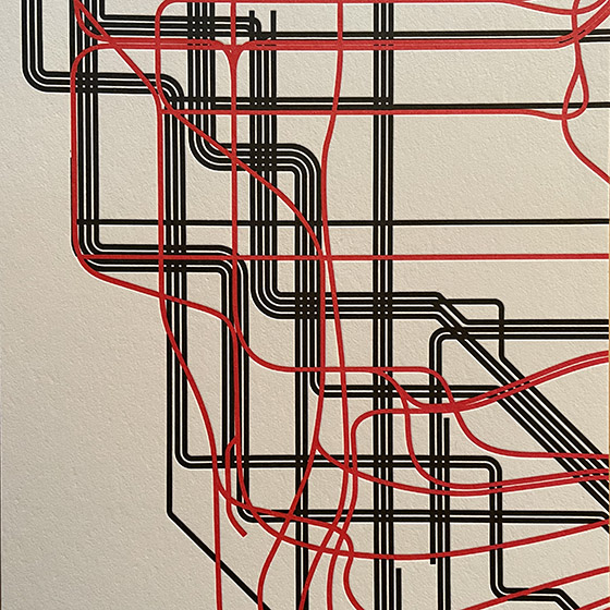
The debate was a battle of two antagonistic concepts of what a transit map was supposed to do. In 1972, Massimo Vignelli and his studio had designed an elegantly abstract new subway map, doing away almost entirely with geography and presenting a schematic, almost a wiring diagram, of how to get from one point to another within a closed system. In 1978, a new map, championed by railroad enthusiast and cartographer John Tauranac, was proposed as a replacement. The new map would restore a semblance of geography, connect the subway to the city streets above, and show how the complex tangle of New York’s subways really worked. It was, as designer and debate panelist Peter Laundy later described it, “really a tunnel map rather than a route map.”

I started riding the New York subways in 1966, when I was sixteen. Shortly before that, Vignelli and Bob Noorda had designed a new signage system for the subways, assigning color-coded numbers or letters to each route. I found this system easy to follow; what I didn’t find easy to follow was the old signs in all the stations, pointing to the “BMT trains” or the “East Side Local.” The new system had not fully replaced the old, and to a novice these mixed signals were confusing. The Vignelli map had not yet been created, but the then-current subway map did identify all the lines by number or letter. There was no clue on it to the old nomenclature, or to the fact that the NYC subway system had been cobbled together from three separate companies, the IRT, the BMT, and the IND.

That map, and the Vignelli schematic in 1972, was an attempt at imposing order on a fundamentally chaotic and contradictory system. This, it seems to me, is exactly what design is supposed to do.

[Originally published on January 1, 2022, in PPN Post and Updates, the newsletter of the Publishing Professionals Network.]

New JDB website

Published

After a mere 13 years, this website is getting an overhaul and a brand-new design. Besides being updated to look like something from the modern world, it’s more directly focused on showing the breadth of my work. The primary purpose, of course, is to make it absurdly easy for people who might want to engage my professional services. (That might be you.)

The images on the portfolio pages are meant as examples, not case studies. If you’re interested enough to want to know the details of how a project was done, and with what purpose in mind, we should talk directly.

All the pages of the old site will still be accessible from the “legacy site” link on the main menu. (I say “will be” because at the moment it’s hiding behind a technical glitch.) The design, although not responsive, was at least intended to be comfortably viewable and readable on a phone as well as on a larger screen. (The even less responsively designed “dot-font.com” website is also still there, if you’d care to check it out. It’s got pretty pictures and free text downloads from two of my books of essays.) And of course the standalone website for the Scripta Typographic Institute, which was already responsive, remains unchanged.

Like most design projects, this one has been collaborative. I took on much more of the hands-on coding than I had ever done before, figuring out how to build the responsive grid that I wanted to use for the portfolio pages. But, as always, much of the heavy lifting and correction of misconceptions has been done by Paul Novitski, my long-time webmaster. (Remember that term?) Paul had been encouraging me for years to dive under the hood; at last, this year, I started doing so. It’s been fun as well as useful. I should also call out Dave Miller at Artefact for useful strategic thinking when I was starting this project, and Alexandru Năstase of TypeThursday Bucharest for insightful advice near the end.

Although she could have no hand in this new iteration, I still owe a lot of thanks to the late Julie Gomoll for her advice and guidance on the initial form of this website.

What really got me interested in creating a new website was the possibilities now available for responsive grids. At last, it seemed, web design was beginning to do things that interested me! I found Rachel Andrew’s CSS grid newsletter and tutorials especially helpful. I’ve had lots of fruitful discussions with Jason Pamental about flexible design and typography on the web (although I have not tried using variable fonts in this design). And as someone who originally came to design through production, and who takes a production-based approach to any design project, I was happy to finally get my hands dirty. (“How do you clean all this syntax out of your fingernails, anyway?”)

Visualizing with text

Published

I had fun recently collaborating with Richard Brath, the author of Visualizing with Text, on a cover for this upcoming book from CRC Press. It’s part of the AK Peters Visualization Series, a line of books from Routledge that focuses on different ways of visualizing information, largely scientific or technical. Brath has written a specialized yet informative study of the many ways that text can function as an element of visual design.

Not surprisingly, the book is richly illustrated, so we had lots of possibilities when it came to pulling images that might be used on the cover. But first I tried out a number of dramatic single images of type or letters that did not come from the book. Richard responded with a very dense collage of images from within his own text, which I found fascinating but probably overwrought for a book cover. Especially for the cover of a book that would most likely be seen as a thumbnail in a catalog or online, rather than displayed lavishly on the front table of a bookstore.

The process, as I said, was fun, going back and forth and trying out different combinations to find one that would both be dramatic and reflect the diversity of techniques that his book covers.

I also got the publisher’s permission to replace the ITC American Typewriter that they had been using on the covers of this series with David Jonathan Ross’s recent revival of Dattilo, a typewriter-inspired Italian typeface of the early 1970s that was originally issued by Nebiolo. Like American Typewriter, Dattilo is not actually monospaced at all; it just reminds us of a monospaced typewriter face. But Dattilo has a much richer variety of weights and optical sizes, enabling me to take the same series design and give it a much more dramatic typographic treatment.

Richard Brath has written his own informative blog post about designing the cover of his book. The book will be published this fall.

A tale of three nametags

Published

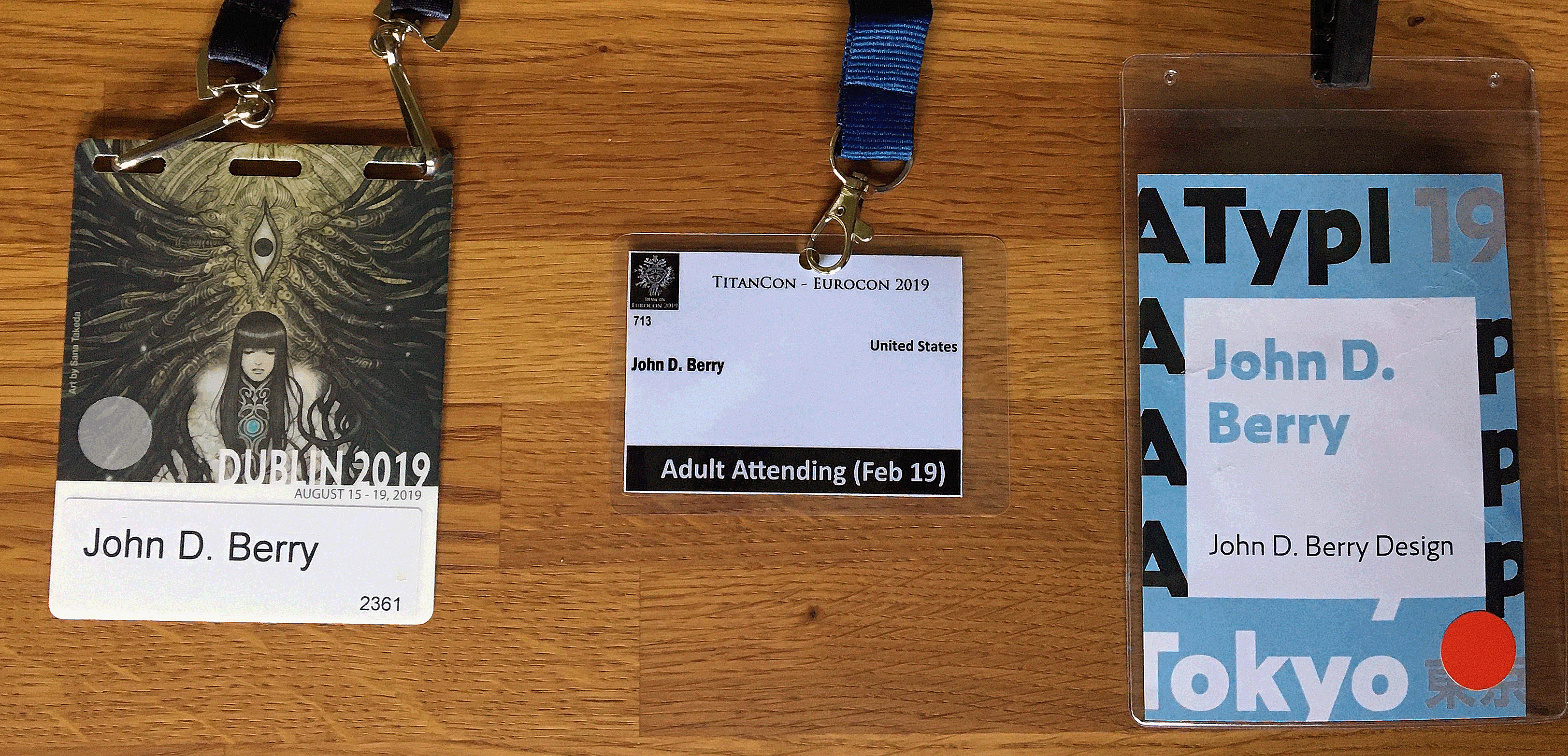
In the course of less than a month this summer, I attended three major events, each of which had a nametag that attendees were supposed to wear. The first, in Dublin, was this year’s World Science Fiction Convention, which was being held in Ireland for the first time. The second, a week later in Belfast, was the Eurocon, or European Science Fiction Convention, which moves around among European countries and was hosted by the organizers of Titancon, an annual Belfast science fiction convention; holding it in Northern Ireland the week after the worldcon made it easy for people visiting from other countries to attend both conventions on their trip. The third event was ATypI 2019, the annual conference of the Association Typographique Internationale, in Tokyo – ATypI’s second time in Asia, as it happens.

Aside from dueling jetlags (I was only home in Seattle for five days between the two trips), this juxtaposition provided a classic opportunity to compare approaches to designing the nametags or badges for such an event. I’ve written about this before, in an article about nametags published in FontShop’s Font magazine: “The moment when the design of nametags really matters is when you’re stumbling about at an opening reception, trying to spot familiar names without rudely staring at people’s chests.” Although the organizers might consider the first purpose of a nametag or badge to be labeling someone as a paying (or non-paying) official attendee of the event, for the attendees themselves the purpose is to be able to identify individual people by name. And the distance at which you want to be able to read the name is about three meters (ten feet), well before you find yourself face to face with that person whose name you know you ought to recall.

So how well did the badge-designers for these three 2019 events do?

Close-up of three nametags

Well, the Dublin nametag does make the name fairly large, though not large enough to be read at any distance. Fully three-quarters of the area of the nametag is taken up with artwork, which incorporates the name of the convention. Not too bad, but not ideal.

The nametag for Eurocon/TitanCon seems perfunctory. It’s quite small, and the largest visual element is the label “Adult Attending.” The typeface used for the name is a pretty good choice – clear, condensed, bold, and set in upper- and lowercase – but it’s tiny. You can barely read it even if you’re peering at it up close. The same name set ten times larger would have been effective; and there’s plenty of white space to accommodate a much bigger name. The TitanCon nametag is basically not functional.

On the nametag for ATypI, which is the largest of the three, the attendee’s name is both big and bold, clearly set within a large white square. It might have accommodated longer names better with a somewhat condensed typeface (which would also let shorter names be set larger), but overall my only complaint is that the name isn’t set in black; instead, it’s set in a pale second color, which tends to drop back, visually. (The color varied depending on the status of the attendee.) But it was generally readable as you approached someone in the corridor, so it was doing its job.

I don’t understand why this is so difficult. It should be thought of as information design, not just branding. Combine the typeface and color of the TitanCon names and the size and placement of the ATypI names, and you’d have a near-perfect nametag. Yet year after year, organizers of conventions and conferences, even ones devoted to graphic design, reinvent the wheel. And they sometimes get it flat.

TypeCon2014 | Washington DC

Published

This year’s TypeCon, which went by the name “Capitolized” but really seemed to revel in being “Redacted,” was very enjoyable. It was a great reunion of colleagues and old friends, and a fine way to make new friends and meet new colleagues, as this sort of event always is. The hotel, the Hyatt Regency Washington (a few blocks from Union Station and the Capitol), had a nice open bar area in its lobby, with several surprisingly good beers on tap, and proved to be the sort of meeting place that you hope for when you’re organizing something like this.

There were some very good talks (and the occasional dud, of course), including some that I really wanted to hear but that started too early in the morning for me. As I was staying with local friends across town, a few stops away on the Red Line, it was often hard to tear myself away from breakfast and conversation – especially if I’d been up late the night before, doing much the same thing (except for the breakfast part). Theoretically, all the talks were videotaped (except for a couple where the speakers asked not to be recorded), so perhaps eventually we’ll have a chance to catch up on the ones that we missed, for one reason or another.

It was gratifying to see so many talks about non-Latin typefaces; TypeCon is showing an admirable international flavor, despite being the North American type conference. Emblematic of this was the choice of Bulgarian type designer Krista Radoeva as the recipient of this year’s SOTA Catalyst Award.

Even better – and carrying the non-Latin theme further – was the presentation of the SOTA Typography Award to Fiona Ross, who must have done more than any other single person to further excellence in non-Latin type design: most notably in Indian types, but in Arabic, Thai, and other non-Latin scripts as well. The enthusiasm with which everyone greeted the announcement that Fiona was this year’s awardee was palpable. It was a very well-deserved award.

Personal favorites among the talks that I did get to hear included Mark Simonson’s nostalgic paean to the pleasures of phototype, X-acto knives, waxers, and rub-down type; Liron Lavi Turkenich on a failed experiment in updating Hebrew type; Carl Crossgrove’s trawl through the much-neglected range of sans-serif types with contrast and modulated strokes; Thierry Blancpain showing us that, yes, there’s been some Swiss graphic design since the days of Max Bill and Müller-Brockmann; Nick Shinn on the visual marketing of recorded music, 1888–1967; and the very clever way that Victor Gaultney demonstrated to English-speaking readers what it’s like for readers whose scripts are barely and inadequately supported in common electronic communications media.

I can’t help pointing out that this year’s TypeCon featured one of the most unreadable nametag designs I have ever seen. The “redacted” bit was cute, but extending it to the nametags made them utterly nonfunctional. There’s a reason they’re call “name” tags.

Washington, DC, in the summertime is not an ideal climate experience, though we did get one soft, warm evening when it was a pleasure to sit outside at the bar across from the hotel and enjoy the evening breeze. The weather was not as fiercely hot as it could have been, but the humidity was up to its usual standard. I lived in the DC area for a couple of years in the early ’70s, first in northern Virginia and then for a year in the District, near Dupont Circle. (As the Metro train stopped at the Dupont Circle station on my daily commute, I found myself thinking, “When I lived above here, they were just building this station.”) I remember one summer without air-conditioning where I got through it only by pretending that I was underwater the whole time; I simply never expected to be dry, and I was never disappointed. Unfortunately, I can neither think nor work in that kind of climate.

I’ll be seeing some of the same people, as well as many who were missed in DC, next month at the ATypI conference in Barcelona. Must be the typographic season.

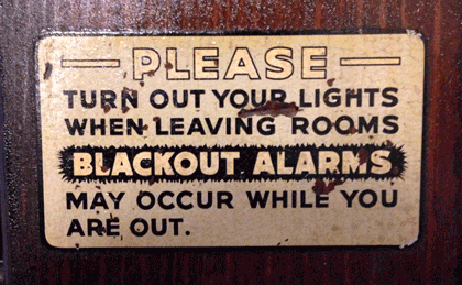
Blackout-alarm sign on the door in an old DC apartment

[Photos: a TypeCon2014 nametag (top); TypeCon attendees suddenly deciding to wear their nametags as headbands (middle); expressive typography in Washington (bottom); and the sign on the door in my friends’ apartment building (above).]

Massimo Vignelli & organizing information

Published

When Massimo Vignelli died last month, the obituaries and remembrances all mentioned his famous 1972 map of the New York City subway system. The New York Times, of course, spent a good deal of ink and pixels on the subject. In retrospect, everyone keeps talking about how confusing that map was to people at the time, implying that it may have been a brilliant design object but that it was a failure as a navigational tool. That’s not what I remember.

I first learned how to navigate the complex, contradictory New York subways in the late 1960s, when the Vignelli map had not yet appeared but the Vignelli-inspired system of color-coding the lines and identifying them by numbers or letters had been implemented. This was truly a system, and it made sense of a wildly inconsistent tangle of lines; it also made the sometimes chaotic interiors of the subway stations themselves navigable and understandable, at least to an extent. The system was designed not to tame the chaos but to give its users – the subway riders, both straphangers who used the system every day and newcomers or first-timers like me – a tool for navigating, for making our way through the jungle and getting to a destination.

The maps we used before 1972 were already highly stylized; they were really diagrams, not maps, despite the nod to geography in the background shapes of the city’s waterways and landforms. The 1966 subway map, which would have been the first one that I used, was already nothing like a realistic map; the lines in the outer boroughs were compressed and condensed, while Manhattan was shortened and fattened, not reflecting the actual geography at all. But the lines still had names, not numbers or letters (“SEA BEACH, W. END” or “JEROME LEX AV”).

By 1968, the map was clearly a wiring diagram of the city, and it introduced the consistent system of identifying each line by a unique number or letter (6, F, RR). The lines were color-coded as well, just like the signs within the stations. (In the 1966 map, the only color distinction was used to show which lines were part of the old IRT, IND, or BMT systems.) The map was complex, because the city’s subway system was complex, but it formed a very useful and usable chart that enabled you to understand how the system was put together and how to get from one point within it to another efficiently.

The famous 1972 map was just a continuation of this to a slightly more abstract level. Actually, to a slightly more abstract-looking level; the abstraction was already there. Compare the 1968 map to the 1972 one: both are diagrams, it’s just that the ’72 map makes this even more obvious. The biggest innovation was how it showed potential transfer points: instead of inscribing all the line numbers or letters in little boxes, the Vignelli map placed black dots side-by-side where trains from adjacent lines stopped at the same station. It was simple and clear, and if your line passed by but didn’t show a dot, that meant it didn’t stop at that station.

None of these subway maps were intended as a way to understand the city; they were intended as a way to understand the subway system, and to use that to get around the city. They were superb at that, and the more abstract they got, the better they did that job. I know; I used them constantly.

The first “schematic” map of the New York subways was produced in 1959. If you want to see what that was an improvement on, take a look at the 1948 map, which makes a brave attempt to reflect the geography and still show the tangle of lines and where they go. The comparison is educational. I know which one I would want to use as a guide.

Strangely, many of the people who complained about the 1972 Vignelli subway map would be perfectly content to use the equally abstract London tube map, which was introduced decades before New York’s attempts. Nobody in London would claim that the tube map gives you any idea of the layout of the city; but it’ll get you from station to station within the system brilliantly. The 1972 NYC subway map did the same.

Thank you, Massimo, for making it easier for me and a lot of other people to get around.

[Image: a detail from the recent digital version of the Vignelli subway map, even more simplified and rationalized than the original.]

A measured response

Published

In on online discussion recently about book design, someone with long experience in print design made the claim that it was a proven fact that unjustified text was harder to read than justified. This was presented as an indisputable conclusion. That got me curious, so I made an effort to get hold of a copy of the source he cited: Colin Wheildon’s Type & Layout: Communicating – Or Just Making Pretty Shapes?. Obviously I would be in sympathy with a book with such a subtitle, but I was skeptical about the claim to hard data.

Wheildon first published this in Australia as a slim booklet in 1984; the version I found was the American edition, revised and expanded, published in 1995 by Strathmoor Press in Berkeley, with a cumbersome new subtitle: How typography and design can get your message across – or get in the way. (There’s a yet newer edition, from the Worsley Press in 2005, which I haven’t seen; happily, it goes back to Wheildon’s original subtitle.)

The heart of the book is the controlled experiments that Wheildon carried out, with as much care as possible and all the expert advice he could get, to test different typographic treatments, and try to find out, scientifically and measurably, which worked better and which didn’t. He came to this question from magazine publishing, with experience in both advertising and editorial design, so his examples are all from the pages, either real or made up for the experiment, of magazines.

Since Wheildon spells out in an appendix exactly how he conducted his research, it’s possible to judge the results. As far as I can tell, his methods for measuring comprehension after reading an article make sense, as far as they go; comprehension of facts may not be the only thing that’s important in reading, but at least it’s measurable.

Basically, he tested comprehension of articles that the participants had read, using a randomized series of questions that would tell him whether they had read all the way through the article or just read the first part and skimmed or skipped the rest. He also mixed this with anecdotal responses to particular features of his sample layouts, which he probably found irresistible but which renders many of his results dangerously subjective.

The real problem, though, is that in too many of his experiments, he didn’t measure comparable alternatives. It doesn’t really tell you much about the difference between serif and sans-serif text typefaces if the serif face you’re testing is Corona, a workhorse newspaper face, and the sans-serif is Helvetica, which was never intended for long text – and you’ve set both examples at exactly the same point size and leading. Testing a sans-serif typeface that was designed for text, and adjusting the size and spacing parameters to make them appropriate and comparable, rather than literally the same, would have been a much better comparison. Similarly, in a section about optimal text sizes, he made no allowance for varying x-heights and the difference in apparent size of different typefaces; he just compared 10pt to 10pt, no matter what the font. Even his test of ragged-right versus justified text tells us nothing about the details of how the text was typeset; it was just the same layout with either justified or unjustified setting.

I showed my borrowed copy of Type & Layout to Kevin Larson at a recent type pub in Seattle. Kevin is Microsoft’s researcher into typographic readability and legibility, so this is right up his alley. Naturally he refused to pass judgment based on just browsing through the book, but he did ask some pertinent questions about the specific test conditions and methods, which I found useful in thinking about Wheildon’s results.

What I found missing in Wheildon’s examples and his tests was the fine points of text typography that I’ve been dealing with for the past thirty-five years. In comparing serif and sans-serif settings of the same text, he used typefaces that, while indeed serif and sans, do not otherwise have much in common. Not surprisingly, the test subjects had a harder time reading a column of 8/9 Helvetica than they did a column of 8/9 Corona.

That’s the most obvious failure, but there are all too many places in Wheildon’s examples where he’s testing gross differences rather than well-adjusted settings in each format. He wrote this in the 1980s, so it’s no surprise that it doesn’t reflect the current state of typesetting technology, but it doesn’t even reflect the state of the technology in the 1980s: I was amazed that in his discussion of letter-spacing he confused kerning with tracking, and he seemed to think that letter-spacing in digital type could only be adjusted using one to four rather large units. (Perhaps he was thinking of the four pre-set tracking values in Aldus PageMaker?) Even at that time, typesetting systems were spacing in tiny fractions of an em.

Nothing in his trials had any way of measuring how much of a reader’s response was inherent and how much was just a matter of what they were already used to. (“We read best what we read most,” as Zuzana Licko famously quipped.)

What I came away with, after reading this book, was disappointment. I appreciated what Wheildon was trying to do; I just wish he had done it better. Some of his data is useful; some of it, unfortunately, is useless, or even misleading.

The focus of Wheildon’s attention was on magazines and advertising, rather than books, though most of what he says about reading text would have some relevance for books too. This 1995 edition of Type & Layout is not itself a very good example of book typography; the publisher and editor, Mal Warwick, makes it clear in a note that he is no typographer, and this is borne out on every page. Too often, Warwick’s re-creations of Wheildon’s examples use a different typeface, usually the light digital version of Goudy Old Style that he’s using as the text face of the book. That makes the examples impossible to judge. (Most of the examples that are reproduced directly from other sources are shown much too small to read, so we have to take the author’s conclusions on faith.) The general text typesetting is perfunctory, not carefully considered and adjusted. It’s a shame that the book itself doesn’t set a better example.

This edition is decked out with a foreword by David Ogilvy, an afterword by Tony Antin, and an introduction by Warwick, all of whom make much more grandiose claims than Wheildon himself does. Where Wheildon offers his conclusions modestly (though not without strong opinions), his promoters put them forward as proof positive of everything they hold dear. I don’t blame Wheildon for that, but it undercuts his book’s effectiveness. And it certainly doesn’t help that the publisher added two chapters of his own, which just show bad examples and make snarky comments about them; those two chapters can safely be ignored.

It’s the subtleties of composition, not just the broad strokes of layout or the size or choice of typeface, that make a page of text easy and inviting to read. Anyone who works professionally with book pages and text composition spends all their time on these fine points; and they don’t do it by rote or rules, but by intuition, experience, and paying attention to the text.

The allure of hard numbers – what software companies love to call “metrics” – is that you can quote them to clients or managers as a justification for your design decisions. But when the metrics rule the design, the tail is wagging the dog.

Rules of thumb can be very handy, but all they are is useful patterns; if you treat them like imperatives from on high – or from a few limited tests that others have inflated into ironclad laws – they’ll trip you up every time.

It would be interesting to see the real subtleties of readability tested, but it’s very hard to do, and it would take a lot of time and effort to come up with anything meaningful.

iOS7 typography: too thin, too tight

Published

Everything about the new design of iOS that was previewed this week looked nifty, except for the typography. Okay, I’m not wild about the candy colors, but that’s just taste. Typography isn’t just about taste; it’s about functionality. On the screen, and for information design, Helvetica – whether Neue or not – is not functional; it just gives the flavor of functionality. The letterforms are too closed, too uniform; they’re not easy enough to distinguish at a glance. And a glance is exactly what we give to the screen of our phone.

At huge size, the Helvetica Neue Thin numbers look all right; but at any other size, they lack clarity. It’s too easy to mix up a 3 and a 6 and an 8 and a 0, at small sizes – not a problem you really want to have when you’re dealing with dates and coordinates and addresses and phone numbers.

Please, can we have a moratorium on very thin sans-serif type that’s pushed tightly together? Trying to squeeze more information into a small space is useless if the information isn’t clearly readable. The lighter the weight of a typeface, the more space it needs between letters, to be easy to read. And it needs even more space when the text is displayed against a dark or mottled background, or seen at an angle rather than straight on. All of which is inherent in the iOS7 design.

For that matter, I wonder whether, in the age of Apple’s Retina display, there’s any need to stick with sans-serif faces on the screen. For years, I’ve felt that an open humanist sans was the most functional style of typeface for reading onscreen; but perhaps that’s no longer true. Or at least not necessarily.

Everything that Jony Ive says about design in his iOS7 video is true. Unfortunately, in the typography of the visual interface, he hasn’t followed through. What we’ve seen is only a preview; the UI is still in development, and it could change for the better before it’s released. But I know how the process of software development goes, and I’m sure there’d be a huge resistance to any change at this point that affected how much text fits on the screen. It’s disappointing, because a fundamental rethinking of the typography is what’s needed.

Some examples:

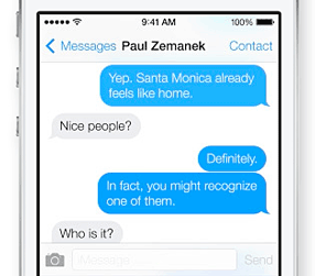
Can you read this exchange easily? Not “can you make it out when you squint and peer closely,” but can you read it easily?

Messaging in iOS7

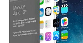
What’s on your calendar for June 10? (And what’s with that busy superior “th,” anyway? That’s 18th-century design, not 21st.) Can you read it when you see it at this angle?

iOS7 interface at an angle

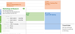
Ironically, Apple’s marketing typeface is much more readable than its iOS text face. The callouts in this example are clearer than the information in the Calendar panel.

iOS7 Calendar with callouts

[Images at left: top, part of a screenshot of a message from Siri in iOS7; below, the same words in a few different of typefaces, with looser spacing.]

Addendum (July 8):

Apparently the latest beta of iOS7 allows switching to Neue Helvetica Regular instead of Light for non-Retina displays. Gizmodo has a nice demo of the effect. (Thanks for pointing this out, Aaron Meek.) Alas, it’s clear when you see the font switching back and forth that somebody at Apple doesn’t understand how to track lighter typefaces so they’re readable. The lines of lighter type should be at least as long as the lines of heavier type, not shorter. Squeezed again!

Unfortunate signage

Published

The street signs in the town of Alcoa, Tenn., which I found myself driving through a couple of weeks ago, have this unusual choice of typeface. It looks like Impact, though a bit straighter and narrower than even that impactful typeface. You can see what whoever chose this was thinking: keep it narrow but bold, something that will really stand out when seen from a car driving up to an intersection. The unfortunate part is that it’s too bold; it certainly draws your eye, but that doesn’t make it legible. The excessively fat strokes combined with the compressed shapes, and the very tight spacing and tiny counters, make it turn into a blob of black (or, in this case, white) against the background, so that it’s not in fact easy to read at all.

Oh well. Nice try.

Word play

Published

In a completely self-referential bit of digital navel-gazing, I’ve used the little online toy Wordle to generate a “word cloud” from the text of this very page. Wordle takes whatever text you feed it – or the text from a webpage whose URL you give it – and turns it into a visual representation of how frequently the text repeats certain words. The more often the word is used, the larger it appears. Wordle has several controls for changing what the visual representation looks like (color, orientation, language, even whether to exclude or include certain kinds of words), but the end result is generated at random. If you run the same text through again, with the same set of parameters, the sizes of the words will stay the same but the word cloud they form will be different.

As you can imagine, Wordle is a wonderful time-suck. (It’s also hard to type; my fingers keep wanting to type “World” instead.) The word cloud at the left has no significance whatsoever; it just represents what I’ve written in recent blog posts right here (at least, before this post itself is added). But it’s recursive fun.