function jdb_page_navigation()
sPageSlug = blog
sPageTitle = easily amused
header:139:aPageArgs:page_title = easily amused
header:140:aPageArgs:section_title =
functions-johndberry:262:aPageArgs:page_title = easily amused
functions-johndberry:298:sPageTitle = easily amused
functions-johndberry:359:sPageTitle = easilyamused

easilyamused |

Archive for the category ‘fonts’

Web type at last!

Published

This has turned out to be the year of web fonts. I don’t just mean typefaces designed for use on the web; that’s been going on for at least a decade and a half, most notably with the spread of Verdana and Georgia throughout the online world. I mean that at last we’re getting a workable system for using a variety of typefaces on web pages – and being reasonably certain that everyone viewing those pages will see the same typefaces, not some substitute based on what happens to be available on their computer.

A year ago, this seemed impossible. There was a whole track of programming at the ATypI conference in Mexico City about web fonts, and lots of interest in the topic, but there seemed to be no common ground for agreement about the right way to move forward.

WOFF

In the past year, however, the key players came together to form a Web Fonts Working Group under the auspices of the W3C (World Wide Web Consortium), and after months of hard work and persuasion, they agreed on a new format for web fonts. It’s called WOFF (Web Open Font Format), and it’s well on its way to becoming a generally accepted standard. According to Erik van Blokland, one of the creators of the format, WOFF will be “the only (!) specification that W3C will recommend for use on the web.”

All of the newest versions of major browsers, either out now or out soon, support WOFF, including the recently-released beta version of Internet Explorer 9. (Mozilla Firefox was the first to implement WOFF support; Mozilla was one of the developers of the format.) Browsers may implement other formats as well, but WOFF is likely to be the only format that’s guaranteed to work across all “modern” browsers.

Properly speaking, WOFF isn’t a new font format; it’s a software wrapper around an existing TrueType or OpenType font. The WOFF wrapper includes “metadata” – information about the font – that font vendors can use to tell you who designed the typeface, who licensed it to you, and what the terms are for that license. This is just information; there’s no enforcement involved, no DRM, nothing to prevent someone who’s willing to go to a little trouble from unpacking the font inside the wrapper. The purpose of the metadata is to make it obvious to anyone who downloads the font that it’s a web font, intended for use while viewing a web page, not a “desktop” font that you can use in any file or application you want. This whole approach is promulgated on the assumption that most people, if it’s clear and easy for them to do the right thing, will, in fact…do the right thing.

Web-font services

The newest versions of all the major web browsers support WOFF, which makes it a universal format going forward. Looking backward, of course, is another story. What about older browsers that don’t have WOFF support built in? Lots of websites will be viewed in older versions of all of the major browsers. That’s where web-font services come in.

At the same time that vendors and manufacturers are coming out with sets of fonts intended for the web, an increasing number of web-font services have sprung up, each offering its own system for supplying those web fonts to designers and end users.

There are two parts to a web-font service: 1) making the fonts available to web designers so they can specify them in the designs of their web pages; and 2) enabling those fonts to be downloaded to users’ systems when they view those web pages.

The web-font service takes care of delivering the right fonts in the right formats to each version of each browser; the website host or designer makes an arrangement with the service, usually for a fairly nominal fee, and then uses the fonts available for that service in designing their web pages.

The list of web-font services is growing almost daily; so is the list of font foundries who are offering their fonts in web versions. There are many different ideas about the best way to do this, both technically and from a business standpoint. A web designer just has to pick one and give it a try. They’re all available right now.

There is variation in quality, of course. Typekit, for instance, which is perhaps the best known, offers fonts from a lot of different foundries; some of them are better engineered for onscreen use than others. Webtype.com, launched by Font Bureau, offers not only a web-font service but several families of carefully designed new fonts, with their roots in metal but their forms dictated by what works onscreen. Adobe recently launched their web-font library, a wide selection of font families from their larger font library, and already Adobe has upgraded and improved the rendering of some of those fonts. On the web, it’s very easy to update things, to iterate; there’s no final form. Now that the floodgates have opened, you can expect things to keep changing fast, and the quality to keep getting better at a rapid rate.

For users, the WOFF revolution is a very good argument for upgrading your browser, since only the newer versions of each browser will support this format. (You may get good results from some of the backward-compatible formats offered by some web-font services, but you will get better results – the type will be more readable – with an up-to-date browser.) If you’re a web designer, it’s time to start looking into WOFF.

[Image: an apt slogan taken from the homepage of webtype.com]

Pontificating

Published

I was interviewed last week, along with Simon Daniels, by “unsolicited pundit” Glenn Fleishman, who writes regularly for the “Babbage” blog on The Economist‘s website. The subject was type on the web – a huge subject that I’ve been trying to write my own blog post about without success. I guess it’s easier to have someone else asking the questions (and writing up the answers) than to put it all together yourself. I think Glenn plans to write more about the subject; this one article doesn’t come close to exhausting it, but it’s a good start.

Huronia

Published

At TypeCon in Los Angeles, Ross Mills is handing out nicely printed type specimens of his newly released typeface Huronia. It’s a sturdy, compact serif design that looks as though it will be immediately useful as a book typeface. Andrew Steeves of Gaspereau Press describes Huronia’s “tensile strength and character,” which seems a good way of expressing the nature of this text type.

The current release is the standard character/glyph complement, which contains an extended Latin character set – that is, the letters that we use in English and most other European languages. A later release will include full support for “all American languages,” including the writing systems used for Cherokee, Cree, and Inuktitut. Those beautifully designed glyphs are shown on the type specimen alongside the English text.

Unserious Sans

Published

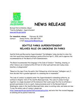
Amy Redmond forwarded this press release that she received from the Seattle Parks and Recreation department after she wrote a letter about a proposed ban on smoking outdoors in parks. “I just can’t take this seriously,” she wrote. “I so very badly want to storm into their office and say ‘I will support the ban on smoking in parks if you make a law banning the use of comic sans in press releases.'” Spoken like a true typographer.

Press release in Comic Sans

Font Aid for Haiti

Published

Font Aid IV is a project to raise money to help the recovery efforts in Haiti after this month’s devastating earthquake. SOTA (Society of Typographic Aficionados), which is a US-based nonprofit, is acting as organizer. The way it works is much like the three previous Font Aid efforts: type designers contribute one character each to a special font, which is then sold to benefit the needy cause. This time, the special font will consist entirely of ampersands; ostensibly this is because of the theme “Coming Together,” though I’m sure it can’t hurt that ampersands are fun to draw and easy to find a use for. All proceeds from sales of the font will go to Doctors Without Borders.

Ikea Verdanarama

Published

It’s amazing when fonts turn up in the news. As everyone in the type business has undoubtedly heard by now, Ikea decided to switch from one typeface to another for its catalogs and ads, and all hell broke loose on Twitter. You wouldn’t think that a typographic design change would generate that much heat, but lots of people (not all of them typographers or graphic designers) have expressed outrage – outrage! – at Ikea’s dropping its longstanding catalog typeface, a custom version of Futura, and replacing it with, of all things, Verdana. Shock! Horror! A web font!

Verdana was designed in the 1990s for Microsoft, developed specifically as a typeface for reading onscreen. The designer, Matthew Carter, has long experience of virtually every kind of typeface technology, and he brought that to bear on designing Verdana. Since text on a computer screen appears, of necessity, at pretty coarse resolution, the outlines of the letters have to be adapted somehow when rendering them at small sizes; there simply aren’t enough pixels available to reproduce the outline shapes perfectly. That’s where the art and craft of designing screen fonts comes in: making the most of those extreme limitations. In what was at the time a revolutionary turnabout, Carter first designed bitmapped letters for each of the target sizes, positioning pixels to get the most legible shapes he could; then he drew the outlines for the higher-resolution letters, based on the shapes of the lo-res bitmaps. Tom Rickner, a wizard of digital font technology, then created the “hints” that would tell the font software exactly how to distort the outlines at a particular size, when drawing a character on the screen, in order to achieve the ideal bitmap at that size.

One of the things that make Verdana legible onscreen, compared with a lot of other typefaces, is the generous space around the characters. There’s always a tendency among web designers to try to cram in as much material as possible in the space available, but that works against clarity and legibility. Without enough space between the letters, they all tend to run together. We’ve all seen this, much too frequently, on our computer screens. The clear, open shapes of Verdana’s letters can vary quite a bit from size to size at small text sizes onscreen, but one thing they have in common is that they’ve been given enough space to breathe.

Although Verdana was meant primarily for onscreen reading, it works surprisingly well on paper as well. It’s a simple, clean, unpretentious sans serif typeface, easy to read. I’ve used it for years as the typeface for manuscripts and drafts of anything I’m writing, because it’s easy to read both onscreen and on paper and it gets out of the way. I realized seven or eight years ago that Verdana had passed into general use, when I saw it on a billboard in San Francisco. (The same characteristics that make it legible onscreen may make it easy to read at a distance as you’re driving by.) I’ve never tried using Verdana in print, but I can imagine situations where I might want to.

It’s funny to see the choice of Verdana lambasted because it was designed for a different purpose. As Erik Spiekermann has pointed out, many of our most versatile typefaces were originally designed for one specific purpose, answering a particular set of constraints (Times New Roman, for instance, which was designed for the presses that printed The Times in 1931). Even Bell Centennial and Bell Gothic, both of which were designed for the listings in American telephone books, have been used successfully at huge display sizes by editorial designers with an eye for the unusual. Perhaps Verdana has unexpected uses as well.

I have no strong opinion about Ikea’s redesign. Certainly Verdana’s numerals are very clear and readable – even stylish, in a chunky, sturdy sort of way – and the numerals are what end up at the largest size on the pages of an Ikea catalog. And I alway felt that the Ikea version of Futura was a little too tightly spaced, though that’s not the fault of the typeface but of how it’s used.

One of the reasons Ikea chose Verdana is that it works across quite a lot of languages and scripts. The basic fonts include Greek and Cyrillic alongside the extended Latin alphabet; and Microsoft’s Japanese typeface Meiryo is based on Verdana, with the romaji (Latin letters) being essentially slightly revised and sharpened versions of Verdana’s designs. (As near as I can tell, from Ikea’s Japanese web pages, the Japanese catalog does use Meiryo, although with a different typeface for some text.)

Verdana may be about to become more versatile for both web and print use, since Ascender Corporation just announced that they are working with Matthew Carter and the Font Bureau to extend both the Verdana and the Georgia families with new weights and widths.

Whatever the merits of the case, what strikes me most forcefully in all of this is that a debate about which font to use could even be noticed, much less become a cause célèbre in the public consciousness. What typographic times we live in!

[Images: two details from Ikea’s U.S. website (top and middle); sample of some of the forthcoming new members of the Verdana and Georgia families.]

Type designs from Mexico

Published

As called out recently on FontFeed, Mexican designer Isaías Loaiza Ramírez has posted on Flickr a bunch of images of Mexican typefaces in action, from the presentation first shown at TypeCon 2007 in Seattle. These images serve as an excellent fore-taste of the typographic exuberance that will be on display in Mexico City at the 2009 ATypI conference, Typ09.

TDCtoo | winners!

Published

The Type Directors Club in New York just announced the winners of its type-design competition, TDC2. Browsing the winners, in the TDC’s nifty new web interface, I was struck by how many useful-looking text faces were included, and also by the well-modulated peculiarities of a couple of the display faces (notably Orbe, by Rui Abreu, and Nebulon, by Carl Crossgrove). As often happens when I see the winners of the TDC type-design competition, I find myself itching to try them out.

The man who made Comic Sans

Published

Vincent Connare, who when he worked at Microsoft created the ubiquitous typeface Comic Sans, does a wonderful stand-up presentation of his handiwork and a small sampling of its overuse and misuse around the world. Vinnie’s original brief was to make a typeface for the word balloons in Microsoft Bob, the overly helpful little animated character in Windows 95, that would be based on lettering in comic books. He succeeded beyond his wildest dreams.

Comic Sans is one of those typefaces, like ITC Souvenir, that’s too successful for its own good. It’s curved and “friendly” in a way that irritates typophiles but appeals to everyday users. And it’s on everyone’s machine, so it’s available to be misused in every way conceivable.

Thanks to Cynthia Batty for pointing me (and the ATypI members’ list) to this brief video of Vinnie’s talk at the ROFLThing conference in New York. The type designer is not responsible for how the typeface gets used. You create a tool and let it loose on the world; sometimes it’s used the way you thought it would be, other times it’s turned to uses you never conceived of.

But I confess that I have this errant fantasy of the ultimate inappropriate typeface: Comic Sans Blackletter!

Guerrilla pixels

Published

In a daring daylight raid, elements of the Microsoft Typography team carried out an action targeted to advancing the cause of macro-typography and raising the visibility of fonts in the most literal way, says our anonymous informant.

Since the Microsoft Typography team, along with the rest of Windows International, was moving to a new building on the Microsoft corporate campus over the weekend of December 12, it seemed only appropriate to make a visible statement about the importance and ubiquity of type in the visual environment. Through the use of six-inch-square pixels cut out of sticky-backed black vinyl (a technique used previously for an installation at the Design Commission during TypeCon Seattle), these large-scale representations of bitmap characters from the Verdana and Georgia type families appeared without warning on the walls of the new building. This was reportedly achieved without a single X-acto-based industrial accident.

Verdana and Georgia were originally commissioned by Microsoft for onscreen reading of text. The way they were designed was the opposite of the usual process of designing type for the screen. Instead of creating outlines and then hinting the outlines (giving them rules to follow when turning into bitmaps at small sizes), type designer Matthew Carter started by designing the bitmaps – the end result that he wanted to see at each size – and then worked with hinting wizard Tom Rickner to create outlines and hinting that would achieve those shapes. The letters of the wordlet “typo” on the wall of Building 9 are taken from the bitmaps of 10pt Verdana and Georgia (in a mix of styles) at 96dpi. (Can you identify which letters are from which font, and in which style?)

The first versions of Verdana and Georgia were released in 1996; they now represent an early stage in the development of digital type at Microsoft. What will it look like when the MST commandos attempt to represent grayscale hinting and ClearType subpixel rendering at wall-size scale?