function jdb_page_navigation()
sPageSlug = blog
sPageTitle = easily amused
header:139:aPageArgs:page_title = easily amused
header:140:aPageArgs:section_title =
functions-johndberry:262:aPageArgs:page_title = easily amused
functions-johndberry:298:sPageTitle = easily amused
functions-johndberry:359:sPageTitle = easilyamused

easilyamused |

Archive for the category ‘books’

Katherine Small Gallery

Published

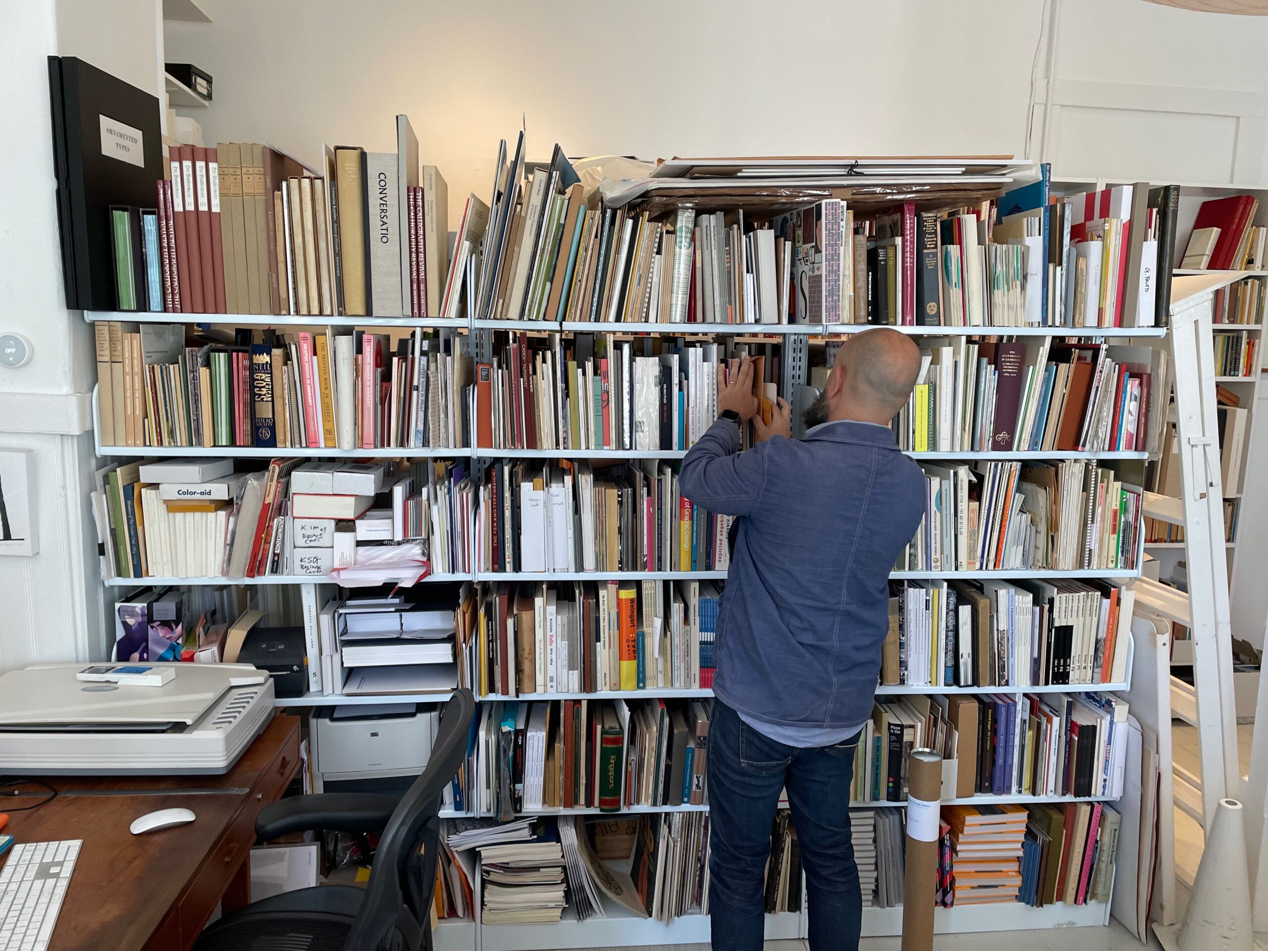
Last week, on a visit to Boston, I got to visit the Katherine Small Gallery in Somerville. It’s a gallery, because it does have exhibitions, but it’s most obviously a bookstore. An inviting, dangerous bookstore.

Michael Russem, the proprietor, greets each new arrival with the same welcoming line: “This shop deals only with graphic design and typography, so lower your expections!” If your tastes and interests are anything like mine, however, this introduction will only raise your expectations. And the shop exceeds them.

The shelves are full of books about typography, both current and rare. I was relieved to see that many of the most inviting were books that I already possessed; but not all. Naturally I ended up leaving with a bag full of books, which Michael bundled up in such a way that I managed to fit them into my carry-on bag for the flight home. (Such restraint I showed! As I told him, if I had wandered into a shop like this thirty years ago, I would have bought far more of the books – if I could have afforded them.) Then there was his own collection, which were not for sale but were displayed behind the desk and available to browse.

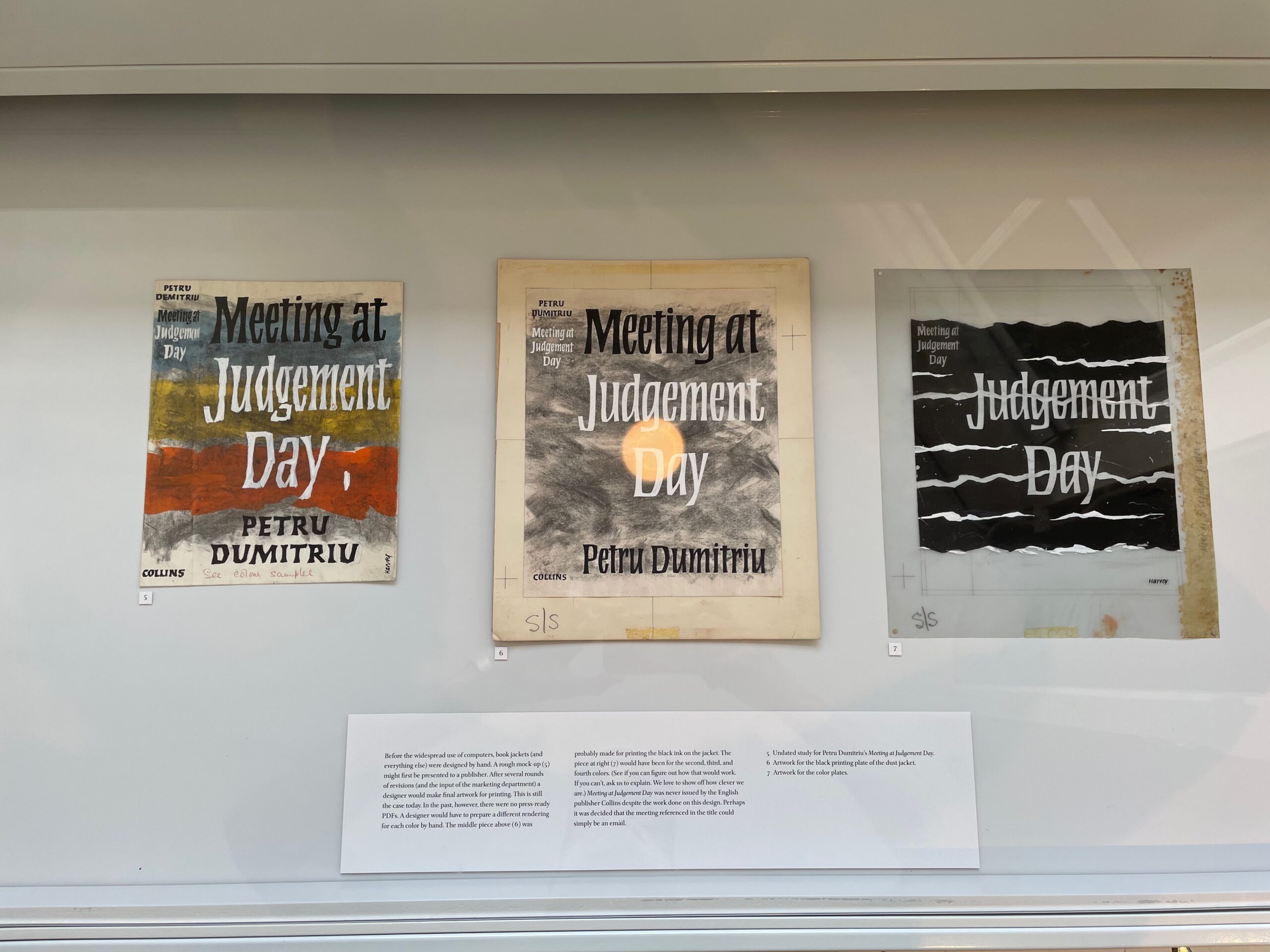
In a fit of perfect serendipity, I found that the current exhibit was on the book-jacket designs of Michael Harvey. I am a big fan of Michael’s distinctive lettering style (and of the man himself, now much missed), so this was a must-see for me. The germ of the exhibit was a small collection of mock-ups for covers and jackets, which were exhibited alongside the finished dust jackets. The glassed-in tops of two display cases were full of Michael Harvey designs, and flat-file drawers underneath them held many more.

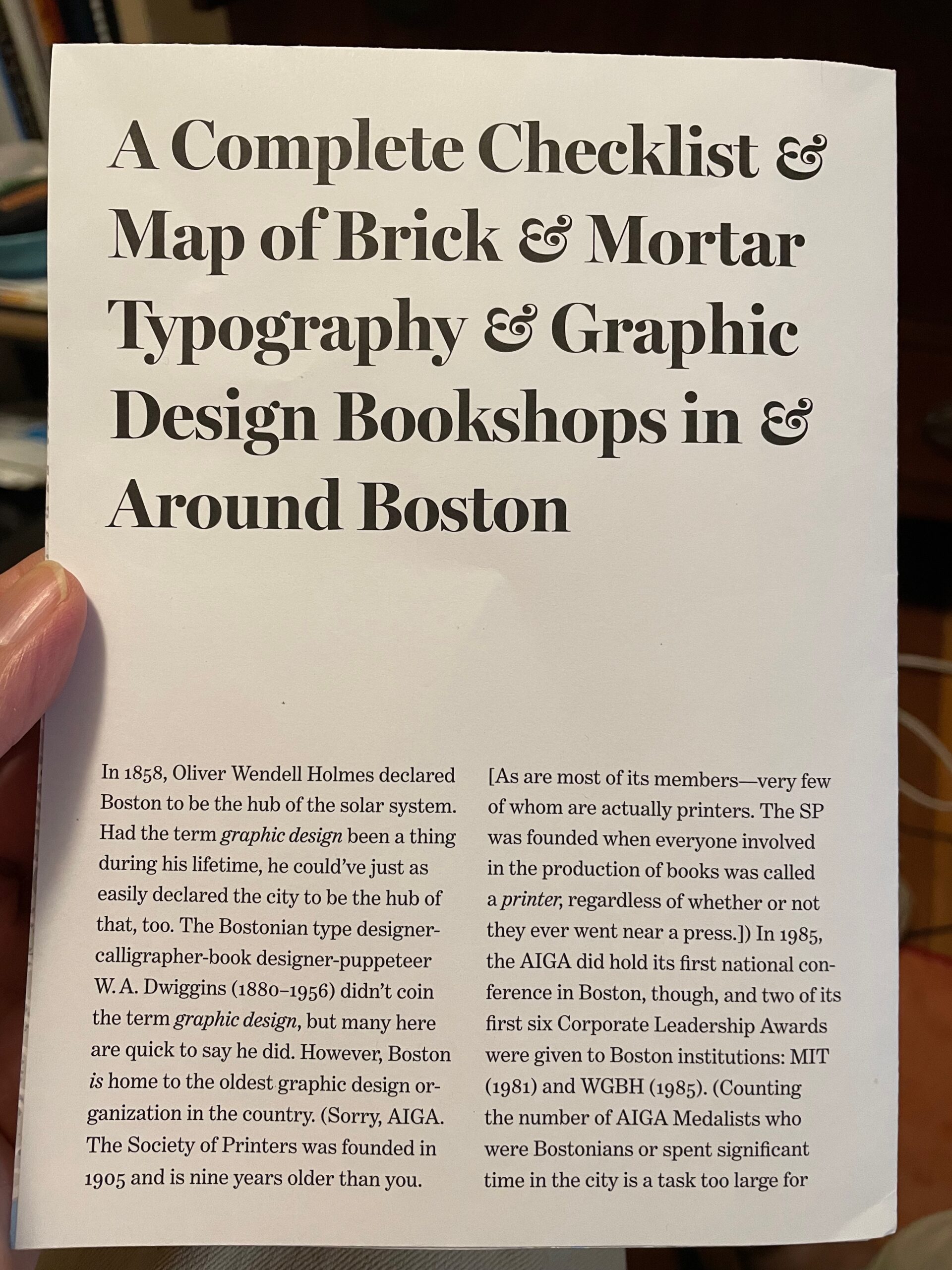
I can certainly recommend a visit to Katherine Small Gallery if you’re in the Boston area. Michael Russem’s dry sense of humor is displayed in the folded map that he handed me: “A Complete Checklist & Map of Brick & Mortar Typography & Graphic Design Bookshops in & Around Boston.” Open it up and you find a lovely map of Boston, with exactly one shop: his.

[Top: Proprietor Michael Russem at the bookshelves behind the desk. Middle: a display case showing three sketches/mock-ups by Michael Harvey for a book jacket. Bottom: “A Complete Checklist & Map of Brick & Mortar Typography & Graphic Design Bookshops in & Around Boston.”]

A plethora of books

Published

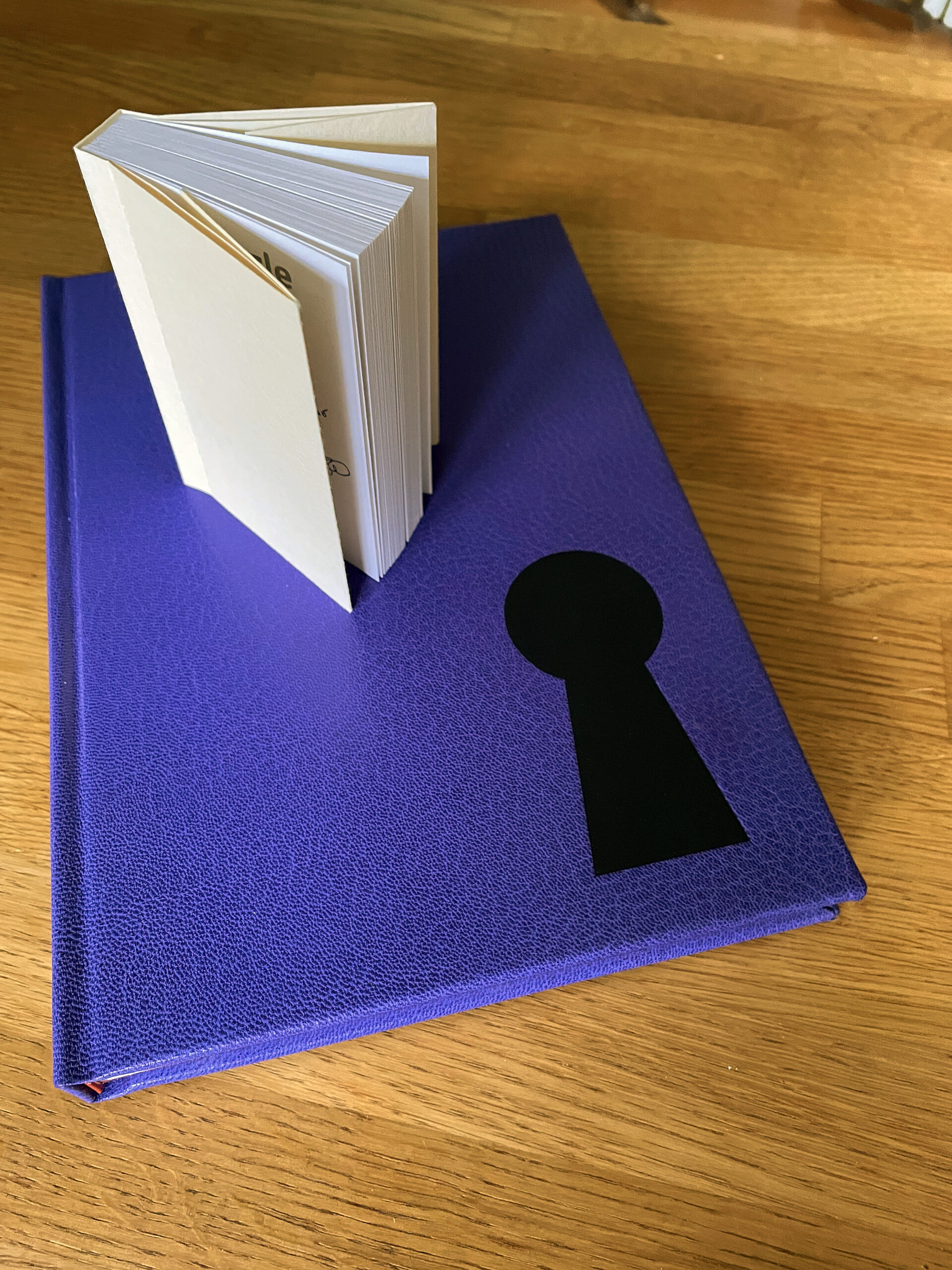
I’ve been engaged in a wide variety of book projects in recent months. First, the limited editions of Little, Big (numbered, lettered) were finally released, after an extraordinarily long gestation. Then there was an even more limited edition (five copies, officially) of Cory Doctorow’s “Martin Hench” novels Red Team Blues and Bezzle, one tucked quite literally into the other, and hand-bound in purple leather by master bookbinder John DeMerritt.

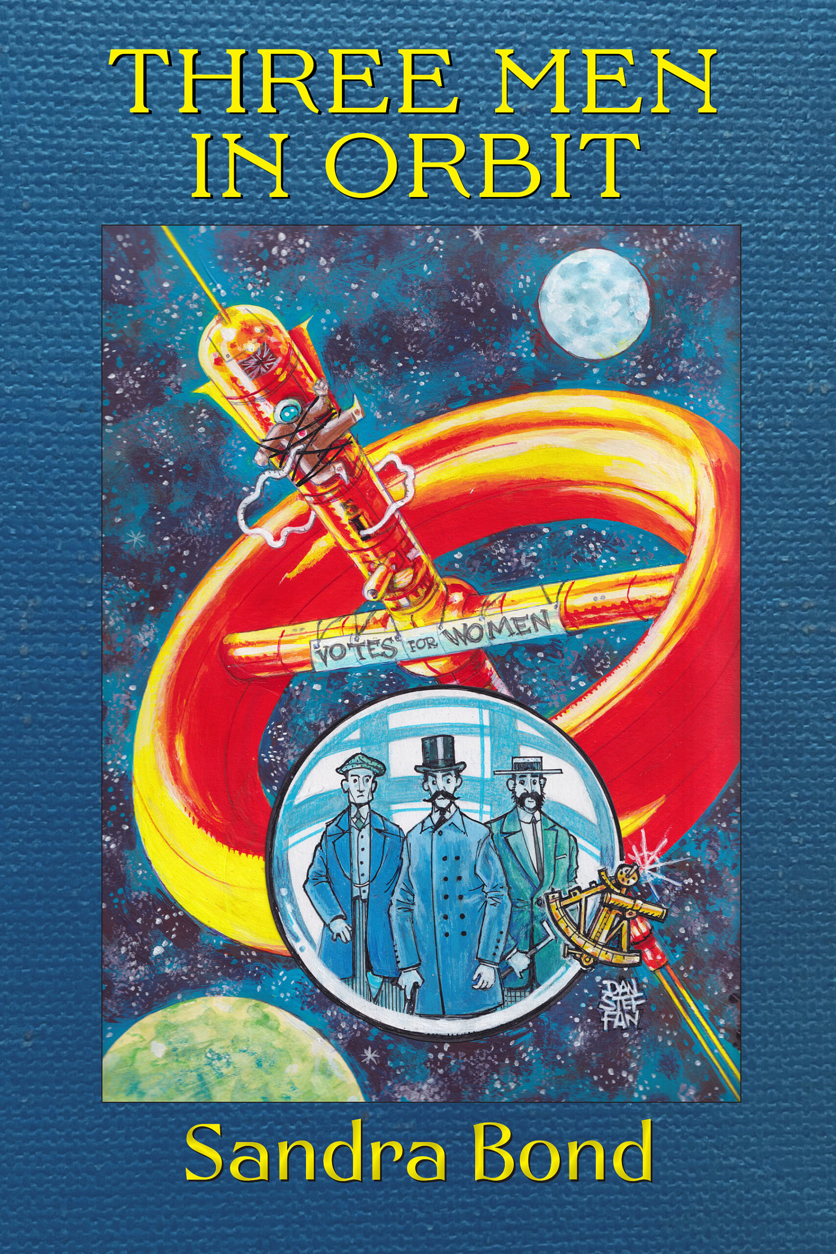
At a completely different end of the production spectrum, I just finished designing and typesetting Sandra Bond’s novel Three Men in Orbit, the third of her books that I’ve designed for Canal Press, an independent imprint run by the redoubtable Michael Dobson. Michael uses Amazon’s publishing machine to actually produce the books; their production methods are so stripped down that they don’t even want crop marks on the cover file, and the placement of a bar code on the back cover is always a bit approximate. But they produce physically readable books; it’s my job to make sure that it’s optically and typographically readable. The official publication date of Three Men in Orbit is August 1, and copies will be for sale at the Glasgow worldcon.

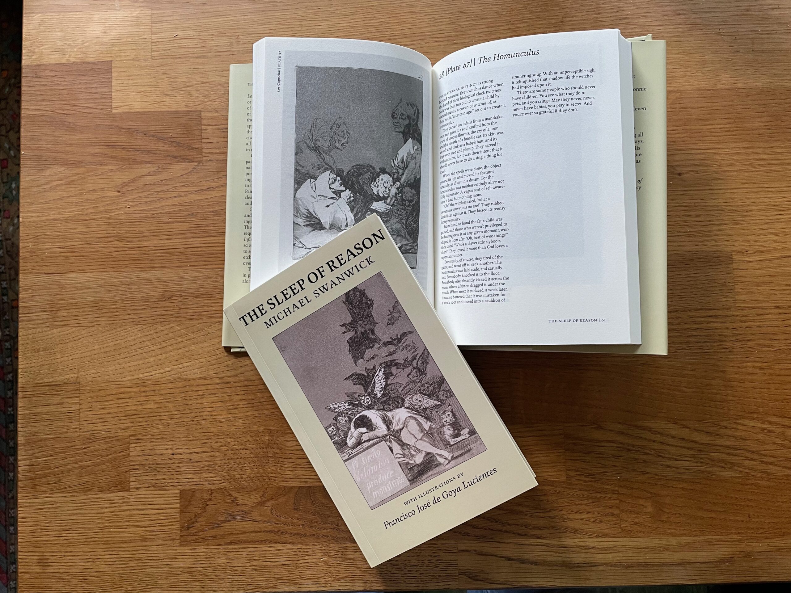
A project that began either 20 years ago or a year ago, depending on how you look at it, just got published: The Sleep of Reason, Michael Swanwick’s collection of very short stories based on images from Goya’s Los Caprichos. The stories were originally published online on The Infinite Matrix, and are now in print via PS Publishing in the UK.

Meanwhile, I’m still in the midst of a collaboration with Arabic type designer Mamoun Sakkal on a bilingual book of commentary on the Quran – a fascinating project for someone who is neither Muslim nor a speaker or reader of Arabic. The publisher asked me if I offered any classes or workshops on book design…

Another long-running project has been the complete works of poet JT Stewart, Our Bones Sing of Salt. Since I had designed two of JT’s earlier chapbooks and quite a few broadsides and related ephemera, it made sense for me to not only edit the manuscript but put it into an appropriate design. We’re in search of the right publisher at this point (and I’m fully aware that a publisher may want their own design rather than mine), but we’ve produced a nice package for them to consider. I don’t want to publish it myself, but that’s always an option.

Then there’s the book of my own selected essays, tentatively titled Working with Words, which is currently at a publisher. Whether I’ll end up getting to design that one is an open question.

Oh, and I’ve put together a couple of speculative proposals for small, entertaining books that riff on typographic ideas. All very much in the realm of Maybe, at this point.

So I guess that with design, writing, editing, typesetting, production management, and marketing, I’m still very much involved in the creation of books. Appropriately enough, I’ve done three talks in the past year about aspects of book design, and written an article on the subject for Jean François Porchez’s revived Typofonderie Gazette.

The completion of Little, Big

Published

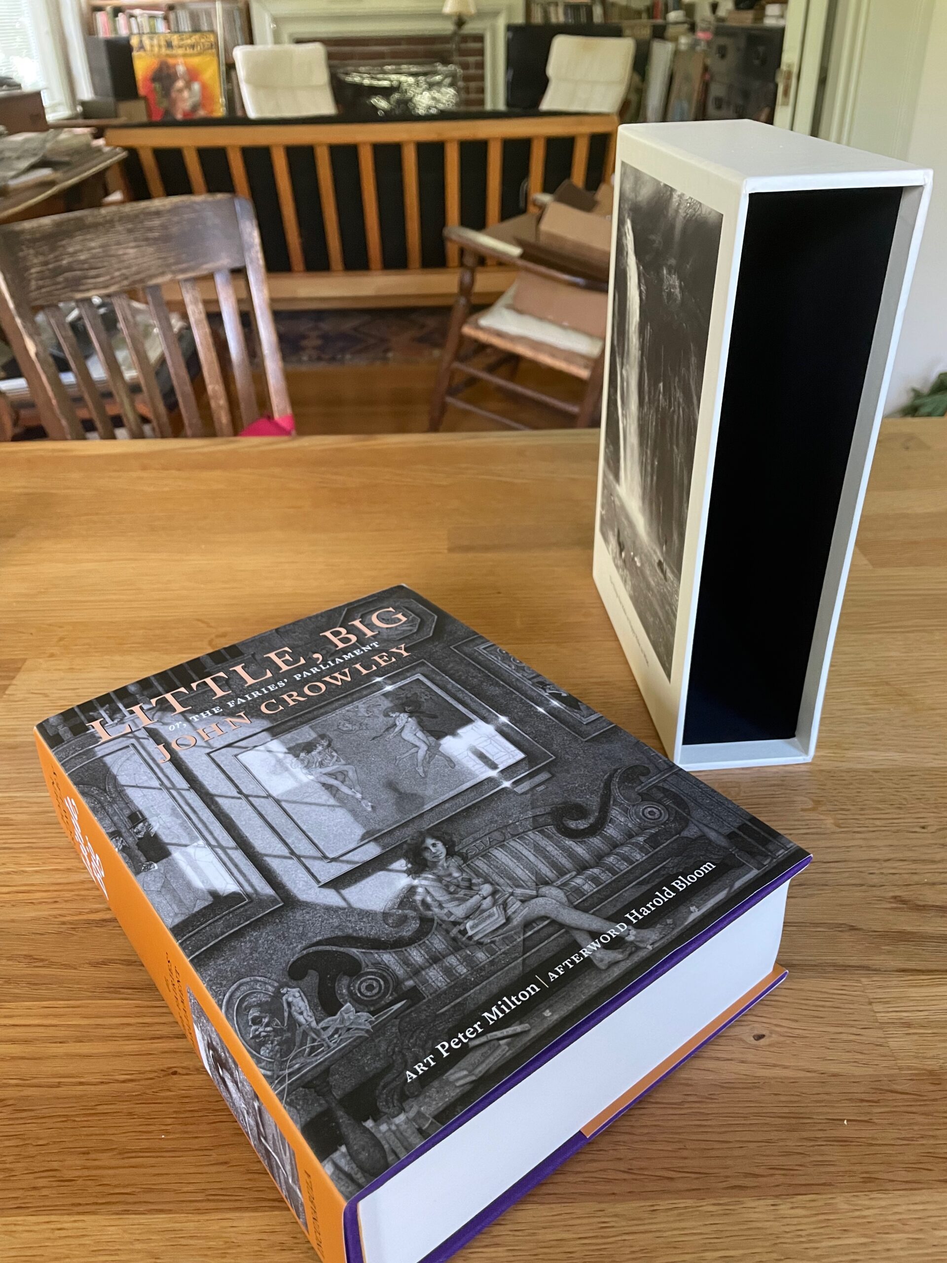
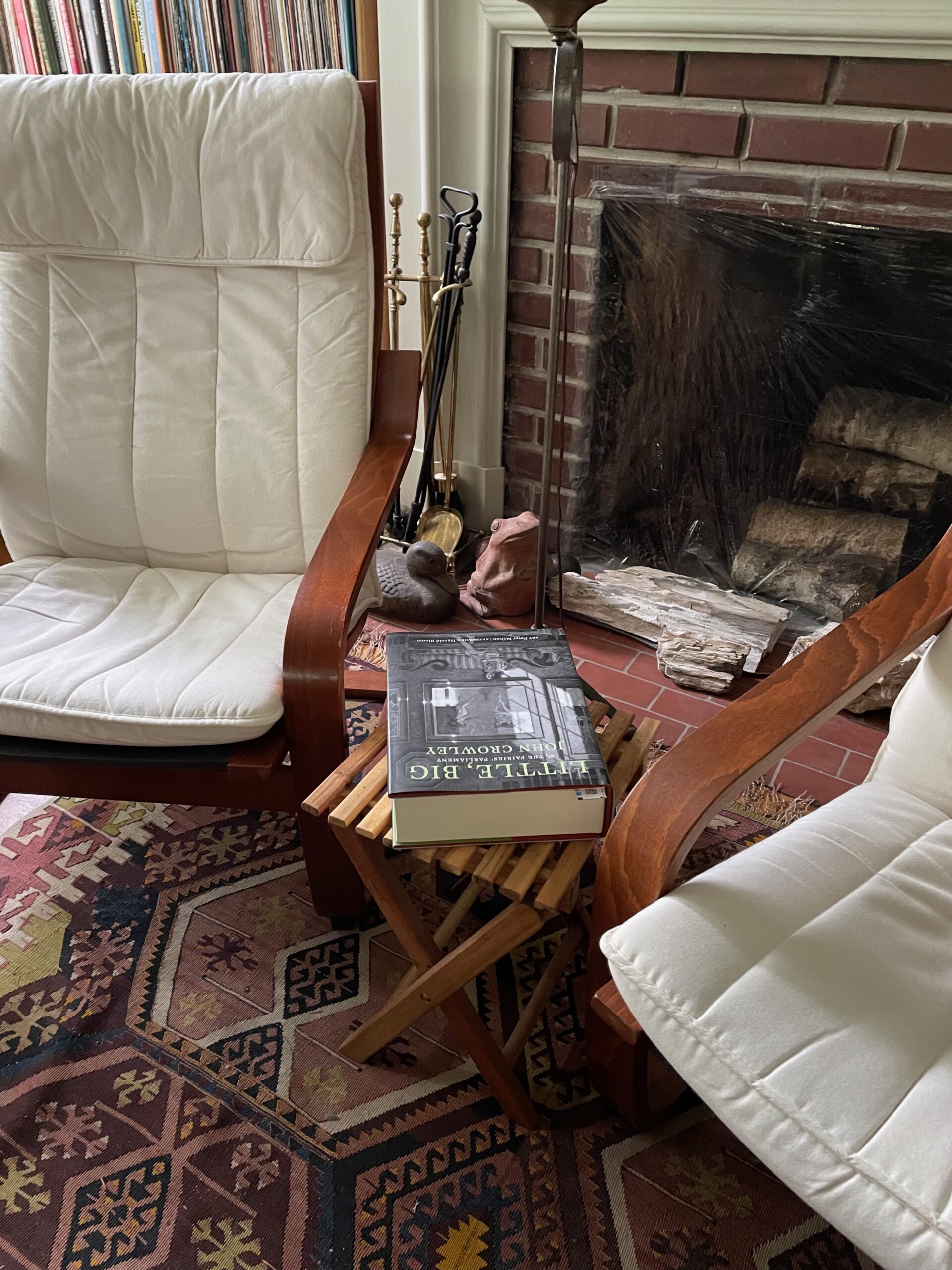
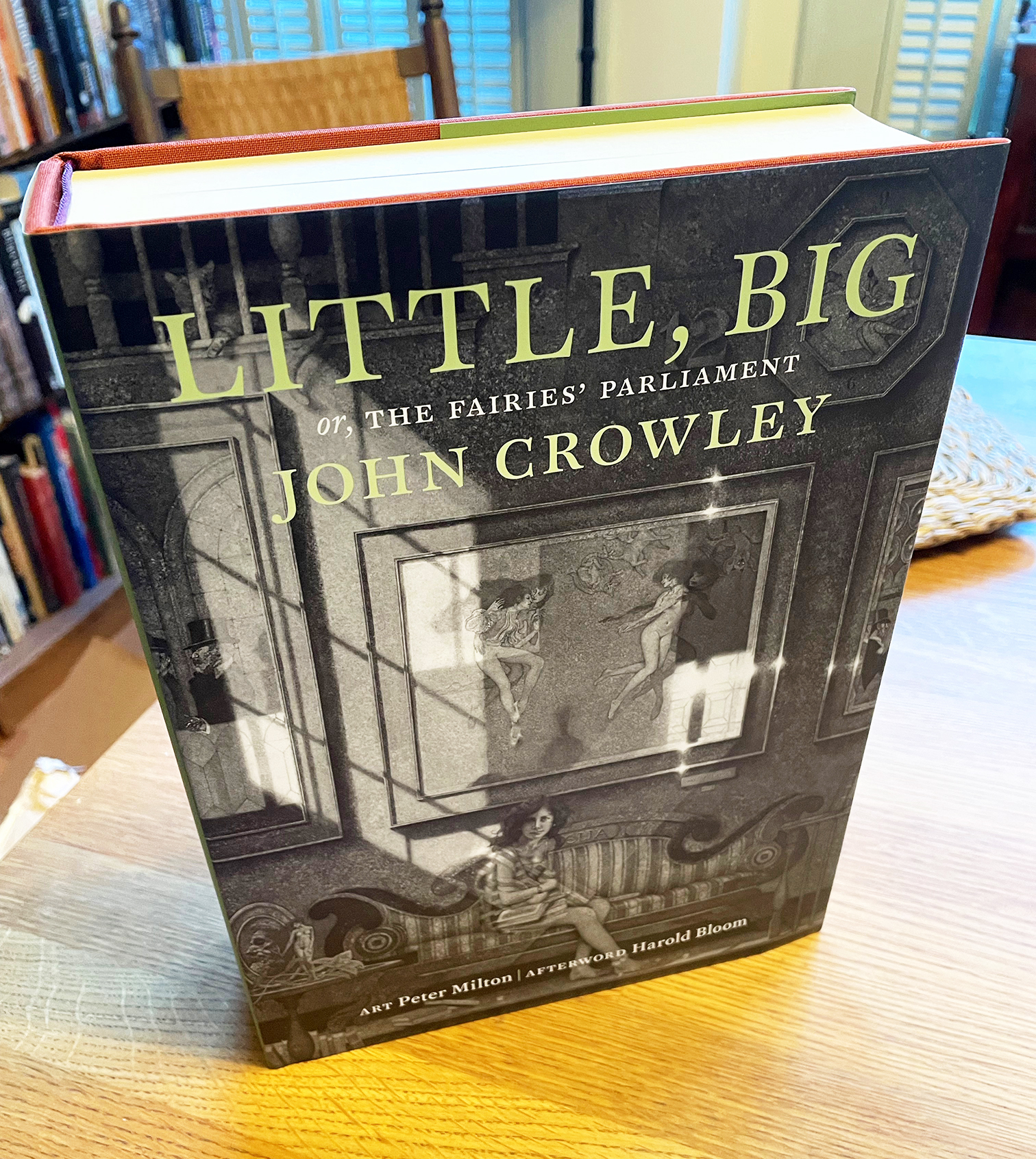
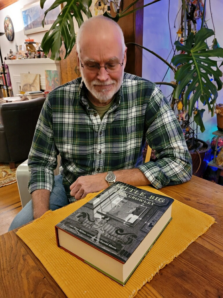
At long last, after more than 17 years of ups, downs, and circuitous side trips, the 40th anniversary edition of John Crowley’s Little, Big was published in late 2022, and the limited Numbered and Lettered editions are finally being distributed. The extra delay on the limited editions involved two different shipments of slipcases being lost en route from China, as well as a painstaking on-site check to ensure that each of the individually signed and inscribed four-page signatures got into the right individual copy. Plus, of course, the apparently inevitable twists and turns of fortune that have accompanied this project from the beginning. (Ben Kamm attributes this to the troublesome whims of the fay. I just say it must be Coyote.)

The Trade edition won an award at the Publishing Professionals Network (PPN) Book Show last year. (As manager of the judging team, I was involved in the judging process, but I recused myself from any consideration of my own book. As did judges whose books had been submitted.) The Trade edition itself is a luxurious book: 800 pages including etchings and prints by Peter Milton, exquisitely printed in a 7.5×10-inch format on Mohawk Superfine by Brilliant Graphics in Exton, Pennsylvania. The Numbered and Lettered editions (which sold out years ago) include a new short story by John Crowley, as well as the slipcases with more Peter Milton art. In the Lettered copies, Crowley wrote out a short passage from the novel in his elegant chancery italic handwriting.

The vision behind this project was Ron Drummond’s, publisher of Incunabula and instigator of ambitious undertakings. Ron and I collaborated over many years on the details of the book’s design; the overall page grid and the details of typesetting were mine, with Ron deciding on image trims and specifying the placement of Peter Milton’s art. Ron also commissioned three different essays about the book, to be published on the generous flaps of the dustjackets, one for each of the three editions. (On the Trade edition, which you can still purchase, the essay is by Neil Gaiman.)

It’s been a very long process. As I’ve written before, there were times when I took to referring to this as “Zeno’s book project,” because like Zeno’s arrow it seemed that it would never reach its target. Amazingly, it has. And it seems to be a bulls-eye.

[Images: The three editions of the Little, Big 40th anniversary edition: Numbered (top), Lettered (middle), and Trade (bottom).]

Evan S. Connell

Published

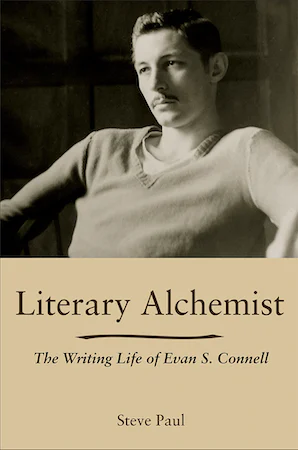
I’ve just finished reading Literary Alchemist: The Writing Life of Evan S. Connell, by Steve Paul (Columbia: Univ. of Missouri Press, 2021). Connell is a peculiar writer, impossible to categorize; he’s been a favorite of mine since I first discovered his writing through North Point Press, my favorite American book publisher of the 1980s. He’s probably best known for his bestseller about Custer, Son of the Morning Star, which examines the Battle of the Little Big Horn from both sides, with its antecedents, its contexts, and its implications. He’s a master of finding the arresting detail, and his prose is wry and precise.

Mid-way through his career, Connell became closely involved with Berkeley-based North Point Press. “Everybody there is intelligent and courteous and they all seem to know what they’re doing – which is not at all true of some people I’ve met in the NY industry.” Jack Shoemaker, North Point’s editor in chief, encouraged Connell and continued to be his editor after North Point shut down and Shoemaker had to create a new publishing company (twice). Steve Paul devotes quite a few pages of the biography to North Point, giving me more background than I knew before now. He describes Shoemaker’s and publisher William Turnbull’s desire to make quality books, though he doesn’t mention David Bullen, North Point’s long-time book designer, who was responsible for how the books looked and felt. (Nor does he mention Jack Stauffacher, who was involved at the press’s inception and set some of the typographic standards that North Point became known for). What Bullen did at North Point was a strong influence on my own ideas about book design.

The other book that Evan S. Connell is best known for is his early novel, Mrs. Bridge, which is highly respected though I haven’t read it. His examination, in detail, of the empty life of an affluent Kansas City matron has simply never appealed to me; I’m much more fascinated by his delvings into history and art. Another of his books that I’ve failed to finish, despite being history-based, is Deus lo volt! (“God wills it!”), which is so effective at conveying the spirit and mindset of the Christians who launched the Crusades that I couldn’t go on; I couldn’t stand being inside their blinkered heads. Maybe one day I’ll come back to it.

But I have read quite a few of Connell’s books, either bought new in North Point editions (which were sometimes reissues) or found and snapped up in used-book stores. Connell’s life is somewhat opaque; he was a private person, notably untalkative. Steve Paul is smart to call his biography a “writing life”; that was clearly the way Connell saw himself. Paul makes it clear, though, that Connell had connections to much livelier characters, especially when he was living in Sausalito and San Francisco. And Paul is good at weaving the strands of Connell’s life together, and at showing how the writing, the publishing, the extensive, usually solitary travel, and the thoughts he expressed were all woven of the same cloth. Or perhaps, given his fascination with pre-Columbian pottery, I should say that they were thrown from the same clay.

Little, Big

Published

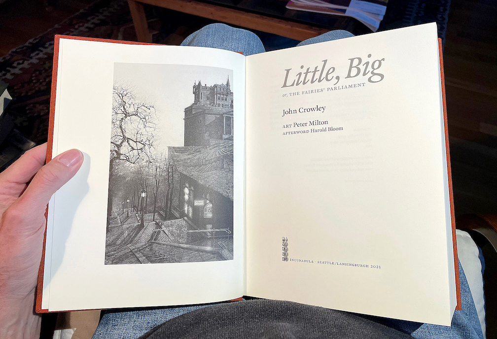
Its origins are lost in the mists of time. Ron Drummond, the one-man publisher of Incunabula, reminds us that he first broached the subject to John Crowley thirty years ago: the subject being a special, celebratory edition of Crowley’s well-loved novel, Little, Big (1981). Incunabula had already published one book by John Crowley and two by Samuel R. Delany, of which I had designed two: Crowley’s Antiquities (1991) and Delany’s Atlantis: Three Tales (1995).

Incunabula, which Ron had named in a combination of respect and chutzpah, was a small press that published worthwhile literary works of science fiction and fantasy (or fantastika as critic John Clute calls it). “Incunabula,” which means “cradles” or “swaddling clothes” in Latin, is used to refer to European printed books published before the year 1501. By that time, sixty years after Gutenberg’s innovations, printing had exploded from a craft into an industry, and many of the standards of book design that we still follow were well established. In calling his new press Incunabula, Ron was drawing on a very long tradition.

I have no recollection of when it was that Ron first asked me about designing this more ambitious volume. I can find files related to the project dating back to 2003, and my earliest design file, LB design 1.indd, is dated May 9, 2005. I’ve been working on this book for at least seventeen years.

I have often referred to it as “Zeno’s book project,” for the way it seemed to keep approaching completion without ever quite arriving. I have also sometimes called it “the Oxford Lectern Little, Big,” in reference to Bruce Rogers’s monumental Oxford Lectern Bible. Our book, however, is not so monumental as to require a lectern.

The tale of how this book came to take its final form, with an intricate interweaving of original etchings and engravings by the artist Peter Milton, would take too long to tell. It has its painful interludes. Ron’s ambitions didn’t always correspond with his practical abilities, or with his never-robust health; this was a much bigger project than any he had undertaken before. But his vision was always clear: choosing and framing details from Peter Milton’s art that would create a conversation with the text of the novel.

Now, amazingly, Zeno’s arrow has hit its target. A couple of weeks ago, my advance copy of the trade edition arrived in my hands, a few days after Ron’s copy reached him. It’s an 800-page tome, 7½ x 10 inches, sewn in signatures, printed on luxurious Mohawk Superfine paper, rich with art, and all digitally typeset in Akira Kobayashi’s historically inspired typeface FF Clifford. I can say, having hefted the book and laid it in my lap and begun my own rereading of a favorite text, that it’s everything I had hoped for: comfortably readable pages, beautifully printed images, in a sturdy yet flexible binding. The printer, Brilliant Graphics in Exton, Pennsylvania, did a masterful job.

Fulfillment will be handled through Dallas-based literary publisher and distributor Deep Vellum. There are still copies of the trade edition available for purchase. The 25th anniversary edition of Little, Big, which is now the 40th anniversary edition, is finally a reality.

Typographic memories: designing for Copper Canyon

Published

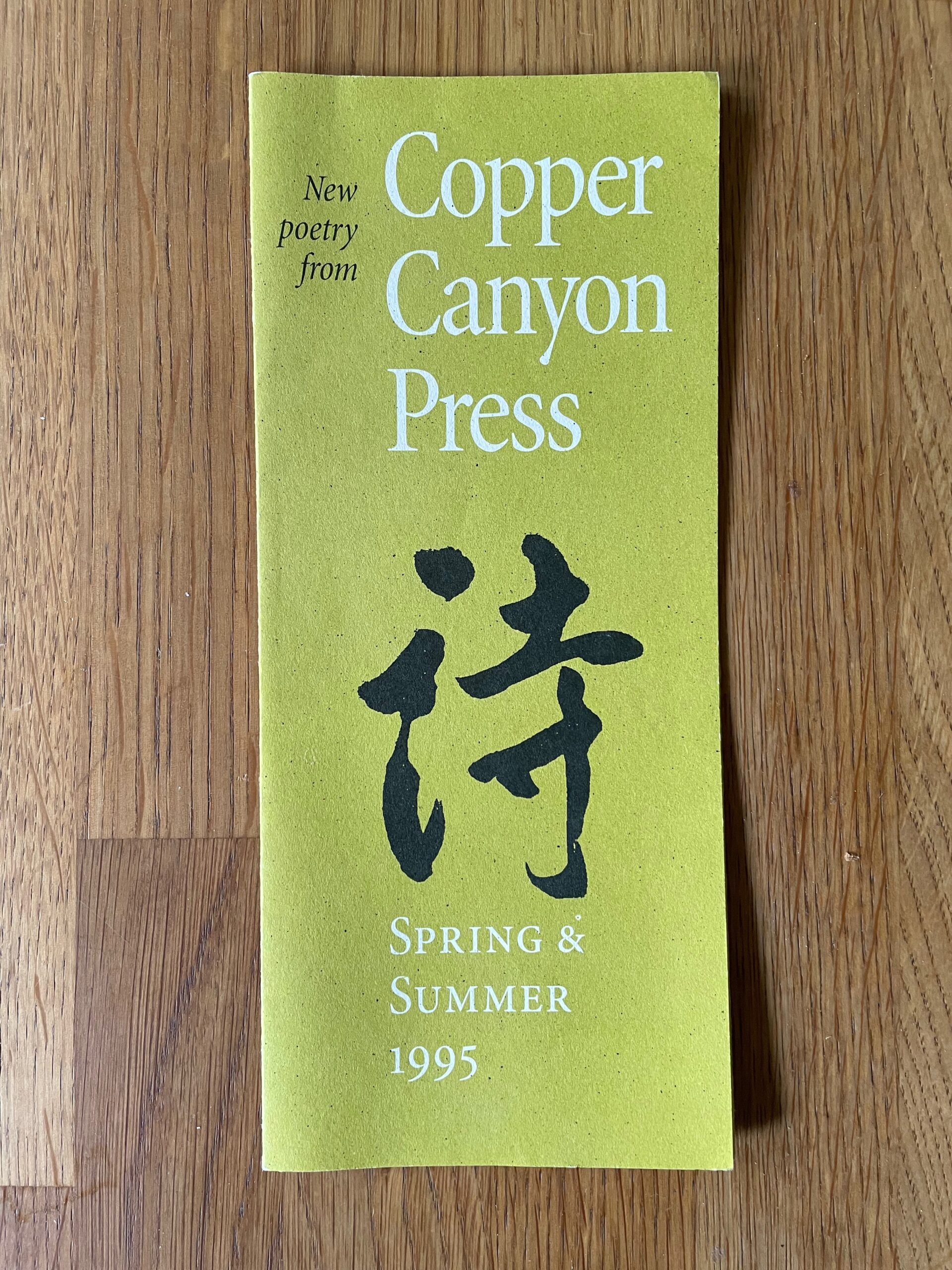
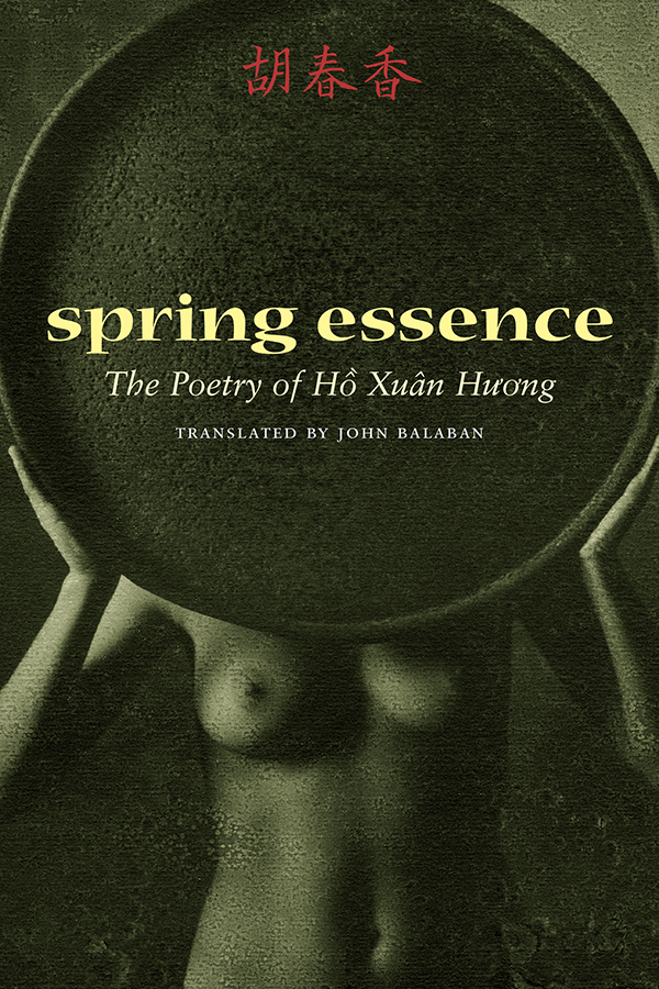
After a bit of a hiatus, I’ve come back to my sporadic typographic memoir, this time to talk about the years in the 1990s when I was the house designer for Copper Canyon Press. In that time, I designed not only the books but all the collateral material as well, trying to keep a consistent feel to everything that came out of the press while maintaining a variety of approaches to individual books.

This chapter is posted on Medium, as are all the previous chapters of the ongoing memoir project.

I still have all the files I created in producing those books, but I was working on a Mac before Apple adopted OS X, which fundamentally changed the file formats of the entire operating system. Unfortunately for future compatibility, all of those old files, none of which had filename extensions, now show up in the modern MacOS as “Unix executable files,” for lack of any other identification. Of course, the file information is still there; add the proper extension and the file type becomes recognizable. Whether it becomes openable, after something like a quarter century, is another question. But there are old Macs and old OSes and old versions of PageMaker. Somewhere.

In a few cases, I did create PDFs of my designs, either book covers or collateral like brochures. But any instances of Minion Multiple Master, the most advanced type technology of the time, which I used a lot, got lost in translation; current Adobe Acrobat technology doesn’t recognize the old MM fonts.

Such a waste of a brilliant technology! Such a short-sighted abandonment of sophisticated design. (Don’t get me started.)

Of course, with today’s variable fonts technology, you can get many of the same effects – and more. I just hope this tech doesn’t get left by the side of the information highway the way multiple-master formats did.

Really, isn’t the point to not lose information as techology advances? Including typographic and graphic-design technology. Our books need to be still readable in 500 years; or five years.

Typographer’s lunch 8: hey, look!

Published

I would like to direct your attention to a typographic element that is often ignored. Allow me to point out what makes it unique.

That element? The manicule. It’s also known as a fist, a hand, and by many other names, but it always takes the same basic form: a small image of a human hand, with the index finger pointing (usually to the right). Manicules date back to at least the Middle Ages, when it was quite common for readers to annotate their books, drawing a little hand in the margin to point out a particularly important or noteworthy passage. (“Manicule” comes from the Latin word for “little hand.”) Today they’re more likely to be part of a font, and to be used typographically, whether very large in a supermarket ad or at small size as an indicator of importance in a system of typographic hierarchy. They are often given a bright color to make them stand out. (Red is the traditional second color.)

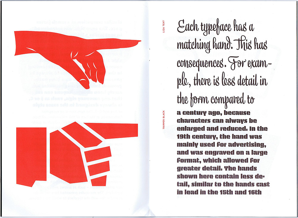
Manicules can take the style of the font they’re in, just like ampersands or currency symbols. And now, the Dutch/Finnish type studio Underware, whose typefaces range from one of my favorite book faces, Dolly, to the truly bonkers stencil typeface Plakato, has issued a small booklet they call a “Manicule specimen,” demonstrating their versatility at imagining new forms of manicules for every occasion.

This little limited-edition book has a short text running through it, changing typeface twice per page, facing enlarged manicules in the same typeface, two per page. It’s a tour-de-force in its own highly specific way. And it serves to remind us that we have manicules at our fingertips, in many digital fonts, and that sometimes it’s appropriate to use them.

[Image: page spread from Underware’s Manicule specimen.]

[Originally published on February 8, 2022, in PPN Post and Updates, the newsletter of the Publishing Professionals Network.]

Typographer’s lunch 4: Gerard Unger’s life in letters

Published

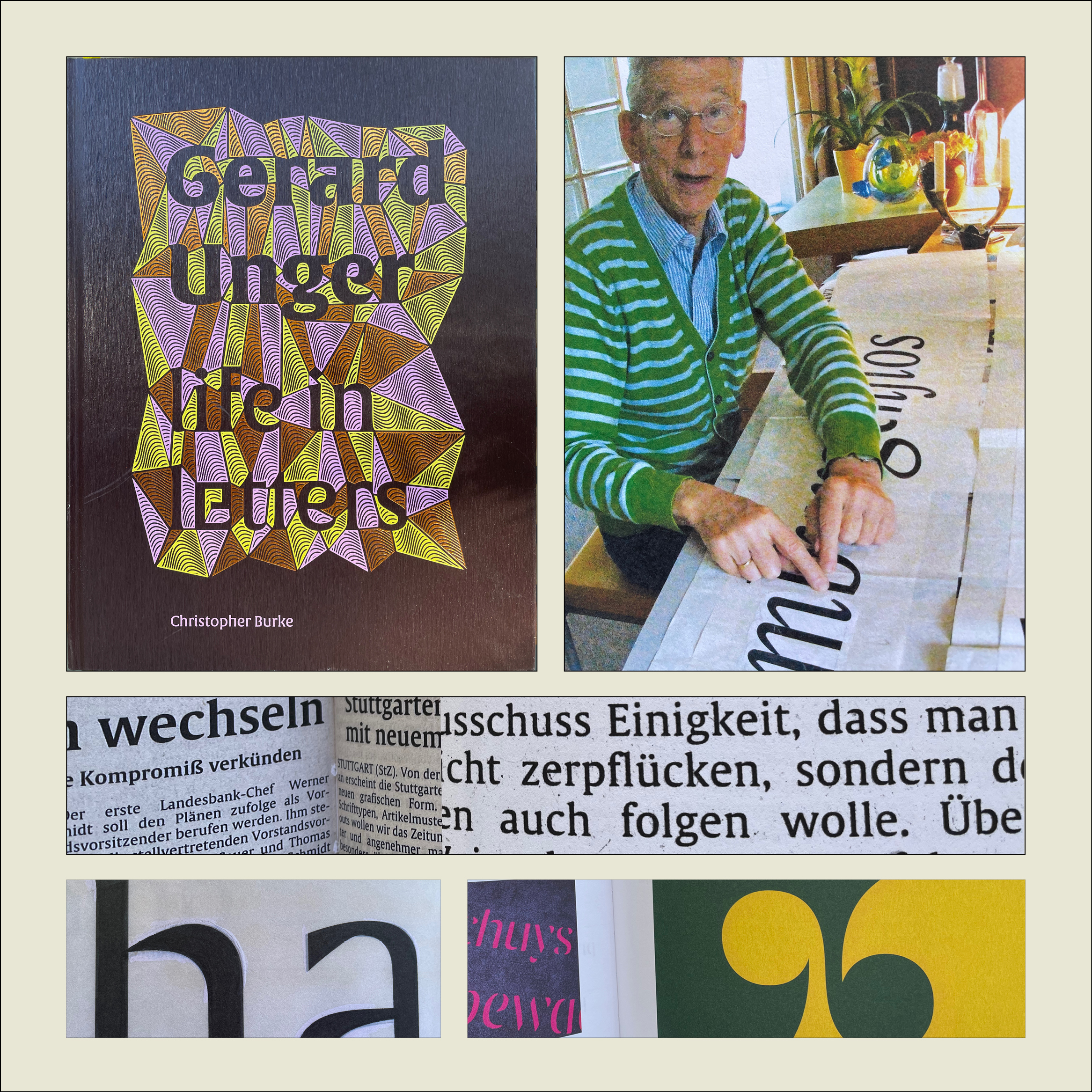
Christopher Burke, Gerard Unger: Life in Letters (Amsterdam: Uitgeverij de Buitenkant, 2021).

Christopher Burke writes clearly and knowledgeably about type and the people who design it. His just-published biography of Dutch type designer Gerard Unger, one of the most prolific and talented type designers of the later 20th century and the early 21st, is quite simply a must-have book. It’s well made, effectively designed, artfully written, and lavishly illustrated.

Gerard Unger: Life in Letters is above all a book about process. In tracing Unger’s life and career, Burke shows Unger repeatedly wrestling with new techniques and new technologies, figuring out how to take advantage of them and finding creative ways to put even their constraints to use. Unger did not begin by cutting metal punches, but he came into the field of typography when it was adapting to phototypesetting, and he then encountered each new iteration of digital typesetting and type design. The book’s ample and detailed illustrations show these processes in abundance.

Unger was a pragmatic designer, always focused on making type that people could actually read. Whether designing signage faces for highways or metros, or text faces for daily newspapers, he studied what made the letters readable and incorporated his insights into each design. The distinctive curve forms of his letters were unique to him, often making it easy to spot an Unger typeface when you saw it. He incorporated history but always created something new; his last major typeface, Alverata, with its sanserif companion Sanserata, is both a usable text face and an exuberant expression of letter forms that first blossomed in Romanesque lettering a thousand years ago.

[Originally published on October 1, 2021, in PPN Post and Updates, the newsletter of the Publishing Professionals Network.]

A talk on Jack Stauffacher’s legacy

Published

In October I joined Chuck Byrne to give a two-part talk about the life and work of Jack W. Stauffacher for the Society of Printers in Boston. No doubt in a normal time we would have traveled to Boston to address the members in person, but because of the pandemic the event was entirely virtual. This has its disadvantages (my connection was evidently a bit wonky, sometimes making my audio slur for a moment, though I had no way of knowing this until I listened to the recording later), but it has advantages as well: a much larger potential audience, one that was geographically dispersed although constrained by time zone. And of course the talk was recorded, so you can watch it now, well after the fact.

My part focused on Jack’s life, using the biographical essay I had written for Only on Saturday, the upcoming book from the Letterform Archive about Jack’s abstract wood-type prints. I was reading my text, rather than speaking extemporaneously, which seemed appropriate, since the book hadn’t yet been published. For the talk, I put together a selection of images that I hoped would give a visual counterpoint to the narration. Researching Jack Stauffacher’s life was a fascinating project, and finding a way to organize its many aspects and facets was a creative project of its own. But it was all in the service of telling people about Jack.

Chuck is the moving force behind the book, and in his part of the presentation he went through the book, page spread by page spread, explaining why they had chosen particular images and how they had put them together into a remarkable, highly visual volume. The design of the book is Chuck’s; he was quite sure that Jack’s approach to the design would have been different, but they were long-time friends and no doubt would have enjoyed mutually criticizing each other’s choices. It’s a beautifully designed book.

Designers of books

Published

“Who’s your favorite book designer?” That was the innocent-seeming question that Deborah Iaria, an Italian typographer based in London, asked me yesterday, during one of TypeThursday’s one-to-one “coffee” chats on Zoom. We had just established that we both loved designing books, so that question didn’t come out of the blue. But it’s a question I haven’t been asked very often, unlike the much more common query, “What’s your favorite typeface?” (My reply to that is usually, “It depends on what I’m going to use it for,” followed by naming a few perennial favorites like Verdigris, Dolly, Profile, and Beorcana.)

After a long pause while I pondered the question, I decided on an answer: the late San Francisco printer Jack Stauffacher. Not only had I learned a lot from Jack in person, but examples of his aesthetic and his craft, even before I met him, had taught me a lot of what I know about placing text and image on a page. And about the importance of books as carriers of culture.

But since that conversation, I have kept coming back to the question. There are lots of excellent book designers, both historical and contemporary, but which ones have influenced me the most? Which ones are my “favorites”?

From the first half of the 20th century, I would cite Jan Tschichold, W.A. Dwiggins, and Bruce Rogers as primary influences. And Jack Stauffacher’s old friend, whom unfortunately I never met: Adrian Wilson. From my own time, I greatly admire the work of the late Steve Renner, long-time art director at the University of California Press, whose spare, modern style always seemed in direct contradiction to his passion for restoring old hotrod cars.

Two more recent designers whose work I have tried to emulate are David Bullen and Tree Swenson. David Bullen established and maintained the high standards of the Berkeley-based North Point Press in the 1980s (the initial templates owed a lot to Jack Stauffacher), which was a model to me of an independent book publisher of works worth reading. Tree Swenson was the long-time publisher and designer of Copper Canyon Press, the eminent international poetry publisher in Port Townsend, Washington. After Tree left and Sam Hamill asked me to take over as house designer, it was Tree’s established standards of quality that I tried to live up to. (I was very happy when she seemed to think that I had succeeded.)

Others who leap to mind are Valerie Brewster, who later took over much of the book design for Copper Canyon and has produced many, many subtly and elegantly designed books, and Saki Mafundikwa, who was an art director at Random House before returning to Zimbabwe to found the visual/digital design school ZIVA, and who wrote and designed the seminal book Afrikan Alphabets. And John Hubbard, whom I worked with at Marquand Books in the 1990s, and who has continued to design exquisite art books ever since. No doubt I’ll think of more the moment I commit this post to pixels.

I haven’t even considered anyone from before the turn of the 20th century, and I’m not reaching beyond the Western world of printing and publishing. I’ve seen some brilliant book designs from Japan and China, but since I can’t read either language, I can’t really consider them to be influences on my ideas about text typography.

So: who’s your favorite book designer?