function jdb_page_navigation()
sPageSlug = blog
sPageTitle = easily amused
header:139:aPageArgs:page_title = easily amused
header:140:aPageArgs:section_title =
functions-johndberry:262:aPageArgs:page_title = easily amused
functions-johndberry:298:sPageTitle = easily amused
functions-johndberry:359:sPageTitle = easilyamused

easilyamused |

Typography of the future: variable fonts

Published

I’ve just finally watched the Special OpenType session, ATypI 2016 Warsaw of the “Special OpenType Session” from the ATypI 2016 Warsaw in Warsaw in September. (Because of scheduling and flight conflicts, I didn’t arrive in Warsaw until the evening of that day, so I missed the live event. Not surprisingly, it was the talk of the town among attendees at the conference.) The discussion in the video is highly technical, but the upshot of this development is exciting.

Variable fonts” seems to be the name that everyone’s adopting for this new extension of the OpenType font format. What it means is that an entire range of variations to a basic type design can be contained in a single font: all the various styles from Extra Light to Extra Bold, for instance, and from Compressed to Extended. Instead of a super-family of separate font files, you can have one font that, conceivably, contains them all.

The presentation had representatives from Adobe, Microsoft, Apple, and Google, reflecting the fact that this is truly a cooperative effort. All four major companies (and several smaller ones) have committed to supporting and implementing this new standard. That’s a very important fact: usually, adventurous people come up with an ambitious new spec for wonderful typographic features, but the problems arrive when the developers of operating systems and applications don’t fully commit to supporting them. This time, from the very first, the companies that develop those apps and OSes are committed.

What that means is that, if it’s implemented properly, the new format will make it possible for font developers to create fonts that adapt to changing circumstances. For instance, in a responsive web layout, you might change the width of the text font as the width of the window gets narrower or wider. You could also change the weight subtly when the screen colors are reversed. These small, almost unnoticeable, but very important variations could make reading onscreen much more comfortable and natural.

This is a watershed. What it reminds me of is two different nodal points in the development of digital type: multiple master fonts, and web fonts. The introduction of variable fonts at this year’s ATypI conference has the same “Aha!” and “At last!” feeling that the introduction of the WOFF font format standard for web fonts had at Typ09, the 2009 ATypI conference in Mexico City. Both events mark the coming-together of a lot of effort and intelligent work to make a standard that can move the typographic world forward.

The history of multiple master fonts is sadder, and it points up the pitfalls of creating a good idea without getting buy-in from all the people who have to support it. The multiple-master font format was a breakthrough in digital type; with its flexible axes of variable designs, it made possible a nearly infinite variation along any of those design axes: a weight axis, a width axis, or (most promising of all) an optical-size axis, where the subtleties of the design would change slightly to be appropriate to different sizes of type.

But the multiple master technology, developed by Adobe, never made it into everyday use. The various Adobe application teams didn’t adopt it in any consistent or enthusiastic way, and it wasn’t adopted by other companies either. Instead of being incorporated into the default settings of users’ applications, giving them the best version of a font for each particular use, multiple master was relegated to the realm of “high-end typographers,” the experts who would know how to put it to use in airy, refined typographic projects. That’s not the way it should have worked; it should have been made part of the default behavior of fonts in every application. (Of course, users should have had controls available if they wanted to change the defaults or even turn it off; but the defaults should have been set to give users the very best, most appropriate typographic effects, since most users never make any changes to the defaults at all. It’s important to make the defaults as good as possible.)

Now it sounds like the new variable-fonts technology is going to be incorporated into the operating systems and the commonly used applications. If this really happens, it will improve typography at the everyday, ordinary, pragmatic level. And what that means is the improvement of communication.

I’m looking forward to seeing how this works in practice. And to putting it to use myself, and helping in any I can to improve and implement these new standards.

[Images: (left, top) Peter Constable speaking at the Special OpenType Session at ATypI Warsaw, September 2016; (left) schematic of the design variations of Adobe’s Kepler, designed by Robert Slimbach.]

Return to Martha’s Vineyard

Published

In May, I had a chance to revisit my childhood home – on a business trip.

Although I was born and raised in Bronxville, New York, a close-in suburb of New York City, my family spent all of our summers in Edgartown, Mass., on the island of Martha’s Vineyard. My parents had met first there in the 1930s, and they are both buried in the Edgartown cemetery. They would have retired there, if my father hadn’t had a fatal heart attack at the age of 56.

So I always had two homes, like a migratory nomad herding the sheep from winter to summer pastures. Though without the sheep; maybe a cat or two, some years.

But I never expected to be returning to the island on typographic business. I’ve been working since last year as managing editor for Font Bureau, which has been technically based at its office in Boston but which is run by Sam and David Berlow, who both live on the Vineyard and have done so for many years. So that’s the location of Font Bureau’s annual “offsite,” and this year I was a participant.

Type Network office

Around the two days of meeting and eating and talking type, I also found a little time to reacquaint myself with the island, and to meet up with one of my oldest friends. Sara Piazza and I have known each other since we were little children living two houses apart, best summertime friends from the age of five. (Admittedly we’ve let many years go by between contacts as adults. Facebook has been useful in renewing our connection. As is its wont.) Walking down Main Street to the Edgartown waterfront with Sara, who knows everyone on the street, and stopping to talk to many of them, felt to me like coming home, even though I was a stranger to them. (Well, no, I was a friend of Sara’s, so I wasn’t a stranger. And when I mentioned to Sam Berlow who it was I was going to see, he said, “Oh, Sara! Of course I know Sara.” It’s a small island.)

I had caught a ride from Boston down to Woods Hole with Roger Black and his husband Foster Barnes, and while we were waiting for our ferry we had lunch at a local seafood restaurant (what else?) and walked around the town a bit. I had never explored much more of Woods Hole than the area near the ferry dock, but we discovered a pleasant little New England seaside town with more, and bigger, scientific institutions than I had realized, as well as a peculiar semi-medieval bell tower overlooking the lagoon.

This Font Bureau offsite was retroactively declared the first offsite of Type Network, the new expanded type-distribution business that launched on June 1. I now have expanded responsibility, too, as managing editor for a complex of type foundries. We anticipate that the Type Network website will have a lot of new content in the coming months, so there’s work to be done. Check it out.

Falmouth Station lettering

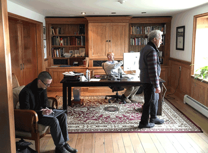
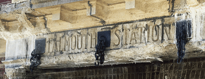
[Photos: (top, above) the new Font Bureau/Type Network office in Vineyard Haven (L–R: Cyrus Highsmith, Sam Berlow, Richard Lipton); (immediately above) lettering on the old Falmouth station (now a bus stop on the route from Boston); (left, top to bottom) Edgartown harbor; bell tower in Woods Hole; Roger Black and Foster Barnes in Woods Hole.]

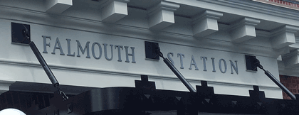
[A year and a quarter later, the Falmouth bus station’s lettering had been spiffed up and updated.]

Falmouth-Station-new-lettering

More writing

Published

I have just added a couple of complete essays to the rather minimalist “Writing” page on this site, and links to several others.

That page has so far consisted of short, and I hope intriguing, excerpts from various longer pieces of my writing. Now I’ve added links to almost all of the originals, making this a sort of landing page or entry point to these essays.

I’ve added the introduction to Contemporary newspaper design (2004), where I attempted to look at the development of newspaper typography over several technological and economic revolutions, and “The Business of Type”, my account of the origins, development, and demise of U&lc, which was the introduction to U&lc: influencing typography & design (2005). Both of these were books that I edited for Mark Batty Publisher; both of them are now out of print. I think those essays are worth making available again.

I’ve added some more links, too. Check ’em out.

[Update, April 15, 2016:] I’ve now added the missing piece, the preface to Language Culture Type. It is a less substantive piece than the others, but still worth having intact.

Acumin & Bickham Script

Published

Now that’s an unusual pair of typefaces to mention together. But both the new Acumin family and the enlarged and updated Bickham Script Pro 3 have been released recently as part of the Adobe Originals program, and I wrote most of the background material on both of them. These were both projects that were a long time in development, so I’m pleased to see my own descriptive work in “print” at last.

Acumin & Bickham Script Pro 3 together

For Acumin, Robert Slimbach’s extensive neo-grotesque type family, I dug into the history of sans-serifs, trying to nail down exactly what makes one a “grotesque” or a “neo-grotesque,” and where the term came from. It was a great pleasure researching images, especially from the 19th century, in the collection of the Letterform Archive in San Francisco. I think we ended up showing more images of old sans-serif type than was strictly required, just because they looked so cool.

Most of my research on the history of the 18th-century English writing style known as “round hand” and George Bickham’s compendium of examples, The Universal Penman, was done at the Seattle Public Library or online, but at the Letterform Archive I also got to see Bickham’s rare earlier book, Penmanship In It’s [sic] Utmost Extent.

The Acumin website is a highly responsive one, coded by Nick Sherman; the Bickham site is more in the mold of Typekit’s usual sites, though it too consists of several parts.

[Images (left, top to bottom): from the Acumin site; Bickham Script Pro 3 illustration; a few 19th-century grotesque typefaces. Above: combining two very different type styles.]

t for 2

Published

You don’t get wonderful bound specimen books from type foundries very often these days. Digital foundries tend to produce digital specimens, for all the obvious reasons. But a few days ago The Terminal Design Type Catalog arrived in my (physical) mailbox, and I was delighted.

James Montalbano, the Chief Cook and Bottle-Washer of Terminal Design, has been designing extensive, carefully coordinated type families for twenty-five years. “Ever since my days as a magazine art director,” he writes in his brief Preface, “I have both loved and been disappointed by type. I loved mixing, arranging and discovering different type designs, but was always disappointed by the lack of weights and widths of most designs.” That disappointment will not await anyone browsing this catalog.

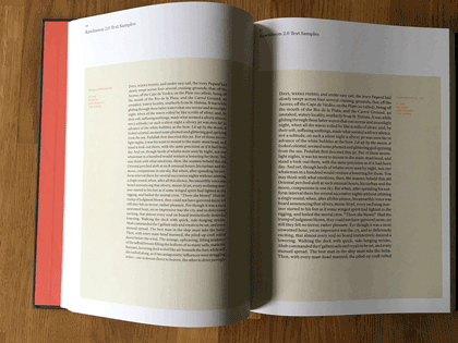
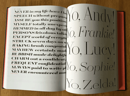
This a well-made, well-bound hardcover book, designed by Charles Nix. The embossed red t that takes up the whole cover is striking and dramatic. Each type family is given several pages, with a display of the full character set and large one-line showings. For text faces, there are also pairs of sample text pages with the type shown at different sizes and sometimes different weights.

Terminal Design catalog text spread

The display faces don’t require extensive text settings, but they’re shown off in dramatic form. My favorite page in the whole book must be the final page for the 20-weight typeface Yo.

Terminal Design catalog display spread

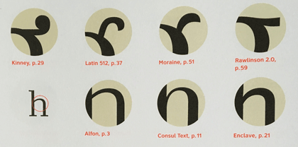
The back matter shows sample pairings of display and text faces, comparison of x-heights, the variations in OpenType stylistic sets, and, most notable of all, a visual index of “earmarks,” the distinguishing features of glyphs from different typefaces.

Terminal Design catalog earmarks

James Montalbano’s typefaces are always thoroughly considered, cleanly designed, and well produced. His squarish text face Choice Sans, with multiple widths, gives a lovely, modern texture to both text and display. The sharply serifed Consul takes high-contrast Didot style and freshens it, with six weights and four optical sizes, in both roman and italic. Even the wonderfully weird Fervent, with its pitchfork e and its double-wide w, looks assured and solid on the page.

There are two things that bother me in this catalog. One is the lack of any descriptions of the various typefaces: each one has a careful list of all its features, but there’s no hint of its history and nature, or of how its designer thinks about it.

The other thing is a choice: in the text samples, facing pages of the same typeface at different sizes have the same amount of added leading (3 points). The effect of that is to give the text blocks of smaller type looser line spacing than the text blocks of larger type. That makes it harder to compare them usefully.

Opening up OpenType

Published

Besides their other useful aspects, OpenType fonts may include a variety of alternate glyphs for the same character: anything from capital and lowercase forms to small caps, superscripts, subscripts, or swash versions. In non-Latin fonts, they may include other related variants, such as the several forms that each character takes in Arabic, and alternate forms preferred in different languages. In some large calligraphic fonts, there may be quite a lot of alternate forms available – but in the past it’s been hard to find them and put them to use.

The most recent update to Adobe’s InDesign CC (2015.2, released Nov. 30) finally addresses this problem. You could always go spelunking in the Glyphs palette to find alternates, but now you have a more direct method: simply select a single character in a text string, and any OpenType alternate forms appear in a small pop-up right on your layout page. Choose one, and it replaces the selected character.

This is the first fruit of a popular groundswell that got started at the ATypI conference in Barcelona last year: type users needed better ways of using OpenType layout features, and petitioned Adobe to improve their products. This new feature in InDesign is a good start.

It has a few glitches, though. Sometimes the relationships among the displayed alternates is not obvious. In Adobe Caslon Pro, for instance, many of the ordinary letters show among their alternates one of the Caslon ornaments. That’s a little odd.

One practical limitation of the current version of this feature is the size of the glyphs in the pop-up. The example shown on Adobe’s tutorial page (left, above) uses a large, bold, flashy typeface (Lust Script) with obvious swash features; it’s not hard to make out the alternates on the screen. But if you try the same thing with a typeface like Bickham Script Pro, which has a very small x-height, it’s virtually impossible to tell one alternate from another.

InDesign pop-up showing OpenType alternates for Bickham Script Pro

The InDesign team added another useful capability while they were figuring out how to access alternate glyphs. Since an OpenType font may include real fractions, you can now select a string of numerals, with a slash in the middle, and turn it into a fraction, using a pop-up much like the one for glyph alternates. How well the fraction is constructed will depend on the font, but if the function is in the font, you can now get at it easily.

Way to go, Adobe! Don’t stop now.

P.S. Yves Peters has done a more in-depth exploration of these features, pointing out some useful things that I had missed. Check it out.

Eyemag

Published

I just got the latest issue of Dennis Letbetter’s Eyemag, his more or less quarterly series of magazine-size books that showcase different aspects of his long and notable career as a photographer. (I’m not sure I can say “long career” about someone who’s younger than I am, but what the hell. He’s been doing it for a long time. And it’s certainly notable.)

These are printed privately and distributed to a very limited circulation, but after some prodding Dennis did allow as how he would welcome subscriptions. I believe the rate for four issues is $200, but you should check with him. It might be worth your while. Meanwhile, you can view the contents of individual issues on the website.

Dennis’s photography is remarkable. It’s not showy; it’s just good. The one thing that might be considered an affectation is his occasional use of an extremely wide aspect ratio (6x17cm): but he puts it to good use. The current issue, no. 8, uses these long, narrow apertures to document the city of Florence. The first half of the images is vertical, like some of the narrow streets, while the second half is horizontal, as our eyes tend to see a streetscape.

The previous issue documented a full year of daily portraits of his friend and mentor René Fontaine. “Who would submit to portraiture, let alone a serial portrait which requires an involvement of a year?” asks Dennis in his thoughtful essay at the end of the volume. But René did: he sat for 365 portrait photographs, from from the summer of 1980 to the summer of 1981, no matter how he was feeling, what he was doing, or what the rest of the day might hold. And Dennis was there to record it. Occasionally René would don a whimsical hat (the portrait on the left has always been a favorite of mine, even before I knew its context), but mostly he just sat down in his everyday garb and looked patiently at the camera.

What might be the most unusual issue of Eyemag is no. 4, “The Haight Street Project.” During the same period when Dennis was shooting portraits of designers and artists in the San Francisco Bay Area using a big old-fashioned camera with glass plates, he was also inviting his neighbors in the upper Haight into his garage, which he had converted into a studio, to take their portraits on 4×5 color film in a thoroughly informal situation. These photos let the people who live in or pass through the Haight show themselves however they wish.

Each issue of Eyemag ends with an essay by someone notable and appropriate, and one by Dennis himself. In the current issue, the essay, “Eye Level” (in Italian, with an English translation), is by Andrea Ponsi. In the Haight Street Project issue, the guest essay is by Herbert Gold.

The striking “i” logo of Eyemag was designed for Dennis by the late Michael Harvey, a good friend and an amazing artist in the creation of letters. That i is recognizable as a Michael Harvey letter from a mile away.

(Note: Yes, it can be confusing, but Eyemag is entirely different from the excellent Eye magazine.)

[Images (top to bottom): Covers of issues 1, 6, and 8, and portrait of René Fontaine, 21 March 1981. All images copyright by Dennis Letbetter.]

The Letterform Archive

Published

I recently had my first chance to visit the remarkable Letterform Archive in San Francisco. This is the fruit of thirty-five years of collecting by Rob Saunders, all of it related to type and lettering and printing – especially type specimens and printer’s samples, along with books, manuscripts, and all kinds of printed and hand-made ephemera. In 2013, Rob turned his private obsession into an institution and established the Letterform Archive as a formal entity. More recently, as he announced last month at TypeCon, he acquired the enormous collection of the late Dutch bibliophile Jan Tholenaar, consisting of thousands of type specimens from the last 400 years.

The purpose of the Letterform Archive is to make original research materials available to people for hands-on study: so you can not just look at them but pick them up and hold them in your hands. There are larger collections than his, as Rob freely admits; but too many of them are closed to the public and not easily accessible. With the Letterform Archive, Rob hopes to provide a resource to students, researchers, type historians, graphic designers, and anyone interested in the history of letters. It’s easy to arrange a visit; the space is bright and welcoming, and so are the people.

The other initiative that Rob announced at TypeCon is a new program in conjunction with Cooper Union: Type@Cooper West. This will be a West Coast equivalent of Type@Cooper, the post-graduate program in type design that Cooper Union has been offering for several years at its campus in New York City.

Rob has a few other ambitious plans in mind, too. I’m delighted to see such an energetic undertaking. And I can say from personal experience that it’s a pleasure to sit in the Archive and peruse type in all its many forms.

The ATF Collection

Published

Just in time for this year’s TypeCon, the new digital ATF Collection arrived on the typographic scene. This is a remarkably broad range of typefaces and type families based on the metal typefaces issued by the American Type Founders Company from the late 19th century to the middle of the 20th. (These were not “hot metal”; that refers to type that was cast on a machine, such as a Linotype or a Monotype caster. ATF was a consolidation of the many American type foundries that manufactured type for hand-setting, in foundry metal. The metal was “hot” when it was first cast, but not when it was being set.) ATF was responsible for many of the best-known American typefaces of the 20th century, both original designs and revivals of classic European types. This release features a wide variety of sans-serif display faces, plus a classic text & display family and a funky brush-written display face.

I had the pleasure of writing most of the descriptions of the typefaces in the collection, as well as the background on ATF. (Stephen Coles wrote the copy for the peculiar ATF Wedding Gothic and a very amusing riff on the quirky yet familiar ATF Brush.) The new typefaces reference ATF’s original designs, but extend them into larger and more fully usable families. Many of the faces in the ATF Collection are sans display faces that we’ve been seeing, in one form or another, for most of our typographic lives.

The mind behind the ATF Collection is Mark van Bronkhorst, director of TypoBrand and founder of the respected digital type foundry MVB Fonts. (I’ve been using his MVB Verdigris as my go-to book text face for many years.) Mark is unusual among type designers for being both a talented and respectful designer of type and a very thoughtful and creative user of type, a typographer. I had ample experience of this when I was editing U&lc and Mark was the designer of the magazine.

Since the début of the ATF Collection a few weeks ago, a number of people have asked me about the back story, especially how Mark got the rights to the ATF name. The answer turns out to be remarkably simple,

“The ATF and American Type Founders trademarks were abandoned many years ago,” Mark told me. The old trademarks had expired by 1996; no one had renewed them, and in any case, “ATF had never been registered for use with digital fonts.” Mark discovered further that “it also appears that ‘American Type Founders’ has never been registered, and, except for our use, no other company appears to be registered as doing business under that name.” So, legally, the name was available for use.

“We started using the ATF and American Type Founders names and filed trademark applications for them in commerce seven years ago,” says Mark, “by releasing an ATF Franklin Gothic as a single digital font on fonthaus.com. (Technically, we had actually started using the ‘ATF’ trademark much earlier.) The USPTO after a diligent examination accepted and issued trademark registrations to TypoBrand for use of the trademarks with our digital ATF fonts. Our registrations have been live for seven years now.”

That’s the story behind the question of who now owns the ATF name (at least the short version). The point is that Mark and TypoBrand were very careful not to step on any toes, legally or ethically, in bringing these type designs back onto the market.

“Stated briefly,” says Mark, “I felt it was high time that the designs formerly associated with ATF see new life in digital form and that such an effort be branded accordingly as a collection, paying tribute to their legacy.” That is exactly what he is doing with the new ATF Collection. “It is my intent to honor the body of work that deserves a place in the digital community.” Mark adds that this is an ongoing effort, and that he’d love to see participation from other interested type designers.

It’s been fun working on this project, and seeing the typefaces take their present form. Reviving and expanding hundred-year-old metal typefaces involves a lot of careful work – not just adapting to a new medium and new technology but extending character sets far beyond what anyone was expecting back in the hand-setting days. I’m looking forward to seeing how people put these newly available fonts to use.

FontCasting

Published

During last year’s TypeCon in Washington DC, FontShop’s David Sudweeks videotaped interviews with a number of type designers, and with at least one non-type-designer: me. He asked questions about how I’d gotten started in the field of typography (“sideways”) and about book design, which gave me an opportunity to set out my ideas about the typography of onscreen reading, and the nascent Scripta Typographic Institute. (That’s a subject that I’ll be taking up again at ATypI 2015 in São Paulo next month.)

Now that interview has been published. The parts about book design & e-book design start at 1:25, after some introductory material.

All of the FontCast interviews are short, focused, and well edited.