function jdb_page_navigation()
sPageSlug = blog
sPageTitle = easily amused
header:139:aPageArgs:page_title = easily amused
header:140:aPageArgs:section_title =
functions-johndberry:262:aPageArgs:page_title = easily amused
functions-johndberry:298:sPageTitle = easily amused
functions-johndberry:359:sPageTitle = easilyamused

easilyamused |

With a little text

Published

Cory Doctorow was in town Friday, as part of his whirlwind tour for his new book For the Win, and Linda Stone hosted a small late-afternoon gathering for him on her back deck. (Linda’s house has a glorious view of Lake Washington, and Friday turned out to be a warm, sunny day. We even spotted a bald eagle cruising overhead. “The emperor will die,” muttered Matt Ruff, gnomically.)

Cory had with him four printed copies of his next new book, the quixotic project With a Little Help, each with a different cover. This is a collection of short stories, which Cory is publishing himself in a variety of formats, some of them given away – largely to find out what happens when you do this without a regular publisher. I had designed and typeset the interior of the book, creating pages that I hoped would work both printed and bound as a perfect-bound paperback by Lulu and read as a PDF onscreen, but until Friday I hadn’t seen it printed out, except as drafts from my laser printer. Now I have an advance copy, with a cover by Frank Wu, and I’m pretty pleased with the way it all came out. The binding is flexible, and the paper is an off-white with no glare. (Cory was going to get some galleys printed at a quick-print shop in London, but found that it was cheaper just to order copies for himself from Lulu and have them delivered to him en route. A truly dispersed publishing method!) The pages seem readable, which is the whole point.

I’m not sure when the official launch is, but no doubt it’ll be soon. Meanwhile, if you’re in San Francisco this Wednesday, Cory will be doing a benefit reading at the 111 Minna Gallery, as a fundraiser for EFF (Electronic Frontier Foundation).

The typography of e-books

Published

It’s gratifying to see, at last, some attention given to the shortcomings of the various e-readers. It took the hoopla around the introduction of the iPad to get us to this critical state. Perhaps the most telling thing about the iPad as a reading device is where it doesn’t improve on its predecessors.

None of the existing e-reading devices – or at least none that I’ve seen – have good book typography. They look superficially impressive – “a decent simulacrum of printed pages,” as Ken Auletta said of the Kindle in his recent New Yorker article – but when you look closely at the actual words on the page, you find that they’re rather crudely typeset. I’m not talking about the fonts or how they’re rendered onscreen; I’m talking about spacing, which is what typography is all about. Most notably, none of the most popular e-readers employ any kind of decent hyphenation-and-justification system (H&J, in digital typesetting terms). And yet all of them default to fully justified text.

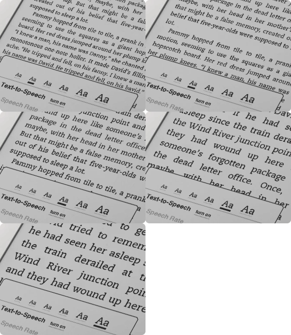
Kindle text sizes

As anyone who has done production typesetting or has designed a book meant for reading knows well, the factors that make a block of text easy or hard to read all occur at a scale smaller than the page. The most obvious is the length of the line, but line length is engaged in a complicated dance with the space between lines, the space between words, and the spaces between letters. The choice of typeface is almost irrelevant; any legible typeface can be made readable with enough care given to the spacing. (Well, almost any legible typeface.) Finding the right combination of all these factors for a particular typeface, and for a particular author’s words, is what text typography is all about.

All of these space relationships will be thrown to the winds if you typeset a page with justified text but no hyphenation. There’s a reason why the words “hyphenation” and “justification” are used together.

In producing a printed book, you can massage all these variables until you get pages that look consistent and that are effortlessly readable. You can do the same for a book that’s going to be read on a screen, but only if the end result is in a static format, such as a PDF document – essentially, a printed page by other means.

But one of the great advantages of e-readers is that you can change the type size at will. (In some, you can also change the typeface, within a narrowly circumscribed range of choices.) Lovely! But then what happens to all those careful choices about line length and word spaces and so on? They have to be made again, on the fly, automatically, by the software. And if the software isn’t smart enough to know how and when to divide words, then the spacing is going to look like hell.

Which is pretty much the way it does look, except when we get lucky, on all of the popular e-reading platforms. Great big holes appear in some lines, or a cascade of holes opens up on adjacent lines, which typographers call a “river.” It’s not just ugly; it slows down reading.

This is bad enough on a normal rectangular page, but it gets even worse when some visual element – an illustration, for instance – intrudes into the text block and the text has to wrap around it. Bad examples abound.

Some people like justified pages on an e-book page because they’re used to it in printed books. Fine. But they’re also used to better typesetting in printed books (even sloppily done ones) than we’re getting so far in e-books. The simplest solution is to give the reader a choice: justified or unjustified. And make the default unjustified. A ragged right-hand edge is easier to read than a ragged middle that’s full of holes.

The ideal solution, of course, is to have a good H&J system built into the e-book reader. But creating a really good hyphenation and justification program isn’t a trivial undertaking. Not only does the software have to know where it can break a word, and have some parameters for knowing when to break it, but the program should also modify these choices depending on the lines above and below the current line. This is what Adobe InDesign’s “multi-line composer” does. No automated system is perfect, but InDesign’s default text composition is pretty good. Certainly something like that would be a vast step upwards from what we see in e-books today.

Since we’ll all be stuck reading digital books at least some of the time, I’d like to see the standards of book composition improve, and improve fast. It might start with reviewers not blithely passing over the poor typesetting and getting wowed by the hardware or the pretty pictures. There has to be a demand for good composition in e-books. Attention to quality on that level doesn’t often get rave reviews; most people never consciously notice it. But they definitely notice it on an unconscious level, and it affects their willingness to read a book or abandon it. This is true in printed books; it’s just as true in e-books.

Who will bring out the first really good e-book reader?

[Photos: iBooks page spreads from iPad in landscape mode (left); animated GIF of Kindle page as the font size changes (above).

Unserious Sans

Published

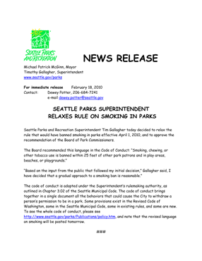
Amy Redmond forwarded this press release that she received from the Seattle Parks and Recreation department after she wrote a letter about a proposed ban on smoking outdoors in parks. “I just can’t take this seriously,” she wrote. “I so very badly want to storm into their office and say ‘I will support the ban on smoking in parks if you make a law banning the use of comic sans in press releases.'” Spoken like a true typographer.

Press release in Comic Sans

Imperial identity system unearthed

Published

(Lyons, France; 1 April 2010) – Researchers from the Institut internationale de l’identité romaine reported on Thursday that they had discovered fragments of what might be the first graphic-design manual in history. According to Jean-Claude Garamond-Jannon, head of the research team that excavated the find, it appears to be part of a manual for the presentation of the visual identity of the Roman Empire, dating from the early 2nd century A.D., during the reign of the emperor Trajan.

Although the unit system used is unclear, it appears that the Roman design administration had a thoroughly worked-out system for the measurement of inscriptional letters, which allowed them to cut inscriptions in matching lettering styles and in consistent sizes throughout the extremely widespread area under Roman rule.

“It was part of a visual identity that shouted ‘Rome!’,” said the Institut’s vice-director, Robespierre Danton, waving his arms enthusiastically at the partially excavated site. “They projected their power and their brand through a coordinated system of graphics that was instantly recognizable anywhere in the Mediterranean world.” The manual’s threadbare pages, according to Danton, specify exactly how the visual system should be implemented, with hints (barely legible) of extreme penalties for misuse of the empire’s intellectual property.

Although the fragments are in a poor state of preservation, one intriguing supplementary find has excited the interest of Dr. Giambattista Farben, a color researcher with the Institut. “This broken tablet, made of baked and polished tufa,” he says, “was found in close proximity to the manual itself. The tablet shows traces of a pattern of varying colors in lead-based paint, and scratches that may be notations to identify the different colors.” Dr. Farben was cautious, but he said that one theory of the colored tablet was that it constituted a color chart for painters who would turn the Romans’ marble walls into a panoply of colors. “It could be the earliest Pantone matching system,” admitted Dr. Farben.

Scholars from the University of Northern California dispute the primacy of the Roman identity system. Professor Chien Su-ma of UNC says that he has spent more than twenty years cataloging a collection of inscribed tortoise shells found under a pile of Han-dynasty tax receipts at Dunhuang, on the edge of the Taklamakan Desert, in China’s Gansu province. “The Han Dynasty had a clearly defined visual identity,” claims Prof. Chien, “and I believe these fragments, which were preserved at a major entrepot and outpost of empire, are a key to the system in its earliest form. They certainly predate this Western find by at least a century.”

[Photo: Detail of the lettering at the base of Trajan’s column, in Rome.]

Typosexual

Published

Oded Ezer continues to be absurdly creative with the actual physical nature of type. And I don’t mean holding lead sorts in your hand. This time he’s in London, or he was last week, talking at the London College of Communication while wearing a slightly painful-looking typographic mohawk. Type roolz OK!

Font Aid for Haiti

Published

Font Aid IV is a project to raise money to help the recovery efforts in Haiti after this month’s devastating earthquake. SOTA (Society of Typographic Aficionados), which is a US-based nonprofit, is acting as organizer. The way it works is much like the three previous Font Aid efforts: type designers contribute one character each to a special font, which is then sold to benefit the needy cause. This time, the special font will consist entirely of ampersands; ostensibly this is because of the theme “Coming Together,” though I’m sure it can’t hurt that ampersands are fun to draw and easy to find a use for. All proceeds from sales of the font will go to Doctors Without Borders.

Title design

Published

The New York Type Directors Club has recognized the importance of typography in the design of titles for movies, TV, online, and live gatherings, and for the first time this year TDC has a competition for the best title designs: TDC Intro. We’ve gotten used to noticing the design of film titles and credits, but this recognizes how widely the use of typographic “introductions” has spread through our entire visual environment. TDC Intro is being chaired by Jakob Trollbäck.

The competition’s deadline has just been extended to Jan. 20 (though the TDC website’s “competitions” page focuses on the just-closed TDC56 and TDC2 comps; follow this link for the entry form for Intro).

Books alive!

Published

Truly remarkable piece of book-related animation from the New Zealand Book Council, “where books come to life.” The text takes on a life of its own through the literal medium of the book pages.

Thanks to Bruce Sterling for this. Following a link from his blog, I found this thoughtful description by an earlier poster, Arwen O’Reilly Griffith, on the site Craft: transforming traditional crafts: “This really is an extraordinary stop-motion animation from the New Zealand Book Council. It usually makes me sad to see books cut up, even for artistic purposes, but this is so masterfully done (and for such a good purpose!) that I can’t mind too much. Yay for books! (Via All About Papercutting.)” Well put.

Looks like the book in question was set ragged-right in Adobe Caslon, as far as I can tell. With title & author’s name in Gill Sans.

The irony of using voiceover and animation to embody such a silent, solitary experience as reading a book isn’t lost on me. But it’s a representation of the kind of visualization you go through in your own mind every time you read an engaging story. It’s just continuation of communication by other means.

The great apostrophe turnaround

Published

The eagle-eyed proofreaders and fact-checkers at The New Yorker clearly didn’t have a go at this pre-Christmas advertisement that came in my e-mail. If I were Eustace Tilley in this image, I’d be peering skeptically not at the butterfly but at the conspicuously backward apostrophe. ’Tis sad, is ’t not?

It wasn’t good association, but it was free

Published

This morning I was trying to think of the name of the musicologist who compiled the famous 1952 Anthology of American Folk Music. “Harry Something-or-other,” I muttered to myself. The name I wanted was Harry Smith, but what my sieve-like brain came up with instead was Harry Carter. I immediately found myself imagining an alternate history in which noted typographic historian Harry Carter had gone out and conducted field recordings of ephemeral fonts. He would have hunted down an agèd and forgotten Garamond in the back country of northern France, a frail but feisty Bodoni in a village in the Apennines. Carter’s compilation would be credited with sparking the later type revival that swept the coffeehouses and small printshops of post-Eisenhauer America.

All right, my flight of fantasy probably owed more to another musicologist, Alan Lomax, and his father John, who actually did conduct field recordings to an extent that Harry Smith never did. But the imagination isn’t held back by petty fact.