This one is a more traditional sort of missing lettering: a faded sign on a wall in Brighton, which I took a photo of while I was there in September for the ATypI conference. Palimpsests within palimpsests.
![]()
easilyamused |
Archive for April, 2008
Missing letters | 2
Published
David Berlow, type designer
Published
A few months ago, the Font Bureau published a small book about the type designs of David Berlow. The typefaces shown in this specimen-style booklet are only a subset of the larger Font Bureau type library, but it’s remarkable to realize just how many of those typefaces are Berlow’s work. Seeing them all in one place like this is eye-opening.
David Berlow has always been a consummate type designer, crafting new faces and new versions of old faces for any number of specific, practical uses. He may have done a few designs just for the hell of it, but it’s obvious that the great majority of these typefaces were created for a purpose, often for a particular client. (Many of them first appeared as proprietary designs for publications, later released to the general font-buying public.)
When Berlow and Roger Black founded the Font Bureau in 1989, it was aimed squarely at the realm of editorial design. In the nearly twenty years since then, anyone reading a random sample of U.S. publications has probably spent a good deal of their time reading typefaces designed by David Berlow. He has designed subtly varied series for newspaper production, exuberantly expansive families for headline and display use, and carefully honed text faces that – if they’re deployed well – never call attention to themselves in a page of text.
He has worked with a wide variety of collaborators, and navigated the shoals of changing technologies. Anyone who has heard David speak at a design conference knows that he’s funny, quirky, and opinionated. He’s also prolific: according to this booklet, the Font Bureau has developed “more than 300 new and revised type designs” in the past nineteen years, and a large percentage of them have been partly or wholly David Berlow’s work.
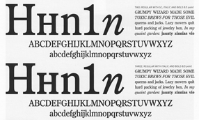
[Images | Above left: detail from the title page of the Berlow type-specimen book. Top: detail from a type-specimen page for Bureau Grot, the expanded family originally called Bureau Grotesque. Bottom: two of the five “grades” of the newspaper text face Bureau Roman.]
Missing letters | 1
Published
I’m a collector of images of vanished signs – not just the decades-old faded lettering on old brick buildings that’s so common around central cities, but the ephemeral remains of more recent signage. Sometimes it’s nothing more than the holes in the wall where molded letters were once attached. This is a form of instant obsolescence; it must appeal to my sense of passing time.
This shot is of a soon-to-be-torn-down building on Broadway in Seattle.
Eye makes a break for it
Published
John L. Walters, editor of Eye magazine in London, writes that Eye is about to go solo – leaving Haymarket, the media group that bought the magazine three years ago, and striking out on its own. Walters, along with Simon Esterson (Eye’s art director), and Hannah Tyson (business director at Esterson Associates), has set up an independent company, Eye Magazine Ltd, to publish the magazine, beginning with the new Spring issue (which, coincidentally, has an article of mine in it).
This sounds like good news for Eye. Any publishing venture is risky, but Eye is an established design magazine with a deservedly strong reputation and a loyal readership. Simon Esterson’s design has made it a pleasure to read (even with the perfect-binding that never allows the pages to lie flat – something that is inexplicably popular in magazines these days). The articles and reviews are thoughtful. I’ve been subscribing, with only one break, since the second issue. (It would have been the first issue, but I got my subscription in too late.) Design magazines tend to be seen as cuckoos in the nest of any large publishing group; they don’t fit in, and the owners never know quite what to do with them or how to promote them. I’m looking forward to seeing what Eye does now that it’s free to soar.
News! Papers! Live!
Published
Thursday’s column by Jon Carroll in the San Francisco Chronicle (which I read online at the excellent SFGate.com, since these days I’m usually not local and can’t pick up the Chron on the street) was all about newspapers. About how newspapers, which everyone says are dying, aren’t dying at all – although, he suggests, they might be signing up for a mutual suicide pact. As Jon Carroll points out, newspapers do make money – in fact, as Roger Black has pointed out, they make profit margins that would cause some other large businesses to break out in great big smiley faces all day long. (Check out the profit margin in supermarkets sometime.) It’s just that someone upstairs thinks they’re not making money – or not enough money.
As an editor/designer who has put together a book about the design of newspapers, not about their business, I’m no expert on the profit-and-loss sheets of our nation’s daily papers (not to mention those of other nations around the globe). But it’s perfectly obvious that newspapers are still a profitable business, overall; and also that they are a fundamental part of our information system – in other words, in how we think. The good ones are worth their weight in, well, paper (not such a cheap commodity these days), and even the mediocre ones offer an astonishing value for a pittance every day. Plus, they’re good for wrapping fish.
Newspapers: still not dead. Changing, yes; that’s usually a sign of what we call life.
Separated at concept?
Published
I just wrote an article for Eye, the excellent graphic-design magazine out of London, about type and lettering on public buildings. It’ll be in the spring issue, Eye 67. The starting point for this piece was Rem Koolhaas’s new Seattle Public Library, and the original ways in which really big type was being used for some of the internal signage. The article expanded far beyond there, of course. (It’s embarrassing to remember how long ago I first spoke with John Walters, Eye’s editor, about doing such a piece. It’s one of those subjects that just keeps expanding; I wouldn’t be surprised if it ended up as a book.)
There’s a lot of smaller-scale signage in the library, too – the sort of ordinary informational stuff that everyone has to deal with. I took a bunch of photos of the SPL signage, in the course of my research. Only one of them ended up in the magazine, but I was intrigued by some of the side-roads and byways that didn’t get covered in a more general article. One unexpected juxtaposition is illustrated here: an informational sign from the library (left), which was free-standing at the top of the “books spiral,” SPL’s unique form of library stacks; and another free-standing sign (below), using the same typefaces and remarkably similar color and shapes, which I noticed next to the fuel pumps in my local gas station on Capitol Hill.
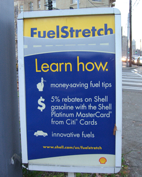
Coincidence? Well, yes, probably. But it’s a surprising bit of design echo, in two entirely different contexts that are only about a mile apart. Fill ’er up! Would you like a book with that?
Big in L.A.
Published
The first I knew that I’d been quoted in a front-page article on the Image section of last Sunday’s Los Angeles Times was when I responded to a phone message on Monday morning from a potential client in LA. They’d read the article and decided I was their man. I knew that Times journalist Adam Tschorn had interviewed me by phone, while I was on the road at a conference in Florida, about the fonts used by Barack Obama and the other presidential candidates; I hadn’t realized, though, that the article had been published.
Now I find, thanks to a heads-up from Amy Redmond, that this article has been republished (in shortened form) by The Age in Melbourne. I guess this makes me Big in Australia, too. Wonder whether any of my Melbourne friends noticed.
Thanks, Adam. Nice article.