function jdb_page_navigation()
sPageSlug = blog
sPageTitle = easily amused
header:139:aPageArgs:page_title = easily amused
header:140:aPageArgs:section_title =
functions-johndberry:262:aPageArgs:page_title = easily amused
functions-johndberry:298:sPageTitle = easily amused
functions-johndberry:359:sPageTitle = easilyamused

easilyamused |

Archive for the category ‘letters’

Vernacular information design

Published

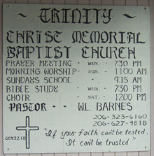
Everybody loves “vernacular typography,” or at least enjoys finding examples. This purely functional sign resides on a store-front church in a neighborhood in Seattle (not far, in fact, from the building with the faded “Roycroft Theater” sign that I noted last year). For several years, the church sign was characterized by the shaky lettering in the top image; I was never sure whether it was a deliberate style or the result of being painted by someone with a nerve problem. (Whatever the intention or the skill involved, presumably it served its purpose; the information was there, albeit in a rather peculiar form.)

More recently, that sign was replaced by the one in the bottom image – same information, mostly, but a more controlled sort of lettering, or at least a more formal set of models. Still not anything that would be mistaken for the work of a professional sign-painter.

The work of Chris Stern

Published

If you’re in Seattle this Thursday, don’t miss the opening of an exhibit of brilliantly creative letterpress printing by the late Chris Stern, at the Design Commission (121 Prefontaine Place S., near 4th & Yesler). Chris and his wife and partner, Jules Remedios Faye, formed Stern & Faye, Letterpress Printers, and founded their “printing farm” in the Skagit Valley north of Seattle. Each of them was a fine, and unusual, printer and artist before they met, and their work together has been amazing. When Chris died of cancer a year and a half ago, many of us lost a friend and we all lost an original talent.

The exhibit is in several parts: in addition to Chris’s printed work, there will be photos and artifacts from the printing farm, and prints produced by friends, colleagues, and students of Chris and Jules’s, inspired by their work. Much of this will be for sale, to benefit Jules and help pay off Chris’s outstanding medical bills.

The opening runs from 5 to 10 p.m. (this is “First Thursday,” Seattle’s monthly arts walk in Pioneer Square). If you can’t make the opening, the exhibit will be accessible during business hours at the Design Commission for the rest of the month.

Yes, the exhibit includes a copy of the magnificent volume that Chris created from my little story “Roman Seattle.”

Update June 6:

I’ve posted a few photos from last night’s opening.

Typescapes

Published

Israeli typographer and type designer Oded Ezer keeps turning language into arresting, surreal landscapes of letter forms. Sometimes they even seem to be biological. His most recent project is a short movie called The Finger, “an homage to the Israeli poet, choreographer, and art critic Hezi Leskley (1952–1994).” Even without reading Hebrew (which I don’t), you can see the intertwining of meaning and pure form, as Ezer twists and teases letter shapes into three dimensions and now extends the effect in time.

Pop-up type

Published

Can this be the first book to be promoted with a YouTube video? (Probably not.) The music and presentation seem terribly retro (I was thinking France in the 1920s, though the combination of i and j made me think of Dutch, where ij is a diphthong), but it appears to be something brand new – a book, by Marion Bataille, that’s coming out next fall. A simple alphabet, but treated anything but simply. I wonder what the manufacturing costs for this book were.

A tip o’ the hat to Jeff Barlow for pointing this one out.