function jdb_page_navigation()
sPageSlug = blog
sPageTitle = easily amused
header:139:aPageArgs:page_title = easily amused
header:140:aPageArgs:section_title =
functions-johndberry:262:aPageArgs:page_title = easily amused
functions-johndberry:298:sPageTitle = easily amused
functions-johndberry:359:sPageTitle = easilyamused

easilyamused |

Archive for the category ‘type designers’

September in Peter’s town

Published

Registration is open for the 52nd annual ATypI conference (St. Petersburg, Russia; September 17–21, 2008). In fact, we’re coming up on the cut-off point for the discounted “very early” rates. After July 18, you can register at the “early” rate (still a discount); after August 15, only at the full rate. So it pays to plan now. The preliminary program is online already, and the website has information and advice on planning travel, including visas, and accommodation in St. Petersburg. See you there?

This upcoming weekend, we’ll see the other major type gathering of the year, TypeCon2008 (Buffalo, N.Y.; July 15–20, 2008); in fact, the pre-conference workshops should be happening right now. Unfortunately, I can’t make it to TypeCon this year, but I’m sure it will be enjoyable (even if I won’t miss re-experiencing an East Coast summer’s heat and humidity). This year, as I pointed out to SOTA director Tamye Riggs, is the tenth anniversary of the first tiny TypeCon, held in an exurban hotel in Westborough, Mass.

And I just got off the phone this afternoon with Roger Black, discussing plans for next year’s ATypI conference, in Mexico City. Both St. Petersburg and Mexico City mark expansions beyond ATypI’s traditional heartland of Western Europe and occasionally North America; this seems appropriate given the widespread nature of type in everyday life.

Zap!

Published

When I googled the name “Zapfest,” to find something I had written about the 2001 San Francisco celebration of calligraphic type, I was startled to find a link to something called “Zapfest 2008.” It turned out to be a one-day music festival in Oxford; it also turned out to be, for reasons unexplained, canceled. (Well, these things happen.) I don’t imagine the reasons had anything to do with possible confusion with a typographic festival that took place seven years ago, but it’s an odd juxtaposition. Clearly, for the organizers of the Oxford music event, the name breaks down into “Zap” plus “fest”; the combination “Zapf” would have been a coincidental one. But for those of us who know and admire the work of Hermann & Gudrun Zapf, it’s hard to imagine not immediately thinking of them and their work upon seeing such a name.

Incidentally, the book that came out of the original Zapfest exhibition is still available.

Typescapes

Published

Israeli typographer and type designer Oded Ezer keeps turning language into arresting, surreal landscapes of letter forms. Sometimes they even seem to be biological. His most recent project is a short movie called The Finger, “an homage to the Israeli poet, choreographer, and art critic Hezi Leskley (1952–1994).” Even without reading Hebrew (which I don’t), you can see the intertwining of meaning and pure form, as Ezer twists and teases letter shapes into three dimensions and now extends the effect in time.

David Berlow, type designer

Published

A few months ago, the Font Bureau published a small book about the type designs of David Berlow. The typefaces shown in this specimen-style booklet are only a subset of the larger Font Bureau type library, but it’s remarkable to realize just how many of those typefaces are Berlow’s work. Seeing them all in one place like this is eye-opening.

Bureau Grot

David Berlow has always been a consummate type designer, crafting new faces and new versions of old faces for any number of specific, practical uses. He may have done a few designs just for the hell of it, but it’s obvious that the great majority of these typefaces were created for a purpose, often for a particular client. (Many of them first appeared as proprietary designs for publications, later released to the general font-buying public.)

Bureau Roman

When Berlow and Roger Black founded the Font Bureau in 1989, it was aimed squarely at the realm of editorial design. In the nearly twenty years since then, anyone reading a random sample of U.S. publications has probably spent a good deal of their time reading typefaces designed by David Berlow. He has designed subtly varied series for newspaper production, exuberantly expansive families for headline and display use, and carefully honed text faces that – if they’re deployed well – never call attention to themselves in a page of text.

He has worked with a wide variety of collaborators, and navigated the shoals of changing technologies. Anyone who has heard David speak at a design conference knows that he’s funny, quirky, and opinionated. He’s also prolific: according to this booklet, the Font Bureau has developed “more than 300 new and revised type designs” in the past nineteen years, and a large percentage of them have been partly or wholly David Berlow’s work.

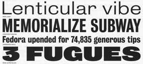
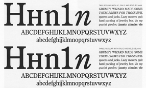
[Images | Above left: detail from the title page of the Berlow type-specimen book. Top: detail from a type-specimen page for Bureau Grot, the expanded family originally called Bureau Grotesque. Bottom: two of the five “grades” of the newspaper text face Bureau Roman.]

Helvetica outtakes

Published

My copy of the Helvetica DVD arrived a couple of days ago – you know, Gary Hustwit’s full-length documentary about a typeface, which has become inexplicably popular far beyond the typographic world. What this film does more than anything else – more than tell us about the actual typeface Helvetica, though it does that quite well – is show us how ubiquitous type is in the world around us, and how this obscure practice, typography, is something we live with every single day. That, I imagine, is the source of its wider appeal.

I’ve been browsing the DVD’s “Extras” – outtakes and extra material that didn’t make it into the movie. My favorite quotes are from Neville Brody and Erik Spiekermann:

Neville Brody on type in the world: “All schools should be teaching typography. We should be fundamentally aware of how typographic language is forming our thoughts.”

Erik Spiekermann, after describing how he’s been re-designing the timetables for the German railroads: “That stuff is what makes a nation’s culture: it’s the visual surrounding. You know: good architecture, good food, and good timetables, or good announcements on the walls of stations – I think that’s a very important cultural contribution.” [Erik Spiekermann]

I was also pleased to hear that, like me, Erik looks first to the lowercase a when identifying a typeface.

Typographers in Japan

Published

When Eileen and I spent three weeks in Japan – the second half of August and the first week of September – we met several different groups of Japanese typographers, all of whom treated us wonderfully and extended their very generous hospitality.

The very first, the day after we arrived in Tokyo, was a small committee of people with a purpose: they are trying to establish legal protection for the design of typefaces in Japan. There has been, historically, no such legal protection, but they have some official interest – one of the three people I met with that day was from the Japan Patent Office – so perhaps they will actually be able to make something happen. At this point they’re collecting information about precedents in other countries. I described as well as I could the quixotic nature of the efforts in Europe and North America (it’s always an uphill battle, and a source of great frustration for anyone involved in designing typefaces), and offered to put them in touch with as wide a variety of knowledgeable people as I could. Two of the people I met with that day, Tomoko Nakatsuka, a researcher with the Institute of Intellectual Property, and a colleague of hers, later attended this year’s ATypI conference in Brighton, where they met with quite a few type designers, typographers, and others with a particular interest in this question.

Thanks to an introduction from Eiichi Kono, I also had coffee one afternoon with Reiko Tanihara, a young designer who had studied at the London College of Printing and had done her thesis on the mixing of the Latin alphabet and Japanese characters. I asked her a lot of questions about how a Japanese reader would perceive different kinds of typographic treatments, and learned a good deal about how the Latin alphabet fits into visual communication in Japan today. (I gather that the younger generations learn the Latin alphabet as just one more part of their very complex system of writing.)

During our later sojourn in Tokyo, after a week in Kyoto, Kanazawa, and the mountain villages of Gokayama, Eileen and I were the guests (along with science-fiction editor Ellen Datlow, our friend from New York, with whom we were traveling) of the Japan Typography Association, at an elaborate dinner at the Japan Publishing Club in the Kagurazaka neighborhood of Tokyo. It was a relatively formal but cheerful affair, with JTA members standing up and introducing themselves and their work, along with much general conversation; I had to get the gist of what they were saying through translation, since I speak no more than a few phrases of Japanese, and my own brief speech was translated in turn. One of the things I hoped to do was renew the existing ties between the JTA and ATypI. As I said to the JTA members, what I like best is making connections across boundaries, and linking Japanese and Western typographers is a large part of that.

I couldn’t begin to mention all the people I met at the JTA dinner. Kyoko Katsumoto, who organized the event, and Shigeru Fuse, who is on the Intellectual Property Right Committee, had kindly met us at our hotel and taken us by taxi to Kagurazaka. Most of the members were local, but Kyoko had come all the way from Osaka, a trip of several hours even by shinkansen. She showed us a catalog of digital typefaces that featured her own work; even without being able to read Japanese, I could appreciate the skill and artistry that went into some of those designs. One typeface, with a rounded, hand-carved look, managed to simultaneously echo ancient Chinese written forms from 2500 hundred years ago and reflect contemporary grunge-inspired display fonts – a startling, eclectic feat.

Two days later, after a lunchtime party at the publisher Hayakawa (which published Eileen’s book in Japan), we met up with Kiyonori Muroga, the editor-in-chief of Idea magazine, for whom I had written a short contribution to the special issue about Jan Tschichold. He took us back to the Idea offices – which looked very much like any magazine offices I’ve ever visited, a familiar clutter – then to the studio of the magazine’s designers, Shirai Design Studio, where we met a number of local designers and typographers, including Taro Yamamoto, Adobe’s main representative in Japan, whom I had conversed with by e-mail but had never met. Eileen had another commitment that evening in Yokohama, and had to leave early, but I went with Muroga-san and the rest to a fascinating little restaurant in the neighborhood, where I had a chance to try shochu, a strong, grappa-like distilled liquor that can apparently be made from any one of a bewildering variety of substances.

On our very last night in Japan, we visited Ginza (where, as Akira Kobayashi had put it to me in e-mail, “You will be standing at the most expensive quarter in Japan”) and met up with members of the Tokyo Type Directors Club, at the opening of an exhibit of work by Kenjiro Sano at the Ginza Graphic Gallery. We were introduced to the designer, and enjoyed what we saw of his work, but soon we were whisked off to another delightful restaurant and fed delicious morsels. (We ate extremely well in Japan, especially whenever we were with local people who knew the best places and the best dishes.) We met the flamboyant graphic designer Katsumi Asaba, who is president of Tokyo TDC and who presented me with not only several of his books but a set of three plates that he had designed (I worried about getting these back to Seattle safely, but they survived the journey just fine); Hiroko Sakomura, whom Matthew Carter describes as his “Japanese sister,” and with whom it turned out we had various unsuspected connections and mutual acquaintances; Takako Terunuma, who works with Asaba-san and organized the TDC evening; Masao Takaoka, who with his father Juzo is proprietor of a well-known letterpress printshop with a large, carefully chosen stock of Western foundry type; and several other local typographers. Also as guests at the dinner were two designers from Hong Kong, Teresa Chan and Benny Au Tak-shing, who were in Tokyo to work on a current project. I always enjoy this sort of cross-connection.

My memory for names, even in my own native language, is getting rather porous, so I especially appreciated the pervasive Japanese custom of exchanging meishi, or business cards. I suppose a more accurate translation would be “calling cards,” but these have long since fallen out of fashion in the West, where only in business settings do people routinely exchange cards (or even have them to exchange). I had arranged before we left to get new cards printed for both Eileen and myself, since I knew they would be expected. With the help of Eiichi Kono, who translated our English-language cards, I created a two-sided design that used the new ClearType screen-based font Meiryo, designed for Japanese Windows Vista, on the Japanese side of the card. Then I took the digital files to Day Moon Press, here in Seattle, where Maura Shapley had them turned into copper plates and printed them by letterpress onto stiff 2-point museum board. These made unusually thick but lightweight cards. Eiichi assured me that this would be the first time Meiryo was printed by letterpress. It was a particular pleasure to present them to some of the type designers from C&G who had worked on the creation of the Meiryo type family.

[Photos | Top: Tokyo main railway station. Middle: L–R, Shigeru Fuse, John Berry, Ellen Datlow, Eileen Gunn, Kyoko Katsumoto. Bottom: Kiyonori Muroga in middle (photo by Taro Yamamoto).]

Matthew Carter’s Microsoft typefaces

Published

On Friday night of TypeCon2007, in Seattle last August, David Conrad hosted a party for TypeCon attendees at the Design Commission, his studio near the Smith Tower and Pioneer Square. The studio was festooned with artifacts of the various typeface design projects that Matthew Carter has been involved with for Microsoft: Verdana and Georgia, of course, but also earlier designs such as Elephant, and the most recent, the Latin-type (romaji) complement of the Japanese Windows typeface Meiryo. Projectors threw interactive typeface samples on the high white studio walls, and smaller screens along a lower wall offered excerpts from video interviews with the many people Matthew has worked with on his Microsoft projects. During the party, most people were busy talking or consuming the tasty munchies and the local wine and beer, but the informational mix they were moving through represented a significant part of the story of digital font development for the mass market.

At one point, I was standing with Tom Rickner, who has done the hinting on several of the fonts that Matthew has designed, and with Brian Kraimer, his colleague from Ascender Corp., when they started critiquing the gigantic white representation of bitmapped lettering on the front windows of the studio. “There’s an extra pixel in that cap-M,” said Tom. I looked; there was. I looked back at Tom. “Must be some bad hinting,” I said without cracking a smile.

This material is of particular interest to me right now, because I’m working on a new book in the “dot-font” series, a book about Matthew Carter’s type designs – how they came about, how they’ve been used, and the impact they’ve had in our visual culture. I’ll be watching those video interviews and mining them for anecdotes and insights. The purely digital typefaces leave fewer visible traces than old methods of type design: it’s all pixels. The hinting of screen fonts or the fine-tuning of outlines to take advantage of ClearType technology are recondite subjects, yet they have a clear impact on the type we see in the world around us. The interviews, the recollections of the people who’ve worked on these projects, ought to add a human dimension to this technical tale.

[Photo: Scene at the opening of the Matthew Carter exhibit, during TypeCon2007. Photo by Marina Chaccur.]

Alphabetical, my dear Watson

Published

Newly arrived from the RIT Cary Graphic Arts Press: Alphabet Stories: A Chronicle of Technical Developments by Hermann Zapf. This tasty edition is the latest in a series of beautifully designed books about the typographic and calligraphic work of Hermann Zapf. It was published simultaneously in German by Linotype, as part of its recently instituted Mergenthaler Edition line.

The volume itself is designed by Hermann Zapf, and its text uses two brand new typefaces designed by Zapf, along with Linotype typographic director Akira Kobayashi: an update to the much-abused Palatino, called Palatino Nova; and a sans-serif companion, Palatino Sans.

I haven’t had a chance yet to do much more than browse through the book, reading just the first few pages, but it’s clearly one of those well-made volumes that is going to be a pleasure to read and peruse. It’s a limited edition, so if you’re interested, you might want to get in touch with the Cary Graphic Arts Press at RIT (Rochester Institute of Technology) right away. I don’t yet see it on their website; but then, this was billed as an advance copy.