function jdb_page_navigation()
sPageSlug = blog
sPageTitle = easily amused
header:139:aPageArgs:page_title = easily amused
header:140:aPageArgs:section_title =
functions-johndberry:262:aPageArgs:page_title = easily amused
functions-johndberry:298:sPageTitle = easily amused
functions-johndberry:359:sPageTitle = easilyamused

easilyamused |

Archive for the category ‘events’

Designing digital books

Published

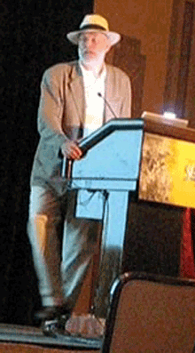
At TypeCon in New Orleans last month, I spoke about “New problems in book design” – basically the question of how to apply good typography to the design of books that are meant to be read on a screen. Here’s a little of what I said:

“What does it mean to design a book, at a time when books take multiple forms?

“I have no answers; this is all about questions. As Nick [Sherman] said, we’re in a period that people will look back on and see as a seminal time. It is; we’re inventing this as we go along. And the reason I find it interesting is that I read books, and I’ve been designing books for twenty-five years. I’ve spent most of that time — starting out demonstrating that you could use digital typesetting and design tools to do typography every bit as good as what could be done in old metal systems. And now it’s about time to translate that onto the screen.

“One of the reasons it’s interesting now is that I think the tools are beginning to be there for us. And publishers are desperate for it.

[…]

“Basically, what we need is control over all the typographic aspects – but give up the idea of control to make a static page. We want that level of control – I want that level of control – over a dynamic page. So I can say, if somebody decides to change the type size: okay, the line length should stay the same. The number of columns would change – not just making the font larger and making the leading change, which is what happens today in a website when you do that (depending on whether the browser allows you to do that or just blows the whole page up). All those factors need to be controlled together. What we need is dynamic design, we need flexible design, we need intelligent design – intelligently flexible, intelligently dynamic – in order to create good design. And the reason for that, the purpose of that, is the readers: for us, the readers. You can’t design books well if you don’t read them, and that’s true for the screen as well as for paper.

“Every publisher I’ve talked to, every editor, even most of the writers I’ve talked to, is desperate for some kind of solution here. I know writers with backlists that they have the rights to but they don’t know what to do with; they just want to say, ‘Can I put it on a Kindle somehow?’ So the marketing and the sales of books are going to change too – dramatically. But I think that what we need to do is think globally about that, think about how to design, and sell, and market books, both in printed form – for those where that’s appropriate – and in digital form. And as much as possible, for practical reasons, design it so that you actually…so the book can grow out of one file, one set of files. It’s hard! But that’s what we need. Because otherwise, again, you’re back to doing several different versions of everything.

“So in the spirit of it all being questions, I’m concluding inconclusively, and I will throw it open to questions.”

Some of the best stuff, as you can imagine, came out in the questions.

Roger Black: “John, are you saying that we need to set, basically, an extension of HTML rules for typographical things like the relationship between line breaks and leading?”

Me: “Absolutely. How you go about it is a good question, and it’s something that I’m working on right now; but it’s important to have the capability, just as it’s important to have, in browsers and the systems that support them, support for OpenType features.

“But it’s the layout and spacing controls that are the most important part. It’s hard – but not impossible. CSS3 and HTML5 are beginning to add these capabilities. Obviously, in terms of browser constraints, not everybody is going to support that, but… It may be that you use HTML-based systems to still make applications; essentially the book could be an app, if you need control that you can’t have otherwise. I suspect that we’ll do it in both formats. It’s an open question.”

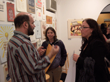
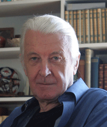
[Thanks for Jill Bell for sending me a copy of the video she shot from her phone, so I could find out what we actually said. The photos above are snapshots grabbed from that video.]

TypeCon surges ahead

Published

TypeCon 2011 – the first one run by SOTA on an all-volunteer basis – seemed to be a successful conference, and it was held in a fascinating city: New Orleans. The single-track program was well designed to engender conversation; in fact, individual presentations seemed to be speaking back and forth to each other, even when they had not be planned with that in mind. A lot of that conversation was about web fonts, design for the screen, and new forms of publishing. That’s what I spoke about myself, in a rambling talk full of questions and explorations (“all questions; no answers!”) about the problems and possibilities of designing books for a digital age. You won’t be surprised to hear that I embraced flexible design and adaptive layout as the best way to design any extended text for a variety of screens.

Everyone enjoyed New Orleans – the food, the music, the culture – though some attendees weren’t prepared for the binary contrast between the hot, steamy outdoors and the brutal air-conditioning in the hotel and in the bars and restaurants. The hotel was in the heart of the French Quarter, however, right on Bourbon Street; a fun place to be, but definitely also a tourist bubble. Bourbon Street seemed the least changed of any part of the city that I saw, since my one previous visit back in 1988 (also for a conference, also in the summer). I’m sure this is not only because the Quarter is on high ground and Katrina’s flood waters mostly didn’t reach that far.

I couldn’t, of course, make it to everything on the program; and as I didn’t arrive until Thursday afternoon, I wasn’t there for the pre-conference Education Forum or workshops. Presentations that stood out for me were Bill Berkson’s provocative “Great Readability Scandal”; Amelia Hugill-Fontenel’s well-crafted and artfully delivered “Artifacts All Around,” about some of the typographic curiosities in the Cary Collection at RIT; Otmar Hoefer’s affectionate tour of the collection of the Klingspor-Museum in Offenbach; Veronika Burian and José Scaglione on their joint type-making venture; and the “three guys in hats” (Scott Boms, Brian Warren, and Luke Dorny) on how designers use web fonts. Particularly notable was the presentation by three guys from the Cherokee Nation, about designing type for the Cherokee syllabary; this was a real-world application of type design that really matters. (“Every font that’s made makes your culture stronger.”) I also liked the tail end of Nick Sherman’s talk, filling in at the last minute for the absent David Berlow, though I missed much of Nick’s talk because I was too busy preparing for my own, which was up next. It was also fun hearing Matthew Carter, John Downer, and Akira Kobayashi do an onstage type crit of each other’s well-known typeface designs.

The heart of the event is always just meeting and talking with people, often at the evening social gatherings. Sometimes they were just a late-night party overlooking Bourbon Street, or an expedition to go “type busking” in Jackson Square in the hot summer night. TypeCon traditionally concludes with a special Sunday-evening event, after the close of the official programming; usually it’s something type-related, such as the visits to printing museums in Boston and Los Angeles, but this time it was pure tourist indulgence: a ride on the riverboat Natchez up and down the river, with music and drinks and commentary as we viewed the city and its environs from the middle of the Mississippi. The ship was by no means ours alone; we were just one among many groups aboard. But despite the cliché’d nature of the voyage, it proved to be a relaxing and enjoyable way to end a conference, and also to get a better sense of just where we were.

I got an even better idea on Tuesday, before catching an evening flight back to Seattle, when my friend Nevenah Smith, an artist who has lived in New Orleans for more than ten years, gave me a whirlwind tour of the city’s neighborhoods. It was great to get away from the Quarter and see something more down home. Even seeing parts of the devastated Lower Ninth Ward or the flooded-out sections near Lake Pontchartrain was a welcome reality check – and encouraging, when Nevenah pointed out to me the new houses being built there by volunteers for returning locals, and the people hanging out on their front porches the way they always used to. New Orleans has been devastated, especially the poorer neighborhoods, and its people treated shabbily. There’s no reason to expect that it won’t happen again; but there’s a resilience among those who’ve stayed or come back. I had prepared for this visit by watching Spike Lee’s powerful documentary When the Levees Broke and by reading Ned Sublette’s excellent book The World That Made New Orleans; I was trying to finish Ned’s more recent Year Before the Flood before I left for TypeCon, but I’m still reading it now at home. All of these gave me a little bit of insight into the context of the city I was visiting. (Even after the fact, I would recommend them to anyone who was in New Orleans for TypeCon.)

No venue was announced for next year’s TypeCon. Perhaps you’d like to put it on.

[Photos, top to bottom: what really goes on at a type conference (hint, hint); Ed Benguiat can’t escape his own typefaces; TypeCon attendees on the Natchez riverboat.]

ATypI Reykjavík 2011: registration & program

Published

Registration has just opened for this year’s ATypI conference in Reykjavík, Iceland, September 14–18, and the preliminary program has been posted. Early-bird rates for registration will be available until August 13.

Iceland has an active local typographic and design community, and has the singular advantage of being easily reachable from both Europe and North America. (Icelandair even flies nonstop from Seattle these days, which is selfishly convenient for me.) The conference venue will be the newly built Harpa concert hall and conference center in Reykjavík, and the keynote speaker will be Icelandic calligrapher and type designer Gunnlaugur SE Briem.

Go ahead – register now!

Back to the Futura

Published

A couple of weeks ago, we drove down to Portland to see a play that promised to mix science fiction and typography. How could I resist a that combination? (“Are you sure you didn’t write this play?” asked a skeptical friend of mine when I told him about it.)

The play is Futura, written by Jordan Harrison, and directed in this performance by Kip Fagan at the Portland Center Stage. (I say “this performance” because the play was having a sort of parallax début: it opened simultaneously in Portland and Los Angeles, after being workshopped in 2009 at the JAW Playwrights’ Festival in Portland.)

The opening act is a lecture on typography – and a good one. In the best science-fiction tradition, you realize, as the lecture goes on, that there’s more to the context that you thought. When the lecturer whips out a genuine piece of paper, it is clearly meant to be a shock to her students. This is a world where physical books have been superseded, and banned, replaced by an agreed-upon digital library that keeps changing, and has no grounding in solid fact. The lecturer drops acerbic references to her late husband, who seems to have been murdered, apparently by the forces of imposed order.

The first act ends [spoiler here!] when the lecturer is suddenly kidnapped, blindfolded and hustled offstage.

The trouble with Futura is that it breaks down after that. The four actors seem good; it’s the writing that lets them down. The arguments between two of the main characters in the second act are true to life, the kind of half-thought-through emotional arguments that people really make. But the play itself doesn’t rise above them, or go any deeper. The logic falls apart at the slightest touch. The metaphor, reminiscent of Fahrenheit 451 and 1984, doesn’t really offer any more insight than a sort of worried extrapolation of Google’s attempt to digitize the world’s books.

The stage sets were wonderful. (I wonder what they were like in the LA performance.) I’m not at all sorry that I went to see this play; I’m just disappointed that it wasn’t better than it was. There’s a lot to be said about books, printing, digital literature, and society; but this play didn’t go beyond its own characters’ blinkered arguments.

Still: “Futura”? How could any typographer resist?

When disaster strikes

Published

As I have followed the news about the earthquake and tsunami disaster in northeastern Japan, naturally my thoughts have turned to the many people we met in both the typographic and science-fiction communities when Eileen and I visited Japan in 2007. Our closest Japanese friends, we found out quickly, were all right, as was everyone in their circle of friends. I certainly hope that all of the wonderful, generous people that I met in the Tokyo Type Directors Club, in the Japan Typography Association, at Idea magazine, and from other parts of the Japanese typographic community are safe and sound; and that all of their families and friends are, as well.

[Photo by Taro Yamamoto, 2007.]

UW Press celebrated

Published

The first Thursday of every month features an “art walk” in downtown Seattle, when galleries throw open their doors and stay open through the evening. On the first Thursday of this month, I dropped by the newly opened storefront space of Marquand Books, on Second Avenue near the Seattle Art Museum, to see an exhibition of notable books from the 90-year history of the University of Washington Press. UW Press has been taking prizes for book design for decades, especially under its long-time art director Audrey Meyer, who retired several years ago. The range of books on display at Marquand reminded me of both the longevity and the quality of UW Press’s publishing program – and of course many of the books themselves were old friends. The way the books were displayed emphasized their covers, but you could pick them up and thumb through them to appreciate the interior design as well. (I looked to see whether the one book I’ve designed for UW Press was included – Answering Chief Seattle by Albert Furtwangler (1997) – but it didn’t make the cut.)

University presses are suffering, like all publishing ventures, from the disastrous economy and the competition of newer publishing technologies, and I’m sure UW Press is no exception. It’s well worth being reminded that a serious and creative approach to publishing, teamed with a sensitivity to book production and design, can produce volumes that we want to keep on our shelves for many years to come.

[Photo: from Marquand Books’ invitation to their “Tribute to University of Washington Press.”]

Jack the printer at 90

Published

Sunday, December 19, was Jack Stauffacher’s ninetieth birthday, and more than 150 of his friends came to celebrate it at the San Francisco Center for the Book. It was a gathering that illuminated both the breadth of Jack’s knowledge and his influence, through the wide variety of talented, creative people who showed up for the occasion in the midst of a ferociously stormy winter weekend. (“It always rains on my birthday,” Jack told me the day before. “It’s December – what can I expect? The clouds to open, trumpets to sound, and the sun to shine?”)

In talking about Jack, I can’t do better than quote Chuck Byrne, who wrote twelve years ago: “Jack Stauffacher describes himself as a printer. It is a somewhat deceptive term for us today. His use of the term connects him to a five-hundred-year tradition of the entrepreneur-publisher-designer-typographer-printer. Like the best who made up that custom, he possesses a love of type and printing and the ability to convey meaningful words and thought.” (“Jack Stauffacher, Printer,” 1998; cribbed in this case from the AIGA’s webpage from when they awarded Jack the AIGA medal.)

Chuck was one of the organizers of this birthday event, which brought together people from all parts of the Bay Area’s book, printing, arts, and design communities (and a few of us from farther away). It would be impossible to tell you all the people who were there, even if my memory for names hadn’t turned into a sieve. It was certainly a celebration – not just of Jack Stauffacher but of the interlocking creative communities that he has influenced, and continues to influence.

As Andrew Hoyem, of Arion Press, said a couple of days afterward, “I ran into people there that I hadn’t seen in years!”

It was a printer’s occasion. In the course of the party, Jack approved the inking on a hand-set letterpress keepsake that he had designed for the occasion, and many people ran off copies. There were a number of other keepsakes distributed, too (I brought one that I had commissioned from Jack leNoir and Maura Shapley at Day Moon Press in Seattle), but the most spectacular was the single big foldout artifact created by Pat Reagh, featuring Jack’s favorite typeface, Kis.

Several of Jack’s friends, and his two daughters, spoke briefly, and Chuck Byrne unveiled the hand-carved alphabet in slate that Chris Stinehour had made for Jack.

When Jack himself took the microphone, he spoke of the ongoing conversation, of how he delights in asking deep questions of everyone he meets, finding out about new things and gaining new understanding. And he urged us to carry this conversation forward – then he put down the mike to let us get on with it.

After all, this was just a birthday party, a punctuation point in a long discourse that’s not done. At 90, Jack may have slowed down a bit – all right, he no longer plays bicycle polo – but he’s still a vigorous voice for excellence, intellectual curiosity, and attention to our cultural history. And he’s intensely interested in what we have to say.

[Photos: (top) keepsake that Day Moon Press created for me for the occasion, designed by Jack leNoir and printed by Maura Shapley; (2nd from top) Jack Stauffacher holding the stone plaque hand-carved by Chris Stinehour; (3rd from top) Jack and Patrick Reagh, holding up Pat’s Kis keepsake; (4th from top) the milling throng; (bottom) milling around a couple of the hand presses at the San Francisco Center for the Book.]

Update: Chuck Byrne has posted three pages of photos taken by him and Dennis Letbetter at the event. For your convenience and amusement – no captions!

American type design revealed

Published

I spent last Friday at the School for Visual Concepts, where a full day of talks about American type design was part of the two-day Type Americana conference. (The second day was hands-on workshops; they filled up and even had overflow sessions, but I didn’t participate in that aspect of the event.) We were shoehorned into a small, cozy space, the SVC gallery, but that made it easy to see and hear.

The individual talks all seemed to be carrying on a conversation with each other, as topics and historical people overlapped and interacted. Patricia Cost’s talk about Linn Boyd Benton fit naturally with Juliet Shen’s talk about his son Morris Fuller Benton; both of them shared references and contexts with Thomas Phinney’s talk about the American Type Founders (ATF), where both Bentons had worked. Steve Matteson’s talk about Frederic and Bertha Goudy intersected with Paul Shaw’s on W.A. Dwiggins, since Goudy and Dwiggins shared a home and a studio for two years in Massachusetts. Shelley Gruendler, talking about Beatrice Warde, said she had learned a fact she’d never known about Beatrice during Paul’s lecture. Jim & Bill Moran’s talk on the Hamilton Wood Type Museum didn’t directly impinge on the earlier designers, but it was part of the same hundred-year history. All in all, this was a remarkably concentrated dose of information and anecdote about the history of American type designers.

The final talk didn’t intersect quite so intimately with the others, but that’s because it was about a more recent period: Sumner Stone’s days as the first typographic director of Adobe, and the creation of Adobe’s program of original typefaces. Sumner said this was the first time he had spoken about that period publicly; it had been too close before. He not only told us tales of how Adobe hired him and how he developed the type program, but he set the stage by explaining the state of the type business and technology at the time Adobe started up. Most of it wasn’t new to me, apart from some of the anecdotes, but it was fascinating to hear Sumner put it all together. I hope he writes it up, or otherwise records it for posterity.

That could be said of all the talks: they all cried out to be expanded and recorded in more permanent form. The information communicated in that room last Friday could not be found anywhere else, at least not all together; it was the fruit of several people’s dedicated research, and much of it doesn’t exist anywhere online. (At least not yet.) Everyone spoke well, and the audience was rapt. Juliet Shen, who spearheaded the effort, and the supporting staff at SVC, put on a fine event.

[Photos: (top) Thomas Phinney & Sumner Stone; (middle) audience during a break; (bottom) Thomas Phinney, Michelle Perham, Kristine Johnson.]

Type Americana

Published

On November 12 & 13, the School of Visual Concepts in Seattle is hosting a two-day event on the history of American type design, called Type Americana. The first day features eight talks; the second day is workshops, one by Sumner Stone and one on wood type. You can attend just the day of lectures, or both days (spaces in the workshops are limited).

The talks: Thomas Phinney on American Type Founders, Paul Shaw on D.A. Dwiggins, Jim & Bill Moran on Hamilton Wood Type, Patricia Cost on Linn Boyd Benton, Sumner Stone on the early days of Adobe Type (Sumner was Adobe’s first Type Director), Shelley Gruendler on Beatrice Warde, Juliet Shen on Morris Fuller Benton, and Steve Matteson on Fred & Bertha Goudy.

The workshops: “Vintage Letterpress with Hamilton Wood Type,” taught by Jim Moran and Bill Moran; and “ThinkWrite,” taught by Sumner Stone.

In addition, Friday night will be the Northwest premiere of Richard Kegler’s film Making Faces: Metal Type in the 21st Century, about the work process (and the personality) of the late Jim Rimmer, working and talking at his home-based type foundry outside Vancouver. I’ve seen an unfinished version of this film, and it’s amazing.

Matthew Carter: MacArthur Fellow

Published

Matthew Carter has been named one of the 2010 MacArthur Fellows – a justly deserved honor with a very handy monetary package attached. It’s usually nicknamed the “genius grant,” and Matthew has lots of excellent company both this year and throughout the history of the fellowships.

This news follows hot on the heels of his being given the AIGA Boston Fellow Award just last Friday, at a sold-out event at the Cambridge Public Library. There must be a lot of feelings of good fellowship swirling around Cambridge this week.

Congratulations, Matthew!