function jdb_page_navigation()
sPageSlug = blog
sPageTitle = easily amused
header:139:aPageArgs:page_title = easily amused
header:140:aPageArgs:section_title =
functions-johndberry:262:aPageArgs:page_title = easily amused
functions-johndberry:298:sPageTitle = easily amused
functions-johndberry:359:sPageTitle = easilyamused

easilyamused |

Archive for the category ‘books’

Text on the pages of iBooks

Published

Two intelligent blog posts appeared today covering the new iBooks software and its choice of fonts; both of them included a link to my 2001 review of one of the new type choices: Iowan Old Style. I’m pleased to see John Downer’s Iowan Old Style get its due at last; I’m even more pleased to see iBooks expand its typographic palette in the direction of actual text typefaces. (Now about actual typography…)

Glenn Fleishman’s essay for Boing Boing is insightful and mindful of the cyclical development of typographic technology; he also mentions the current problems with trying to incorporate web fonts in e-books. Yves Peters in the FontFeed has more to say about the history of the typeface designs, and his illustrations cleverly show the fonts in all three of iBooks’ screen views or “themes.”

What I don’t understand is why Apple chose to drop three of the previous iBooks fonts (Cochin, Baskerville – really Monotype Baskerville – and Verdana). None of them were ideal for books onscreen, but why reduce the choices instead of simply adding to them?

And now the newly introduced Seravek is the only sans serif font available for reading in iBooks. It’s a nicely designed humanist sans, but it doesn’t have to be the only sans, humanist or otherwise, on the system. And the small eyes of Seravek’s e and a tend to visually close up under some circumstances.

[Image: one of the illustrations from Yves Peters’ review, showing Iowan Old Style. In the FontFeed original, you can click on any of the three sections to see the full page in that view.]

Talking about fonts

Published

Now download my other Dot-font book

Four years ago, Mark Batty published a pair of books by me, Dot-font: talking about design and Dot-font: talking about fonts, which were intended to be the first of a series of small, handy books on typography and design. Last year, I made the first one (on design) available as a free download. Now, I’m posting the second book (on fonts) as well, also as a free download.

Please download the text of both books and enjoy them.

You can download the complete text of Dot-font: talking about fonts as a PDF, designed and formatted for onscreen reading; as a Word document; or as a text file. The illustrations that appear in the printed book are not part of these downloads; I don’t have rights to reproduce and distribute all of the images in digital form, so for the full visual effect you’ll have to buy a copy of the physical book (which of course I encourage you to do). Some of those images appeared online at Creativepro when the original columns were published, but there are quite a few original images that were created for the book: for example, the series of photos that Dave Farey made from scratch, to illustrate the process of cutting a letter by hand out of Rubylith in order to create a Letraset font in the 1960s.

This book, like the last, is published under a Creative Commons license. Please do not distribute it without that license information.

The Creativepro columns that seemed worth collecting into a book broke down naturally into three categories: design in general, typefaces or fonts, and typography or how type is used. So I’ve still got the material for a third book, Dot-font: talking about typography. Is there a demand? You tell me.

Download dot-font

Type Works: Will Powers

Published

When Will Powers died suddenly two years ago, he left a gaping hole in the community of typographers, printers, and book-designers in this country. Now we have a small book to remind us of the work that he left behind: Type Works: the printing, design and writing of Will Powers.

It’s small in extent (50 pages) but not in format: its pages are a generous nine inches square, as befits a book that’s got to show a lot of examples of the design of other books. Oddly, there’s no one named as author or editor, which will perplex book dealers and annoy librarians; it’s simply credited to Interval Press, Birchwood, Minnesota. My copy was sent to me by Cheryl Miller, Will’s wife, and the copyright is in her name. (The information page on the distributor’s website confirms that Cheryl is the book’s editor.)

This collection of essays and reminiscences by Will’s many friends and collaborators gives a kaleidoscopic picture of the man. Although by the time I first met him, he was living and working in Minneapolis, as design and production manager for the Minnesota Historical Society Press, Will had spent many years in the San Francisco Bay Area as a letterpress printer. He and Wesley Tanner printed Fine Print for several years, and Will also wrote articles and designed covers for that remarkable publication. Reading about those times now, with names of people I came to know many years later, makes me imagine an alternate history in which, when I was living in San Francisco after I got out of college in 1971, I had somehow made contact with the local printing community. But at that young age I had no idea that typography was going to be central to my life, and I didn’t meet any of those people, or stay in the Bay Area.

Type Works is a short-run book, printed by BookMobile in Minneapolis, who specialize in short-run and print-on-demand books (and who I know from experience can do a good job of it). Given the display purpose of this book, I could wish that it had a sewn binding that would lie perfectly flat, but that’s not an option in this short a run, unless you manufacture the book by hand. I also wish I could read every word on every printed example shown, but that’s just a reflection of how fascinating the texts that Will worked on (or wrote) tended to be. This is a fine presentation of examples of Will Powers’s excellent typography and book design, of the words written about him, and of a few of his own words as well. And I love the fact that the text uses Zuzana Licko’s typeface Journal, an idiosyncratic but very readable text face of the digital era.

Flexible, adaptive, responsive

Published

For the past couple of days I’ve been devouring Ethan Marcotte’s new book, Responsive Web Design. It’s the fourth in the series of “brief books for people who make websites” published by A Book Apart (an outgrowth of A List Apart). Each one focuses on a specific subject, and is written in a direct, conversational manner with a hands-on approach for web designers.

“Responsive web design” is Marcotte’s term for what I first heard referred to as “adaptive layout” by Microsoft’s Geraldine Wade (now Banes) when she was working on the original New York Times Reader. I usually just call it “flexible layout.” (As the Times Reader app suggests, it’s not only applicable to web pages.) The essential idea is visual design that adapts itself intelligently to the size, orientation, and resolution of the digital “page” it’s displayed on. This can be done well or badly, of course, but first you’ve got to understand the importance of doing it at all.

Marcotte is cogent and persuasive about that. And he shows you exactly how to do it, step by step, even though this is not strictly speaking a “how to” book. More important, he shows you why to do it. His last chapter suggests a reversal of the notion of “graceful degradation” in onscreen design: instead of making a complex design for a big monitor and the latest, most capable software, and then figuring out how it should deal with smaller sizes or less capable systems, he suggests starting by designing a simple, uncomplicated basic design that will work on the tiniest mobile device (“mobile first”), then adding features as (and if) they seem useful in a more expansive environment. Both approaches are adaptable and responsive, but this one seems cleaner and more elegant.

Now the area that interests me most is text typography, which Marcotte doesn’t go into in any great detail. But this just means that there’s more to be learned and invented in this area.

I’m a fan of small, handy, precisely targeted books, and the Book Apart series is just that. These books are consistently designed (by Jason Santa Maria), readable, and easily portable (despite somewhat heavy coated paper). There are a few bits of sloppiness; the proofreader could have caught the glitches in the hyphenation algorithm that produced “wides-creen” and “in-teract” as word breaks, and a copyeditor might have questioned the author’s frequent use of “to better [do this]” or “to better [do that],” but these are quibbles. Responsive Web Design and its predecessors in this series are useful, well-done tools in their own right.

Powers of observation

Published

In an unexpected confluence of two of my areas of interest, science fiction and graphic design, I discovered that design critic Rick Poynor has been waxing lyrical, over on Design Observer, about the surrealist cover paintings done by Richard Powers for so many science-fiction paperbacks in the 1950s and 1960s. I grew up on those covers. Although I knew nothing about surrealist art, nor for that matter about book design, I remember those Powers paintings as representing the mood and style of science fiction to me. They were very far from the rocketships and spacemen that might adorn a less sophisticated cover. It wasn’t until later that I learned who he was (it was rare for an artist’s credit to be included in those books), yet his visual imagination burned its way into my own, all unknowing.

Powers’s images were almost never representational; they were dreamlike and evocative, with flowing shapes, curving lines, and polished surfaces, floating in a limitless space of the mind.

Poynor takes off from a reference in the Guardian’s science fiction issue, where the editors asked a wide range of science fiction writers to describe their favorite novel or author; Christopher Priest wrote about J.G. Ballard’s early short-story collection, The Voices of Time (left). The cover of that Berkley paperback was classic Richard Powers; so was the (different) cover of a later reprinting (also from Berkley). This provides Poynor with a perfect jumping-off point.

The image to the left is not a swipe from the Guardian, but a scan of the cover of my own lovingly tattered copy of The Voices of Time. The only time I met Ballard, on a reading tour for Empire of the Sun, I had the pleasure of getting his autograph on this book that I had kept with me since I was a youthful sf reader.

Madame Wahler’s Lucky Serif Dream Book

Published

There are always plenty of reasons to be a member of the Type Directors Club, the New York–based organization that fights a never-ending battle for truth, justice, and really great typography. But a particularly wonderful reason arrived in the mail just the other day: a little 16-page booklet called Madame Wahler’s Lucky Serif Dream Book.

This invaluable guide, written and designed by Gail Anderson and illustrated by Bonnie Clas, could set you on the road to a better life. “This book will make you a winner!” exclaims the back cover, and who could doubt it? As the introduction explains, “The Type Directors Club is the first international organization to make public a genuine and authentic guide to the connection between typography and dreams.”

The contents include a list of dream types (“To dream of ligatures denotes popularity with the opposite sex”), a typographic horoscope (“As the most sensitive sign of the zodiac, Pisces is easily devastated by poorly drawn characters”), and small ads for everything imaginable (“Miracle Open Type Necklace,” “Go Away Comic Sans Cologne,” and “PROFESSOR INA’S Tattoo Type Removal Cream”).

Remember: “Madame Wahler’s Lucky Serif Dream Book will prove itself valuable as a reference because it uses small words and lists the meanings of many popular lettering dreams.”

Reading matter

Published

The new issue of Typo has a thoughtful article about the typography of onscreen reading – entitled, sensibly enough, “Electronic reading: the future is now.” It certainly is.

The author clearly knows his stuff. According to his bio note, “Martin Pecina is a designer and typographer, enjoys reading and designs books.” An enjoyment of reading is a prerequisite for designing books, or at least doing it well. (I know that my own approach to designing a book starts with imagining how it would be to hold and read that book.) And an enjoyment of reading should also inform any design for electronic books, as Pecina points out in a rather severe critique of the current state of the art.

He doesn’t just show off bad examples – something that’s absurdly easy to do with almost any current form of e-reader – he spells out the kind of typographic decisions that need to be made in laying out a page of text, whether that page is fixed and printed or fluid and controlled by dynamic rules. Anyone working in digital book publishing today ought to read this article.

Pecina analyzes the problem by dividing it into two parts: basically, the hardware and the software. The hardware may be a “universal device” (a computer or phone that serves a number of functions, of which reading is just one) or a “specialized device” (a dedicated e-reader). He is scathing about the nature of most computer screens: “But – it is impossible to read well from a lit display. Sure, we read websites on them, even PDF documents, maybe annual reports, press releases and various corporate documents. But it’s no good for reading long passages of text.” He feels that the only reasonable future for digital books is passive display technology using e-ink and reflected light. “In terms of electronic books, the backlit display is a dead end and brutal debasement; devices with this technology will never fully replace printed books, no matter how many millions of titles for the iPad or similar devices end up being sold.”

In the long term, I’m sure, he’s quite right. The future of long-form reading may be a few high-quality printed books, supplemented by a kind of smart paper, where nanotech “ink” forms and re-forms the text as needed on a single page.

Most of the essay, however, focuses on the software used to create e-books, cataloging both what the currently available systems do and what’s needed to make them work right. He makes a distinction between a “final” document, a composed page (whether in print or in a fixed form like a PDF file), and an “unfinalized” document, where both the form and the content may continue to change. (He doesn’t give much attention to the idea of a document whose content is fixed – nobody’s going to change the words of a novel – but which might be presented in a fluid variety of forms.) And he raises serious questions about books with complicated multi-level text, such as scholarly publications, which may have footnotes and several layers of nested content. (Scholarly books would benefit most from electronic publishing, since the audience is usually small and the cost of printing proportionately high, but creating a system that can handle that kind of complexity in a flexible manner is not easy.) “Simple text,” he says, “is flexible, can easily flow from a small into a large format or from landscape into portrait orientation, all quickly and without losing a bit of its essential nature. The situation is perceptibly different for scholarly or professional texts.”

Pecina gives a nod to the two-page spread, so innate to the nature of a printed book bound at the spine. Digital books, of course, do not have any need for a spine, and therefore no need for facing pages, although some e-reading software tries to present a familiar-looking facsimile of an open book. He mentions the “scrolling” model, which we’re all used to from websites and word-processors; what he doesn’t mention is that before the codex form of the book, handwritten scrolls too were composed in pages – though not in two-page spreads. I remember how surprised I was when I learned that real-life ancient scrolls were held horizontally and read side-to-side, not held top-to-bottom the way you see in cartoons and historical movies. Perhaps a royal proclamation would be held vertically, but an actual book – the literature of the Greeks and Romans, or the religious texts of the ancient world – was held horizontally and rolled open enough to view a single, relatively narrow block of writing: a single page. Perhaps we’re coming back to an older tradition than we’ve been following for the last millennium or so.

Pecina also mentions the design problems of books with illustrations or other images, which a traditional book designer deals with in composing a page. What he doesn’t go into is the other kind of editorial design, which shares a lot of its DNA with the book: magazine design. There are books that revel in image and display type with hardly any traditional “text” content, and there are scholarly journals that are essentially books in periodical form; the boundary is very porous. Do magazines lend themselves to display on an e-ink device? How about sumptuous art or photography books? Is the dividing line the need for color? The balance between image and text? The ephemeral nature of the content?

I suspect that the problems of designing complex books for reading on a variety of screens are akin to the design problems currently being posed by magazines with digital editions. The answer requires truly dynamic layout, with all the careful thinking-through of hierarchy and if/then behavior that that implies. If such systems of design and production are sophisticated enough, they’ll be able to handle text and image of any complexity, and do so in a typographically elegant way that just seems natural to read. That’s where the future is, now.

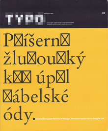
[Image: cover of Typo 43, Spring 2011, with its witty commentary on fonts’ spotty support of Central European character sets.]

Back to the Futura

Published

A couple of weeks ago, we drove down to Portland to see a play that promised to mix science fiction and typography. How could I resist a that combination? (“Are you sure you didn’t write this play?” asked a skeptical friend of mine when I told him about it.)

The play is Futura, written by Jordan Harrison, and directed in this performance by Kip Fagan at the Portland Center Stage. (I say “this performance” because the play was having a sort of parallax début: it opened simultaneously in Portland and Los Angeles, after being workshopped in 2009 at the JAW Playwrights’ Festival in Portland.)

The opening act is a lecture on typography – and a good one. In the best science-fiction tradition, you realize, as the lecture goes on, that there’s more to the context that you thought. When the lecturer whips out a genuine piece of paper, it is clearly meant to be a shock to her students. This is a world where physical books have been superseded, and banned, replaced by an agreed-upon digital library that keeps changing, and has no grounding in solid fact. The lecturer drops acerbic references to her late husband, who seems to have been murdered, apparently by the forces of imposed order.

The first act ends [spoiler here!] when the lecturer is suddenly kidnapped, blindfolded and hustled offstage.

The trouble with Futura is that it breaks down after that. The four actors seem good; it’s the writing that lets them down. The arguments between two of the main characters in the second act are true to life, the kind of half-thought-through emotional arguments that people really make. But the play itself doesn’t rise above them, or go any deeper. The logic falls apart at the slightest touch. The metaphor, reminiscent of Fahrenheit 451 and 1984, doesn’t really offer any more insight than a sort of worried extrapolation of Google’s attempt to digitize the world’s books.

The stage sets were wonderful. (I wonder what they were like in the LA performance.) I’m not at all sorry that I went to see this play; I’m just disappointed that it wasn’t better than it was. There’s a lot to be said about books, printing, digital literature, and society; but this play didn’t go beyond its own characters’ blinkered arguments.

Still: “Futura”? How could any typographer resist?

The MyFonts interviews

Published

“In the history of typography,” writes Jan Middendorp in his introduction to Creative Characters: the MyFonts interviews vol. 1, “the 1990s represented a phase of unprecedented democratization of the type design and production process… It seems the 2000s have accomplished a similar step for the user… Today, many managers, secretaries, bloggers or scrapbookers have preferences regarding the fonts they use.”

Creative Characters was launched in 2007 to give a peek behind the creative curtain and introduce “the faces behind the fonts,” the people who design type. The newsletter has been edited by Jan Middendorp, who has conducted interviews with type designers from all across the world of type. Twenty-six of them have been collected between covers in this book.

Middendorp is a good interviewer. He knows his subject, and he asks intelligent questions; he doesn’t ask long, rambling questions to get his own ideas across, but instead looks for for a response from the people he’s there to listen to. The nature of each interview, of course, varies with the interviewee.

Jim Parkinson, the lead-off subject, is self-deprecating in recounting his own notable history as a lettering artist. “Many people who worked for Rolling Stone in the early years still think it was the coolest job they ever had.” And: “Of all the people I have been lucky enough to bump into, Myron [McVay] taught me more about lettering and type design than everyone else put together, save Roger Black. I still do most things the ways Myron taught me.”

That’s not unusual. David Berlow, asked about his influences, says, “I’m still learning a lot from the people I’m supposed to be teaching.” Christian Schwartz, after receiving the Prix Charles Peignot from ATypI: “Although I have some really great collaborators, they’re all far away, so I spend almost all of my time working in my little office at home, by myself, which makes my job seem very anonymous. It’s a real honor to be recognized by my colleagues.”

The range of type designers interviewed here is wide; what they have in common, besides quality, is that they’re all active today, and they all have something to say about their careers and their work. Some dig deep into typographic history for their inspiration; others shun it. Some draw spectacular display faces; some craft meticulous text faces; some do both. The other thing they have in common is that at least some of their fonts are available from MyFonts.com.

These interviews all appeared first as e-mail newsletters from MyFonts. Like most of us, I receive these delightfully formated e-mails and, more often than not, put them aside in my inbox to read later. I find that it’s easier to read them in this invitingly designed physical book, which has spacious pages, colorful displays, readable text, and a format with flexible covers and loose sewn binding that is light enough to carry around and comfortable to hold in your lap and pore over at leisure. The page design not only shows off each designer’s typefaces, but has varied examples of other graphic designers’ real-world use of the faces – for example, a page of newspaper and magazine designs by Tony Sutton using a range of typefaces from Nick Shinn. Everything about this book is inviting and workable. This is only Volume 1; the series of interviews continues to appear in our e-mail, and I hope the next set will be collected soon in Volume 2.

UW Press celebrated

Published

The first Thursday of every month features an “art walk” in downtown Seattle, when galleries throw open their doors and stay open through the evening. On the first Thursday of this month, I dropped by the newly opened storefront space of Marquand Books, on Second Avenue near the Seattle Art Museum, to see an exhibition of notable books from the 90-year history of the University of Washington Press. UW Press has been taking prizes for book design for decades, especially under its long-time art director Audrey Meyer, who retired several years ago. The range of books on display at Marquand reminded me of both the longevity and the quality of UW Press’s publishing program – and of course many of the books themselves were old friends. The way the books were displayed emphasized their covers, but you could pick them up and thumb through them to appreciate the interior design as well. (I looked to see whether the one book I’ve designed for UW Press was included – Answering Chief Seattle by Albert Furtwangler (1997) – but it didn’t make the cut.)

University presses are suffering, like all publishing ventures, from the disastrous economy and the competition of newer publishing technologies, and I’m sure UW Press is no exception. It’s well worth being reminded that a serious and creative approach to publishing, teamed with a sensitivity to book production and design, can produce volumes that we want to keep on our shelves for many years to come.

[Photo: from Marquand Books’ invitation to their “Tribute to University of Washington Press.”]