function jdb_page_navigation()
sPageSlug = blog
sPageTitle = easily amused
header:139:aPageArgs:page_title = easily amused
header:140:aPageArgs:section_title =
functions-johndberry:262:aPageArgs:page_title = easily amused
functions-johndberry:298:sPageTitle = easily amused
functions-johndberry:359:sPageTitle = easilyamused

easilyamused |

Title design

Published

The New York Type Directors Club has recognized the importance of typography in the design of titles for movies, TV, online, and live gatherings, and for the first time this year TDC has a competition for the best title designs: TDC Intro. We’ve gotten used to noticing the design of film titles and credits, but this recognizes how widely the use of typographic “introductions” has spread through our entire visual environment. TDC Intro is being chaired by Jakob Trollbäck.

The competition’s deadline has just been extended to Jan. 20 (though the TDC website’s “competitions” page focuses on the just-closed TDC56 and TDC2 comps; follow this link for the entry form for Intro).

Books alive!

Published

Truly remarkable piece of book-related animation from the New Zealand Book Council, “where books come to life.” The text takes on a life of its own through the literal medium of the book pages.

Thanks to Bruce Sterling for this. Following a link from his blog, I found this thoughtful description by an earlier poster, Arwen O’Reilly Griffith, on the site Craft: transforming traditional crafts: “This really is an extraordinary stop-motion animation from the New Zealand Book Council. It usually makes me sad to see books cut up, even for artistic purposes, but this is so masterfully done (and for such a good purpose!) that I can’t mind too much. Yay for books! (Via All About Papercutting.)” Well put.

Looks like the book in question was set ragged-right in Adobe Caslon, as far as I can tell. With title & author’s name in Gill Sans.

The irony of using voiceover and animation to embody such a silent, solitary experience as reading a book isn’t lost on me. But it’s a representation of the kind of visualization you go through in your own mind every time you read an engaging story. It’s just continuation of communication by other means.

The great apostrophe turnaround

Published

The eagle-eyed proofreaders and fact-checkers at The New Yorker clearly didn’t have a go at this pre-Christmas advertisement that came in my e-mail. If I were Eustace Tilley in this image, I’d be peering skeptically not at the butterfly but at the conspicuously backward apostrophe. ’Tis sad, is ’t not?

It wasn’t good association, but it was free

Published

This morning I was trying to think of the name of the musicologist who compiled the famous 1952 Anthology of American Folk Music. “Harry Something-or-other,” I muttered to myself. The name I wanted was Harry Smith, but what my sieve-like brain came up with instead was Harry Carter. I immediately found myself imagining an alternate history in which noted typographic historian Harry Carter had gone out and conducted field recordings of ephemeral fonts. He would have hunted down an agèd and forgotten Garamond in the back country of northern France, a frail but feisty Bodoni in a village in the Apennines. Carter’s compilation would be credited with sparking the later type revival that swept the coffeehouses and small printshops of post-Eisenhauer America.

All right, my flight of fantasy probably owed more to another musicologist, Alan Lomax, and his father John, who actually did conduct field recordings to an extent that Harry Smith never did. But the imagination isn’t held back by petty fact.

Dublin & Birmingham, Nov. 2009

Published

Last month I went to Dublin, and to Birmingham and London in the UK – so soon after returning from Typ09 in Mexico that it felt as though I was just visiting this interesting city called “Seattle” for a brief time. The main purpose of the trip was to check out venues and talk to organizers for next year’s ATypI conference in Dublin, but the timing was occasioned by my being invited to speak at the one-day Typographic Horizons conference in Birmingham (and incidentally to stay an extra day and address the Chitterlings typographers’ dinner). We flew into and out of London, so we had a chance to see a small sampling of our friends in London, too.

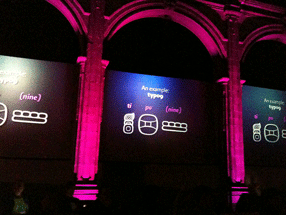
Typographic Horizons was a small but enthusiastic conference, bringing together some of the energy of Birmingham’s design community. Caroline Archer and Alexandre Parré, and the hosts at the Birmingham Institute of Art and Design, have ambitions to make Birmingham a design center. London, of course, is the metropolis, but second-city Birmingham actually finds it easier to attract people from around the country, including London, according to Caroline. And besides, it’s got three-foot-high stone statues of John Baskerville’s punches.

Dublin Castle is a remarkable venue, well set up for conferences of all kinds; and Dublin is a delightful city. We certainly enjoyed the Guinness (“the wine of the country,” as James Joyce called it) and the comfortable pubs that served it. Clare Bell and Mary Ann Bolger, the principal organizers of next year’s conference, were well organized and cheerful hosts; so were their colleagues at the Dublin Institute of Technology, which will be hosting the conference. We saw only a small bit of the city, but enough to be sure that it will be a good site for ATypI; Irish culture is so intimately tied up with literature that naturally the theme of the conference is going to be “The Word.” On the last day, before Mary Ann headed off to the picket lines for a one-day public-service strike, we managed to see the National Print Museum, which is full of presses, type, and printing artifacts of all kinds, as well as printed matter, including one of the few remaining copies of the 1916 proclamation of the Irish Republic.

I’ve posted a few photos from the trip on Flickr. This is just a taste; I took lots of shots of the interior spaces of Dublin Castle, but most of them will only be of interest to the organizers. You’ll see them all – the spaces, that is – when you show up next September for the conference.

Typ09 happened

Published

I was too busy during Typ09, the 2009 ATypI conference in Mexico City, to write anything for this blog (or for much of anything else), but it wasn’t for lack of potential content. The conference was very well attended and full of ideas; everyone I’ve talked to seemed to think that the program was particularly stimulating, and the cultural and intellectual milieu was rich and intense.

Many thanks to the organizers of the conference – especially to Ricardo Salas, the mastermind of the whole event; to the indispensible Mónica Puigferrat and Paulina Rocha; to Marina Garone and Leonardo Vásquez, of the program and exhibitions committees, respectively; to Roger Black, who got the ball rolling; and to Barbara Jarzyna, ATypI’s conference organizer and executive director.

Although I didn’t have time to write anything, I did take a lot of photos. I posted an early batch to Flickr before the conference began, and later added quite a few more. Most of them even have captions! Here they are.

[Photos: Typ09 banner and posters at Anáhuac University (left); Mark Barratt & Simon Daniels at a sidewalk bar in the Centro Histórico (below, top, L–R); one of the multiple screens in the main program at MIDE (below, bottom).]

Mark Barratt & Simon Daniels

Main program at MIDE

Four score and three cheers

Published

Time to mark one of those arbitrary points on the calendar that mean so much to us. October 21 is the 80th birthday of one of the finest American writers, Ursula K. Le Guin. Her novels have embodied a thoughtfulness, a humanity, and a pragmatic sensibility that have resonated with me since I read the earliest ones when I was just a teenager. Her essays, beginning with The Language of the Night, edited by Susan Wood, joined the most intelligent conversations in print, the ongoing weaving of ideas and their telling that humans have been engaged in since they first had time to speculate.

She’s got a great laugh, too. Happy birthday, Ursula!

[Photo: Ursula Le Guin, by Eileen Gunn]

Elegance & credibility, blown

Published

Brooks Brothers has an amazing ability to project established elegance and solid reliability in the realm of men’s formal clothing. A Brooks Brothers suit is iconic. When Brooks Brothers first established a store in downtown Seattle, a few years back, they managed to make it look as though the shop had been established on that corner since the founding of the company in 1818 – despite the fact that there hadn’t even been a town, much less a street intersection, at that spot nearly two hundred years ago. In the spot they moved to later, a couple of blocks away, the building isn’t quite as convincing, but the shop still has that aura of conservative quality.

Except in the execution of its typography. The choice of Bodoni for the type on this window text was clearly meant to emphasize the classic elegance of the brand. But the effect is spoiled by the typewriter apostrophes, which neither Giambattista Bodoni nor any type designer up until the advent of desktop publishing had ever conceived of. (It’s further spoiled by the fact that the second apostrophe doesn’t even belong there: the adjective is its, not it’s.)

Window sign at Brooks Brothers shop in Seattle

Up against the wall

Published

This striking bit of hortatory graffiti was on the wall of an alley near City Lights Books in North Beach, when I was in San Francisco last week. (No, it wasn’t Kenneth Rexroth Alley, surely the best-named street in America.) The drip-effect may have been unintentional – at least at first – but I could imagine this being the basis for an entire lettering style. Whatever caused it, will or happenstance, it was effective.

The sounds & images of ATypI

Published

A link has just gone up on the ATypI website to a set of videos from the program of the 2007 ATypI conference in Brighton – a selection (not complete) of the talks and presentations that made that conference worth attending. (When I first started listening to one of the recordings, I found myself thinking, “Hey, that sounds like me…!” Of course, as I realized after a few moments, it was me: I did the introduction to the speaker, and that was included in the recording.) It’s a nice, timely reminder of how eclectic and informative an ATypI conference can be. It also gives me a chance (at long last) to catch one or two of the talks that I missed because I was hosting another track at the same time. That won’t be a problem this year, since the main program at Typ09 will be presented in a single continuous track. (“All singing! All dancing!” The Busby Berkeley musical numbers starring John Downer, Erik Spiekermann, and David Berlow will astound and delight!)

Time’s a-wastin’! Register now!